10,000 search results
(0.032 seconds)
- DF Mercat by Dutchfonts,
$30.00 DF Mercat is a tribute to the famous marketplace situated at ‘La Rambla’ in Barcelona's historic centre. It is a picture font containing over 240 illustrations of fish, crustacean, clams, poultry, game, meat, sausages, herbs, vegetables, fruit, bread, butter, a variety of cheese, wines and spirits, small dishes, drinks (coffee, beer, soft drinks), ice cream, pastry, etc.
 - DF Dudok by Dutchfonts,
$33.00 The DF Dudok is a minimal bitmap typeface which works very well in small sizes both on your screen and on paper. I am connected in a culinary way with the architects’ name W.M. Dudok. It was the first restaurant where I cooked under the critical eye of my chef Gerhard Braun. (Now La Stanza in Rotterdam) Well, it is incidently getting into my typeface work, the cook, the architect, his wife and...who knows
 - DF Camino by Dutchfonts,
$33.00 DF Camino is a revised mid 20th century geometric sanserif which guides you from somewhere to elsewhere. And beyond.
 - FP Silly by Fontpartners,
$29.00 Silly, as the name suggest, is a somewhat silly font with uppercase letters and it is based on the characteristic expression of the stencil shape. FP Silly is available in two versions, with either rounded or angular shapes.
 - DF Pommes by Dutchfonts,
$16.00 The Pommes font originates from my mid seventies potato punchcuttings at artschool. Since I’m living in a potato republic (NE of the province of Groningen) I got inspired to continue. I prepared this culinary alphabet as a tribute to this wonderful allround vegetable. Belgian and French recipies helped me in selecting and cutting/cooking the 6 styles. The Pommes-Dauphine Ultra Heavy (too much eggs added) can be used as a layer behind the Pommes-Dauphine.
 - FP Stage by Fontpartners,
$29.00 FP Stage was inspired by old Victorian theater posters and corresponding typographic designs.
 - FP København by Fontpartners,
$35.00 Copenhagen has been in need of a typeface that unites the city’s many visual expressions. The three designers Morten Rostgaard Olsen, Henrik Birkvig and Ole Søndergaard have designed and developed the typeface FP København. Now available from MyFonts in 20 styles: Uprights & Italics, small caps, pictos-characters, stencils, sprayed style, OT-features, ligatures, contextual alternates etc. The shapes of the letters are inspired by the city’s culture and the visual environment and design in Denmark in the 20th century. It is relatively low and wide as the city itself and with rounded corners that give it a warm visual mood. “You can find examples of the use of a typeface with the same purpose in other parts of the world, for example, to identify local areas or urban tourism materials. FP København is our take on that kind of typeface” the designers add.
 - DF Ariënne by Dutchfonts,
$33.00 The Etalage-script has been drawn for the first time in the year 2000, based on a early 20th century lettering stencil with what farmer Boelema at Lalleweer stenciled his grainsacks. Eventually the script letter was developed as a typeface with a wink to the ‘lost’ displaytypes for the ‘display window’ of graphic designer Ariënne Boelens, who in exchange made the website www.lalleweer.nl. What originated the Ariënne should be evident now.
 - FP Fragile by Fontpartners,
$29.00 FP Fragile is a worn & scratched stencil typeface, inspired by packages, package-design and shipments. A font, that hopefully inspires you to travel to distant parts of the globe ...
 - DF Stromboli by Dutchfonts,
$- DF-Stromboli doesn’t look like it but in fact it is a script typeface. It was written with a coffee spoon, acting like a broad pen, in the ashes of the Stromboli volcano right on top of a scanner. This typeface evokes orientation and fear, the dichotomy of Stromboli’s personification. A tribute to il faro del mediterraneo: the mediterranean lighthouse.
 - FP Elsinore by Fontpartners,
$29.00 FP Elsinore was custom made for street name signs in the city of Elsinore. The font has a straightforward and very classic expression, that blends harmoniously with the architecture of this old coastal city. The corners are gently rounded, because the font is mainly used in signage.
 - DF Pigtail by Dutchfonts,
$33.00 DF Pigtail is the result of a curious marriage of the 'free'-form of writing with the fixed (mono) space for each character of the typewriter typeface. In the early sixties of the last century, typewriter typography became popular as a Fluxus vocabulary. The Fluxus art movement (in fact a Dada like follow up) which encouraged a do it yourself aesthetic, and valued simplicity over complexity and anti commercialism over the conventional market-driven approach. I was educated in the mid seventies when this form of typography was still very popular and was even applied in corporate design. This particular letter has been used by my teacher Jan Begeer to compose his design assignments. Recently I rediscovered this type and was struck by its pigtail similarity and drew it my way.
 - DF Charlie_go! by Dutchfonts,
$- DF Charlie_go! is designed by Ko Sliggers January 8 and 9 2015 and released by dutchfonts. DF Charlie_go! is a free font. DF Charlie_go! Is a solidarity typeface, dedicated to the free expression and imagination of meaning. Paris 07.01.2015.
 - FP Palina by Fontpartners,
$29.00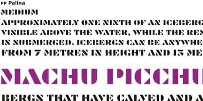 FP Palina is a very simple and geometric, stencil typeface with a strong graphic design.
 - DF Tapa by Dutchfonts,
$39.00 DF Tapa is a typeface based on the vernacular, popular graphics used in Spain. They proudly announce the daily fresh snacks which are homemade and served in every proper bar.
 - DF Ko by Dutchfonts,
$33.00 The Ko family was developed for the text posters at the Holland Festival in 1997, based on the filling of a lettering stencil with different pen thicknesses. Ko Heavy and the Ko KAP were the first weights; the family was completed in 2002 with a Ko Light, a second Ko KAP and two italics.
 - FP Head by Fontpartners,
$29.00 FP Head is a redesign of a corporate typeface for the Danish trade union FOA. Head is a extended display font, with a blurred look and a touch of FF Max: Hard and soft at the same time. Available in two versions.
 - DF Zzzz by Dutchfonts,
$33.00 This typeface, in fact a bitmap font 'avant la lettre' is an interpretation of the Old Face condensed type. It is being used where space is scarce. Its skeleton is projected on the chain structure of a fly screen. Eventually your text lines fill the space as wide as hypothetical doors can be. In small sizes the text appears to be drawn with a pencil.
 - DF Riga by Dutchfonts,
$33.00 DF Riga is a minimal bitmap typeface which works very well in small sizes both on your screen and on paper. But... if you want to express its deep beauty, use it in display sizes and the smell of ink is there. These typefaces (DF-A BIT, DF-Riga and DF-Dudok) owe their existence to the excellent letterpress printing of Hanneke Briër at the Grafisch Centrum Groningen. Beyond ‘the perfect’ there is a lot to get, it is made, you can see that.
 - M XiangHe Hei SC Pro Variable by Monotype,
$1,049.99The M XiangHe Hei Simplified Chinese typeface merges traditional brush strokes with modern letterforms to carefully balance traditional calligraphy with humanist design. Named for the smooth movements of a flying crane, the M XiangHe Hei typeface is designed to glide across the page, and features strokes that are partly derived from the Kaishu calligraphic style – an everyday script which dates back hundreds of years. Seol Sans features Neue Frutiger for its Latin glyphs, and works harmoniously with Neue Frutiger World and Monotype’s CJK typefaces Tazugane Info (Japanese) and Seol Sans (Korean). M XiangHe Hei is a great choice for global brands using sans serif Latin typefaces looking to maintain their visual identity, and communicate with a consistent tone of voice with Simplified Chinese. - M XiangHe Hei SC Std Variable by Monotype,
$1,049.99The M XiangHe Hei Simplified Chinese typeface merges traditional brush strokes with modern letterforms to carefully balance traditional calligraphy with humanist design. Named for the smooth movements of a flying crane, the M XiangHe Hei typeface is designed to glide across the page, and features strokes that are partly derived from the Kaishu calligraphic style – an everyday script which dates back hundreds of years. Seol Sans features Neue Frutiger for its Latin glyphs, and works harmoniously with Neue Frutiger World and Monotype’s CJK typefaces Tazugane Info (Japanese) and Seol Sans (Korean). M XiangHe Hei is a great choice for global brands using sans serif Latin typefaces looking to maintain their visual identity, and communicate with a consistent tone of voice with Simplified Chinese. - Zenith by Glyphobet,
$9.99 Chinese characters have simplifed and more complex, "traditional" variants. Zenith imagines what an un-simplified, traditional version of the Latin alphabet might have looked like.
 - Shining Like Stars - Personal use only

- Cheese and Mouse - Unknown license

- Accent Swiss Cheese - Unknown license

- Shine of Love by Namara Creative Studio,
$9.00 Cute and Playful display fonts crafted with heart, especially for you. It is perfect for children-themed designs, Such as t-shirt designs, story books, packaging, children’s activity or school projects, posters, greeting cards, valentine’s crafts, and more! Come in 03 variants : Regular, Shadow and Fun. So add it to your creative ideas and notice how it makes them stand out!
 - Chive Turkey JNL by Jeff Levine,
$29.00Chive Turkey JNL is a solid version of Jeff Levine's inline font, Toucan Tango JNL. This bold and sassy sans serif has the great retro look of hand lettering and can really add some punch to ad copy. - P22 Ching Mang by IHOF,
$24.95 Ching Mang is a cartoon character created by Hajime Kawakami for a magazine in Japan in the 1980s. This picture font features various expressions of this fun creature. It features solid and outline variations for multi-color overlay effects in layout.
 - China Doll JNL by Jeff Levine,
$29.00 A 1960 edition of the Speedball® Pen lettering instruction book yielded the model for China Doll JNL.
 - Long Shine Script by BonjourType,
$17.00 LongShine Script is a fluid handwritten calligraphy fonts, combining calligraphy typefaces with a free flowing and moving baseline. It has a casual, yet elegant touch. Features 275 glyphs. Including initial and terminal letters, alternates, ligatures and multiple language support. Can be used for various purposes. such as headings, signature, logos, wedding invitation, t-shirt, letterhead, signage, lable, news, posters, badges etc.
 - Steak And Cheese by Fenotype,
$25.00 Steak and Cheese - a Savoury Font Collection Packed with flavour, Steak and Cheese includes following: • Brush - Two weights of a connected Brush Script with Contextual, Swash, Titling and Stylistic Alternates • Pen - Three weights of a connected monoline Script with Contextual, Swash, Titling and Stylistic Alternates • Slab - Two weights of a chunky Slab Serif with rounded corners • Condensed - A bold and tight condensed Sans Serif with rounded corners. Steak and Cheese fonts are designed to work together - in pairs or more. Steak and Cheese is great for branding, posters or any display use. All fonts are PUA encoded and have a wide language support.
 - Mix String Cheese by Mix Fonts,
$13.00 Flexi. Bendy. Stringy. Rubbery. Introducing Mix String Cheese – the ultimate handwritten font for adding personality and playfulness to your designs. This font is perfect for logos, titles, and packaging design, and comes with a full range of characters including uppercase letters, punctuation, numbers, and special symbols and accents. Mix String Cheese is a versatile font that is sure to bring fun and creativity to all of your projects. Don’t settle for boring, generic fonts – add some flavor to your designs with Mix String Cheese.
 - Durazno de Chile by Ocha Puyaber,
$10.00 Durazno de Chile are cursive fonts based on Chilean school script. It can be written in Aymara, Mapuche and Rapa Nui from Chile. It can also be written in Dutch, Maltese, and other languages. This font family is cute. The style is wide and rounded. It has wide and open loops. The strokes are drawn with a round cap tool, with no contrast. It is cursive and connected. The form is upright because upright is the Chilean script standard. It is easy to read in Chile. Parts A have capitals with high starts. Parts B have capitals with low starts. Parts F are Final forms.
 - China Dragon JNL by Jeff Levine,
$29.00 China Dragon JNL was inspired by a vintage letterpress logo cut on sale in an online auction. The logo for The China Dragon restaurant (presumably from the 1950s or 1960s) had a wonderfully eclectic hand-lettered look. Some of the original characters were modified slightly to conform with the ones created for the remainder of the typeface, but the original styling remains intact. The unique design of this font allows it to adapt well to Art Nouveau or Mideastern project styles. In January of 2006, Jeff Levine Fonts started with just ten designs. A little more than seven years later, in April, 2013 the release of China Dragon is the 700th font added to this ever-growing library.
 - Stay and Shine by Brithos Type,
$11.00 Stay and Shine is a strong and tall display font. Its sharp yet approachable feel makes this font incredibly versatile, fitting a wide range of contexts.
 - West of China by Monotype,
$29.99 - Cheese And Crackers by Comicraft,
$19.00 Don't forget the Cheese! CHEESE AND CRACKERS is a delightfully light and creamy font created for lettering Wallace & Gromit in Nickelodeon Magazine.
 - Spaghetti And Cheese by Hanoded,
$15.00 Who doesn’t like Spaghetti & Cheese? Well, my son doesn’t like it, because he hates cheese, but he seems to be one of the few. Spaghetti & Cheese is also a handmade font: slightly slanted, slightly eroded, yet very legible and clear. It was made with a Japanese ‘Shake & Write’ marker pen. Comes with a generous topping of diacritics.
 - Hiragino Sans GB by SCREEN Graphic Solutions,
$200.00 Based on the Hiragino Sans (Kaku Gothic) design, this is the first Chinese-language font from a Japanese font manufacturer to be certified compliant with China’s GB 18030-2000 standard. Unique features are a contemporary typeface design that sets it apart from existing Chinese typefaces and a dedication to high quality down to the slightest detail. Multi-language composition using both Japanese and Chinese Hiragino fonts offer a sense of unity With demand growing rapidly in China, Hiragino Sans Simplified Chinese is the optimal font for uses in those fields that need both readability and contemporary vibe such as product packaging, catalogues, books, magazines, websites, and sign and displays.
 - Wide Eyed - Unknown license


