10,000 search results
(0.036 seconds)
- Beta Dance - Unknown license

- Fairfield by Linotype,
$41.99 Rudolph Ruzicka designed his font Fairfield as a legible text font. His philosophy: The reader expects optical assistance with reading. He does not want to be distracted while interpreting and understanding the ideas of a text." Fairfield font is based on the forms of Venecian Old Face fonts as well as on the designs and details of Art Deco, giving the font a distinctive appearance"
 - Peter Schlemihl by profonts,
$41.99 Adalbert von Chamisso wrote that wondrous story about the man who sold his shadow to the devil. Walter Thiemann recovered that shadow when he put a thin line and a shadow line around his Tiemann Fraktur. It is an embellished and delightful typeface, this Peter Schlemihl. It is probably one of the most beautiful typefaces among the outline, shadow and striped black letter fonts. (Albert Kapr)
 - Maricava by Monotype,
$29.99The Maricava font was designed for a lady, who received her first computer on her 60th birthday. Maricava is loosely based on her own handwriting and now used intensely by herself in her short stories, writings, recipes and so on. - Zhang QA - Unknown license

- 946 Latin by Roman Type,
$35.00 946 is a multilingual techno-style family developed by Berlin-based type designer Roman Wilhelm (RomanType). While more and more text families have recently been extended to a multilingual and multi-script level, not so much attention has been given to the more decorative styles. The 946 family does exactly that. A lot of care has been given to the various diacritics: they were designed a little more brutal, a little more European than with some other fonts of this category. Do also watch out for the non-Latin legs of this family. 946 is inspired by electronic music. When Roman found a second-hand Roland TR-606 drum machine in a store in his hometown back in 1995, he started to hang out with would-be DJs and musicians, trying to play the beats that went around the globe. When he started to study visual communication three years later, he was assigned the matriculation number of 946, which has now become the name of this family. Language support: Afrikaans, Albanian, Catalan, Croatian, Czech, Danish, Dutch, English, Estonian, Finnish, French, German, Hungarian, Icelandic, Italian, Latvian, Lithuanian, Maltese, Norwegian, Polish, Portuguese, Romanian, Slovak, Slovenian, Spanish, Swedish, Turkish, Vietnamese, Zulu. Do also watch out for the other script versions of this family!
 - Mike Wick by Epiclinez,
$18.00 Mick Wick is a casual handwritten font. It’s readable and it has a playful feel. Get inspired by its simplistic charm and use it to brighten up any creative project
 - Vuk by LetterPalette,
$48.00 Vuk Stefanovic Karadzic was a Serbian philologist and linguist who was the major reformer of the Serbian language. In addition to his linguistic reforms, Karadzic also contributed to folk literature, using peasant culture as the foundation. Because of his peasant upbringing, he was closely associated with the oral literature of the peasants, compiling it to use in his collection of folk songs, tales, and proverbs. He was well known abroad and familiar to Jacob Grimm, Johann Wolfgang von Goethe and historian Leopold von Ranke. This typeface, based on his manuscripts, presents the perfect balance between casual handwriting and careful calligraphy. Thoroughly created by Vedran Erakovic and Marija Rnjak, it contains a comprehensive set of upper and lower case letter alternates. Thanks to some OpenType features, such as contextual alternates, this typeface approaches handwritten text as closely as possible. It is ideal for designing greeting cards, quotes, packaging, invitations, fashion layouts and much more.
 - Catalpa by TypeTogether,
$35.00 The Catalpa font family is José Scaglione and Veronika Burian’s wood type inspired design for an overwhelming headline presence. It has no regular weights, only four slender and four hulking weights. Catalpa wasn’t made to be normal; it was made to overwhelm, to stand out, to bellow. Catalpa is the first font family within a trilogy that will be released through 2020. Each of the three have a distinct purpose and their own look, but they serve a common goal: to act as a complete family covering an editorial’s wide array of needs. As the first of the three, Catalpa is the bookend font family with a headlining purpose. What requirements are there for a great headline typeface? Distinction, weight, and cohesiveness are a good start. Its distinctiveness must catch attention, it must have a range of weights applicable to its purpose, and its internal consistency and external look must create a cohesive family. Catalpa is a distinct and unified family whose weights are attuned to its single-minded purpose — headlines and large text. Catalpa has only eight styles that are divided into two ranges of weights — four very light weights (Hairline, Thin, Extralight, and Light ) and four very bold ones (Extrabold, Heavy, Black, and Extrablack). The thin and heavy ends of the spectrum also have their own variable fonts, each with one axis of weight so designers can fine-tune their work. The geometric influence of the design is more obvious in the light range, with their line thickness increasing in the classical manner. The bold weights increase more in width and substance to serve well in websites, mobile apps, posters, advertisements, and magazines that aim for impact more than spreading information. As a family, Catalpa gels in big headlines, short sentences, and isolated words. The family has many recognizable features, in the bolder weights especially, like the reversed contrast ‘S, s’ or the angular design of ‘Q, M, W, w, a, f, 2, 3’. Catalpa’s headlining mixture of geometry and quirkiness leaves an impression that is so characteristic of wood type, but designed for substrates and screens.
 - Sebastian Pro by Storm Type Foundry,
$32.00Sans-serif typefaces compensate for their basic handicap – an absence of serifs – with a softening modulation typical of roman typefaces. Grotesques often inherit a hypertrophy of the x-height, which is very efficient, but not very beautiful. They are like dogs with fat bodies and short legs. Why do we love old Garamonds? Beside beautifully modeled details, they possess aspect-ratios of parts within characters that timelessly and beauteously parallel the anatomy of the human body. Proportions of thighs, arms or legs have their universal rules, but cannot be measured by pixels and millimeters. These sometimes produce almost unnoticeable inner tensions, perceptible only very slowly, after a period of living with the type. Serifed typefaces are open to many possibilities in this regard; when a character is mounted on its edges with serifs, what is happening in between is more freely up to the designer. In the case of grotesques, everything is visible; the shape of the letter must exist in absolute nakedness and total simplicity, and must somehow also be spirited and original. - Fortune Teller by Kitchen Table Type Foundry,
$15.00 Back in the nineties I had a deck of Tarot cards. It was part interest and part curiosity, but I also liked the look of them. My readings were just for fun; I thought it was all a joke, but when people started to return for more readings (because what I had predicted actually happened), I quit. That was way out of my comfort zone! Fortune Teller is a nice brush font. I made it with one of my late father in law’s Chinese brushes and ink. It comes with all diacritics and a set of alternate glyphs. If you buy this font, you will meet with a tall and handsome stranger and you will win the lottery. Guaranteed! Haha!
 - Siamese Katsong Pro by CheapProFonts,
$10.00 A faux Thai font - but not over the top, just stylishly hinting at the foreign script. I have introduced lots of alternate glyphs, so it now has both lower- and uppercase letterfoms. Perfect for that travel brochure, ad or restaurant menu - in many languages. Vic Fieger simply says: "A font based on a boldface sign in Thai". ALL fonts from CheapProFonts have very extensive language support: They contain some unusual diacritic letters (some of which are contained in the Latin Extended-B Unicode block) supporting: Cornish, Filipino (Tagalog), Guarani, Luxembourgian, Malagasy, Romanian, Ulithian and Welsh. They also contain all glyphs in the Latin Extended-A Unicode block (which among others cover the Central European and Baltic areas) supporting: Afrikaans, Belarusian (Lacinka), Bosnian, Catalan, Chichewa, Croatian, Czech, Dutch, Esperanto, Greenlandic, Hungarian, Kashubian, Kurdish (Kurmanji), Latvian, Lithuanian, Maltese, Maori, Polish, Saami (Inari), Saami (North), Serbian (latin), Slovak(ian), Slovene, Sorbian (Lower), Sorbian (Upper), Turkish and Turkmen. And they of course contain all the usual "western" glyphs supporting: Albanian, Basque, Breton, Chamorro, Danish, Estonian, Faroese, Finnish, French, Frisian, Galican, German, Icelandic, Indonesian, Irish (Gaelic), Italian, Northern Sotho, Norwegian, Occitan, Portuguese, Rhaeto-Romance, Sami (Lule), Sami (South), Scots (Gaelic), Spanish, Swedish, Tswana, Walloon and Yapese.
 - Boogie Nights NF Pro by CheapProFonts,
$10.00 A typical Art Deco font. I have redesigned the uppercase “S” to mach the lowercase, tweaked a little here and there - and completely redesigned all the diacritics (which didn't really match the letter designs). Nick Curtis says: "The inspiration for this font came from a poster for an Austrian trade show from the 1920s, credited simply to Wasserman." ALL fonts from CheapProFonts have very extensive language support: They contain some unusual diacritic letters (some of which are contained in the Latin Extended-B Unicode block) supporting: Cornish, Filipino (Tagalog), Guarani, Luxembourgian, Malagasy, Romanian, Ulithian and Welsh. They also contain all glyphs in the Latin Extended-A Unicode block (which among others cover the Central European and Baltic areas) supporting: Afrikaans, Belarusian (Lacinka), Bosnian, Catalan, Chichewa, Croatian, Czech, Dutch, Esperanto, Greenlandic, Hungarian, Kashubian, Kurdish (Kurmanji), Latvian, Lithuanian, Maltese, Maori, Polish, Saami (Inari), Saami (North), Serbian (latin), Slovak(ian), Slovene, Sorbian (Lower), Sorbian (Upper), Turkish and Turkmen. And they of course contain all the usual “western” glyphs supporting: Albanian, Basque, Breton, Chamorro, Danish, Estonian, Faroese, Finnish, French, Frisian, Galican, German, Icelandic, Indonesian, Irish (Gaelic), Italian, Northern Sotho, Norwegian, Occitan, Portuguese, Rhaeto-Romance, Sami (Lule), Sami (South), Scots (Gaelic), Spanish, Swedish, Tswana, Walloon and Yapese.
 - Knock Type by sugargliderz,
$20.00 KnockType is based on the concept of braille notation in Japanese. It does not support braille notation in other languages. KnockType is not necessarily aimed at facilitating “braille transcription”. It is designed so that someone who understands the grammar of “braille transcription” can instantly transliterate into braille text that was previously transcribed to kana characters, etc. In addition, it allows ink characters to be converted to braille using OpenType features. It is recommended for use in applications that are compatible with OpenType features. If they are not compatible, KnockType is “simply a kana font”. To be a little more specific, it is assumed that KnockType will be used in Adobe’s InDesign and Illustrator applications. If you don't have them, you will not get satisfactory results. Four types of font are available. There are “hasBox&Line”, “hasnotBox&Line”, and the reversed font of each. When displayed on a convex surface, the assumption is that they will be used mainly for printing applications. When displayed on a concave surface, the assumption is that they will be used mainly for writing on braille boards, etc. By printing, you can get a rough idea of the dot positions. It is more effective to match them to the grid size of the braille board.
 - Eurotypo Bodoni by Eurotypo,
$48.00 Talking about the numerous types that today bear the name of Giambattista Bodoni are a kind of tribute as much to his reputation as a printer as to his ability as designer and engraver. In fact, all of them tent to be more in the way or style of Bodoni than simply copy of his letterforms. Like many other type designers, we’ve been seduced also to develop our own point of view of his work, nowadays enriched by some features of OpenType format that allows a variety of combinations: standard ligatures, discretional ligatures, stylistic alternates and old styles figures. Whereas the Bodoni serif in the capitals was of the same weight as the thin stroke but joined with a very slight fillet (Bracket) and the lowercase serif were like his French rivals, the Didots, featured straight- edged serifs that were unbracketed. The ascenders and descenders of this new Bodoni are shorter, giving in this way, more space for enlarge x high. Specially designed for editorial design and advertising, can be used in magazines, annual reports and all kind of fine print materials or web pages. The beauty of his letterforms can enrich headlines; this font can also be used as body text for its good legibility and accurate kerning.
 - Logitech by Shape Studio,
$16.00 Hi everybody, on this occasion I would like to introduce a new product. dubbed Logitech, he is very classic and elegant. equipped with stylistics up to 288 glyphs, of course it will really help your work more attractive and beautiful.
 - Telkomsel by Shape Studio,
$14.00 Hi everybody, on this occasion I would like to introduce a new product. dubbed Telkomsel, he is very classic and elegant. equipped with stylistics up to 288 glyphs, of course it will really help your work more attractive and beautiful.
 - Go POP by Gleb Guralnyk,
$14.00 Hey! Introducing a vintage style font GoPOP. This font was inspired by 80s pop culture and has a smooth rounded shape with decorative thin lines. Base shape and additional lines can be combined from two font layers, for easy color manipulations.
 - Mr. and Mrs. Peter by Khaito Gengo,
$23.00 Mr. Peter is a warm and friendly handwritten san-serif font which has two weights, Regular and Bold. He also features multi languages, some alternative letters, and 35 ligatures. He is good for an eye catching title, display as well as small text. Mrs. Peter is a handwritten script font based on Mr Peter. She also provides two weights, Regular and Bold, and features multi languages, automatic ligatures, and beginning and end-changing effect. It will be in good taste if you combine and use Mr. & Mrs. Peter together. Jr Peter consists of around 100 unique icons and ornaments. Also you can simply create multiple faces by using this font. The description of how to make a face is on the promotion poster.
 - Jack Stanislav - Personal use only

- Stoutface SC - Personal use only

- BIG Slant Black UltExp - Personal use only

- Desmond Text by MADType,
$24.00 Desmond Text is a highly readable and quirky serif face with a tall x-height and glyphic serifs. It is easy to read small, but with pleasing details that shine at display sizes.
 - Scarlett Mackenzie by Letterhanna Studio,
$19.00 Introducing our new modern handwriting signature font Scarlett Mackenzie. A sophisticated signature-style handwriting script with an uppercase swash alternatives for each letter and 7 sets of alternate for each lowercase letter. Scarlett Mackenzie handwriting font was created to look as close to a natural handwritten script as possible by including over 35 natural-looking opentype ligatures
 - Darwin Pro by Los Andes,
$26.00 Darwin Pro, the sequel to Darwin, is ready to leave port and start new adventures. The font was redrawn, the language support was extended and a new set of figures was added. Darwin Pro comes in 7 weights plus italics and includes alternative characters available as an OpenType feature as well as oldstyle figures, numerators and denominators.
 - MGN Burro by Morgana Studio,
$17.50 MGN Burro by Morgana Studio is a slab serif font offering 7 styles: Thin, Light, Regular, Medium, Semibold, Bold, and Extra Bold. Combining classic and modern elements, it caters to diverse designs, ensuring readability and impact. From delicate Thin to bold Extra Bold, each weight caters to various preferences, making MGN Burro a versatile toolkit for designers.
 - Gildan by Sign Studio,
$15.00 Gildan fonts come in 7 measured thicknesses. Inspired by a charming classic style. Equipped with several OpenType features (plain version); Discretionary Ligatures, Small Caps, Stylistic Sets, Oldstyle Figures. We made the italic version simpler but with controlled thickness on each side. Everything is made with the aim of complementing each other and supporting the design well. Regards
 - Tequila Sunrise by TypeClassHeroes,
$12.00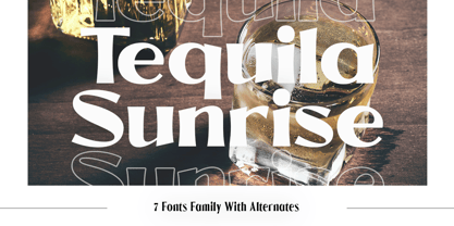 Introducing Tequila Sunrise, access your OpenType features to access the large selection of alternate letters and ligatures. Use this font for any branding, product packaging, invitation, quotes, t-shirt, label, poster, logo etc. Feature 7 Weight Uppercase & Lowercase Number & Symbol International Glyphs Multilingual support Alternative Ligature Feel free to drop us a message any time Hope you enjoy it.
 - Tobi Pro by RodrigoTypo,
$15.00 Tobi Pro - the new version of Tobi "the previous year" - is a geometric typographic family with an organic touch. Contains 7 fun variants, shadows, dingbats and effects for the Heavy variant, also has OpenType alternatives in all its variants. Tobi is a perfect typeface for posters, packaging, logos and any visual communication application inherent to children and youth designs.
 - Humorist JNL by Jeff Levine,
$29.00 The May 7, 1936 issue of “The Film Daily” carried an ad for the Will Rogers Memorial Hospital Fund. (In August of 1935 Rogers, along with famed aviator Wiley Post died in a plane crash.) While the fundraising for the hospital was a serious event, Rogers is remembered as a humorist, hence the font’s name of Humorist JNL.
 - Closer by Mint Type,
$35.00 Closer is a highly customizable Swiss Grotesque with overclosed aperture. Being a bit wider than the average grotesque and featuring some humanistic shapes, Closer feels less bland though still relatively neutral. Closer comes in 9 weights (18 styles altogether), features extensive language support including Cyrillic and is highly customizable with 7 stylistic sets to mix and match.
 - FF Kipp by FontFont,
$47.99 0 Kipp "German type designer Claudia Kipp created this display and sans FontFont in 1993. The family has 7 weights, and is ideally suited for film and tv and music and nightlife. FF Kipp provides advanced typographical support with features such as ligatures and case-sensitive forms. It comes with proportional lining, tabular lining, and proportional oldstyle figures.
 - Creata by Ivan Petrov,
$25.00 Creata is a sans serif typeface with a wide range of application. The font family contains 14 weights (7 straight with match italics). The overall design is neutral but some letters has pretty unusual appearance (for example @, &). Creata has its own personality, its own integrity and a unique voice. Recommended for corporate branding and editorial exercises.
 - Big Wave by Vozzy,
$10.00 Introducing a vintage look label font named Big Wave. This font have a lot of additional characters and multilingual support (you can see them at the screenshot) and including 7 styles - Regular, Full, Shadow, Texture, Shadow FX, Texture FX and Outline. This font will good viewed on any retro design like poster, t-shirt, label, logo etc.
 - Ki by Mint Type,
$29.00 Ki is a monospaced display typeface inspired by older VCR / camcorder OSD (on-screen display) fonts. It is peculiar for its diagonal angles being restricted to 45°, which results in a specific textural effect perfectly legible in small type sizes. Ki comes in 7 weights with corresponding italics, and features extensive language support with over 500 glyphs, including Cyrillic.
 - Casty by TypeClassHeroes,
$12.00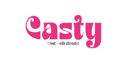 Introducing Casty, access your OpenType features to access the large selection of alternate letters and ligatures. Use this font for any branding, product packaging, invitation, quotes, t-shirt, label, poster, logo etc. Feature 7 Weight Uppercase & Lowercase Number & Symbol International Glyphs Multilingual support Alternative Ligature Feel free to drop us a message any time Hope you enjoy it.
 - Monospaceland by Pepper Type,
$25.00 Monospaceland is a round monospaced typeface in 7 weights with rich language support (Cyrillic included), small capitals, and some double-width alternatives for added fun. It includes obliques and reverse obliques, making a total of 21 fonts. Plus, the family pack comes with a two-axis variable font to allow setting arbitrary weight and slant angle.
 - Skorid by Totem,
$20.00 Skorid is a geometric condensed sans serif font family, constructed only out of straight lines. Coming in 7 weights, regular and italic, from thin to black, you have a wide array of possibilities of using Skorid for any purpose you need. Skorid speaks around 70 languages, including Cyrillic. Contains a lot of alternative letters to boost your creativity.
 - Parkson by Rook Supply,
$18.00 Inspired by the grotesque fonts of the 19th century, Parkson is a tall sans serif typeface of 7 weights along with italic and several outline versions. The contemporary typeface aims to be one of the world's best condensed collection of fonts. Designed for optimum legibility, its clean, geometric look is perfect for logotypes, headers, titles and brochures.
 - Churchward Freedom by BluHead Studio,
$25.00BluHead Studio LLC is pleased to announce the release of 7 fonts from the Churchward Freedom family designed by New Zealand typeface designer Joseph Churchward. BluHead Studio is in the process of digitizing many of the fonts in Churchward's extensive library of exciting and unique designs and will be releasing them in OpenType format on a regular basis.


