7,732 search results
(0.039 seconds)
- HeiS ASC Simplified Chinese by Ascender,
$523.99HeiS ASC Medium is a Simplified Chinese font supporting GB2312. The HeiS ASC Medium font is a sans serif style typeface with consistent strokes. HeiS ASC Medium font character Set: Latin-1, Simplified Chinese (code page 936). - M Ying Hei PRC by Monotype HK,
$523.99 M Ying Hei™ is designed by type designer Kenneth Kwok and Robin Hui. Unnecessary details have been eliminated to pursue a minimal form. The structure of characters are well balanced, neat and dignified. Different components of a character are cooperating perfectly in an appropriate proportion. Thickness of strokes are modified according to the number of strokes, thus achieving an even texture throughout the paragraphs. Therefore a perfect choice for prints, user interface and signages. M Ying Hei™ is equipped with 7 weights, which is sufficient for various occasions like matching with different Latin typefaces and handling complex information hierarchy.
 - M Zuo Hei PRC by Monotype HK,
$523.99 M Zuo Hei PRC is a graphic style Simplified Chinese typeface. Graphic font designs have strong personalities and visual impact. Graphic style Simplified Chinese fonts feature decorative elements and pronounced graphics characteristics, suitable for catching attention in display applications.
 - M Young Hei PRC by Monotype HK,
$523.99 M Ying Hei™ is designed by type designer Kenneth Kwok and Robin Hui. Unnecessary details have been eliminated to pursue a minimal form. The structure of characters are well balanced, neat and dignified. Different components of a character are cooperating perfectly in an appropriate proportion. Thickness of strokes are modified according to the number of strokes, thus achieving an even texture throughout the paragraphs. Therefore a perfect choice for prints, user interface and signages. M Ying Hei™ is equipped with 7 weights, which is sufficient for various occasions like matching with different Latin typefaces and handling complex information hierarchy.
 - HEX Font - Personal use only

- HKI Nightlife - Unknown license

- HKI metropol - Unknown license

- Heil Vertica - Unknown license

- Key Lime by Kellie Jayne Studio,
$10.00 Key Lime is a sweet and friendly handmade typeface! I carefully drew and then digitally edited the characters. It is inspired heavily by children's books and toys. Key Lime is easy-going, unique, and still easy to read.
 - Hiyagh Ahey by Viaction Type.Co,
$16.00 Hiyagh Ahey Script & Sans font with original handwriting style, looks very natural and beautiful. It is suitable for boutique brand, photography, magazine, quote, business card, logo, poster and many more. There are two types of fonts: script and sans, script is equipped with opentype features such as ligature, contextual alternates and multilingual support. Opentype Feature : Standard Ligature. Contextual Alternates. Multilingual & Punctuation. PUA Encoded. I hope you enjoy and thank you.
 - Rounded Keys by Funk King,
$5.00 Rounded Keys is a type font with a smooth, modern feel.
 - Hay Scary by HandletterYean,
$13.00 This is a Halloween-themed font. Its style will make your creativity stands out in your designs. Feel free to use it on any kind of creative design, and cherish your Halloween with this font to make it more festive.
 - Nerdish Hex by Ingrimayne Type,
$5.95 NerdishHex is a hexagonal distortion of NewNerdish that I thought was rather interesting.
 - Hai Brush by Sabrcreative,
$30.00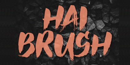 Unleash your creativity with the all-caps captivating Hai Brush Font. This unique typeface effortlessly combines the raw energy of hand brush strokes with a touch of elegance, making it an exceptional choice for a variety of design endeavors. Whether you're crafting logos, posters, or branding materials, Hai Brush Font adds an authentic, artistic flair to your projects.
 - Oh Ley by TypeSETit,
$19.95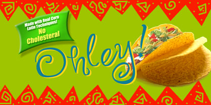 A playful fun font.
 - Hai California by Colllab Studio,
$15.00 Meet Hai California, a handwritten font with a fancy script and a small-caps companion, this passionate pair of hand-drawn marker fonts is for logos + branding ,website design + website accents - think travel blogs, fashion blogs, & more, Clean print design, like magazines + flyers, header elements that need handwritten touch, quote graphics for social media. Hai California comes with stylistic alternate, ligatures, swashes, and multilingual support. Follow us for more great fonts. A Million Thanks Colllab Studio
 - Key West by BA Graphics,
$45.00A sans serif casual gothic. Works for many applications. - Her Song by Allouse Studio,
$16.00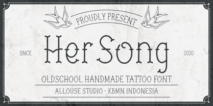 Proudly Present, Her Song a Oldschool Handmade Tattoo Font Her Song is perfect for product packaging, branding project, megazine, social media, wedding, or just used to express words above the background. Her Song also come with Multi-Lingual Support. Enjoy the font, feel free to comment or feedback, send me PM or email. Thank You!
 - Hex Braille by Echopraxium,
$5.62 The purpose of this monospace font is to display braille in an original although rather steganographic way. Its glyphs are built from a flat hexagon which can be read as 3 rows of 2 vertices (i.e. regular braille glyph grid). The initial design is illustrated by glyphs 'ç' (no dot) and 'û' (6 dots) as shown by poster 5. Glyphs are connected to each other, thus 6 connections for each hexagon (2 on left/right and 4 on top/bottom). In the final design many diagonal segments of the hexagon were removed for esthetical reason. Text is displayed not as a honeycomb but as a lattice instead which mixes hexagons, squares and "irregular convex octagons" (mostly unclosed), the design favored squares over octagons. The whole slightly resembling a PCB. Text can be framed with 3 sets of Frame glyphs (as shown in Poster 4): Octagonal: { €, °, £, µ, §, ¥, ~, ¢ } which can be mixed with Rectangular High Rectangular Low: { è, é, ê, ï, î, à, â, ä } Rectangular High: { Â, ù, Ä, Ê, Ë, ô, õ, ë } which can be mixed with Octagonal NB: When using Frame glyphs, it is advised to show Pilcrow (¶) and Non Breaking Space, which are replaced by empty shapes (e.g. in Microsoft Word, use CTRL+8 or use [¶] button in the ribbon).
 - Allen Keys by Letters&Numbers,
$18.00 Rummaging through the toolbox recently, I was surprised by how many allen keys I had from years of assembling flat-pack furniture. After some experimenting with the keys to make up individual letters I was struck by their graphic quality. The typeface is defined by the slim, right-angled shape of the allen key; creating a geometrical, yet playful font. The typeface is suitable for logos and feature headings.
 - Orchid Key by Missy Meyer,
$12.00 I built the Orchid Key font family from the ground up with the idea that there would be several different styles; the Inline Spurs style was the first to be built, which let me then subtract the spurs, inline slices, or both to make the other styles. I've never made a font quite like this before, which shows in the time it took - it's been over 5 months since I started construction! Each style contains the same character set, with 700 total glyphs. Each has the usual basics: letters, numbers, and punctuation; plus over 300 extended Latin characters for language support, and almost 200 alternates for tons of variety! There's a swash alternate for every uppercase letter, at least 6 alternates for every single lowercase letter, and a set of 10 extra swashes and flourishes so you can customize! Whether you're looking for a western or country look, a retro look, or a modern hipster look for your project, check out Orchid Key!
 - Hay Billy by Zeenesia Studio,
$14.00 Hay Billy is cute handwritten font. It is bouncy, charming and perfect for many design projects or crafting ideas, Hay Billy perfect for large design project like Tshirt, Advertising, bags, quotes, food , poster, fashion, custom sticker, magazine, and many others. It completed with numbers and punctuation. Multilingual support, and came with PUA encoded.
 - Hay Anika by MC Creative,
$10.00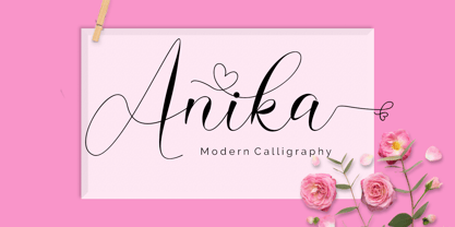 Hay Anika is a sweet and a natural script stylish script. Anika Calligraphy is perfect for wedding designs,monogram, invitation, branding projects, logo, social media posts, advertisements, product packaging, product designs, label, photography, watermark, stationery and any projects that need handwriting taste. What’s Included : · Standard glyphs · Ligature & Alternate · Works on PC & Mac · Simple installations · Accessible in the Adobe Illustrator, Adobe Photoshop, Adobe InDesign, even work on Microsoft Word. · PUA Encoded Characters – Fully accessible without additional design software. · Fonts include multilingual support for; ä ö ü Ä Ö Ü ß ¿ ¡ Thank you for your purchase! Hope you enjoy with our font!
 - Hay Ghost by Letterafandi Studio,
$16.00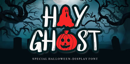 Hay Ghost is a thick-lettered and spooky display font. It is perfectly suitable for any Halloween-related project or crafty idea! This font is PUA encoded, which means that you can access all of the glyphs with ease!
 - Decrypt He2 by Type Innovations,
$39.00 Say hello to Decrypt He2—a geometric typeface that features highly stylized capitals with sharp corners, circular forms and generous proportions. Specifically created for visual impact—use Decrypt He2 when you want your words to stand out from the rest of the crowd. The concept is modern, futuristic and non-traditional. Perfect for display text, logos and headings. The development of Decrypt He2 started in 1997, inspired by Alex Kaczun’s best selling grotesque font family called Contax Pro. Decrypt He2 is specifically introduced here as a bold weight, but Alex plans to expand the design to include many weights, styles and alternative design treatments. Stay tuned! If you like Decrypt He2—check out it’s alternate twins Decrypt H1, Decrypt 01, Decrypt 02 and all of Type Innovations fonts at: http://www.myfonts.com/person/Alex_Kaczun/.
 - Flagellum Dei by Hanoded,
$20.00 Flagellum Dei is Latin for ‘The Scourge of God’. It is a title given by later generations to Attila the Hun (406-453 C.E.). Flagellum Dei is also a rather scary font, which I made with the use of a stiff brush and some China ink. Of course you could use this quite versatile font to scare the bejesus out of your friends, but I’d much rather see it used on book covers, posters and album artwork. Flagellum Dei comes with a horde of diacritics.
 - Braga Huis by Juru Rancang Studio,
$15.00 Braga Huis typeface is a font family that is inspired by the famous street in Bandung that was made to embodies the atmosphere and the environment of Netherland-Indie city at its golden time, whereby all the elements were designed to give the impression of structural, artistic, and advance. Braga Huis typeface has a strong Art Deco character, where the impression is depicted from the strong lines, curvy passion so it is very appropriate to describing the future atmosphere from the perspective of the 19th century. Braga Huis typeface has 3 font styles consisting of uppercase, lowercase and various alternative options that can be customize to your taste, poster is one of the media form of presentation that we believe is very appropriate for this type of font. But whatever the medium is, honestly we say; using Braga Huis typeface will make your artwork will never be cracked by time.
 - Hemi Head by Typodermic,
$11.95 Rev up your designs with the bold power of Hemi-Head, the square industrial typeface inspired by the classic muscle cars of the 60s and 70s. Its audacious letterforms and stylish gaps will give your message a commanding presence, instantly conveying authority and technologically superior design. With its sleek, constructivist squareness, Hemi-Head is the perfect typeface for any project that demands strength, speed, and raw power. From high-performance automotive advertising to cutting-edge tech branding, Hemi-Head delivers the perfect blend of style and substance. Available in 8 versatile weights and italics, Hemi-Head offers a wide range of options for any project. Choose the style that best suits your needs, from the light and nimble to the heavy and powerful, and add a touch of italicized style for even more visual impact. So whether you’re looking to create a design that demands attention, or simply want to add a touch of muscle car style to your next project, Hemi-Head is the perfect typeface for the job. Embrace the bold, square industrial aesthetic of the 60s and 70s, and let your designs roar with power and precision. Most Latin-based European writing systems are supported, including the following languages. Afaan Oromo, Afar, Afrikaans, Albanian, Alsatian, Aromanian, Aymara, Bashkir (Latin), Basque, Belarusian (Latin), Bemba, Bikol, Bosnian, Breton, Cape Verdean, Creole, Catalan, Cebuano, Chamorro, Chavacano, Chichewa, Crimean Tatar (Latin), Croatian, Czech, Danish, Dawan, Dholuo, Dutch, English, Estonian, Faroese, Fijian, Filipino, Finnish, French, Frisian, Friulian, Gagauz (Latin), Galician, Ganda, Genoese, German, Greenlandic, Guadeloupean Creole, Haitian Creole, Hawaiian, Hiligaynon, Hungarian, Icelandic, Ilocano, Indonesian, Irish, Italian, Jamaican, Kaqchikel, Karakalpak (Latin), Kashubian, Kikongo, Kinyarwanda, Kirundi, Kurdish (Latin), Latvian, Lithuanian, Lombard, Low Saxon, Luxembourgish, Maasai, Makhuwa, Malay, Maltese, Māori, Moldovan, Montenegrin, Ndebele, Neapolitan, Norwegian, Novial, Occitan, Ossetian (Latin), Papiamento, Piedmontese, Polish, Portuguese, Quechua, Rarotongan, Romanian, Romansh, Sami, Sango, Saramaccan, Sardinian, Scottish Gaelic, Serbian (Latin), Shona, Sicilian, Silesian, Slovak, Slovenian, Somali, Sorbian, Sotho, Spanish, Swahili, Swazi, Swedish, Tagalog, Tahitian, Tetum, Tongan, Tshiluba, Tsonga, Tswana, Tumbuka, Turkish, Turkmen (Latin), Tuvaluan, Uzbek (Latin), Venetian, Vepsian, Võro, Walloon, Waray-Waray, Wayuu, Welsh, Wolof, Xhosa, Yapese, Zapotec Zulu and Zuni.
 - Piano Keys by Funk King,
$10.00 Piano Keys is a musically-inspired font. It can be used for commercial as well as educational projects. In other versions, I tried to accurately replicate the pattern of black and white keys across the character set. Of course when used, the randomness of text and characters often produced less than realistic results when needed. This version allows black and white keys to be accurately arranged, if desired.
 - Romance Fatal Serif Std - Personal use only

- Le Monde Courrier Std by Typofonderie,
$59.00 A rounded slab in 4 styles In our age, since the arrival of microcomputing, the majority of professional letters have been composed in quality typefaces. Typewriters & the typestyles they used have become antiques. A letter set in Times or Helvetica & printed with a laser printer at 600 dpi or more are of such quality that one can no longer distinguish it with a document produced by offset printing. But letters composed in this way appear overly institutional when a bit of informality is needed. Le Monde Courrier, designed by Jean François Porchez, attempts to re-establish a style halfway between writing and printing. Informal neo-tech style This rounded slab serif returns the informal character of “typewritten” fonts to letters and suit well all bad conditions, from inkjet printed memos to webfonts use. With a unique typographic colour, it integrate itself with the rest of the Le Monde family with effective contrast. The verticals metrics and proportions of Le Monde Courrier are calibrated to match perfectly others Typofonderie families. Bukva:raz 2001 Type Directors Club .44 1998 European Design Awards 1998
 - Hebrew Caligraphic Stam Std by Samtype,
$49.00 Beautiful font, good for posters and small books and folders. This is a complete font with all diacritic marks (Nikud and Taamim) and also shevana, kamatz katan, dagesh hazak and holam chaser.
 - Preto Serif OT Std by DizajnDesign,
$50.00 Preto is an extensive type family, which explores the function of serifs on readability and legibility. Preto consist of three subfamilies: Sans, Semi and Serif. Preto is designed for multilingual typesetting. All of the subfamilies have equal gray value but different texture which can be use to differentiate languages. Preto sub-families have two text weights and two bold styles (Regular -> Bold, Medium -> Black). Every weight has a companion Italic style as well. The serif version has been designed to work best at small point sizes (around 8, 9 points). You will not achieve calm, boring or invisible look of your text with Preto Serif. Its long, spiky and sharp serifs contribute to give the typeface a distinct and energetic character. It is very suitable for magazines, corporate identity, brochures or other print materials where a typeface for continuous reading is required. The ligatures in Preto Serif are very special. You can set them in different tracking values and spacing will increase/decrease consistently in the ligatures as well. Alternative characters in the font files allow you to change the feeling of the text from typical to more special (J, Q, g , &). Each font contains a full set of small caps and many alternative characters for complex typesetting.
 - Le Monde Journal Std by Typofonderie,
$59.00 A highly legible typeface in 4 series Le Monde Journal by definition is intended for newspaper use & at small sizes. It’s an economical and workshorse typeface adapted to any extrem condition of uses. Even though it has the same colour as Times, it appears more open. The reading flow has been made more fluent & less abrupt. The glyphs counters are bigger, as if they were “alluminating the interior.” The form, characterized by its serifs, remains embedded in our visual memory. Intermediate weights like Book can be considered as a grade supplement of the Regular. Italics accompany Le Monde Journal. With a more delicate design & a distinctive rhythm, they remain noticeable when used with the romans. Its companion, Le Monde Sans can extend your typographic palette. For beautiful page layout, use it in conjunction with Le Monde Livre for titling sizes. The verticals metrics and proportions of Le Monde Journal are calibrated to match perfectly others Typofonderie families. This family was designed in 1994 as bespoke typeface family for the French newspaper Le Monde. The family is not used any more by this newspaper from November 2005. Bukva:raz 2001 Type Directors Club .44 1998 European Design Awards 1998
 - Iwata News Mincho Std by IWATA,
$199.00 数多くの新聞社で使われてきた伝統ある「岩田新聞明朝体」を再現した「イワタ新聞明朝体」と、かなを現代風にアレンジした「イワタ新聞明朝体新がな」があります。
 - TT Norms Std Condensed by TypeType,
$35.00 TT Norms® Std Condensed useful links: Specimen | Graphic presentation | Customization options TT Norms® Std Condensed is the logical development of our bestselling TT Norms®. Since the release of TT Norms®, we received a bunch of requests to create its narrow version and even managed to make several custom projects of the narrow TT Norms® before we decided to start creating a full-fledged commercial version of the typeface. At the very beginning of the project, we did some research and tested several options for the possible width of the typeface. Despite the fact that TT Norms® Std Condensed has narrower proportions than the original family, it inherited the classic proportions of characters, attention to detail and meticulous elaboration of each character in the typeface. The TT Norms® Std Condensed font family consists of 18 faces (9 upright and 9 italics). Each style includes a sufficient set of characters that allow you to solve most of the problems that arise in the field of graphic design, branding, packaging design or website design.
 - PF Bague Sans Std by Parachute,
$39.00 Bague Sans is an award-winning monoline typeface with a distinct and eye-catching personality. Despite its inspiration from early 20th century geometrics, it diverts from the mechanical rigidity of those typefaces by incorporating humanist characteristics, such as subtle variations in stroke width and open counter shapes with vertical endings. This is a very clean and legible typeface with a warm and well-balanced texture which is ideal for intense editorial use in magazines and newspapers. The most remarkable feature of Bague Sans is its vast array of uppercase alternates and ligatures which truly shine when set at display sizes. This typeface is automatically transformed into a flexible, charming and stylish typeface with strong modern aesthetics. Explore its dual personality, switch from Humanist to Geometric and vice versa by using alternate characters such as the single-storey a and single-storey g. From classic to modern, from excessive to neutral, Bague Sans is a multipurpose typeface which offers enormous possibilities and variations for editorial design, branding and corporate identity while it performs amazingly well on web. This superfamily includes 18 weights from Hairline to Ultra Black with a consistent and well-refined structure. It supports extended Latin such as Central European, Baltic, Turkish, Romanian and includes numerous alternates and ligatures for unlimited text variations. You may also want to check out Bague Sans Pro which supports Cyrillic and Greek as well.
 - AW Conqueror Std Slab by Typofonderie,
$59.00 Slab serif with a 70’s aesthetic A version of AW Conqueror Sans, AW Conqueror Slab draws inspiration from geometrical slab serifs of the 1930s, of which Rockwell is a perfect example. Lubalin Graph, a reworking of the genre, came out in the wake of the Avant Garde wave of the early 70s. In recent years, ‘slabs’ have made a comeback in the graphic design world. AW Conqueror Slab advances the cause quite happily. AW Conqueror superfamily AW Conqueror Didot is part of a larger family, who include 4 others subfamilies with great potential: They’re but based on same structure, with some connection between them (width for example), to offer a great & easy titling toolbox to any designers, from skillful to beginner. Each of the members try their best to be different from the others because of their features. They should work harmoniously in contrast. Club des directeurs artistiques Prix 2010 European Design Awards 2011
 - Preto Sans OT Std by DizajnDesign,
$50.00 Preto is an extensive type family, which explores the function of serifs on readability and legibility. Preto consist of three subfamilies: Sans, Semi and Serif. Preto is designed for multilingual typesetting. All of the subfamilies have equal gray value but different texture which can be use to differentiate languages. Preto subfamilies have two text weights and two bold styles (Regular --> Bold, Medium --> Black). Every weight has a companion Italic style as well. Preto Sans OT Std The Sans version of Preto forms the basic skeleton of the family, it is decidedly simpler than the other styles (Semi and Serif). Although you can find many distinctive and unique elements in the details. The most visible elements are the tapered upper part of the letters. The capital letters have uniform widths achieving very different texture than traditional roman proportions. There are two different options for ligatures and alternative characters (J, Q, g, &) gives more variability for different languages.
 - Le Monde Livre Std by Typofonderie,
$59.00 A text face in 4 styles Before the arrival of Phototypesetting, each font size had a specific design. Le Monde Livre, designed by Jean François Porchez, along with Le Monde Journal re-establishes this practice. When Le Monde Journal was developed specifically for use at small point sizes (below 10 points.) Le Monde Livre works beautifully for book typography, magazine settings. In comparison to the italics in Le Monde Journal, Le Monde Livre’s italics are of a totally different design, closer to the models of the Renaissance. The families match well together on the same page, Le Monde Journal for small sizes settings, Le Monde Livre for large settings. The verticals metrics and proportions of Le Monde Livre are calibrated to match perfectly others Typofonderie families.


