1,610 search results
(0.165 seconds)
- Japanese by Volcano Type,
$29.00A different view of Japanese - fresh, modern and traditional! - Zapanese by Nocturnal Workspace,
$15.00 The first version of the Zapanese font has been published since 2019 under the name Zapan Script, and can be downloaded for free on the dafont website. At first this font was just a learning project from the 3rd type font and because we saw the enthusiasm of the downloaders, we developed it into a duo font with extra japanese elements. 2 versions Support Glyphs Basic Hiragana & Basic Katakana PUA Encode Characters, fully accessible without additional design software. Includes a range of multilingual characters. Zapanese is suitable typeface for various purposes like logotype, signage, label, poster, dropcap, titles, letterhead, book cover and etc. Thank you!
 - 14 minutes - Unknown license

- DF Temple - Unknown license

- DF Daantje by Dutchfonts,
$16.00The DF-Daantje is an icon font based on a brisk black creature: our Fell Terrier ‘Daantje’. - DF Mercat by Dutchfonts,
$30.00 DF Mercat is a tribute to the famous marketplace situated at ‘La Rambla’ in Barcelona's historic centre. It is a picture font containing over 240 illustrations of fish, crustacean, clams, poultry, game, meat, sausages, herbs, vegetables, fruit, bread, butter, a variety of cheese, wines and spirits, small dishes, drinks (coffee, beer, soft drinks), ice cream, pastry, etc.
 - DF Dudok by Dutchfonts,
$33.00 The DF Dudok is a minimal bitmap typeface which works very well in small sizes both on your screen and on paper. I am connected in a culinary way with the architects’ name W.M. Dudok. It was the first restaurant where I cooked under the critical eye of my chef Gerhard Braun. (Now La Stanza in Rotterdam) Well, it is incidently getting into my typeface work, the cook, the architect, his wife and...who knows
 - DF Camino by Dutchfonts,
$33.00 DF Camino is a revised mid 20th century geometric sanserif which guides you from somewhere to elsewhere. And beyond.
 - DF Pommes by Dutchfonts,
$16.00 The Pommes font originates from my mid seventies potato punchcuttings at artschool. Since I’m living in a potato republic (NE of the province of Groningen) I got inspired to continue. I prepared this culinary alphabet as a tribute to this wonderful allround vegetable. Belgian and French recipies helped me in selecting and cutting/cooking the 6 styles. The Pommes-Dauphine Ultra Heavy (too much eggs added) can be used as a layer behind the Pommes-Dauphine.
 - DF Ariënne by Dutchfonts,
$33.00 The Etalage-script has been drawn for the first time in the year 2000, based on a early 20th century lettering stencil with what farmer Boelema at Lalleweer stenciled his grainsacks. Eventually the script letter was developed as a typeface with a wink to the ‘lost’ displaytypes for the ‘display window’ of graphic designer Ariënne Boelens, who in exchange made the website www.lalleweer.nl. What originated the Ariënne should be evident now.
 - DF Stromboli by Dutchfonts,
$- DF-Stromboli doesn’t look like it but in fact it is a script typeface. It was written with a coffee spoon, acting like a broad pen, in the ashes of the Stromboli volcano right on top of a scanner. This typeface evokes orientation and fear, the dichotomy of Stromboli’s personification. A tribute to il faro del mediterraneo: the mediterranean lighthouse.
 - DF Pigtail by Dutchfonts,
$33.00 DF Pigtail is the result of a curious marriage of the 'free'-form of writing with the fixed (mono) space for each character of the typewriter typeface. In the early sixties of the last century, typewriter typography became popular as a Fluxus vocabulary. The Fluxus art movement (in fact a Dada like follow up) which encouraged a do it yourself aesthetic, and valued simplicity over complexity and anti commercialism over the conventional market-driven approach. I was educated in the mid seventies when this form of typography was still very popular and was even applied in corporate design. This particular letter has been used by my teacher Jan Begeer to compose his design assignments. Recently I rediscovered this type and was struck by its pigtail similarity and drew it my way.
 - DF Charlie_go! by Dutchfonts,
$- DF Charlie_go! is designed by Ko Sliggers January 8 and 9 2015 and released by dutchfonts. DF Charlie_go! is a free font. DF Charlie_go! Is a solidarity typeface, dedicated to the free expression and imagination of meaning. Paris 07.01.2015.
 - DF Tapa by Dutchfonts,
$39.00 DF Tapa is a typeface based on the vernacular, popular graphics used in Spain. They proudly announce the daily fresh snacks which are homemade and served in every proper bar.
 - DF Ko by Dutchfonts,
$33.00 The Ko family was developed for the text posters at the Holland Festival in 1997, based on the filling of a lettering stencil with different pen thicknesses. Ko Heavy and the Ko KAP were the first weights; the family was completed in 2002 with a Ko Light, a second Ko KAP and two italics.
 - DF Zzzz by Dutchfonts,
$33.00 This typeface, in fact a bitmap font 'avant la lettre' is an interpretation of the Old Face condensed type. It is being used where space is scarce. Its skeleton is projected on the chain structure of a fly screen. Eventually your text lines fill the space as wide as hypothetical doors can be. In small sizes the text appears to be drawn with a pencil.
 - DF Riga by Dutchfonts,
$33.00 DF Riga is a minimal bitmap typeface which works very well in small sizes both on your screen and on paper. But... if you want to express its deep beauty, use it in display sizes and the smell of ink is there. These typefaces (DF-A BIT, DF-Riga and DF-Dudok) owe their existence to the excellent letterpress printing of Hanneke Briër at the Grafisch Centrum Groningen. Beyond ‘the perfect’ there is a lot to get, it is made, you can see that.
 - Maisha by MrLetters,
$19.00 Introducing Maisha Script is a handwriting font that is modern and cool daat used in greeting cards, wedding invitations, business cards and also suitable for the purpose in the world of photography and more. Maisha Script comes with 339 glyphs alternate characters that can be accessed easily using programs such as Adobe Illustrator, Adobe InDesign, Adobe Photoshop Corel Draw version X, and Microsoft Word. Fonts have supported unicode PUA. so that all the alternative characters can be easily accessed in full by designers and other users. If you don't have a program that supports OpenType features such as Adobe Illustrator and CorelDraw X Versions, you can access all the alternate glyphs using Font Book (Mac) or Character Map (Windows). If you have some questions about Maisha Script please send an inquiry email to hello.mrletters@gmail.com, Thank you for a layover.
 - Kaisar by Hazztype,
$21.00 Kaisar is a geometric sans serif typeface that draws inspiration from Eurostile or similar typefaces, with less boxy feels. It comes with 9 weights and matching italics and contains 400+ glyphs that support broad latin language. Kaisar was designed to give a corporate, technological, futuristic look, great for many contexts from web to print, as a headline or as a body text.
 - Keishue by Rometheme,
$12.00 Keishue is a modern handwritten typeface, beautiful and luxurious. This elegant and beautiful font is stylish and versatile so you can use in a plethora of designs in both digital and print applications.
 - Magisho by Letterena Studios,
$17.00 Magisho is a distinct and classic serif font that has its own unique style & modern look. This typeface is perfect for an elegant & luxury logo, book or movie title design, fashion brand, magazine, clothes, lettering, quotes, and so much more.
 - Japanese Brush - Unknown license

- Japanese Emperor by Putracetol,
$28.00 Japanese Emperor is a font inspired Japanese style and the only fonts with shapes and styles that exactly resemble the Japanese characters & this font is easy to read and can be applied to all media and all can use this font without exception This font is suitable for your projects such as logos, wedding invitations, branding, landing pages, apparel, posters, headlines, greeting cards, invitation cards, social media, crafting, quote and more. This font can be used and supported in various programs and OS, such as procreate, cricut, windows, macOS and others. This font is also support multi language.
 - SST Japanese by Monotype,
$236.99 Designed for global branding and supporting 93 languages, the SST® typefaces blend the organic readability and controlled structure of modern sans serif designs. In combining these attributes, the SST family is understated, versatile – and sure to be a timeless design. The SST Japanese Pro family has 6 fonts in total. It spans four weights from ultra light to bold, and has two condensed weights to further expand the family’s vast range of uses. SST’s subtle design traits provide a quietly handsome and consistently friendly typographic presence that can be used for just about any typographic application. Broad range branding applicability, combined with coverage for almost a hundred languages, makes SST one of the most widely accessible and usable typefaces available. Originally designed in partnership with the global consumer brand, Sony, the SST family is one of the most comprehensive type families available. Since extensive multi-lingual support was a critical design goal from the beginning, Akira Kobayashi, Monotype type director and primary designer on the project, turned to a network of local designers around the world for their individual language expertise. As a result, the details – which could be as subtle as stroke curvature and width – are consistent across Latin, Greek, Cyrillic, Arabic and multiple Asian languages. SST performs equally well in print and on-screen and the designs can be used at very small sizes in packaging and catalogs; while massive print headlines – even complicated wayfinding projects — pose no stumbling blocks to the family’s typographic dexterity.
 - Ashito Japanese by Attype Studio,
$15.00 Ashito is Font that inspired by Japanese Letter style, perfect for any Asian theme of design & promotion to create spectacular designs! Ashito is perfect for branding, logo, invitation, stationery, social media post, product packaging, merchandise, blog design, game titles, cute style design, Book/Cover Title and more. Hope you enjoy with our font! Attype Studio
 - Faux Japanese by Page Studio Graphics,
$24.00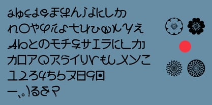
- Oriental Kaishu by Indian Summer Studio,
$65.00 Classical Oriental brush font Western Latin + Greek + Cyrillic typeface, created using the principles of Chinese traditional Kaishu brush script (Kaisho in Japanese) and Japanese kana. All Caps Fonts There are different oriental styles in this project, first of them was developed in 2005 for orientalist community Oriental.ru.
 - Iwata Kaisho Std by IWATA,
$149.00 書の基本を生かし、美しく格調高いデザインの筆書系書体です。伝統的な正/中太/特太楷書体に加え「力強さ」「伸びやかさ」「整然とした読みやすさ」を意識した「新楷書」「新楷書かなA」があります。
 - Iwata Kaisho Pro by IWATA,
$199.00
- Petit-w Font - Unknown license

- Victorian Alphabets W by Intellecta Design,
$20.00 Victorian Alphabets is a incoming family of complete victorian style alphabets, researched and developed upon a comprehensive number of vintage books, magazines and catalogues from XIX century. The "Victorian Alphabets W" font has just W' designs, performing 52 different W's to your use. Here at MyFonts you can get more TWENTY fonts of this family, wih a very and atractive array of alphabets and letters to complete your artwork
 - Japanette by SoftMaker,
$9.99 Japanette is a vaguely oriental typeface published by SoftMaker.
 - Japoneh by Okaycat,
$29.50 Japoneh is a dynamic font set in all bold heavy brushed characters. It practically jumps off the page with the action of these fluid strokes! Take your design to the next level with Japoneh. Japoneh is extended, containing West European diacritics & ligatures, making it suitable for multilingual environments & publications.
 - Kaixo by T-26,
$39.00 - Kairo by Scratch Design,
$14.00 Introducing Kairo! Kairo is a geometric font based on simple geometric shapes that has bold and modern character. This font also has a retro, nostalgic yet modern style that will bring nostalgic memories. This font will be perfect for logo, eye-catching headlines, posters, brandings, and other design that has a sense of dynamic and positive vibes. What you'll get: Uppercase and lowercase Numbers and punctuation Multilingual support Alternates for lowercase Hope you enjoy our font!
 - Kairos by Monotype,
$50.99 The Kairos™ family from Terrance Weinzierl is that rare form of typeface that successfully melds design distinction and ease of use. While based on 19th century Grecian wood type forms, it performs admirably in a variety of applications, both in print and on screen. Kairos Variables are font files which are featuring two axis and have a preset instance from Thin to Black and Condensed to Extended
 - Kashi by Naghi Naghachian,
$64.00 Kashi is the Persian word for tile. This font is inspired from building decorations of 16th and 17th centuries in Iran. It is extremely legible even in very small size. Kasha design fulfills the following needs: A Explicitly crafted for use in electronic media fulfills the demands of electronic communication. B Suitability for multiple applications. Gives the widest potential acceptability. C Extreme legibility not only in small sizes, but also when the type is filtered or skewed, e.g., in Photoshop or Illustrator. Nima’s simplified forms may be artificial obliqued in InDesign or Illustrator, without any loss in quality for the effected text. D An attractive typographic image. Kasha was developed for multiple languages and writing conventions. Kashi supports Arabic, Persian and Urdu. It also includes proportional and tabular numerals for the supported languages. E The highest degree of calligraphic grace and the clarity of geometric typography.
 - Aicho by Handpik,
$13.00 Aicho is beauty serif display.This font is suitable for invitation cards, decorations, clothing products, greeting cards and others. This font also has uppercase, lowercase, numeric, puntuation and multilingual. and there are several ligature and stylistic alternate.
 - News No. 14 by Monotype,
$39.00 - Axion RX-14 by Type Innovations,
$39.00 Axion RX-14 is an original design by Alex Kaczun. It is but one of several alternate designs based on his original Axion family of fonts. Alternate design elements, specifically on capitals like 'A' , 'V' and terminals of 'C' and 'G', along with contrasting sharp and rounded corners, create a tension within this modern grotesque and add a class of destinction and interest. This display font is not intended for text use. It was designed specifically for display headlines, logotype, branding and similar applications. The entire font has an original look which is strong, dynamic, machine generated and can be widely used in publications and advertising. Axion RX-14 is a futuristic, techno-looking and expressive typeface with an apperance of machined parts with sharp and rounded edges. This attractive display comes in roman with lower case and lining figures. The large Pro font character set supports most Central European and many Eastern European languages.


Page 1 of 41Next page