8,870 search results
(0.017 seconds)
- Camy by Scholtz Fonts,
$9.50 I wanted to create a "handwriting" font which could be used professionally. I have often needed such a font with a variety of weights and styles for a particular project and have had to resort to mixing fonts, creating a rather messy, amateur job. Camy is named for a little village in South West France where I did much of the initial work on this font. Camy is ideal for contemporary display work, comes in ten styles, and has a contemporary appeal with its casual, easy to read letters. Camy was designed as a total professional package for designers looking for a handwritten font suitable for all kinds of contemporary display work: the idea being that once you have the Camy Professional Pack you don't have to waste time searching for other handwritten fonts. The Family: LIGHT -- NARROW - light weight, condensed width, delicate line -- MEDIUM - light weight, delicate line -- WIDE - light weight, expanded width, delicate line NORMAL WEIGHT -- NARROW - of medium weight and condensed width - perfect for limited space -- MEDIUM - of medium weight -- WIDE - of medium weight and expanded width BLACK - for best readability -- NARROW - condensed width for bolder statements in small areas without losing legibility -- MEDIUM - for bolder statements -- WIDE - expanded width for bolder statements FAT -- WIDE - for maximum impact Use a combination of styles for product branding, book covers, invitations, greeting cards. The Camy combination works well for both headings and body text. Camy contains over 250 characters - (upper and lower case characters, punctuation, numerals, symbols and accented characters are present). It has all the accented characters used in the major European languages.
 - PF Scandal Pro by Parachute,
$79.00 “A couple of years ago, when I was designing a package for a marmalade range, I started having a go at creating a typeface that would suit the package I had in mind. The whole process was intensely appealing to me: from merely using typefaces as an intricate part of my work as an art director, I started exploring the function of each and every element that a typeface consists of. The two things on my mind in designing a typeface for a marmalade brand were firstly, that I wanted it to have a hand-written feel, so as to exude that old-fashioned, homemade quality, and secondly, that it ought to have a certain sweetness and gentleness that would match the product. However, PF Scandal managed to outgrow its original inspiration. As I continued working on it, I toned down some of its elements to make it more versatile. And so, PF Scandal evolved into a typeface that has a contemporary, and yet handwritten look, which makes it suitable for a wide range of uses. The ‘Pro’ version comes with the full array of European characters including Latin, Greek and Cyrillic as well as 120 matching pictograms". -A.S.
 - BF Rotwang Pro by BrassFonts,
$39.99 The BF Rotwang™ Pro is a contemporary new edition and re-design of a formerly design by Guido Schneider. Named after the C.L. Rotwang, the inventor of the Mensch-Maschine from the film Metropolis (1925/1926), BF Rotwang plays with the character traits of high-contrast transitional serif typefaces and Didone-style typefaces. BF Rotwang is a typeface characterized by balanced elegance. It is sensitive, sophisticated and self-confident, but unobtrusive. The heavy weights have the power and dynamic for strong headlines and exciting logotypes, the lighter cuts the elegance and lightness for use in continuous text. All letters and characters are a touch condensed, so the typeface looks compact and works space-saving. BF Rotwang™ Pro supports up to 200 Latin-based languages. The family comes with 7 weights plus matching Italics. Each font contains more than 1.220 glyphs, featuring a wide range of alternate characters, small caps, figure sets, fractions, more than 35 ligatures, many currency symbols, special characters and other useful symbols. The style sets give you the option to individualize and adjust the typeface to the requirement of your design, without changing the general visual feeling.
 - Quieta by Italiantype,
$39.00 Quieta is a humanist serif typeface inspired by the aesthetics of Italian Renaissance and by the empowering history of the painter Artemisa Gentileschi, first woman to be admitted to an Academy of Fine Arts in Italy. The designer, Maria Chiara Fantini, has used sharp flat-nib calligraphic strokes to add a vibrant contemporary vibe to the traditional humanist proportions. Classical details (such as the beak of the “e” and the angled stress of the “o”), are balanced by a modern and readable low-contrast design, developed in a range of six weights with a matching set of true italics. A Display weight, with lighter shapes and stronger contrast has been developed excel in logos, headlines and captions. The wide array of alternate, decorative and swash glyphs and the full coverage of over 200 extended latin languages make Quieta a solid, highly readable and elegant typeface perfect for body text both on the screen and on the printed page. Graceful and powerful at the same time, this typeface family is ready to help you when in need of the timeless appeal of a self-conscious feminine elegance.
 - Stabile by PintassilgoPrints,
$26.00 Stabile is a rather stylish casual font with loads of good vibes and alternates: there are four glyphs for each letter, two for each numeral plus swashes to this side and the other. Two for each side, in fact. It's a flexible font that looks unique and quite distinctive, with its charming uneven look that gets even more uneven when Contextual Alternates are turned on. Stabile family brings a delish accompanying font, Stabile Toys, packed with organic shapes inspired by the breathtaking work of the american artist Alexander Calder. These play together deliciously well, you can bet. Are you prepared to balance them? Enough reading, then, just go ahead! A couple quick notes on usage: . Go with Contextual Alternates to instantly cycle glyphs. Eye-catching results guaranteed! . Swash feature turns on (guess what...) swashes. But there's always alternative swashes, like to this side going up or to this side going down, that side up or down, so it's cool to pick your choices through a glyphs palette.
 - Fattern - 100% free

- Cherry Blue - Personal use only

- PXL3287 by BW90,
$25.00 PXL3287 is pixel art font inspired by '80s space and sci-fi cartoons and arcade games. It contains more than 220 glyphs (capitals, lower-case letters, numbers, plus many other characters) and supports many european languages.
 - Optima Cyrillic by Linotype,
$65.00Many typefaces are distinctive or attractive at the expense of legibility and versatility. Not so the Optima® family. Simultaneously standing out and fitting in, there are few projects or imaging environments outside of its range. Although Optima is almost always grouped with sans serif typefaces, it should be considered a serifless roman. True to its Roman heritage, Optima has wide, full-bodied characters – especially in the capitals. Only the E, F and L deviate with narrow forms. Consistent with other Zapf designs, the cap S in Optima appears slightly top-heavy with a slight tilt to the right. The M is splayed, and the N, like a serif design, has light vertical strokes. The lowercase a and g in Optima are high-legibility two-storied designs. Optima can be set within a wide choice of line spacing values – from very tight to very open. In fact, there are few limits to the amount of white space that can be added between lines of text. Optima also benefits from a wide range of letter spacing capability. It can be set quite tight, or even slightly open – especially the capitals. If there are any guidelines, Optima should be set more open than tight. It’s not that readability is affected that much when Optima is set on the snug side; it’s just that the unhurried elegance and light gray typographic color created by the face are disrupted when letters are set too tight. Optima is also about as gregarious as a typeface can be. It mixes well with virtually any serif design and a surprisingly large number of sans serif faces. The Optima family is available in six weights, from roman to extra black, each with an italic counterpart. In addition, the family is available as a suite of OpenType® Pro fonts, providing for the automatic insertion of small caps, ligatures and alternate characters, in addition to offering an extended character set supporting most Central European and many Eastern European languages. When you’re ready to find its perfect pairing, browse these fantastic matches: Monotype Century Old Style™, Dante®, Frutiger® Serif, Joanna® Nova, Malabar™, and Soho®. - Optima by Linotype,
$45.99 Many typefaces are distinctive or attractive at the expense of legibility and versatility. Not so the Optima® family. Simultaneously standing out and fitting in, there are few projects or imaging environments outside of its range. Although Optima is almost always grouped with sans serif typefaces, it should be considered a serifless roman. True to its Roman heritage, Optima has wide, full-bodied characters – especially in the capitals. Only the E, F and L deviate with narrow forms. Consistent with other Zapf designs, the cap S in Optima appears slightly top-heavy with a slight tilt to the right. The M is splayed, and the N, like a serif design, has light vertical strokes. The lowercase a and g in Optima are high-legibility two-storied designs. Optima can be set within a wide choice of line spacing values – from very tight to very open. In fact, there are few limits to the amount of white space that can be added between lines of text. Optima also benefits from a wide range of letter spacing capability. It can be set quite tight, or even slightly open – especially the capitals. If there are any guidelines, Optima should be set more open than tight. It’s not that readability is affected that much when Optima is set on the snug side; it’s just that the unhurried elegance and light gray typographic color created by the face are disrupted when letters are set too tight. Optima is also about as gregarious as a typeface can be. It mixes well with virtually any serif design and a surprisingly large number of sans serif faces. The Optima family is available in six weights, from roman to extra black, each with an italic counterpart. In addition, the family is available as a suite of OpenType® Pro fonts, providing for the automatic insertion of small caps, ligatures and alternate characters, in addition to offering an extended character set supporting most Central European and many Eastern European languages. When you’re ready to find its perfect pairing, browse these fantastic matches: Monotype Century Old Style™, Dante®, Frutiger® Serif, Joanna® Nova, Malabar™ and Soho®.
 - Yariko by Mevstory Studio,
$35.00 Yariko is a typeface that has a modern, bold, clean, simple, and futuristic look. The basic shape of this typeface is like two rectangles arranged side by side with simple, unique joints and accents. Perfect for logo, brand and apparel projects. Airforced Typeface Include : Letters Alternates Numeral Multilingual Support
 - Demigrunge by Aah Yes,
$9.95Just a hint of grunge in this font, one side fairly clean and one side with subtle grunge. Demigrunge lends itself readily to display, headlines and writing sentences without verbs in them. Just one style in this family. Lots of accented characters and extensive punctuation. Great for goth titles. - Caltic by Ingrimayne Type,
$12.95 Caltic-Holiday, Caltic-Festival, and Caltic-Straight are three eye-catching, very bold typefaces that are suitable for posters and signage. Caltic-Holiday and Caltic-Festival base letter shapes on trapezoids with curved sides but with curves that are reversed going from one to the other. Caltic-Straight has letters based on trapezoids with straight sides. None are suited for text and with their built-in spacing will not work as all upper-case or all lower-case. All three come in two widths, regular and wide, giving the Caltic family six members. Caltic has nothing to do with Celts. The Calt refers to the calt or contextual alternative OpenType feature that makes this typeface work. When the letters on the upper-case keys alternate with the letters on the lower-case keys, they fit snuggly together. As long as the user has a word processor that supports the contextual alternatives feature, there is no need for the user to alternate letters; the calt feature does it automatically. Although the fonts seem similar to hand-drawn lettering that was done on posters and signs during the hippie era of the 1960s and 1970s, I can find nothing quite like them. My inspiration for them is older, in a newspaper from 1932 that led to the typeface family PoultySign. Caltic (and Lentzers) are the result of seeing what else I could do with the inspiration that sprang from that 1932 newspaper.
 - Karibu by ROHH,
$40.00 Karibu™ is a 100-font original, ultra versatile geometric grotesk family with a lot of character. It is designed for modern projects, to serve as display as well as paragraph text typeface. It is perfect for lots of design situations - from magazine editorial use, logo design & branding, to web design, user interfaces and mobile applications. Main features: - 5 widths (Narrow, Condensed, Normal, Expanded, Wide), each consisting 20 fonts - 10 weights for each width (from Hairline to Black) - handdrawn, carefully crafted italics - alternate stylistic set for more technical and minimalistic projects - pronounced ink traps and large x-height improving legibility in small sizes and adding strong personality to display sizes - flatten letter shapes adding vertical rhythm and elegance to narrow widths - extended latin language support - OpenType features (case sensitive forms, standard and discretionary ligatures, stylistic sets, contextual alternates, lining, oldstyle and tabular figures, slashed zero, fractions, superscript and subscript, ordinals, currencies and symbols)
 - Hyperspace Race Capsule by Swell Type,
$25.00 Welcome aboard the Hyperspace Race Capsule! Let the weight of gravity slip away as our interplanetary transport system takes you around the solar system in unparallelled style and comfort. Our reclaimed UFO has been remodeled with soft, luxurious curves on the interior and the latest cutting edge flight technology under the hood, to meet all your typographic travel desires. Each weight and package includes these luxurious five-star amenities: Kick your Capsule into TURBO mode to access eleven sleek, fast-moving alternate letter shapes. Hit WARP SPEED to cross time and space with hundreds of auto-connecting letter pairs. Chat with passengers from all over Earth, as Hyperspace Race Capsule effortlessly presents speech in 224 languages. Use the versatile Variable font to access 20 preset weights plus over 100,000 options between. Hyperspace Race Capsule is a versatile, full-featured font that's perfect for galaxy-wide branding projects, now and into the future.
 - Zawya Pro Arabic by Protype,
$50.00 The family has 24 weights, ranging from Thin to Black in Normal, Condensed and Wide styles. It is ideally suited for advertising and packaging, editorial and publishing, logo, branding and creative industries, poster, and billboards, small text, wayfinding, and signage as well as web and screen design. Zawya Pro provides advanced support with features such as case-sensitive forms, fractions, super- and subscript characters, and stylistic alternates. It comes with a complete range of letters for Arabic and English with Arabic and Latin digits. As well as Latin-based languages, the typeface family also partly supports the Arabic, Urdu and Persian and more than 30 writing systems such as ( Afrikaans - Albanian - Catalan - Croatian - Czech - Danish - Dutch - English - Estonian - Finnish - French - German - Hungarian - Icelandic - Italian - Latvian Lithuanian - Maltese - Norwegian - Polish - Portuguese - Romanian - Slovak - Slovenian - Spanish - Swedish - Turkish Zulu - العربية Arabic - Urdu الفارسية - الأوردو Persian). In includes OpenType features for Arabic and English: Stylistic set 01 and 02 Numerator & denominator Fractions Ordinals Superscript standard ligatures discretionary ligatures Case Sensitive
 - Neck Candy - Unknown license

- Liquid Sex - Unknown license

- Kobern by The Northern Block,
$19.30 A strong, horizontal sans serif typeface. The letterforms distinct lateral emphasis combined with condensed proportions helps improve readability and use of space across layouts. Ideally suited for a wide range of modern applications, details include 9 weights with italics, 540 characters, 5 variations of numerals, manually edited kerning and Opentype features.
 - Break Age Graffiti by Sipanji21,
$17.00 Break Age is an awesome display font with a graffiti style and break characters with bandages to make your design look awesome! It will elevate a wide range of design projects to the highest levels, be it branding, headings, wedding designs, invitations, signatures, logotypes, wall art illustrations, apparel, labels, and more!
 - Naville by Letterhend,
$16.00 Introducing, Naville Sans, the all caps font family. This family has 6 weights - extra light, light, reguler, medium, semibold and bold. The clean and simplicity look of the font suitable for wide range of graphic needs especially for headline, title, sign board, information board, billboard and for UI/UX design.
 - Spiky Frog Graffiti by Sipanji21,
$18.00 Spiky Frog is a spectacular decorative font with a graffiti style and included some swash for your design look awesome. It will elevate a wide range of design projects to the highest level, be it branding, headings, wedding designs, invitations, signatures, logotype, wall art illustration, apparel, labels, and much more!
 - Blue Monsta Graffiti by Sipanji21,
$18.00 Blue Monsta is a spectacular decorative font with a graffiti style and included some swash for your design look awesome. It will elevate a wide range of design projects to the highest level, be it branding, headings, wedding designs, invitations, signatures, logotype, wall art illustration, apparel, labels, and much more!
 - Slashmine by Din Studio,
$29.00 Slashmine is authentic and modern blackletter font. The font is suitable for any branding project like logo, t-shirt printing and many more. Outstanding in a wide range of contexts. Featured : Alternates Accents (Multilingual characters) PUA encoded Numerals and Punctuation (OpenType Standard) Thanks for downloading premium font from Din Studio
 - Noma by Spinturnix,
$15.00 Noma is a new wide-set display font with a minimal geometric style. I designed Noma because I wanted a tech-inspired font that has plenty of character while remaining legible. Noma is a great choice for high-impact headings and logotypes. I hope you enjoy, thanks for checking it out!
 - Finition by Mans Greback,
$59.00 Finition is a calligraphic brush script. Created by Måns Grebäck, this typeface is perfect to create a youthful logo. With its hundreds of glyphs it supports a wide range of languages. Use underscore to make an underline. Example: Fin_ition With ligatures activated, write multiple underscores for a longer line. Example: Aut___omatic
 - Moon Walk by Mchcrafter,
$15.00 Moon-Walk is an unique and very elegant font for brand and logo design. It is a bold, detailed and assertive sans serif font. This font is imposing and features uniquely shaped alternatives, and as a result, it will easily match a wide range of creations that require a distinct touch.
 - Presence by Présence Typo,
$36.00Présence is a modern sans serif with a light stroke contrast. The capitals are a bit narrow for a titling use which makes them space-economical without lack of legibility. The lower cases have a normal width for a fluid reading. Its wide range of weights allows it many uses. - Masmobius by Afdalul Zikri,
$10.00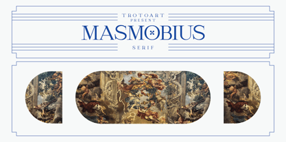 Masmobius is a modern and elegant serif font. Contemporary and fresh, this font is perfect for a wide pool of design ideas. Add it confidently to your projects and you will love the results! Masmobius is PUA encoded which means you can access all the glyphs and ligatures with ease!
 - Giraffe by Fenotype,
$19.00 Giraffe is a wide and bold rounded serif in two styles. Giraffe occupies a large space and is best used as display type to convey a confident look. Giraffe comes with a set of Stylistic Alternates for letters C,G,J,R,S, a, c, f, g, r, s and $.
 - Elkdale by Matteson Typographics,
$19.99 Elkdale is an Antique Tuscan typeface based on a series of wood types designed in the 19th century. Elkdale exudes the impactful ornamental designs found in posters, newspapers and signage of the day. With its wide complement of weights and widths, Elkdale should fill any space with attention-grabbing delight.
 - Maldive by Muksal Creatives,
$12.00 Maldive is a unique, simple, clean and well appointed display serif. It is perfect for gorgeous logos, titles, web layouts, fashion magazine and branding. It looks very nice and classy in an all-caps with a wide-set spacing, and also very beautiful on its own in capital and lowercase letters.
 - Semi Calligraphic JNL by Jeff Levine,
$29.00 A 1950 reissue of the 1934 tune “With My Eyes Wide Open I’m Dreaming” had the title of the sheet music hand lettered in a semi-calligraphic sans serif design. This became the model for the appropriately named Semi Calligraphic JNL, which is available in both regular and oblique versions.
 - ITC Lennox by ITC,
$40.99ITC Lennox is the work of German designer Alexander Ruehl. Ruehl had long digitized typefaces for other designers and decided to give design a try himself. ITC Lennox is suitable for a wide variety of headlines uses, a sans serif display face with a modern feel yet based on classical elements. - Bohemaz by Malgorzata Bartosik,
$29.00 Bohemaz is a typeface inspired by the Art Deco typography from the 1930s. It contains 4 styles - Thin, Light, Regular and Bold - Latin, Greek and Cyrillic alphabet, diacritics from Western, Central and South Eastern Europe and many decorative ligatures. Bohemaz is both classic and modern, so it can be widely used.
 - Farench by Muksal Creatives,
$15.00 Farech is modern Display Vintage font, and Farech features unique and modern Display Vintage look and feel.is a fancy and Display Vintage font will elevate a wide variety of projects, from logos and stationery to magazine covers and social media posts. This typeface will take your designs to the next level!
 - Erratic JNL by Jeff Levine,
$29.00 Erratic JNL earns its name from the varying widths and shapes of the hand lettering found on some old Art-Deco era sheet music. Following this unusual pattern throughout the complete typeface, the user finds a mix of traditional Deco type design and an overly wide M, N, W and 8.
 - Sillium by ATK Studio,
$15.00 Inspired by blackletter type styles. Sillium is built on modular basis. As a result, it excels in a wide range of display settings, logotypes, and short text. Determine the grid and create a complete set of cohesive characters (a-z) and multilanguage characters (latin based) in either lowercase or uppercase.
 - Public Secret by Hanoded,
$15.00 A Public Secret (or Open Secret) is something that is widely known, although it is not supposed to be. Public Secret is a hand drawn font (I used a fineliner) that I made in between building a shower, a toilet and a laundry room… Yes, it’s all in a day’s work! ;-)
 - Beldon by Aqeela Studio,
$12.00 Introducing a new beautiful calligraphy font, Beldon! It is perfect for elegant logos, upscale packaging, wedding stationery, websites, and any other projects requiring a handwritten and luxurious touch. A wide range of ligature alternates are included so that you can give your logo or name a custom, hand-calligraphy look.


