4,677 search results
(0.023 seconds)
- Bodoni Classic Initials by Wiescher Design,
$55.00 I became interested in designing Bodoni Classic because of a lazy graphic designer at Jacques Damase publishing house. He had to change a single letter on a bookcover about J. B. BODONI. The French call him Jean Baptiste instead of Giambattista! And that unknown graphic designer just took any old “J” from some newly cut Bodoni. All the new Bodoni cuts have square serifs, whereas the originals had rounded serifs and slightly concave feet. The single letter “J” with the squared off serif was for me like a road sign to start redesigning the entire Bodoni family. That’s exactly what I started in 1993 and a dozen years later I am finished. Okay, I am still adding new Bodoni Classics, but those are my personal additions. Yours very retro, Gert Wiescher
 - Maritote by I Can Be Your Type,
$20.00While designing a logotype for a client, she described herself as "loud and colorful." Thinking about some eras in typefaces that portrayed this idea, I instantly thought of the "Roaring 20s" and the Prohibition era where the cinema is starting to take off and the Italian mafia are running the bars. (Which is coincidental because my client has family connections to Al Capone.) One of the most iconic typefaces designed for these times was Broadway by Morris Fuller Benton in 1925. This typeface was the zeitgeist of Broadway, the big city, theater, and cinema, which can now be seen in use almost everywhere an old family run cinema is located. Using the heavy influences of the thick and thin contrast of this typeface, Maritote brings the charm of Broadway into the 21st century. - Bramante LP by LetterPerfect,
$39.00 Bramante™ is an original display font by LetterPerfect Fonts, designed by Garrett Boge in 2020. It is modeled after a fifteenth-century inscription in the church of Santa Cecilia in Trastevere, Rome. The name is a tribute to the pre-eminent Renaissance architect Donato Bramante, whose Tempietto (1502, San Pietro in Montorio) marked the beginning of the High Renaissance in Rome. In 1503 he was named lead architect for the new St. Peter's Basilica, which was completed by Michelangelo, Maderno and Bernini a century later. Based on the pervasive use of Adobe Trajan as a classical-inspired titling face, LetterPerfect offers this Renaissance revival of imperial Roman capitals as an alternative with additional refinement and personality. (The full size capitals are complemented with small capitals in the lowercase positions.)
 - Opticum by ParaType,
$25.00Font family Opticum is not just a set of fonts, it’s a maze construction kit that hides letters inside. Each inscription is a little brain-twister with variable difficulty, where the level is defined by the style. The third one is the most difficult. When you type with these fonts you fill the space entirely without spaces because characters in the fonts don’t have side bearings and the leadings are set to zero. This converts you into an artist who produces geometric abstractions containing verbal messages. Texts set with this font not only catch an eye, but keep it for a long time. The duration of attention period can be adjusted by selection of the font style. The third one keeps longer. Opticum was designed by Erken Kagarov and released by ParaType in 2009. - Stevie Sans by Typefolio,
$29.00 Some years ago I had my first contact with a grotesque typeface, when handling a sample catalog of typographic specimens from the age of phototypesetting. The style eventually settled in my memory waiting for the work of time. Behind its apparent neutrality, there is a complex balance game, that almost leads to the basic principles of design which deliver such power to the grotesque style. Stevie Sans is the answer to the action of time. A bridge that allows the designer to go into the past, while being in the present and looking towards the future. It is what it’s expected from a grotesque designed in the 21st century. With 7 roman styles ranging from thin to black, support to many languages and essential opentype features, Stevie Sans is the ideal choice for your project.
 - F2F Frontpage Four by Linotype,
$29.99The Face2Face (F2F) series was inspired by the techno sound of the mid-1990s, personal computers and new font creation software. For years, Alexander Branczyk and his friends formed a unique type design collective, which churned out a substantial amount of fresh, new fonts, none of which complied with the traditional rules of typography. Many of these typefaces were used to create layouts for the leading German techno magazine of the 1990s, Frontpage. Branczyk and his fellows would even set in type at 6 points, in order to make it nearly unreadable. It was a pleasure for the kids to read and decrypt these messages! F2F Frontpage Four is one of 41 Face2Face fonts included in the Take Type 5 collection from Linotype GmbH. Branczyk designed 16 of these himself." - Bodoni Classic Chancery by Wiescher Design,
$55.00 I became interested in designing Bodoni Classic because of a lazy graphic designer at Jacques Damase publishing house. He had to change a single letter on a bookcover about J. B. BODONI. The French call him Jean Baptiste instead of Giambattista! And that unknown graphic designer just took any old “J” from some newly cut Bodoni. All the new Bodoni cuts have square serifs, whereas the originals had rounded serifs and slightly concave feet. The single letter “J” with the squared off serif was for me like a road sign to start redesigning the entire Bodoni family. That’s exactly what I started in 1993 and a dozen years later I am finished. Okay, I am still adding new Bodoni Classics, but those are my personal additions. Yours very retro, Gert Wiescher
 - MFC Peony Monogram by Monogram Fonts Co.,
$19.95 The inspiration source for Peony Monogram was a unique stackable monogram design with floral accents from a vintage embroidery publication. Originally intended to adorn handkerchiefs, this simple pattern has so many design possibilities, from colorizing to formatting options. You can really play around with this monogram font! Peony Monogram can create one, two, or three letter monograms, even basic titling due to its unique design. Because of Peony's unique stackable monogram formatting, make certain that the point size of the font is the same as the leading being applied to the font in order to minimize gapping between stacked forms. While we've adjusted this within the font, your program may override these settings. Download and view the MFC Peony Monogram Guidebook if you would like to learn a little more.
 - Bodoni Classic Text by Wiescher Design,
$55.00 I became interested in designing Bodoni Classic because of a lazy graphic designer at Jacques Damase publishing house. He had to change a single letter on a bookcover about J. B. BODONI. The French call him Jean Baptiste instead of Giambattista! And that unknown graphic designer just took any old “J” from some newly cut Bodoni. All the new Bodoni cuts have square serifs, whereas the originals had rounded serifs and slightly concave feet. The single letter “J” with the squared off serif was for me like a road sign to start redesigning the entire Bodoni family. That’s exactly what I started in 1993 and a dozen years later I am finished. Okay, I am still adding new Bodoni Classics, but those are my personal additions. Yours very retro, Gert Wiescher
 - Tengwar Transliteral by Zephyris,
$- You can read more about how to use this font and how it works here. This font lets you write in accurate Tengwar (elvish) quickly and easily. While writing his Middle Earth books, JRR Tolkein invented an entire alphabet for the elves called Tengwar. His attention to detail was incredible, Tengwar is a fully functioning writing system. This is the famous Elvish writing seen all through Lord of The Rings and the Hobbit. Tengwar is an alphabet, not a language, and can be used to write many languages. Tolkein gave detailed notes on how to write English in the Tengwar alphabet. This font uses advanced font features (contextual alternates, ligatures and kerning) to automatically convert any English text, as you type, into an accurate representation in the elvish Tengwar alphabet.
 - F2F Burnout Chaos by Linotype,
$29.99The Face2Face (F2F) series was inspired by the techno sound of the mid-1990s, personal computers and new font creation software. For years, Alexander Branczyk and his friends formed a unique type design collective, which churned out a substantial amount of fresh, new fonts, none of which complied with the traditional rules of typography. Many of these typefaces were used to create layouts for the leading German techno magazine of the 1990s, Frontpage. Branczyk and his fellows would even set in type at 6 points, in order to make it nearly unreadable. It was a pleasure for the kids to read and decrypt these messages! F2F Burnout Chaos is one of 41 Face2Face fonts included in the Take Type 5 collection from Linotype GmbH. Branczyk designed 16 of these himself." - Salo by Borutta Group,
$39.00 SALO – is a hybrid of two Italian typographic worlds. The serif version refers to the beautiful and sophisticated typefaces found on the signs of cafes, restaurants, and fashionable boutiques. Its complemented by the sans variant, inspired by Italian modernism and road signage. All styles are based on the same core but with a totally different expressions. The biggest challenge during the project was designing all of the glyphs compatible to work as a 100% variable font. In the OTF version, SALO has 4 varieties: Serif, Semi Serif, Semi Sans and Sans. The family of these typefaces is suitable both for posters, magazine headlines, and branding purposes where the character will count. It is worth experimenting and combining different varieties with each other. (This font cannot be used to create a logo with the phrase "FRANCO").
 - Figment by Scholtz Fonts,
$10.00 Like a figment of the imagination, this very readable font wafts across the page, leading the reader into a world of enchantment. Ethereal and fluid, it is reminiscent of sorcerer's spells written on ancient parchment. It manages, by the distortion of its characters, to transform a simple serif font into something quite different. Wavy outlines and an uneven baseline create an impression of fluidity and magic, while retaining the essential clarity of the classic serif body font. Use Figment for: -- Children's books -- Halloween advertising media -- book covers -- movie titles -- swing tickets -- posters Figment is available in two styles, Figment Regular and Figment Force (a wider and bolder style) The font has been professionally letterspaced and kerned. All upper and lower case characters, punctuation, numerals and accented characters are present.
 - Transylvanian by Comicraft,
$19.00 At the end of every road in Transylvania stands a dark, foreboding castle, seemingly clouded by impossibly dark shadows. Bat-like creatures scurry across its gargoyle-festooned towers, and slimy green patches of moss climb inexorably up its cold walls. Blood has been spilt in the tombs of this chilling location, and there, etched in stone above the arched entranceway, is inscribed -- in Comicraft’s TRANSYLVANIAN typeface -- a simple legend: ABANDON ALL HOPE YE WHO ENTER HERE. TRANSYLVANIAN is a small-caps font that includes Comicraft's revolutionary Crossbar I Technology™, to locate that mysterious character in exactly the right places. Artwork from ASK FOR MERCY by Richard Starkings & Abigail Jill Harding, available on Comixology.com Features Four weights (Regular, Italic, Bold & Bold Italic) with upper and lowercase characters. Includes Western European international characters.
 - Treacherous by Comicraft,
$29.00 Midnight, Pacific Coast Highway. You're driving home alone at night and your battery's dying. Your headlights have dimmed and you can barely see the road or the signpost up ahead. But there's an eerie green light glimmering in your rear view mirror and that strange warning uttered by the pump attendant at the Devil's Elbow gas station has put the frighteners on you. Is that Satan's face glowering at you through the mist, or something far worse? The only way to handle this font is with one foot on the gas pedal and one foot on the brake. Originally designed by John Roshell for GAMBIT titles, this sharp font has appeared on vampire & rock magazine covers, Star Wars & Star Trek merch, and the logo for the INHUMANS comic & TV show!
 - F2F Haakonsen by Linotype,
$29.99The Face2Face (F2F) series was inspired by the techno sound of the mid-1990s, personal computers and new font creation software. For years, Stefan Hauser and his friends formed a unique type design collective, which churned out a substantial amount of fresh, new fonts, none of which complied with the traditional rules of typography. Many of these typefaces were used to create layouts for the leading German techno magazine of the 1990s, Frontpage. Hauser and his fellows would even set in type at 6 points, in order to make it nearly unreadable. It was a pleasure for the kids to read and decrypt these messages! F2F Haakonsen is one of 41 Face2Face fonts included in the Take Type 5 collection from Linotype GmbH. Hauser designed two of these himself." - F2F El Dee Cons by Linotype,
$29.99The Face2Face (F2F) series was inspired by the techno sound of the mid-1990s, personal computers and new font creation software. For years, Thomas Nagel and his friends formed a unique type design collective, which churned out a substantial amount of fresh, new fonts, none of which complied with the traditional rules of typography. Many of these typefaces were used to create layouts for the leading German techno magazine of the 1990s, Frontpage. Nagel and his fellows would even set in type at 6 points, in order to make it nearly unreadable. It was a pleasure for the kids to read and decrypt these messages! F2F EI Dee Cons one of 41 Face2Face fonts included in the Take Type 5 collection from Linotype. Nagel designed nine of these himself." - Bodoni Classic Hand by Wiescher Design,
$55.00 I became interested in designing Bodoni Classic because of a lazy graphic designer at Jacques Damase publishing house. He had to change a single letter on a bookcover about J. B. BODONI. The French call him Jean Baptiste instead of Giambattista! And that unknown graphic designer just took any old “J” from some newly cut Bodoni. All the new Bodoni cuts have square serifs, whereas the originals had rounded serifs and slightly concave feet. The single letter “J” with the squared off serif was for me like a road sign to start redesigning the entire Bodoni family. That’s exactly what I started in 1993 and a dozen years later I am finished. Okay, I am still adding new Bodoni Classics, but those are my personal additions. Yours very retro, Gert Wiescher
 - Kasyfa by Hatftype,
$15.00 KASYFA is a cute display font. Is a work of typographic art that brings playfulness and warmth to every character. With a cute and adorable design, filled with tenderness and playfulness, each letter is an expression of joy and innocence. This display font style brings a friendly feel and is suitable for projects that want a touch of playfulness. With its gentle curves and understated design, this font provides a unique and inviting feel, making it the perfect choice for projects that require a touch of beauty and innocence. From titles in children's books to cute greeting card designs, cute display fonts take a leading role in conveying messages with warmth and happiness. They are not just letters, but a tool to bring a positive and fun feel to any design.
 - Neon Rounded by Joe Hewitt Design,
$12.99 Neon Rounded is a rounded monoline typeface inspired by retro neon light bulbs often used in signage. Neon bulbs were first seen back in 1910 in Paris. They later became popular in 1930s New York, especially on Broadway and the Las Vegas strip. Although Neon Rounded was designed with eye-catching signs in mind, its possible usage is vast. Clothing brands, road signs, logos and advertising. The heavier weights lend themselves to children's books and toys, while the lighter weights provide a more modern, futuristic feel. The typeface contains lower and uppercases in five weights: Light, Regular, Medium, Semi-bold and Bold. There are also alternatives for most letters and all numbers. The glyph set includes all languages covered in Basic Latin, Latin-1 Supplement and Latin Extended-A scripts.
 - Apium by Spilling Type,
$14.99 Apium is a non-trivial serif typeface. Inspired by the lettering of an old advert, it aims to add fun to a serif with distinctive features. It comes in five weights with matching italics. The typeface performs well in display environment: headings, stand out text, packaging, posters and so on. The regular and medium weights work well as body text. The typeface is suitable for print and digital. Apium has Latin Extended A and Latin Plus Multi-Lingual support. OpenType features include: Small capitals, Discretionary ligatures, Standard ligatures, Lining figures, Oldstyle figures, Proportional figures, Tabular figures, Ordinals, Denominators, Numerators, Scientific inferiors, Subscript, Superscript and Fractions. The word apium is Latin for parsley. The original advert was for a vegetable margarine and that got me on the road of a food theme.
 - Tessie Dingies by Ingrimayne Type,
$9.95 A tessellation is a shape that can be used to completely fill the plane--simple examples are isosceles triangles, squares, and hexagons. The TessieDingie fonts contain tessellation shapes that can be used to construct tessellation patterns. The repeating unit, which may contain only one of the shapes or a several of the shapes, is on one key so making patterns is trivial with these fonts. TessieDingieAbstract contains abstract shapes that tessellate. TessieDingiePictures contains shapes that resemble real world objects, such as birds, animals, tools, and vehicles. Make sure the leading is the same as font size or the rows will not line up. Tessellation patterns are eye-catching and visually appealing, which is the reason that they have long been popular in a variety of decorative situations, such as quilting.
 - Quodlibet Serif by Signature Type Foundry,
$43.00 The new typeface system is based on legibility of Renaissance and Baroque Antiqua. It maintains the quality of drawings without an overpowering historical legacy. The current concept makes the system a universal whole. Abrading of sharp edges which could catch one’s attention leads to a fine rounding of details. In this way, a sans drawing does not look hard and sterile unlike most of its contemporaries. Special attention was paid to every detail of each letter. The professional question of how to incorporate brightening wedges into the dark places of individual strokes’ onsets was resolved by rounded shapes that have their graphic response in the detail of the serifs. Particularly in larger sizes the typeface offers drawing sophistication and dimensional interconnection. Apart from Cyrillic alphabet, the alphabet design includes Vietnamese accents.
 - Quodlibet Sans by Signature Type Foundry,
$43.00 The new typeface system is based on legibility of Renaissance and Baroque Antiqua. It maintains the quality of drawings without an overpowering historical legacy. The current concept makes the system a universal whole. Abrading of sharp edges which could catch one’s attention leads to a fine rounding of details. In this way, a sans drawing does not look hard and sterile unlike most of its contemporaries. Special attention was paid to every detail of each letter. The professional question of how to incorporate brightening wedges into the dark places of individual strokes’ onsets was resolved by rounded shapes that have their graphic response in the detail of the serifs. Particularly in larger sizes the typeface offers drawing sophistication and dimensional interconnection. Apart from Cyrillic alphabet, the alphabet design includes Vietnamese accents.
 - Roadhouse by Kimmy Design,
$10.00 Roadhouse is a layering typeface family that is part of the greater Evanston type collection, which is inspired by American typefaces commonly used at the turn of the century leading up to Prohibition. Roadhouse reflects the style of lettering used on tavern signage and printed ephemera during the early 20th century. The family comes with 31 layering fonts, from top layers like bevels, highlights, stripes, outlines, as well as extruding and drop layers. It also includes 2 script fonts, upright and oblique, as well as 9 complimentary text fonts for smaller text settings. Either get the entire family of extrusions, bevel angles or the basic family with ready to use fonts that don’t need to be layered. Roadhouse is a great display typeface for logos, branding, packaging, and advertising.
 - Farmhouse by Victory Type,
$20.00Farmhouse is a rustic serif typeface that was inspired by the woodcarved store signs on Main Street in a quaint little village nearby. Farmhouse is based upon the shapes of Baskerville but has a unique rustic character all its own. - Adoha by Letterena Studios,
$17.00 Proudly present Adoha Typeface. A modern and classic serif typeface featuring its own unique style & modern look. This typeface is perfect for an elegant & luxury logo, book or movie title design, fashion brand, magazine, clothing, lettering, quote, and so much more.
 - Stange by Vultype Co,
$29.00 Stange is a font with a futuristic edge, geometric corners, perfect for technology theme. As with its Stange, Stange makes a strong impression in print, headlines, video, and social media – whether paired with a contrasting typeface or on its own.
 - Analfabeto by Type-Ø-Tones,
$40.00 The Brazilian illustrator, Flavio Morais, devised this amusing display alphabet to have his own font for his former website. We helped to digitalize it and encouraged him to complete it with a series of “chiringuito” drawings. More about his work here.
 - Aimstesa by Letterena Studios,
$9.00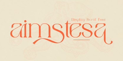 Aimstesa is a modern and classic serif font with its own unique style and beautiful characters. This typeface is perfect for an elegant & luxury logo, book or movie title design, fashion brand, magazine, clothes, lettering, quotes, and so much more.
 - Hendrix Bubble by Letterena Studios,
$17.00 Hendrix bubble is a modern and classic display font with its own unique style and modern looks. This typeface is perfect for an elegant & bold logo, book or movie title design, fashion brand, magazine, clothes, lettering, quotes, and so much more.
 - Quihk by Letterena Studios,
$9.00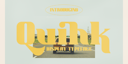 Quihk is a modern and classy serif font with its own unique style and modern look. This typeface is perfect for an elegant & luxury logo, book or movie title design, fashion brand, magazine, clothes, lettering, quotes, and so much more.
 - Dishta Bikailen by Letterena Studios,
$17.00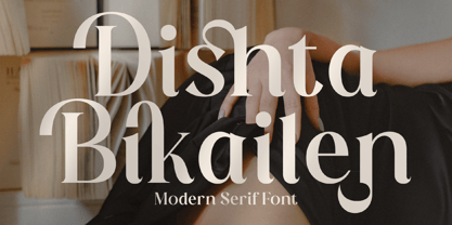 Dishta Bikailen is a serif modern and classic typeface that has its own unique style & modern look. This typeface is perfect for an elegant & luxury logo, book or movie title design, fashion brand, magazine, clothes, lettering, quotes, and so much more.
 - Treadstone by Rook Supply,
$14.00 Treadstone gives a modern twist on the athletic, college style font. This font family includes versions with rounded edges, rough edges and grunge effects, each of which has its own character and charm. Treadstone works great for headlines, titles and logos.
 - Decafe by Arendxstudio,
$14.00 Introducing Decafe: wrapped with texture ruling pen so that this font has its own characteristics compared to other fonts that carry a distinctly distinct style. Decafe is equipped with full simple Latin characters that meet the International character glyphs standard
 - Grunge Decay by Okaycat,
$29.50 Grunge Decay is an urban font with a unique look. It creates a rugged and unusual feel to with its own character & stylization. Grunge Decay is extended, containing West European diacritics and ligatures, making it suitable for multilingual environments & publications.
 - We Love Nature Stems by kapitza,
$85.00 We Love Nature is a picture font consisting of 52 high quality, hand drawn illustrations with clean outlines and a minimum of vector points. The contemporary stem flower illustrations can used on their own or combined to create striking illustrations.
 - Romalika by Letterena Studios,
$17.00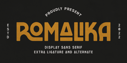 ROMALIKA is a serif modern and classic typeface that has its own unique style & modern look. This typeface is perfect for an elegant & luxury logo, book or movie title design, fashion brand, magazine, clothes, lettering, quotes, and so much more. **Uppercase
 - Burst Flower by Wasabib Type Foundry,
$10.00 BURST FLOWER is a display font that coming with 3 style ( Regular, Outline, Extrude ) every style have their own power to make your design stunning and stand out. Burst Flower create by 100% hand drawing to get the artistic look.
 - Sweety Pie by LePine Studios,
$10.00 Originally designed as a companion font to a series of illustrations by Phillip LePine, this font stands beautifully on its own. Featuring letterforms with curls and varied line weight, it captures a feeling of the carefree days of our youth.