168 search results
(0.024 seconds)
- Detroit 3k - Unknown license

- MC Castroy by Maulana Creative,
$18.00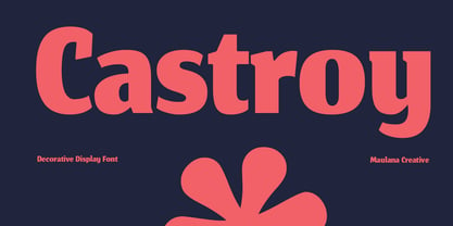 Castroy is a modern Decorative flared serif Display font. Bold stroke, fun character with a bit of ligatures and alternates. To give you an extra creative work. Castroy font support multilingual more than 100+ language. This font is good for logo design, Social media, Movie Titles, Books Titles, a short text even a long text letter and good for your secondary text font with script or serif. Make a stunning work with Castroy font. Cheers, Maulana Creative
 - Distory Script by Letterfreshstudio,
$15.00 Distory Script Is a calligraphy Vintage script font that comes with beautiful alternate characters. copper plate mix calligraphy with handlettering style. Designed to convey stylish elegance. Pagoda attracts like a typeface that is smooth, clean, feminine, sensual, glamorous, simple and very easy to read. Distory Script comes with a Clean and Aged version, beautiful upper and lower case, binding and loved by many finishes. It has Multilingual support (Western European characters) and works with the following languages: English, Danish, Dutch, Estonian, Finnish, French, German, Hungarian, Icelandic, Italian, Norwegian, Polish, Portuguese, Spanish, Swedish. In my example I show how this script can be used. It's perfect for logos, wedding invitations, alcohol labels, romantic cards, and more. Thanks You.
 - Sabrina Destiny by Timurtype,
$14.00 Introduced by Timurtype Studio! Sabrina Destiny is a Handwritten Script Font This font Introducing the epitome of elegance and refinement, our exclusive luxury handwritten script font. Every stroke, meticulously crafted with precision and passion, exudes an aura of opulence and sophistication. Elevate your design projects to new heights as this exquisite typeface seamlessly blends the timeless charm of handwritten artistry with a touch of modern luxury. Sabrina Destiny Font also supports multilingualism. Enhance your designs with our original fonts, feel free to comment or provide feedback, Enjoy the fonts 😊 Thank You
 - Destiny Bestie by Arendxstudio,
$13.00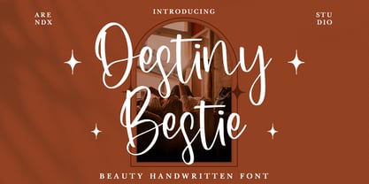 Destiny Bestie – Beauty Handwritten Font is a font with distinctive handwritten characters perfect for branding projects, logos, wedding designs, media posts, advertisements, product packaging, product designs, labels, photography, watermarks, invitations, stationery, and any project who need handwritten dishes. Features : • Character Set A-Z • Numerals & Punctuations (OpenType Standard) • Accents (Multilingual characters) • Ligature Multilingual Support : Afrikaans, Albanian, Asu, Basque, Bemba, Bena, Catalan, Chiga, Cornish, Danish, English, Estonian, Faroese, Filipino, Finnish, French, Friulian, Galician, German, Gusii, Icelandic, Indonesian, Irish, Italian, Kabuverdianu, Kalenjin, Kinyarwanda, Low German, Luo, Luxembourgish, Luyia, Machame, Makhuwa-Meetto, Makonde, Malagasy, Malay, Manx, Morisyen, North Ndebele, Norwegian Bokmål, Norwegian Nynorsk, Nyankole, Oromo, Portuguese, Romansh, Rombo, Rundi, Rwa, Samburu, Sango, Sangu, Scottish Gaelic, Sena, Shambala, Shona, Soga, Somali, Spanish, Swahili, Swedish, Swiss German, Taita, Teso, Vunjo, Zulu
 - The Destiny by Lemonthe,
$15.00 The Destiny is a monoline handwritten font. It has a clean, thin and smooth vibe and it will be a hit for any design that you want to add it to. Suitable for any projects such as logos & branding, signature, invitation, stationery, wedding designs, social media posts, product designs, label, photography, and more!
 - Arabetics Detroit by Arabetics,
$39.00 Arabetics Detroit is a monoshape font family with a fixed single shape per each Arabic Unicode character. This font family supports all Arabetic scripts covered by Unicode Standards 6.1, and the latest Arabic Supplement and Extended-A Unicode blocks, including support for Quranic texts. It includes three weights: regular, bold, and light, each of which has normal and left-slanted (Italic) versions. The design of this font family follows the Arabetics Mutamathil style design principles utilizing varying x-heights and no glyph substitutions. The Mutamathil type style was introduced by the designer more than 15 years ago. The Arabetics Detroit font family includes all required Lam-Alif ligatures in addition to all soft vowel diacritics (harakat), which are selectively positioned with most of them appearing on similar high and low levels—top left corner—to clearly distinguish them from the letters. The Tatweel or Kashida lengthening character is a zero-width glyph.
 - Turn Destiny by Deeezy,
$14.00 Trendy, bold & modern style sans font for your fancy projects. Elegant, funny and classic style on Amarillo font will be great for any branding project. Lot of alternates and ligatures will help you to create unique and original logo design or website header! Enjoy :) -Multilingual support -Lot of alternate characters & ligatures -Great for modern branding projects!
 - Ganz Grobe Gotisch - Personal use only

- Fleischmann Gotisch PT by preussTYPE,
$29.00 Johann Michael Fleischmann was born June 15th, 1707 in Wöhrd near Nuremberg. After attending Latinschool he started an apprenticeship as punchcutter in the crafts enterprise of Konstantin Hartwig in Nuremberg, which ought to last six years. For his extraordinary talent Fleischmann completed his apprenticeship after four and a half years, which was very unusual. 1727 his years of travel (very common in these days) began, during which he perfected his handcraft by working in different enterprises as journeyman. First location was Frankfurt/Main where he worked for nearly a year at the renowned type foundery of Luther and Egenolff. Passing Mainz he continued to Holland, where he arrived in November 1728 and stayed till he died in 1768. In Amsterdam he worked for several type founderies, among others some weeks for Izaak van der Putte; in The Hague for Hermanus Uytwerf. Between 1729 and 1732 he created several exquisite alphabets for Uytwerf, which were published under his own name (after his move to Holland Fleischmann abandoned the second n in his name), apparently following the stream of the time. After the two years with Uytwerf, Fleischmann returned to Amsterdam, where he established his own buiseness as punchcutter; following an advice of the bookkeeper and printer from Basel Rudolf Wetstein he opened his own type foundery 1732, which he sold in 1735 to Wetstein for financial reasons. In the following Fleischmann created several types and matrices exclusively for Wetstein. In 1743 after the type foundery was sold by Wetstein’s son Hendrik Floris to the upcoming enterprise of Izaak and Johannes Enschedé, Fleischmann worked as independent punchcutter mostly for this house in Haarlem. Recognizing his exceptional skills soon Fleischmann was consigned to cutting the difficult small-sized font types. The corresponding titling alphabets were mostly done by Jaques-Francois Rosart, who also cut the main part of the ornaments and borders used in the font examples of Enschedé. Fleischmann created for Enschedé numerous fonts. The font example published 1768 by Enschedé contains 3 titling alphabets, 16 antiquacuts, 14 italic cuts, 13 textura- and 2 scriptcuts, 2 greek typesets (upper cases and ligatures), 1 arabic, 1 malayan and 7 armenian font systems, 5 sets of musicnotes and the poliphonian musicnotesystem by Fleischmann. In total he brought into being about 100 alphabets - the fruits of fourty years of creative work as a punchcutter. Fleischmann died May 27th, 1768 at the age of 61. For a long time he was thought one of the leading punchcutters in Europe. A tragedy, that his creating fell into the turning of baroque to classicism. The following generations could not take much pleasure in his imaginative fonts, which were more connected to the sensuous baroque than to the bare rationalism of the upcoming industrialisation. Unfortunately therefore his masterpieces did not survive the 19th century and person and work of Fleischmann sank into oblivion. The impressive re-interpretation of the Fleischmann Antiqua and the corresponding italics by Erhard Kaiser from Leipzig, which were done for the Dutch Type Library from 1993 to 1997, snatched Fleischmann away from being forgotten by history. Therefore we want to place strong emphasis on this beautiful font. Fleischman Gotisch The other fonts by Fleischmann are only known to a small circle of connoisseurs and enthusiasts. So far they are not available in adequat quality for modern systems. Same applies the "Fleischman Gotisch", which has been made available cross platform to modern typeset-systems as CFF Open Type font through the presented sample. The Fleischman Gotisch has been proved to be one of the fonts, on which Fleischmann spent a good deal of his best effort; this font simply was near to his heart. Between 1744 and 1762 he created 13 different sizes of this font. All follow the same principles of forms, but their richness of details has been adapted to the particular sizes. In later times the font was modified more or less sensitive by various type founderies; letters were added, changed to current taste or replaced by others; so that nowadays a unique and binding mastercopy of this font is missing. Likewise the name of the font underwent several changes. Fleischmann himself probably never named his font, as he did with none of his fonts. By Enschedé this textura was named Nederduits, later on Nederduitsch. When the font was offered by the german type foundery Flinsch in Frankfurt/Main, the more convenient name of Fleischmann-Gotisch was chosen. In his "Masterbook of the font" and his "Abstract about the Et-character" Jan Tschichold refered to it as "Duyts" again. To honour the genious of Johann Michael Fleischmann we decided to name the writing "Fleischmann Gotisch PT" (unhyphenated). Developing the digital Fleischman Gotisch I decided not to use one of the thirteen sizes as binding mastercopy, but corresponding to the typical ductus of the font to re-create an independent use of forms strongly based on Fleischmann´s language of forms. All ascenders and descenders were standardised. Some characters, identified as added later on, were eliminated (especially the round lower case-R and several versions of longs- respectively f-ligatures) and others were adjusted to the principles of Fleischmann. Where indicated the diverse characters were integrated as alternative. They can be selected in the corresponding menu. All for the correct german black letter necessary longs and other ligatures were generated. Through the according integration into the feature-code about 85% of all ligatures in the type can be generated automatically. Problematic combinations (Fl, Fk, Fh, ll, lh, lk, lb) were created as ligatures and are likewise constructed automatically. A historically interesting letter is the "round r", which was already designated by Fleischmann; it is used after preceding round letters. Likewise interesting is the inventive form of the &-character, which is mentioned by Tschichold in his corresponding abstract. Nevertheless despite all interpretation it was very important to me to maintain the utmost fidelity to the original. With this digital version of a phantastic texturfont of the late baroque I hope to contribute to a blossoming of interest for this genious master of his kind: Johann Michel Fleischmann. OpenType features: - Unicode (ISO 10646-2) - contains 520 glyphes - Basic Latin - Latin-1 Supplement - Latin Extended-A - Latin Extended-B - Central European Glyhps - Ornaments - Fractions - Standard ligatures - Discretionary ligatures - Historical ligatures - Kerning-Table
 - Ganz Grobe Gotisch by URW Type Foundry,
$39.99 It is not only coarse but extremly black, and it is quite right to name it Black Letter in English. Ernst Schneidler, the designer, created the smallest possible counters. Still, this very coarse black letter is sensitive in detail and drawn with a high level of aesthetics. By the way, it was said in Schneidler's design class in Stuttgart that his number one student Walter Brudi had cut some of the characters with �silhoutte scissors� from black paper. Sharing his ideas and work with his students does not at all decrease or lower his copyright.Ganz Grobe Gotisch is not only a distinguised but also a very catchy design.(Albert Kapr in Fraktur -- �Form und Geschichte der gebrochenen Schrift�.)
 - Diamant Gotisch Pro by SoftMaker,
$10.99 Blackletter is the classic “German” printing type. Starting in the 16th century and lasting well into the 20th century, most works in Germany were printed using blackletter types. Today, blackletter fonts are mainly used decoratively. If you want to communicate a feeling of old-world quality or nostalgia, blackletter fonts are the preferred choice – use them on signs, in brochures or on invitation cards. Diamant Gotisch Pro is a classic blackletter font of its epoch which inspires you to create vintage-looking designs with ease.
 - Fleischmann Gotisch Pro by SoftMaker,
$10.99 Blackletter is the classic “German” printing type. Starting in the 16th century and lasting well into the 20th century, most works in Germany were printed using blackletter types. Today, blackletter fonts are mainly used decoratively. If you want to communicate a feeling of old-world quality or nostalgia, blackletter fonts are the preferred choice – use them on signs, in brochures or on invitation cards. Fleischmann Gotisch Pro is a classic blackletter font of its epoch which inspires you to create vintage-looking designs with ease.
 - Schneidler Grobe Gotisch by Intellecta Design,
$24.90a revival of a classic bold blackletter from the great german typedesigner F. H. Ernst Schneidler - Wilhelm Gotisch Pro by SoftMaker,
$10.99 Blackletter is the classic “German” printing type. Starting in the 16th century and lasting well into the 20th century, most works in Germany were printed using blackletter types. Today, blackletter fonts are mainly used decoratively. If you want to communicate a feeling of old-world quality or nostalgia, blackletter fonts are the preferred choice – use them on signs, in brochures or on invitation cards. “Wilhelm Gotisch Pro” is a classic blackletter font of its epoch which inspires you to create vintage-looking designs with ease.
 - Hohenstein Gotisch Pro by SoftMaker,
$10.99 Blackletter is the classic “German” printing type. Starting in the 16th century and lasting well into the 20th century, most works in Germany were printed using blackletter types. Today, blackletter fonts are mainly used decoratively. If you want to communicate a feeling of old-world quality or nostalgia, blackletter fonts are the preferred choice – use them on signs, in brochures or on invitation cards. “Hohenstein Gotisch Pro” is a classic blackletter font of its epoch which inspires you to create vintage-looking designs with ease.
 - Wilhelm Klingspor Gotisch by Linotype,
$40.99Wilhelm Klingspor Gotisch appeared in 1925 with the Klingspor font foundry in Offenbach, Germany. Designer Rudolf Koch based his work on the Gothic forms of the 14th century and his broken letter font is often seen in advertisements. However, the ornamental letters do not match today’s legibility standards and Wilhelm Klingspor Gotisch is therefore recommended for use in headlines and short texts with a point size of 12 or larger. - Fette Gotische Maiuskel by Intellecta Design,
$4.95 - Futurex Distro - Unknown license

- Estro Venora by Ilhamtaro,
$32.00 ESTRO VENORA is a serif font with a vintage style of Victorian influence. A classic font that matches the vintage layout design combined with abstract leaf or floral ornaments. This font is an all caps font, with a letter height difference between the uppercase and lowercase. It is suitable for vintage logo designs such as liquor logos and label designs. To enable the OpenType Stylistic alternates, you need a program that supports OpenType features such as Adobe Illustrator CS, Adobe Indesign & CorelDraw X6-X7. Cheers!
 - Heylabs Stroyed by Ronny Studio,
$19.00 Heylabs Stroyed is distinctive handwriting and encapsulates the essence of street style. This typeface is perfect for an poster event, movie title, streetwear stuff, magazine layout, fashion brand, quotes, or simply as a stylish text overlay to any background image.
 - Destinys Border Dings - Unknown license

- Gotica Lumina by Omine Type,
$24.00Gotica Lumina is a an attempt to make blackletter more legible to the 21st century's eye. It is available in two styles: soft (for text) and sharp (for display). Both of them have an alternate font, which contains stylistic alternate forms for several characters, for a more “traditional” look. Opentype features: four styles of figures and currencies, ligatures (f-ligatures and c-ligatures), historical forms (long-s). - Gotica Moderna by Intellecta Design,
$25.90a modern blackletter - Futurex Distro - Protection - Unknown license

- Futurex Distro - Survival - Unknown license

- Futurex Distro - Numb - Unknown license

- Faber Gotic by Ingo,
$21.00 A ”modern“ Gothic – designed according to principles of modern form in three variations Faber Gotik is a reminiscence of Gutenberg’s first script from around 1450. The heavily broken forms allow further development in the direction of a modern, strongly geometric and less formal type. It should be possible to push the principle of design so far to the limit that a type is created which, from the very start, extinguishes reminders of a dark past. The characters are composed of squares which are lined up straight or in a more or less slanted manner. The resulting corners similar to serifs were removed so that a sans serif type in the true sense without up and down strokes was created. The principle of ”breaking“ was applied according to the historical model. Even the form of the characters is based on the model from the Middle Ages. Only the characters which cannot be created with the principle described were modeled on today's forms. Faber Gotik includes three variations: - Faber Gotik Text — most similar to the historical model - Faber Gotik Gothic — pushes the applied principle of form the furthest - Faber Gotik Capitals —; a Gothic upper case font, contrary to tradition. 555 years after Gutenberg, interest in black-letter typefaces is nearly extinct. They are especially looked down upon in German-speaking countries because they are still associated with ”Nazi“ scripts. But yet, the very forms of blackletter, Gothic, Schwabacher and especially cursive have enormous potential with regard to the development of new advanced font forms.
 - Gotic Josecio by Warisand,
$17.00 Gotic Josecio is a Vintage Font inspired by beautiful vintage sign art and lettering. The font comes with unique alternate design characters to give your designs an elegant and artistic look. It is perfect for logo and packaging design, short phrases or headlines.
 - Por Siempre Gótica - Personal use only

- Gans Gotico Globo by Intellecta Design,
$9.00See also other font families inspired by Gans' original typefaces: Gans Tipo Adorno , Gans Lath Modern , Gans Titular Adornada, Gans Ibarra , Gans Antigua , Gans Antigua Manuscrito , Gans Fulgor , Gans Radio Lumina , Gans Carmem Adornada , Gans Italiana and Gans Titania . - Futurex Distro - Wiped Out - Unknown license

- Insurgent Pro by The Type Fetish,
$25.00 Destroy, destroy, destroy. Insurgent was expanded to include extended Latin, extended Cyrillic and Greek alphabets so it will work with most languages in Europe and the Americas.
 - Tannenberg Fett - Personal use only

- The Crashed Fonts by Resistenza,
$39.00 We destroyed our fonts and create a new collection with our best-sellers types.
 - Baroque Borders A by preussTYPE,
$21.00 PT Baroque Borders A is a baroque ornament-font for borders. Especially in combination with Fleischmann Gotisch you can made very impressive greeting cards, wedding invitations or decorative certificates.
 - Baroque Borders B by preussTYPE,
$21.00 PT Baroque Borders B is a baroque ornament-font for borders. Especially in combination with Fleischmann Gotisch you can made very impressed greeting cards, wedding-greetings or decorative certificates.
 - Linotype Textur by Linotype,
$29.99Textur Gotisch is a real historic blackletter that contains a wide variety of ligatures and offers, with the Lombardic letters, a sacral style. Ideal for documents like certificates for mediaeval games. - Slave - Unknown license

- Valimo by Fenotype,
$19.00 Valimo RMX is a destroyed hard-to-read typeface. It's suitable for creating text "textures" where you don't necessarily need any actual content.


