10,000 search results
(0.039 seconds)
- Grotica by Runsell Type,
$24.99 Grotica is a versatile geometric sans serif contains 7 weights from Thin to Bold. IIt's inspired by the beautiful logotype on old labels and by exploring the Retroica font we've created in 2020. This font is suitable for movies, TV, advertising, packaging, logos, posters, music, branding, posters and so on with a modern design style. With over 600 glyphs per style, Grotica supports around 150 languages in Latin and Cyrillic script. Grotica OpenType Features including alternate glyphs, fractions, contextual alternates, oldstyle and lining (proportional and tabular) numerals, numerators/denominators, superiors/inferiors, and a variety of symbols.
 - Million Dreams by Sansakerta,
$13.00 Million Dreams is an elegant and bold display font. Unique, playful and versatile serif Fot that you can combine to get curves and beautiful shapes just in seconds. Play with the ornaments to create a more stunning display. This font is suitable for use in many design forms, for example magazines, postcards, logos, vintage look, old classic ,60s, 70s, 80s era, wedding projects and many more. We recommend using Adobe Illustrator or Photoshop. Fall in love with its incredibly versatile style and use it to create gorgeous wedding invitations, beautiful stationary art, eye-catching social media posts, and much more! Cheers! Sansakerta
 - SF Buttacup Lettering - Unknown license

- Sacharon by Konstantine Studio,
$19.00 Are you tired of the same old fonts that everyone's using? Add a touch of nostalgia and personality to your designs with Sacharon, a retro pop font! Whether you're working on a vintage-themed project, designing a catchy poster, or simply want to stand out from the crowd, our fonts will give your work the groovy vibe it deserves. Sacharon takes inspiration from the bold and vibrant styles of the '60s and '70s, bringing back the essence of the good old days. From funky disco fonts to psychedelic lettering, we've got the perfect typefaces to transport your audience to an era of fun and excitement. Perfectly fit for logo, branding, advertising, poster, food and beverages, restaurant, book cover, album artwork, decoration, sign painting, and many more. Don't settle for ordinary typography—take a trip down memory lane with Sacharon! Browse our collection now and transform your designs into eye-catching works of art. Get ready to embrace the vibrant, nostalgic spirit of the past in a modern and trendy way. Get it now and let the grooviness begin!
 - Argo Nova by Eliezer Grawe,
$- In Greek mythology, Argo was the ship on which Jason and the Argonauts sailed from Iolcos to Colchis to retrieve the Golden Fleece. The Argo Nova font is an adventure though geometric sans universe with a touch of humanistic feel, bringing a different look with curved vertical strokes and high contrast on thicker weights. Designed with OpenType features, it includes extended Latin support, fractions, tabular and old-style figures, ligatures and more. With no excess in mind, it came in 10 styles (5 uprights and is matching italics) and it is a font family ideal for text, branding, signage, editorial, print and web design creations. 5 weights: Thin, Light, Regular, Bold and Black Matching italics Lining and old-style figures with proportional and tabular spacing Ligatures on “f” Alternate characters for a, æ, g and ß Fractions Ordinals Extended language support, designed following the Underware Latin Plus character set, with 534 glyphs, supporting 219 Latin based languages (see https://underware.nl/latin_plus/languages/). * Some features require an application with OpenType support.
 - Cacao by Wiescher Design,
$39.50 Cacao is another one of my "found fonts". I found this one in an old advertising for a French cocoa drink. Since I am a vervent lover of cocoa, I will give you my recipe for a normal coffee mug full of delicious hot cocoa. Mix three heaped teaspoons of sugar with one and a half to two teaspoons of finest cocoa powder. Then add a little cold milk, stir, add a little cold milk, stir, and so on until you have a mushy creamy consistency. Now slowly add - always stirring - boiling hot water til the cup is almost full. Top with a little liquid cream and enjoy! If you have a package design job, use my Cacao font and stir in some creativity. Your sweet-tooth designer, Gert Wiescher.
 - Musika by Lurinzu Studios,
$12.75 Musika" is a serene and elegant display typeface that is inspired by the vibe of soft jazz. Serene, elegant, soothing, somewhat sensual and at the same time feels like a warm hug. This typeface is made with the intention to be used in both titles and body text. The bold weight (even the light weight could also be used as a title card) holds really well as a title while the lighter weights (regular and light) can be used in body text. *This font includes letters, numbers, multi-language, and all essential marks needed. * Three (3) weights are currently available. (Light, Regular and Bold)
 - Kathmandu by Volcano Type,
$19.00Kathmandu, the Nepalese capital in the foothills of the Himalayas, is not like any other city. That's why Kathmandu Bold is not like any other font going by the name of a town, either: This font is not as digital as Chicago but not as solid as Aachen. Kathmandu Bold's capital letters are slightly irregular, giving the font its unique character, which is extended and more black than bold. Everyone who has hitherto regarded "naïve" and "cool" as being an oppositional pair should check out this font by Ingo Juergens. For special needs, such as foreign languages, there is a host of special characters. - 1495 Bastarde Lyon by GLC,
$38.00 Font designed from this who was used by an unknown printer in Lyon (France) to print the “Conte de Griseldis ” (Griseldis' tale), from Petrarque, inspired by Boccace, in 1495. The original font has a relatively small number of special characters and ligature, for the time. This font includes “long s”, naturally, as typicaly medieval but numerous letters - as accented ones - were added for this version. A render sheet, enclosed with the file, helps to identify them on keyboard. It is used variously in web-site titles, posters and fliers design, editing ancient texts or greeting cards as a very decorative and fine font... This font works at a small size like 9, remaining clear and easy to read on screen, but always better when printed.
 - Alfarn by Adobe,
$29.00Alfarn is based on capital letters that Bauhaus student Alfred Arndt (1898?1976) drew for a poster in 1923, designed to advertise a bakery in Jena, Thuringia. The poster is an example for what we call today ?Bauhaus features?: yellow circle, red square, black bars and an indication of geometric lettering that became so popular in the following years. C�line Hurka carefully analysed Arndt?s lettering and derived two weights in different widths: wide and condensed. She took on the characteristic bars and transformed them into an underlined weight of its own. Hurka also drew perfectly balanced small caps, which make up for a missing lower case. Alfarn captures the spirit of 1920s Bauhaus-influenced posters ? a timeless style quite suitable for contemporary designs. - FF Bauer Grotesk by FontFont,
$50.99 FF Bauer Grotesk is a revival of the metal type Friedrich Bauer Grotesk, released between 1933 and 1934 by the foundry Trennert & Sohn in Hamburg Altona, Germany. The geometric construction of the typeface, infused with the art déco zeitgeist of that era, is closely related to such famous German designs as Futura, Erbar, Kabel and Super Grotesk that debuted a few years earlier. However, Bauer Grotesk stands out for not being so dogmatic with the geometry, lending the design a warmer, more homogenous feeling. The oval “O” is a good example of that, as well as characteristic shapes like the capital M or the unconventionally differing endings of “c” and “s” which make for a less constructed look. Watch the FF Bauer Grotesk introduction video on Vimeo
 - TBS Gartek Condensed by TypoBureau Studio,
$25.00 TBS GARTEK CONDENSED is a latin based condensed type of font that has a different characters from the previous TBS GARTEK BLACK font, TBS GARTEK CONDENSED has a strong yet sharp looks character, with a post modernism and semi 90's nostalgic, supported by more than 60± accent languages ranging from West, South East, Central Europe and a bit of Vietnamese. TBS GARTEK CONDENSED is able to complete your current needs who are designing something great. the single DemiBold weight is stunning in Magazine, Posters, Social Media Content, headlines, clothing, large print formats and wherever you want to see it. Inspired by the design styles of post modernism and popular style's nowadays, let's get your project elevate works with TBS GARTEK CONDENSED.
 - Steelplate Gothic Pro by Red Rooster Collection,
$60.00 Steelplate Gothic Pro is a sans serif font family with traditional and drop shadow weights. It shares letterform similarities to conventional Copperplate Gothic families, but has no spur serif endings. Most of the original designs came from the Western Type Foundry when BB&S acquired it in 1918; all were cut by Robert Wiebking. It was recast in 1954 by American Type Founders (ATF). Steve Jackaman (ITF) designed and produced a digital version of the original single weight in 1997. In 2017, Jackaman completely redrew and expanded the family, adding entirely new condensed variants and true small caps. Steelplate Gothic Pro has a masculine, industrial feel, and works effortlessly at display and subhead sizes. It shares letterforms with its sans serif sister family, Barnsley Gothic.
 - Garnet Euro Typewriter by Coniglio Type,
$19.95Garnet is a rare TT typewriter face, made digital from analog samples gathered with great care by Coniglio Type. A time and place; type and life. Garnet Euro Typewriter is the first new release by designer Joseph V Coniglio in over 5 years. It is contemporary designer type, made from the struck steel hammers of an art deco san serif face transferred from a mechanical 1926 Royal Portable typewriter. It has an obsessively complete commercial roman character set ––for the pre-opentype environment of the late 1990's. Yes, it has that great “Monopoly Game” question mark -- and all on a period-piece typewriter! You should have no trouble grafting that sorely needed Euro symbol.” –And he very well did! - Brioso by Adobe,
$35.00Brioso Pro is a new typeface family designed in the calligraphic tradition of the Latin alphabet. Brioso displays the look of a finely-penned roman and italic script, retaining the immediacy of hand lettering while having the scope and functionality of a contemporary composition family. Brioso blends the humanity of written forms with the clarity of digital design, allowing designers to set pages of refined elegance. Designed by Robert Slimbach, this energetic type family is modeled on his formal roman and italic script. In the modern calligrapher?s repertoire of lettering styles, roman script is the hand that most closely mirrors the oldstyle types that we commonly use today; it is also among the most challenging styles to master. Named after the Italian word for ?lively,? Brioso moves rhythmically across the page with an energy that is tempered by an ordered structure and lucidity of form. - Technical SCRIPTURE by MMC-TypEngine,
$19.00 ‘Technical Scripture’ 2015-2021 A manuscript look, Pixel labyrinthine Display Type System… Plus, an Optical “Layered Game”, Retro Futuristic Sci-Fi Digital interface evolving placeholder… Now with 3D Styles! It was designed as a pair to its brother font ‘Technical Signature’ a Small Caps Font, both inspired by antique Greek, mosaics zig-zag ornaments “ancient times computer” intentionally as a Romanic variation with same metrics... Searching for Technical Solutions, it resulted in many combined styles by matching the primary ones so there’s plenty variations for multi-purpose texting like layered typesetting or simply monochromatic designs… Plus got accurate streaming resolution, therefore some sub-families like Stamp and Texture implicates greater points for minimum size as Regular and Light is appropriated to Small Optical Text reductions. *The New 3’s Upgraded Edition Improvements consisted of Correct ‘Font Info’ (verified data-debugging) rescaled glyphs, quick design review, better style linking with correspondent renamed fonts, addition of automatic OT features encoding, 3D Styles and Italics. Ps. This actual Typeface was quickly re-edited for technical reasons and hasn’t yet reached the intended design, it will soon receive a more tangible redesign upgrade, mainly in lowercases to enhance cursive style. Due to other priorities. Tip: Give preference to THE LYSERGIC UPPERCASES! Multilanguage Support: Western & Eastern European, Baltic, Turkish, Greek, and Cyrillic. This Type is pleasant to Technician Compositions, Such as Briefs layouts manuscript, Old Engineering & Crafts Logos or Support Text, Op-Art Posters, Stamps, Labels, movies and Cartoons Ludic Scripts, sites and of course Video Games! Try ‘Technical Scripture’ & Have some Power to the Pixel! Padang!
 - Caribe by Andinistas,
$37.00 Caribe is an expressive typefamily like the blue sky and bright Caribbean sun, designed by CFCG @andinistas. We love to design experimental fonts with a large amount of ligatures and swashes, drawn with special respect and study for what is handmade by ancient artisans. In this context, Caribe is an impressive typefamily of 5 fonts to create logos, posters, book covers, menus, labels, packaging, etc. The 5 Caribbean fonts add up to more than 1500 glyphs that serve to be mixed or independent, functioning as a springboard to encourage your creativity in the design of words, phrases or remarkable headlines of the elements that appear around them. Caribe Script has lowercase letters such as "b d f g h i j k l p q y z" with extremely short ascending and descending strokes achieving generous height x in: "a c e m n o r s u v w x". Caribe Script Produces visual attraction in words and phrases that need lowercase letters with sparing horizontal space width and bold stroke thickness, producing exceptional legibility in headlines or advertising texts. Caribe Script & Caps are based on ancient and multiple letterings from the 40s and 50s that were useful inspiration tools to produce visual pleasure. Caribe Words has more than 60 script words drawn diagonally generating greater intensity within a sentence. Caribe Shields & Digits has more than 50 designs each and they have containers and numbers designed to accompany words, phrases or drawings that serve to harmonize different writings. ENJOY more than 1500 glyphs: + Caribe Script: 743 glyphs + Caribe Caps: 507 glyphs + Caribe Words: 71 glyphs + Caribe Shields: 230 glyphs + Caribe Digits: 40 glyphs
 - Selektor by Tour De Force,
$25.00 Selektor is a small font family characterized as geometrical sans. Inspired and after that designed with charm of technical letters, it contains a few letters with specific endings that gives Selektor a peculiar impression. Global overview of Selektor says it's a neutral, corporate, stable, well balanced font family, but not cold and heartless to leave readers without remembrance on its characteristics. It is fully appliable in all kinds of publications, from long texts in paragraphs to titles and product names. Contain 3 weights - Light, Regular and Bold and matching Italics. All family members include Small Caps and Fractions as well as additional OpenType features.
 - Selektor Slab by Tour De Force,
$25.00 Selektor Slab is small font family created as logical extending of the Selektor font family. Inspired and after that designed with the charm of technical letters, it contains a few letters with specific endings that gives Selektor Slab peculiar impression. Global overview of Selektor Slab says it’s a neutral, corporate, stable, well balanced font family, but not cold and heartless to leave readers without remembrance on its characteristics. It is fully appliable in all kinds of publications, from long texts in paragraphs to titles and product names. Available in 3 weights - Light, Regular and Bold and matching Italics. All family members include Small Caps and Fractions as additional OpenType features.
 - Ransite Medieval by Mans Greback,
$69.00 Ransite Medieval is a bold blackletter typeface. Put together and refined by Mans Greback in 2022, this Old-English style lettering is drawn based on studies of multiple historical documents and typographic resources. With black calligraphy strokes, this heavy middle ages typeface is decorative but clean and clear. Ransite Medieval is provided in four styles: Regular, Bold, Italic and Bold Italic Use it for a logotype or in a medieval context where you want a genuine, yet legible, typography. The font is built with OpenType functionality and has a guaranteed top-notch quality. It has extensive lingual support, covering all Latin-based languages, from North Europa to South Africa, from America to South-East Asia. It contains all characters and symbols you'll ever need, including all punctuation and numbers.
 - Initiate by Stiggy & Sands,
$24.00 A Stylish Technology Sans Serif Initiate began as a digitization of a film typeface from LetterGraphics in the early 70's known as "Kent". The original specimen was only in a Black weight with a tall x-height and included standard Capitals, Lowercase, Numerals and minimal Punctuation. It was a techno style sans-serif, ripe with potential. As a single weight typeface, it yearned for so much more: from family weight development to stylistic variants. We also decided to create a more normalized x-height version as well, leaving the original design as the Display series. Extras we developed for this family are Unicase variants, High & Low hairline position glyphs, as well as other alternate styled characters. The Initiate standard family has 1154 characters per font, while the Display family and Monoline font has 685 characters per font. A comprehensive character map preview is at the end of the poster graphics collection. Opentype features for Initiate Family include: Ligatures Unicase Stylistic Alternate Set Stylistic Set 02 - Limited Alternate Characters (A,K,X,Y,k,u,x,y and variants) Stylistic Set 03 - Lower Hairline Characters (B,C,E,F,G,H,P,R,Æ,a,c,e,r,s and variants) Stylistic Set 04 - M & N alternates Stylistic Set 05 - I alternates Smallcaps Set Smallcaps Lower Hairline Set when Stylistic Set 03 is enabled Limitless Fractions Ordinals Superscript & Subscript Opentype features for Initiate Display Family & Monoline font include: Ligatures Unicase Stylistic Alternate Set Stylistic Set 02 - Limited Alternate Characters (A,K,X,Y,k,u,x,y and variants) Stylistic Set 03 - Lower Hairline Characters (B,C,E,F,G,H,P,R,Æ,a,c,e,r,s and variants) Stylistic Set 04 - M & N alternates Stylistic Set 05 - I alternates Limitless Fractions Ordinals Superscript & Subscript
 - Teimer Std by Suitcase Type Foundry,
$75.00Typographer and graphic designer Pavel Teimer (1935-1970) designed a modern serif roman with italics in 1967. For the drawing of Teimer he found inspiration in the types of Walbaum and Didot, rather than Bodoni. He re-evaluated these archetypes in an individual way, adjusting both height and width proportions and modifying details in the strokes, thus effectively breaking away from the historical models he used as a starting point. Teimer's antiqua has less contrast; the overall construction of the characters is softer and more lively. The proportions of the italics are rather wide, making them stand out by their calm and measured rhythm. This was defined by the purpose of the typeface, as it was to be utilised for two-character matrices. The long serifs are a typical feature noticeable throughout the complete family of fonts. In 1967, a full set of basic glyphs, numerals and diacritics of Teimer's antiqua was submitted to the Czechoslovak Grafotechna type foundry. However, the face was never cast. At the beginning of 2005 we decided to rehabilitate this hidden gem of Czech typography. We used the booklet "Teimer's antiqua - a design of modern type roman and italics", written by Jan Solpera and Kl‡ra Kv’zov‡ in 1992, as a template for digitisation. The specimen contains an elementary set of roman and italics, including numerals and ampersands. After studying the specimen, we decided to make certain adjustments to the construction of the character shapes. We slightly corrected the proportions of the typeface, cut and broadened the serifs, and slightly strengthened the hair strokes. In the upper case we made some significant changes in the end serifs of round strokes in C, G and S, and the J was redrawn from the scratch. The top diagonal arm of the K was made to connect with the vertical stem, while the tail of Q has received a more expressive tail. The stronger hairlines are yet more apparent in the lower case, which is why we needed to further intervene in the construction of the actual character shapes. The drawing of the f is new, with more tension at the top of the character, and the overall shape of the g is better balanced. We also added an ear to the j, and curves in the r have become more fluent. To emphasise the compact character of the family, the lining numerals were thoroughly redrawn, with the finials being replaced by vertical serifs. The original character of the numerals was preserved in the new set of old-style figures. To make the uppercase italics as compact as possible, they were based on the roman cut rather than on the original design. The slope of lowercase italics needed to be harmonised. The actual letter forms are still broader than the characters in the original design, and the changes in construction are more noticeable. The lower case b gained a bottom serif, the f has a more traditional shape as it is no longer constricted by the demands of two-matrice casting, the g was redrawn and is a single storey design now. The serifs on one side of the descenders of the p and q were removed, the r is broader and more open. The construction of s, v, w, x, y, and z is now more compact and better balanced. Because Teimer was designed to make optimal use of the OpenType format, it was deemed necessary to add a significant amount of new glyphs. The present character set of one font comprisess over 780 glyphs, including accented characters for typesetting of common Latin script languages, small caps and a set of ligatures, tabular, proportional, old style and lining, superscript and fraction numerals. It also contains a number of special characters, such as arrows, circles, squares, boxed numerals, and ornaments. Because of its fine and light construction, the original digitised design remained the lightest of the family. Several heavier weights were added, with the family now comprising Light, Light Italic, Medium, Medium Italic, Semibold, Semibold Italic, Bold, and Bold Italic. - Brother Scribble by Mvmet,
$18.00 Brother Scribble is a bold scribbly handwritten font. You can use it for anything ranging from t-shirts, book designs, and greeting cards to stickers and posters, packaging designs or anything that needs a casual touch, it will be your perfect font to pick. Fall in love with its incredibly versatile style, and use it to create lovely designs!
 - Nikaru by Twinletter,
$18.00 Nikaru is a retro-inspired display font designed in a simple and contemporary style that gives it a modern feel. This elegant typography is perfect for designing any project, especially editorial work, branding, product packaging, and promotional designs with bold and fun characters. It’s time to add some zest to your next project with this font.
 - Regio Mono by Degarism Studio,
$30.00 Regio Mono is a monospaced typeface designed with industrial-strength, sturdy columns and tidy layouts. contrasting geometric shapes and sharp terminals. Whether used in design or in a code editor, Design proposal, Ads, Packaging and more. Regio Mono comes in six weights, from Ultra Light to Bold, and with a character set that covers over 200 Latin languages.
 - Onyx by Monotype,
$29.99 Gerry Powell, typographer, industrial designer, and director of typographic design for American Type Founders, designed Onyx font for ATF in 1937. A very popular advertising type in the 1940s, Onyx resembles an extremely condensed, bold member of the Bodoni family. Onyx is a good display font, with proportions that make it readable even when space is at a premium.
 - Vallino by Stefani Letter,
$12.00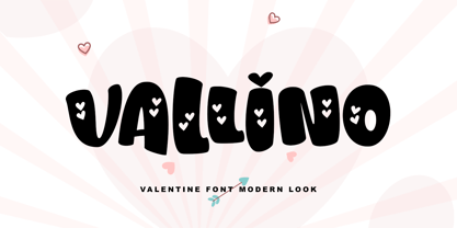 Vallino is a fresh & modern playful font. It has a bold cute style and will add an upscale to all your designs. This Font is perfect for many different projects such as logos & branding, invitations, birthday party, valentine, fashion, stationery, wedding designs, social media posts, advertisements, product packaging, product designs, photography, watermarks, special events, and much more!
 - Dance Moderne JNL by Jeff Levine,
$29.00 A small book entitled “Portfolio of Alphabet Designs for Artists, Architects, Designers & Craftsmen” [published in 1938 by Irene K. Ames] contained a number of pages displaying hand lettered alphabet examples. One sample in particular stood out for its bold Art Deco look and unusual design. This is now available as Dance Moderne JNL, in both regular and oblique versions.
 - RM Hangle by Ray Meadows,
$19.00 This strong angular cousin of RM Hunky offers a bold display face. The distinctive nature of this design will be a welcome addition to any designers collection of useful fonts. Due to the nature of this design there may be a very slight lack of smoothness to the curves at extremely large point sizes (around 200 pt and above).
 - Lothie by RagamKata,
$14.00 Lothie, a quirky font that will make your design looks outstanding! With Lothie, you can you’re your project even more fun. A playful font with it’s bold and unique shaped font, will make your design catches their eyes. This typeface is a perfect for an invitation, posters, logo, and many more! Get Lothie to make your design looks lit!
 - Grantham - Unknown license

- GranthamCondensed - Unknown license

- Ritalin - Unknown license

- Adagio - Unknown license

- Churchward Legible by BluHead Studio,
$25.00 Churchward Legible is an extensive typeface family designed by New Zealand type designer Joseph Churchward. A geometric sans serif, it is, as its name boasts, highly legible and readable on screen as well as in print. The family includes five weights from Light to Extra Bold, with companion italics.
 - Gokil by Eotype,
$12.00 Gokil is an unique bold display font with rounded edges. You can use this font in retro, vintage, and hipster designs. This font is perfect for a variety of projects, such as branding, poster displays, logo designs, magazines, headlines, stickers, and more.This font also has alternate and ligature features.
 - RM Deco by Ray Meadows,
$19.00 A mixture of bold and fine line helps this distinctive design evoke the spirit of the 1930s Jazz Age. Due to the modular nature of this design there may be a slight lack of smoothness to the curves at very large point sizes (around 100 pt and above).
 - Wood Poster Display JNL by Jeff Levine,
$29.00 Wood Poster Display JNL is a more casual sans wood type, with a bold and friendly appeal. This font offers a pleasant design which lends itself perfectly to titling, price cards, event notices and any print or web design that prefers a less formal structure to its typography.
 - Rolever Texture by Putracetol,
$20.00 Elevate your designs with Rolever - Modern Sans Serif Font. This versatile typeface boasts three distinct weights - regular, semibold, and bold - allowing you to infuse your creations with a range of visual impact. With two versions available - clean and textured - Rolever offers design flexibility that caters to your unique preferences.
 - Leon by Hafontia,
$99.00 Leon is a modern wide sans serif type family in Hebrew and Latin. It comes in four styles to match any design need - Headers in Black or Thin to long text in regular and Bold. Includes full Hebrew support including punctuation. Designed in Tel Aviv by Ben Nathan, 2021.


