10,000 search results
(0.045 seconds)
- Good Faster by Mans Greback,
$59.00 Good Faster is a bold script typeface. In a quirky calligraphic style, this flowing font has a rustic look and soft lines. The Good Faster family consists of four styles: Regular, Bold, Italic and Bold Italic, complimenting each other for the greatest design possibilities. The font is built with advanced OpenType functionality and has a guaranteed top-notch quality, containing stylistic and contextual alternates, ligatures and more features; all to give you full control and customizability. It has extensive lingual support, covering all Latin-based languages, from Northern Europe to South Africa, from America to South-East Asia. It contains all characters and symbols you'll ever need, including all punctuation and numbers.
 - Barrlow by Epiclinez,
$18.00 Barrlow is an awesome and bolded script font that is incredibly versatile and will look great on any design or craft. So what's included: Basic Latin, numbers, symbols, punctuations, and ligatures Simple Installations: works on PC & Mac Multilingual Support includes Afrikaans Albanian Catalan Danish Dutch English Estonian Finnish French German Italian Norwegian Portuguese Spanish Swedish Zulu. Accented Characters : ÀÁÂÃÄÅÆÇÈÉÊËÌÍÎÏÑÒÓÔÕÖØŒŠÙÚÛÜŸÝŽàáâãäåæçèéêëìíîïñòóôõöøœšùúûüýÿžß Accessible in Adobe Illustrator, Adobe Photoshop, Adobe InDesign, even works on Microsoft Word PUA Encoded and fully accessible without additional design software Thank you! We hope you enjoy our font!
 - Haliond by Multype Studio,
$18.00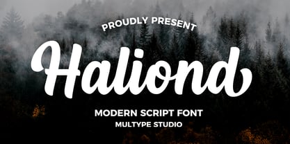 Haliond is a modern script font with bold style and modern looks. This font would perfect for logos, branding, product designs, product packaging, photography, watermark, social media posts, advertisements, invitation, stationery, labels, logos, magazines, books, greeting / wedding cards, fashion, make up, and etc. What's Include : Uppercase & lowercase Numbers and punctuation Multilingual support Ligatures Alternates Swashes Works on PC & Mac Simple installations Accessible in the Adobe Illustrator, Adobe Photoshop, Adobe InDesign, even work on Microsoft Word. PUA Encoded Characters – Fully accessible without additional design software. Thank you for your purchase! Hope you enjoy with our font!
 - Backly Highs by Multype Studio,
$16.00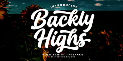 Backly Highs is a bold script font. This font would perfect for logos, branding, product designs, product packaging, photography, watermark, social media posts, advertisements, invitation, stationery, labels, logos, magazines, books, greeting / wedding cards, fashion, make up, and etc. What's Include : Uppercase & lowercase Numbers and punctuation Multilingual support Ligatures Alternates Swashes Works on PC & Mac Simple installations Accessible in the Adobe Illustrator, Adobe Photoshop, Adobe InDesign, even work on Microsoft Word. PUA Encoded Characters – Fully accessible without additional design software. Thank you for your purchase! Hope you enjoy with our font!
 - Dubia by Ilhamtaro,
$17.00 DUBIA is a western style font, a font that goes well with cowboy, rodeo and vintage designs. The font, which is based on a serif font, is bold and tends to carry a strong and tough character like a cowboy taming a wild horse. This font is allcaps so it is perfect for creating a title or headline on a poster or magazine cover design. To enable the OpenType Stylistic alternates, you need a program that supports OpenType features such as Adobe Illustrator CS, Adobe Indesign & CorelDraw X6-X7. Cheers!
 - Adverb Mono by Rumors Foundry,
$9.00 Adverb Mono is an atypical monospaced, squared proportional, slab-serif and low contrast typeface inspired by the American Type Founders' "OCR-A" and the latest work of Adrian Frutiger "OCR-B" designed during the second half of the 20th century. The typeface (in his 1.00 version) counts five different weight, from Thin to Bold, and a pixelated redesign of the regular weight inspired by the retrogaming consoles' graphics. It counts more than 240 different glyphs continuously updated. Designed by Gabriele Bellanca for IED Florence Typography Masterclass 2020/21. All rights reserved.
 - Sanstooy by Letterlite Studio,
$13.00 Sanstooy Cute Display Font Sanstooy - a super fun and playful hand-lettered bold typeface. It is perfect for headings, flyer, greeting cards, product packaging, book cover, printed quotes, logotype, apparel design, album covers, etc. What's Included : - Standard & Multilingual glyphs - Ligature - Alternate - Works on PC & Mac - Simple installations - Accessible in the Adobe Illustrator, Adobe Photoshop, Adobe InDesign, even work on Microsoft Word. - PUA Encoded Characters - Fully accessible without additional design software. - Fonts include multilingual support for; Afrikaans, Danish, Dutch, French, German, Indonesian, Irish, Italian, Norwegian, Portuguese, Scottish, Spanish, Swedish, Swiss. Hope you enjoy with our font!
 - Silver Shark by Epiclinez,
$18.00 Silver Shark is a cool and authentic brush display font. It has a bold, rough texture and as a result, it makes each of your creative designs stand out. Carefully handcrafted to grab the attention of the viewers, this font is ideal for logos, posters, headlines, branding, apparel and so much more. Silver Shark contains 199 glyphs. Supporting more than 66 languages, from English to Zulu. Accessible in Adobe Illustrator, Adobe Photoshop, Adobe InDesign, even works on Microsoft Word PUA Encoded and fully accessible without additional design software,
 - Rocket Thunder by Scratch Design,
$14.00 Rocket Thunder is a retro, bold and chunky typeface with a style that typically features a classic that brings nostalgic feelings to your design. This font will be suitable for logos, posters, headlines, magazines, and branding, to make the design stand out, be eye-catching and grab attention. To access the alternate and ligatures glyphs, you need a program that supports OpenType features such as Adobe Illustrator CS and Adobe Indesign. FILE INCLUDED: Uppercase and lowercase Numbers & punctuation Multilingual support Alternates Ligatures Thank you for your purchase and we hope you enjoy this font!
 - Agency Gothic CT by CastleType,
$59.00 Originally designed by American type designer Morris Fuller Benton in 1933, Agency Gothic is a wonderful, narrow, squarish art deco typeface. I was commissioned by Publish magazine to create digital versions of Agency Gothic Open and Agency Gothic Condensed for a redesign in 1990. Since then, I have added four other styles. Agency Gothic CT is uppercase only and supports most European languages that use the Latin or Cyrillic alphabets. The Agency Gothic CT family is available in six weights/styles: Light, Medium, Bold, Condensed, Inline, and Open.
 - Umba Slab by TypeThis!Studio,
$29.00 The best thing about Umba Slab is its surprise! UMBA Slab is a clean but eye-catching typeface designed by Anita Jürgeleit. It adds an amazing touch to your corporate design and titling by developing a more dynamic shape from thin to bold. It’s especially designed for a wide range of variety and to create a highly recognizable branding and titling. Twenty styles from thin to bold and matching italics help you to create design with a strong essence. Separate styles for alternate and small caps will show up in your font menu, making sure that you always stay aware of the wide range of possibilities of your new favourite font. Finally, for all those who love caps, there are extra caps-only fonts added to the collections. Would you like to see more of how UMBA can improve your design? Let’s get in touch! INSTAGRAM @anitajuergeleit +++ FACEBOOK AnitaJuergeleitTypefaces
 - Kejaxi by Twinletter,
$18.00 Kejaxi font groovy is a psychedelic-inspired typeface. It has a fun and bold shape, perfect for all your creative projects that need a retro style. This Groovy font is a free display font with bold and geometric shapes, perfect for branding and editorial design. This font is also ideal for product packaging or even just to add a little flair to your design work. Kejaxi is a contemporary font with geometric shapes and accuracy that will add a touch of elegance to any design. So stop procrastinating and incorporate it into your designs right away! What’s Included : Standard glyphs Iso Latin 1 Simple installations We highly recommend using a program that supports OpenType features and Glyphs panels like many Adobe apps and Corel Draw, so you can see and access all Glyph variations. PUA Encoded Characters – Fully accessible without additional design software. Fonts include Multilingual support
 - Plectrum CP by CounterPoint Type Studio,
$29.95 As the first multi-font family designed for the CounterPoint font library, Plectrum offers designers and font lovers an alternative to the usual display style fonts of CounterPoint with a low key yet elegant sans serif family that can serve a variety of functions. Designed as a humanist style sans serif, the letters have variation in stroke weight. The italic faces have some variation in the letter design making them more of a true italic rather than simple oblique faces. The complete family consist of four weights: Regular, Italic, Bold and Bold Italic which can be purchased separately or as a complete package. The typeface has some unique features which add warmth to the design such as a slanted cross bar on the lowercase e and a large x-height. This is a solid, versatile family. Available in OpenType and contains support for Latin based and Eastern European languages.
 - Invincible Duo Script by Prestige Artsy Studio,
$19.00 Introducing Invincible Duo, a sleek, modern, and clean font package designed to elevate your creative projects. This dynamic duo consists of two fonts that perfectly complement each other, offering endless possibilities for your designs. The first font, a beautiful script, exudes elegance and charm. With an abundance of ligatures — over 170 ligatures, with every word becomes a work of art. Its flowing strokes and intricate details add a touch of sophistication, making it ideal for invitations, logos, branding, and other projects where a touch of beauty is desired. The second font, a bold sans, brings a contemporary edge to the table. With its clean lines and strong presence, it grabs attention and exudes confidence. Perfect for headlines, titles, and bold statements, this font adds a bold and modern touch to your designs, creating impact and visual appeal. Invincible Duo is carefully crafted to ensure seamless harmony between the script and sans font. When used together, they create a stunning visual contrast that captivates the audience. Whether combined or used individually, these fonts make a lasting impression and deliver a powerful, cohesive message.
 - Contenu by Hackberry Font Foundry,
$24.95 Because Contenu is designed for text use, it is spaced for body copy in the 9-12 point range. That is far too much spacing for heads, subheads, and the like. So I made the display version of Contenu Book to use for headers. In the process of tightening the spacing at the very large sizes, I also made some minor modifications to the glyph shapes to make this version a little more elegant. Contenu Opentype has two Opentype families for print design. Contenu Book has five fonts: Regular, Italic, Bold, Bold Italic, and Display. Contenu has Medium, Medium Italic, Black, and Black Italic. The name is French for content and this is what the family is designed for: text, body copy, and book layout. If it has a style, it is a modern take on oldstyle serif font using Jenson as a mask. There are no plans for display versions of the bolder weights or the italics. If you want them, use Contenu Medium, Book Bold, Contenu Black, or any of the four italics and tighten the tracking.
 - Rolide by Craft Supply Co,
$20.00 Introducing Rolide – Expanded Sans Serif Contemporary Charm Rolide – Expanded Sans Serif presents a unique blend of contemporary charm with its wide and boxy shape. Versatile Design Solution This font is your versatile design solution, ideal for titles and body text. Its non-bold style strikes a harmonious balance between subtlety and impact. Wide & Expanded Rolide’s wide and expanded characters add a touch of modernity to your projects. They stand out without overwhelming the content. Perfect for Titles and Body Text Whether for titles or body text, Rolide is the perfect choice. It maintains clarity and readability, making your content engaging. Elegance in Simplicity In the world of fonts, Rolide embodies elegance through simplicity. Its clean lines and non-bold form offer a contemporary feel. In Conclusion In conclusion, Rolide – Expanded Sans Serif is the font that marries wide, expanded, and non-bold characters to create a contemporary and versatile design solution. It ensures your titles and body text are engaging, clear, and subtly impactful, appealing to a broad range of readers.
 - Contenu Book by Hackberry Font Foundry,
$24.95Because Contenu is designed for text use, it is spaced for body copy in the 9-12 point range. That is far too much spacing for heads, subheads, and the like. So I made the display version of Contenu Book to use for headers. In the process of tightening the spacing at the very large sizes, I also made some minor modifications to the glyph shapes to make this version a little more elegant. Contenu Opentype has two Opentype families for print design. Contenu Book has five fonts: Regular, Italic, Bold, Bold Italic, and Display. Contenu has Medium, Medium Italic, Black, and Black Italic. The name is French for content and this is what the family is designed for: text, body copy, and book layout. If it has a style, it is a modern take on oldstyle serif font using Jenson as a mask. There are no plans for display versions of the bolder weights or the italics. If you want them, use Contenu Medium, Book Bold, Contenu Black, or any of the four italics and tighten the tracking. - Imagine a font that struts in with a leather jacket flung over its shoulder, slides a comb through its slick-back hair, and orders a milkshake with an extra cherry on top. That's the 50's Headline DS...
- AZ Grampa by Artist of Design,
$25.00 AZ Grampa font was inspired from old content type on vintage tins. This font utilizes an "old look" to the line work which is designed to have a "worn feel" to it. Ideal for use as content text in you design.
 - KING HOSHUN by Twinletter,
$17.00 Welcome King Hoshun, a display font with a superhero style ready to take your projects to a higher level. If you need a strong, bold, and action-packed theme like those in movies, games, or bold designs, King Hoshun is the right choice. With King Hoshun in attendance, your designs will be in the spotlight. Each letter is filled with strength and heroism that will make an unforgettable impact on the audience. The impressive and bold look of this font will make your message feel even more powerful and compelling. Not only does it look impressive, but King Hoshun also offers special features that enrich your creativity. With the available ligatures and alternative characters, you can explore unique and interesting typography combinations. Plus, this font supports multiple languages, so you can present a strong and inspiring message to a global audience. Join the power of King Hoshun and let your projects light up the world. With its bold superhero style and superior features, this font will give your designs an unforgettable impression. Don’t miss the chance to own King Hoshun and create amazing works that amaze and inspire. What’s Included : File font All glyphs Iso Latin 1 Alternate, Ligature Simple installations We highly recommend using a program that supports OpenType features and Glyphs panels like many Adobe apps and Corel Draw so that you can see and access all Glyph variations. PUA Encoded Characters – Fully accessible without additional design software. Fonts include Multilingual support
 - Ice Creamery by FontMesa,
$29.00Ice Creamery is a new variation of our Saloon Girl font family complete with italics and fill fonts which may be used to layer different colors into the open parts of each glyph. We don’t recommend using the fill fonts for Ice Creamery as stand alone solid fonts, Ice Creamery Chocolate was designed as a the stand alone solid font for this font family. Fill fonts go back to the 1850's where they would design matched sets of printing blocks and the layering of colors took place on the printing press, they would print a page in black then on a second printing they would print a solid letter in red or blue over the letters with open spaces to fill them in. Most of the time the second printing didn't line up exactly to the open faced font and it created a misprinted look. With the fill fonts in Ice Creamery and other FontMesa fonts you have the option to perfectly align the fill fonts with the open faced fonts or shift it a little to create a misprinted look which looks pretty cool in some projects such as t-shirt designs. I have some ice cream making history in my family, my Grandfather Fred Hagemann was the manager of the ice cream plant for thirty years at Cock Robin Ice Cream and Burgers in Naperville IL. In the images above I've included an old 1960's photo of the Cock Robin Naperville location, the ice cream plant was behind the restaurant as seen by the chimney stack which was part of the plant. If you were to travel 2000 feet directly behind the Cock Robin sign in the photo, that's where I started the FontMesa type foundry at my home in Naperville. My favorite ice cream flavor was their green pistachio ice cream with black cherries, they called it Spumoni even though it wasn't a true Spumoni recipe. Their butter pecan ice cream was also incredibly good, the pecans were super fresh, their Tin Roof Sundae ice cream was chocolate fudge, caramel and peanuts swirled into vanilla ice cream. One unique thing about Cock Robin and Prince Castle was they used a square ice cream scoop for their sundaes. - Caride Script by Krafted,
$10.00 Look back to learn how to look forward - Joe Girard Find yourself and share your purpose with the Caride Script. With its bold vintage script type, sometimes you need to remind others that we must look to the past to pave a better way for our future. It’s time for you to unleash the old school retro trend again. Leather jackets? Making a comeback. Pompadour hairdos? Definitely cool. 70s music? They’re sampled in the music all over our radio stations! The magnificence of the past will surely help you give a new and fresh breath of life to your projects. This font was designed for you to use in any kind of projects that you might have! They were specifically designed to fit in anywhere you want them to be. We assure you that there will be no awkwardness in the relationship between your text and your designs, they’ll get along well like old-timey partners! The Caride Script is the perfect addition to bring your perspective to the world. Have the world see you and your encompassing view of the human experience with your creations!
 - Andron 2 EIR Corpus by SIAS,
$34.90 SIAS opens a new chapter in Irish vernacular typography: the Andron-2-Irish font family. The genes of the insular typographic heritage have been blended with the timeless classical style of the versatile Andron series. Whereas most Irish-style fonts available more or less stick to ancient designs, Andron-2-EIR is different: it’s an entirely new design in which Irishness meets the beauty of a matured Venetian Roman text face. Envision a new horizon for setting Irish text in its own visual mode! Now you can utilize Italics, Semibold and Small capitals for Irish just as you have been doing in other languages for a long time. But the icing on the cake is the fifth font: Andron Irish Middlecase honours the rich medieval tradition of Ireland by a special uncial-style glyph set. It corresponds to the Andron MC series. Last but not least the Irish type connoisseur will relish this font package for it’s unique utilization of Opentype functionality. In Opentype-aware applications, by just ticking a box you can switch to the special insular forms of s and r. By ticking another box you can transform the text from modern-day orthography to the traditional spelling with lenited consonants. This built-in intelligence has never been implemented in any Irish font before. Briefly, the Opentype substitution features are: [Ligatures] – default basic f-ligatures; [Descretionary Ligatures] – more ligatures for typographic reason, mainly t- and long-s-combinations; [Style set 1] – turns all lowercase r and s into their insular glyph variants; [Style set 2] – replaces all consonant-h digraphs by dotted consonants (ḃċḋḟġṁṗṡẛṫ, ḂĊḊḞĠṀṖṠṪ), works for lowercase, uppercase and upper-lowercase alike; [Style set 3] – provides another range of additional special ligatures (for Regular and Italic only); [Oldstyle figures] – turns the default lining figures into proportional oldstyle figures. Andron Irish will also perfectly combine with every other Andron product in mixed settings. For an overview please go to the SIAS main page. For a quick reference go to Andron Latin, Andron Greek, Andron English or Andron MC. For more wonderful new Irish fonts look at Hibernica and Ardagh!
 - Beleck by ArimaType,
$19.00 Beleck is a bold and horror display font. To make your creations look amazing, this font has the potential to take your creative ideas further. It is perfect for your horror designs and also a unique alternative to display designs. Beleck was designed for the needs of Halloween themed design concepts and events in October and November. Beleck is also perfect for quotes, greeting cards, invitations, posters, business cards, presentations and more.
 - Pinatas Masters by Piñata,
$17.00 Original Foundry: TypeType Original name: TT Masters Pinatas Masters is a very emotional typeface. This typeface will add to your design sincerity and warmth. Pinatas Masters typeface consist of 4 different subfamilies: Pinatas Masters, Pinatas Masters Birds, Pinatas Masters Rough and Pinatas Masters Condensed. Each subfamily consists of 5 styles: Thin, Light, Regular, Bold and Black. Scope of typeface: DIY, handmade stuff, interior design, infographics, graphic design, logotypes, packaging, design of exhibitions, presentations.
 - Sagordi by Objectype,
$20.00 Sagordi is a font that displays a strong and modern style. With clean lines and bold shapes, Sagordi is perfect for use in various applications, ranging from logo design to marketing materials, digital publications, and more. This font is designed with careful details to ensure excellent readability at various sizes and resolutions. Sagordi is a great choice for designers who are looking for a flexible and adaptable font that can match various design styles.
 - Firas by Linotype,
$155.99Firas, designed by Abbas Al-Baghdadi in 2005, is a traditional Kufi and a winner in Linotype’s first Arabic Typeface Design Competition. The design is very geometric and bold with very high level of contrast. This makes it suitable for large display sizes, especially in the area of advertising. The font includes a matching Latin design and support for Arabic, Persian, and Urdu. It also includes proportional and tabular numerals for the supported languages. - Redriver by Niznaztype,
$9.00 Redriver is a postmodern font in a futuristic graphic style, mixing characteristics from postmodern, contemporary and even older design styles. Redriver's strength will be the soul of your graphic designs. Redriver is perfect for futuristic and postmodern graphic art, editorial design, posters, t-shirts, book covers, headlines, advertising, branding, movies titling, and more. Redriver can be used for both short or long text in your designs and comes in 3 styles: thin, regular, and bold.
 - Dizengof by Yinon Ezra,
$9.00 'Dizengof' is a Display Typeface, design to deliver a humanistic quality with a unique interpretation for the latin type. The Bold look of 'Dizengof' gives a magnetic visual impact, that is thanks to the strict attention of spaces within and between the letters. Can be used for logos, posters, on video, and of course - branding. The Bold look of 'Dizengof' gives a magnetic visual impact, that is thanks to the strict attention of spaces within and between the letters. Has 2 Stylistic sets.
 - The American Family by Ake,
$18.00 The American Family Font is a bold and thick lettered display font that exudes strength and versatility. With its robust and confident character, this font is perfect for various branding projects, including logos, t-shirt printing, creative products, and much more. The American Family Font makes a powerful statement, adding a touch of boldness and impact to your designs. Its carefully crafted letterforms ensure readability while making a lasting impression. Unleash your creativity and elevate your projects with The American Family Font.
 - Al Manverse Norm by Aluyeah Studio,
$95.00 Hallo Aluyeaholic! Introducing Manverse, a bold manly typeface. Inspired by the things that make up the world of men. With a bold, strong, and firm vibe. Coming with 2 styles, all caps and multilingual support. Very suitable for magazine, headline, website, ads, product package and all type of design project you have. Thanks for checking out my font. I really hope you enjoy using it! If you have any questions I'd be more than happy to answer them, just send me a message!
 - Kungfoo Fighter by IKIIKOWRK,
$15.00 Introducing Kungfoo Fighter typeface, created by ikiiko. This typeface is inspired by the asian character brush strokes. This font has a bold & bold character, with flexible curves. This typeface is perfect for poster design, food & beverages, asian stuff, community logo, magazine, quotes, or simply as a stylish text overlay to any background image. What's included? 2 Weights : Regular & Oblique Uppercase & Lowercase Number & Punctuation Multilingual Support Enjoy our font and if you have any questions, you can contact us by email : ikiikowrk@gmail.com
 - Listian by Top Type,
$9.00 Hello, I'm back with my best product. This product is a serif font family because there are four style options, namely regular, italic, bold and bold italic. This font is also equipped with several alternates and ligatures so that you have the best choices for your work. This font can be used for wedding invitations, advertisements, web designs, quotes, banners, presentations and more. This font is PUA encoded which means you can access all the glyphs and ligatures with ease!
 - Cringe by Aiyari,
$25.00 Introducing "Cringe": a captivating typeface that draws inspiration from the mesmerizing world of psychedelic pop culture and combining it with a uncial letter form and calligraphy approach. Each character exudes a sense of whimsy and free-spiritedness. Cringe Font Family contains 5 style regular, medium, semi bold, bold, & Expanded. It comes with Stylistic set & ligatures. Ayr Cringe Font Family is best used for headings, logotype, quotes, apparel design, invitation, poster, flyers, greeting cards, packaging, book cover, printed quotes, cover album, movie, & etc
 - Marlos by Sronstudio,
$23.00 "Introducing 'Marlos,' a serif font that marries the elements of grace and boldness seamlessly. With its graceful serifs and commanding letterforms, 'Marlos' leaves a bold and lasting impression. Ideal for projects that demand a perfect balance between sophistication and impact, this font brings a touch of timeless elegance to your designs, making it a go-to choice for creating a powerful visual presence." Features: - Ligatures - Alternate - PUA Encoded - Multilingual support - Simple Installation - Work both on Mac and Windows Thank you very much :)
 - Joules et Jacques by Nicky Laatz,
$18.00 Say hello to Joules et Jacques! A stylish modern font duo consisting of a natural handwritten script and a refined, elegant serif font. Perfect for making bold stylish statments - or adding a touch of class to your designs. The script has a multitude of natural looking ligatures in its OpenType features - making the font look as close to natural handwriting as possible. The Serif includes two weights - regular and bold - and built-in OpenType kerning features for a professional touch.
 - Steelkold by Maulana Creative,
$12.00 Steelkold is unique bold handwritten display font, with bold stroke, slant and fun character. It has Opentype features ligatures of character and extra swash, To give you an extra creative work. Steelkold font support multilingual more than 100+ language. This font is good for logo design, Social media, Movie Titles, Books Titles, a short text even a long text letter and good for your secondary text font with sans or serif. Make a stunning work with Steelkold font. Cheers, MaulanaCreative
 - Qiduwy by Twinletter,
$15.00 Qiduwy is a futuristic and stylish font perfect for designing labels, retro, stamps, badges, Oktoberfest posters, packaging, titles, beer, logos, barbershops, whiskeys, tattoos, music, movies, or certificates. This font is perfect for a dark and mysterious look. Bold black lines make this font perfect for a classy and stylish look. The wide, bold typeface gives this font an upscale look. Sharp corners and edges add a touch of class. This is the perfect font for a dark and mysterious look.
 - School by Monotype,
$39.00The School font family is a popular design based on a grade school alphabet. The School fonts allow teachers to create custom hand-lettered exercise sheets and classroom signage. Five variations are available. The plain style and its corresponding bold will create hand-lettered stand-alone text. The lined style and its corresponding bold superimposes a set of three guidelines on the plain style. A dashed style is also provided in case a teacher prefers the centerline to be dashed instead of solid. - Heroliga by Yahya Type,
$18.00 Heroliga is an elegant & modern sans serif font with special alternative letters and with multilingual support. Heroliga is perfect for logo design, magazine headers, product packaging, branding projects, clothing or simply as a stylish text overlay to any images or websites. WHAT’S INCLUDED? • Comes with regular, italic, bold and bold italic font styles. • Uppercase & lowercase letters. • Numbers, punctuation. • Ligature & Huge Stylistic alternate. • Multilingual support. Still got a question? Send me a message and I’ll be happy to answer! qura.yahya@gmail.com