10,000 search results
(0.035 seconds)
- Torino by URW Type Foundry,
$35.99 The Torino font family was designed by Alessandro Butti in 1908 for the Nebiolo foundry in Turin. Torino is a narrow face in the Bold weight; the condensed weight is so narrow that it should be used in over 14pt.
 - Jelly Billy by Illushvara,
$14.00 Jelly Billy is a fun handwritten font featuring a quirky, bold, and modern style! It will work perfectly with packaging products, merchandise or pretty much any design of spring or summer season that requires a touch of happiness and joy.
 - CA Rough Rider by Cape Arcona Type Foundry,
$29.00 Rough Rider is a handcrafted bold italic typeface. Intended as a rough display style typeface it’s perfect for illustrative titles, logotypes and small texts. Initially developed for a logo design, Rough Rider was expanded to a full Central European character set.
 - Express by ParaType,
$30.00 Express® is based on the lettershapes of Express typeface designed for Ludwig & Mayer in 1957 by Walter Hoehnisch. A tall, bold script with even inclination. Cyrillic version developed in 2001 by Natalia Vasilyeva. For use in advertising and display typography.
 - P22 Art Nouveau by P22 Type Foundry,
$24.95 The Art Nouveau styles of the late 19th century exhibited a bold approach to organic lines and lavish decoration. This new style was spread throughout the world and helped usher in a new era that led to modern art and design.
 - Movie Ad Deco JNL by Jeff Levine,
$29.00 An extra-bold, hand lettered type design with a casual feel was used for the 1942 movie poster “Tortilla Flat”. This served as the inspirational model for Movie Ad Deco JNL, and is available in both regular and oblique versions.
 - Bakari by Letteralle,
$18.00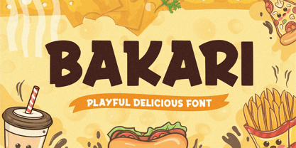 Introducing, Bakari! An attractive, bold, and playful display font. This font gives a charming and strong impression. Bakari is very suitable for various design needs such as merchandise, packaging, social media, ads, T-shirts, logos, events, and many more. Thank you!
 - Flared by Graphicfresh,
$25.00 A groovy, bold typeface that transports you back to the 70s and 80s. Its sleek curves and sharp angles evoke the spirit of neon signs and vintage design. Get ready to captivate with this striking font that exudes nostalgic coolness.
 - Blaak by Mans Greback,
$19.00 Blaak is an interpretation of a Modern Classic typeface with a beautiful and strong impression for editorial design. The sharp serif combined with curves gives Blaak a fabulous, glamorous and bold look; at the same time doesn't sacrifice its functionality.
 - Punchado by MyAnvil,
$20.00 This font titled "Punchado" original was designed in light of its sharp angels and bold impact type. This font would theme in the realm of: engineering, technology, science fiction, science, futures, etc... This font could be described as energetic, and motivational.
 - Black Rovers by Pandanwangi,
$16.00 Black Rovers is a striking sans serif font with a bold and modern charm. It will add a touch of minimalism to any design project. If there is anything you need to ask, you can contact me at suratnokang@gmail.com
 - Goudy Heavyface by Bitstream,
$29.99This face was designed in 1925 as the Monotype answer to the very popular Cooper Black. Goudy is also quite similar in appearance to Ludlow Black and Pabst Extra Bold, both of which were also done in response to Cooper Black. - BLADE sharp by WAP Type,
$15.00 About the Product Blade is a bold and authentic display font. It celebrates abstract shapes in all their eclectic brilliance. Add this font to any racing or speed related design idea and notice how it will make them stand out!
 - Cintra Slab by Graviton,
$12.00 Cintra Slab font family has been designed for Graviton Font Foundry by Pablo Balcells in 2014. It is a slab serif, bold, geometric typeface with subtle rounded angles, which provides a soft, pleasant appearance. Cintra Slab consists of 8 styles.
 - Government Stencil JNL by Jeff Levine,
$29.00 A poster for the 1952 film “Diplomatic Courier” featured the title hand lettered in a bold serif stencil design. With some modifications, this served as the model for Government Stencil JNL, which is available in both regular and oblique versions.
 - The Blackheads by Almarkha Type,
$35.00 The Blackheads - Authentic Bold Script font with a clear style and dramatic movement this font is great for your next creative project such as logos, printed quotes, invitations, cards, product packaging, headers, Logotype, Letterhead, Poster, Apparel Design, Label, and etc.
 - Toma Sunny by Letterena Studios,
$17.00 Toma Sunny is a modern and classic serif font with a unique style and bold look. This typeface is perfect for an elegant & luxury logo, book or movie title design, fashion brand, magazine, clothes, lettering, quotes, and so much more.
 - FM Rossija by FontMeister,
$24.95 'Rossija' is inspired by russian typographic designs. It's bold look makes a perfect font for the use of titles. You can use these fonts to create posters, greeting cards, scrapbooks, CD labels, T-shirts, coffee mugs, digital videos websites and banners.
 - Blantica by 4RM Font,
$35.00 Blantica font is inspired by something harmonious and is made with variations in inktrap with bold font sizes making this font look unique and harmonious. suitable in the use of display fonts and graphic designs such as logos, covers, and others.
 - Torino by ITC,
$39.00The Torino font family was designed by Alessandro Butti in 1908 for the Nebiolo foundry in Turin. Torino is a narrow face in the Bold weight; the condensed weight is so narrow that it should be used in over 14pt. - Geoffrey - Personal use only

- BLOODSTAIN PERSONAL USE - Personal use only

- Nadejda - Unknown license

- Zekton - Unknown license

- Covington SC Exp - Unknown license

- Covington SC Cond - Unknown license

- Covington SC Rev - Unknown license

- BEEF 3 PERSONAL USE - Personal use only

- THINK EXTRA PERSONAL USE - Personal use only

- BAHAMAS TWO PERSONAL USE - Personal use only

- Regards Elegant by Gold Type,
$15.00 Regards Elegant is a beautiful and versatile serif font. This font is characterized by a serif style with a luxurious style in a modern form, but also a friendly and cheerful style in bold, Regards Elegant has glyphs to give crafters more options in designing. This modern style will make a design appear more classy, elegant, unique and edgy. Thank you & Congratulations on the Design!
 - Hambare by Differentialtype,
$10.00 Hambare is a sans serif font family that is bold, elegant, and futuristic. Its clean lines and balanced proportions make it an ideal choice for digital and print designs, ensuring readability and visual impact. Hamabare comes with six styles that you can mix and match. Add it to any design to provide the flexibility and visual impact you need to take your designs to the next level!
 - Crunold by Trustha,
$17.00 Crunold is a bold hand-drawn with dingbats as his mate. Inspired by today's popular designs, abstract shapes as an important element in both digital and print designs. Crunold is perfect for your creative projects. Because, a combination of typography, and the abstract shape of art. Makes your design perfect, also easier in the process. Crunold is perfect for branding, headlines, packaging, and many more.
 - Heritage Set by Katatrad,
$29.00 Heritage Set is a display font. It was designed specifically for display, headline, logotype, branding, and similar applications. Heritage Set has been designed to equipped with three different widths; Narrow, Normal and Wide, addition to expanding weights to support various usabilities ranging from ExtraLight, Light, Regular, Bold and ExtraBold. Which makes with a Tabular Lining features support the creativities of the designer from the Font Menu.
 - Sedhayu by Kulokale,
$19.00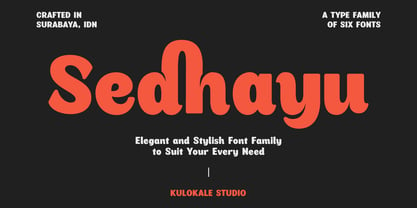 Sedhayu is a modern and bold sans serif font. It has a unique style and will give your design a friendly and expressive look. Sedhayu is perfect for many different projects such as logos and branding, invitation, stationery, wedding designs, social media posts, advertisements, product packaging, product designs, labels, photography, watermark, special events or anything. We hope you enjoy the font and have fun! Thank You.
 - Albertho by NJ Studio,
$19.00 Hi...Thank for your visit :) Albertho A Bold Fonts are font designs that are made for various vector designs, printing such as digital wedding invitations, blogs, online shops, social media, while printing can be used in the field of product clothing, accessories, bags, pins, logos, business cards, watermarks and many others ... so it can make your product look elegant and attractive, and also Multilingual support!!! Happy design ...
 - Salmond by Arterfak Project,
$19.00 Meet Salmond, a geometric and modern sans serif font designed with a tight letterspace, exuding a unique, minimalist charm. Consists with six weights, ranging from Light, Regular, News, Medium, Semibold, and Bold, matching with Oblique styles and multilingual support. This font family offers versatility for various design needs, designed especially for display such as titles, branding, logos, books, UI/UX, and impactful editorial work.
 - SF News by Sultan Fonts,
$19.99 About this font family: News - Dedicated to writing a news text in newspapers, magazines, road boards, book , TV and other printing products, and web pages. The News font contains 3 styles (regular, Medium and bold) The font includes a matching Latin design and support for Arabic, Persian, Kurdish, and Urdu. Language families: Arabic, Persian, Kurdish, Urdu, Latin Designer: Sultan Maqtari Design date: 2021 Publisher: Sultan Fonts
 - RePublic by Suitcase Type Foundry,
$75.00In 1955 the Czech State Department of Culture, which was then in charge of all the publishing houses, organised a competition amongst printing houses and generally all book businesses for the design of a newspaper typeface. The motivation for this contest was obvious: the situation in the printing presses was appalling, with very little quality fonts existing and financial resources being too scarce to permit the purchase of type abroad. The conditions to be met by the typeface were strictly defined, and far more constrained than the ones applied to regular typefaces designed for books. A number of parameters needed to be considered, including the pressure of the printing presses and the quality of the thin newspaper ink that would have smothered any delicate strokes. Rough drafts of type designs for the competition were submitted by Vratislav Hejzl, Stanislav Marso, Frantisek Novak, Frantisek Panek, Jiri Petr, Jindrich Posekany, and the team of Stanislav Duda, Karel Misek and Josef Tyfa. The committee published its comments and corrections of the designs, and asked the designers to draw the final drafts. The winner was unambiguous — the members of the committee unanimously agreed to award Stanislav Marso’s design the first prize. His typeface was cast by Grafotechna (a state-owned enterprise) for setting with line-composing machines and also in larger sizes for hand-setting. Regular, bold, and bold condensed cuts were produced, and the face was named Public. In 2003 we decided to digitise the typeface. Drawings of the regular and italic cuts at the size of approximatively 3,5 cicero (43 pt) were used as templates for scanning. Those originals covered the complete set of caps except for the U, the lowercase, numerals, and sloped ampersand. The bold and condensed bold cuts were found in an original specimen book of the Rude Pravo newspaper printing press. These specimens included a dot, acute, colon, semicolon, hyphens, exclamation and question marks, asterisk, parentheses, square brackets, cross, section sign, and ampersand. After the regular cut was drafted, we began to modify it. All the uppercase letters were fine-tuned, the crossbar of the A was raised, E, F, and H were narrowed, L and R were significantly broadened, and the angle of the leg and arm of the K were adjusted. The vertex of the M now rests on the baseline, making the glyph broader. The apex of the N is narrower, resulting in a more regular glyph. The tail of Q was made more decorative; the uppercase S lost its implied serifs. The lowercase ascenders and descenders were slightly extended. Corrections on the lower case a were more significant, its waist being lowered in order to improve its colour and light. The top of the f was redrawn, the loop of lowercase g now has a squarer character. The diagonals of the lowercase k were harmonised with the uppercase K. The t has a more open and longer terminal, and the tail of the y matches its overall construction. Numerals are generally better proportioned. Italics have been thoroughly redrawn, and in general their slope is lessened by approximatively 2–3 degrees. The italic upper case is more consistent with the regular cut. Unlike the original, the tail of the K is not curved, and the Z is not calligraphic. The italic lower case is even further removed from the original. This concerns specifically the bottom finials of the c and e, the top of the f, the descender of the j, the serif of the k, a heavier ear on the r, a more open t, a broader v and w, a different x, and, again, a non-calligraphic z. Originally the bold cut conformed even more to the superellipse shape than the regular one, since all the glyphs had to be fitted to the same width. We have redrawn the bold cut to provide a better match with the regular. This means its shapes have become generally broader, also noticeably darker. Medium and Semibold weights were also interpolated, with a colour similar to the original bold cut. The condensed variants’ width is 85 percent of the original. The design of the Bold Condensed weights was optimised for the setting of headlines, while the lighter ones are suited for normal condensed settings. All the OpenType fonts include small caps, numerals, fractions, ligatures, and expert glyphs, conforming to the Suitcase Standard set. Over half a century of consistent quality ensures perfect legibility even in adverse printing conditions and on poor quality paper. RePublic is an exquisite newspaper and magazine type, which is equally well suited as a contemporary book face. - ITC Schuss Hand by ITC,
$29.99Designed by German graphic designer Jochen Schuss. ITC Schuss Hand and ITC Schuss Hand Bold can probably best be described as excellent all around scripts useful for a broad spectrum of advertising purposes as well as for those applications that benefit from a refined handwritten appearance. The characters themselves have a soft, almost “liquid” appearance which is enhanced by the subtle swelling at most of the stroke terminals. The slightly condensed nature of the characters plus a relatively large x-height ensures that both weights are ideal for the advertising arena. An additional feature on ITC Schuss Hand and ITC Schuss Hand Bold are the capital letters which can actually be used on their own in word settings whereas most script capitals are designed just for initialing purposes. The designer has also invested a good deal of careful thought to the way in which a high percentage of the lowercase letter combinations overlap to create an authentic hand-scripted appearance. This, together with the italicized letter forms, will make Schuss Hand and Schuss Hand Bold ideal candidates for those occasions when paper correspondence requires an informal style. So, as is claimed, an excellent all around script style.


