10,000 search results
(0.041 seconds)
- Craw Clarendon by Wooden Type Fonts,
$15.00 One of the many Clarendon font designs, this one based in part on the Craw Clarendon design.
 - Gargoyle by Red Rooster Collection,
$45.00Based on an Adrian Williams design, circa 1976 and Brook Type in 1903 designed by Lucien Pissaro. - Alexander by Monotype,
$29.99The Alexander font family was designed by Adam Roe for Lunchbox design. Alexander was released in 1993. - Christmas Glow by Pedro Teixeira,
$14.00 When I started designing this font, I had the purpose of giving a retro warming christmas feeling. So I added ornaments to add more value to your designs. Ornament glyphs can be arranged in numerous different designs.
 - Bokarms Stencil by SMZ Design,
$19.00 Bokarms stencil is a condensed font with a distinctive look Created for military-themed design. Perfect for industrial projects. It will also work as a universal typeface for promotional poster designs, branding, logo design, and clothing branding.
 - Hello Eiffel by Yumna Type,
$15.00 Being loyal to your same old font will make your designs plain and dull. You need a prominent font to live up your messages without losing the essence of the content itself. Time to welcome Hello Eiffel, a font to help you deliver your desired messages without omitting the whole design. Hello Eiffel is a display font in simple, yet interesting letter shapes with which you can strengthen your desired messages to deliver without distracting attention on the text content itself. Despite its simplicity, Hello Eiffel remains interesting in modern styles to enhance the design’s aesthetic value. Its letters are legible enough to be flexibly applicable for various text sizes, and it gives you a clipart as a bonus. You can enjoy the available features here as well. Features: Multilingual Supports PUA Encoded Numerals and Punctuations Hello Eiffel fits best for various design projects, such as brandings, posters, banners, headings, magazine covers, quotes, printed products, merchandise, social media, etc. Find out more ways to use this font by taking a look at the font preview. Thanks for purchasing our fonts. Hopefully, you have a great time using our font. Feel free to contact us anytime for further information or when you have trouble with the font. Thanks a lot and happy designing.
 - ATF Poster Gothic by ATF Collection,
$59.00 ATF Poster Gothic is an expansion of a typeface designed in 1934 by Morris Fuller Benton for American Type Founders. The one-weight design was a slightly condensed display companion to Benton’s ubiquitous Bank Gothic family. This new family of aggressively rectilinear headline types expands the design’s possibilities, offering 30 fonts. The all-cap design sports square corners in the counters, creating tension between angular and curved details; this feature, and the generally rectangular shape of the whole alphabet, makes ATF Poster Gothic distinctive on the page or screen, while its relationship to Bank Gothic makes it seem somehow familiar. Vertical strokes on the C, G, J, and S, as well as on several of the numerals, are cut off at an angle, which suggest the curves those strokes might typically display if the characters were less boxy in design and more along the lines of late-19th-century headline faces. Certain weights also recall the style of lettering used on athletic team jerseys, television crime dramas, action & adventure movie titles, and engraved stationery. With three widths and five weights, ATF Poster Gothic is distinctive and versatile at the same time. The full family is also available in a “Round” version, with corners subtly rounded for a softer, more “printed” feel.
 - Moot jungle by Alit Design,
$18.00 Presenting 🍃The Moot Jungle Nature Font🍃 by alitdesign. "The Moot Jungle" is an elegant serif font with a natural twist. Inspired by the beauty of nature, this font features a stunning swash of leaves that adds a touch of sophistication to any design. The serifs are delicate and refined, making it perfect for elegant, upscale designs. Whether you're creating a logo, invitations, or other design projects, "The Moot Jungle" is sure to make a lasting impression. In addition, "The Moot Jungle" has a versatile design, making it suitable for various uses such as headers, titles, body text, and more. The font supports multiple languages and includes a full set of uppercase and lowercase letters, numbers, and punctuation marks. It also comes with stylistic alternatives and ligatures, adding to its uniqueness and allowing for even more creative freedom. Embrace the beauty of nature and elevate your design with "The Moot Jungle" font. The Moot Jungle font has alternatives that you can combine between swashes and symbols that have the theme of elegant nature. Besides that this font is very easy to use both in design and non-design programs because everything changes and glyphs are supported by Unicode (PUA). The Moot Jungle Font has a total of 700 glyphs including symbol, multilingual. Language Support : Latin, Basic, Western European, Central European, South European,Vietnamese. In order to use the beautiful swashes, you need a program that supports OpenType features such as Adobe Illustrator CS, Adobe Photoshop CC, Adobe Indesign and Corel Draw. but if your software doesn't have Glyphs panel, you can install additional swashes font files.
 - Garelina by Riasyletter_Studio,
$19.00 Looking for a minimalist and luxurious serif font for logos, web design, clothing promotions, brochures, and more? Garelina is the answer. This font has thin and smooth lines that make it look elegant and luxurious. Garelina is perfect for branding and promotion purposes. With its delicate typography, this font can add aesthetic value to your design. Garelina also has several letter variants making it easy to use for various design types. With Garelina, you can create minimalist designs that still look luxurious and elegant. This font is perfect for companies that want to display a professional and stylish image. Do not hesitate to try Garelina on your design now. You will be surprised how easy it is to make elegant and luxurious designs with this serif font. Garelina, the elegant and luxurious serif font for your branding needs. What's Included : - Garelina OTF - More than 250 of glyphs (include Uppercase, Lowercase, Numerals & Punctuations,Ligatures and Stylistic) - Multilingual support - Works on PC & Mac - Simple installations - Accessible in the Adobe Illustrator, Adobe Photoshop, Adobe InDesign, even work on Microsoft Word. - PUA Encoded Characters (fully accessible without additional design software) Support For Language : Albanian, Basque, Breton, Chamorro, Danish, Dutch, English, Finnish, French, Frisian, Galician, German, Italian, Malagasy, Norwegian, Portuguese, Spanish, Alsatian, Aragonese, Arapaho, Arrernte, Asturian, Aymara, Bislama, Cebuano, Corsican, Fijian, French_creole, Genoese, Gilbertese, Greenlandic, Haitian_creole, Hiligaynon, Hmong, Hopi, Ibanag, Iloko_ilokano, Indonesian, Interglossa_glosa, Interlingua, Irish_gaelic, Jerriais, Lojban, Lombard, Luxembourgeois, Manx, Mohawk, Norfolk_pitcairnese, Occitan, Oromo, Pangasinan, Papiamento, Piedmontese, Potawatomi, Rhaeto-romance, Romansh, Rotokas, Sami_lule, Samoan, Sardinian, Scots_gaelic, Seychelles_creole, Shona, Sicilian, Somali, Southern_ndebele, Swahili, Swati_swazi, Tagalog_filipino_pilipino, Tetum, Tok_pisin, Uyghur_latinized, Volapuk, Walloon, Warlpiri, Xhosa, Yapese, Zulu, Latinbasic, Ubasic, Demo
 - Neuzeit Office Soft Rounded by Linotype,
$29.99 Every year, more and more text is read directly on a computer screen in office applications, or from freshly printed sheets from a copier or laser printer. Clear, legible text faces are more imperative to office communication than ever before. Yet every worker desires a small bit of personality in the corporate world. Most office environments are only equipped with a few basic fonts that are truly optimized for use in text, with laser printers, and on screen. The Linotype Office Alliance fonts guarantee data clarity. All of the font weights within the individual family have the same character measurements; individual letters or words may have their styles changed without line wrap being affected! All numbers, mathematical signs, and currency symbols are tabular; they share the same set character width, ensuring that nothing stands in the way of clear graph, chart, and table design. In addition to being extremely open and legible, the characters in this collection's fonts also share the same capital letter height and the same x-height. The production and reading of financial reports is duly streamlined with the Linotype Office Alliance fonts. The Neuzeit Office family is designed after the model of the original sans serif family Neuzeit S, which was produced by D. Stempel AG and the Linotype Design Studio in 1966. Neuzeit S itself was a redesign of D. Stempel AG's DIN Neuzeit, created by Wilhelm Pischner between 1928 and 1939. Intended to represent its own time, DIN Neuzeit must have struck a harmonious chord. DIN Neuzeit is a constructed, geometric sans serif. It was born during the 1920s, a time of design experimentation and standardization, whose ethos has been made famous by the Bauhaus and De Stijl movements in art, architecture, and design. Upon its redesign as Neuzeit S in the 1960s, other developments in sans serif letter design were taken into account. Neuzeit S looks less geometric, and more gothic, or industrial. Separating it from typefaces like Futura, it has a double-storey a, instead of a less legible, single-storey variant. Unlike more popular grotesque sans serifs like Helvetica, Neuzeit S and especially the redesigned Neuzeit Office contain more open, legible letterforms. Neuzeit Office preserves the characteristic number forms that have been associated with its design for years. After four decades, Neuzeit has been retooled once again, and it is more a child of its age than ever before. Akira Kobayashi, Linotype's Type Director, created the revised and updated Neuzeit Office in 2006. His greatest change was to retool the design to make its performance in text far more optimal. Additionally, he created companion oblique to help emphasize text. The other three families in the Office Alliance system include Metro Office, Times Europa Office and Trump Mediaeval Office.Some weights of the Neuzeit Office are availabla as soft rounded versions. "
 - Retro Lettering by Nirmana Visual,
$19.00 Retro Lettering , Inspired by 70s Design Era with 2 style : Regular & Shadow, Include 4 style ending swash. Retro Lettering offers beautiful typographic harmony for a diversity of design projects, including logos & branding, social media posts, advertisements & product designs.
 - Abimanyu by Goodigital13,
$20.00 perfect for branding, photography, invitations, quotes, watermarks, advertisements, product designs, labels, and much more!. it will make your design project more beautiful. The font is suitable for any design like branding, fashion, print template, quotes, wedding and etc.
 - CLASSIC Line by WAP Type,
$25.00 frontline classic font Font a stylish Font. It’s useful for any Design project. Decal, card, e-card, Good for Logos & Headlines, Poster,Tag design, Newspaper & Magazine Ad Design and many more. True type and Open type font files
 - Nouthend by Lemonthe,
$15.00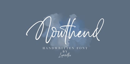 Nouthend is a beautiful and flowing handwritten font with a modern style. This gentle font will look gorgeous on a variety of design ideas such as, logos & branding, invitation, stationery, wedding designs, product designs, labels, photography, and more!
 - ROBO - Personal use only

- Cartoonist - Personal use only

- Emoticons - Personal use only

- Cyberspace - Personal use only

- Juvenis by Storm Type Foundry,
$32.00Designs of characters that are almost forty years old can be already restored like a historical alphabet – by transferring them exactly into the computer with all their details. But, of course, it would not be Josef Tyfa, if he did not redesign the entire alphabet, and to such an extent that all that has remained from the original was practically the name. Tyfa published a sans-serif alphabet under the title Juvenis already in the second half of the past century. The type face had a large x-height of lower-case letters, a rather economizing design and one-sided serifs which were very daring for their time. In 1979 Tyfa returned to the idea of Juvenis, modified the letter “g” into a one-storey form, narrowed the design of the characters even further and added a bold and an inclined variant. This type face also shows the influence of Jaroslav Benda, evident in the open forms of the crotches of the diagonal strokes. Towards the end of 2001 the author presented a pile of tracing paper with dozens of variants of letter forms, but mainly with a new, more contemporary approach: the design is more open, the details softer, the figures and non-alphabetical characters in the entire set are more integral. The original intention to create a type face for printing children’s books thus became even more emphasized. Nevertheless, Juvenis with its new proportions far exceeds its original purpose. In the summer of 2002 we inserted all of this “into the machine” and designed new italics. The final computer form was completed in November 2002. All the twelve designs are divided into six variants of differing boldness with the corresponding italics. The darkness of the individual sizes does not increase linearly, but follows a curve which rises more steeply towards the boldest extreme. The human eye, on the contrary, perceives the darkening as a more fluent process, and the neighbouring designs are better graded. The x-height of lower-case letters is extraordinarily large, so that the printed type face in the size of nine points is perceived rather as “ten points” and at the same time the line spacing is not too dense. A further ingenious optical trick of Josef Tyfa is the figures, which are designed as moderately non-aligning ones. Thus an imaginary third horizontal is created in the proportional scheme of the entire type face family, which supports legibility and suitably supplements the original intention to create a children’s type face with elements of playfulness. The same applies to the overall soft expression of the alphabet. The serifs are varied; their balancing, however, is well-considered: the ascender of the lower-case “d” has no serif and the letter appears poor, while, for example, the letter “y”, or “x”, looks complicated. The only serif to be found in upper-case letters is in “J”, where it is used exclusively for the purpose of balancing the rounded descender. These anomalies, however, fit perfectly into the structure of any smoothly running text and shift Juvenis towards an original, contemporary expression. Tyfa also offers three alternative lower-case letters *. In the case of the letter “g” the designer follows the one-storey form he had contemplated in the eighties, while in “k” he returns to the Benda inspiration and in “u” adds a lower serif as a reminder of the calligraphic principle. It is above all the italics that are faithful to the tradition of handwritten lettering. The fairly complicated “k” is probably the strongest characteristic feature of Juvenis; all the diagonals in “z”, “v”, “w”, “y” are slightly flamboyant, and this also applies to the upper-case letters A, V, W, Y. Juvenis blends excellently with drawn illustrations, for it itself is modelled in a very creative way. Due to its unmistakable optical effect, however, it will find application not only in children’s literature, but also in orientation systems, on posters, in magazines and long short-stories. - Phantom Urbanism Graffiti by Sipanji21,
$22.00 "Phantom Urbanism" is a monoline font with a monoline graffiti theme and an option with stylistic set with arrow effect to add depth and decoration to the font. It is perfect for a wide range of urban or street-themed design projects, such as streetwear design, logo design, car/motosport decals, skateboard decals, and other similar designs. With its edgy and bold appearance, "Phantom Urbanism" brings a sense of energy and attitude to your designs. The font's monoline style and arrow effect optional to adds visual interest and makes your designs stand out. Whether you're looking to create a strong and impactful design or add a touch of urban style to your projects, "Phantom Urbanism" is the font for you.
 - Street Of Exodus by Sipanji21,
$18.00 "Street of Exodus" is a monoline font with a graffiti theme and a slight shadow effect to add depth and decoration to the font. It is perfect for a wide range of urban or street-themed design projects, such as streetwear design, logo design, car/motosport decals, skateboard decals, and other similar designs. With its edgy and bold appearance, "Street of Exodus" brings a sense of energy and attitude to your designs. The font's monoline style and slight shadow effect create a 3D effect that adds visual interest and makes your designs stand out. Whether you're looking to create a strong and impactful design or add a touch of urban style to your projects, "Street of Exodus" is the font for you.
 - Ainslie Sans by insigne,
$- Say g'day to Ainslie Sans, insigne Design’s new typeface. Like its big brother, the new face incorporates a mix of influences from Oz, although Sans is pared down from the original semi-serif. The original Ainslie was inspired by Mt. Ainslie and the city of Canberra’s inner suburb of the same name. Canberra is Australia’s capital--a planned city designed by American architect Walter Burley Griffin. Griffin’s style and geometric design for the city, which include Mt. Ainslie, are now also the same structure that make up the foundation of Ainslie Sans. Unlike the original Ainslie family member, though, Ainslie Sans does away with much of the aboriginal-inspired touches by eliminating the semi-serifs, forcing the font to borrow more heavily than its predecessor from Canberra’s distinct, geometric design and style. The result’s a spiffy Australian font that’s usable within a wide array of applications. The trendy typeface incorporates a multitude of alternates. You can access these in any OpenType-enabled application. Alternates, swashes and alternate titling caps allow you to customize the look and feel. Also incorporated are capital swash alternates, old style figures, and compact caps. Check out the PDF brochure to view these options in action. OpenType enabled applications can take complete benefit of your automatic replacing ligatures and alternates. This font also presents the glyphs to help a wide array of languages. Try it for copy. Try it for a headline. Try it alongside the original Ainslie. Whichever way suits you best, give it a burl. You won't be sad you did.
 - Insaniburger - Unknown license

- Randi - 100% free

- Shoestore - 100% free

- WoodCut - Unknown license

- Sthlm graffiti - Unknown license

- Abella Script by Joelmaker,
$18.00 Abella Script, is a calligraphy manuscript, handwritten modern and classic, so soft, perfect for your next design, such as logos, printed quotes, invitations, cards, product packaging, headers and anything else about your imagination. Abella Script allows you to create custom dynamic text. you can access by turning on; Stylistic Alternates, Swash, as well as ligatures in Photoshop, Adobe Illustrator, Adobe InDesign or through a panel of glyphs such as Adobe Illustrator, Photoshop CC, Let's switch from the regular character into character alternative to get the text with the layout of your dreams. Abella Script features 1000 glyphs and has given PUA encoded (specially coded fonts), with tons of alternate characters. The pack can be accessed in full by any crafter or designer, without the requirement for extra design software. Language Support Albanian, Basque, Breton, Chamorro, Danish, Dutch, English, Faroese, Finnish, French, Frisian, Galician, German, Icelandic, Italian, Malagasy, Norwegian, Portuguese, Spanish, Swedish.
 - Hero Beam by Alit Design,
$14.00 Introducing Hero Beam Typeface Hero Beam typeface is inspired by the form of writing in the era of the European empire. Carrying a Victorian theme that has an elegant and of course cool swash. Hero Beam typeface is perfect for classic Victorian themed designs, packaging beer, whiskey, barbershop, pomade, tattoo studio logo and so on. Hero Beam also has 2 types of letter shapes, namely the regular type and the hold type which is like bone which makes it more character. Apart from that this font is very easy to use in both design and non-design programs because all alternates and glyphs are supported by Unicode (PUA). In order to use the beautiful swashes, you need a program that supports OpenType features such as Adobe Illustrator CS, Adobe Photoshop CC, Adobe Indesign and Corel Draw. but if your software doesn't have Glyphs panel, you can install additional swashes font files.
 - Myla by Creative Toucan,
$12.00 Myla makes it easier to convey the message in your designs. Use its eastern, old soviet inspired style for awesome display, labeling, clothing, movie screen, posters, movie titles, gigs, album covers, logos, and much more. It comes in 3 styles: Regular, Bold and Black, in 2 variations of regular and italic. Inspired by eastern and soviet traditions, hardworking people and 1960s, Myla is ideal for retro and vintage projects, from clear to rough looking designs. Myla features: Stylistic alternatives Ligatures International characters (Multi-lingual) Punctuation symbols OpenType Features Multilanguage Support: English, Albanian, Danish, Dutch, Estonian, Croatian, Bosnian, Slovenian, Finnish, French, German, Icelandic, Italian, Norwegian, Portugese, Spanish, Swedish with a lot of other languages; see the Full Character List. Note: To access the extra alternate letters, you will need to use the glyphs panel. Many design programs offer this ability, including Adobe Photoshop CC 2015 , Adobe Illustrator, Adobe Indesign.
 - Trade Gothic Next Rust by Linotype,
$29.00 Trade Gothic Next is Akira Kobayashi's 2008 revision of Jackson Burke's 1948 design. Developed over many years, the original Trade Gothic was filled with many inconsistencies. Under the direction of Akira Kobayashi, Linotype's Type Director, the american type designer Tom Grace, a graduate of the MA Typeface Design in Reading, was commissioned to redesign, revise, and expand the Trade Gothic family. Kobayashi and Grace refined many details such as the terminals and stroke endings, symbols, and the spacing and kerning. Moreover, there are newly added compressed widths and heavy weights perfect for setting even more powerful headlines. The Regular weight has been beefed up making it stronger and more robust in text settings. Trade Gothic is a staple of the advertising and newspaper industries, and now Trade Gothic Next brings more features and better quality for today's astute typographers. In addition several weights are available as soft rounded versions.
 - Barghust by Pixesia Studio,
$29.00 Introducing Barghust - Modern Decorative Blackletter Font Barghust is a modern decorative blackletter font inspired by classic aesthetics, yet infused with a contemporary twist. With featuring ligatures and stylistic alternative characters, Barghust provides endless possibilities for creating designs with a bold and unique charm. Barghust is perfectly suited for branding, logotype, social media posts, advertisement, product packaging, label, photography, watermark, t-shirt, website design, invitation, stationery and any projects seeking a touch of modern or aesthetic blackletter elegance. FEATURES - Stylistic Alternates - Ligatures - Uppercase and Lowercase letters - Numbering and Punctuations - Works on PC or Mac - Simple Installation - PUA Encoded Characters - Easily accessible without additional design software. - Support Adobe Illustrator, Adobe Photoshop, Adobe InDesign, also works on Microsoft Word - Multilingual Support including Afrikaans, Albanian, Basque, Catalan, Danish, Dutch, English, Estonian, Faroese, Filipino, Finnish, French, Galician, German, Icelandic, Indonesian, Irish, Italian, Malay, Norwegian Bokmål, Portuguese, Spanish, Swahili, Swedish, and Zulu Hope you Like it. Thanks.
 - Runholdy by Alit Design,
$18.00 “RUNHOLDY” is a unique font designed with a concept of dark beauty and modern style. The font combines elements of both modern sans serif and blackletter styles, creating a striking and distinctive appearance. With a total of 762 glyph characters, including rare ligatures and swashes, this font is perfect for creating bold and impactful designs. The font also supports PUA unicode and multilingual characters, making it suitable for use in a variety of languages and settings. Whether you’re designing logos, posters, or other graphics, “RUNHOLDY” is sure to make a lasting impression. Language Support : Latin, Basic, Western European, Central European, South European,Vietnamese. In order to use the beautiful swashes, you need a program that supports OpenType features such as Adobe Illustrator CS, Adobe Photoshop CC, Adobe Indesign and Corel Draw. but if your software doesn’t have Glyphs panel, you can install additional swashes font files.
 - Rainmoney by Alit Design,
$18.00 “Rain Money” is a unique font designed with a concept of dark beauty and modern style. The font combines elements of both modern serif and blackletter styles, creating a striking and distinctive appearance. With a total of 717 glyph characters, including rare ligatures and swashes, this font is perfect for creating bold and impactful designs. The font also supports PUA unicode and multilingual characters, making it suitable for use in a variety of languages and settings. Whether you’re designing logos, posters, or other graphics, “Rain Money” is sure to make a lasting impression. Language Support : Latin, Basic, Western European, Central European, South European,Vietnamese. In order to use the beautiful swashes, you need a program that supports OpenType features such as Adobe Illustrator CS, Adobe Photoshop CC, Adobe Indesign and Corel Draw. but if your software doesn’t have Glyphs panel, you can install additional swashes font files.
 - The Roletta by Almarkha Type,
$29.00 Introducing The Rolleta – Handbrush Signature is a brush script that is written casually and quickly. Letters are made with brushes on paper. Then scanned and carefully drawn into vector format. That is why The Rolleta has charming, authentic and relaxed characteristic,has 4 styles of regular, slant, Alternate , and Alternate Slant variations with a more natural look to your text with a more natural look to your text. The Rolleta is perfect for homeware designs, branding projects, Logo, design, Quotes, Product packaging, Photography, Watermark What’s Included : + Standard glyphs + Ligatures + Web Font + Works on PC & Mac + Simple installations Accessible in the Adobe Illustrator, Adobe Photoshop, Adobe InDesign, even work on Microsoft Word. PUA Encoded Characters – Fully accessible without additional design software. Fonts include multilingual support Image used : All photographs/pictures/vector used in the preview are not included, they are intended for illustration purpose only. Cheers! Thank You
 - Baltster by Picatype,
$23.00 Baltster is a bold and beautiful natural and elegant design with a vintage flair. It uses 56 ligature to smoothly link letters. This allows Baltster to function as a magnificent display font. This unique font also includes 89 alternatives. Numbers, symbols and punctuation are also included in this font. Multi-lingual and PUA-encode. Let this font make your project more raw and natural! Baltster is perfect for any modern project including branding designs, logos, invitations, wedding decorations, website designs, Instagram, business cards, and more. To activate the OpenType Stylistic alternative, you need a program that supports OpenType features such as Adobe Illustrator CS, Adobe Indesign & CorelDraw X6-X7, Microsoft Word 2010 or newer versions. We hope you enjoy using Baltster. Please comment if you have thoughts or feedback. Or just send me a PM or email me at picatypestudio@gmail.com Thank you for buying and having fun!
 - William by Aqeela Studio,
$20.00 Williem is a beautiful signature font. It features a very classic style, while still maintaining a welcoming feel. Williem is the perfect font for creating original and extraordinary designs. Can be used for various purposes. Such as logos, wedding invitations, headings, t-shirts, letterheads, signage, labels, news, posters, badges etc. To activate the OpenType Stylistic alternative, you need a program that supports OpenType features such as Adobe Illustrator CS, Adobe Indesign & CorelDraw X6-X7, Microsoft Word 2010 or a later version. How to access all alternative characters using Adobe Illustrator: https://www.youtube.com/watch?v=XzwjMkbB-wQ Ossellany Script is coded with PUA Unicode, which allows full access to all additional characters without having to design special software. Mac users Mac users, and Windows users can use Character Map to view and copy any additional characters for pasting into your favorite editor / application. Thank you and happy designing :) Enjoy!
 - Hurricane by TypeSETit,
$44.99 A storm has been brewing. It’s Hurricane. A complete redesign of a popular style. New flair and excitement abounds with this fast moving spirited brush script. This updated version of Hurricane was created with high end advertising in mind but can also be used for designs outside of commercial uses— greeting cards and social expression, or even scrap-booking projects. There are three regular styles and a PRO version of the script styles, plus a graphics font to add an extra breeze to your work. Hurricane Regular is straight forward with the more Roman capital forms. The Script version swaps the caps out for the more flourished uppercase. And finally, the Swash version contains many of the alternate letter forms found in the PRO version. Hurricane Pro offers the features of all three of the regular Hurricane versions with added OpenType programming and additional alternate glyphs. The Contextual feature of Hurricane swaps out the regular forms for more flashy characters along with necessary ligatures and alternates that give perfect flow to the words. Access the stylistic sets for even more creative options. In addition, see GLORY— a sans serif spin-off (pun intended) to complement the script styles. The Glory styles contrast to Hurricane’s slanted, brushy speed. In addition, an inline font has added to complete the pro package. I sincerely hope you enjoy this exciting update to a font I have always found to have huge potential.
 - Tempting by RGB Studio,
$19.00 Tempting Script is one of the Elegant script fonts that comes with a very beautiful character change, a kind of classic copper decorative script with a modern touch, designed with high detail to present an elegant style. Files Include : Basic Latin A-Z and a-z Numbers Symbols PUA Encode Multilanguage Support Tempting Script is interesting because the typeface is pleasing to the eye, clean, feminine, sensual, glamorous, simple and very easy to read, because of the many luxurious letter connections. I also offer a number of decent stylistic alternatives for some of the letters. This font perfectly made to be applied especially in logo, and the other various formal forms such as invitations, labels, logos, magazines, books, greeting / wedding cards, packaging, fashion, make up, stationery, novels, labels or any type of advertising purpose. Tempting has 349+ , including multiple language support. With OpenType features with alternative styles and elegant. The OpenType features don't work automatically, but you can access them manually and for best results your creativity will be required in combining variations of these Glyphs. I highly recommend using a program that supports OpenType features and the Glyphs panel such as Adobe Illustrator, Adobe Photoshop CC, Adobe InDesign, or CorelDraw, so that you can view and access all variations of Glyphs. Thanks and have a wonderful day, If you have any questions, please get in touch with us Don't forget to check out our other products.
 - Plantin Infant by Monotype,
$29.99Plantin is a family of text typefaces created by Monotype in 1913. Their namesake, Christophe Plantin (Christoffel Plantijn in Dutch), was born in France during the year 1520. In 1549, he moved to Antwerp, located in present-day Belgium. There he began printing in 1555. For a brief time, he also worked at the University of Leiden, in the Netherlands. Typefaces used in Christophe Plantin's books inspired future typographic developments. In 1913, the English Monotype Corporation's manager Frank Hinman Pierpont directed the Plantin revival. Based on 16th century specimens from the Plantin-Moretus Museum in Antwerp, specifically a type cut by Robert Granjon and a separate cursive Italic, the Plantin" typeface was conceived. Plantin was drawn for use in mechanical typesetting on the international publishing markets. Plantin, and the historical models that inspired it, are old-style typefaces in the French manner, but with x-height that are larger than those found in Claude Garamond's work. Plantin would go on to influence another Monotype design, Times New Roman. Stanley Morison and Victor Larent used Plantin as a reference during that typeface's cutting. Like Garamond, Plantin is exceptionally legible and makes a classic, elegant impression. Plantin is indeed a remarkably accommodating type face. The firm modelling of the strokes and the serifs in the letters make the mass appearance stronger than usual; the absence of thin elements ensures a good result on coated papers; and the compact structure of the letters, without loss of size makes Plantin one of the economical faces in use. In short, it is essentially an all-purpose face, excellent for periodical or jobbing work, and very effective in many sorts of book and magazine publishing. Plantin's Bold weight was especially optimized to provide ample contrast: bulkiness was avoided by introducing a slight sharpening to the serifs' forms."


