10,000 search results
(0.041 seconds)
- Linoma by FlehaType,
$21.99 Linoma is a handmade font duo consisting of a sans and a stencil version. Its rough and textured appearance derives from the linocutting technique. Use Linoma Stencil as headline or display font and Linoma Sans when you need text settings in smaller sizes. Linoma is suitable for packaging, books, magazines, products and branding projects. It supports most of Central European and Easter European languages.
 - Fast Lane by Supfonts,
$14.00 Fast Lane Script it is a Lettering chick font with exquisite accents. It is perfect for branding, wedding invitations and invitation cards and much more. It includes a full set of gorgeous uppercase and lowercase letters, numbers, a large selection of punctuation marks & ligatures. Includes: Latin languages support Uppercase and lowercase Numbers and punctuation Ligatures Check out my blog: https://www.instagram.com/di.zigner https://pinterest.com/dmitriychirkov7 Enjoy
 - Avenia by Supfonts,
$15.00 Avenia it is a modern calligraphic font with exquisite accents. It is perfect for branding, wedding invitations and invitation cards and many more Font includes a full set of gorgeous uppercase and lowercase letters, numbers, a large selection of punctuation marks and ligatures. Includes: Regular Script Latin languages support Uppercase and lowercase Numbers and punctuation Ligatures Swashes Check out my blog: https://www.instagram.com/di.zigner pinterest.com/dmitriychirkov7 Enjoy
 - Haunted Gallery by Letterhend,
$17.00 Haunted Gallery is a fun horror typeface with classic letterform. You can play around with the ligatures.This font perfectly made to be applied especially in logo, and the other various formal forms such as invitations, labels, logos, magazines, books, greeting / wedding cards, packaging, fashion, make up, stationery, novels, labels or any type of advertising purpose. Features : Uppercase & lowercase Numbers and punctuation Alternates & Ligatures Multilingual PUA encoded
 - Minou by Hanoded,
$15.00 Minou is a French cat’s name. There are more: you could name your cat Léo, Fripouille, Orion, Orphée or Tigrou, but I kind of like Minou. Minou font is a very cute, handmade affair, that started from some doodles I had drawn. Use it for children’s book covers, pyjama party posters, toy packaging and inspirational quotes. I am sure it’ll do the job purrfectly!
 - Tabby by Attype Studio,
$10.00 Tabby is display font inspired by connection about human and cat. It has 3 font style, It's super easy to use 3D effect with Tabby family font. Three style Font: Regular, Display & Shadow Tabby perfectly match for any product like book cover, t-shirt, branding, promotion, social media post, quotes, crafting, photography and more. What's included: - Multilingual Support --- Hope you enjoy with our font! Attype Studio
 - Times New Roman PS Cyrillic by Monotype,
$67.99In 1931, The Times of London commissioned a new text type design from Stanley Morison and the Monotype Corporation, after Morison had written an article criticizing The Times for being badly printed and typographically behind the times. The new design was supervised by Stanley Morison and drawn by Victor Lardent, an artist from the advertising department of The Times. Morison used an older typeface, Plantin, as the basis for his design, but made revisions for legibility and economy of space (always important concerns for newspapers). As the old type used by the newspaper had been called Times Old Roman," Morison's revision became "Times New Roman." The Times of London debuted the new typeface in October 1932, and after one year the design was released for commercial sale. The Linotype version, called simply "Times," was optimized for line-casting technology, though the differences in the basic design are subtle. The typeface was very successful for the Times of London, which used a higher grade of newsprint than most newspapers. The better, whiter paper enhanced the new typeface's high degree of contrast and sharp serifs, and created a sparkling, modern look. In 1972, Walter Tracy designed Times Europa for The Times of London. This was a sturdier version, and it was needed to hold up to the newest demands of newspaper printing: faster presses and cheaper paper. In the United States, the Times font family has enjoyed popularity as a magazine and book type since the 1940s. Times continues to be very popular around the world because of its versatility and readability. And because it is a standard font on most computers and digital printers, it has become universally familiar as the office workhorse. Times?, Times? Europa, and Times New Roman? are sure bets for proposals, annual reports, office correspondence, magazines, and newspapers. Linotype offers many versions of this font: Times? is the universal version of Times, used formerly as the matrices for the Linotype hot metal line-casting machines. The basic four weights of roman, italic, bold and bold italic are standard fonts on most printers. There are also small caps, Old style Figures, phonetic characters, and Central European characters. Times? Ten is the version specially designed for smaller text (12 point and below); its characters are wider and the hairlines are a little stronger. Times Ten has many weights for Latin typography, as well as several weights for Central European, Cyrillic, and Greek typesetting. Times? Eighteen is the headline version, ideal for point sizes of 18 and larger. The characters are subtly condensed and the hairlines are finer." - Times New Roman Seven by Monotype,
$67.99In 1931, The Times of London commissioned a new text type design from Stanley Morison and the Monotype Corporation, after Morison had written an article criticizing The Times for being badly printed and typographically behind the times. The new design was supervised by Stanley Morison and drawn by Victor Lardent, an artist from the advertising department of The Times. Morison used an older typeface, Plantin, as the basis for his design, but made revisions for legibility and economy of space (always important concerns for newspapers). As the old type used by the newspaper had been called Times Old Roman," Morison's revision became "Times New Roman." The Times of London debuted the new typeface in October 1932, and after one year the design was released for commercial sale. The Linotype version, called simply "Times," was optimized for line-casting technology, though the differences in the basic design are subtle. The typeface was very successful for the Times of London, which used a higher grade of newsprint than most newspapers. The better, whiter paper enhanced the new typeface's high degree of contrast and sharp serifs, and created a sparkling, modern look. In 1972, Walter Tracy designed Times Europa for The Times of London. This was a sturdier version, and it was needed to hold up to the newest demands of newspaper printing: faster presses and cheaper paper. In the United States, the Times font family has enjoyed popularity as a magazine and book type since the 1940s. Times continues to be very popular around the world because of its versatility and readability. And because it is a standard font on most computers and digital printers, it has become universally familiar as the office workhorse. Times?, Times? Europa, and Times New Roman? are sure bets for proposals, annual reports, office correspondence, magazines, and newspapers. Linotype offers many versions of this font: Times? is the universal version of Times, used formerly as the matrices for the Linotype hot metal line-casting machines. The basic four weights of roman, italic, bold and bold italic are standard fonts on most printers. There are also small caps, Old style Figures, phonetic characters, and Central European characters. Times? Ten is the version specially designed for smaller text (12 point and below); its characters are wider and the hairlines are a little stronger. Times Ten has many weights for Latin typography, as well as several weights for Central European, Cyrillic, and Greek typesetting. Times? Eighteen is the headline version, ideal for point sizes of 18 and larger. The characters are subtly condensed and the hairlines are finer." - Times New Roman WGL by Monotype,
$67.99 In 1931, The Times of London commissioned a new text type design from Stanley Morison and the Monotype Corporation, after Morison had written an article criticizing The Times for being badly printed and typographically behind the times. The new design was supervised by Stanley Morison and drawn by Victor Lardent, an artist from the advertising department of The Times. Morison used an older typeface, Plantin, as the basis for his design, but made revisions for legibility and economy of space (always important concerns for newspapers). As the old type used by the newspaper had been called Times Old Roman," Morison's revision became "Times New Roman." The Times of London debuted the new typeface in October 1932, and after one year the design was released for commercial sale. The Linotype version, called simply "Times," was optimized for line-casting technology, though the differences in the basic design are subtle. The typeface was very successful for the Times of London, which used a higher grade of newsprint than most newspapers. The better, whiter paper enhanced the new typeface's high degree of contrast and sharp serifs, and created a sparkling, modern look. In 1972, Walter Tracy designed Times Europa for The Times of London. This was a sturdier version, and it was needed to hold up to the newest demands of newspaper printing: faster presses and cheaper paper. In the United States, the Times font family has enjoyed popularity as a magazine and book type since the 1940s. Times continues to be very popular around the world because of its versatility and readability. And because it is a standard font on most computers and digital printers, it has become universally familiar as the office workhorse. Times?, Times? Europa, and Times New Roman? are sure bets for proposals, annual reports, office correspondence, magazines, and newspapers. Linotype offers many versions of this font: Times? is the universal version of Times, used formerly as the matrices for the Linotype hot metal line-casting machines. The basic four weights of roman, italic, bold and bold italic are standard fonts on most printers. There are also small caps, Old style Figures, phonetic characters, and Central European characters. Times? Ten is the version specially designed for smaller text (12 point and below); its characters are wider and the hairlines are a little stronger. Times Ten has many weights for Latin typography, as well as several weights for Central European, Cyrillic, and Greek typesetting. Times? Eighteen is the headline version, ideal for point sizes of 18 and larger. The characters are subtly condensed and the hairlines are finer."
 - Times New Roman by Monotype,
$67.99 In 1931, The Times of London commissioned a new text type design from Stanley Morison and the Monotype Corporation, after Morison had written an article criticizing The Times for being badly printed and typographically behind the times. The new design was supervised by Stanley Morison and drawn by Victor Lardent, an artist from the advertising department of The Times. Morison used an older typeface, Plantin, as the basis for his design, but made revisions for legibility and economy of space (always important concerns for newspapers). As the old type used by the newspaper had been called Times Old Roman," Morison's revision became "Times New Roman." The Times of London debuted the new typeface in October 1932, and after one year the design was released for commercial sale. The Linotype version, called simply "Times," was optimized for line-casting technology, though the differences in the basic design are subtle. The typeface was very successful for the Times of London, which used a higher grade of newsprint than most newspapers. The better, whiter paper enhanced the new typeface's high degree of contrast and sharp serifs, and created a sparkling, modern look. In 1972, Walter Tracy designed Times Europa for The Times of London. This was a sturdier version, and it was needed to hold up to the newest demands of newspaper printing: faster presses and cheaper paper. In the United States, the Times font family has enjoyed popularity as a magazine and book type since the 1940s. Times continues to be very popular around the world because of its versatility and readability. And because it is a standard font on most computers and digital printers, it has become universally familiar as the office workhorse. Times?, Times? Europa, and Times New Roman? are sure bets for proposals, annual reports, office correspondence, magazines, and newspapers. Linotype offers many versions of this font: Times? is the universal version of Times, used formerly as the matrices for the Linotype hot metal line-casting machines. The basic four weights of roman, italic, bold and bold italic are standard fonts on most printers. There are also small caps, Old style Figures, phonetic characters, and Central European characters. Times? Ten is the version specially designed for smaller text (12 point and below); its characters are wider and the hairlines are a little stronger. Times Ten has many weights for Latin typography, as well as several weights for Central European, Cyrillic, and Greek typesetting. Times? Eighteen is the headline version, ideal for point sizes of 18 and larger. The characters are subtly condensed and the hairlines are finer."
 - Times New Roman Small Text by Monotype,
$67.99In 1931, The Times of London commissioned a new text type design from Stanley Morison and the Monotype Corporation, after Morison had written an article criticizing The Times for being badly printed and typographically behind the times. The new design was supervised by Stanley Morison and drawn by Victor Lardent, an artist from the advertising department of The Times. Morison used an older typeface, Plantin, as the basis for his design, but made revisions for legibility and economy of space (always important concerns for newspapers). As the old type used by the newspaper had been called Times Old Roman," Morison's revision became "Times New Roman." The Times of London debuted the new typeface in October 1932, and after one year the design was released for commercial sale. The Linotype version, called simply "Times," was optimized for line-casting technology, though the differences in the basic design are subtle. The typeface was very successful for the Times of London, which used a higher grade of newsprint than most newspapers. The better, whiter paper enhanced the new typeface's high degree of contrast and sharp serifs, and created a sparkling, modern look. In 1972, Walter Tracy designed Times Europa for The Times of London. This was a sturdier version, and it was needed to hold up to the newest demands of newspaper printing: faster presses and cheaper paper. In the United States, the Times font family has enjoyed popularity as a magazine and book type since the 1940s. Times continues to be very popular around the world because of its versatility and readability. And because it is a standard font on most computers and digital printers, it has become universally familiar as the office workhorse. Times?, Times? Europa, and Times New Roman? are sure bets for proposals, annual reports, office correspondence, magazines, and newspapers. Linotype offers many versions of this font: Times? is the universal version of Times, used formerly as the matrices for the Linotype hot metal line-casting machines. The basic four weights of roman, italic, bold and bold italic are standard fonts on most printers. There are also small caps, Old style Figures, phonetic characters, and Central European characters. Times? Ten is the version specially designed for smaller text (12 point and below); its characters are wider and the hairlines are a little stronger. Times Ten has many weights for Latin typography, as well as several weights for Central European, Cyrillic, and Greek typesetting. Times? Eighteen is the headline version, ideal for point sizes of 18 and larger. The characters are subtly condensed and the hairlines are finer." - Times New Roman PS Greek by Monotype,
$67.99In 1931, The Times of London commissioned a new text type design from Stanley Morison and the Monotype Corporation, after Morison had written an article criticizing The Times for being badly printed and typographically behind the times. The new design was supervised by Stanley Morison and drawn by Victor Lardent, an artist from the advertising department of The Times. Morison used an older typeface, Plantin, as the basis for his design, but made revisions for legibility and economy of space (always important concerns for newspapers). As the old type used by the newspaper had been called Times Old Roman," Morison's revision became "Times New Roman." The Times of London debuted the new typeface in October 1932, and after one year the design was released for commercial sale. The Linotype version, called simply "Times," was optimized for line-casting technology, though the differences in the basic design are subtle. The typeface was very successful for the Times of London, which used a higher grade of newsprint than most newspapers. The better, whiter paper enhanced the new typeface's high degree of contrast and sharp serifs, and created a sparkling, modern look. In 1972, Walter Tracy designed Times Europa for The Times of London. This was a sturdier version, and it was needed to hold up to the newest demands of newspaper printing: faster presses and cheaper paper. In the United States, the Times font family has enjoyed popularity as a magazine and book type since the 1940s. Times continues to be very popular around the world because of its versatility and readability. And because it is a standard font on most computers and digital printers, it has become universally familiar as the office workhorse. Times?, Times? Europa, and Times New Roman? are sure bets for proposals, annual reports, office correspondence, magazines, and newspapers. Linotype offers many versions of this font: Times? is the universal version of Times, used formerly as the matrices for the Linotype hot metal line-casting machines. The basic four weights of roman, italic, bold and bold italic are standard fonts on most printers. There are also small caps, Old style Figures, phonetic characters, and Central European characters. Times? Ten is the version specially designed for smaller text (12 point and below); its characters are wider and the hairlines are a little stronger. Times Ten has many weights for Latin typography, as well as several weights for Central European, Cyrillic, and Greek typesetting. Times? Eighteen is the headline version, ideal for point sizes of 18 and larger. The characters are subtly condensed and the hairlines are finer." - Times New Roman PS by Monotype,
$67.99In 1931, The Times of London commissioned a new text type design from Stanley Morison and the Monotype Corporation, after Morison had written an article criticizing The Times for being badly printed and typographically behind the times. The new design was supervised by Stanley Morison and drawn by Victor Lardent, an artist from the advertising department of The Times. Morison used an older typeface, Plantin, as the basis for his design, but made revisions for legibility and economy of space (always important concerns for newspapers). As the old type used by the newspaper had been called Times Old Roman," Morison's revision became "Times New Roman." The Times of London debuted the new typeface in October 1932, and after one year the design was released for commercial sale. The Linotype version, called simply "Times," was optimized for line-casting technology, though the differences in the basic design are subtle. The typeface was very successful for the Times of London, which used a higher grade of newsprint than most newspapers. The better, whiter paper enhanced the new typeface's high degree of contrast and sharp serifs, and created a sparkling, modern look. In 1972, Walter Tracy designed Times Europa for The Times of London. This was a sturdier version, and it was needed to hold up to the newest demands of newspaper printing: faster presses and cheaper paper. In the United States, the Times font family has enjoyed popularity as a magazine and book type since the 1940s. Times continues to be very popular around the world because of its versatility and readability. And because it is a standard font on most computers and digital printers, it has become universally familiar as the office workhorse. Times?, Times? Europa, and Times New Roman? are sure bets for proposals, annual reports, office correspondence, magazines, and newspapers. Linotype offers many versions of this font: Times? is the universal version of Times, used formerly as the matrices for the Linotype hot metal line-casting machines. The basic four weights of roman, italic, bold and bold italic are standard fonts on most printers. There are also small caps, Old style Figures, phonetic characters, and Central European characters. Times? Ten is the version specially designed for smaller text (12 point and below); its characters are wider and the hairlines are a little stronger. Times Ten has many weights for Latin typography, as well as several weights for Central European, Cyrillic, and Greek typesetting. Times? Eighteen is the headline version, ideal for point sizes of 18 and larger. The characters are subtly condensed and the hairlines are finer." - Gailenia by HandletterYean,
$20.00 A special person deserves a special font. That is why we present you Gailenia. Make your design or any project of yours look stunning and wonderful with all the features of this font, like alternates, swashes, titling, and stylistic alternates. This font looks amazing for packaging, business cards, invitations, posters, labels, and any kind of design. Accessible in Adobe Illustrator, Adobe Photoshop, Adobe InDesign, & CorelDraw. Multilingual Support: ä ö ü Ä Ö Ü ß ¿ ¡ To access the alternate glyphs, you need a program that supports OpenType features such as Adobe Illustrator CS, Adobe Photoshop CC, Adobe Indesign, and CorelDraw. For more information about how to access alternate glyphs, please go to this link ( goo.gl/ZT7PqK ) Check out our font collection for more great and artistic fonts. Pick your most favorite font and use it as you like to reach your goals.
 - Matwin by Eyad Al-Samman,
$10.00 The idea behind designing ‘Matwin’ font was related to the youngest children of the designer namely the M-A fraternal twin. The name of the typeface (i.e., Matwin or M-A-Twin) was composed by merging three linguistic small syllables. The ‘-Twin’ syllable refers to the non-identical twin of the designer. The ‘M-’ and ‘A-’ syllables refer to the initial letters of the twin’s first names (i.e., Muhammad and Abdul-Wli) respectively. The typeface ‘Matwin’ has a personal trait which makes it as one of the most favorite fonts for the designer among his humble collection of fonts. Modestly, it is the designer’s handwriting and it has been designed to be added to the script font family known as brush un-joined. The brief process for having this typeface alive was done by firstly scanning the real script for each Latin letter, digit, symbol which were handwritten earlier by the designer himself. Then, the combination of these many scanned characters was manipulated using digital programs to produce at the end the complete typeface. The typeface has the essential glyphs comprising the character set required for most of the Latin, Western, and Eastern European languages including the Irish language. It combines +605 characters and this makes it as a pro font. It also entitles it to be applicable for usage in many languages of different communities and nations worldwide. ‘Matwin’ is dedicated for those who search for a genuine handwriting typeface with a natural touch and informal style to be added on their different published and produced products and services. It is more preferable when it is used in artistic, typographic, and other works using the lowercase letters or by mixing both upper- and lower-case letters. Moreover, the typeface is appropriate for any type of typographic and graphic designs in web, print, and other media such as boards and walls. It is also preferable to be used in the wide fields related to publications especially children-related ones, comics, printed or handwritten menus of cafeterias and restaurants at universities and public places, as well as other prints related to services and production industries. It also can create a very personal and friendly impact when used in headlines, books and novels’ covers, posters, titles, messages, envelopes addresses, grocery lists, postcards, ads, fliers, journals, paper arts, public notices, invitations, scrapbooks, notations, products’ surfaces for organic foods and juices, logos, medical packages related to children, Android applications, as well as products and corporates branding and the like. In a nutshell, ‘Matwin’ typeface fits without a glitch those (i.e., designers, typographers, publishers, artists, packagers, service providers, and so on) who have drastic and strong tendency towards imprinting their works with spontaneous and outlandish touches made by this typeface. Please, enjoy it extremely.
 - Raspberie by Variatype,
$16.50 Raspberie is a special font that was designed carefully with love and passion for a classic and retro design theme. You can play with this font for a large scoop of media such as poster design, graphic design, logotype, packaging design, branding, and whatever you want. Contains more than 300 glyphs, 98 stylistic alternates, and 23 ligatures to produce a retro look and playful design. Comes in 2 styles, regular and italic. FONT FEATURES Additional Accents 66 Languages Kerning Alternates Ligatures
 - Flow Handscript by Taner Ardali,
$26.00 Main idea of this font depends on creating a “well designed handwriting typeface”. With general brush script characteristics, this font is also designed in detail letter by letter to create the best geometric values. It is particularly designed to achieve better connections between letters as well as the best rhythm for words. It is not just a hand brush typeface, Flow handscript is a high quality designed typeface that can be used for graphic design like packaging, branding, poster design and invitations.
 - Meposa by Typodermic,
$11.95 Meposa is more than just a typeface; it is a bold statement of individuality and creativity. It’s a unique, tough, and quirky design that defies convention. Meposa’s mixed-case letters with open apertures deviate from the traditional roots of wood-block typography, bringing a fresh and modern twist to an old-school classic. This hybrid typeface is an amalgamation of various design elements from different eras and cultures. The result is a unique and mesmerizing typeface that defies categorization. Meposa also draws inspiration from the 1970s custom van culture, where artists and designers would showcase their creativity by customizing their vehicles with bold and colorful graphics. This typeface channels that same spirit of creativity and individuality, inviting you to break the mold and think outside the box. With historical wood type influences, Meposa pays homage to the timeless and authentic craft of typography. Yet, it also features retro-tech and modern design elements, resulting in a truly one-of-a-kind typeface that bridges the past and the present. In summary, Meposa is a unique and tough display typeface that is both historical and modern, quirky and bold. Its mix of design influences makes it an ideal choice for anyone looking to break the mold and stand out from the crowd. Whether you’re a graphic designer or a creative professional, Meposa is sure to leave a lasting impression. Most Latin-based European writing systems are supported, including the following languages. Afaan Oromo, Afar, Afrikaans, Albanian, Alsatian, Aromanian, Aymara, Bashkir (Latin), Basque, Belarusian (Latin), Bemba, Bikol, Bosnian, Breton, Cape Verdean, Creole, Catalan, Cebuano, Chamorro, Chavacano, Chichewa, Crimean Tatar (Latin), Croatian, Czech, Danish, Dawan, Dholuo, Dutch, English, Estonian, Faroese, Fijian, Filipino, Finnish, French, Frisian, Friulian, Gagauz (Latin), Galician, Ganda, Genoese, German, Greenlandic, Guadeloupean Creole, Haitian Creole, Hawaiian, Hiligaynon, Hungarian, Icelandic, Ilocano, Indonesian, Irish, Italian, Jamaican, Kaqchikel, Karakalpak (Latin), Kashubian, Kikongo, Kinyarwanda, Kirundi, Kurdish (Latin), Latvian, Lithuanian, Lombard, Low Saxon, Luxembourgish, Maasai, Makhuwa, Malay, Maltese, Māori, Moldovan, Montenegrin, Ndebele, Neapolitan, Norwegian, Novial, Occitan, Ossetian (Latin), Papiamento, Piedmontese, Polish, Portuguese, Quechua, Rarotongan, Romanian, Romansh, Sami, Sango, Saramaccan, Sardinian, Scottish Gaelic, Serbian (Latin), Shona, Sicilian, Silesian, Slovak, Slovenian, Somali, Sorbian, Sotho, Spanish, Swahili, Swazi, Swedish, Tagalog, Tahitian, Tetum, Tongan, Tshiluba, Tsonga, Tswana, Tumbuka, Turkish, Turkmen (Latin), Tuvaluan, Uzbek (Latin), Venetian, Vepsian, Võro, Walloon, Waray-Waray, Wayuu, Welsh, Wolof, Xhosa, Yapese, Zapotec Zulu and Zuni.
 - ITC Bodoni Seventytwo by ITC,
$29.99Giambattista Bodoni (1740-1813) was called the King of Printers; he was a prolific type designer, a masterful engraver of punches and the most widely admired printer of his time. His books and typefaces were created during the 45 years he was the director of the fine press and publishing house of the Duke of Parma in Italy. He produced the best of what are known as modern" style types, basing them on the finest writing of his time. Modern types represented the ultimate typographic development of the late eighteenth and early nineteenth centuries. They have characteristics quite different from the types that preceded them; such as extreme vertical stress, fine hairlines contrasted by bold main strokes, and very subtle, almost non-existent bracketing of sharply defined hairline serifs. Bodoni saw this style as beautiful and harmonious-the natural result of writing done with a well-cut pen, and the look was fashionable and admired. Other punchcutters, such as the Didot family (1689-1853) in France, and J. E. Walbaum (1768-1839) in Germany made their own versions of the modern faces. Even though some nineteenth century critics turned up their noses and called such types shattering and chilly, today the Bodoni moderns are seen in much the same light as they were in his own time. When used with care, the Bodoni types are both romantic and elegant, with a presence that adds tasteful sparkle to headlines and advertising. ITC Bodoni™ was designed by a team of four Americans, after studying Bodoni's steel punches at the Museo Bodoniana in Parma, Italy. They also referred to specimens from the "Manuale Tipografico," a monumental collection of Bodoni's work published by his widow in 1818. The designers sought to do a revival that reflected the subtleties of Bodoni's actual work. They produced three size-specific versions; ITC Bodoni Six for captions and footnotes, ITC Bodoni Twelve for text settings, and ITC Bodoni Seventytwo - a display design modeled on Bodoni's 72-point Papale design. ITC Bodoni includes regular, bold, italics, Old style Figures, small caps, and italic swash fonts. Sumner Stone created the ornaments based on those found in the "Manuale Tipografico." These lovely dingbats can be used as Bodoni did, to separate sections of text or simply accent a page layout or graphic design." - ITC Bodoni Twelve by ITC,
$29.99Giambattista Bodoni (1740-1813) was called the King of Printers; he was a prolific type designer, a masterful engraver of punches and the most widely admired printer of his time. His books and typefaces were created during the 45 years he was the director of the fine press and publishing house of the Duke of Parma in Italy. He produced the best of what are known as modern" style types, basing them on the finest writing of his time. Modern types represented the ultimate typographic development of the late eighteenth and early nineteenth centuries. They have characteristics quite different from the types that preceded them; such as extreme vertical stress, fine hairlines contrasted by bold main strokes, and very subtle, almost non-existent bracketing of sharply defined hairline serifs. Bodoni saw this style as beautiful and harmonious-the natural result of writing done with a well-cut pen, and the look was fashionable and admired. Other punchcutters, such as the Didot family (1689-1853) in France, and J. E. Walbaum (1768-1839) in Germany made their own versions of the modern faces. Even though some nineteenth century critics turned up their noses and called such types shattering and chilly, today the Bodoni moderns are seen in much the same light as they were in his own time. When used with care, the Bodoni types are both romantic and elegant, with a presence that adds tasteful sparkle to headlines and advertising. ITC Bodoni™ was designed by a team of four Americans, after studying Bodoni's steel punches at the Museo Bodoniana in Parma, Italy. They also referred to specimens from the "Manuale Tipografico," a monumental collection of Bodoni's work published by his widow in 1818. The designers sought to do a revival that reflected the subtleties of Bodoni's actual work. They produced three size-specific versions; ITC Bodoni Six for captions and footnotes, ITC Bodoni Twelve for text settings, and ITC Bodoni Seventytwo - a display design modeled on Bodoni's 72-point Papale design. ITC Bodoni includes regular, bold, italics, Old style Figures, small caps, and italic swash fonts. Sumner Stone created the ornaments based on those found in the "Manuale Tipografico." These lovely dingbats can be used as Bodoni did, to separate sections of text or simply accent a page layout or graphic design." - ITC Bodoni Ornaments by ITC,
$29.99Giambattista Bodoni (1740-1813) was called the King of Printers; he was a prolific type designer, a masterful engraver of punches and the most widely admired printer of his time. His books and typefaces were created during the 45 years he was the director of the fine press and publishing house of the Duke of Parma in Italy. He produced the best of what are known as modern" style types, basing them on the finest writing of his time. Modern types represented the ultimate typographic development of the late eighteenth and early nineteenth centuries. They have characteristics quite different from the types that preceded them; such as extreme vertical stress, fine hairlines contrasted by bold main strokes, and very subtle, almost non-existent bracketing of sharply defined hairline serifs. Bodoni saw this style as beautiful and harmonious-the natural result of writing done with a well-cut pen, and the look was fashionable and admired. Other punchcutters, such as the Didot family (1689-1853) in France, and J. E. Walbaum (1768-1839) in Germany made their own versions of the modern faces. Even though some nineteenth century critics turned up their noses and called such types shattering and chilly, today the Bodoni moderns are seen in much the same light as they were in his own time. When used with care, the Bodoni types are both romantic and elegant, with a presence that adds tasteful sparkle to headlines and advertising. ITC Bodoni™ was designed by a team of four Americans, after studying Bodoni's steel punches at the Museo Bodoniana in Parma, Italy. They also referred to specimens from the "Manuale Tipografico," a monumental collection of Bodoni's work published by his widow in 1818. The designers sought to do a revival that reflected the subtleties of Bodoni's actual work. They produced three size-specific versions; ITC Bodoni Six for captions and footnotes, ITC Bodoni Twelve for text settings, and ITC Bodoni Seventytwo - a display design modeled on Bodoni's 72-point Papale design. ITC Bodoni includes regular, bold, italics, Old style Figures, small caps, and italic swash fonts. Sumner Stone created the ornaments based on those found in the "Manuale Tipografico." These lovely dingbats can be used as Bodoni did, to separate sections of text or simply accent a page layout or graphic design." - ITC Bodoni Brush by ITC,
$29.99Giambattista Bodoni (1740-1813) was called the King of Printers; he was a prolific type designer, a masterful engraver of punches and the most widely admired printer of his time. His books and typefaces were created during the 45 years he was the director of the fine press and publishing house of the Duke of Parma in Italy. He produced the best of what are known as modern" style types, basing them on the finest writing of his time. Modern types represented the ultimate typographic development of the late eighteenth and early nineteenth centuries. They have characteristics quite different from the types that preceded them; such as extreme vertical stress, fine hairlines contrasted by bold main strokes, and very subtle, almost non-existent bracketing of sharply defined hairline serifs. Bodoni saw this style as beautiful and harmonious-the natural result of writing done with a well-cut pen, and the look was fashionable and admired. Other punchcutters, such as the Didot family (1689-1853) in France, and J. E. Walbaum (1768-1839) in Germany made their own versions of the modern faces. Even though some nineteenth century critics turned up their noses and called such types shattering and chilly, today the Bodoni moderns are seen in much the same light as they were in his own time. When used with care, the Bodoni types are both romantic and elegant, with a presence that adds tasteful sparkle to headlines and advertising. ITC Bodoni™ was designed by a team of four Americans, after studying Bodoni's steel punches at the Museo Bodoniana in Parma, Italy. They also referred to specimens from the "Manuale Tipografico," a monumental collection of Bodoni's work published by his widow in 1818. The designers sought to do a revival that reflected the subtleties of Bodoni's actual work. They produced three size-specific versions; ITC Bodoni Six for captions and footnotes, ITC Bodoni Twelve for text settings, and ITC Bodoni Seventytwo - a display design modeled on Bodoni's 72-point Papale design. ITC Bodoni includes regular, bold, italics, Old style Figures, small caps, and italic swash fonts. Sumner Stone created the ornaments based on those found in the "Manuale Tipografico." These lovely dingbats can be used as Bodoni did, to separate sections of text or simply accent a page layout or graphic design." - ITC Bodoni Six by ITC,
$40.99Giambattista Bodoni (1740-1813) was called the King of Printers; he was a prolific type designer, a masterful engraver of punches and the most widely admired printer of his time. His books and typefaces were created during the 45 years he was the director of the fine press and publishing house of the Duke of Parma in Italy. He produced the best of what are known as modern" style types, basing them on the finest writing of his time. Modern types represented the ultimate typographic development of the late eighteenth and early nineteenth centuries. They have characteristics quite different from the types that preceded them; such as extreme vertical stress, fine hairlines contrasted by bold main strokes, and very subtle, almost non-existent bracketing of sharply defined hairline serifs. Bodoni saw this style as beautiful and harmonious-the natural result of writing done with a well-cut pen, and the look was fashionable and admired. Other punchcutters, such as the Didot family (1689-1853) in France, and J. E. Walbaum (1768-1839) in Germany made their own versions of the modern faces. Even though some nineteenth century critics turned up their noses and called such types shattering and chilly, today the Bodoni moderns are seen in much the same light as they were in his own time. When used with care, the Bodoni types are both romantic and elegant, with a presence that adds tasteful sparkle to headlines and advertising. ITC Bodoni™ was designed by a team of four Americans, after studying Bodoni's steel punches at the Museo Bodoniana in Parma, Italy. They also referred to specimens from the "Manuale Tipografico," a monumental collection of Bodoni's work published by his widow in 1818. The designers sought to do a revival that reflected the subtleties of Bodoni's actual work. They produced three size-specific versions; ITC Bodoni Six for captions and footnotes, ITC Bodoni Twelve for text settings, and ITC Bodoni Seventytwo - a display design modeled on Bodoni's 72-point Papale design. ITC Bodoni includes regular, bold, italics, Old style Figures, small caps, and italic swash fonts. Sumner Stone created the ornaments based on those found in the "Manuale Tipografico." These lovely dingbats can be used as Bodoni did, to separate sections of text or simply accent a page layout or graphic design." - Wilhelm Klingspor Schrift by Alter Littera,
$25.00 A comprehensive and faithful rendition of one of the finest metal typefaces of the 20th century. Rudolf Koch designed Wilhelm Klingspor Schrift (initially conceived as “Missal Schrift”, and later referred to also as “Wilhelm Klingspor Gotisch”) between 1919 and 1925 for the Gebr. Klingspor Type Foundry in Offenbach am Main. It is an impressive textura typeface, being sharp, elegant, spiky, sensitive and noble at the same time. Some of its most notable features have to do with the delicate decorations, the thin but subtly swelling lines that parallel or bridge strokes in the capitals, the hairline endings that terminate each stroke in both the capitals and the lowercase letters, the subtle joining of hairlines to thicker strokes, and the tension of some of the transitional curves. Koch’s original design included two sets of capitals (normal and condensed); alternates for a, d, e, r, s and z, plus long s; short and long flourished finial forms for f and t; thirty-five ligatures; and eighteen decorative pieces (Zierstücke). All of these features, plus several additional ones for modern use (including the usual standard characters for typesetting in modern Western languages, additional alternates and ligatures, plus carefully coded Opentype features), have been thoroughly implemented to the highest and most lively level of detail in the present font, in the hope that the past greatness of Wilhelm Klingspor Schrift will finally step into the modern OpenType realm. The main sources used during the font design process were several pages from a specimen book issued by the Gebr. Klingspor Type Foundry in 1927. Other sources were as follows: Bain, P., and Shaw, P. (Eds.) (1998), Blackletter: Type and National Identity, New York: Princeton Architectural Press (p. 43); Hendlmeier, W. (1994), Kunstwerke der Schrift, Hannover: Bund für Deutsche Schrift und Sprache (pp. 56-7); Kapr, A. (1983), Schriftkunst, Dresden: VEB Verlag der Kunst (p. 453); Kapr, A. (1993), Fraktur - Form und Geschichte der gebrochenen Schriften, Mainz: Verlag Hermann Schmidt (pp. 124-5); and Klingspor, K. (1949), Über Schönheit von Schrift und Druck, Frankfurt am Main: Georg Kurt Schauer (pp. 136-7). Some public and private comments by renowned designer and design historian Paul Shaw have also influenced both the design and the description of the present font. Specimen, detailed character map, OpenType features, and font samples available at Alter Littera’s The Oldtype “Wilhelm Klingspor Schrift” Font Page.
 - Blotchy Bitter Texture by Dumadi,
$20.00 Blotchy Bitter – Playful Typeface is made with a regular version and a polka-dot textured version ready to perfect the design in your project. Blotchy Bitter is perfect for design, logos, social media, branding, advertising, product design, handwritten quotes, product packaging, headers, posters, merchandise, and other designs.
 - Origin Tech by Ronin Design,
$15.00 Origin Tech is a modern typeface inspired from technologies, this display font have a beginning and ending alternate and also have some swashes will make your design perfect. Origin Tech designed for modern project theme, perfect for game/app design, logo design, poster, advertising and many more
 - Joined Tightly by Jehansyah,
$9.00This is a very unique font, because of its cute appearance, will give your designs a very modern look. use this design for any design that smells retro or futuristic, suitable for any appearance of any media design, and supported by unique ligatures, very easy to use - Ocean by Arodora Type,
$10.00 Ocean font offers you unique experiences for your designs. It reflects the essence of your designs thanks to its distinctive writing lines and original style. You can use Ocean font character in every field, and you can use it in magazine and catalog cover designs, poster designs.
 - The Best We Could Do by Chank,
$39.00 The new font “The Best We Could Do” was created by artist and author Thi Bui who used the font in the graphic novel by the same name. The font is brush-script handwriting font which displays human personality rendered with bold confident strokes full of passion and expression. Chank’s work on this font captured Bui’s distinctive textual style and also saved her a ton of headache and time in inking. A debut memoir that tells the story of one family’s journey from their war-torn home in Vietnam in the 1970s to their new lives in America, the autobiographical book is lauded for its heart-breaking exploration of identity, family, and home. Bui ties her modern life with the multi-generational experiences of her family, weaving together the emotional threads of their relationships to find clarity in her current day. “The Best We Could Do” graphic novel is published by Abrams ComicArts and is available wherever fine books are sold.
 - Helter Slab by Dora Typefoundry,
$15.00 NEW! Helter is a slab-serif font that gives off a clean and very elegant feel that has a strong and bold look. the slab is thick and does not regret the size of the width. The slab-serif helter is perfect for your upcoming project which is applied especially to various other formal forms such as invitations, labels, logos, magazines, books, greeting / wedding cards, packaging, fashion, make up, stationery, novels, home decor labels, book / cover titles, special events and many more. Features: • Full set of uppercase letters, • Numbers & Punctuation • Characters with accents • Supports Multiple Languages This type of family has become a work of true love, making it as easy and enjoyable as possible. I really hope you enjoy it! I can't wait to see what you do with Helter Slab! Feel free to use the #Dora Typefoundry tag and # Helter Slab font to show what you've done visit my Instagram : https://www.instagram.com/doratypefoundry/
 - Cosmic Venus by Ironbird Creative,
$15.00 Cosmic Venus - Brush Typeface Cosmic Venus is a handmade brush typeface with bold and strong feel. This type of font perfectly made to be applied especially in headlines which is need a standout font, and the other various formal forms such as labels, logos, magazines, books, packaging, fashion, stationery, novels, labels or any type of advertising purpose. Features : Uppercase & lowercase (alternates) PUA encoded ADDITIONAL INFORMATION Feel free to convert the fonts to web fonts for your personal/business website. You may not use the fonts in templates or for sale/free or on template websites. ( web/print/app ) For upgrading license please contact me. Upgraded licenses are required for apps, books, television, commercial exhibition, film, gaming, print on demand products, etc. Simply email me to : ironbirdcreative@gmail.com Hope you enjoy the font, please feel free to comment if you have any thoughts or feedback. Thanks for purchasing and have fun! Regards, Ironbird Creative
 - Scrittura by Scholtz Fonts,
$12.50 Scrittura was inspired by Anton Scholtz’s font, Honeybird, and developed into a contemporary variation with three styles. Scrittura Moderna: sleek and calligraphic. A dramatic, vigorous yet elegant font, whose upright letter shapes flow into each other like molten gold. Use Moderna for marketing cosmetics and clothing, for book covers, greeting cards, wedding stationery. Scrittura Antiqua: weathered, almost grungy. A new font with an “antique” look , reminiscent of ancient parchment manuscripts. Use Antiqua for certificates, medieval banquet or wedding stationery, theatre posters and programs, and book covers. Scrittura Fantasia: magical and ghostly. A slightly distorted, evoking Halloween, the Day of the Dead, and your favorite horror movie. Use Fantasia for horror comic covers & posters, horror movie posters, CD covers, Halloween material. The font contains over 272 characters - (upper and lower case characters, punctuation, numerals, symbols and accented characters are present). It also includes "open-type"characters to enhance the flow of the text. It has all the accented characters used in the major European languages.
 - Geek Speak by Comicraft,
$29.00 Scissors cuts paper, paper covers rock, rock crushes lizard, lizard poisons Spock, Spock smashes scissors, scissors decapitates lizard, lizard eats paper, paper disproves Spock, Spock vaporizes rock, and as it always has, rock crushes scissors. If you're familiar with this theory, you already Speak Geek, and now you can download a font that has 250 friends in the Comicraft Font Library but has never met one of them. Take it to Comic-con this weekend and take photos of Wonder Woman cosplayers together then post them to your tumblr account... Or head down to the basement for D&D and debate the merits of George Lucas fiddling with his trilogies. Yep, GEEKSPEAK shoots first -- put that on a t-shirt! And gimme some Spock. GeekSpeak features Western & Central European, Vietnamese & Cyrillic support, worldwide currency symbols and Crossbar I Technology™ * Comicraft fonts are created by actual comic book letterers for actual comic book lettering
 - Selectric Century by Indian Summer Studio,
$45.00 Also known as Schoolbook. 900+ glyphs. After Linn Boyd Benton's and Morris Fuller Benton's 1894 lower contrast version of Scotch Modern, Didone. The part of the large project on revival and further development (by drawing many additional glyphs) of the 20th century’s typewriters’ fonts. And especially the most famous, versatile and beautiful typewriter: IBM Selectric’s golfball fonts, lost for the civilization for many decades after ‘80s, not being created since then in digital vector form. This new sub-project started in July 2018 for the restoration of the most beautiful classical typefaces, used during the 20th century on the extremely rare now IBM Selectric Composer typewriters / desktop publishing systems. Together with Nick Hamze and the Right Reverend Theodore Munk, the collectors of old typewriters. IBM showed the perfect taste by developing these best historical book typefaces of the human civilization for typewriters. So people could type then using both the real book faces, and the famous classical ones.
 - Metal Gothic by Nirmana Visual,
$22.00 Metal Gothic Inspired by art nouveau Design Era. Metal Gothic offers beautiful typographic harmony for a diversity of design projects, including logos & branding, social media posts, advertisements & product designs.
 - Retro Volt by Nirmana Visual,
$24.00 Retro Volt Inspired by 70s-80s Design Era. Retro Volt offers beautiful typographic harmony for a diversity of design projects, including logos & branding, social media posts, advertisements & product designs.
 - Retro Cool by Nirmana Visual,
$22.00 Retro Cool , Inspired by 60s - 70s Design Era. Retro Cool offers beautiful typographic harmony for a diversity of design projects, including logos & branding, social media posts, advertisements & product designs.
 - Just Square by Linotype,
$29.99Zoran Kostik began designing the Just Square font family in 1999, based on a logo that his son, an art student, had designed. The design project grew until Kostic had designed eight weights, for both the Latin and the Cyrillic writing systems. Just Square is a very geometric and constricted face best used in experimental designs (i.e., logos, web sites, flyers, and expressive headlines). - Popten Display by Saffatin.co,
$10.00 Popten is a modern minimalist design typeface with semi condensed conture and include alternative character also some ligature. It is inspired by hype and urban design, freestyle and brutalism. Popten typeface suited for anything lifestyle project with trend design. It was designed to be versatile, to blend in your design with light or dark through thin to black weights can add a lot of touch of personality.
 - The Bronkids by Bluestudio,
$15.00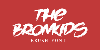 Introducing our newest product: The Bronkids. The Bronkids is a strong brush font, making it suitable for your design projects such as: logo design, clothing design, posters, magazines, quotes and more. Made with a natural touch, this font is the best choice for all your design projects. Includes: - The Bronkids TTF - Multilingual support: AÀÁÂÃÄÅCÇDÐEÈÉÊËIÌÍÎÏNÑOØÒÓÔÕÖUÙÜÚÛWYÝŸÆßÞþ - PUA Encoded Characters: Fully accessible fonts without additional design software.