10,000 search results
(0.124 seconds)
- LP Hand Eins by URW Type Foundry,
$19.99 LP Hand Eins is a typeface designed by German type designer Peter Langpeter. LP has been running his own design studio since 1995, working as a typeface and logo designer, as a calligrapher, cartographer and illustrator. During this time LP created a large number of excellent new typeface designs. LP Hand Eins is well-suited for plenty of applications, e.g. personal correspondence, invitations, greeting cards etc.
 - Spoilers Script by Rastype Studio,
$20.00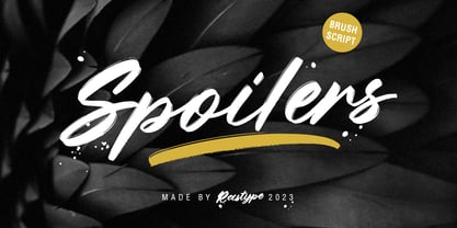 Spoilers Script is a textured brush font, with natural handcraft and underlines and ligatures that make your designs more interesting. Suitable for use in designs, such as clothing, invitations, book titles, stationery designs, quotes, branding, logos, greeting cards, t-shirts, packaging designs, posters and more. The font includes OpenType features with ligature styles and multi-language support. Thank you for your purchase and happy designing!
 - Hill Stone by Bal Studio,
$14.00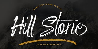 Hill Stone is a textured brush font, a contemporary approach to design, naturally handmade and with underscores. It also has alternatives and ligatures that make your design more attractive. Suitable for use in title design such as clothing, invitations, tittle books, stationery designs, quotes, branding,brand projects, logos, greeting cards, t-shirts, packaging designs, poster, product packaging, news, blogs, everything including personal charm and more.
 - Urban Daily by Mvmet,
$12.00 Urban Daily is a playful daily handwritten font, inspired by graffiti-style tags. It will elevate a wide range of design projects to the highest level. You can use this font for many design ideas such as stickers, t-shirt designs, amazing logo designs, magazine or book covers, comics, cartoon drawings, and many more. This font will add a super cool touch to your designs!
 - Rosttaly Script by Rastype Studio,
$18.00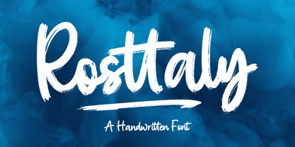 Rosttaly is a textured brush font, with natural handcraft and underlines and ligatures that make your designs more interesting. Suitable for use in designs, such as clothing, invitations, book titles, stationery designs, quotes, branding, logos, greeting cards, t-shirts, packaging designs, posters and more. The font includes OpenType features with ligature styles and multi-language support. Thank you for your purchase and happy designing!
 - Geffroge Authentic by Ronny Studio,
$19.00 Geffroge Authentic is an elegant modern classic Sans Serif font. This font is impressive and features a clean and elegant font, professionally shaped, and as a result, it will easily match a variety of creations that require a different touch. Add it with confidence to your projects, and you'll love the results. This typeface is perfect for elegant logos, branding, travel promotions, layout magazines, beauty products, product packaging, quotes, or simply as a stylish text overlay onto any background image. 2 Font Style: - Regular - Italic Geffroge Authentic Features: - Uppercase - Lowercase - Numbers & Punctuation - Ligature - Multilingual Support - Simple installation All features and special characters of this font are included in one file. So that it is easily accessible by using a program or software that supports opentype such as Adobe Illustrator, Adobe Photoshop, and Adobe Indesign). This font is also very easy to use as it is compatible for all supported software even for non-opentype. Please comment us if you have any questions Thank you and have a nice day. Thank You
 - Milchella by Ronny Studio,
$19.00 Milchella is a luxurious and elegant Serif font. This font is impressive and features a clean and elegant font, professionally shaped, and as a result, it will easily match a variety of creations that require a different touch. Add it with confidence to your projects, and you'll love the results. This typeface is perfect for elegant logos, branding, travel promotions, layout magazines, beauty products, product packaging, quotes, or simply as a stylish text overlay onto any background image. 2 Font Style: - Regular - Italic Milchella Features: - Uppercase - Lowercase - Numbers & Punctuation - Alternate - Ligature - Multilingual Support - Simple installation All features and special characters of this font are included in one file. So that it is easily accessible by using a program or software that supports opentype such as Adobe Illustrator, Adobe Photoshop, and Adobe Indesign). This font is also very easy to use as it is compatible for all supported software even for non-opentype. Please comment us if you have any questions Thank you and have a nice day. Thank You
 - Enamela by K-Type,
$20.00 Enamela (rhymes with Pamela) is a monoline square sans that is available in normal width and condensed versions. Although rooted in the early years of sans serif type, the Enamela fonts have a timeless quality that is practical and unpretentious. The letterforms derive from vitreous enamel signage dating from the Victorian era and widely used in Britain for street nameplates, Post Office signs, the plates on James Ludlow wall postboxes, railway signs and direction signs, as well as for circular Automobile Association wayfinding plaques throughout the first half of the twentieth century. The quirky terminals, stemming from the compression of geometric type, invite comparison with the Charles Wright fonts used for UK vehicle registration plates. Enamela and Enamela Condensed are both available in three weights – regular, medium and bold – and as italics (optically corrected obliques). A commonly used alternative M with a vertex that touches the baseline is provided at the Alt-M (µ) keystroke on a Mac, or Alt-0181 on Windows. A commonly used G with a plain vertical throat, no crosspiece, is assigned Unicode FF27 (full width capital G).
 - Phitagate by Ronny Studio,
$19.00 Phitagate is a signature script font with beautiful strokes. This font is impressive and features a clean and elegant font, professionally shaped, and as a result, it will easily match a variety of creations that require a different touch. Add it with confidence to your projects, and you'll love the results. This typeface is perfect for elegant logos, branding, promotions, layout magazines, beauty products, business cards, weddings, quotes, or simply as a stylish text overlay onto any background image. 2 Style Font : - Regular - Italic Phitagate Features : - Uppercase - Lowercase - Numbers & Punctuation - Alternates - Ligatures - Swashes - Multilingual Support - Simple installation All of features and special characters of this font are included in one file. So it is easy to accessed by using program or software that support the opentype like Adobe Illustrator, Adobe Photosop, and Adobe Indesign). This font also very easy to use because compatible for all software even for non-opentype supported. Please comment us if you have any questions Thank you and have a nice day. thank you
 - Bestigia by Ronny Studio,
$19.00 Bestigia is an elegant and chic Sans Serif font. This font is impressive and features an clean and elegant, professionally shaped font, and as a result, it will easily match a variety of creations that require a different touch. Add it with confidence to your projects, and you'll love the results. This typeface is perfect for elegant logos, branding, travel promotions, layout magazines, beauty products, product packaging, quotes, or simply as a stylish text overlay onto any background image. 4 Style Font : Regular Italic Bold Bold Italic Bestigia Features : Uppercase Lowercase Numbers & Punctuation Alternates Ligatures Multilingual Support Simple installation All of features and special characters of this font are included in one file. So it is easy to accessed by using program or software that support the opentype like Adobe Illustrator, Adobe Photosop, and Adobe Indesign). This font also very easy to use because compatible for all software even for non-opentype supported. Please comment us if you have any questions Thank you and have a nice day. thank you
 - Bellarosta by Ronny Studio,
$15.00 Bellarosta is a signature script font with beautiful strokes. This font is impressive and features a clean and elegant font, professionally shaped, and as a result, it will easily match a variety of creations that require a different touch. Add it with confidence to your projects, and you'll love the results. This typeface is perfect for elegant logos, branding, promotions, layout magazines, beauty products, business cards, weddings, quotes, or simply as a stylish text overlay onto any background image. 2 Style Font : Regular Italic Bellarosta Features : Uppercase Lowercase Numbers & Punctuation Alternates Ligatures Swashes Multilingual Support Simple installation All of features and special characters of this font are included in one file. So it is easy to accessed by using program or software that support the opentype like Adobe Illustrator, Adobe Photosop, and Adobe Indesign). This font also very easy to use because compatible for all software even for non-opentype supported. Please comment us if you have any questions Thank you and have a nice day. thank you
 - Noad Sans by Groteskly Yours,
$60.00 Noad Sans is an experimental sans serif typeface with a strong character and some very unique visual features. At the core of Noad Sans is a sturdy sans serif with closed apertures and fairly simple letterforms. The defining feature of Noad Sans, however, is its visualised nodes: all control points of Bézier curves in each of the fonts in the family are intentionally visualised. The effect of this feature is largely defined by the usage: in titles and larger bodies of text, the visualised nodes stand out and create a rhythmic pattern of their own. In smaller sizes, the sans serif base of the font becomes more prominent and the nodes create a visual fuzz. Noad Sans comes in 6 styles and as a Variable Font with two axes–Optical Size and Slant. The size of each node can be changed from the smallest (Mini and Mini Italic) to the largest (Extra and Extra Italic). Variable Font technology allows you to fine tune the size of the nodes and the slant angle, so that your version of Noad Sans can be truly unique. Noad Sans has a large character set of 570+ glyphs, covering the vast majority of Latin based languages. In addition to that there are dozens of special characters, punctuation, numbers, and symbols. Noad Sans is equipped with a number of useful OpenType features, such as Case-Sensitive Punctuation, Stylistic Alternates, Ligatures, Fractions and many more. Noad Sans began as an experimental project, and during its development the spirit of experimentation was at the heart of the project. Thanks to the unique nature of the typeface, it can feel at home in a variety of settings: from web development, graphic and product design to more novel uses like 3D and NFTs. Noad Sans type family includes 6 static fonts (Mini, Mini Italic, Regular, Regular Italic, Extra and Extra Italic) and one variable font. Each style can be purchased separately. There is a free trial version of Noad Sans that can be downloaded free of charge on MyFonts. For more information on the typeface, feel free to download Noad Sans PDF Specimen.
 - Kunstler Grotesk by HiH,
$12.00 Künstler Grotesk ML is one of a number of typeface designs that attempts to reconcile Germany’s blackletter tradition with the international familiarity of roman letterforms in a simple, robust design suitable for meeting the demands of a modern industrial economy, while rejecting the extraneous ornamentation of the departing Victorian era. It is an all-cap design with a number of playful ligatures. It has an appealing boldness that reverses well. Künstler means ‘artist’ in German. I had always assumed it was a person’s name until I came across the translation. Lesson: conjecture is not fact. Grotesk refers to a sans serif letterform tradition. Kunstler Grotesk was originally released by Bauer'sche Giesserei of Frankfurt am Main circa 1900. Künstler Grotesk ML represents a major extension of the original release, with the following changes: 1. Added glyphs for the 1250 Central Europe, the 1252 Turkish and the 1257 Baltic Code Pages. Added glyphs to complete standard 1252 Western Europe Code Page. Special glyphs relocated and assigned Unicode codepoints, some in Private Use area. Total of 350 glyphs, 260 kerning pairs. 2. Added OpenType GSUB layout features: pnum, salt, dlig (19) and hist. 3. Revised vertical metrics for improved cross-platform line spacing. 4. Redesigned mathematical operators. 5. Included tabular (std) & proportional (opt) numbers. 6. Refined various glyph outlines. 7. Made CcNnOoSsZz-kreska available (salt). 8. Incorporated alternate glyphs in lower case.
 - Arta by Olivier Blanc,
$34.00 ARTA is an ArtDeco style font, inspired by classic font like Newport Classic with elongated typeface with high waisted uppercase letters which curve in an geometric and elegant way. It consisted of really condensed lettering which had little space available. It's a well complet font with 315 Glyphs for most latin languages as "English, French, Spanish, German, Icelandic, Afrikaans, Catalan, Czech, Esperanto, Hungarian, Latin, Latvian, Lithuanian, Maltese, Northern Sami, Polish, Serbo-Croatian, Slovak, Slovene, Sorbian, Turkish and Welsh". ARTA will give to your design an chic presentation, you will be able to generate beautiful writings,thanks to 3 differents type "Light, Regular & Bold". It can be used for Shop, Restaurant, Jewelry, Cosmetic, Press identity & more. I started to work on this typeface at the creation of a logo in 2017 for the butcher shop of my uncle in Luchon in France named "Le Louchébem". I always had in mind to complete & share it. So after some years, I decided that it was time to finish it. This was my first Typography creation and I wanted to make it as an Art Deco typeface. I really love this elegant, high & classy lettering style. I want to bring this 1910's vibes back to be more use in our days.
 - Ribbons by Positype,
$20.00 Ribbon type. Holy grail of complex-lettering-turned typeface or an elusive Loch Ness monster that is often teased, possibly seen in the wild, but never confirmed? From the amazing lettering artist and author Martina Flor and masterful type designer Neil Summerour, comes the aptly named Ribbons. Ribbons is a sincere and well-conceived approach to providing a reliable solution to ribbon and ribbon-styled type for creative professionals when a lettering artist just isn’t available. Ribbons provides both flat and ‘folded’ options with the Regular and Fold styles, but then raises the bar with separate layer styles that will allow you to easily create the elegant back and forth movements produced with ribbon-style lettering we have all come to appreciate. These layer options are provided in both ‘smooth’ and ‘pleated’ connected styles. Flor and Summerour didn’t stop there. Each typeface was expanded with a number of stylistic alternates, additional swashed and flourished letters, ligatures, and even more in order to provide as many decorative options as possible to the creative. To round out the nine fonts available in the typeface and to ‘put a bow on it’, they’ve added a separate Shadow style and two different color fonts (available exclusively with family purchases).
 - Blau by Wilton Foundry,
$19.00 Designed with a hand-chiseled feel, Blau’s sculpted characters add a refined personality to a wide range of brand, corporate, product and service applications. Highlighting the sculpted theme, inkwell treatment variations are prevalent throughout Blau, with several key glyphs that are stenciled for increased legibility. This sturdy, typographic workhorse shines when a slightly unorthodox typographic approach is required — a prime choice for distinctive and dynamic logotype use. The Blau family is available in Light, Light Italic, Regular, Italic, Bold and Bold Italic. The name Blau was chosen to celebrate the color Blue (or Blau in German, Blaauw in Dutch, Bleu French, Blå in Norwegian, Swedish & Danish, Blua in Esperanto, Blár in Icelandic) Blue is nature’s color for water, sky, mountains and glaciers. Blue is embraced as the color of heaven and authority, denim jeans and corporate logos. Surveys in the US and Europe show that blue is the color most commonly associated with harmony, faithfulness, confidence, distance, infinity, the imagination, and cold. In US and European public opinion polls, it is the most popular color, chosen by both men and women as their favorite color. Another very popular Wilton Foundry font in the “blue” family is “Cyan” and “Cyan Neue”.
 - Berndal by Linotype,
$29.99Bo Berndal, the master Swedish typographer, is the eponymous designer of Berndal, a contemporary text family with five different styles. This family represents a new achievement for Bo Berndal, who has spent many years working to optimize text legibility in the printed media. Several small tricks make the Berndal family an interesting milestone in legibility. Berndal's letterforms contain large x-heights. Large x-heights open up the counterforms of letters, making text appear lighter on a page, but their correspondingly shorter ascenders and descenders can hinder legibility. This does not occur in Berndal at all! Coupled with this experiment, Berndal's various font weights display a certain softness and roundness. The letterforms themselves are relatively wide, with an overall consistency in width. The calligraphic nature of the strokes has been minimized, yet a contrast stroke-thickness is still to be noticed within the alphabet. Berndal's five styles offer almost everything that one could want from a good text family. The Regular weight may be paired with Small Caps, Italic, Bold, and Bold Italic. All styles ship in the OpenType format, and include tabular and old style figures. The two italic weights are made up of true italics, not obliques. The Berndal family is a part of the Take Type 5 collection from Linotype GmbH." - La storia by Abo Daniel,
$15.00 Introducing La storia - a fine tip signature font. Beautiful monoline signature, looking so classy and natural. There are 2 version, - Regular - Bold La storia is perfect for branding, photography, invitations, quotes, watermarks, advertisements, product designs, labels, and more that needs a natural sign feel. Includes number-punctuations and multilingual support. I created 89 ligatures to keep this font looks natural. at ct dt et ft gt ht it jt kt lt mt nt ot qt rt st tt ut vt wt xt zt an in un en on ar ir ur er or aa ant int unt ent ont att itt utt ett ott ii ee oo uu ff rr ss xx zz ll adl idl udl edl odl ald ild uld eld old art irt urt ert ort fl fh fb jl Fr Gr Hr Ir Kr Mr Nr Or Pr Tr Ur Vr Wr Dr space-r Titling and Ending Swash - Quick Access Add underscore 2x before or after a lowercase (you can see this on the presentation posters). For example a_ _ or _ _a Swash Lines make this font complete. Add underscore 2x before numbers from 1 to 9, you'll get 9 variations of swash line (as shown in the posters). For example _ _1 Thank You so Much!
 - Gramers by Dora Typefoundry,
$15.00 Gramers is an elegant and modern minimalist font family, a new roman sans serif font carefully crafted, These font ideas come from various references, from vintage, classic, art deco, to the modern era. Carefully drawn with high contrast between the strokes bold and thin with the aim of making even the simplest sans serif letters look sensual, elegant, and warm. The feeling of versatility and luxury you get in Gramers. As you can see in the display of our creations such as Branding, Header, Logotype, Posters, Magazines, Packaging, Art deco wedding invitations, and others. This shows that Gramers can accommodate various design styles. The flat lines cover five styles (each light, regular, medium, semi thick, Thick), each of which includes nearly 293 glyphs. OpenType features include 103 standard ligatures and a small number of character variants, and multilingual support (including multiple currency symbols). Features: • 5 Font weight • uppercase • Alternative & Ligature Styles • Numbers & Punctuation • Characters with accents • Supports Multiple Languages This type of family has become the work of real love, making it as easy and enjoyable as possible. I really hope you enjoy it! I can't wait to see what you make with Gramers! Feel free to use the #Dora Typefoundry and #Gramersfont tags to show what you've done!
 - Hydrargyrum by Type Minds,
$15.00 Hydrargyrum is the Latin form of a Greek word meaning "liquid silver" - mercury. The Hydrargyrum typefaces are designed with characteristics both of a metal and a liquid. The basic shapes of the letters are generally rigid and rectangular (particularly in style C), but the forms are enhanced by fluid curves and gently rounded corners. Hydrargyrum is not recommended for use at small sizes or in lengthy passages of text. It performs best in display-sized settings. Hydrargyrum consists of three styles, each in medium and semibold weights with matching obliques. The A style features solid, standard letterforms including the two-story a and g. Style B substitutes the a, g, M, and N (and related glyphs including numero and trademark symbols) for alternate shapes. The third subfamily takes the rectangular theme to an extreme, eliminating as many slanted strokes as possible from the letterforms. This makes some C-style letters ambiguous with one another, such as the U's and V's. As such, the C style is best used carefully even at larger sizes. The Hydrargyrum fonts are style linked within each style subfamily with, for example, Hydrargyrum A Medium as the regular style, Hydrargyrum A Medium Oblique as the italic, Hydrargyrum A SemiBold as the bold option, etc.
 - Sassoon Joined NORDIC by Sassoon-Williams,
$66.00 These fonts will join-as-you-type in your OpenType application as shown in the posters above. Choose Use Contextual Alternates option in your app to get basic recommended baseline joins for teaching. Additionally, use can choose from 7 Stylistic Sets of alternative letterforms that are so important for Teachers. Create ‘pen lifts’ anytime too! Fonts display unjoined by default on this website and are delivered that way - joining is controlled by your application. Designed for teaching children, these fonts enable progressive pupil exercises for a smooth transition between separate letters and the teaching of joined handwriting. Purchase a single font or the complete package contains the typeface ‘Sassoon Joined’ in a Regular weight only, for the 5 Nordic languages; Finnish (Suomi), Danish (Dansk), Icelandic (íslenska), Norwegian (Norsk), Swedish (Svenska), with English as the default language in all fonts. These fonts are for use with a compatible OpenType applications such as Word to get joined text. Or, enter " | " between letters for unjoined text. Free to download resources Stylistic Sets and how to access the alternative letters feature in these OpenType fonts Purchasers of this font package may use their Order Number to receive a free Copybook PDF by Rosemary Sassoon recommended for effective teaching
 - Berryfield by Missy Meyer,
$12.00 Berryfield started as an experiment: making a font entirely out of geometric shapes. It started with a couple of circles and a couple of rectangles, and was constructed entirely from those parts, and parts made from those parts! For the uppercase, I took style inspiration from the heavy serif classics. But when it came time to create the lowercase set, I took a sharp turn and looked to fun unicase fonts, creating uppercase-height lowercase letters, in addition to uppercase alternates. When I finished Berryfield Regular, I liked it so much I made a lighter version (almost like a typewriter font), and a heavier version, to give you even more variety! Each font in the family contains over 520 characters, including over 300 extended Latin characters for language support. There are also a number of alternate letters to choose from, as well as superscript ordinals (ST, ND, RD, and TH), all of which are PUA-encoded for easy access no matter what design program you're using. Berryfield was a ton of fun to make, and I hope you have a ton of fun using it! It's smooth and easy for both print and crafting; the uppercase alone is straightforward enough for a magazine headline, but combining in the lowercase makes it quirky and fun.
 - Philadelphian by FontMesa,
$29.00 Philadelphian is a revival of a MacKellar, Smiths & Jordan font from 1867 by the same name. The regular version with shadow outline was the only style that was offered in 1867. We've taken the original design further by creating two additional weights of medium and bold plus plain black versions. The medium and bold weights are unique because only the horizontal strokes increase in thickness while the vertical strokes remain the same in each weight. Philadelphian Nite is the plain black version of this font family, Nite is the casual spelling of the word Night meaning dark or black. In the late 1800's Philadelphian was a very popular typeface which can be seen on many billheads and letterheads through the early 1900's. If you're looking for a western style font that doesn't look like any other then Philadelphian is the right choice. While the name doesn't remind you of the cowboy genre we've kept the original name for historical reasons because this font was so popular in its day. We plan on going forward with a weathered version of Philadelphian which will be released under a southwestern style name. With Philadelphian we've decided to set the complete family price to an amount that may be considered on sale all of the time.
 - Evoque Text by Monotype,
$40.00 Evoque Text is a humanist serif type family specifically designed for a comfortable reading experience. This has been achieved by optically adjusting the regular weights from my original Evoque family (released November 2021). You will notice a significantly reduced x-height and longer ascenders and descenders, complemented by adjustments to weight and spacing. This makes Evoque Text a perfect choice for any long passages of text. All OpenType features have been retained from Evoque. A plethora of swash alternates and discretionary ligatures enhance Evoque Text, giving you the opportunity to embellish your typography. Simply activate Stylistic Sets to start adding these flourishes to your text. Other useful features include Small Caps at the click of a button, and Old Style Figures are an option to the default proportional figure style. There are 14 fonts altogether over 7 weights in roman and italic, you can also avail of two variable fonts which allow you to fine tune the weight to your exact liking. Evoque Text has an extensive character set (900+ glyphs) that covers every Latin European language. Key features: 7 weights in both roman and italic 80 Alternates 26 Ligatures Small Caps Variable fonts included with full family Full European character set (Latin only) 900+ glyphs per font.
 - Quarpa by Pasternak,
$9.00 Name: Quarpa Styles: 6 styles Glyphs: 394 Year: 2021 This lofty font features a compact structure as well as a unique combination of rounded corners and square contours. The collection includes six styles: Extra Light, Light, and Semi Light that will ensure elegance; Regular, Medium, Semi Bold and Bold suitable for a solid design. Each of them also has Italic variation. It’s an ideal option for outstanding corporate images, logos, promos, or video presentations. Quarpa has proper kerning, multi-lingual support, and ligatures. Languages: Afrikaans, Albanian, Asu, Basque, Bemba, Bena, Bosnian, Catalan, Cebuano, Chiga, Colognian, Cornish, Corsican, Croatian, Czech, Danish, Embu, English, Esperanto, Estonian, Faroese, Filipino, Finnish, French, Friulian, Galician, German, Gusii, Hungarian, Icelandic, Ido, Indonesian, Interlingua, Irish, Italian, Javanese, Jju, Kabuverdianu, Kalaallisut, Kalenjin, Kamba, Kikuyu, Kinyarwanda, Kurdish, Latvian, Lithuanian, Lojban, Low German, Lower Sorbian, Luo, Luxembourgish, Luyia, Machame, Makhuwa-Meetto, Makonde, Malagasy, Malay, Maltese, Manx, Maori, Meru, Morisyen, North Ndebele, Northern Sotho, Norwegian Bokmål, Norwegian Nynorsk, Nyanja, Nyankole, Occitan, Oromo, Polish, Portuguese, Romanian, Romansh, Rombo, Rundi, Rwa, Samburu, Sango, Sangu, Sardinian, Scottish Gaelic, Sena, Shambala, Shona, Slovak, Slovenian, Soga, Somali, South Ndebele, Southern Sotho, Spanish, Swahili, Swati, Swedish, Swiss German, Taita, Taroko, Teso, Tsonga, Tswana, Turkmen, Upper Sorbian, Vunjo, Walloon, Walser, Xhosa, Zulu
 - Orangerie by Mans Greback,
$69.00 Orangerie is a soft, delicate, and beautiful typeface that captures the essence of fashion, sweetness, and nature. Its flowing, thin lines evoke a sense of calm and loveliness, making it the perfect choice for romantic, professional, and light-hearted projects alike. Inspired by the serene beauty of blooming flowers in a sunlit orangerie, the typeface was meticulously crafted to convey a sense of warmth, tranquility, and sophistication. The result is a font that feels both contemporary and timeless, perfect for a wide range of applications, from branding and packaging to wedding invitations and personalized stationery. Use character ¤ to make decorative nature element such as leaves. Use multiple for different versions. Example: Sweet¤¤¤¤Morning (Download required.) This elegant font comes in four versatile styles: Regular, Bold, and their italic versions, allowing you to craft the perfect tone and atmosphere for your designs. The font is built with advanced OpenType functionality and has a guaranteed top-notch quality, containing stylistic and contextual alternates, ligatures, and more features; all to give you full control and customizability. It has extensive lingual support, covering all Latin-based languages, from Northern Europe to South Africa, from America to South-East Asia. It contains all characters and symbols you'll ever need, including all punctuation and numbers.
 - Go To Town JNL by Jeff Levine,
$29.00 Vintage sheet music for a song from the 1941 animated feature "Mr. Bug Goes to Town" featured a casual, hand-lettered inline type style on its cover page. Recreated as the digital font Go to Town JNL, this design is presented in all the imperfect glory of pen and ink lettering. Go to Town JNL is available in the regular inline version as well as a solid version. A bit about the cartoon: The project was created by the legendary Fleischer Studios in Miami, Florida (they had relocated from New York City), after they could not obtain the rights to adapt Maurice Maeterlinck's "The Life of the Bee". Beset by the expenses of relocating to Florida, growing production costs on the full-length feature cartoon and other problems; mid-way through the making of "Mr. Bug Goes to Town" the Fleischer brothers were forced to sell their studio to their distributor (Paramount Pictures) in order to continue in operation. It was released on Dec. 5, 1941 - just two days before the Japanese attack on Pearl Harbor. The release [and subsequent re-release by Paramount as "Hoppity Goes to Town"] was a disappointing failure, earning [as late as 1946] only $241,000 of the initial cost of $713,511 it took to make the film.
 - KookyKaps - Unknown license

- KookyLower - Unknown license

- Haeock by Pedro Teixeira,
$16.00 Haeock is very readable, an beautiful slab serif designed by Pedro Alexandre Teixeira. This font family works very well on packagings, branding and editorial design, tiles, books, magazines, corporate design.
 - Grotley by Owl king project,
$39.00 Grotley is designed with a sweet shape, supported by several weights, making the equipment very supportive for all design needs or projects that look premium. let's start designing. Be happy
 - Vintage Retro by Nirmana Visual,
$22.00 Vintage Retro Inspired by Renaissance Design Era. Vintage Retro offers beautiful typographic harmony for a diversity of design projects, including logos & branding, social media posts, advertisements & product designs. Happy Creating!
 - Parlinttons Script by FadeLine Studio,
$12.00 Parlinttons Script is a trendy, elegant, natural and thin font. It is suitable for use in various design styles such as watercolors, minimalism, flat, modern designs, classic designs, and more.
 - Nusaibah by Eyad Al-Samman,
$20.00 “Nusaibah” is the first name of an early convert woman to Islam, and the first female to fight in defense of the Islamic religion. Her full name is Nusaibah bint Kaíab Al-Maziniyyah and she took part in the Battles of Uhud, Hunain, Yamama and the Treaty of Hudaibiyah with Islam’s prophet Muhammad (pbuh). Nusaibah is best known for her brave and heroic feat during the Battle of Uhud - fought on March 19, 625 - when she entered the battle carrying a sword and a shield to protect the prophet Muhammad (pbuh) from the arrows of the enemy, and she accordingly received several wounds while fighting and these wounds were not healed until the following year. The prophet Muhammad (pbuh) mentioned her distinct courage by saying that in whichever direction he turned in the battlefield, he could see her defending and protecting him. "Nusaibah" is a modern, geometric, and headline Arabic display typeface. The main trait of this typeface is the novel symmetrical design of its letters which renders it as one of the modern stylish typefaces used for headlines and titles. This is can be noticed in its letters such as “Theh”, “Jeem”, “Ain”, “Sheen”, and others. Moreover, “Nusaibah” font has a character set which supports Arabic, Persian, Urdu, and Latin letters and numerals with a limited range of specific Arabic and Latin ligatures. This font comes in two weights (i.e., regular and bold) with nearly 643 distinctive glyphs. Due to its geometric and linear design, “Nusaibah” typeface is appropriate for heading and titling in Arabic, Persian, and Urdu magazines, posters, and surfaces of different equipment. It is also elegantly suitable for signs, books’ covers, advertisement light boards, products’ and services’ names, and titles of flyers, pamphlets, novels, and books of children. “Nusaibah” typeface is one of the Arabic typefaces that has a novel and modern-day design which can be used in versatile graphic, typographic, and artistic works in different languages for diverse cultures.
 - Mantika Book by Linotype,
$50.99 Mantika Book was originally conceived and drawn parallel to the first Agilita drawings. *[images: pencil drawings] It took several years before having a chance looking at these designs again. But then, my first impulse was to turn this alphabet into a new sanserif, which was to become Mantika Sans. This was the starting point to conceive a super family consisting of different design styles and corresponding weights. The initial drawings of Mantika Book were refined and an Italic was developed to go with it. The aim was to create a modern serif typeface which is reminiscent of humanistic Renaissance typefaces, yet without following a particular historic model. Its large x-height for one is far away from original Renaissance models. Mantika Book was designed as a companion serif typeface to Mantika Sans that can be set for lengthy texts as in books, hence its name. It shares the same x-height with Mantika Sans but has longer ascenders and descenders, making for better word shapes in long, continuous reading. The approach of an ›old-style‹ looking typeface with large minuscules makes Mantika Book also a choice for magazine text settings where one often needs smaller point sizes to fit in a multiple columns layout. The unique details of Mantika Book are the asymetric bracketed serifs in the upright font and its higher stroke contrast than usual in a Renaissance style. The stems are slightly curved inwards. Also, the Italics have a low degree of inclination, which makes longer passages of text set in Italic rather pleasing to read. Another feature Mantika Book shares with Mantika Sans is that all four weights take up the same line length. It covers all European languages plus Cyrillic and Greek, is equipped with lots of useful scientific symbols [double square brackets, angle brackets, empty set, arrows] and the regular weight has small caps. There is a kind of an old-style feeling to Mantika Book, yet these citations were turned into a contemporary serif typeface with a soft but sturdy character.
 - Biphoton by Typodermic,
$11.95 Introducing Biphoton—the monospaced sans-serif typeface designed to elevate your screen captions and UI applications to a new level of clarity and precision. With proportions that match Letter Gothic 12 Pitch, Biphoton can easily replace this font in any application where it has been specified. Unlike Letter Gothic, Biphoton is optimized for screen performance, ensuring that your message is delivered with utmost clarity and impact. This font features a range of currency symbols, numeric ordinals, primes, and common precomposed fractions, ensuring that your message is conveyed with precision and style. Biphoton is available in Regular, Italic, Bold, and Bold-Italic in TrueType, making it easy to integrate into your existing design workflow. Whether you’re designing for mobile or desktop applications, Biphoton delivers superior performance and visual appeal. Most Latin-based European, Vietnamese, Greek, and most Cyrillic-based writing systems are supported, including the following languages. Afaan Oromo, Afar, Afrikaans, Albanian, Alsatian, Aromanian, Aymara, Azerbaijani, Bashkir, Bashkir (Latin), Basque, Belarusian, Belarusian (Latin), Bemba, Bikol, Bosnian, Breton, Bulgarian, Buryat, Cape Verdean, Creole, Catalan, Cebuano, Chamorro, Chavacano, Chichewa, Crimean Tatar (Latin), Croatian, Czech, Danish, Dawan, Dholuo, Dungan, Dutch, English, Estonian, Faroese, Fijian, Filipino, Finnish, French, Frisian, Friulian, Gagauz (Latin), Galician, Ganda, Genoese, German, Gikuyu, Greenlandic, Guadeloupean Creole, Haitian Creole, Hawaiian, Hiligaynon, Hungarian, Icelandic, Igbo, Ilocano, Indonesian, Irish, Italian, Jamaican, Kaingang, Khalkha, Kalmyk, Kanuri, Kaqchikel, Karakalpak (Latin), Kashubian, Kazakh, Kikongo, Kinyarwanda, Kirundi, Komi-Permyak, Kurdish, Kurdish (Latin), Kyrgyz, Latvian, Lithuanian, Lombard, Low Saxon, Luxembourgish, Maasai, Macedonian, Makhuwa, Malay, Maltese, Māori, Moldovan, Montenegrin, Nahuatl, Ndebele, Neapolitan, Norwegian, Novial, Occitan, Ossetian, Ossetian (Latin), Papiamento, Piedmontese, Polish, Portuguese, Quechua, Rarotongan, Romanian, Romansh, Russian, Rusyn, Sami, Sango, Saramaccan, Sardinian, Scottish Gaelic, Serbian, Serbian (Latin), Shona, Sicilian, Silesian, Slovak, Slovenian, Somali, Sorbian, Sotho, Spanish, Swahili, Swazi, Swedish, Tagalog, Tahitian, Tajik, Tatar, Tetum, Tongan, Tshiluba, Tsonga, Tswana, Tumbuka, Turkish, Turkmen (Latin), Tuvaluan, Ukrainian, Uzbek, Uzbek (Latin), Venda, Venetian, Vepsian, Vietnamese, Võro, Walloon, Waray-Waray, Wayuu, Welsh, Wolof, Xavante, Xhosa, Yapese, Zapotec, Zarma, Zazaki, Zulu and Zuni.
 - Clockpunk by Typodermic,
$11.95 Welcome to a world where the past and future collide, where vintage meets modern in a glorious display of Clockpunk. This industrial grotesque typeface is not your ordinary typeface. Inspired by early twentieth-century boxy railroad signage, Clockpunk is the perfect fusion of steampunk and sci-fi. Its sharp serifs and straight lines bring to mind memories of vintage ads painted on brick walls, adding an air of nostalgia and history to your designs. But don’t be fooled by its retro look, Clockpunk is a versatile font that can be used for both small print and headlines. Its Regular and Small Cap styles are perfect for bringing your vision to life, whether you’re designing a poster for a steampunk festival or creating a sci-fi book cover. With Clockpunk, the possibilities are endless. Get ready to take your designs to the next level with this unique and eye-catching typeface. Clockpunk is here to make a statement and leave a lasting impression. Most Latin-based European, Greek, and some Cyrillic-based writing systems are supported, including the following languages. Afaan Oromo, Afar, Afrikaans, Albanian, Alsatian, Aromanian, Aymara, Bashkir (Latin), Basque, Belarusian (Latin), Bemba, Bikol, Bosnian, Breton, Bulgarian, Cape Verdean, Creole, Catalan, Cebuano, Chamorro, Chavacano, Chichewa, Crimean Tatar (Latin), Croatian, Czech, Danish, Dawan, Dholuo, Dutch, English, Estonian, Faroese, Fijian, Filipino, Finnish, French, Frisian, Friulian, Gagauz (Latin), Galician, Ganda, Genoese, German, Greek, Greenlandic, Guadeloupean Creole, Haitian Creole, Hawaiian, Hiligaynon, Hungarian, Icelandic, Ilocano, Indonesian, Irish, Italian, Jamaican, Kaqchikel, Karakalpak (Latin), Kashubian, Kikongo, Kinyarwanda, Kirundi, Komi-Permyak, Kurdish (Latin), Latvian, Lithuanian, Lombard, Low Saxon, Luxembourgish, Maasai, Macedonian, Makhuwa, Malay, Maltese, Māori, Moldovan, Montenegrin, Ndebele, Neapolitan, Norwegian, Novial, Occitan, Ossetian, Ossetian (Latin), Papiamento, Piedmontese, Polish, Portuguese, Quechua, Rarotongan, Romanian, Romansh, Russian, Sami, Sango, Saramaccan, Sardinian, Scottish Gaelic, Serbian, Serbian (Latin), Shona, Sicilian, Silesian, Slovak, Slovenian, Somali, Sorbian, Sotho, Spanish, Swahili, Swazi, Swedish, Tagalog, Tahitian, Tetum, Tongan, Tshiluba, Tsonga, Tswana, Tumbuka, Turkish, Turkmen (Latin), Tuvaluan, Uzbek (Latin), Venetian, Vepsian, Võro, Walloon, Waray-Waray, Wayuu, Welsh, Wolof, Xhosa, Yapese, Zapotec Zulu and Zuni.
 - Xenara by Typodermic,
$11.95 Introducing Xenara—a typeface born from the mechanical precision of vintage calculators and electric typewriters of the 1970s. Designed with technical applications in mind, Xenara features stolid letterforms and rounded ends that communicate a cold, businesslike style with scientific precision. Xenara’s unique design elements include an alternate barless “A”, trident “M”, zigzag “E”, and square “S”, which are available when you use the OpenType alternates feature. These details add a level of technical sophistication to your work that is unmatched by other typefaces. Available in both Regular and Bold weights, Xenara is the perfect choice for projects that require a technical look and feel. Whether you’re creating data-heavy reports, technical manuals, or scientific publications, Xenara will ensure your message is delivered with the utmost precision. Choose Xenara for a typeface that speaks to the essence of science and technology with a timeless design that will endure for years to come. Most Latin-based European writing systems are supported, including the following languages. Afaan Oromo, Afar, Afrikaans, Albanian, Alsatian, Aromanian, Aymara, Bashkir (Latin), Basque, Belarusian (Latin), Bemba, Bikol, Bosnian, Breton, Cape Verdean, Creole, Catalan, Cebuano, Chamorro, Chavacano, Chichewa, Crimean Tatar (Latin), Croatian, Czech, Danish, Dawan, Dholuo, Dutch, English, Estonian, Faroese, Fijian, Filipino, Finnish, French, Frisian, Friulian, Gagauz (Latin), Galician, Ganda, Genoese, German, Greenlandic, Guadeloupean Creole, Haitian Creole, Hawaiian, Hiligaynon, Hungarian, Icelandic, Ilocano, Indonesian, Irish, Italian, Jamaican, Kaqchikel, Karakalpak (Latin), Kashubian, Kikongo, Kinyarwanda, Kirundi, Kurdish (Latin), Latvian, Lithuanian, Lombard, Low Saxon, Luxembourgish, Maasai, Makhuwa, Malay, Maltese, Māori, Moldovan, Montenegrin, Ndebele, Neapolitan, Norwegian, Novial, Occitan, Ossetian (Latin), Papiamento, Piedmontese, Polish, Portuguese, Quechua, Rarotongan, Romanian, Romansh, Sami, Sango, Saramaccan, Sardinian, Scottish Gaelic, Serbian (Latin), Shona, Sicilian, Silesian, Slovak, Slovenian, Somali, Sorbian, Sotho, Spanish, Swahili, Swazi, Swedish, Tagalog, Tahitian, Tetum, Tongan, Tshiluba, Tsonga, Tswana, Tumbuka, Turkish, Turkmen (Latin), Tuvaluan, Uzbek (Latin), Venetian, Vepsian, Võro, Walloon, Waray-Waray, Wayuu, Welsh, Wolof, Xhosa, Yapese, Zapotec Zulu and Zuni.
 - Binder by Grype,
$16.00 Our Binder Family is a revival and expansion of Binder-Style, a typeface designed by Joseph Binder and released by D. Stempel AG in 1959. It originally was a single weight. In later film type adaptations, a bold style, and an outline with drop shadow style were made available. However, this typeface never really had a true sense of family or larger language compatible character set. The original Binder-style typeface found revived popularity with its super condensed style when it appeared on the movie poster for "Silence of the Lambs". It was always a disappointment to me how this typestyle had never gained more traction in use. And so, many years later, we decided to revive the original typestyle, and expand it with a range of weights and obliques to pair with those weights. We've moved most of the unusual lowercase forms to a Stylistic Alternates feature, along with unicast alternates for the Capitals. The family includes a full standard character set with expansive international support of latin based languages, and 4 weights jumping from Thin to Bold, along with 4 accompanying obliques. This family is ready for you to eat it up with a nice glass of Chianti. Here's what's included with the Binder Family: 538 glyphs per style - including Capitals, Lowercase, Numerals, Punctuation and an extensive character set that covers multilingual support of latin based languages. 4 weights: Thin, Light, Regular, & Bold. Accompanying Obliques with each weight/width style. TTF formatted fonts have been hinted for optimal performance. Here's why the Binder Family is for you: You're in need of a stylish condensed font with a variety of weights and obliques for your designs You're a fan of the typographic works of Joseph Binder, but wish there was more to them You love the style of Agency and Bank Gothic, but want something uber-narrow You are desperate to recreate the movie poster from Silence of the Lambs You just like to collect quality fonts to add to your design arsenal
 - Kindah by Eyad Al-Samman,
$30.00 “Kindah” is a Yemeni ancient tribe with evidence of its existence going back to the second century B.C.E. The kings of Kindah exercised an influence over a number of associated tribes more by personal prestige than by coercive settled authority. The Kindites were polytheistic until the 6th century CE, with evidence of rituals dedicated to the gods Athtar and Kahil found in their ancient capital in south-central Arabia. It is not clear whether they converted to Judaism or remained pagan, but there is a strong archaeological evidence that they were among the tribes in Dhu Nuwas' forces during the Jewish king’s attempt to suppress Christianity in Yemen. They converted to Islam in the mid-7th century CE and played a crucial role during the Muslims' conquests of their surroundings. Among the most famous figures from Kindah known as Kindites are Imru' al-Qays (526-565?), al-Ash'ath ibn Qays (599-661), Hujr ibn 'Adi al-Kindi (?-660), al-Miqdad Ibn Aswad al-Kindi (589-653), and Abu Yusuf Yaíqub ibn Ishaq as-Sabbah al-Kindi (805-873) known as the Philosopher of the Arabs. "Kindah" font is a modern Kufic font comes in three weights (i.e., bold, regular, and thin) which is mainly designed to be used as a display Arabic font. The main feature of this typeface is the mixture of curves and rectangular shapes used in the designed Arabic characters. Kindah font was inspired by the design of the Yemeni modern windows of houses in which only top part of the arc is used for building such windows which reflects the originality of the architecture preserved in this part of the world. "Kindah" font is extremely outstanding when used in printed materials with big sizes especially for headline, titles, signs, and names of brands. Hence, it is suitable for books' covers, advertisement light boards, and titles in magazines and newspapers. It has also a Latin character set and it also supports several Arabic character sets which makes it proper for composing alphabetical and numerical words in Arabic, Urdu, and Persian.

