10,000 search results
(0.287 seconds)
- Gitenn by SteerFonts,
$7.50 Gitenn - is a font that you can use in your projects and features both Latin and Russian alphabets. I did it cheap enough that anyone with a couple bucks could buy it. I think that anyone who wants to buy a font wants it to be unique, and most fonts are of the same type, so I made it extraordinary and beautiful.
 - Prismatic Spirals Pro by MMC-TypEngine,
$182.00 PRISMATIC SPIRALS PRO FONT! The Prismatic Spirals PRO is a Decorative Type-System and ‘Assembling Game’, itself. Settled in squared pieces modules or tiles, embedded by unprecedented Intertwined Prismatic Structures Design, or intricate interlaced bars that may seem quite “impossible” to shape. Although it originated from the ‘Penrose Square’, it may not look totally as an Impossible Figures Type of Optical Illusions. More an “improbable” Effect in its intertwined Design, that even static can seem like a source of Kinetical Sculptures, or drive eyes into a kind of hypnosis. Prismatic Spirals Pro has two related Typefaces both more basic or easier to use versions, the Default Family plus its “bold” braided version Prismatic Interlaces… PRO provides a more advanced, complex, and twisted Design, plus requires to be typed alternating caps. Instructions: Use the Map Font Reference PDF as a guide to learn the 'tiles' position on the keyboard, then easily type and compose puzzle designs with this font! All alphanumeric keys are intuitive or easy to induce, you may easily memorize it all! Plus, often also need to consult it! *Find the Prismatic Spirals Pro Font Map Reference PDF Here! (!) Is recommended Print it to have the Reference or open the PDF to also copy and paste, when consulting is required or when it may be difficult to access, depending on the keyboard script or language. The 2 glyphs sets are separated in colors for facilitating. Also use the Map Font with key captions or switch to it for ensure that the characters are alternating between both uppercase and lowercase letters as other Keys as numbers, marks, and punctuation along the strings, holding Shift one by one or actually two by two. As a Tiles Type-System, the line gap space value is 0, this means that tiles line gaps are invisibly grouted, so the user can compose designs, row by row, descending to each following row by clicking Enter, same as line break, while advances on assembling characters. Background History: The first sketches of my Prismatic Knots or Spirals Designs dates back then from 2010, while started developing hand-drawn Celtic Knots and Geometric Drawings in grid paper, while engage to Typography, Sacred Geometry and the “Impossible Figures” genre… I started doing modulation tests from 2013, until around 2018, I got to unravel it in square modules or tiles from the grid, then idealized it as fonts, along with other Type projects. This took 13 years to come out since the first sketches and 6 months in edition. During the production process some additional tiles or missing pieces were thought of and added to the basic set, which firstly had only the borders, corners, crossings, nets, Trivets connectors or T parts and ends, then added with nets and borders integrations. Usage Suggestions: This type-system enables the user to ornate and generate endless decorative patterns, borders, labyrinthine designs, Mosaics, motifs, etc. It can seem just like a puzzle, but a much greater tool instead for higher purposes as to compose Enigmas and use seriously. As like also to write Real Text by assembling the key characters or pieces, this way you can literarily reproduce any Pixel Design or font to its Prismatic Spirals correspondent form, as Kufic Arabic script and further languages and compose messages easily… This Typeface was made to be contemplated, applied, and manufactured on Infinite Decorative Designs as Pavements, Tapestry, Frames, Prints, Fabrics, Bookplates, Coloring Books, Cards, covers or architectonic frontispieces, storefronts, and Jewelry, for example. Usage Tips: Notice that the line-height must be fixed to 100% or 1,0. In some cases, as on Microsoft Word for example, the line-height default is set to 1,15. So you’ll need to change to 1,0 plus remove space after paragraph, in the same dropdown menu on Paragraph section. Considering Word files too, since the text used for mapping the Designs, won't make any literal orthographical sense, the user must select to ignore the Spellcheck underlined in red, by clicking over each misspelled error or in revision, so it can be better appreciated. Also unfolding environments as Adobe Software’s, the Designer will use the character menu to set body size and line gap to same value, as a calculator to fit a layout for example of 1,000 pts high with 9 tiles high, both body size and line gap will be 111.1111 pts. Further Tips: Whenever an architect picks this decorative system to design pavements floor or walls, a printed instruction version of the layout using the ‘map’ font may be helpful and required to the masons that will lay the tiles, to place the pieces and its directions in the right way. Regarding to export PNGs images in Software’s for layered Typesetting as Adobe Illustrator a final procedure may be required, once the designs are done and can be backup it, expanding and applying merge filter, will remove a few possible line glitches and be perfected. Technical Specifications: With 8 styles and 4 subfamilies with 2 complementary weights each (Regular and Bold) therefore, Original Contour, Filled, Decor, with reticle’s decorations and 2 Map fonts with key captions. *All fonts match perfectly when central pasted for layered typesetting. All fonts have 106 glyphs, in which 96 are different keys with 2 versions of each of both caps and shift keys, plus a few repeated for facilitating. It was settled this way in order for exchanging with its Prismatic relative fonts which has only 48 different keys repeated twice. Concerning tiles manufacturing and Printed Products as stickers or Stencils, any of its repeated pieces was measured and just rotated in different directions in each key, so when sided by other pieces in any direction will fit perfectly without mispatching errors. Copyright Disclaimer: The Font Software’s are protected by Copyright and its licenses grant the user the right to design, apply contours, plus print and manufacture in flat 2D planes only. In case of the advent of the same structures and set of pieces built in 3D Solid form, Font licenses will not be valid or authorized for casting it. © 2023 André T. A. Corrêa “Dr. Andréground” & MMC-TypEngine.
 - Danah by Eyad Al-Samman,
$35.00 Danah” is the first name of a very close and cherished classmate, friend, and peer. Danah is a Palestinian woman who used to study with me in the same university where I was honorably introduced to her several years ago. In fact, I decided to dedicate this typeface wholly to her in return for all the years of friendship that we had spent together as classmates during the late 1990s. She was—and absolutely still—a source of support and inspiration for me in life due to her brilliant, big-hearted, and philanthropic personality. Danah likes different things in life and among them the sea, horses, reading, and also travelling. She lives and works now in Palestine, and yearns for being granted a new life—like many other free Palestinians—full of freedom, peace, and happyness. Danah® is a handwriting and scribbly Arabic display typeface. The main trait of this typeface is the realistic handwriting design of its letters and ligatures. This feature renders it as one of the stylish typefaces used for headlines and also texts. Among the distinguished letters of Danah® typeface are the “Qaaf”, “Kaaf”, “Meem”, “Noon”, and others. Moreover, Danah® typeface has a character set which supports Arabic, Persian, Urdu, and Latin letters/numerals with a limited range of specific Arabic and Latin ligatures. This font comes in a single weight (i.e., regular) with exactly 639 distinctive glyphs. Due to its free and streamlined design, Danah® typeface is appropriate for heading and text in Arabic, Persian, and Urdu. It can be graphically and visually exploited in magazines, posters, and interfaces of different things such as clothes and equipment. Moreover, it can be pleasingly used in writing personal, friendly, and unofficial letters, messages, documents, invoices, notes, dispatches and menus which require a smoothed handwritten touch and trend. It is also elegantly suitable for signs, books’ covers, advertisement light boards, and titles of flyers, pamphlets, novels, and books of children and adults. In brief, Danah® typeface is one of the new hand-drawn typefaces which can be brought into play efficiently in diverse graphic, typographic, calligraphic, and artistic works in different languages and cultures. 2018-09-13 00:00:00.000 10.0000 F25946-S114426 10913 Timeless URW Type Foundry https://www.myfonts.com/collections/timeless-duplicate-font-urw NULL NULL 2016-01-08 00:00:00.000 89.9900 F10913-S42560 54569 Jellofries Maulana Creative https://www.myfonts.com/collections/jellofries-font-maulana-creative https://cdn.myfonts.net/cdn-cgi/image/width=417,height=208,fit=contain,format=auto/images/pim/10000/JtHgrbkPi7YU282OWix69Tqb_97b690350e4b3ed453d7c27fe0eb6664.png Jellofries is a fancy brush script font. With brush bold contrast stroke, fun character with a bit of ligatures and alternates. To give you an extra creative work. Jellofries font support multilingual more than 100+ language. This font is good for logo design, Social media, Movie Titles, Books Titles, a short text even a long text letter and good for your secondary text font with sans or serif. Make a stunning work with Jellofries font. Cheers, Maulana Creative 2022-05-06 00:00:00.000 12.0000 F54569-S252887 38361 Alt Moav ALT https://www.myfonts.com/collections/alt-moav-font-andreas-leonidou https://cdn.myfonts.net/cdn-cgi/image/width=417,height=208,fit=contain,format=auto/images/pim/10000/70046_aa489c02cd589f8f924b405c901a8014.png Moav is a geometric experimental display typeface for use on logos,posters etc. 2011-12-13 00:00:00.000 15.0000 F38361-S179452 42255 M Elle HK Monotype HK https://www.myfonts.com/collections/m-elle-hk-font-monotype-hk NULL HK series fonts are in Unicode encoding and consists of BIG 5 character set and HKSCS characters. The character glyphs are based on the regular Traditional Chinese writing form and style. It is generally used in Taiwan ROC, Hong Kong and Macau. 2011-05-11 00:00:00.000 523.9900 F42255-S193845 71839 Kaerobi Kulokale https://www.myfonts.com/collections/kaerobi-font-kulokale https://cdn.myfonts.net/cdn-cgi/image/width=417,height=208,fit=contain,format=auto/images/pim/10004/ieVtB18gl4EgKrVVDIPLtX8b_33d93ffd2cd339b2544feb3d7a0a3121.png Kaerobi is an condensed display font, and with a style that is very different from the others. This font comes in four styles, Regular, Oblique, Rough, and Outline Version. Kaerobi is well-suited for posters, social media, headlines, magazine titles, clothing, large print formats - and wherever you want to be seen. Inspired by the style of design that is currently popular, and this is the answer to all the needs of every idea that you will pour in this modern era. We highly recommend using a program that supports OpenType features and Glyphs panels such as Adobe Illustrator, Adobe Photoshop CC, Adobe InDesign, or CorelDraw, so you can see and access all Glyph variations. This font is encoded with Unicode PUA, which allows full access to all additional characters without having special design software. Mac users can use Font Book, and Windows users can use Character Map to view and copy one of the extra characters to paste into your favorite text editor / application. Thank You. 2022-08-16 00:00:00.000 17.0000 F71839-S298671 52588 The Heather Romie Creative https://www.myfonts.com/collections/the-heather-font-romie-creative https://cdn.myfonts.net/cdn-cgi/image/width=417,height=208,fit=contain,format=auto/images/pim/10000/Lc4estBSB0wCiDunz9GNDUcb_097035319875b31f0a18a4bb2e8e675b.png The Heather Script is a formal calligraphy design, including Regular. This font is casual and pretty with a stroke. Can be used for various purposes. such as logos, product packaging, wedding invitations, branding, headlines, signage, labels, signatures, book covers, posters, quotes and much more. Heather Script featuring OpenType style alternatives, ligatures and International support for most Western Languages is included. To enable the OpenType Stylistic alternative, you need a program that supports OpenType features such as Adobe Illustrator CS, Adobe Indesign & CorelDraw X6-X7, Microsoft Word 2010 or a later version. How to access all alternative characters using Adobe Illustrator: *https://www.youtube.com/watch?v=XzwjMkbB-wQ Heather Script is coded with PUA Unicode, which allows full access to all additional characters without having to design special software. Mac users can use Font Book , and Windows users can use Character Map to view and copy any additional characters to paste into your favorite text editor/application. How to access all alternative characters, using the Windows Character Map with Photoshop: *https://www.youtube.com/watch?v=Go9vacoYmBw 2022-02-23 00:00:00.000 19.0000 F52588-S242949 16709 Pastina Lebbad Design https://www.myfonts.com/collections/pastina-font-lebbad-design https://cdn.myfonts.net/cdn-cgi/image/width=417,height=208,fit=contain,format=auto/images/pim/10000/220264_a574aa9e49d2f9f1da3950f1fef09123.png Pastina is an elegant serif font consisting of caps, lower case, and alternate characters. Soft serifs and the graceful flow of each character add to the classic feel of this font. 2008-07-31 00:00:00.000 24.9500 F16709-S66588 2367 Munira Script Picatype https://www.myfonts.com/collections/munira-script-font-picatype https://cdn.myfonts.net/cdn-cgi/image/width=417,height=208,fit=contain,format=auto/images/pim/10000/309621_5c93006e7517281c082dc7c75bfd1c2b.png Munira Script is a modern calligraphy design. This font is casual and pretty with swashes. It can be used for various purposes. such as logos, product packaging, wedding invitations, branding, headlines, signage, labels, signature, book covers, posters, quotes and more. Munira Script features OpenType stylistic alternates, ligatures and International support for most Western Languages. To enable the OpenType Stylistic alternates, you need a program that supports OpenType features such as Adobe Illustrator CS, Adobe Indesign & CorelDraw X6-X7, Microsoft Word 2010 or later versions. How to access all alternative characters using Adobe Illustrator: https://www.youtube.com/watch?v=XzwjMkbB-wQ How to access all alternative characters, using Windows Character Map with Photoshop: https://www.youtube.com/watch?v=Go9vacoYmBw Munira Script is coded with PUA Unicode, which allows full access to all the extra characters without having special designing software. Mac users can use Font Book , and Windows users can use Character Map to view and copy any of the extra characters to paste into your favourite text editor/app. If you need help or have any questions, please let me know. I'm happy to help :) Thanks & Happy Designing! 2019-07-05 00:00:00.000 10.0000 F2367-S10062 27004 Ketimun Hanoded https://www.myfonts.com/collections/ketimun-font-hanoded https://cdn.myfonts.net/cdn-cgi/image/width=417,height=208,fit=contain,format=auto/images/pim/10000/306179_8517cd9a57ccc15cff68737e17de4e85.png Ketimun means ‘cucumber’ in Bahasa Indonesia. At home we eat a lot (A LOT) of Indonesian food, which often includes Acar Ketimun (Sweet/sour cucumber salad). I usually make the simple version, but sometimes I go for the more elaborate cucumber salad (the recipe of which you’ll find on poster 2). Ketimun font is a rather delicious script font; uneven, organic and full of life. Comes with a fresh taste and lots of diacritics. 2019-06-06 00:00:00.000 15.0000 F27004-S120951 38675 Psalterium Alter Littera https://www.myfonts.com/collections/psalterium-font-alter-littera https://cdn.myfonts.net/cdn-cgi/image/width=417,height=208,fit=contain,format=auto/images/pim/10000/204202_94b78204200645ccd1daa5d5f1a63916.png A clean, smooth adaptation of the magnificent gothic types used by Johann Fust and Peter Schöffer in their famous Mainz Psalter (Psalterium Moguntinum) of 1457, also used in their Canon of the Mass (Canon Missae) of 1458, and in their Benedictine Psalter (Psalterium Benedictinum) of 1459. [Although these works were published after Gutenberg’s break with Fust, it is generally agreed that Gutenberg was working along with Fust and Schöffer on the Mainz Psalter while the 42-line Bible was still being printed.] In addition to the usual standard characters for typesetting modern texts, the font includes a comprehensive set of special characters, uncial initials (adapted from both the Mainz Psalter and early sixteenth-century Dutch types by Henric Pieterszoon), alternates and ligatures, plus Opentype features, that can be used for typesetting (almost) exactly as in the Mainz Psalter and later incunabula. The main historical sources used during the font design process were high-resolution scans from the copy of the Mainz Psalter preserved at the Österreichische Nationalbibliothek, Vienna (the only copy whose colophon includes the famous printer’s mark of Fust and Schöffer). Other sources were as follows: Masson, I. (1954), The Mainz Psalters and Canon Missae, 1457-59, London: Printed for the Bibliographical Society; Kapr, A. (1996), Johann Gutenberg - The Man and his Invention, Aldershot: Scolar Press (ch. 8); Füssel, S. (2005), Gutenberg and the impact of printing, Burlington: Ashgate (ch. 1); and Man, J. (2009), The Gutenberg Revolution, London: Bantam (ch. 8). Specimen, detailed character map, OpenType features, and font samples available at Alter Littera’s The Oldtype “Psalterium” Font Page. Note: Several uncial initials in The Oldtype “Psalterium” Font have been derived from corresponding characters in The Initials “Gothic C” Font, adjusting them to cope with the special (large) x-height and letter spacing of the Psalterium font (so the two sets of initials are not directly interchangeable). 2012-07-06 00:00:00.000 25.0000 F38675-S178340 23791 VLNL Donuts VetteLetters https://www.myfonts.com/collections/vlnl-donuts-font-vetteletters https://cdn.myfonts.net/cdn-cgi/image/width=417,height=208,fit=contain,format=auto/images/pim/10001/190114_ca5047d6d6754375933067862f9328a8.png VLNL Donuts’ first incarnation was designed already in 2005 by DBXL as a logo for Dutch funky house music outfit Hardsoul, and since then has been used for lots of music related projects. Donuts is heavily infused by hip 1970s geometric fonts like Blippo, Pump and ITC Bauhaus, but nonetheless has both feet in this modern day and age. Meticulously designed and tightly spaced, VLNL Donuts is very suitable for logos, headlines and music artwork. We especially recommend using it on big 12 album covers. Oh, and it got its name for obvious reasons (“the O looks like one...’) VLNL Donuts is deep fried, glazed and can be covered in a variety of sweetness: sprinkles, cinnamon, coconut, chopped peanuts, powdered sugar or maple syrup. They also can be filled with cream, custard or jam. As a very sweet and saturated snack should, VLNL Donuts is fitted with a full set of alternate swoosh caps that can be deployed to liven up your already ‘out there’ designs.
 - HGB Bluesband Two by HGB fonts,
$23.00 The roots of this font go back to 1967. A book title in trendy letters was created in a completely ingenuous way as a film prop for a Super 8 fun film. I drew the letters with felt-tip pen and poster paint without thinking too much about it. It wasn't until a good 50 years later that I realized, this was a first awkward typeface draft. The flower power vibe was captured here subconsciously. In 2019 I completed the few glyphs and created variants that I would not have thought of at the time.
 - Drowsy Lunch by PizzaDude.dk,
$15.00 The inspiration for this font (as well as the name!) comes from a London cafe I visited years ago. I was fascinated with the handwritten menu - irregular and awkward, yet refreshingly charming. I did my best to recall that particular look by adding 4 slightly different versions of each lowercase letter. The name of the font comes from the speed of the waiter...or the lack of it! But luckily he took his time, otherwise I wouldn't have had the time to really look at the handwritten menu! :)
 - Lemony Crumpet by Kitchen Table Type Foundry,
$10.00 A crumpet is a small griddle bread, mostly enjoyed in the UK, North America, Australia and New Zealand. I have never had one, but I have heard of them and I like the name - which is probably Welsh in origin. Lemony Crumpet is a whimsical, handmade font. It is tall & thin, shaky and jumpy and I wouldn’t use it as a poster font because of its delicate properties, but it would look fantastic on book covers, product packaging and websites. Comes with extensive language support and a set of alternates for the lower case letters.
 - Nefarious by Hanoded,
$15.00 A few fonts ago I mentioned the fact that I like posh English words; words you don’t really use in conversation. As I am busy expanding my ‘halloween’ font collection, I came across the beautiful word Nefarious. It means wicked or evil and when you say the word, it even sounds evil! Fantastic! Nefarious is a halloween/witches font. It looks like my Griezelig font, but it is rougher and spikier. Use Nefarious for your halloween invitations, posters and books about evil geniuses. Comes with all diacritics and a bunch of swashes as well.
 - SideNote by Jamie Clarke Type,
$25.00 Hello! I’m SideNote. I specialize in annotations, headings and friendly dialogue. I’m perfect for descriptions and explanatory text. Use me to deliver tricky information in a helpful, reassuring manner. I look friendly and relaxed but professional enough to make you look awesome. I add personality to otherwise dry information making it fun and easier to understand. Whether you’re pulling some slides together or explaining your work, think of me as your friendly assistant I come with all sorts of useful features, like emoji, arrows and underlines. See my webpage for more details: https://www.jamieclarketype.com/SideNote
 - Smooth Brushings by Hanoded,
$20.00 When I was painting this font, I suddenly had the movie Cool Runnings (1993, directed by Jon Turteltaub) in my head. I had to name the font, so I came up with Smooth Brushings. Of course, this font has nothing to do with the movie. Smooth Brushings is an all caps brush font, which was made with a stiff brush and some China Ink. Upper and lower case glyphs can be mixed. It is a very legible and clear font, ideally suited for posters, product packaging and book covers.
 - Xanthine by Hanoded,
$15.00 Xanthine… is a purine base found in most human body tissues. Yes, you can forget that. I don’t even know what it means, but I suddenly realised that I was running low on fonts with an ‘x’ in the name. Xanthine font is a messy brush: it is all caps, but upper and lower case mingle freely. It comes with a whole bunch of diacritics and some interesting ligatures as well. I have included a very handy shapez pack and a truckload of arrows - anything to make you happy…
 - Orenji by Hanoded,
$15.00 Orenji is the Japanese word for Orange: it is a phonetic translation of the English word. I was actually looking for a certain shade of orange (the color), when I stumbled upon this fun word. I already toyed with the idea of creating a font loosely based on my son Sam's handwriting and I figured Orenji would be a good name for it. Orenji is a fun, cute and extravagant font. It has some uniquely shaped glyphs, comes with a giggle and a hug and more diacritics than you can throw a banana at.
 - Guilty Pleasure by Hanoded,
$15.00 Some time ago, my kids asked me what kind of sweets I really liked. To be honest, I don’t actually like sweets at all - never have, never will. BUT… you can wake me up for chocolate and ice cream! Those are my guilty pleasures! Guilty Pleasure is a handmade font. I used China Ink and a brush to create all the glyphs. Guilty Pleasure is a very distinct display font. I recommend you use it for your ice cream or chocolate packaging… but that, of course, is entirely up to you!
 - Camping Holiday by Hanoded,
$15.00 My family and I are off to England for a camping holiday this summer. I have booked some small, basic campsites which are close to nature. The kids love to camp, especially since we can have a campfire at night! I was thinking about this when I worked on Camping Holiday font. It is a cute sans serif ‘book cover’ font. That doesn’t mean that you cannot use it for something else; fancy a poster? No problem. Need a font for your website? Go ahead! It’s yours for the taking!
 - Peanut Ache by PizzaDude.dk,
$17.00 I don't know what it is with me and peanuts. I simply love it! I like peanuts in all kinds of meals: breakfast, lunch, dinner and even in desserts! But with an addiction like this, an overload of peanuts sometimes appear...and I guess that's where the name of this font comes from :) The Peanut Ache font is super clean, and super steady - use it for anything that needs a clean look! I've added 5 slightly different versions of each letter, and this really helps making your text to look even more fresh and lively!
 - Artificial Flavour by Kitchen Table Type Foundry,
$15.00 I do groceries a couple of times a week. When I am shopping for food, I always read the ingredients list; I don’t want too much sugar, nor palm oil, trans fats or a lot of E numbers. It used to be quite hard finding products that didn’t contain artificial flavours or colouring, but it is getting better. Artificial Flavour is an anti-ode to the time we couldn’t get enough of the stuff - it is a handmade, all caps font which comes with extensive language support and a sweet set of alternates.
 - HGB Bluesband One by HGB fonts,
$23.00 The roots of this font go back to 1967. A book title in trendy letters was created in a completely ingenuous way as a film prop for a Super 8 fun film. I drew the letters with felt-tip pen and poster paint without thinking too much about it. It wasn't until a good 50 years later that I realized, this was a first awkward typeface draft. The flower power vibe was captured here subconsciously. In 2019 I completed the few glyphs and created variants that I would not have thought of at the time.
 - Cadora Woods by Hanoded,
$15.00 Last year I walked half of Offa’s Dyke path, a long distance trail on the Welsh/English border. Walking the trail, I came across a beautiful stretch of forest with a lovely name: Cadora Woods. Cadora Woods font was made with a Japanese brush pen. It sort of looks medieval and a friend of mine suggested it would be the font of choice for maps of ‘The Shire’. I guess that is true, but I am convinced you can come up with some innovative uses for this font!
 - Drama Queen by melifonts,
$5.00 Drama Queen is a remake of the very first font I ever made. At the time, I was thirteen years old, and this was my handwriting. This font fully supports the following languages: Bulgarian, Czech, Danish, Dutch, English, Estonian, Finnish, French, German, Icelandic, Italian, Norwegian, Polish, Portuguese, Romanian, Russian, Serbian, Slovak, Spanish, Swedish, Ukrainian. If your language is not listed, or if I've missed a character in a language I claim to support, please contact me! I will be happy to add characters as needed, and will consider supporting more languages if there is interest.
 - Biscuit Juice by PizzaDude.dk,
$20.00 A biscuit and a cup of coffee, a biscuit and a cup of tee ... both are obvious - but what about a biscuit and a glass of juice? I loved that combination as a kid (and I even crumbled the biscuit in the juice...yuck...I wouldn't do that today!!! Anyway, here you have a legible uppercase font with a nice handmade look. I've added 4 different versions of each letter, which makes the font look really nice and slightly jumpy. I even added two nice swashes to the N and K. Enjoy!
 - Behrens Schrift by Solotype,
$19.95A simplified blackletter designed by Peter Behrens, architect and graphic artist who came into prominence around 1900. Issued by Rudhard's Typefoundry, Offenbach A. M., this face was typical of many in the Jugendstil period. Its squarish look works well in Craftsman period layouts. - Abi Nouveau JNL by Jeff Levine,
$29.00Inspired by the images on some EBay auctions, Jeff Levine sketched out and revived this early 1900s serif design used on some French sign letters. Named for a friend in the graphics industry, this font captures the charm of the Art Nouveau period. - Candor by Daily Studio,
$17.00 Candor is a typeface designed by Daily Studio. This font has over 200 glyphs with multilingual letters included. Perfect for gorgeous logos and titles. You can play with the letters and make your projects look marvelous. it will pair beautifully with many fonts.
 - Olympik by The Northern Block,
$16.70 A multi-lined typeface digitally remastered from the 1970s Letraset font Optex. The font has gone through an exacting design program with over 100 hours in the production. Details include: three unique styles, a full character set, manually edited kerning and Euro symbol.
 - Taco by FontMesa,
$25.00 Taco is a new Mexican style font family based on our Tavern and Algerian Mesa type designs. When I finished the extra heavier weights for Tavern I decided to play around with a decorated version, the extra bold letters allowed for much more room to work with an inlay pattern. After experimenting with several designs I decided on a Mexican pattern because the original base font is very popular in Mexican restaurant logos and menus plus it's frequently used on Tequila bottle labels. I originally planned three weights for the Taco font family, however, after completing the bold weight I've decided to release it now so you may put it to use while the regular and extra bold are being produced, sorry I can't estimate a release date for the two other weights. To use the fill font layers you'll need an application that allows you to work in layers such as Adobe Creative Suite products. The Taco Fill Uno font may be used as a stand alone font, however, we recommend searching for our Tavern font family where you'll find three different bold weights of this same design. Opentype features aware applications are also needed for accessing the many alternate glyphs in Taco, all the alternates that you love in our Tavern fonts are also available in Taco. While the fill font layers are in registration with one another some applications may throw them out of alignment by changing the spacing. Custom inter letter spacing in Adobe Creative Suite may also throw the fill fonts out of alignment. We recommend doing your custom spacing first then duplicate the type layer and change to the next fill font and color. The inspiration for the Taco name of this font family was from a homemade Taco dinner I made for a guest at my house, after dinner I searched to see if there was a commercial font named Taco. There was no such font named Taco and the rest is history. The old Stephenson Blake Algerian font has come a long way since 1908, and we're not done with it yet. We hope you enjoy our Taco font family, we're looking forward to see it in use.
 - Frogurt by Missy Meyer,
$14.00 Frogurt is a soft, plump, rounded slab serif font full of fun! Its fat curves make me think of frozen yogurt, and I've always preferred the shorthand "frogurt" to "fro-yo." I was inspired by a 30-year-old hand-carved wooden sign; when I went to try to find a font with a similar look, I couldn't really find anything soft and funky enough! It was a real Goldilocks situation: that one was too thin, that one's corners were too sharp, that one's baseline was too strict. So since I couldn't find something I liked, I made something I liked! I gave Frogurt big pillowy slab serifs, a slightly irregular baseline, and just enough tilt and variation to be fun while still keeping things really clean and readable. The outlines are cleaned up and sharp, so Frogurt will work well for both printing and cutting. Frogurt clocks in with just over 570 glyphs total, including all of the basics (A-Z, a-z, 0-9, and a ton of punctuation), plus over 310 extended Latin characters for language support, and over 50 alternates and ligatures to add some variety and flair. Frogurt is PUA-encoded for easy access to all characters.
 - KAMPUCHEA - Unknown license

- Olivie Font Duo by Calamar,
$10.00 Olivie Font Duo is the third font duo created by me and honestly I totally love each my duet. Today I present you the new font pair that already matched up and ready to be used together for many of your projects. Here’s a run through everything included in this product: - Olivie Script features 90 ligatures giving you the options to look totally custom. Font also includes full set of uppercase and lowercase letters, multilingual symbols, numerals, punctuation. - Olivie Sans Serif is a classy high contrast all-caps font that contains only uppercase characters, numerals and punctuation. All fonts available for Western European, Central European and South Eastern European Languages. You can check your language typing characters in text box above. Olivie Font Duo has a smooth texture, so would be perfect for all types of printing techniques.
 - As of my last update in April 2023, there isn't a widely recognized font named "Spaceman" within major font libraries or among widely used typefaces. However, let's imagine what a font aptly named "S...
- Distance Rider by B1 Industries,
$4.50 This font is useful for all sorts of things (Sites, Gaming, Signage, Electronics, Logos, etc.) I wanted to create a Type Face like this, so I did, making sure to check for errors…
 - Band Wagon by Hanoded,
$15.00 I don't know why exactly, but I felt the need to create a Western font. Band Wagon is a handcrafted cowboy font. It comes with curly slabs, spurs and ye olde outlaw spirit.
 - Pragmatik by Christopher Stahl,
$24.90 Pragmatik is a carefully crafted Square Sans by Christopher Stahl, awarded with a Commendation at the Art Director's Club Germany Junior Competition 2011 and selected as Font of the Week 42.2011 by Typolution.de. The design is influenced by the heritage of German industrial typesets like DIN, yet the use of forms and proportions feels modern and fresh. The family consists of three weights with matching italics, thus making a total of six fonts. The high x-Height and the sturdy design provide a good legibility in body text, while in larger sizes the exciting details and alternates create headlines full of atmosphere. Features: - 350 glyphs supporting central and western European languages as of DIN 16518 - over 500 manually adjusted kerning classes and pairs - available in Open Type with a host of Open Type features, such as: - proportional lining, lining table and proportional oldstyle number figures - 7 default and 16 discretionary ligatures that especially cater the needs of the German and English language - a variety of stylistic alternate figures like a stencil like i and j or an old-style Eszett.
 - Jasson Gillen by Din Studio,
$29.00 Introducing Jasson Gillen Font. Made with naturally handwritten, it will make your design project more beautiful. This font is suitable for any design like branding, quotes, t-shirt printing and etc. Features: Accents (Multilingual characters) Beautiful ligatures Stylistics set PUA encoded Numerals and Punctuations Customer support I hope you enjoy it !!Thanks for visiting and purchasing my font.
 - Eyeballs by Bitstream,
$29.99Eyeballs was designed at Bitstream by designer David Robbins. Its beginnings can be found in Bitstream’s Old Dreadful No. 7, where Mr. Robbins first conceived the capital I. He was later asked by Bitstream to develop the entire character set. The result is a humorous meld of cartoon and typography. A word of caution: Watch how you use it! - Lisa Bella by Wiescher Design,
$39.50 Lisa is an elegant script family in the tradition of early Italian type designers like Bodoni. I added counter strokes and floral embellishments to the font. Lisa comes in three variations: the beautiful Lisa Bella, the flowery Lisa Fiore and the extra swinging Lisa Piu (which means more in Italian). Enjoy! Your elegant script designer Gert Wiescher
 - Hansel by Viaction Type.Co,
$18.00 Hansel is a slab serif with 2 styles rough & textured, which can be nicely applied in various products. Complete with multilingual characters and stylistic alternates. It is suitable for quotes, clothing design, vintage logos, labels, posters, packaging and other designs. Features (PUA Encoded) : - UPPERCASE. - LOWERCASE. - MULTILINGUAL. - PUNCTUATION & SYMBOL. - STYLISTIC SET. I hope you enjoy and thank you.
 - Unisketch by Letters&Numbers,
$22.00 Unisketch is an homage to my favorite font Univers when I was at design college. Univers is a neo grotesk font by famous Swiss typeface designer Adrian Frutiger. Unisketch, with its worn, misaligned and slightly tilted characters, still retains some of the qualities that workhorse body copy requires: It is legible at small sizes and produces a compact ‘Schriftbild’.
 - Quitgan Script by FallenGraphic,
$16.00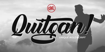 Introducing Quitgan, an amazing handwritten font . This font will make your design more beautiful and powerful. Quitgan is suitable for any design like branding, quotes and much more. I hope you enjoy it. Quitgan is multi-lingual, PUA encoded and contains Numerals and Punctuations (OpenType Standard) and many alternates. Thanks for visiting and downloading my font.
 - Roundlane by Zealab Fonts Division,
$10.00 Roundlane is a font inspired by retro badges antique labels, and includes all-caps, multilingual support, alternates signs, numbers & punctuation. It works well for album covers, video tittles, stickers, clothing brand names, t-shirt designs, badges designs, banner, flyer and more. I can’t wait to see what you guys will come up with with using this font!
 - Lisa Fiore by Wiescher Design,
$39.50 Lisa is an elegant script family in the tradition of early Italian type designers like Bodoni. I added counter strokes and floral embellishments to the font. Lisa comes in three variations: the beautiful Lisa Bella, the flowery Lisa Fiore and the extra swinging Lisa Piu (which means more in Italian). Enjoy! Your elegant script designer Gert Wiescher
 - Lisa Piu by Wiescher Design,
$39.50 Lisa is an elegant script family in the tradition of early Italian type designers like Bodoni. I added counter strokes and floral embellishments to the font. Lisa comes in three variations: the beautiful Lisa Bella, the flowery Lisa Fiore and the extra swinging Lisa Piu (which means more in Italian). Enjoy! Your elegant script designer Gert Wiescher
