10,000 search results
(0.296 seconds)
- Demarus by Zamjump,
$15.00DEMARUS originally designed for use in e-Sports related projects, logotype, quotes, wordmark, magazine, t shirt etc. The downloadable file contains the font in ttf, woff, font license. Includes: Uppercase Numbers Punctuation Symbols multilingual support PUA Encoded Characters Fully accessible without additional design software. To access alternative glyphs, you'll need a program that supports OpenType features such as Adobe Illustrator CS, Adobe Photoshop CC, Adobe Indesign, and Corel Draw. - Staylive by Rotterlab Studio,
$12.00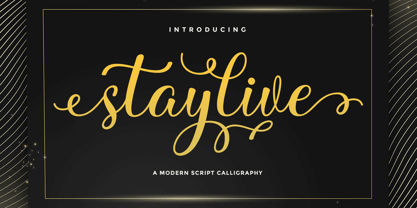 Staylive is a beautiful calligraphy font with many alternative styles & leaf swashes, it looks natural, elegant and perfect for any extraordinary project. Staylive is suitable for a wide range of products such as invitations, product packaging, quotes, product design, crafters, labels, photography, watermarks, logos & branding. Everything can be accessed using software that supports Opentype, such as Adobe Indesign, Adobe CS Illustrator, Adobe Photoshop CC, and Corel Draw. Thank you & happy design :)
 - Petite Fleur by Wiescher Design,
$39.50 Petite Fleur is a combination of engraved, flowery embellishments and the Capitals of my redesigned Royal Romain (Romain du Roi), the exclusive font of King Louis XIV. It is best used as initials only, but can be mixed with Royal Romain. On the keys for ≥ and ≤ I designed two filler embellishments and the ciphers 0-9 are embellished as well. Enjoy! Your designer of beautiful fonts, Gert Wiescher
 - Canger staong by ryan creative,
$10.00 Introducing the Canger staong font which has a unique looking design. This font has curved joints like pipes. You can use Canger staong in modern and contemporary designs, and are suitable for use in various media such as stickers, posters, covers, typography and other digital media. -Uppercase. -Foreign Support, Numbers and Punctuation. -Alternates & ligatures -Simple installation. -Accessible in Adobe Illustrator, Adobe Photoshop. Adobe InDesign, it even works in Microsoft Word.
 - Everbright by Nyalaapi,
$12.00 Everbright is a vintage monoline font, It features a vintage monoline script style with a strong sans serif that make amazing combinations for your design. Perfect for branding projects, logos, clothing, and any other designs that require vintage feel. Features 6 Ligatures 176 Character Alternates Multilingual support OpenType features can be accessed using Open Type programs such as Adobe Illustrator CS/CC, Adobe Photoshop CS/CC, Adobe Indesign & CorelDraw X6-X7.
 - Eden CT by CastleType,
$39.00 Eden Light, originally designed by the American type designer Robert H. Middleton in 1934, was commissioned by Publish magazine for a redesign in 1990. When I found a specimen of Eden Bold a couple years later, I decided to digitize it also. Subsequently, I created a Medium weight. Very squared and compact with thin slab serifs, Eden includes support of all European languages that use the Latin alphabet.
 - Verger Junior by David Engelby Foundry,
$25.00 Verger Junior is a serif font designed for editorial design, books, and magazines. But not constrained by anything but your fantastic imagination! Verger Junior is a part of the Verger Font Family. Junior is a moderate redesign with a ... specifik Ten-version for small text (footnotes, picture texts etc.) slightly narrower width a more conventional italic style new swash family Don't let its classic look fool you. It’s a working horse!
 - Collins Butter Hollow by Omotu,
$18.00 Collins Butter is a display sans font. Comes with 2 fonts family, solid and hollow. Great for logotype, branding, packaging design, poster design, website / display, editorial, headline, and more. Whats Include? Uppercase and lowercase characters Supports international languages Opentype features: alternates and ligatures. Accessible in the Adobe Illustrator Glyphs panel, or under Stylistic Alternates in the Adobe Photoshop OpenType menu, Adobe InDesign, Corel Draw, even work on Microsoft Word
 - Visconte by Zetafonts,
$51.00 After Marcovaldo, here comes Visconte: a new singularity variant expanding the Calvino typeface family by Andrea Tartarelli with Cosimo Lorenzo Pancini and Francesco Canovaro as a branding font for the Desina Graphic Design Festival in 2023. It takes the design of the original Calvino typeface in the "brutal serif" territory, expanding spiky serifs and creating unexpected distortions and connections while keeping the original calligraphic old style structure of the Calvino Family.
 - Moonrova by Slide Shoot,
$12.00 Moonrova Serif is a handmade serif font. He has a beautiful character. It fits perfectly with invitation card designs, company logos, movie titles, movie names, business cards, book titles, brand names and various other designs. FEATURE : Ligature Uppercase and lowercase Numbering and Punctuation Works on PC or Mac Simple Installation Supports Adobe Illustrator, Adobe Photoshop, Adobe InDesign, also works in Microsoft Word Hope you like it Thank you.
 - Applied Sans by Monotype,
$57.99 The Applied Sans™ family is a reinterpretation of the first sans serif typefaces used in what was then called, “jobbing or trade” work – typefaces like Venus and Ideal Grotesk. While built on the foundation of these late 19th and early 20th century designs, Applied Sans adds to it all the required features for modern typographic communication. The design benefits from a large x-height, open counters, generous apertures and a subtle modulation in stroke weight. These ensure character legibility and make for a design that is inviting and easy to read. Applied Sans family’s wide range, precise gradation of weights and extensive language support guarantees the design’s effectiveness in a wide and varied range of uses.
 - Face Type by TypoGraphicDesign,
$9.00 The typeface Face Type is designed from 2021 for the font foundry Typo Graphic Design by Manuel Viergutz. A mix from the TGD font collection with 1 font-style (Icons) incl. decorative extras like icons, dingbats, emojis and stylistic alternates (4 stylistic sets). For use in logos, magazines, posters, advertisement plus as webfont for decorative headlines. The font works best for display size. Have fun with this font & use the DEMO-FONT (with reduced glyph-set) FOR FREE! ■ Font Name: Face Type ■ Font Styles: 1 font-style (Icons) + DEMO (with reduced glyph-set) ■ Font Category: Display for headline size ■ Glyph Set: 357 glyphs incl. decorative extras like icons ■ Design Date: 2021 ■ Type Designer: Manuel Viergutz
 - Hamptons BF by Bomparte's Fonts,
$40.00 Hamptons BF is a beautiful, elegant sans serif with dramatic individuality. A font that steps out in Art Deco style. As a design movement Art Deco came into prominence during the 1920s and 30s when forms were typically sleek, symmetrical, geometric or highly stylized. Today the influence of this enduring style can be clearly seen in architecture, industrial design, fashion, art, graphic design, and yes, even type design. Art Deco style exemplifies luxury, glamour and modernity. I believe Hamptons BF captures something of that retro look in a nod to the past without ever looking dated, all the while retaining a contemporary flair. Named after the well-known New York resorts synonymous with style and elegance, this gothic or sans serif type is based upon University Roman, an early 1970s serif design which in turn was influenced by yet another serif design called Forum Flair (late 1960s); and that in turn owes its pedigree to the late 1930s’ Stunt Roman, which is the original source of inspiration for all of these. Quite a family tree! There’s dynamic interplay between certain wide, full-round letters such as C, D, G, O, P, Q, R, S and narrow ones like A, E, F, H, K, L, M, N, U, etc. This contrast repeats throughout certain lower case letters and serves to create a unique look of distinction. Light and Regular weights communicate a romantic, feminine appeal while the Bold offers a complementary emphasis. The font is somewhat versatile as in addition to its primary purpose for display, Hamptons BF also succeeds in settings containing short blocks of large text. It’s right at home in a variety of typographic environments: branding, packaging, signage logos, magazine headlines, invitations, menus, trendy cafes and more. Among the included OpenType features are Stylistic Alternates, Automatic Ligatures and Fractions. There is extended language support for Western, Central and Eastern Europe and Turkish.
 - Liferdas by Sealoung,
$20.00 Liferdas is a mix of Old Style Roman Serif styles. The glyphs are formed in extended width, smooth strokes, moderate stem contrast, and soft edges to pursuing clarity, quick recognizable text, and a warm personality. The italics style is 13 degrees low slanted with redrawn lowercase which has shown in more organic and flowy forms. This font contains 9 weights with more than 245 glyphs that support extended multilingual.
 - Speedometer by Dharma Type,
$19.99 Speedometer is derived from Dimensions font family that is most narrow and black font for titling and logo. This Speedometer is more elegant by its contrast between the thickness of stem and thinness of the arms than Dimensions. This contrast makes more vigorous and speedy impressions too. All 6 weights and italics have upper and lower cases, accented characters and small capital glyphs that can be used with OpenType smcp feature.
 - Sancoale Gothic by insigne,
$35.00 In comparison to the powerful and commanding original, Sancoale Gothic is a more sober version of Sancoale. The medium contrast between thick and thin strokes makes for a typeface that stands out with striking clarity in longer texts, yet is very readable. This new addition to the Sancoale family is a perfect alternative if you want to use a different style than the original family. Using the utmost care and restraint, the designer strove to avoid overbearing futurism in favor of a typeface with clean lines and clear forms. Show your customers the world with Sancoale Gothic, a versatile sans with a wide range of styles, from delicate thins to bold, hefty weights that dominate the page and screen with confidence and futuristic flair. A fresh, friendly voice for all kinds of uses, from corporate statements to fashion, Sancoale Gothic is a versatile sans with a wide range of styles, from delicate thins to bold, hefty weights that dominate the page and screen with confidence and futuristic flair. Sancoale Gothic has a distinct personality, which allows you to create a wide range of projects, including posters and websites. The Sancoale Gothic fonts come in many varieties, so you can go with a light or thick weight, depending on what fits your project best. With their sweeping curves, the heavy fonts are meant for huge headings on posters and websites. The Sancoale Gothic family is made up of 48 distinct styles, with 660 glyphs and supports 70 languages, allowing you to communicate with your customers all over the world. Small Capitals and other OpenType features abound! The design is sleek with no stems or spurs in the default character set, but OpenType alternates have alternates with stems. OpenType capable applications such as Quark or the Adobe suite can take full advantage of the automatically replacing ligatures and alternates. The superfamily offers an array of optical sizes, contrasting weights, and contrasting optical sizes to discover the right balance, contrast, and optical size for your design. Prepare to be blown away by Sancoale Gothic’s smooth curves and captivating allure. Sancoale Gothic is perfect for both a contemporary and forward looking style. Sancoale Gothic is both practical and unique, in a standalone capacity or with the companion Sancoale fonts. Use it to make an impact today.
 - Bank Sans EF by Elsner+Flake,
$35.00 With its extended complement, this comprehensive redesign of Bank Gothic by Elsner+Flake offers a wide spectrum for usage. After 80 years, the typeface Bank Gothic, designed by Morris Fuller Benton in 1930, is still as desirable for all areas of graphic design as it has ever been. Its usage spans the design of headlines to exterior design. Game manufacturers adopt this spry typeface, so reminiscent of the Bauhaus and its geometric forms, as often as do architects and web designers. The creative path of the Bank Gothic from hot metal type via phototypesetting to digital variations created by desktop designers has by now taken on great breadth. The number of cuts has increased. The original Roman weight has been augmented by Oblique and Italic variants. The original versions came with just a complement of Small Caps. Now, they are, however, enlarged by often quite individualized lower case letters. In order to do justice to the form changes and in order to differentiate between the various versions, the Bank Gothic, since 2007 a US trademark of the Grosse Pointe Group (Trademark FontHaus, USA), is nowadays available under a variety of different names. Some of these variations remain close to the original concept, others strive for greater individualism in their designs. The typeface family which was cut by the American typefoundry ATF (American Type Founders) in the early 1930’s consisted of a normal and a narrow type family, each one in the weights Light, Medium and Bold. In addition to its basic ornamental structure which has its origin in square or rectangular geometric forms, there is another unique feature of the Bank Gothic: the normally round upper case letters such as B, C, G, O, P, Q, R and U are also rectangular. The one exception is the upper case letter D, which remains round, most likely for legibility reasons (there is the danger of mistaking it for the letter O.) Because of the huge success of this type design, which follows the design principles of the more square and the more contemporary adaption of the already existing Copperplate, it was soon adopted by all of the major type and typesetting manufacturers. Thus, the Bank Gothic appeared at Linotype; as Commerce Gothic it was brought out by Ludlow; and as Deluxe Gothic on Intertype typesetters. Among others, it was also available from Monotype and sold under the name Stationer’s Gothic. In 1936, Linotype introduced 6pt and 12pt weights of the condensed version as Card Gothic. Lateron, Linotype came out with Bank Gothic Medium Condensed in larger sizes and a more narrow set width and named it Poster Gothic. With the advent of photoypesetters and CRT technologies, the Bank Gothic experienced an even wider acceptance. The first digital versions, designed according to present computing technologies, was created by Bitstream whose PostScript fonts in Regular and Medium weights have been available through FontShop since 1991. These were followed by digital redesigns by FontHaus, USA, and, in 1996, by Elsner+Flake who were also the first company to add cursive cuts. In 2009, they extended the family to 16 weights in both Roman and Oblique designs. In addition, they created the long-awaited Cyrillic complement. In 2010, Elsner+Flake completed the set with lowercase letters and small caps. Since its redesign the type family has been available from Elsner+Flake under the name Bank Sans®. The character set of the Bank Sans® Caps and the Bank Sans® covers almost all latin-based languages (Europe Plus) as well as the Cyrillic character set MAC OS Cyrillic and MS Windows 1251. Both families are available in Normal, Condensed and Compressed weights in 4 stroke widths each (Light, Regular, Medium and Bold). The basic stroke widths of the different weights have been kept even which allows the mixing of, for instance, normal upper case letters and the more narrow small caps. This gives the family an even wider and more interactive range of use. There are, furthermore, extensive sets of numerals which can be accessed via OpenType-Features. The Bank Sans® type family, as opposed to the Bank Sans® Caps family, contains, instead of the optically reduced upper case letters, newly designed lower case letters and the matching small caps. Bank Sans® fonts are available in the formats OpenType and TrueType.
 - Kuryin by Twinletter,
$13.00 Introducing “Kuryin Font” – Where Playful Typography Meets Creativity! Unleash your design’s full potential with Kuryin Font, a lively and whimsical typeface that adds a touch of playfulness to your projects. Kuryin Font is your go-to choice for designs that need a fun and vibrant personality. Its unique, playful characters are perfect for children’s books, captivating posters, and standout branding that grabs attention. With Kuryin Font, your designs will instantly exude a sense of joy and creativity, drawing your audience in. Whether you’re crafting a cheerful invitation or crafting a memorable logo, this font infuses a playful spirit into your work. Elevate your creative projects and let your imagination run wild with Kuryin Font. Embrace the whimsical charm of this typeface today and watch your designs come to life! – PUA Encoded Characters – Fully accessible without additional design software.
 - TT Fellows by TypeType,
$39.00 TT Fellows useful links: Specimen | Graphic presentation | Customization options There can't be too many universal fonts! Meet TT Fellows, a new workhorse whose functionality allows you to comfortably use the font in a variety of projects. Calm and neutral at first glance, the mood of TT Fellows can change. Working with the typeface, you can reveal its soft and friendly nature, or even the brutal one, for example, by typing the text exclusively in capital letters in the bold style. TT Fellows is easy to use and perfect for setting large text arrays. Thanks to the font's uniwidth and versatility, the font is ideal for use on websites or in periodicals. Bold styles will work harmoniously in headlines or as accents in print or on packaging. TT Fellows is a humanist sans serif with a mechanical touch. With its open shapes, the friendly neutral character of thin weights and an even softer character in bold weights, the new typeface differs in character from the classic TT Norms® and TT Commons sans serifs, while still offering the same functionality. Calm regular styles differ from bold, deliberately display and more expressive ones. By the way, TT Fellows is a unwidth typeface. It was important for us that the user could change the styles, knowing that the layout will not suffer. The typeface features equal width proportions, open apertures, and slightly squared ovals, which associatively brings it closer to other popular modern fonts. Since the idea of the typeface was focused on it being a uniwidth typeface, we needed to fit the bold styles into the regular em squares, which led to interesting graphic solutions that are noticeable, for example, in the k and ж characters, in which the branches are cut directly into the stems. TT Fellows consists of 19 styles: 9 upright, 9 italic and 1 variable, each with over 700 glyphs. The font has 26 useful OpenType features. For example, there is a switch to single-part versions of letters a and y, fractions, tabular characters, case versions of punctuation, and localized versions of characters for different languages. There is a ligature for a combination of two characters of a complex design fl. TT Fellows font field guide including best practices, font pairings and alternatives.
 - Voguing by Resistenza,
$39.00 Sashay, you stay! Voguing is inspired by the movement and glamour of the ’80s/90s and New York ballrooms scene. Based on multiline strokes like our first font release Afrobeat but this time playing with the movement and direction of strokes we got a 3D effect to embrace the feeling of Voguing Art Expression. We highly recommend to combine Voguing with Nautica Sottile Modern letterforms reminding the skeleton of geometric type and serving optical contemporary elegance to this typeface presented in 3 different styles: regular, slanted and backslanted. The font includes also a set of ligatures accessible through OpenType perfect to customize your text. Bring a “10 across the board” to your layout with this new font family. Voguing is perfect for fashion, publishing, cosmetics, sports and art industries. Its eye catching effect works great for headlines, branding, magazine, social media posts, website headers, posters, ads, stationery designs and products. Check out also Dreamteam & Afrobeat
 - ITC Garamond Handtooled by ITC,
$34.99Claude Garamond (ca. 1480-1561) cut types for the Parisian scholar-printer Robert Estienne in the first part of the sixteenth century, basing his romans on the types cut by Francesco Griffo for Venetian printer Aldus Manutius in 1495. Garamond refined his romans in later versions, adding his own concepts as he developed his skills as a punchcutter. After his death in 1561, the Garamond punches made their way to the printing office of Christoph Plantin in Antwerp, where they were used by Plantin for many decades, and still exist in the Plantin-Moretus museum. Other Garamond punches went to the Frankfurt foundry of Egenolff-Berner, who issued a specimen in 1592 that became an important source of information about the Garamond types for later scholars and designers. In 1621, sixty years after Garamond's death, the French printer Jean Jannon (1580-1635) issued a specimen of typefaces that had some characteristics similar to the Garamond designs, though his letters were more asymmetrical and irregular in slope and axis. Jannon's types disappeared from use for about two hundred years, but were re-discovered in the French national printing office in 1825, when they were wrongly attributed to Claude Garamond. Their true origin was not to be revealed until the 1927 research of Beatrice Warde. In the early 1900s, Jannon's types were used to print a history of printing in France, which brought new attention to French typography and the Garamond" types. This sparked the beginning of modern revivals; some based on the mistaken model from Jannon's types, and others on the original Garamond types. Italics for Garamond fonts have sometimes been based on those cut by Robert Granjon (1513-1589), who worked for Plantin and whose types are also on the Egenolff-Berner specimen. Linotype has several versions of the Garamond typefaces. Though they vary in design and model of origin, they are all considered to be distinctive representations of French Renaissance style; easily recognizable by their elegance and readability. ITC Garamond? was designed in 1977 by Tony Stan. Loosely based on the forms of the original sixteenth-century Garamond, this version has a taller x-height and tighter letterspacing. These modern characteristics make it very suitable for advertising or packaging, and it also works well for manuals and handbooks. Legible and versatile, ITC Garamond? has eight regular weights from light to ultra, plus eight condensed weights. Ed Benguiat designed the four stylish handtooled weights in 1992." In 1993 Ed Benguiat has designed Handtooled versions. - The Blendhes by YdhraStudio,
$25.00 We introduce our new script font called Blendhes. Blendhes is a strong bold script font inspired from Vintage baseball sport design. Blendhes has a standart OpenType Features. With the OpenType Features, Blendhes gives you so many options to create something awesome. Mix and match the alternate characters to add an attractive message to your design. Blendhes is great for Logotype, Branding Design, Logo Design, Badges, Digital Lettering Arts, T-Shirt/Apparel, Poster, Magazine, Signs, Advertising Design, and any vintage design needs. Blendhes Features : - Upper and Lowercase Standard Characters, Punctuation, Numerals. - Opentype Features such as Standard Ligature, Discretionary Ligature, Ornament (Trail and Swash), Contextual Alternates and Stylistic Set (ss01 - ss07). - Fully accessible without additional design software. - Includes a range of multilingual characters. You can access all those alternate characters by using a program that supports OpenType features such as Adobe Illustrator CS, Adobe Indesign & CorelDraw X6-X7. Guides to access all alternates glyphs : http://adobe.ly/1m1fn4Y Please, Feel free to contact me by e-mail yyudhara@gmail.com for any question about my font, Extended License document and more.
 - Veltro by profonts,
$41.99 Veltro was originally designed in 1931 for Nebiolo in Torino. The typeface has been redesigned, digitized, completed and expanded as OpenType Pro in the profonts studio. Both styles cover the complete character set for Western and Eastern Europe.
 - WolfieBoy - Unknown license

- Quell by Underscore,
$35.00 Quell is a novel attempt to bridge the gap between geometrically constructed shapes on the one hand, and modulated strokes and subtle calligraphic influence on the other hand. The visual tension in Quell stems from conflict between two tendencies: The perfectly round shapes are geometrically constructed, yet the contrast of stroke widths and oblique line terminations suggest calligraphic roots. How this dualism affects typographic impression is up to designers and typographers using Quell — as variable font the seamless transition between modulated contrast and linear appearance offers unique typographic possibilities. Linear appearance gives the text a solid and compelling voice, whereas the modulated styles convey elegance, vibrance and a delicate tone. Quell is suited to display setting, headlines, way finding and identity. The combination of linear and contrast variants provides typographic range to convey different stance while rooted in the same visual heritage. In short paragraph typesetting the fonts have a modern look and characterful tone, but should not be overused for longer texts. Quell has been in development for over a year, and is the proud third release under the Underscore label. Released in 2018 this design by Johannes Neumeier is available from the Underscore webshop as well as selected retailers.
 - DT Paperside by Dragon Tongue Foundry,
$15.00 Paperside: Neither Papyrus nor SSI Countryside. Inspired in some ways by the Papyrus form, but untextured and smoother, with the dimensions and proportions more open, like that of Countryside SSi, with its larger easily readable lowercase body, and more consistent, shorter stems. Paperside has an open scripted feel which is pleasing on the eye and easy to read. Paperside can enhance the first letter of most sentences automatically, and changes other letters to suit their position within words, and the letters they appear beside. Now comes in 5 weights plus italic. For best results, use this ‘smart font’ with Contextual Ligatures turned on. Mulitiple Stylistic Alternatives are included. Inspiration for this font came from two other fonts. Papyrus: was designed by Chris Costello and created in 1982, it is a hand-drawn textured typeface, emulating texts written in biblical times. One of the most used (and misused) fonts of all times. Owned by Letraset, and currently published by the Internation Typeface Corporating (ITC). Countryside SSi: The serif font of an unknown designer, is currently licensed by Southern Software Inc. Feel free to preview some of the Dragon Tongue fonts that are yet to be released, at https://www.dragon-tongue.com/fonts
 - Crayond by Dora Typefoundry,
$15.00 - Elegan / Bergaya / Modern - Introducing a beautiful and classy Crayond modern san serif typeface with lots of alternative styles to choose from, planting it firmly in a modern design. It is a careful collaboration between beauty and function. The beautiful modern Crayond sans serif is available in 3 regular and Italic weights including Light, Regular, and Bold. The style of the font family stems from the classic Didone, but makes steps to simplify and modernize some letterforms and make Didone feel more contemporary. If you want to get that classic Haute Couture look - Crayond Sans is a great choice. It is the perfect choice for fashion logos, headlines, short text, magazines, because its simplicity looks great in big typography, branding, identity, website design, album art, covers, posters, advertisements, etc. This purchase includes: Crayond - San serif typeface containing upper and lowercase characters, numbers 0-9, as well as a series of punctuation marks and symbols as well as an alternative style. If you have trouble finding a certain character, you can access it via the glyph panel. You can see all the characters available in the screenshot above, and you can try the font below. Please let me know if you have any questions, leave a comment!
 - Leomarle by Alit Design,
$20.00 Presenting the LEOMARLE typeface from alitdesign. Leomarle is inspired by the classic blackletter font. The leomarley font is designed with an elegant combination of scripts that is very cool when combined with a simple blackletter style. This font looks unique and elegant when used for making designs. LEOMARLE is perfect for magazine cover designs, brochures, flyers. Instagram ads, Canva Design and so on with unique and modern concepts. besides that this font is very easy to use both in design and non-design programs because everything changes and glyphs are supported by Unicode (PUA). The "LEOMARLE"contains 591 glyphs with many unique and interesting alternative options. Language Support : Latin, Basic, Western European, Central European, South European,Vietnamese. In order to use the beautiful swashes, you need a program that supports OpenType features such as Adobe Illustrator CS, Adobe Photoshop CC, Adobe Indesign and Corel Draw. but if your software doesn't have Glyphs panel, you can install additional swashes font files.
 - Mironta by Alit Design,
$15.00 Presenting the 🎃 The Mironta Halloween Typeface 🦇 by alitdesign. The Mironta Halloween Typeface is designed for the needs of design concepts themed about Halloween and events in October and November. The Mironta Halloween Typeface has a horror character with a character shaped like distortion character, making the horror Halloween themed design concept even better and unique. The Mironta Halloween Typeface also gets a bonus character of 150 Halloween-themed illustrations that make creating designs even easier. Simply by downloading The Mironta Halloween Typeface, creating a Halloween themed design is very quick and easy. The Mironta Halloween Typeface is perfect for magazine cover designs, brochures, flyers. Instagram ads, Canva Design and so on with halloween and dark concepts. besides that this font is very easy to use both in design and non-design programs because everything changes and glyphs are supported by Unicode (PUA). The Mironta Halloween Typeface contains 623 + 150 bonus glyphs with many unique and interesting alternative options. Language Support : Latin, Basic, Western European, Central European, South European,Vietnamese. In order to use the beautiful swashes, you need a program that supports OpenType features such as Adobe Illustrator CS, Adobe Photoshop CC, Adobe Indesign and Corel Draw. but if your software doesn't have Glyphs panel, you can install additional swashes font files.
 - Noganas by Alit Design,
$16.00 Presenting the 🎃 The Noganas Halloween Typeface 🦇 by alitdesign. The Noganas Halloween Typeface is designed for the needs of design concepts themed about Halloween and events in October and November. The Noganas Halloween Typeface has a horror character with a character shaped like distortion character, making the horror Halloween themed design concept even better and unique. The Noganas Halloween Typeface also gets a bonus character of 150 Halloween-themed illustrations that make creating designs even easier. Simply by downloading The Noganas Halloween Typeface, creating a Halloween themed design is very quick and easy. The Noganas Halloween Typeface is perfect for magazine cover designs, brochures, flyers. Instagram ads, Canva Design and so on with halloween and dark concepts. besides that this font is very easy to use both in design and non-design programs because everything changes and glyphs are supported by Unicode (PUA). The Noganas Halloween Typeface contains 797 + 150 bonus glyphs with many unique and interesting alternative options. Language Support : Latin, Basic, Western European, Central European, South European,Vietnamese. In order to use the beautiful swashes, you need a program that supports OpenType features such as Adobe Illustrator CS, Adobe Photoshop CC, Adobe Indesign and Corel Draw. but if your software doesn't have Glyphs panel, you can install additional swashes font files.
 - Zombik by Alit Design,
$14.00 Presenting the 🎃 The Zombik Typeface 🦇 by alitdesign. The Zombik typeface is designed for the needs of design concepts themed about Halloween and events in October and November. The Zombik font has a horror character with a character shaped like dripping blood, making the horo or Halloween themed design concept even better and unique. The Zombik font also gets a bonus character of 150 Halloween-themed illustrations that make creating designs even easier. Simply by downloading The Zombik font, creating a Halloween themed design is very quick and easy. The Zombik Typeface is perfect for magazine cover designs, brochures, flyers. Instagram ads, Canva Design and so on with halloween and dark concepts. besides that this font is very easy to use both in design and non-design programs because everything changes and glyphs are supported by Unicode (PUA). The Zombik Typeface contains 473 + 150 bonus glyphs with many unique and interesting alternative options. Language Support : Latin, Basic, Western European, Central European, South European,Vietnamese. In order to use the beautiful swashes, you need a program that supports OpenType features such as Adobe Illustrator CS, Adobe Photoshop CC, Adobe Indesign and Corel Draw. but if your software doesn't have Glyphs panel, you can install additional swashes font files.
 - Rankday by Alit Design,
$14.00 Presenting the 🎃 Rankday Typeface 🦇 by alitdesign. Rankday typeface is designed for the needs of design concepts themed about Halloween and events in October and November. The Rankday font has a horror character with a character shaped like dripping blood, making the horor Halloween themed design concept even better and unique. The Rankday font also gets a bonus character of 150 Halloween-themed illustrations that make creating designs even easier. Simply by downloading the Rankday font, creating a Halloween themed design is very quick and easy. The Rankday Typeface is perfect for magazine cover designs, brochures, flyers. Instagram ads, Canva Design and so on with halloween and dark concepts. besides that this font is very easy to use both in design and non-design programs because everything changes and glyphs are supported by Unicode (PUA). The Rankday Typeface contains 607 + 150 bonus glyphs with many unique and interesting alternative options. Language Support : Latin, Basic, Western European, Central European, South European,Vietnamese. In order to use the beautiful swashes, you need a program that supports OpenType features such as Adobe Illustrator CS, Adobe Photoshop CC, Adobe Indesign and Corel Draw. but if your software doesn't have Glyphs panel, you can install additional swashes font files.
 - The crots by Alit Design,
$15.00 Presenting the 🎃 The Crots Typeface 🦇 by alitdesign. The Crots typeface is designed for the needs of design concepts themed about Halloween and events in October and November. The Crots font has a horror character with a character shaped like dripping blood, making the horo or Halloween themed design concept even better and unique. The Crots font also gets a bonus character of 150 Halloween-themed illustrations that make creating designs even easier. Simply by downloading The Crots font, creating a Halloween themed design is very quick and easy. The Crots Typeface is perfect for magazine cover designs, brochures, flyers. Instagram ads, Canva Design and so on with halloween and dark concepts. besides that this font is very easy to use both in design and non-design programs because everything changes and glyphs are supported by Unicode (PUA). The Crots Typeface contains 557 + 150 bonus glyphs with many unique and interesting alternative options. Language Support : Latin, Basic, Western European, Central European, South European,Vietnamese. In order to use the beautiful swashes, you need a program that supports OpenType features such as Adobe Illustrator CS, Adobe Photoshop CC, Adobe Indesign and Corel Draw. but if your software doesn't have Glyphs panel, you can install additional swashes font files.
 - Festina by Twinletter,
$14.00 Festina is our newest font, which is handwritten which is neat and clean and proportionate in usage. gives a friendly, relaxed, and cool impression when reading. Not limited to that, the bold calligraphy font is designed to keep paying attention to the beauty of each letter, there are alternate options for the letters which are certainly easy for you to access, so you can automatically customize the letters you want to enhance the visual appearance of your design project. This charming font also offers the beauty of abstract typography harmony for a wide variety of design projects, including digital natural handwriting for designs, quote designs, for social media business designs, advertisements, trademarks, food and beverage promotion banners, text, posters, a signature, and all designs require handwriting or whatever design you want. What’s Included : File font Web Fonts Standard glyphs Ligature Works on PC & Mac Simple installations Accessible in Adobe Illustrator, Adobe Photoshop, Adobe InDesign, even work on Microsoft Word. PUA Encoded Characters – Fully accessible without additional design software. Fonts include multilingual support for; Afrikaans, Albanian, Croatian, Czech, Danish, Dutch, English, Estonian, Finnish, French, German, Hungarian, Italian, Norwegian, Polish, Portuguese, Slovak, Slovenian, Spanish, Swedish Thank you for your purchase! Hope you enjoy our font!
 - Zukones Distor by Alit Design,
$15.00 Presenting the 🎃 The Zukones Halloween Typeface 🦇 by alitdesign. The Zukones Halloween Typeface is designed for the needs of design concepts themed about Halloween and events in October and November. The Zukones Halloween Typeface has a horror character with a character shaped like distortion character, making the horror Halloween themed design concept even better and unique. The Zukones Halloween Typeface also gets a bonus character of 150 Halloween-themed illustrations that make creating designs even easier. Simply by downloading The Zukones Halloween Typeface, creating a Halloween themed design is very quick and easy. The Zukones Halloween Typeface is perfect for magazine cover designs, brochures, flyers. Instagram ads, Canva Design and so on with halloween and dark concepts. besides that this font is very easy to use both in design and non-design programs because everything changes and glyphs are supported by Unicode (PUA). The Zukones Halloween Typeface contains 663 + 150 bonus glyphs with many unique and interesting alternative options. Language Support : Latin, Basic, Western European, Central European, South European,Vietnamese. In order to use the beautiful swashes, you need a program that supports OpenType features such as Adobe Illustrator CS, Adobe Photoshop CC, Adobe Indesign and Corel Draw. but if your software doesn't have Glyphs panel, you can install additional swashes font files.
 - Beat Ghost by Alit Design,
$16.00 Presenting the 🐈⬛🌙🎃 The Beat Ghost Halloween Typeface 🐁🌙🎃 by alitdesign. The Beat Ghost Halloween Typeface is designed for the needs of design concepts themed about Halloween and events in October and November. The Beat Ghost Halloween Typeface has a horror character with a character shaped like distortion character, making the horror Halloween themed design concept even better and unique. 🐁🌙The Beat Ghost Halloween Typeface also gets a bonus character of 150 Halloween-themed illustrations that make creating designs even easier. Simply by downloading The Mouse Moon Halloween Typeface, creating a Halloween themed design is very quick and easy. The Mouse Moon Halloween Typeface is perfect for magazine cover designs, brochures, flyers. Instagram ads, Canva Design and so on with halloween and dark concepts. besides that this font is very easy to use both in design and non-design programs because everything changes and glyphs are supported by Unicode (PUA). Language Support : Latin, Basic, Western European, Central European, South European,Vietnamese. In order to use the beautiful swashes, you need a program that supports OpenType features such as Adobe Illustrator CS, Adobe Photoshop CC, Adobe Indesign and Corel Draw. but if your software doesn't have Glyphs panel, you can install additional swashes font files.
 - Funroot by Alit Design,
$16.00 Presenting the 🎃 The FUNROOT Halloween Typeface 🦇 by alitdesign. The FUNROOT Halloween Typeface is designed for the needs of Halloween themed design concepts and events in October and November. FUNROOT Halloween Typeface has a horror character with a character shaped like a haunted tree root, making the Halloween horror-themed design concept even better and unique. The FUNROOT Halloween Typeface also gets a bonus character of 150 Halloween-themed illustrations that make creating designs even easier. Simply by downloading The FUNROOT Halloween Typeface, creating a Halloween themed design is very quick and easy. The FUNROOT Halloween Typeface is perfect for magazine cover designs, brochures, flyers. Instagram ads, Canva Design and so on with halloween and dark concepts. besides that this font is very easy to use both in design and non-design programs because everything changes and glyphs are supported by Unicode (PUA). The FUNROOT Halloween Typeface contains 561 + 150 bonus glyphs with many unique and interesting alternative options. Language Support : Latin, Basic, Western European, Central European, South European,Vietnamese. In order to use the beautiful swashes, you need a program that supports OpenType features such as Adobe Illustrator CS, Adobe Photoshop CC, Adobe Indesign and Corel Draw. but if your software doesn't have Glyphs panel, you can install additional swashes font files.
 - Transport New by K-Type,
$20.00 Transport New is a redrawing of the typeface designed for British road signs. In addition to the familiar Heavy and Medium weights, Transport New extrapolates and adds a previously unreleased Light weight font originally planned for back-lit signage but never actually applied. Version 3.0 of Transport New features significant improvements including numerous outline and spacing refinements, and a full complement of Latin Extended-A characters. Also, to align Transport New with the 2015 release of Motorway, the other typeface used for UK road signage, Italic fonts for all three weights have been added. Originally designed by Jock Kinneir and Margaret Calvert beginning in 1957 and first published on the Preston bypass in 1958, the original Transport font has subtle eccentricities which add to its distinctiveness, and drawing the New version involved walking a tightrope between impertinently eliminating awkwardness and maintaining idiosyncrasy. The Grotesk roots of the glyphs were investigated and cheekily fine-tuned – uncomfortably close terminals of characters such as 5, 6, C, G, and e were shortened, the S and s were given a more upright aspect and their protruding lower terminals tucked in, overly wide glyphs like the number 4 were narrowed, and some claustrophobic counters were slightly opened up. The question mark was redesigned and parentheses given some stroke contrast. The x height was edged fractionally even taller. The Heavy font is actually more of a Bold, and the Light is pretty much a regular weight, but the original nomenclature has been retained for old times’ sake.
 - Elipses by Lián Types,
$30.00 It all began with an ellipse. Like an artist who goes from a pictorical logic to a more abstract one, in Elipses geometry is stripped of any distractive or ornamental detail. The font is naked and it shows that it does not need complex shapes or decisions in order to be very attractive. The font is a compendium of ellipses and stems, with a didone 'pensiero'. It also gets some inspiration from the art-deco letters and architecture, due to obvious reasons. Geometry at its best. Elipses will be useful for magazines, books, ads, or any piece of design that needs elegant letters. Note about the styles The styles named "Alt" (from Alternative) have their swashes with less loops. Use them if you are more into naked geometry. Apart from many alternates and ligatures, I've included some different sized glyphs in all the styles so you can also play on the rhythm! Have fun!
 - Salloon by Ingrimayne Type,
$8.95 The original version of Salloon was what has become Salloon-Wide. It was designed a year or two before 1990. The narrower version, which is now the regular version of the face, was constructed a few years later. There never has been a true lower-case set of letters for these fonts, but the narrower version introduced a second set of caps by removing the side bumps from the letters. Although Salloon may look like an old font, no historic font closely resembles it. Fonts with bold, thick stems such as Salloon invite interior decoration. The five striped versions and the shattered version of the font were produced a year or two after the construction of the narrower Salloon when the arrival of a font distortion program made it easy to cracked and stripe fonts. In 2019 an outline style and two highlighter styles were added to be used in layers with the Salloon-Regular and one highlighter style was added to be used with Salloon-Wide.
