2,795 search results
(0.016 seconds)
- Quenda by Marc Lohner,
$25.00 Quenda is a small sans-serif family comprising six weights: thin to heavy. Due to its rounded terminals and a slight handwritten look, Quenda has a friendly and warm appearance. Its main purposes are for advertising and branding projects. You will find lots of ligatures and a total of 593 glyphs in each style. With extensive language support, lining-, old-style- and tabular-figures, a slashed zero, self-building fractions, superscript and subscript digits, a set of arrows as well as thousands of kerning pairs, Quenda is ready to contribute to your next design project. Designed by Marc Lohner in 2015.
 - Novaturient by DimitriAna,
$18.00 Novaturient is a modern, brush calligraphy font, designed to give an elegant hand-drawn style at your work. It is suitable for a variety of applications such as stationery design, invitations, logos, labels, packaging design, merchandise products, etc. It supports Central, Eastern, Western European, Baltic, Turkish and Greek languages. The font contains a variety of opentype features in Latin and Greek alphabet: Both, uppercase and lowercase character sets have their stylistic alternates. Standard ligatures, 2 sets of terminals (te01 & te02) and a set of initial letters (in01), will also give your text a custom personal look.
 - Merel by Inhouse Type,
$33.78 Merel is a modern geometric typeface with humanist attributes. Geometry and logic are at the heart of this 6 weight font family. Humanist touches give it a number of distinctive characteristics, as well as aid legibility. Despite being rational and function driven in its nature, Merel has a soft and gentle touch. It was designed to tackle both print and onscreen challenges of the modern environment. Details include reduced x-height, mild stroke contrast and vertically sheared terminals with cushioned finish across the typeface. Merel features a number of alternative characters, manually edited kerning and Opentype features.
 - Bluesmate by Fontdroe,
$15.00 Bluesmate is a new another modern script font built in 878 glyphs. It has opentype features with PUA encode. of course this is a smart font works with poluler design software like Photoshop, Coreldraw X version, Illustrator, Microsoft Office, ect. This Modern Calligraphic typeface welcomes you to use it for various desing need such as logo, card, wedding invitation, headings, signatures, t-shirt, letterhead, cutting sticker, hot stamping, signage, labels, posters and more. It's craft friendly!!!! OPENTYPE TECHNOLOGY: - Stylistic alternate - Contextual alternates - Standard Ligatures - Discretionary Ligatures - Contextual Ligatures - Initial form - Medial form - Terminal form - Swashes - Numerals - Punctuations
 - Latte by Font Kitchen,
$9.99Cozy up with a warm cup of Latte! This friendly typeface uses the highest quality hand-roasted glyphs blended with some wonderful rounded serifs and ball terminals to create a bold, earthy flavor that can't be beat. Available in 14 robust styles, including true italics, Latte is a great way to give your next project a warm, friendly, and natural feel. You’ll pick up on subtle notes of OpenType features like stylistic alternates (on 41/52 Latin characters+diacritics), fractions, ligatures, oldstyle and lining figures, and more. Latte is the perfect ingredient to bring a kind, peaceful feeling to your next project. - Xotor by Typogama,
$19.00 Xotor is a double styled typeface family destined for use in titling and headlines. The main style, the Triline weight, is a modular typeface composed of three strokes and is best used in large sizes. For smaller bodies of text, the second Regular style is based on the same letter construction but in a simple, solid stroke. Both weights can either be used individually or combined to add extra effect to any layout. With an extended Latin language support, Xotor covers most Latin based scripts and equally features a range of Opentype features, from ligatures, alternative letters or different styles of numerals.
 - Orlando Smith by Meutuwah,
$20.00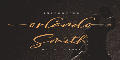 Hello Font Lovers... Orlando Smith is another lovely modern calligraphy typefaces, which is combining the style of classic calligraphy with an modern style. combines from copperplate to contemporary typeface with a dancing baseline, modern and elegant touch. including initial and terminal letters, alternates, and ligatures. Can be used for various purposes.such as headings, logos, wedding invitation, t-shirt, letterhead, signage, lable, news, posters, badges etc. To enable the OpenType Stylistic alternates, you need a program that supports OpenType features such as Adobe Photoshop, Adobe Illustrator, Adobe Indesign, Corel Draw, and More!!! Thank you for your purchase...
 - Vandermark by TypeTrust,
$30.00Vandermark began as a simple daydream of what became the 'n' glyph. I considered the elegant balance of a terminal stroke that would never join its supporting stem. The premise was simple, but further experimentation was required for other parts of the alphabet. Vandermark follows a somewhat flexible array of structural rules and curve arrangements that called for considerable sketching to harmonize. The names I choose for my typefaces have to look decent when set in the signature type. Considering its improvisational development, it was only fitting that the namesake is a jazz musician and fellow Chicagoan, Ken Vandermark. - Croog Pro by TipografiaRamis,
$39.00 Croog Pro is an upgraded version of Croog fonts (2009). As its predecessor, the new release is a rounded geometric monoline typeface, but built now in four weights with true italics. One more style has been added - "Black", for display use. Squarish in proportions, monoline letterforms gain more readability by having short rounded serifs and terminals. The typeface is ideal for use in display sizes, though is quite legible in text. Croog Pro is released as OpenType fonts with extended glyph amounts, which enabled support of more Latin languages as well as Cyrillic languages, and includes some OpenType features.
 - Stick-A-Round by PintassilgoPrints,
$24.00 Stick-A-Round started as an attempt to domesticate the wild Daft Brush font. During the process, though, it begun taking its own shape and personality, with friendly rounded terminals, dynamic interlock pairs and lots of alternates. There are at least 4 variations for each letter and 2 for the numbers and for some punctuation marks, plus an extra set of stylistic alternates. Besides showing up such a good humor, this font brings a lovely mate loaded with handy ornaments to jazz up your designs. Stick-A-Round, And Have Some Fun. I bet you will!
 - Praho Pro by Picador,
$29.00 Praho Pro is a part of Warsaw Types – a project based on Warsaw’s local typographic heritage. The project, presented at the Museum of Praga, is a collaboration of 12 young Polish typographers. Praho Pro is a multilingual family inspired by the unique, historical character of Praga district of Poland's capital - Warsaw. High contrast, thin serifs, sharp terminals and large x-height are key features for distinctive headlines. The whole family consist of 9 weights and real italics, small caps, superscript and subscript letters, oldstyle, tabular figures and fractions. It covers latin and cyrillic script. Every weight has almost 2000 glyphs.
 - Hello Script by Zetafonts,
$39.00 Hello Script is a high contrast calligraphic script designed by Cosimo Lorenzo Pancini, featuring monoline swashes and terminals and strong, round body shapes designed with a parallel nib. It covers over 40 languages that use the Latin alphabet, with full range of accents and diacritics, and comes with over ten different swashes and two decorative fill typefaces (Hello Script Fill and Hello Script Striped Fill) to use as multilayer color fonts. The Hello family features a sans serif companion (Hello Sans) as well as a christmas-themed version ( Hello Christmas ) with a set of Icons (Hello Christmas Icons), both featuring multilayer color fill.
 - M Hei PRC by Monotype HK,
$523.99 Although traditional Heiti typefaces may not be as lively as Songti, the modesty of M Hei makes is enduring and stand out from other similar typefaces. M Hei’s design is based on the hallmarks of traditional Heiti typefaces: it has little to no thick-thin contrast in strokes and has square cut terminals. Its dots (點), ticks (剔) and downstrokes (撇、捺) are subtly curved and longer than usual; all stems (豎) and crossbars (橫) remain simple and clear; and hooks (勾) appear rounded. Together they make a harmonious form which is clean but pure, classy but contemporary.
 - Nordikka by Latinotype,
$29.00 Nordikka is a 10-style sans-serif simple pure typeface designed by Luciano Vergara. Nordikka is a condensed font with a large x-height and straight terminals well-suited for headlines and short texts. A good option for clean and visually appealing designs. Nordikka is inspired by Scandinavian culture and its globally recognised design, which is characterised by pure, clean and clear forms. The final stage of the design process was completed in Olinda, Brazil, which inspired some of the words in the font specimens, allowing for reflecting an image of people’s daily habits and customs.
 - BB Casual Pro by Bold Studio,
$49.00 BB Casual™ (Std/Pro) is a font family that appears between a contemporary neo and geogrotesque design. The characteristic is formed by the intermediate step of the font classifications on the most relevant shapes: geometry (shape and with), contrast (text and display), white space (initial and terminal) and chiriographic elements (linework, punctuation, style and variant). The character set also has a large selection of matching symbols and superscripts. ● 2 Variants: characterized and simplified ● 20 Stylistic-Sets ● 34 Styles ● 41 OpenType features ● 95 Languages Support ● 41,854 Glyphs (1,231/Style) Designer: Bold Publisher: Bold Design date: 2019-2020 Release date: 2020 Version: 2.0
 - PGF Dinos by PeGGO Fonts,
$29.00 “PGF Dinos” is a low contrast round typeface that resembles handmade American ‘Sign Painting’ in such the upper portion of the characters is bigger than the lower one, what gives the font a more playful and friendly personality. Another remarkable feature is its hooked terminals in characters such as C, G or S, heightening the differences between similar characters. “PGF Dinos” Family is composed of 10 different weights ranging from Hairline to Extra Black plus Italics and a full set of Dingbats. Early version was originallly called as “Globa” and was developed under the supervision of the Latinotype Team. Designer: Pedro González.
 - Alasassy Caps by Leksen Design,
$19.00 Bring some sass to your signage! Alasassy is a font inspired from Sharpie pen drawings, featuring ink ball terminals. The lowercase letters are a mix of uppercase and lowercase letters that share the same cap height and baseline. There are several alternate characters with a mix of high and low crossbars as well as crossbar overhang options and language support for each. This display font will bring some zest to your logo, signage, packaging design or large titles on book covers or advertising. It is a great combination of an organic, hand drawn feel but still clean and crisp enough to look professional.
 - Arial Windows compatible by Monotype,A contemporary sans serif design, Arial contains more humanist characteristics than many of its predecessors and as such is more in tune with the mood of the last decades of the twentieth century. The overall treatment of curves is softer and fuller than in most industrial-style sans serif faces. Terminal strokes are cut on the diagonal which helps to give the face a less mechanical appearance. Arial is an extremely versatile family of typefaces which can be used with equal success for text setting in reports, presentations, magazines etc, and for display use in newspapers, advertising and promotions.
- Bigante by Vibrant Types,
$29.00 Bigante is a big, giant superfamily with two variants: Solid and Inline, offering six weights and seven widths. Its constructed design interprets rounded corners as three 30° angles, resulting in edged terminals and twelve-sided dots. While it sounds functional, this rounded-like semi-serif enhances the appearance, creating a friendly aesthetic. The lowercase alphabet features a high x-height. For versatile use in display and advertising, the multitude of fonts enables flexibility. Captivating with a linear structure, it associates with modern architecture, tactical sports, space travel, and futuristic technology. The character set of 780 glyphs supports 410 Latin languages.
 - ITC Jeepers by ITC,
$29.99Designer Nick Curtis found the inspiration for this typeface on a 1920s poster for a German bookseller, by Berlin poster artist Paul Scheurich. ITC Jeepers retains the spontaneity and playfulness of Scheurich's original lettering and adds a few surprises of its own, one being the somewhat exclamatory ear on the lowercase "g". It was, in fact, the excited look of this particular character that gave rise to the font's name. Not to be outdone, the exclamation point takes on an even more startling demeanor. The monoweight, slab serif design has a friendly personality, perfect for headlines and other display uses. - Ragik Sans by Hurufatfont,
$29.00 Ragik; It is a low-contrast sans serif font family with two accents. The letters are designed with a clear and simple elegance, devoid of ornaments. The open terminals of the letters “S, C, G, s, a, c, e” are elegant and legible with their large open areas. It consists of 16 styles, from thin to heavy, with true italics. Ideal for modern typographic posters, packaging and branding designs. It comes with rich OpenType features. Alternating glyphs, elegant and functional ligatures. All number sets (tnum, onum, lnum, numr, denom, sinf, sups etc.) have a rich symbol library with ornaments and arrows.
 - Albiona Soft by Device,
$39.00 A rounded version of Albiona, a contemporary slab-serif which revisits aspects of Robert Besley’s classic Clarendon. Originally named after the Clarendon Press in Oxford, the type family was subsequently extended by Stephenson Blake in the 1950s. Albiona adds the inwardly-curved stroke terminals of the same foundry’s Grotesque series, and includes italics and old-style and tabular numerals. The original Clarendon’s ball serifs and calligraphic eccentricities have been rationalised for functional contemporary uses. The family consists of five weights plus italics and a stencil, and its clean readable style is perfect for both extended text as well as headline setting.
 - Hoban by District,
$40.00 The light and the bold. The thick and the thin. Laverne and the Shirley. Peanut Butter and the Jelly. Hoban is about contrast. Hoban wants to be noticed, but only after a second glance. A friend of a friend to the didones, it has smaller, tapering serifs, slightly calligraphic traits, and spindly little terminals that go where they please. It’s a headline face. Period. Set it big and bold. Or light and airy. But preferably next to something with flair. Cuff links, canapés, or corvettes–it’s up to you. Distinct ligatures, ornaments, and swashy alternates provide plenty of character to tailor your style.
 - Beauties by Meutuwah,
$20.00 Hello Font Lovers... Beauties Script is another lovely modern calligraphy typefaces, which is combining the style of classic calligraphy with an modern style. combines from copperplate to contemporary typeface with a dancing baseline, modern and elegant touch. including initial and terminal letters, alternates, and ligatures. Can be used for various purposes.such as headings, logos, wedding invitation, t-shirt, letterhead, signage, lable, news, posters, badges etc. To enable the OpenType Stylistic alternates, you need a program that supports OpenType features such as Adobe Photoshop, Adobe Illustrator, Adobe Indesign, Corel Draw, and More!!! Thank you for your purchase...
 - Rooney Sans by Jan Fromm,
$45.00 RooneySans is a humanist sans-serif typeface, and the latest addition to the Rooney family. It shares the same attributes as its seriffed companion – softly rounded terminals and a moderate contrast, thoughtfully applied to classical sans-serif proportions. Although RooneySans was developed as a stand-alone typeface family, it combines well with Rooney since both typefaces share the same stem weights and an equal gray value. RooneySans is suitable for any task in branding and packaging design and gives long texts a warm and inviting feel. All six weights from Light to Black come with matching real italics.
 - Voga by North Type,
$35.00 Meet Voga. Voga is a condensed modern Didone typeface with three weights: Regular, medium and bold. My aim was to create a very elegant and “sexy” typeface with some unique letterforms based on the principle of contrast - curves vs. strong straight lines - thin hairlines vs. thick stems - ball terminals vs. geometric serifs. These contrasts make it a glamourous display font for titles and large typography settings, yet readable at text sizes. Voga was inspired by iconic typefaces such as Bodoni and Didot. It has an extensive glyph set that supports languages for the Americas and most of Europe.
 - Jackalope LP by LetterPerfect,
$39.00 Jackalope is a new original script font from LetterPerfect Fonts. The design is a hybrid of pressure-pen calligraphy infused with whimsy and curlicue terminals. Letterforms are free-spirited and edges are rough, simulating spontaneous writing on rough paper. In addition to the full ANSI western character set, Jackalope includes a full set of small capitals, both lining and old-style numbers, and swash lowercase alternate characters that can be used as terminal letters at the ends of words for additional flourish. The genesis and realization of Jackalope was also a hybrid process. In 1996, LetterPerfect commissioned type designer Kathy Schinhofen to provide pen-written source material based on her commercial handwriting style and specifically on a logo she had designed for its "Viva la Fonts" line of script fonts. This work was digitized by LetterPerfect’s Garrett Boge and later fonticized by former Hallmark Cards type maven Myron McVay who unified the design and contributed additional characters. The design sat unfinished for over 12 years until Garrett Boge revived the project in 2010 filling out the extended character set. Jackalope is released in two versions: Jackalope LP Regular, which is the base font for continuous text setting; and Jackalope LP Expert, which includes swash variants, small capitals, and old-style numerals which can be swapped into text for extra flourish and effect.
 - Qualion by ROHH,
$39.00 Qualion™ is a modern geometric grotesk typeface with humanist and calligraphic inspirations. The base of design is a minimal geometric sans serif with subtle humanist touches. Letter shapes are crafted with the highest care for beautiful proportions and excellent legibility. Qualion™ is a sibling of Qualion Round™ & Qualion Text™ - type family adjusted to fit paragraph text and small sizes best (narrower width, greater contrast, larger ink traps and tapering, adjusted spacing and kerning & even more calligraphic, elegant true italics). This versatile sans serif is not only well suited to clean, minimal projects and text paragraphs, but it has lots of features making it perfect for branding, logo design and all kinds of display use. All fonts are packed with alternates, swashes, terminal forms and ligatures, which make Qualion™ a very original ornamental type great for posters and packaging design. Qualion™ family consists of 10 weights with corresponding oblique and true italic styles, that give total of 30 styles. Both Oblique and Italic styles were hand drawn to get sharp and fine letter shapes. It has extended language support, as well as broad number of OpenType features, such as small caps, case sensitive forms, standard and discretionary ligatures, swashes, terminal forms, stylistic sets, contextual alternates, lining, oldstyle, tabular and small cap figures, slashed zero, fractions, superscript and subscript, ordinals, currencies and symbols.
 - Salt & Spices Mono by Fontforecast,
$29.00 Salt&Spices Mono is the mono lined version of Salt & Spices Pro. Where Salt & Spices Pro has the rough contours and high contrast that is typical for dip pen calligraphy, Salt & Spices Mono has clean crisp smooth letterforms that result in a totally different look and feel. Great for creating neon effects. Fun features like connecting spaces and long swashes for customization of words and phrases are preserved in Salt & Spices Mono. This versatile 10 font family, consisting of 4 casual script styles: Regular, Bold, Shadow and Bold Shadow offers great flexibility. For instance: the appearance of initial and terminal letters can be customized using the glyph pallet. Contextual alternates, Swashes and Stylistic sets give you the ability to replace spaces by 3 alternate connecting spaces or add swashes to initial/terminal letters. Double letter ligatures help sustain the natural flow of handwriting. In addition to the 4 script styles 3 SmallCaps Sans styles and 3 SmallCaps Serif styles were added, all mono lined. They add great variation to your designs and supplement and support each other perfectly. Add exceptional language support to all that and you have the perfect ingredient to spice up even the most demanding design project. You'll need an Open Type savvy application to get the most out of Salt & Spices Mono.
 - Cabo Soft by Design A Lot,
$15.00 Cabo Soft is the 2.0 version of our original Cabo Rounded Typeface, created back in 2015. With this new version, Cabo Soft, we have brought multiple upgrades and updates compared with the original version. Some of those consist in the addition of more glyphs and accents, alternate designs for many of the glyphs (including an alternate for @, #, some of the numbers and more), and most importantly, we have done a slight update in the design of the letters, which we'll give more details in the following paragraphs. The main style and thought behind our Cabo fonts has always been the rounded corners and the soft and welcoming vibe that it gives. It's friendly and familiar, but also modern and slightly elegant, especially the Thin and Light styles. With Cabo Soft we have worked on adding an extra touch to the design of the letters by working on the termination edges of each letter. If Cabo Rounded had an exact round termination for each letter, with Cabo Soft we have developed a unique non-equally rounded shape that is applied to all types of terminations for each letter. This new design approach makes it have a more clean style, a more modern and unique look, but it also gives stylish, exclusivist and elegant vibes, while still being friendly and familiar. Thanks to it's variety in weights and styles, you can use Cabo Soft in almost any design project. It works well with headlines and paragraphs, it's a perfect match for logo design and branding, but can also do wonders in videos, signage and many other elements. The typeface covers most likely the entire Latin Alphabet, it comes with multiple design alternates for many of the letters, glyphs and numbers, with accents applied for all of the available alternates. As a finishing note, with the help of our Cabo Soft typeface you can create an friendly and welcoming designs, as well as stylish, elegant and exclusivist. It has all the necessary glyphs and accents for any Latin Alphabet projects, and you can play around with all of the alternates to create unique designs right from the start.
 - Trevor by TypeTogether,
$36.80 Teo Tuominen’s Trevor took its first breath as a revival of an 18th century antiqua, but culminated in an entirely new and good-natured family. Trevor is an affable slab serif in nature: both heavy and kind. Known for their familiarity and their dark colour, the terminals of slab serifs put additional weight along the line to maintain an inky presence. Their clunky forms reveal slight immaturity and arouse the reader’s sympathy for the subject at hand. Trevor connects with others by consciously riding the line between being personal and commanding. One goal with Trevor was to pair the robust nature of a low contrast slab serif with more sophisticated elements, such as the ball terminals. So wherever one looks in Trevor, rounded corners rule the day, softening the overall appearance by mimicking ink spread made by old metal type. The easygoing look is tempered by very few inktraps and sharp corners, mostly to the inside of characters and in acute angles. Whatever Trevor is paired with, it has an altruistic outlook in that it sees the best in others. It’s the neighbourly type family — the neighbour you actually want. Trevor’s almost monolinear weight and high x-height give it a typewriter look in the extralight and light weights, but the whole family was made to work with many other font styles, design work, and information structures. It certainly finds its home in packaging and advertising, its sturdy verticality and narrowness fit the needs of headlines and intro text, and its seven weights are primed for plays and involved text needing many layers of distinction. The black weight is treated like a separate display style with altered ball terminals and serifs to capitalise on the added heft. Trevor’s seven roman weights cover the Latin A Extended glyph set to bring its kindly and commanding outlook to your projects. Along with alternate version of the ‘R’ in the black weight, its OpenType features include both tabular and proportional lining and oldstyle figures, ligatures, and fractions. The complete Trevor family, along with our entire catalogue, has been optimised for today’s varied screen uses.
 - PC.DE - 100% free

- Krellon by Nathatype,
$29.00 Krellon invites you to step back in time and embrace the elegance of the past with its vintage style. Rounded shapes define each character, creating a sense of approachability and friendliness. What makes Krellon so special is its subtle, textured appearance. The font carries a delightful roughness that adds authenticity to your text, as if each letter has endured the test of time. Beautiful ornaments are included as a bonus. Krellon fits in headlines, logos, branding materials, and many more.
 - Halla by Wilton Foundry,
$19.00 Creating Halla was a bit unusual for me since I started out creating the italic version first and that inspired the name Halla, meaning to tilt in Icelandic. It is also a fairly common female name in Iceland. “Halla” is derived from old Norse word “hallr” = 'flat stone, rock' or 'sloping, leaning to one side' Halla is a true italic inspired by handwriting and mechanical type. The combination of Light and Italic makes Halla ideal for advertising, branding, signage, packaging and editorial design.
 - Kontras by Hurufatfont,
$29.00 Kontras has high contrast at vertical and horizontal emphasis. When analyzing characters as a whole, it has contrast at style and practice too. Although has not much alternative characters, it provides decorative and grift effects because of this characteristic. Kontras is ideal for brand building, packet designs, decorative titles and so on. However it contains standard ligatures, contextual alternates (R, a, &), discretionary ligatures and case-sensitive forms. “Kontras” has been derived from “kontrast” which means contrast and opposition in Turkish.
 - ALS Ekibastuz by Art. Lebedev Studio,
$63.00 ALS Ekibastuz is a contemporary urban-style typeface extremely suitable for periodicals and advertising. It has defined, open, clear-cut letterforms and modern proportions. Originally designed to work well for headings, Ekibastuz was developed further to give a distinct energetic feel when used at large sizes and be highly readable and neutral at small sizes. It consists of six font styles and offers a wide choice of weights, which is useful for creating contrast between boxes of text on a page.
 - Letunical by Ingrimayne Type,
$9.95 Letuncial is a sans-serif typeface in which the shapes of the letters are derived from uncial, a writing style in the early medieval period. Like uncial, it has no true upper-case letters. Rather it has two sets of letters that are interchangeable. Fonts Letunical Inline Overlay-Middle and Letunical Inline Overlay Inside are designed to be layered with Letunical Inline to produce bicolored or tricolored letters and Letunical Shadow Inside is designed to layered with Letunical Shadow to produce bicolored letters.
 - Album Cover JNL by Jeff Levine,
$29.00An older typeface belonging to a family of sans serif fonts known as Grotesque (or Grotesk in the classic spelling) has been re-drawn by Jeff Levine and released as Album Cover JNL. The font's name is derived from the fact that this typeface was found on many long-playing record jackets during the 1950s and 1960s. To add a look closer to that of hand-set type, there are minute variants in some of the heights of the characters. - Grotesca Negra by MAC Rhino Fonts,
$59.00 Grotesca Negra is a charming sans serif with a flirt towards the Jugend era. Still its modern enough not to feel outdated. It is briefly inspired by a local typeface named Grotesca chupada negra, found in a Spanish edition of a type specimen book from the German Bauer type foundry. It has an angle on the horisontal strokes on many of the letters. It is one of many display face derived from book cover designs. Intended to work as a display typeface.
 - Bebas Kai by Dharma Type,
$- Bebas Kai is free font which is licensed under the SIL Open Font License 1.1. Designed by Ryoichi Tsunekawa. We have another Bebas edition called Bebas Neue and there are some derived, rounded fonts such as Bebas Neue SemiRounded and Bebas Neue Rounded. Bebas Neue Pro has lowercases and Italics. When you need more impact for titling, please try Dharma Gothic and Rama Gothic. When you need body-text font matching with this Bebas family, please try our Bio Sans font family.
