2,795 search results
(0.016 seconds)
- Centrifuge by Midwest Type,
$12.00 Originally inspired by manufacturer badges on old laboratory equipment, Centrifuge sports soft geometric shapes, wedge serifs, and sharply-angled terminals. Quirky but versatile, Centrifuge can appear anywhere from formal and elegant to funky and chunky depending on how it’s set. Centrifuge is suitable for short-form text and headlines but really sings in an all-caps setting with generous tracking.
 - ND Raster Neon by NeueDeutsche,
$10.00 A captivating and futuristic font inspired by the iconic worlds of The Matrix, Terminator, and Blade Runner. Embrace the enigmatic allure of the future as each character pulsates with neon energy, unleashing possibilities for cybernetic titles, gaming interfaces, logos, and more. Step into the neon-laden realms of ND Raster Neon and ignite your designs with a touch of cybernetic mystique.
 - Pony Tale Pro by Jonahfonts,
$45.00 Pony Tale Pro is a handwritten unconnected script face in eight styles: Light, Regular, Bold and Outline with Italics and Small-Caps. Very suitable for Packaging, Greeting cards, Magazines, Posters and Advertising Ads. A space after any lower-case glyph will produce the word terminal, invoking the OpenType/CONTEXTUAL ALTERNATIVE variant. (Opentype variants may only be accessible via Opentype-Aware applications.)
 - Estampa Script by Latinotype,
$39.00 Estampa Script is a 5-weight script typeface, designed by Sofia Mohr, with high contrast between thick and thin strokes, and teardrop terminals that remind us of Didone typefaces. These elements are the main feature of the font and give it a very strong character. Estampa Script is well-suited for clothing, interior design, branding, packaging, advertising and publishing design.
 - Esfera NF by Nick's Fonts,
$10.00This handy family takes its design cues from Beton, a slab serif designed by Heinrich Jost for Bauersche Gießerei in 1931. A number of characters have been softened by the addition of ball terminals, commonly seen on manual typewriter type in the 1950s. Both versions of this font contain the complete Latin A Extended character set, as well as extended ligatures and fractions. - Bolshy by K-Type,
$20.00 Bolshy is a stroppy font whose x-height has got ideas above its station, it’s ended up being equal to the cap height. Bolshy doesn’t go completely Bauhaus, and although the boundaries are somewhat blurred, the distinction between upper and lower case just about remains intact. There is something slightly Cyrillic about Bolshy’s bulbous terminals, exotic shapes and condensed curvature.
 - Fragilers by Alandya TypeFoundry,
$21.00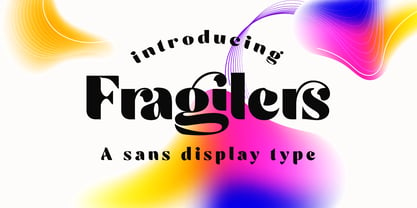 Fragilers is a bold sans display with high contrast, making it a versatile and elegant typeface. Fragilers contrast lines and smooth terminals give a sleek and elegant look to logos, holiday cards, wedding invitations, quotes, advertisements, and more. Fragilers is a versatile typeface full of character to enrich your designs. And of course multilingual support. Create awesome layouts of your designs with Fragilers.
 - Long Shine Script by BonjourType,
$17.00 LongShine Script is a fluid handwritten calligraphy fonts, combining calligraphy typefaces with a free flowing and moving baseline. It has a casual, yet elegant touch. Features 275 glyphs. Including initial and terminal letters, alternates, ligatures and multiple language support. Can be used for various purposes. such as headings, signature, logos, wedding invitation, t-shirt, letterhead, signage, lable, news, posters, badges etc.
 - PAG Liberta by Prop-a-ganda,
$19.99Prop-a-ganda offers retro-flavored fonts inspired by lettering on retro propaganda posters, retro advertising posters, retro packages all the world over. This is perfect font for your retrospective project. Very bold stems. Pointed Apexes. Bars and some of the terminals which designed as a ball are very eye-catching. These features make a strong impact with nostalgic feel. - Acid Squares by Milan Vuckovic,
$29.00Acid Squares is a casual ornamental (fun) font. It was inspired by squares, the 70’s, the 90′s, street art and Berlin. Due to its limited readability it is recommended to use it in words that are common and uncomplicated or in logo design. As a decorative element it can be used well if the kerning is adjusted by the user. - Aladin Pro by Sudtipos,
$29.00 Aladin is a calligraphic art deco face with an eastern touch, designed by Angel Koziupa and produced by Alejandro Paul. Casual, airy counters and friendly terminals give it an advantage as a packaging font for exotic coffees and teas. It also serves quite well on posters and book jackets where relaying the famous sense of Eastern hospitality and playfulness is a must.
 - Pelita by Lafontype,
$25.00 Pelita is a sans serif family which is divided into 2 sub-families, Regular and Grande. Pelita is designed with a terminal that forms a curved angle on one side so as to give the impression of representing firmness and softness. The grande version is a modified version of the main version, but is designed more streamlined with curves and more extreme angles.
 - Birdinaire by Ayca Atalay,
$16.00 Birdinaire | A Modern Calligraphy Font Birdinaire is a modern calligraphy font with highly slanted yet legible forms. It has a variety of ligatures and alternate letters that contribute to its originality and flow. With its textured dry brush look, Birdinaire emphasizes its handmade authentic qualities. FEATURES - Uppercase and Lowercase Letters - Numerals and Punctuation - Ligatures and Alternates - Terminal Forms - Arrows - Multilingual Character Set
 - Rase Grimm by Graffiti Fonts,
$24.99 The Grimm family is a blackletter inspired graffiti style built for headline and display. The family includes 3 variants: Grimm Regular & Grimm Curves both utilize traditional upper & lowercase letters while the Grimm Fat variation is an all-caps style. All 3 styles include initial, terminal & isolated letter variations as contextual alternates as well as a number of stylistic alternates, ligatures & other embellishments.
 - Aesthet Nova by Inhouse Type,
$33.78 Aesthet Nova is a display type family. Released initially as Aesthet in 2015, it had a significant makeover. Inspired by the 70’s aesthetics, Aesthet Nova remains true to its original "back to nature" roots. It is a smooth talker with a larger than life personality. Equipped with an extended Cyrillic character set, it features rounded serifs, ball terminals and soft corners.
 - Larisch by HiH,
$8.00 Larisch is a hand-lettered design by the Austrian calligrapher and teacher, Rudolf von Larisch. The original was used for the title page of the 1903 edition of Beispiele Kunstlerischer Schrift (Examples of Artistic Writing). Larisch is an attractive, casual set of caps of even strokes with rounded terminals. Except for the terminals, it is similar in style to Kunstler Grotesk. The numerals are lining or ranging figures, meaning they line up with the baseline, unlike old-style text figures. All are of equal width for setting up columns of numbers. The letters are well formed and easy to read, as you would expect from a writing master. Ligatures includes CH (123), CK (125), FT (135), LA (137), LO (167), OO (172), CO (177) and TT (181. An alternative O with underscore is provided at position 111. Friendly, but not fancy -- a very useful all-cap font.
 - Donovan Display by The Ampersand Forest,
$19.00 Meet Donovan Display! She's a lovely, high-contrast Didone with lots of options. Do you like sweeping flourishes at the end of your strokes? She's got 'em! Prefer juicy ball terminals? She's got 'em! Like a simpler, cleaner terminal? She's got those, too! She also has a set of grand swash capitals and a trunkful of ligatures that will add panache and elegance to any project that requires display-size type. Even better, she comes in two widths: Slim, for standard display use, and Skinny, a compressed version for spaces that require a bit of a squeeze and/or a more (traditionally) masculine feel! Donovan's lines are inspired by classic Didone faces — most notably the work of Firmin Didot (for architectural detail) and Giambattista Bodoni (for the look of the skinny version). She's sexy and stylish and she'll give you exactly the fashionable, elegant look you're after.
 - Melkslijter by PintassilgoPrints,
$29.00 With a stylish Dutch accent, this font draws inspiration from a 1935 brochure by the talented graphic designer and artist Dirk Hart. Carrying different hand-drawn lettershapes on upper and lower case slots despite being a unicase typeface, this font also brings a nice set of ornaments and complete sets of initial and terminal swash forms. When working with OpenType savvy applications these can conveniently be applied at the click of a button, thanks to the smart swashes programming, which will change the first and last letters in words with its corresponding initial or terminal forms. There are also some stylistic alternates for a (yet) more decorated look. The black version, with a somewhat art-deco feeling with added boldness, is also very decorative and contains the same features as the regular cut: smart swashes, different letterforms on upper and lowercase slots, ornaments and stylistic alternates.
 - Queulat Condensed by Latinotype,
$- This font is the condensed version of Queulat, but keeping the same features as the original typeface. Queulat Cnd is a hybrid typeface that combines different styles, reflecting charm, freshness and, especially, a strong personality.. Since it is a condensed font, it is well-suited for publishing and subheadings. The font is inspired by Modern and Grotesk styles. The former is shown in some characteristic features such as teardrop terminals, which give the typeface an attractive unique look, making it an ideal choice for logotypes and labelling. The latter, with its rationality, makes Queulat Cnd a stable and strong face for headings and subheadings. The combination of styles can be clearly seen by comparing the Regular with the Alt version. The Regular version is more simple than the Alt one. Differently, the alternative version possesses more features of the Modern style, like teardrop terminals in ‘k’ and ‘v’.
 - Pillow Fort by Fromletterel,
$12.00 Pillow Fort is a quirky handwritten font to energize your designs, this font really fits cute and casual concept. Others than that Pillow Fort also fits the degins that need magical fantasy vibe. This font will be suitable for branding, greeting cards, quotes and other beautiful projects.
 - Part and Parcel JNL by Jeff Levine,
$29.00Part and Parcel JNL is a collection of twenty-six packaging and shipping labels in a retro style. Use them for spot illustrations or scale them to make actual labels. Please refer to the license agreement for specific use in commercial applications regarding derivative or salable works. - Xero by Megami Studios,
$12.50 Xero is an intentionally loose creation of a humanist font, given a Russian flair! Played rougher than its counterparts Helvetica and Arial, Xero works well for those who want to go that route but don't want the sharply defined lines of others in the humanist family.
 - Bilbao by Borutta Group,
$29.00 Bilbao is a hybrid between sans, slab and mono fonts with geometric details. This typeface is defined by multiple features, which give it a friendly feeling. Bilbao is perfect for branding and display purposes. The entire family consist of 18 styles with italics from Thin to Bold.
 - M Kai 2 HK by Monotype HK,
$523.99 M Kai 2 HK is a handwritten style Traditional Chinese typeface. Handwritten font designs are derived directly from hand-drawn lettering or handwriting using analogue tools. Handwritten style Traditional Chinese fonts can include typefaces that reference or reinterpret traditional calligraphy, using classical exemplars by calligraphic masters.
 - M Kai 2 PRC by Monotype HK,
$523.99 M Kai 2 PRC is a handwritten style Simplified Chinese typeface. Handwritten font designs are derived directly from hand-drawn lettering or handwriting using analogue tools. Handwritten style Simplified Chinese fonts can include typefaces that reference or reinterpret traditional calligraphy, using classical exemplars by calligraphic masters.
 - Linotype Albawing by Linotype,
$29.99Linotype Albawing is the text type that is derived from the original idea for Linotype Albatross. The sketches were done with Fontographer 3.5 using the simplified outlines of Linotype Albatross. Linotype Albawing is an agile, lively and elegant font and well-suited for headlines, posters and advertisements. - Trade Journal JNL by Jeff Levine,
$29.00Trade Journal JNL and its oblique counterpart are derived from a classic grotesk sans face from the 1800s. Despite the 'Grotesk' style name, the font design is actually quite pleasing to the eye and a nice alternative to many of the sterile sans serif faces of today. - P22 BlancoNeg by IHOF,
$24.95 BlancoNeg was inspired by the lettering of Saul Bass with some thoughts of Op-Art. Each character relies on the positive and negative spaces of its neighboring letters to help define its own shape. This font is casual with the look of cut out paper forms.
 - Geotype by Say Studio,
$10.00 Geotype is typeface inspired by circle shapes simple but significant, and defined by its crisp edges and modern touches. It is designed for optimal legibility. An lowercase is unique with some alternates, Geotyface makes a statement without making a scene. Three weights, four very different personalities.
 - Concord by Soneri Type,
$39.00 Yet another typeface with simplicity as its core element. Concord is derived from a successful type family ‘Accord Alternate’ with an added geometric touch. Concord is a geometric sans serif. It has large counters which enhance readability. It is available in seven different weights for emphasis.
 - Brand X JNL by Jeff Levine,
$29.00 Brand X JNL is a retro-inspired Art Deco typeface with its name being derived from the generic label given to competitor's brands. Whenever a product wishes to extol its virtues without directly naming its competitors and thereby giving reverse publicity to them, "Brand X" is mentioned.
 - Molto by TypeTogether,
$49.00 Xavier Dupre’s Molto font family is a tonal master, creating tenderness in a slab serif and tempering toughness with flourishes. Slab serifs created their original niche by their ability to grab attention and overwhelm, which caused them to be seen as strong, dominant, and desired fonts, especially in advertising. Slab serifs are the result of placing defined edges on something meant to take up an inordinate amount of space, rather than meant to be graceful. Molto updates this concept to allow a greater, and gentler, range in the lighter weights. Molto’s nine weights are defined by their intended use. The two extreme weights (Hair and Fat) act as display partners for magazines, titles, and posters. The Hair weight is runway ready with its sturdy serifs, breathy internal space, and stable lettershapes that were designed both to perform and impress. Molto’s Fat weight packs maximum punch in a believable way. Its wide and deliberate curves contrast against thin connections and landing strip stems. Molto can be put to perfect use in a fashion magazine using swashy Hair headlines set against its darkest weight. Molto’s seven intermediate weights, with their classic and legible shapes, are meant for texts of all sizes. The notches on diagonals, distinct numerals, and acute terminals grant benefits from caption sizes up to headings. Molto’s refined light weights and punchy heavy weights set the stage for a swashy surprise — alternate capital letters act as refined garments laid atop its concrete skeleton. The Molto font family rejects saving space in favour of intensifying shapes, placing maximum weight on the edges for better legibility and impact. Latin-based digital and printed designs will benefit from Molto’s design voice and breadth. This means UI, video, and online text, and print materials like dictionaries, packaging, advertising, and branding can all put Molto’s robust forms to multipurpose use. Molto successfully creates balance in a slab serif design: an opinionated and striking type family, stalwart in captions and exuberant in display, thanks to swashes which add some originality to the slab category.
 - P22 St G Schrift by IHOF,
$39.95 P22 ST.G Shrift is a font series based on the type designs of Stefan George with an italic version designed by Colin Kahn. Stefan George (1868-1933) was a German poet who led the revolt against realism in German literature. All of his works were privately published and the typefaces that were used reflected his neo-classic and anti-industrial (progessive) aesthetics; oftentimes consisting of his own hand lettering designs. The original font was cast in 1907 by a small foundry in Germany and was used primarily for the works of George as well as other books including a monumental edition of Dante's Divine Comedy. The ST.G Shrift Fonts contained in this set are derived from 3 known variations of the original roman typeface, St.G., found in various books published in Berlin in the early 20th century. ST.G Shrift One contains the most idiosyncratic characters, while ST.G Shrift Two uses more familiar characters as well as a redesign of characters including the t and the k to be more in keeping with modern san-serif designs. The OpenType version of the roman contains both one and two and expands on them by including central European characters, small caps, and small caps titling figures. The Small Caps titling figures are derived from the first version of the typeface. Below is a features list (accessible through the type palette in Adobe programs) and their functions: ST.G Shrift Opentype Features: Small Caps: Changes Lowercase to Small Caps Titling Figures: Changes Uppercase to Titling Caps, and Small Caps to Small Caps Titling Figures Contextual Alternates: Changes Character Set to match ST.G One and changes Small Caps to Titling Small Caps Ornaments: Changes < > and ? (greater, less and bullet) to ornaments ST.G Shrift Italic is an art nouveau version of the roman. The OpenType version includes central European characters, small caps, titling caps, titling small caps and ornaments.
 - Amarga by Latinotype,
$29.00 The inspiration behind Amarga comes from the bitter taste of coffee. Amarga is a serif typeface with high contrast and pointed terminals, composed of 9 weights that range from a very heavy black version to a thin version plus italics, with a total of 18 fonts. Amarga has a great visual impact and is perfect for display uses in editorial design, web, branding, posters and many others.
 - Brasilica by CAST,
$45.00 Brasílica is a robust design, with wide proportions, that assimilates influences both from old style and modern types. This wide shapes, as well as the moderate contrast and sturdy serifs make it suitable to different conditions of printing. The sharp corners, as well as the abrupt connections and terminals are remarkable features of this typeface, that renders a sturdy and crisp texture, with a distinct aspect.
 - Mazot by Hurufatfont,
$29.00 Mazot is a modern sans serif with a compact and low contrast structure. Low contrast structure and terminals being flush with the body, gives it a raw effect. Perfect for Branding, Poster and Packaging designs. It has rich OpenType features. It consists of a total of 18 styles, from Light to Heavy with 9 weights and matching italics. It is available in 2-axes variable version.
 - Herchey by Ilham Herry,
$25.00 Introducing the new script font called Herchey. High quality script font with swashes inspired by modern vintage design and baseball logo. Plus OpenType features with Stylistic Alternates, Swashes, Ligatures, Stylistic set, Terminal Form and Ornament that allows you to mix and match pairs of letters to fit your design. This font is good for vintage design, t-shirt, logo, labels, badges, posters and etc.
 - Dora Fonna by Ws Studio,
$15.00 Dora Fonna is a new modern script font with an irregular baseline. Trendy and feminine style. Dora Fonna looks beautiful for branding, logo, wedding supplies, greeting cards, fashion, lookbooks, marketing promotions. Includes initial and terminal letters, alternatives, ligatures and multiple language support. Dora Fonna also has a strong neoclassical serif typeface with high contrast, cool style and look, unique with alternative fonts, Ligatures, and multilingual support.
 - Locke by North Type,
$- Locke is a stylish slab serif with a modern twist. Currently, it has 6 weights, ranging from ExtraLight to Bold. The presence of ball terminals on certain glyphs and its unusually high x-height give it a unique look, perfect for large titles or body copy. Locke has extensive multi-language support, counting over 390 glyphs per weight. Try out Locke Regular for free!
 - Blue (Not) Mono by Volcano Type,
$35.00 As a binary system, at the junction to two antagonist drawings, the Blue (Not) Mono typeface is a hybrid between the monospace and the humanistic sans-serif families. Declined to several variants and weights: a true monospace and a proportional one, a roman and italic style, bold and the main purpose is obviously to maintain in the same time a calligraphic identity, and a computing legacy.