10,000 search results
(0.053 seconds)
- GoodDogBones - Unknown license

- BadDog - Unknown license

- Waimea by BA Graphics,
$45.00A bold powerful design with a bit of Latin flare, great for headlines yet suitable for text. - Art Nouveau BA by Bannigan Artworks,
$19.95This is an original font designed in the Art Nouveau style with strong influences by Arnold Boecklin. - Semantica MF by Masterfont,
$59.00 Formal, yet with very high legibility even in small point sizes. Many weights gives you design alternatives
 - Tricky D by URW Type Foundry,
$39.99 Tricky is a modern and dynamic design which is enhanced and supplemented by Tricky Tracky following soon.
 - Serenade JNL by Jeff Levine,
$29.00Serenade JNL is an original design from Jeff Levine with a bit of an Art Nouveau feel. - Erased Typewriter 2 by Intellecta Design,
$27.00 A distressed typewriter font design, great for mimicking the distressed and sloppy ink effect of older machines.
 - Goygoy by Ali Güzel,
$14.00 It is a font that combines futurism and elegance. It is specially designed for logo font creation.
 - Italian Didot by BA Graphics,
$45.00 Exquisite design, delicate but yet strong enough to make a statement just right for that special occasion.
 - Plastelina MF by Masterfont,
$59.00 Very versatile sans serif font, designed with a soft touch of elegance. Great for invitations and headlines
 - Radiant by Red Rooster Collection,
$45.00Designed by R.H. Middleton. Digitally engineered by Steve Jackaman. Based on the original Ludlow drawings, circa 1938. - Tune Up JNL by Jeff Levine,
$29.00 Tune Up JNL is a collection of music notation symbols for graphic design or basic music composition.
 - Clarista by Nissa Nana,
$21.00 Clarista is a stunning script that will turn any design project into an authentic piece of art.
 - Fashion Didot by BA Graphics,
$45.00 Exquisite design, delicate but yet strong enough to make a statement. Just right for that special occasion.
 - Staxx Pro by RMU,
$45.00 Staxx Pro - a fantastic plastic display font - for ads, posters, billboards, covers, car and truck design etc.
 - Queen Of Hearts by BA Graphics,
$45.00This is a beautiful, free-flowing, informal, hand-written design, yet still elegant enough for many applications. - Bindle by Elemeno,
$25.00Rounded, tapered and bold, Bindle was designed as an alternative to overused or outdated informal sans serifs. - Zarina by BohFonts,
$- Sans serif typeface with calligraphic features and outstanding contrast between curve and line designed for small text.
 - Grandeur by BA Graphics,
$45.00A contemporary design can be used in all applications from text to Headlines. Very clean and readable. - Bacchus MF by Masterfont,
$59.00 The Bacchus font is a great choice when you want to effortlessly make your designs stand out.
 - Elephant Bells by BA Graphics,
$45.00 This 60's 70's design has a great nostalgic look. It appears to flourish within itself.
 - Gionni by Cultivated Mind,
$15.00 Gionni was designed by Cindy Kinash. This is a hand drawn, tall, light, thin retro inspired font.
 - Typetonic by Wilton Foundry,
$21.00 Typetonic is great display face for anything related to design, art or technology. Available in Crossplatform Opentype.
 - Delancey JNL by Jeff Levine,
$29.00 Inline lettering from a vintage piece of sheet music inspired Delancey JNL, an Art Deco-flavored design.
 - Ger by ParaType,
$25.00A set of historical Ossetic ornaments was designed by Lev Alborov in 1998 and licensed by ParaType. - Hess Old Style by Red Rooster Collection,
$45.00 Originally designed by Sol Hess as just a roman and italic for Lanston Monotype, circa 1920-23.
 - Shore Bodoni by BA Graphics,
$45.00A Bold new re cut of Bodoni, designed with a more contemporary look. Also has matching Italic. - Katty Signature by Dieza Design,
$15.00 Give your design the feel of authentic craft. "Katty Signature" is perfect for stationary, logos and more.
 - Pi Communication by Scangraphic Digital Type Collection,
$26.00PI Communication is part of the Scangraphic Collection and designed 1985 by Schriftatelier Scangraphic Dr. Böger GmbH. - Brutal by bb-bureau,
$65.00 Brutal is a not stencil calligraphic typeface designed in light, regular and bold. language: all latin glyphs
 - HOON Kkokkachamsae by Ziwoosoft,
$300.00 The final consonant was small designed to express cuteness. The changing writing line added a casual feeling.
 - Smart by Falling Angel,
$9.00 The Smart family started out as an idea for a smart design and kids magazine, games, etc.
 - Drum Shake by PizzaDude.dk,
$16.00 Drum Shake is my friendly, all-caps comicbook font - ready to serve and protect your next design!
 - Psychopath by DawnCreative.Id,
$12.00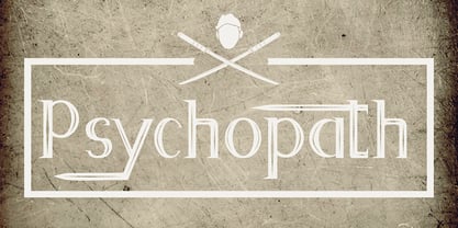 Psychopath is a display font with a katana effect. It'll match spooky, horror, and Halloween theme design.
 - Ashemore Softened by insigne,
$32.00 Following the success of the Ashemore family, it became clear that a rounded version of Ashemore would be a great addition to the product line that would allow designers even more design choices. Ashemore Softened’s rounder forms compliment the face well as the original font eschewed straight lines. The rounded terminators give the face a sense of friendliness that is unsurpassed. The distinct and flamboyant style of Art Nouveau and the Arts and Crafts style remain, but the blunted terminators give the face a more technological and contemporary look and feel. The Ashemore Softened family has a full range of six weights from thin to black and includes condensed and extended options for a total of 36 fonts. The typeface also includes some unique OpenType alternates that make the superfamily even more versatile. Ashemore Softened is equipped for complex professional typography, including alternates, small caps and many alternate characters. The face also has a number of numeral sets, including tabular figures, fractions, old-style, lining figures and superiors and inferiors. OpenType-capable applications such as Quark or the Adobe Suite can take full advantage of automatic ligatures and alternates. You can find these features demonstrated in the .pdf brochure. Ashemore Softened also includes the glyphs to support a wide range of languages, including Central, Eastern and Western European languages. In all, Ashemore Softened supports over 40 languages that use the extended Latin script, making the new addition a great choice for multi-lingual publications and packaging. The original Ashemore was designed by Jeremy Dooley with production assistance from Lucas Azevedo and Marcelo Magalhaes. Kerning assistance from iKern.
 - Dederon Serif by Suitcase Type Foundry,
$75.00Dederon Serif has been specifically designed for book setting. Preliminary sketches were drawn in 2004. Its inspiration – particularly its weight and width proportions – can be traced to the Liberta typeface from the TypoArt type foundry in former Eastern Germany. After a careful study of the model, the design of Dederon branched off into its own direction, finding its distinctive voice and becoming a wholly original type family. Dederon Serif kept most of the elements typical for the Old Style Roman lettering, such as the angle of the stress, the medium x-height, and lower contrast. In large sizes, the typical shapes of the letters stand out – the calligraphic feel characteristic for the Czech typefaces by Oldrich Menhart, the unusual serifs hinting at the angle of the pen, the shapes of the stems, or the terminals of dots and ears. Upon finishing the serif version, a Serif-serif variant called Dederon Serif was added. The construction principles are also derived from the Old Style Roman model, which lends the lettering its open, humanist feel. Yet the design also conforms to the rules of the modern Serif serif. Most characteristics of Dederon Serif match the serif version – the weight of individual cuts, the width proportions, x-height, ascenders' and descenders' length, and the slope of the italics. Each version of Dederon Open Type Std contains the standard Western Latin character set and the Central European characters; a number of basic and accented ligatures, small caps; old style, small caps and caps, table, fraction and superscript numerals; expert glyphs and alternative characters. This brings the total to a comfortable 820 glyphs per weight, permitting truly professional use in the most demanding projects. - Cursed Stone by Ditatype,
$29.00 Cursed Stone is a spine-chilling display font that will transport your designs to a realm of dark enchantment. Designed in large letters and with a bold weight, this typeface demands attention and exudes an aura of haunting mystery. Each letter is meticulously crafted with eerie stone texture details, adding an ominous and cursed touch to the font. The large size of the letters enhances the font's imposing presence, making it impossible to ignore. The stone texture details in each letter of this font bring an authentic and sinister feel, as if the font was chiseled from the depths of an ancient cursed monument. These haunting details add an element of mystique and darkness, immersing the viewer into a world of malevolent enchantment. The combination of bold weight and stone texture gives Cursed Stone a rugged and formidable look, evoking images of cursed relics and forbidden ruins. The letters appear to hold secrets from the past, carrying a haunting energy that captures the imagination. For the best legibility you can use this font in the bigger text sizes. Enjoy the available features here. Features: Alternates Multilingual Supports PUA Encoded Numerals and Punctuations Cursed Stone fits in headlines, logos, movie posters, flyers, invitations, branding materials, print media, editorial layouts, headers, and any horror-themed project. Find out more ways to use this font by taking a look at the font preview. Thanks for purchasing our fonts. Hopefully, you have a great time using our font. Feel free to contact us anytime for further information or when you have trouble with the font. Thanks a lot and happy designing.
 - FS Irwin by Fontsmith,
$80.00 New York vibes FS Irwin was born in New York while Senior Designer, Fernando Mello, was studying an intensive 5 week typeface design course at the Cooper Union. His brief was to design a perfectly clear typeface that could communicate well, without loud or overtly mannered design features. Fernando was influenced by the subway font in New York: ‘It is very in your face and clear, always in bold. It doesn’t shout much but at the same time is very present and unique. The design is completely different but it was this spirit I wanted to capture for FS Irwin.’ And the vibe of the city: ‘In a similar way to London, New York is so mixed and so cosmopolitan. I was amazed by the different styles and identities I saw there, and tried to encapsulate this essence to create something new, relevant and very now.’ Incisive quality Rather than focusing on quirks or distinctive characteristics, the key to FS Irwin is the quality of its design and spirit of simplicity. The design, proportions and details are usable and authentic and it is suitable for countless situations, without running the risk of being instantaneously noticeable. Families like this can be used on nearly anything, from more playful designs to serious corporate IDs. ‘Extensively tested and precisely drawn text-oriented typefaces are what I enjoy designing the most. There is a beauty and a different approach, a different way of making them interesting, sellable and usable rather than adding flicks or unexpected details.’ Inscriptions and calligraphy FS Irwin’s origin lies in Fernando’s studies in inscriptional lettering and writing-calligraphic exercises at the Cooper Union. Mello started the process by digitising his explorations and adapting them into a more workable sans serif structure. The traditional forms of writing which gave the basis to Latin type as we know it today were the perfect place to start. This influence can be seen in the proportion of the capitals and in slight writing-calligraphic details in the lowercase, such as the slightly angled, chiselled spurs and their open terminals.
 - Alisal by Monotype,
$29.99 Matthew Carter has been refining his design for Alisal for so long, he says, that when he was asked to complete the design for the Monotype Library, it was almost as if he were doing a historical revival of his own typeface. The illusion even extended to changes in his work process: although he now does all his preliminary and final drawing on screen, the first trial renderings of Alisal were done as pencil renderings. Alisal is best classified as an Italian old style design. Originally created between the late 15th and mid-16th centuries in northern Italy, the true Italian old styles were some of the first roman types. They tend to be the most calligraphic of serifed faces, with the axis of their curved strokes inclined to the left, as if drawn with a flat-tipped pen or brush. These designs offer sturdy, free-flowing and heavily bracketed serifs, short descenders, and a modest contrast in stroke weight. Alisal has nearly all the classic Italian old style character traits, plus a few quirks of its own. It is calligraphic in nature, with more of a pen-drawn quality than faces like Palatino or Goudy Old Style. It is more rough-hewn than either Goudy's Kennerley or Benton's Cloister, and is generally heavier in weight than most of the other Italian old style designs. One place where Alisal makes a clean break with traditional old style designs is in the serifs. While sturdy and clearly reflecting pen-drawn strokes, Alisal's serifs have no bracketing and appear to be straight strokes crossing the main vertical. Like Caslon or Trajanus, Alisal is a handsome design when viewed as a block of copy. Ascenders are tall and elegant, and serve as a counterpoint to the robust strength of the rest of the design. Alisal is available as a small family of roman and bold with a complementary italic for the basic roman weight, providing all that is needed for the majority of text typography. Alisal is not as well-known as some of Carter's other typefaces, but this lovely and long-incubated design was certainly worth the wait.

