10,000 search results
(0.048 seconds)
- FF Real Text by FontFont,
$50.99 FF Real is a convincing re-interpretation of the German grotesque style from between 1998 and 1908, but with much more warmth and improved legibility as well as a hint towards the warmer American grotesques. Later on, not just slanted styles, but a “proper” italic version was added inspired by the way Roman and Italic are distinguished in traditional serif faces. NEW: a specially created set of obliques were added in 2018 to give designers more design flexibility, for those looking for a less calligraphic look. In 2020 the family was extended with matching condensed weights. FF Real was originally conceived by Erik Spiekermann as one text weight and one headline weight to be used as the only faces in his biography ‘Hello I am Erik’, edited by Johannes Erler, published in 2014. While Spiekermann drew the alphabets, he passed on the font data to Ralph du Carrois and Anja Meiners who cleaned it up and completed it. In the meantime, FF Real has been extended to a family of two styles and 65 weights each. The design of FF Real is rooted in early static grotesques from the turn of the century. Several German type foundries – among them the Berlin-based foundries Theinhardt and H. Berthold AG – released such designs between 1898 and 1908. The semi-bold weight of a poster-size typeface that was lighter than most of the according semi-bolds in metal type at the time, gave the impetus to FF Real’s regular weight. In the words of Spiekermann, the historical example is “the real, non-fake version, as it were, the royal sans serif face“, thus giving his new typeface the name “Real” (which is also in keeping with his four-letter names, i.e. FF Meta, FF Unit). FF Real is a convincing re-interpretation of the German grotesque style, but with much more warmth and improved legibility. With a hint towards the warmer American grotesques, Spiekermann added those typical Anglo-American features such as a three-story ‘g’ and an ‘8’ with a more defined loop. To better distinguish characters in small text sizes, FF Real Text comes in old style figures, ‘f’ and ‘t’ are wider, the capital ‘I’ is equipped with serifs, as is the lowercase ‘l’. What’s more, i-dots and all punctuation are round.
 - ITC Bodoni Ornaments by ITC,
$29.99Giambattista Bodoni (1740-1813) was called the King of Printers; he was a prolific type designer, a masterful engraver of punches and the most widely admired printer of his time. His books and typefaces were created during the 45 years he was the director of the fine press and publishing house of the Duke of Parma in Italy. He produced the best of what are known as modern" style types, basing them on the finest writing of his time. Modern types represented the ultimate typographic development of the late eighteenth and early nineteenth centuries. They have characteristics quite different from the types that preceded them; such as extreme vertical stress, fine hairlines contrasted by bold main strokes, and very subtle, almost non-existent bracketing of sharply defined hairline serifs. Bodoni saw this style as beautiful and harmonious-the natural result of writing done with a well-cut pen, and the look was fashionable and admired. Other punchcutters, such as the Didot family (1689-1853) in France, and J. E. Walbaum (1768-1839) in Germany made their own versions of the modern faces. Even though some nineteenth century critics turned up their noses and called such types shattering and chilly, today the Bodoni moderns are seen in much the same light as they were in his own time. When used with care, the Bodoni types are both romantic and elegant, with a presence that adds tasteful sparkle to headlines and advertising. ITC Bodoni™ was designed by a team of four Americans, after studying Bodoni's steel punches at the Museo Bodoniana in Parma, Italy. They also referred to specimens from the "Manuale Tipografico," a monumental collection of Bodoni's work published by his widow in 1818. The designers sought to do a revival that reflected the subtleties of Bodoni's actual work. They produced three size-specific versions; ITC Bodoni Six for captions and footnotes, ITC Bodoni Twelve for text settings, and ITC Bodoni Seventytwo - a display design modeled on Bodoni's 72-point Papale design. ITC Bodoni includes regular, bold, italics, Old style Figures, small caps, and italic swash fonts. Sumner Stone created the ornaments based on those found in the "Manuale Tipografico." These lovely dingbats can be used as Bodoni did, to separate sections of text or simply accent a page layout or graphic design." - ITC Bodoni Brush by ITC,
$29.99Giambattista Bodoni (1740-1813) was called the King of Printers; he was a prolific type designer, a masterful engraver of punches and the most widely admired printer of his time. His books and typefaces were created during the 45 years he was the director of the fine press and publishing house of the Duke of Parma in Italy. He produced the best of what are known as modern" style types, basing them on the finest writing of his time. Modern types represented the ultimate typographic development of the late eighteenth and early nineteenth centuries. They have characteristics quite different from the types that preceded them; such as extreme vertical stress, fine hairlines contrasted by bold main strokes, and very subtle, almost non-existent bracketing of sharply defined hairline serifs. Bodoni saw this style as beautiful and harmonious-the natural result of writing done with a well-cut pen, and the look was fashionable and admired. Other punchcutters, such as the Didot family (1689-1853) in France, and J. E. Walbaum (1768-1839) in Germany made their own versions of the modern faces. Even though some nineteenth century critics turned up their noses and called such types shattering and chilly, today the Bodoni moderns are seen in much the same light as they were in his own time. When used with care, the Bodoni types are both romantic and elegant, with a presence that adds tasteful sparkle to headlines and advertising. ITC Bodoni™ was designed by a team of four Americans, after studying Bodoni's steel punches at the Museo Bodoniana in Parma, Italy. They also referred to specimens from the "Manuale Tipografico," a monumental collection of Bodoni's work published by his widow in 1818. The designers sought to do a revival that reflected the subtleties of Bodoni's actual work. They produced three size-specific versions; ITC Bodoni Six for captions and footnotes, ITC Bodoni Twelve for text settings, and ITC Bodoni Seventytwo - a display design modeled on Bodoni's 72-point Papale design. ITC Bodoni includes regular, bold, italics, Old style Figures, small caps, and italic swash fonts. Sumner Stone created the ornaments based on those found in the "Manuale Tipografico." These lovely dingbats can be used as Bodoni did, to separate sections of text or simply accent a page layout or graphic design." - ITC Bodoni Six by ITC,
$40.99Giambattista Bodoni (1740-1813) was called the King of Printers; he was a prolific type designer, a masterful engraver of punches and the most widely admired printer of his time. His books and typefaces were created during the 45 years he was the director of the fine press and publishing house of the Duke of Parma in Italy. He produced the best of what are known as modern" style types, basing them on the finest writing of his time. Modern types represented the ultimate typographic development of the late eighteenth and early nineteenth centuries. They have characteristics quite different from the types that preceded them; such as extreme vertical stress, fine hairlines contrasted by bold main strokes, and very subtle, almost non-existent bracketing of sharply defined hairline serifs. Bodoni saw this style as beautiful and harmonious-the natural result of writing done with a well-cut pen, and the look was fashionable and admired. Other punchcutters, such as the Didot family (1689-1853) in France, and J. E. Walbaum (1768-1839) in Germany made their own versions of the modern faces. Even though some nineteenth century critics turned up their noses and called such types shattering and chilly, today the Bodoni moderns are seen in much the same light as they were in his own time. When used with care, the Bodoni types are both romantic and elegant, with a presence that adds tasteful sparkle to headlines and advertising. ITC Bodoni™ was designed by a team of four Americans, after studying Bodoni's steel punches at the Museo Bodoniana in Parma, Italy. They also referred to specimens from the "Manuale Tipografico," a monumental collection of Bodoni's work published by his widow in 1818. The designers sought to do a revival that reflected the subtleties of Bodoni's actual work. They produced three size-specific versions; ITC Bodoni Six for captions and footnotes, ITC Bodoni Twelve for text settings, and ITC Bodoni Seventytwo - a display design modeled on Bodoni's 72-point Papale design. ITC Bodoni includes regular, bold, italics, Old style Figures, small caps, and italic swash fonts. Sumner Stone created the ornaments based on those found in the "Manuale Tipografico." These lovely dingbats can be used as Bodoni did, to separate sections of text or simply accent a page layout or graphic design." - Rezak by TypeTogether,
$36.00 Nothing is hidden in the simplistic forms and overt aesthetic of Anya Danilova’s Rezak font family. Rezak is not a type family directly from the digital world, but was inspired by the stout presence of cutting letters out of tangible material: paper, stone, and wood. With only a few cuts, the shapes remain dark and simple. With more cuts, the shapes become lighter and more defined, resulting in a dynamic type family not stuck within one specific category. The Black and medium weights began as one approach before separating into display and text categories. The four text weights were created through pendulum swings in design direction that experimented with contrast, angles, tangent redirections, and the amount of anomalies allowed. The text weights are vocal when set larger than ten points and subtle at smaller sizes. The tech-heavy Incised display style came last, employing a surprising range of trigonometric functions to make it behave exactly as desired. Its look can result in something distinctive and emotional or completely over-the-top. Most normal typefaces change only in thickness; Rezak changes in intention, highlighting the relationship between dark and light, presence and absence, what’s removed and what remains. Rezak’s Black and Incised display styles are like a shaft of light in reverse and are perfect in situations of impact: websites, headlines and large text, gaming, call-outs, posters, and packaging. The tone works for something from youthful or craft-oriented to organic and natural products. Try these two in logotypes, complex print layering, branding, and words-as-pattern for greater experimentation. The text styles are bold, energetic, well informed, and round out the family with four weights (Regular, Semibold, Bold, Extrabold) and matching italics for a family grand total of ten. These jaunty styles work well in children’s books, call-outs, movie titles, and subheads for myriad subjects such as architecture, coffee, nature, cooking, and other rough-and-tumble purposes. Rezak’s crunchy letters are meant to expose rough, daring, or dramatic text. A further benefit is that this family is not sequestered within one specific genre or script, so it can be easily interpreted for other scripts, such as its current Latin and extended Cyrillic which supports such neglected languages as Abkhaz, Itelmen, and Koryak. Rezak’s push toward creativity and innovation, with an eye on typography’s rich history, reinforces our foundry’s mission to publish invigorating forms at the highest function and widest applicability.
 - FF Real Head by FontFont,
$50.99 FF Real is a convincing re-interpretation of the German grotesque style from between 1998 and 1908, but with much more warmth and improved legibility as well as a hint towards the warmer American grotesques. Later on, not just slanted styles, but a “proper” italic version was added inspired by the way Roman and Italic are distinguished in traditional serif faces. NEW: a specially created set of obliques were added in 2018 to give designers more design flexibility, for those looking for a less calligraphic look. In 2020 the family was extended with matching condensed weights. FF Real was originally conceived by Erik Spiekermann as one text weight and one headline weight to be used as the only faces in his biography ‘Hello I am Erik’, edited by Johannes Erler, published in 2014. While Spiekermann drew the alphabets, he passed on the font data to Ralph du Carrois and Anja Meiners who cleaned it up and completed it. In the meantime, FF Real has been extended to a family of two styles and 65 weights each. The design of FF Real is rooted in early static grotesques from the turn of the century. Several German type foundries – among them the Berlin-based foundries Theinhardt and H. Berthold AG – released such designs between 1898 and 1908. The semi-bold weight of a poster-size typeface that was lighter than most of the according semi-bolds in metal type at the time, gave the impetus to FF Real’s regular weight. In the words of Spiekermann, the historical example is “the real, non-fake version, as it were, the royal sans serif face“, thus giving his new typeface the name “Real” (which is also in keeping with his four-letter names, i.e. FF Meta, FF Unit). FF Real is a convincing re-interpretation of the German grotesque style, but with much more warmth and improved legibility. With a hint towards the warmer American grotesques, Spiekermann added those typical Anglo-American features such as a three-story ‘g’ and an ‘8’ with a more defined loop. To better distinguish characters in small text sizes, FF Real Text comes in old style figures, ‘f’ and ‘t’ are wider, the capital ‘I’ is equipped with serifs, as is the lowercase ‘l’. What’s more, i-dots and all punctuation are round.
 - Civane by insigne,
$- High atop the mountain of fonts, a new structure has been raised--one solid and strong against the challenges of time. Civane is a victorious conqueror among fonts, standing above the clutter and the mundane. Its firm structure joins effortlessly with graceful calligraphy in a new flowing, inscriptional typeface. Civane is inspired by monuments of great civilizations, whose lofty inscriptions remain chiseled into the very stones and columns of their structures. The font’s medium contrast with its flared stroke ends lead the reader to feel the solemn presence found in these great obelisks and shrines. Even Civane’s thinnest weight holds a quiet power over its audience. Still, its classic lines provide a beautiful flow between the strong letters, allowing the reader’s eye to move easily across the page. Civane supports OpenType features and comes with upright italics, alternates, ligatures, old-fashioned figures, titling and small caps. Preview all these features in the interactive PDF manual. The font family has 48 fonts, with three widths and eight weights. The font family also includes glyphs for 72 languages; over 550 glyphs per font stand ready for you to command throughout your design. Civane is built for advertising and display typesetting as well as title and small text, making it an excellent choice for websites as well as flyers and packaging. Use it for defining your brand or for creating designs that evoke academia, militaria, monuments, automobiles, signs, and so on. Its 48 well-designed fonts are well-equipped to help you leave your mark on history. Production assistance from Lucas Azevedo and ikern.
 - TT Severs by TypeType,
$29.00 TT Severs useful links: Specimen | Graphic presentation | Customization options TT Severs is a geometric grotesque with emphasized elements of internal brackets. A distinctive feature of TT Severs is the unusual form of internal ovals, which refers us to the style of traditional Arabic writing. TT Severs has a strong character and is great for use in high tech (IT), the web, in robotics, computer games, and sports. TT Severs is a 2-in-1 font family. In a large body size, it works great as a display font, creating a distinctive character for logos and headings. At the same time, when TT Severs is used in a small body size or in large text arrays, the font’s peculiarities of bracket construction fade, and it perfectly functions as a text font, thanks to both the low contrast between vertical and horizontal strokes and the detailed logic of interaction of black and white letter elements. The font family TT Severs includes 18 fonts, each of which consists of 558 glyphs. The family has standard and discrete ligatures, which include experimental ligatures for the Cyrillic alphabet. In addition, TT Severs can be made a little more humanist—it is enough to turn on stylistic alternates, and due to them the font takes the form of a humanist grotesque, which refers us to traditional broad nib writing. As part of the font family, you will also find old-style figures and a large number of OT features such as case, ordn, sups, sinf, dnom, numr, onum, tnum, pnum, liga, dlig, salt (ss01), frac.
 - Pixochrome - Unknown license

- Walentiny by Stringlabs Creative Studio,
$25.00 Walentiny is a Script Font with Handwritten Style. The Walentiny font made with digital brush pen strokes that making this font look authentic. This font is perfect for fashion brand, wedding invitation, business card, logo brand, signature, and then calligraphy.
 - Quiet The Thief by Dismantle Destroy,
$19.00This would be a great font for a book. There are 7 fonts in the font family, so there are a lot of choices to work with. The font features all capital letters with some alternate glyphs for certain characters. - Arionna by Stringlabs Creative Studio,
$25.00 Arionna is a Script Font with Calligraphy Style. The Arionna font made with modern digital brush pen strokes that making this font look beautiful. This font is perfect for fashion brand, wedding invitation, business card, logo brand, signature, and then calligraphy.
 - Hedymosia by Wontenart,
$12.00 Hedymosia is a font that has unique glyphs on the curve intended to be shaped like noodles or spaghetti or similar food. font suitable for the food. Noodle food Font or anything about foods, New and Fresh font 2023, Thank You
 - Black Orchestra by 38-lineart,
$16.00 ‘Black Orchestra’ is a black letter font inspired by heavy metal. This font consists of uppercase and lowercase and is supported by ‘Latin extended’ which allows wider use of this font. This font will turn any horror project into a standout!
 - Firsta by Stringlabs Creative Studio,
$25.00 Firsta is a Script Font with Handwritten Style. The Firsta font made with digital brush pen strokes that making this font look authentic. This font is perfect for fashion brand, wedding invitation, business card, logo brand, signature, and then calligraphy.
 - Baliung by Stringlabs Creative Studio,
$25.00 Baliung is a Script Font with Handwritten Brush Style. The Baliung font made with digital brush pen strokes that making this font look authentic. This font is perfect for fashion brand, wedding invitation, business card, logo brand, signature, and then calligraphy.
 - Reinstay by Stringlabs Creative Studio,
$25.00 Reinstay is a script font with textured brush style. The Reinstay font made with digital brush pen strokes that making this font look authentic. This font is perfect for fashion brand, wedding invitation, business card, logo brand, signature, and then calligraphy.
 - Vagnotie by Stringlabs Creative Studio,
$25.00 Vagnotie is a Script Font with Modern Brush Style. The Vagnotie font made with digital brush pen strokes that making this font look authentic. This font is perfect for fashion brand, wedding invitation, business card, logo brand, signature, and then calligraphy.
 - Rakeboom by CBRTEXT Studio,
$16.00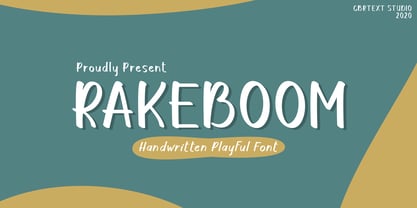 Rakeboom is a cute handwritten font. This font is equipped with uppercase, lowercase, symbols, and punctuation. This font is suitable for branding purposes such as logos, book covers, quotes, crafts, magazines, advertisements, and others. This font also supports multi-languages.
 - Curly Gloom by Heyfonts,
$15.00 Curly gloom is an experimental font adapted from a combined groovy font and graffiti that makes its unique character as a display font, this font is very suitable to use as your project design such as a graphic template or clothing.
 - Vezthisory by Stringlabs Creative Studio,
$25.00 Vezthisory is a Script Font with Handwritten Style. The Vezthisory font made with digital brush pen strokes that making this font look authentic. This font is perfect for fashion brand, wedding invitation, business card, logo brand, signature, and then calligraphy.
 - Aquaboy by ZetDesign,
$16.00 Aquaboy fonts are display fonts that are inspired from water, bringing you to a feeling of relaxation and peace. This font is very suitable for use in water nuanced design work. let your mind flow by using this nice font. Thanks ...!
 - Blantica by 4RM Font,
$35.00 Blantica font is inspired by something harmonious and is made with variations in inktrap with bold font sizes making this font look unique and harmonious. suitable in the use of display fonts and graphic designs such as logos, covers, and others.
 - HeiT ASC Traditional Chinese by Ascender,
$523.99The HeiT ASC Font family contains 3 Traditional Chinese fonts with Big 5 support. HeiT ASC Font Family features a sans serif style with consistent strokes. HeiT ASC Bold Font Family character Set: Latin-1, Traditional Chinese (code page 950). - Segoe Chess by Microsoft Corporation,
$29.00Segoe™ Chess font is part of the Segoe family of fonts from Microsoft. The Segoe Chess font contains the chess figurines and symbols for creating chess diagrams. Segoe Chess was designed by Jim Ford and is a symbol-encoded font. - Shrapnel - Personal use only

- Murrx - 100% free

- Tomatoes Cake by Balpirick,
$15.00 Tomatoes Cake is a Cute Handbrushed Font. Whether you’re using it for crafts, digital design, presentations, or making greeting cards, this font has the potential to become your favorite go-to font, no matter the occasion! This font only has allcaps letters. - also multilingual support Enjoy the font! Feel free to comment or feedback! Thank you!
 - Shield Classic 2 Letters by MonogramBros,
$12.00 Shield Classic 2 Letters Monogram Font is a perfect shaped monogram font consisting of 52 letters and 1 basic frame. With just a single font file you will be able to create beautiful monograms in just a matter of minutes after the purchase! Shield Classic 2 Letters Monogram Font comes with font file in OTF format.
 - Simpleoak by Balpirick,
$15.00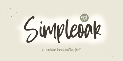 Simpleoak is a Modern Handwritten Font. Simpleoak is a cute and vintage styled handwritten font. Whatever the topic, this font will be a wonderful asset to your font library, as it has the potential to enhance any creation. - also multilingual support Enjoy the font, feel free to comment or feedback, send me PM or email. Thank you!
 - Obelisk Stone by Balpirick,
$15.00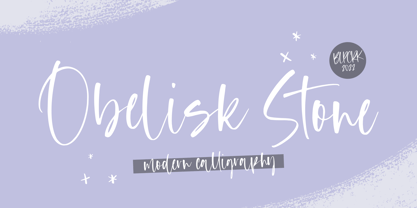 Obelisk Stone is a Modern Calligraphy Font. Obelisk Stone is a dazzling script font. Whatever the topic, this font will be a wonderful asset to your font library, as it has the potential to enhance any creation. - also multilingual support - Ligatures Enjoy the font, feel free to comment or feedback, send me PM or email. Thank you!
 - PAG Theater by Prop-a-ganda,
$19.99Prop-a-ganda offers retro-flavored fonts inspired by lettering on retro propaganda posters, retro advertising posters, retro packages all the world over. This is perfect font for your retrospective project. PAG Theater is narrow and monoline font, it definitely retrospective font, but it is also modern and contemporary. Perfect font for display, poster and logo. - Fabulous Rabbit by Balpirick,
$15.00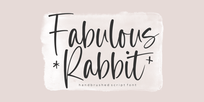 Fabulous Rabbit is a Handbrushed Script Font. Fabulous Rabbit is a cute and slim handwritten font. Whatever the topic, this font will be a wonderful asset to your font library, as it has the potential to enhance any creation. - also multilingual support Enjoy the font, feel free to comment or feedback, send me PM or email. Thank you!
 - MGN Ismawan by Morgana Studio,
$17.50 MGN Ismawan. This font was created in 2022 and was inspired by the Helvetica font. With a standard shape and being a bit wide, this font is suitable for writing, but for headlines, we think it's still OK. There are several forms of this font that have a distinctive character, which makes this font suitable for logo writing.
 - Cupid Gummies by Balpirick,
$15.00 Cupid Gummies is a Sweet and Cute Handbrushed Font. Whether you’re using it for crafts, digital design, presentations, or making greeting cards, this font has the potential to become your favorite go-to font, no matter the occasion! This font only has allcaps letters. - also multilingual support Enjoy the font! Feel free to comment or feedback! Thank you!
 - Auguste Boutique by Balpirick,
$15.00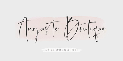 Auguste Boutique is a Modern Calligraphy Font. Auguste Boutique is a dazzling script font. Whatever the topic, this font will be a wonderful asset to your font library, as it has the potential to enhance any creation. - also multilingual support - Ligatures Enjoy the font, feel free to comment or feedback, send me PM or email. Thank you!
 - Punchado Punch by MyAnvil,
$20.00 This font was inspired by the original "Punchado" font; and this evolved font is named the "Punchado Punch". The "Punchado Punch" font features similar sharp edges and measured right angles with a greater impact of design . The theme of this font is perhaps best suited for: science, science fiction, engineering, mathematics, future, video games, gaming, computers, etc.
 - Dolphin Dolls by Balpirick,
$15.00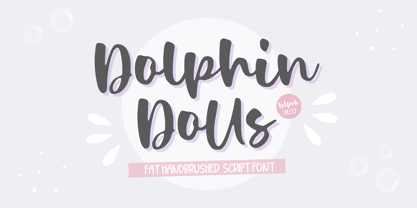 Dolphin Dolls is a Handbrushed Script Font. Dolphin Dolls is a cute and vintage styled handwritten font. Whatever the topic, this font will be a wonderful asset to your font library, as it has the potential to enhance any creation. - also multilingual support Enjoy the font, feel free to comment or feedback, send me PM or email. Thank you!
 - White Risolles by pentagonistudio,
$19.00 White Risolles Is Clean Script Font Inspired By Handwritting Characters. Font Features : White Risolles OTF ( Open Type ) White Risolles WOFF ( Web Font ) SOFTWARE REQUIREMENTS : Fonts and alternate : No special software required they may be used in any basic program /website apps that allows standard fonts That's it folks! You can go ahead and get cracking :) Have a Good Day !
 - Alnis by Daily Studio,
$16.00 Alnis is a bold type font with a round but straight shape. This font creates a formal yet relaxed vibe for any of your projects. Best font for designers. Alnis is excellent for logos, posters, cards, ext. Make your project look fascinating by combining it with another font. This font comes up with full uppercase, lowercase, and multilingual letters.


