10,000 search results
(0.012 seconds)
- Not His Angel - Unknown license

- Crushed Out Girl - Unknown license

- Black Eye Nue - Unknown license

- Crinkle Cut Glass - Personal use only

- VTC Krinkle-Kut - Unknown license

- VTC Krinkle-Kut - Unknown license

- Popcorn NOT included - Unknown license

- VTC Krinkle-Kut - Unknown license

- VTC Krinkle-Kut - Unknown license

- Cacophony Out Loud - Unknown license

- Boldly Go Out - Unknown license

- Scissor Cuts 2 - Unknown license

- I'm NOT Weapon - Unknown license

- Out of sight - Unknown license

- VTC Krinkle-Kut - Unknown license

- Supervixen Honeyed Out - Personal use only

- Decked Out NF by Nick's Fonts,
$10.00 - Directors Cut Pro by Type Innovations,
$39.00
- Cut Sans Serif by Aksharasarovara,
$25.00 - MC Nun Waw by Maulana Creative,
$14.00
- Evening Out JNL by Jeff Levine,
$29.00
- Cut Nyak Dhin by Nandatype Studio,
$12.00
- Blue (Not) Mono by Volcano Type,
$35.00
- Spread Out NF by Nick's Fonts,
$10.00 - Not Your Droids by Thomas Käding,
$5.00
- Dining Out JNL by Jeff Levine,
$29.00
- Maxed Out NF by Nick's Fonts,
$10.00
- Nud Motoya Cedar by Motoya,
$229.00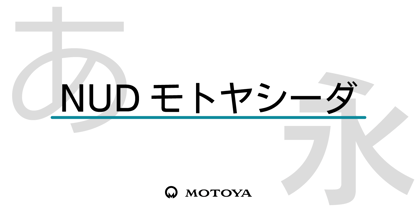
- AZ Cut Script by Artist of Design,
$25.00
- Not My Type by It's me Simon,
$14.00
- Random But Perfect by Aldedesign,
$18.00
- MC Robneys Hut by Maulana Creative,
$15.00
- Shaken, Not Stirred by Hanoded,
$15.00
- FE Blacking Out by Egor Stremousov,
$50.00
- Tooned Out JNL by Jeff Levine,
$29.00 - Funky Tut NF by Nick's Fonts,
$10.00 - Nud Motoya Aporo by Motoya,
$229.00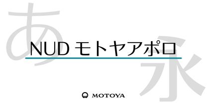
- Not A Chance by PizzaDude.dk,
$20.00
- Rough Cut NF by Nick's Fonts,
$10.00 - Letterpress Cuts JNL by Jeff Levine,
$29.00


