1,683 search results
(0.187 seconds)
- Benton Modern RE by Font Bureau,
$40.00 Benton Modern was first prepared as a text face by Font Bureau for the Boston Globe and the Detroit Free Press. Design and proportions were taken from Morris Fuller Benton’s turn-of-the-century Century Expanded, drawn for ATF, faithfully reviving this epoch-making magazine and news text roman. The italic was based on Century Schoolbook. This version of the family is part of the Reading Edge series of fonts specifically designed for small text onscreen, having been adjusted to provide more generous proportions and roomier spacing, and having been hinted in TrueType for optimal rendering in low resolution environments.
 - Roscha by Luhop Creative,
$14.00 Roscha is a fully reconsidered high contrast transitional serif, which is perfectly adapted to modern realities and requirements. When starting this project, we wanted to try to draw a modern serif with the precisely verified shapes, high contrast and detailed elaboration of each character. Roscha is perfect for use in magazines, in the fashion industry, in the branding of premium goods and services. Roscha is quite versatile and suitable for use both in headings and in text arrays. In addition, we have done manual hinting in the typeface, and now it can be used with a clear conscience in the web and applications.
 - Balkey by Flawlessandco,
$9.00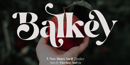 Balkey is a captivating retro serif font that brings a touch of fun and uniqueness to your designs. With its distinct style and nostalgic charm, Balkey is perfect for projects that demand a hint of playful elegance. An Original typeface that suitable for any graphic designs such as branding materials, t-shirt, print, business cards, logo, poster, t-shirt, photography, quotes .etc This font support for some multilingual. Modern Sweet Retro that contains uppercase A-Z and lowercase a-z, alternate character, numbers 0-9, and some punctuation. If you need help, just write me! Thanks so much for checking out my shop
 - Beeching by Greater Albion Typefounders,
$14.95 Beeching is a family of six typefaces designed to combine extreme legibility with a hint of retrospective character. It is inspired by the lettering used in the Leslie Green designed stations of the London Underground and is as up to date today as it was the day those stations opened. The Beeching faces (Regular, Bold, Small Capitals, Small Capitals Bold, Shadowed and Small Capitals Shadowed) are ideal for use in large scale signage that needs to be seen over long distances. We feel the family provides a clear demonstration that traditional details, such as serifs and ligatures serve to enhance legibility.
 - Copenhagen Grotesk by David Engelby Foundry,
$- From Weimar to København/Copenhagen, picking up some decadent traits on its journey. The design of Copenhagen Grotesk is inspired by the great German grotesque type design history, although it will not fall into ranks in all aspects. Indeed, Copenhagen Grotesk will not be put into one single time pocket of style, so you'll notice that there's a hint of art deco style in its capital letters. The visual expression is first and foremost firmly rooted in the style of Scandinavian design, so feel free to use Copenhagen Grotesk for functional typographic design in relation to multiple media types.
 - Bogue by Melvastype,
$29.00 Bogue is a soft serif type family of 8 weights and matching italics. The soft forms gives it a friendly and approachable character with a hint of retro feeling. Bogue comes with a lots of stylistic alternates that makes it very versatile in various uses like logos, editorial design, branding, web design, package design and much more. You can use it to create short powerful phrases and headlines and also use it in longer text like lead paragraphs and body texts. So if you are looking for a versatile soft serif font with a friendly character you have found it!
 - Chesterfield by ITC,
$39.00Alan Meeks designed Chesterfield in 1977. Chesterfield is a retro typeface, harkening back to decorative design from the turn of the century. There are many subtle art nouveau traits and curves in Chesterfield, and a hint to Frederic Goudy's work as well. Chesterfield is a display typeface, and should not be used in sizes below 12 point. This typeface would be a great fit for newsletter headlines, or signs for country stores. There are two styles of Chesterfield available: Chesterfield, and Chesterfield Antique. Chesterfield Antique is a more antiquated version of the typeface, and its letters appear slightly corroded. - ITC True Grit by ITC,
$29.99ITC True Grit is the work of American designer Michael Stacey, a bold distinctive typeface. An enthusiastic collector of vintage graphic design, Stacey says that he is especially intrigued by lettering styles from the days when most display typography was done by hand. The style for ITC True Grit was taken from the 1930s and updated for digital imagine. Stacey say his goal was to retain the casual feel of handlettering yet impart the crisp finish of current precision typography." ITC True Grit is a hybrid design, a cross between German Blackletter and brush script with a hint of Jugendstil thrown in." - VVDS Rashfield by Vintage Voyage Design Supply,
$20.00 Rashfield is a soft serif type family in 5 weights and italics. Inspired by classical Windsor mood in Woody Allen movie titles, with outward bent h, m, n and a lot of modern alternates. Softly character with a hint of retro feeling. Rashfield has a lots of stylistic alternates that makes it very playful in various uses like logos, prints, branding, web design, packaging and more. Use it to create short powerful phrases and headlines and also use it in longer text like paragraphs and block texts. Perfect for modern projects with a little retro mood feel.
 - GreenCherry by Vishwakarma Studio,
$10.00 GreenCherry typeface is for regular texts. I have designed every glyph with kept perfection in mind. I also retained symmetry throughout all glyphs. They look very premium when placed together. The typeface has 3 fonts - Thin, Normal & Bold. Every font has 210 glyphs and supports Western European languages. It has essential OpenType features like Kerning and Hinting. Hence you can use it wherever you want. It works very well with print media and web media as well. This typeface is suitable for Websites, Apps, Blogs, Book Publication, Stationery, Signage, and other Printing media. I am sure you will enjoy this typeface.
 - WEAR FAT SHIRT by TypoGraphicDesign,
$15.00 CONCEPT/ CHARACTERISTICS A display font that allows you to »Kleckern und Klotzen« (modified German proverb »to not take half-measures«) The fat and square character to the font, a bold and loud statement. The motto is square, practical, fat. The font styles ranging from high-contrast line difference "beanpole" over mediocrity "slim" to the fattest and blackest "okay" style. A font with humor ^^ APPLICATION AREA The modern, square lightweight »Fat Wear Shirt« would be happy as a display typeface in headline size on the following areas and would find this very real bold: Editorial Design (Magazine or Fanzine) or Webdesign (Headline Webfont for your website), party flyer, movie poster, music poster, clothing, fashion, t-shirts, music covers or webbanner. And and and… TECHNICAL SPECIFICATIONS Headline Font | Display Font | Fat Techno Font »Wear Fat Shirt« OpenType Font (Mac + Win) with 3 styles (okay, slim, beanpole) & 268 glyphs. Alternative letters and ligatures (with accents & €) Desktop Font (.otf) + Web Font (.svg, .eot, .woff) KONZEPT/BESONDERHEITEN Eine Display-Schrift bei der Kleckern und Klotzen erlaubt ist! (Verändertes deutsches Sprichwort »nicht kleckern sondern klotzen«) Der fette und eckige Charakter verleihen der Schrift eine plakative und laute Aussage. Das Motto lautet quadratisch, praktisch, fett. Die Schriftschnitte reichen von kontrastreichen Linienunterschied »beanpole«, über mittelmaß »slim« bis zum fettesten und schwärzesten »okay« Style. Eine Schrift mit Humor ^^ EINSATZGEBIETE Das moderne, quadratische Leichtgewicht »Wear Fat Shirt«, würde sich als Auszeichnungsschrift in Headlinegröße über folgende Einsatzgebiete sehr freuen und fände dies echt fett: Logos/Wortmarken aller Art, Flyer für fast jede Party, Platten Cover, CD-Cover und Icon Design, Plakat Design, Kleidung, T-Shirts, Comics und Graphicnovels, Game– und Videospiel Design aller Genres, als Headlineschrift für print und digitale Magazine, Bücher und Webseiten u.v.m. TECHNISCHE INFORMATIONEN Headline Font | Display Font | Fat Techno Font »Wear Fat Shirt« OpenType Font (Mac + Win) mit 3 Schriftschnitten (okay, slim, beanpole) & 268 Glyphen. Inkl. diakritisches Zeichen, alternative Buchstaben, Ligaturen & €. Desktop Font (.otf) + Web Font (.svg, .eot, .woff)
 - Cinnamon Peach by Abbasy Studio,
$8.50 Let me introduce my first ever product on my shop. Cinnamon Peach - Layered Font After 2 years of learning how to create a fonts, learn about the anatomy of typography, features of the OpenType fonts, and all of the experience on my collaborations with many friends, Finally I just launched my first personal product with the name Cinnamon Peach. Cinnamon Peach is beauty combinations of layered font. It has a Serif and Script style inside. Both of them are layered font, which is you can express the style on both of it. You can add shadow, inline or hatch on Serif style. Changing the color of the other layer as just easy as change standard color of the fonts but it’s more deep in detail. On the Script style, I give you more freedom of choosing which style do you want, if you want a deep style of layer, you can choose regular and inside with different color. but if you want the outline style, it also available as a single fonts. Looks like on the display that I Created, You can see the most of combinations font in there are perfectly matched even on script version doesn’t include the Uppercase character. Because of the strong characteristic of this fonts you can see the combinations are great with or without layer, monochrome or multi color, pastel or watercolour. It’s great for posters, display, logos, header website, magazine, animation text, etc. Thank You very much, hope you enjoy this fonts !
 - Masqualero by Monotype,
$50.99 The Masqualero™ family is a versatile solution for a deep and broad range of applications. In large sizes, the heavier designs are dark and handsome, while the lighter weights are charming and friendly in text copy. Thanks to its many variations and distinctive demeanor, both print and interactive designers will find that Masqualero expands their creative options, while setting the perfect tone to catch and hold readers’ attention. It’s About the Design Like the legendary jazz song of the same name, Masqualero is haunting and sophisticated. Drawn as a tribute to Miles Davis, its letterforms are as beautiful as his “Masqualero” composition. “I approached drawing the letters as if they were marble sculptures,” Says Jim Ford about his typeface. “Many sharp, black, modern sculptures filling a large park. All of them created with the same qualities – the flair of Miles' electric funk and rock sounds, the sparkly smooth finish and serifs like trumpet bells, the sweet lyricism and the tone and clarity of Miles’ horn.” What’s Available With six weights and italics, in addition to Stencil and Groove display designs, Masqualero is available as a suite of OpenType Pro fonts, providing for the automatic insertion of small caps, ligatures and alternate characters. Pro fonts also offer an extended character set supporting most Central European and many Eastern European languages. Thoughts About Use A book or album cover set in the Masqualero design sends a message: what’s inside is of value. Like jazz, the Masqualero typeface takes ordinary basic concepts and slips them into something special. Readers take notice and immediately recognize that what they’re viewing is a cut above – and radiates quality. “I see Masqualero as a luxurious typeface for exquisite typography,” says Ford. “I wouldn’t use it to sell toys or hot dogs. Masqualero sells diamonds, boats, real estate and champagne.” Perfect Pairings Antique Olive™ Neue Kabel® Neue Frutiger® Quire Sans™ Trade Gothic®
 - Cinema Macabre by Wing's Art Studio,
$10.00 Cinema Macabre: Horror Fonts Torn from the Pages of Giallo A Hand-drawn Display Font for Creating the Most Diabolical Horror Titles This loose and inky brush font takes its inspiration from the classic Giallo film posters of the 1960s to 1980s - a cult cinematic subgenre beloved for its stylish visuals, haunting soundtracks and exploitation led marketing. It's a devilishly drawn design that aims to capture the feeling of vintage horror, preserving analogue details of old print while remaining versatile enough to work across a variety of digital designs. The Cinema Macabre font family boasts six fonts, each containing a unique set of uppercase and lowercase characters, as well as numerals, punctuation and language support. Add to this a host of custom ligatures, underlines and graphic elements and you have an essential toolbox for creating truly hand-made looking title designs. Cinema Macabre if a font that rewards experimentation by mixing all the various upper and lowercase alternatives, with interesting combinations waiting to be found and inspire terror across your own movie posters, book covers, albums and editorials. Few other fonts offer the versatility to create such diabolical designs! A Brief Introduction to Giallo: In popular cinema, Giallo is a genre of mystery fiction and thrillers often containing slasher, psychological horror, exploitation, supernatural and erotic elements. The term giallo (meaning yellow) derives from a series of pulp novels published by Mondadori from 1929 taking the name from its trademark yellow covers. The series consisted of Italian translations of mystery novels by well-known authors such as Agatha Christie, Edgar Allan Poe and Raymond Chandler. The popularity of these cheap paperbacks eventually established the word Giallo as a synonym in Italian for a mystery novel. The cinematic Giallo subgenre developed during the 1960-80s and are noted for their vivid cinematography, memorable soundtracks and inventive gore-filled scenarios. Key examples include Dario Argento's Suspiria, Tenebrae and Deep Red - stylish films that at once influenced the American slasher (see Black Christmas and Friday 13th) up to todays horror in Censor and Last Night In Soho.
 - PMN Caecilia eText by Monotype,
$29.99PMN Caecilia™ is the premiere work of the Dutch designer Peter Matthias Noordzij. He made the first sketches for this slab serif design in 1983 during his third year of study in The Hague, and the full font family was released by Linotype in 1990. The PMN prefix represents the designer's initials, and Caecilia is his wife's name. This font has subtle variations of stroke thickness, a tall x-height, open counters, and vivacious true italics. Noordzij combined classical ductus with his own contemporary expression to create a friendly and versatile slab serif family. With numerous weights from light to heavy, and styles including small caps, Old style figures, and Central European characters, PMN Caecilia has all the elements necessary for rich typographic expression. eText fonts - the optimum of on-screen text quality With our new eText fonts that have been optimised for on-screen use, you can ensure that your texts remain readily legible when displayed on smartphones, tablets or e-readers. The poor resolution of many digital display systems represents a major challenge when it comes to presenting text. It is necessary to make considerable compromises, particularly in the case of text in smaller point sizes, in order to adapt characters designed in detail using vector graphics to the relatively crude pixel grid. So-called 'font hinting' can help with this process. This, for example, provides the system with information on which lines are to be displayed in a particular thickness, i.e. using a specific number of pixels. As font hinting is a largely manual and thus very complex technique, many typefaces come with only the most necessary information. What is unimportant for a text printed in high resolution can result in a poor quality image when the same text is displayed on a screen, so that reading it rapidly becomes a demanding activity. Specially optimised eText fonts can help overcome this problem. An extremely refined and elaborate font hinting system makes sure that these fonts are optimally displayed on screens. Monotype has not only adopted font hinting for this purpose but has also thoroughly reworked the fonts to hone them for display in low resolution environments. For example, the open counters present in the letters C, c, e, S, s, g etc. have been slightly expanded so that these retain their character even in small point sizes. Also with a view to enhancing appearance in smaller point sizes, line thickness has been discreetly increased and x-height carefully adjusted. Kerning has also been modified. Don't leave the on-screen appearance of your creations to chance. Play it safe and use eText fonts to achieve perfect results on modern display devices. Many typefaces, including many popular classics, are already available as eText fonts and new ones are continually being published. The eText font you can purchase here are available for use as Desktop Fonts or Web Fonts. Should they be used in Mobile Devices such as smartphones, tablets or eReaders, please contact our OEM specialists at sales-eu@monotype.com. - Neospace Exp - Personal use only

- SEISDEDOS DEAD - Personal use only

- Vacaciones - Personal use only

- La Pejina ffp - Personal use only

- Sabandija ffp - Personal use only

- f2 Tecnocratica - Personal use only

- Jolgoria in Town - Personal use only

- Tabaiba wild ffp - Personal use only

- Gevher by Hurufatfont,
$23.00 Gevher is a grotesque based font family that the product of a meticulous work that spread over 2 years. It differs from other grotesque fonts with its very soft angular turns to the rounded forms and its daring ink traps. The rigid and stable structure is balanced by deep ink traps and unusual opposite angle at the joints. Thus it has a more humanistic expression. It has 3 widths: Condensed, Narrow and Normal. It consists of 8 main weights and their compatible italics, totally has 48 styles. Therefore, it provides a wide range of usage practices. It offers creative "contextual alternates" for the best reading experience. Ideal for every editorial design, packaging, corporate identity, brand, application, web and desktop usages.
 - Hwaiting Sans by Konstantine Studio,
$20.00 Inspired by the emerging Korean culture that grabbing the worldwide actuation in so many realms of the industry. To bridge the vibes and to make it easier to consume, we found the gap to fill with simple things in life that are useful for it, and yes, it’s a new day it’s a new font. So without any further ado, please welcome Hwaiting Sans. 2/3 series of Korean vibes typefaces. It’s a sans-serif font with bold and strong vibes to catch up with today’s graphic design trends. Crafted with deep research about Korean traditional letters, shaped up with the approach of universal Latin letters. This is the second drop of 3 series from the Hwaiting family. So stay tuned for the upcoming release.
 - Scroll by Canada Type,
$24.95Earlier this year, my eyes fell upon a discarded wedding invitation on the sidewalk. A closer look at it revealed that it had at one point been victimized by rain. Some of the fancy script letters were not quite broken, but sort of melted and run-down, while the rest were still somewhat intact. That's how Scroll was conceived, as an idea for a script where thicks and thins blend to produce a wet appearance. Unlike most available broken scripts, the Scroll script was originally drawn in its own juiced context, and not based on any existing script. This font is great for atmospheric antiquity, deep natural poetry, still life captioning, gothic music posters and collateral, or horror literature and poetry covers. - Eroika Slab by Eclectotype,
$40.00 Eroika Slab is a robust, display serif, intended to be set large. While for most serifs, display means high contrast, Eroika's "displayness" stems from its wide stance, tight spacing, equal cap and ascender heights, flared stems and large x-height. The italics in particular are quite unorthodox, with their vertical serif cut-offs and foot serifs where most fear to tread ('scuse the pun). All fonts feature a useful array of stylistic sets, oldstyle figures, automatic fractions and case sensitive forms. All ligatures are in the discretionary section, as it's my belief that this typeface looks better without them, but I like to offer the choice. Perfect for book covers, craft beer logos, boxing paraphernalia and tattoo magazine pull quotes. And probably a whole lot more besides!
 - Matahati by Locomotype,
$15.00 Matahati is a script font that is created based on the modern calligraphic style which is reprocessed by combining passion and deep feelings to create beautiful artwork and memorable. Besides bringing charming basic characters, Matahati also offers OpenType features that will facilitate the work of typography and graphic design. It includes Standard Ligatures, Stylistic Alternates, Terminal Swashes, Regular Swashes, Stylistic Set and PUA (Private Use Area) Unicode. This font also presents the beautiful ornaments of Matahati Swash, so it will be easier to mix and match your design. Matahati is suitable for the design of posters, invitations, quotes, headlines etc. Matahati comes in various styles — Regular, Slant, and Swash — each with its own unique personality to suit the style you need for your design.
 - Linda by profonts,
$51.99 Linda - a typeface not only for girls! Linda, a graphic design trainee, started this font as an experiment. It should become a professional typographic project. Linda is like Linda: youthful, feminine, and easygoing. Dear Linda,we are quite happy now you are finished. We enjoyed an exciting period of time with you, and we learned a lot of new things through you. With every new step, we became more convinced of you. Your aesthetics, your easiness, and your wonderful Teenie-charakter are so beautiful and charming. Copy text or headlines: your flow is absolutely fantastic and versatility is your strength. We really look forward to seeing more of you, maybe on posters or book titles, for example. Just carry on.
 - Hwaiting Handwriting by Konstantine Studio,
$20.00 Inspired by the emerging Korean culture that grabbing the worldwide actuation in so many realms of the industry. To bridge the vibes and to make it easier to consume, we found the gap to fill with simple things in life that are useful for it, and yes, it’s a new day it’s a new font. So without any further ado, please welcome Hwaiting Handwriting. 1/3 series of Korean vibes typefaces. It’s handwriting-based fonts with the reference of the ancient style ink and brush strokes but make it modern. Crafted with deep research about Korean traditional letters, shaped up with the approach of universal Latin letters. This is the first drop of 3 series from the Hwaiting family. So stay tuned for the upcoming release.
 - Stash by J Foundry,
$30.00 Your Stash of fonts for that custom hand-lettered look. Stash comes in two styles; a clean modern and a worn vintage look, each in five weights. Stash features hundreds of alternates to make every setting look crafted and unique. The fonts are programmed with a smart set of contextual alternates that handle initial and final forms, as well as a few connecting pairs, making each word look polished. Tails and underlines round out the character set. With Stash you can craft solid logotypes with a unique look, set posters and ads, and even run longer lines of copy on packaging. Pick it up for your next craft beer label, chocolate pack, café logo, or good old social media posts!
 - OT Replica by OzType.,
$35.00 Replica seamlessly blends organic and geometric elements to create a captivating geometric grotesque font that draws its creative essence from the principles and design philosophy of organic architecture. Replica's journey towards this harmonious equilibrium begins with a deep exploration of organic architecture, a design philosophy that celebrates the integration of the built environment with the natural world. Drawing inspiration from the works of architects like Frank Lloyd Wright and Antoni Gaudí, Replica seeks to capture the essence of flowing lines, biomorphic shapes, and the seamless fusion of structure and surroundings. At the heart of Replica's design process lies a commitment to translating these organic principles into a typographic form that resonates with viewers in a way that is both visually captivating and functionally versatile.
 - Foom by Comicraft,
$19.00 DOCTOR OCTOPUS! BOOM! DOCTOR DOOM! 'SHROOM! DOCTOR EVIL! BA-THROOM! DOCTOR FRANKENSTEIN! KRA-KOOM! Never let it be said that Comicraft does not possess a Varied Vocabulary of Vile Villainy or a Tremendous Thesaurus of Terrible Tinkerers! It's our belief that every Medley of Madmen, every Rogue's Gallery of Ragged Rascals and every Sinister Selection of Scoundrels, Scalliwags and Sick Scientists --even they deserve a Nefariously Notorious Name-Finagling Font to announce their Apocalyptic Arrival. That font is here, towering murderously above the city blocks of Manhattan even as we speak... It's a Despicable Doctor of Dastardly Deeds, it's a Master of Evil Scheming, an Infamous Infidel, your Arch Enemy, your NEMESIS... IT'S THE END OF THE WORLD AS WE KNOW IT! FING... FAN... FOOM!
 - Brevier by CAST,
$45.00 Compact sans, ideal for setting long texts in small or very small type sizes: for packaging, instruction booklets, drug information leaflets and anything else that has to be legible at very small sizes. Lean and rhythmical, designed ideally to be used at less than 8 points (Brevier was the old typefounders’ name for 8-point type), Brevier holds up well even under adverse printing conditions. The apparently geometric letterforms hide Renaissance characteristics, the x-height and openings are very generous and the strokes slightly modulated. In order to offset ink spread – which is inevitable when printing very small sizes of type – Brevier has large white spaces between the letters. All internal angles have deep ink traps and many connections have been left open.
 - Emperatriz by Latinotype,
$19.00 Emperatriz—with deep roots in the Roman tradition—is an elegant font and, above all, firmly situated in the present, featuring monumental forms and a classical design yet with a contemporary twist. It is a refreshing, clean, modern display font, perfect for the editorial design of magazines and catalogs, for the creation of titles and short texts, on book covers and large format publications, or as part of a corporate identity, logos, packaging and labels. Every variant in the family has generous counter forms, with ligatures and alternative capitals (Q, R, P, O), as well as oldstyle and Roman numerals, manicules, and monetary and mathematical symbols, providing a complete set with language support for more than 200 Latin script languages.
 - Halewyn by Hanoded,
$15.00 Heer Halewijn (The Song of Lord Halewijn) is a 13th century Dutch folk tale which survives in folk ballad. The story tells of a man called Halewijn, who lives in the woods and who lures pretty women with his songs (whom he then kills). One day a princess visits Halewijn, but when he wants to kill her, she requests he remove his robe, so as not to stain it with her blood. He obliges and when he is undressing, the princess seizes his sword and chops off his head. Halewyn is a handmade font, which was loosely based on my Languedoc font and Garamond. Use it for product packaging, books and posters. Comes in 4 weights (with italics) and a ballad full of diacritics.
 - The Upstairs by Redy Studio,
$10.00 Dear friends, we are so excited to share with you our brand new font! Just check out this new typeface called the Upstairs Font. Cool looking and unique typeface that gives your work an awesome look. This font is great for books, magazines, logos, branding, photography, quotes, blog header, poster, advertisements, etc. the Upstairs is a display typeface that comes in two styles: Regular and Wide. This typeface gives your work a cool-looking and unique style also this typeface is great for awesome headlines. So take a dive into “The Upstairs”, it’ll be awesome! Feel free to give me a message if you have a problem or question. Thank you so much for taking the time to look at one of our products. ~Redy
 - Stoutface - Personal use only

- Bigplace Caps ExtBd ExtCond - Personal use only

- NEOMETRA - Personal use only


