5,006 search results
(0.118 seconds)
- Kappa Vol. 2 by W Type Foundry,
$25.00 Kappa Vol.2 is the serif version of our popular Kappa. Just as Kappa sans, this font has a slight narrowed structure and a prominent ascender height, therefore this font is suitable for a large range of platforms. Moreover, due to its serif Kappa Vol.2’s level of legibility is more accurate, so when you use it alongside Kappa sans the results will be extremely effective. Designed with powerful OpenType features in mind. Each weight includes alternate characters, ligatures, fractions, special numbers, arrows, extended language support, small caps and many more… Perfectly suited for graphic design and any display / text use. The 36 fonts are part of the larger Kappa super family. Learn about upcoming releases, work in progress and get to know us better! On Instagram W Foundry On facebook W Foundry wtypefoundry.com
 - Indigo Antiqua 2 by Fontanova,
$36.00 Indigo Antiqua 2 is an old-style humanist serif typeface primarily based on personal studies of a typeface by Francesco Griffo (1450–1518) Italian punchcutter. But it is not a revival of the so called original Bembo (1496) or any other typeface. My Inspirations are of various kinds, but some outstanding old typeface masters like Guillaume le Bé, Miklós Kis, Peter de Walpergen and Christoffel van Dijck are important. Indigo Antiqua 2 is most commonly used for body text were legibility / readability matters – and is a reliable multi-purpose typeface. It has been applied for thousands of book titles and between the book covers made reading comfortable. By using Indigo Antiqua 2 with OpenType features You can reach additional ligatures, various figure sets, small caps, stylistic options and a lot of other typographical choices. Multi-Lingual support: Central European languages and many others. | See www.fontanova.se
 - TE Classic 2 by Tharwat Emara,
$79.00 TE Classic2 Tharwat Emara is an exquisite Arabic Thuluth font that is designed to add a touch of elegance and sophistication to any project. This font is named after the renowned calligrapher Tharwat Emara, who is widely celebrated for his outstanding work in the field of Arabic calligraphy. One of the most remarkable features of TE Classic2 Tharwat Emara is its impeccable balance between the thick and thin lines. The font's curves and strokes are carefully crafted to create a seamless and harmonious flow, giving it a unique and mesmerizing appearance. The intricacies and details of the font's characters reflect the skill and artistry of the calligrapher and demonstrate the perfect balance between tradition and modernity. TE Classic2 Tharwat Emara is a perfect choice for designers and artists who want to add a touch of Arabic culture and tradition to their projects. The font comes with a full set of Arabic characters, including ligatures, diacritical marks, and numerals. The characters are designed to be easily legible and readable, making it suitable for use in both print and digital media. One of the most striking aspects of TE Classic2 Tharwat Emara is its versatility. It can be used for a wide range of applications, from branding and advertising to editorial and publishing. Its unique and captivating design will make any project stand out and attract customers, making it a valuable investment for designers and artists. The font's exquisite design is not only limited to its characters, but it extends to its overall layout and spacing. TE Classic2 Tharwat Emara has a perfect balance between its characters' shapes and spaces, giving it a smooth and consistent look. The font's spacing is also carefully crafted to ensure that the characters are well-organized and easy to read. TE Classic2 Tharwat Emara is not just a font; it's a work of art. Its unique design and intricate details make it stand out from other Arabic fonts in the market. The font's exquisite design is a result of the meticulous attention to detail paid by the calligrapher, which is evident in every stroke and curve of the font's characters. Overall, TE Classic2 Tharwat Emara is a font that celebrates the beauty and elegance of Arabic calligraphy. Its captivating design and versatility make it an excellent choice for designers and artists who want to add a touch of tradition and culture to their projects. With its unique and mesmerizing appearance, TE Classic2 Tharwat Emara is sure to attract customers and make any project stand out.
 - Bodoni No. 2 by URW Type Foundry,
$35.99 - Calligraphia Latina 2 by Intellecta Design,
$24.90 One of the most successful ornament fonts is CalligraphiaLatina. It is part of a trend that’s been quite popular lately: messed-up calligraphy. CalligraphiaLatina is a worldwide best-seller from IntellectaDesign. Besides the original CalligraphiaLatina, its family of fonts (13 different sets) represents a complete solution of intrincate fleurons and ornaments to use with several styles of artwork.
 - Christmas Dingbats 2 by HVD Fonts,
$25.00 Christmas Dingbats 1 and Christmas Dingbats 2 are two Christmas fonts with different styles. Each font contains more than 90 Christmas icons, borders and ornaments.
 - Garamond No. 2 by URW Type Foundry,
$35.99 - Synchro No. 2 by URW Type Foundry,
$35.99 - 2008 Script 2 by GLC,
$38.00 This font was created for the birth of a baby in June 2008. It's a melting font, including various types : blackletter script, bastarde, humanistic... a joyful interpretation for a joyful event. It is intended for use as web-site titles, posters and flyers design, but primarily for greeting cards, invitations, party, menus... as a very fancy and joyful font... This font remains clear and easy to read from 8 or 9 points to 72 and much more...
 - Bookshelf Symbol 2 by Microsoft Corporation,
$29.00Bookshelf Symbol 2 is a unique font that was originally developed for inclusion in a Microsoft product. Bookshelf Symbol 2 font is available in TrueType with a custom character set. - Deco Experiment 2 by Intellecta Design,
$22.90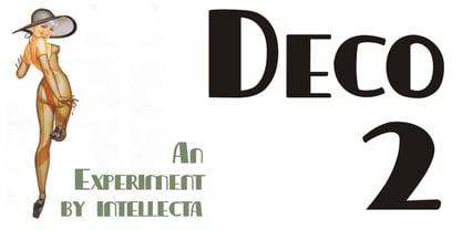
- Relic Island 2 by Jehansyah,
$9.00 This is a font with a pretty vintage look You can express your design looks old-fashioned but has a modern feel, with several options that you can use and develop your work perfectly
 - Fuse V.2 by W Type Foundry,
$25.00 Fuse Vol 2 is an extension to our popular Fuse type family. All of the corners of the typeface’s character are rounded, making Fuse Vol 2 friendlier and more amiable variant of the original Fuse. Designed with a powerful OpenType features in mind. Each weight includes alternate characters, ligatures, fractions, special numbers, arrows, extended language support , small caps and many more.. Perfectly suited for graphic design and any display / text use. The 32 fonts are part of the larger Fuse super family. We’re proud to introduce: Fuse Vol 2. Learn about upcoming releases, work in progress and get to know us better! On Instagram W Type Foundry On facebook W Type Foundry wtypefoundry.com
 - Futura No. 2 by URW Type Foundry,
$39.99
- TE Cathrine 2 by Tharwat Emara,
$49.00 This font may be conservative and classic, but also may be more playful and modern. It is good for theater or art posters and for modern music, web-pictures or vinyl covers. Of course it also will be good for coffee shops, cafe's, restaurants, magazine's headers, signs or gift/post cards and weddings. Try to use it in your beauty or travel blogs, you will see how many options you will have with stylish CATHRINE2
 - TE Rekaah 2 by Tharwat Emara,
$49.00 This font may be conservative and classic, but also may be more playful and modern. It is good for theater or art posters and for modern music, web-pictures or vinyl covers. Of course it also will be good for coffee shops, cafe's, restaurants, magazine's headers, signs or gift/post cards and weddings. Try to use it in your beauty or travel blogs, you will see how many options you will have with stylish REKAAH2
 - Poldi No 2 by 066.FONT,
$9.99 Poldi No 2 is a display font in which each letter has been handwritten, giving it an authentic and original character. It exudes a varied and extravagant style, and with its daring and sophisticated letterforms, Poldi No 2 attracts attention and gives projects a touch of nonchalance. It is ideal for creative projects such as posters, invitations or branding materials, where a striking and distinctive text finish is sought that stands out. Remastered in 2023.
 - Brewery No 2 by Linotype,
$40.99 An entry in the Second Linotype Design Contest, Linotype Brewery, designed by Gustavs Andrejs Grinbergs, became part of the TakeType Collection in 1997. Brewery No 2 represents a significantly improved version of its precursor, and the typeface has been both extended and enhanced. When asked about prototypes, Grinbergs cites German typefaces of the early 20th century. It is thus not surprising that the characters of Brewery™ No 2 are based on geometrical forms. However, this is no mere synthetic Grotesque-derived typeface. It has significant contrasts in line thickness and triangular line terminals that are not unlike serifs, placing it in the middle ground somewhere between a Grotesque and serif font. The contrast between the features of a synthetic Grotesque and an Antiqua gives the characters of Brewery No 2 their distinctive charm and is the distinguishing attribute of this contemporary typeface. Additional vibrancy is provided by bevelled line endings (as in the case of the 'E' and the 'F'), the circular punctuation marks and the slight curve of the descending bar of the 'k'. Thanks to a generous x-height and its open counters, Brewery No 2 is also highly legible in small point sizes. Only in its bolder versions is another aspect of Brewery No 2 apparent; Grinbergs has here made the linking elements more rectangular and has emphasized the counters, so that the Bold variants of Brewery No 2 exhibit elements typical of a broken typeface. Brewery No 2 is available in seven finely graduated weights, ranging from Light to Black. Every variant has a corresponding, slightly narrower Italic version. In addition, the lowercase 'a' is given a closed form, the 'e' is more rounded and the 'f' has a descender. The character sets of Brewery No 2 leave nothing to be desired. In addition to small caps and ligatures, there are various numeral sets with old style and lining figures for setting proportional text and table columns. In its most extensive form (the Pan-European variant), Brewery No 2 can be used to set texts in many languages that employ the Latin alphabet and also texts in international languages that use Cyrillic or monotonic Greek orthography. Although some of the features of Brewery No 2, such as the tiny serifs, are only evident in the larger point sizes, this typeface is not just at home when used to set headlines. Brewery No 2 also cuts a good figure in short or medium length texts. This contemporary typeface with its formally elegant quality looks good, for example, on posters, in newspapers and promotional material. It can also be used for websites as it is also available as a web font.
 - Baskerville No. 2 by URW Type Foundry,
$35.00
- News No. 2 by Monotype,
$39.00 - Snow Crystals 2 by Deniart Systems,
$20.00 Snow, snow and more snow! Deniart's Snow Crystals 2 typeface is an original design featuring 62 unique symbols. These charming snow crystals are sure to add elegance to all your winter designs - the set includes traditional style snow crystals. This font comes with a PDF guide to put all these special characters right at your fingertips!
 - Ornaments 2 AR by ARTypes,
$30.00Ornaments 2 contains designs for the Fanfare Press by Berthold Wolpe, 1939; and for the Kynoch Press by Tirzah Garwood, c. 1927. - Hamis Vol 2 by Fo Da,
$12.00 Hamis vol. 2 is an improved version of "Hamis" font, and provides advanced typographical support with features such as ligatures, case-sensitive forms, fractions, super and subscript characters, and stylistic alternates. This is a more professional than "Hamis" font. "Hamis vol. 2" is a display font of a single weight " Regular ", ideally suited for advertising and packaging, festive occasions, editorial and publishing, logo, branding and creative industries, posters and billboards as well as web and screen design. It comes with a complete range of figure set options – oldstyle and lining figures, each in tabular and proportional widths.
 - Really No 2 by Linotype,
$29.99 Really No. 2 is a redesign and update of Linotype Really, a typeface that Gary Munch first designed in 1999. The new Really No. 2 offers seven weights (Light to Extra Bold), each with an Italic companion. Additionally, Really No. 2 offers significantly expanded language support possibilities. Customers may choose the Really No. 2 W1G fonts, which support a character set that will cover Greek and Cyrillic in addition to virtually all European languages. These are true pan-European fonts, capable of setting texts that will travel between Ireland and Russia, and from Norway to Turkey. Customers who do not require this level of language support may choose from the Really No. 2 Pro fonts (just the Latin script), the Really No. 2 Greek Pro fonts (which include both Latin and Greek), or the Really No. 2 Cyrillic Pro fonts (Latin and Cyrillic). Each weight in the Really No. 2 family includes small capitals and optional oldstyle figures, as well as several other OpenType features. Really No. 2's vertical measurements are slightly different than the old Linotype Really's; customers should not mix fonts from the two families together. As to the design of Really No. 2's letters, like Linotype Really, the characters' moderate-to-strong contrast of its strokes recalls the Transitional and Modern styles of Baskerville and Bodoni. A subtly oblique axis recalls the old-style faces of Caslon. Finally, sturdy serifs complete the typeface's realist sensibility: a clear, readable, no-nonsense text face, whose clean details offer the designer a high-impact selection.
 - Retro Frames 2 by Edyta Demurat,
$28.00
- MS Reference 2 by Microsoft Corporation,
$29.00MS Reference 2 is a unique font that was originally developed for inclusion in a Microsoft product. MS Reference 2 font is available in TrueType with a custom character set. - Black Cycle 2 by Vozzy,
$10.00 Introducing vintage label font duo named Black Cycle. These two fonts has an additional characters and multilungual support (check out all available characters on previews). Both of font familes has four styles: Clean, Clean Shadow, Aged and Aged Shadow. This font will look good on any vintage styled designs like a poster, T-shirt, label, logo, etc.
 - Reporter No. 2 by Linotype,
$29.99 Carlos Winkow designed Reporter in 1938 for the Wagner foundry. The strokes of this interesting script have the texture of dry brushwritten letters. The alignment is slightly irregular, giving it a spontaneous feeling. Reporter No. 2 is a slightly simplified version of the original Reporter, without the numerous small white strokes inside its stems, which gave the original a scribbly effect. The font is bold and informal. It works well in signs, posters, and other display uses.
 - Ps Rooster 2 by Fontopia,
$25.00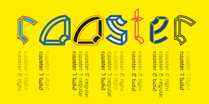 Rooster Families are based on a ventilation grill. All the individual characters are isolated from this form. Rooster 1 and Rooster 2 can be combined with each other.
 - Christmas Spirit 2 by Alphabet Zoo,
$14.00 Christmas Spirit was designed to incorporate some of the most familiar icons of the Christmas season into a highly decorative font. Each letter is unique with its own design, and lends itself to a festive environment. From the A as a decorated Christmas tree, to a reindeer that translates into a Z, Christmas Spirit will liven up holiday greetings, invitations, and announcements.
 - Kulfonus No 2 by 066.FONT,
$9.99 Kulfonus No 2 is a display font in which each letter has been handwritten, giving it an authentic and original character. It exudes a varied and extravagant style, and with its daring and sophisticated letterforms, Kulfonus No 2 attracts attention and gives projects a touch of nonchalance. It is ideal for creative projects such as posters, invitations or branding materials, where a striking and distinctive text finish is sought that stands out. Remastered in 2022.
 - FDI Tierra Nueva by FDI,
$25.00 Four fonts — found on a map of America, created by the spanish cartographer Diego Gutiérrez and the dutch engraver Hieronymus Cock anno 1562. From the start of the digitization by Sebastian Nagel in 2005, Tierra Nueva has gone a long way. On its journey of exploration it has grown to four members of a family (regular, bold, italic and script) with an overall count of almost 3.700 characters for different languages and purposes, extensively featured with useful typographic options. Over six years after the start of the expedition, it shall be launched. Land ahoy!
 - TT Firs Neue by TypeType,
$39.00 TT Firs Neue useful links: Specimen | Graphic presentation | Customization options TT Firs Neue is reborn! We have rethought the font to introduce the next-generation typeface. After analyzing each contour and graphic element, we rebuilt the font, preserving its best features while making any necessary adjustments. We have created a flawless and modern sans serif using the new technical capabilities of the studio. TT Firs Neue is a Scandinavian sans serif that combines expressive graphic elements with the versatility of use. In the latest 2023 edition, the font's display elements have become even more attractive, while the overall font balance has also been improved. This is the result of the visual research we did before working on the update. Here is what has changed. The visual elements of the font are now logically coherent. We got rid of the ones that did not suit the font's concept and kept the most attractive ones. The changes affected letters with diagonal strokes "M, N, И", and figures "2, 3, 6, 9". All round characters' shapes have been standardized for all font styles. In the previous version, all glyphs looked different: more square or oval, depending on the font's weight. We made the shapes consistent for the font to feel more integral. Glyphs containing bowls have also changed. We have worked on the balance, altering the height and shape of the bowls. Like rounded ones, we aspired to make the glyphs more balanced for all font styles. The shapes of the letters "J, M, N, S, W, З, И" and Black font style characters have changed. The individuality of these glyphs was slightly different from the whole set, which became apparent in larger sizes. We have improved the shapes and made them more suitable for the font's style. Letters with diagonal strokes and triangular glyphs, such as "A, V, Y, D". We have brought the characters to a consistent logic in their shapes by refining the angles and weight of diagonals in different font styles. The glyphs' terminals follow the same logic in the new version. We have preserved and perfected the old shapes. Ligatures and stylistic sets have been updated entirely and expanded. We have researched Scandinavian languages and designed ligatures and diacritical sets that would definitely be useful for designers. We have redesigned diacritical marks, figures, and punctuation marks. Now all characters follow the same logic and contribute to a well-balanced impression of the font. The character set in each font style has been increased from 934 to 1719, and the number of OpenType features—from 24 to 40. The new font includes 23 font styles: 11 roman, 11 italic, and 1 variable font. The variable font has also become a significant technological advancement for TT Firs Neue. We retained a warm sentiment towards TT Firs Neue's previous success while redesigning the font and implementing substantial alterations. The 2023 font has been developed according to new technical standards that have become significantly higher in the past 5 years. TT Firs Neue is a font well-suited for a wide range of contexts. It can be used for headings, text fragments, visual merchandising and building decoration, and the web. The font is visually aesthetic on podcast and video covers and is an ideal choice for packaging design and brand identity. TT Firs Neue OpenType features: aalt, ccmp, locl, subs, sinf, sups, numr, dnom, frac, ordn, tnum, onum, lnum, pnum, case, dlig, liga, c2sc, smcp, ss01, ss02, ss03, ss04, ss05, ss06, ss07, ss08, ss09, ss10, ss11, ss12, ss13, ss14, ss15, ss16, ss17, ss18, ss19, ss20, calt. TT Firs Neue language support: English, Albanian, Basque, Catalan, Croatian, Czech, Danish, Dutch, Estonian, Finnish, French, German, Hungarian, Icelandic, Irish, Italian, Latvian, Lithuanian, Luxembourgish, Maltese, Moldavian (lat), Montenegrin (lat), Norwegian, Polish, Portuguese, Romanian, Serbian (lat), Slovak, Slovenian, Spanish, Swedish, Swiss German, Valencian, Azerbaijani, Kazakh (lat), Turkish, Uzbek (lat), Acehnese, Banjar, Betawi, Bislama, Boholano, Cebuano, Chamorro, Fijian, Filipino, Hiri Motu, Ilocano, Indonesian, Javanese, Khasi, Malay, Marshallese, Minangkabau, Nauruan, Nias, Palauan, Rohingya, Salar, Samoan, Sasak, Sundanese, Tagalog, Tahitian, Tetum, Tok Pisin, Tongan, Uyghur, Afar, Asu, Aymara, Bemba, Bena, Chichewa, Chiga, Embu, Gikuyu, Gusii, Jola-Fonyi, Kabuverdianu, Kalenjin, Kamba, Kikuyu, Kinyarwanda, Kirundi, Kongo, Luba-Kasai, Luganda, Luo, Luyia, Machame, Makhuwa-Meetto, Makonde, Malagasy, Mauritian Creole, Meru, Morisyen, Ndebele, Nyankole, Oromo, Rombo, Rundi, Rwa, Samburu, Sango, Sangu, Sena, Seychellois Creole, Shambala, Shona, Soga, Somali, Sotho, Swahili, Swazi, Taita, Teso, Tsonga, Tswana, Vunjo, Wolof, Xhosa, Zulu, Ganda, Maori, Alsatian, Aragonese, Arumanian, Asturian, Belarusian (lat), Bosnian (lat), Breton, Bulgarian (lat), Colognian, Cornish, Corsican, Esperanto, Faroese, Frisian, Friulian, Gaelic, Gagauz (lat), Galician, Interlingua, Judaeo-Spanish, Karaim (lat), Kashubian, Ladin, Leonese, Manx, Occitan, Rheto-Romance, Romansh, Scots, Silesian, Sorbian, Vastese, Volapük, Võro, Walloon, Walser, Welsh, Karakalpak (lat), Kurdish (lat), Talysh (lat), Tsakhur (Azerbaijan), Turkmen (lat), Zaza, Aleut (lat), Cree, Haitian Creole, Hawaiian, Innu-aimun, Lakota, Karachay-Balkar (lat), Karelian, Livvi-Karelian, Ludic, Tatar, Vepsian, Guarani, Nahuatl, Quechua, Russian, Belarusian (cyr), Bosnian (cyr), Bulgarian (cyr), Macedonian, Serbian (cyr), Ukrainian, Kazakh (cyr), Kirghiz, Tadzhik, Turkmen (cyr), Uzbek (cyr), Lezgian, Abazin, Agul, Archi, Avar, Dargwa, Ingush, Kabardian, Kabardino-Cherkess, Karachay-Balkar (cyr), Khvarshi, Kumyk, Lak, Nogai, Rutul, Tabasaran, Tsakhur, Buryat, Komi-Permyak, Komi-Zyrian, Siberian Tatar, Tofalar, Touva, Bashkir, Chechen (cyr), Chuvash, Erzya, Kryashen Tatar, Mordvin-moksha, Tatar Volgaic, Udmurt, Uighur, Rusyn, Montenegrin (cyr), Romani (cyr), Dungan, Karakalpak (cyr), Shughni, Mongolian, Adyghe, Kalmyk.
 - Friz Quadrata SH by Scangraphic Digital Type Collection,
$26.00 Since the release of these fonts most typefaces in the Scangraphic Type Collection appear in two versions. One is designed specifically for headline typesetting (SH: Scangraphic Headline Types) and one specifically for text typesetting (SB Scangraphic Bodytypes). The most obvious differentiation can be found in the spacing. That of the Bodytypes is adjusted for readability. That of the Headline Types is decidedly more narrow in order to do justice to the requirements of headline typesetting. The kerning tables, as well, have been individualized for each of these type varieties. In addition to the adjustment of spacing, there are also adjustments in the design. For the Bodytypes, fine spaces were created which prevented the smear effect on acute angles in small typesizes. For a number of Bodytypes, hairlines and serifs were thickened or the whole typeface was adjusted to meet the optical requirements for setting type in small sizes. For the German lower-case diacritical marks, all Headline Types complements contain alternative integrated accents which allow the compact setting of lower-case headlines.
 - AZ Fast Fury by Artist of Design,
$15.00 AZ Fast Fury font was inspired to have a "rough Scratched" look to some letters. This font utilizes an "old look" to the line work which is designed to have a "worn feel" to it. Ideal for use as headline or sub-head text in you design.
 - TT Firs Text by TypeType,
$39.00 Specimen | Graphic presentation | Customization options TT Firs Text includes 23 font styles: 11 roman, 11 italic, and 1 variable font. Each font style consists of 898 characters, counting in the characters of the expanded Latin and Cyrillic writing systems. The font has 31 OpenType features, among which are localization features for various languages, circled numerators, and stylistic alternate for the ampersand.
 - Uri Rounded MF by Masterfont,
$59.00 - P22 Goudy Aries by P22 Type Foundry,
$24.95 Frederic W. Goudy (1865-1947) created over 100 typefaces during his lifetime. Like most type designers, he is known principally to most people only through his eponymously titled faces such as Goudy Modern, Goudy Old Style etc. This set includes one of Goudy's rarest Arts & Crafts styled faces, a font known as Aries. The font was originally created by Goudy for a private press in Eden, New York in 1926. Also included in this set are two decorative fonts: one font of 52 decorative Ornaments & one font that contains 52 Ampersands.
 - Kris Handwriting Pro by SoftMaker,
$15.99 Digitized handwriting fonts are a perfect way to give documents the “very special touch”. Invitations look simply better when handwritten than when printed in bland Arial or Times New Roman. Short handwritten notes look authentic and appealing. There are numerous occasions where handwritten text makes a better impression. “Kris Handwriting Pro” is a beautiful typeface that mimics true handwriting closely. Use Kris Handwriting Pro to create stunningly beautiful designs easily.
 - FDI Mainzer Initialen by FDI,
$18.00 Based on a letterpress typeface using the same name, FDI Mainzer Initialen is a carefully crafted set of German blackletter initials using three colors per style. 10 palettes are available as individual styles and can be used in design applications such as Photoshop, Illustrator, InDesign and Affinity Designer. Make sure your operating system and apps already support OpenType SVG fonts before buying a license for FDI Mainzer Initialen.