284 search results
(0.186 seconds)
- Laurel by Fenotype,
$25.00 Often in typography, a standout appeal is required – but preferably without compromising on clarity and legibility. Laurel font family by Fenotype is where the best of both worlds meet – an edgy display letter yet easily legible and appropriate for a wide range of use cases. Brand identities, packaging, posters or editorial – choose Laurel for a touch of unique flair.
 - Quadrivium NF by Nick's Fonts,
$10.00A classic typeface with timeless appeal, based on the venerable Weiss Initials II, designed by Eric Rudolf Weiss for Bauersche Gießerei in 1931. Essentially a monocase font, this version also includes variants located at lowercase a, e and g. Both versions of this font contain the Unicode 1252 (Latin) and Unicode 1250 (Central European) character sets, with localization for Romanian and Moldovan. - Fluence by dooType,
$20.00 Fluence is a calligraphic typeface designed by dooType. With generous proportions, rounded forms and outstanding endings, Fluence is the right choice for those seeking personality and rhythm. Available in three different weights, contains 15 ligatures, 26 swashes and multilingual support to over 30 languages. Enjoy it.
 - Delicatta by dooType,
$40.00 Delicatta is a beautiful and expressive script font by dooType. You can use it in many areas such as packaging, invitations, magazines and posters. This version contains Opentype Features including alternates and ligatures that you can use as needed. Check in gallery for some images. Enjoy!
 - 1648 Chancellerie by GLC,
$42.00 This font was inspired by the hand-written 1648 Munster peace treatise signed by French King Louis XIV and German emperor Ferdinand II. It is a Cancellaresca font style, meticulously written and almost legible. It contains Western (including Celtic) and Northern European, Icelandic, Baltic, Eastern, Central European and Turkish diacritics. The numerous alternates and ligatures made the font looking like a real various hand.
 - Homeward Bound by Hanoded,
$15.00 Homeward Bound is a fat, grungy slab serif font - all handmade and inspired by a well known 1934 font. Together with sidekick Homeward Bound II, this baby will lighten up your day, bring you your newspaper and do your dishes to boot. Well, that may not be an accurate description of Homeward Bound’s abilities, but I am sure it will make your work stand out, giving it that ‘handmade eroded vintage’ look.
 - Friedrichsfeld by Otto Maurer,
$17.00 Friedrichsfeld is a small town near there where I live. Friedrichsfeld, Voerde and Wesel was Part of the Preussen Kingdom till 1912. Friedrichsfeld was a Parade ground of the preussen troops and get the name of the King Friedrich II (the old Fritz). Today there is a Preussen Museum near Friedrichsfeld in Wesel. The Font comes in two ground Version, one in the history Letters and old Ligatures and a modern Version.
 - Lookey Here JNL by Jeff Levine,
$29.00Lookey Here JNL is an "Alphading" - a term coined by Jeffrey N. Levine to describe dingbat fonts containing both images and letters and/or numbers. This one - partially based on the classic "Kilroy" icon from the World War II era is a newer, cleaner reworking of one of Jeff's early freeware fonts. The typeface used inside the images is Casual Lunch JNL, so you can match this text for a particular project. Limited character set. - JP2 by Linotype,
$40.99JP2 has some special roots being inspired by the actual handwriting of Pope John Paul II. Franciszek Otto took this source material and transformed it into a high quality font. The result is a rough, but intelligent, design with letters that slightly bounce along the baseline to mimic typical writing. Their short x-height, long extenders, and unique capital letters make this a very beautiful and distinctive typeface. Try it out for greetings, invitations, or posters! - HUBlueocean by Heummdesign,
$15.00 HU Blueocean is a headline typeface created by imagining waves in a square glass tube. It iis designed to be used in various environments by adding decorative elements, the swaying form of waves, to the Gothic style of a full square module. There is 1 weight of HU Blueocean : Black Features : Uppercase & lowercase Numbers and punctuation Multilanguage (Basic Latin, Western European, Euro, Catalan, Baltic, Turkish, Central European, Romanian, Pan African Latin, Dutch, Afrikaans, Basic Greek, Basic Cyrillic, Mathematical Operators) 882 Glyphs
 - Palatino by Linotype,
$47.99 Palatino is the work of Hermann Zapf and became available in the late 1950s from D. Stempel AG in Frankfurt am Main. Zapf optimized Palatino’s design for legibility, producing a typeface which remained legible even on the inferior paper of the post World War II period. Zapf named the font after Giambattista Palatino, a master of scripts from the time of Leonardo da Vinci. Palatino is an Old Face font which proves that classic forms can still be used to create new typefaces.
 - Multihalf by Luxfont,
$21.00 Introducing Neotype. Abstract font family with colored halves. An interesting and unusual fonts in the glitch style. Combination of clear shapes with soft gradients. Geometric color stylization of letters. Features: - Uppercase and lowercase the same size but different colors. - Transparency in letters. - Kerning. IMPORTANT: - Check the glyphs in the font before buying! - SVG fonts contain raster letters. - Check it www.colorfonts.wtf - Try a FREE DEMO version before buying. ld.luxfont@gmail.com
 - Diamond Braille by Echopraxium,
$5.00 Here is a "Decorative Braille font". The initial design was indeed drawn on a K.I.S.S digital sketchpad, the Windows default drawing tool (Microsoft Paint, classic version). A. Glyph Concept The Braille 2x3 dot matrix is weaved around a diamond-shape. a.1. Each "dot" is represented by a "right-angle isocel triangle". a.2. Braille dots in Diamond Braille a.2.I. "Dots" are outside the diamond for first Braille row (Braille dots 1, 4) and third Braille row (Braille dots 3, 6). a.2.II. "Dots" are inside the diamond for second Braillle row (Braille dots 2, 5). a.3. Diamond lattice Glyphs are connected horizontally (to/bottom diamond's corners) and vertically (left/right corners) to each other (see poster 5). a.4. Special Glyphs - Space: its is either empty ("Empty cell") or a "non Braille shape" { _, ° } depending on your display needs (as explained in b.3.II) - 6 dots: { £, =, û } - 6 empty dots: { ç, ¥ } B. Font user guide b.1. Lowercase glyphs { A..Z } In these glyphs the "dots" are represented as a white right-angle isocel triangle filled with a smaller black triangle. b.2. Uppercase glyphs { a..z } In these glyphs, the "dots" are represented as an empty triangle (this is an "empty dot"). b.3. 'Space' vs 'Empty Cell' b.3.I. 'Space' - 'Space' glyph is an empty shape - '¶' glyph (at the end of each line in Microsoft Word) is also an empty shape b.3.II. 'Empty cell' glyphs: _ (underscore), ° (degree). In these glyphs there are 2 "empty dots" at top and bottom corners of the diamond, which differentiates them from regular Braille glyphs (which dont have a "dot in the middle"). b.4. Diamond Lattice To display text as a 'diamond lattice', replace each 'Space' by an 'Empty cell' (as explained in b.3.II, see poster 5) b.5. Connectors The connector glyphs allow the creation of "circuit like" designs (see poster 1). Here are the connector glyphs: { µ, à, â, ä, ã, è, é, ê, ë, î, ï } b.6. Domino feature Some Glyphs represent numbers 1..6 in a way which is similar than on dominos (see poster 6) C. Posters Poster 1: the "Font Logo", it displays "Diamond Braille" text together with the Connectors feature. Poster 2: a pangram which is published on pangra.me ( "Adept quick jog over frozen blue whisky mix" ). Poster 3: an illustration of the Domino feature. Poster 4: a DiamondBraille version of the Periodic table. Poster 5: illustration of the Diamond lattice using only 6 dots ( û ) and 6 empty dots ( ç ) glyphs.
 - Supplier Stencil JNL by Jeff Levine,
$29.00 The design idea for this condensed sans serif stencil font was inspired by a post-World War II brass stencil spotted in an online auction. The United States was assisting Europe with much-needed goods, and the text in the middle of a “stars and stripes” shield used for marking the shipping containers read “For European Recovery supplied by the United States of America”. It was the first line (“For European Recovery”) that became the working model for Supplier Stencil JNL, which is available in both regular and oblique versions.
 - Monumental Gothic by Scriptorium,
$18.00For Monumental Gothic, we delved into the archives and found some old rubbings and photos of monumental brasses from British tombs of the 12th and 13th centuries. The sources included famous monuments like the tomb of Richard II and less well known inscriptions with similar style lettering. The rubbings were made by Dave Nalle in the 1970s (when they still let you have access to the the brasses). Monumental Gothic includes some alternate characters, plus upper and lower case characters, numbers and a selection of very interesting decorative emblems to complement the text. - Relic Forest Island 3 by Jehansyah,
$9.00 Relic forest island III, This is the newest font from the previous generation, Relic island I and Relic Island II, this design comes with a more detailed touch with very charming carvings, comes with several families that you can make your best design choice for later this year and in the future, with several monograms and families that you can choose according to your design, this design will add inspiration to your project, and see, how it will work for you, and make this font your best choice thank you very much
 - Alright, picture this: The font Greghor II, conjured from the depths of the creative mind of KLoNk, rolls onto the scene with the swagger of an eccentric uncle at a family barbecue. It's not just any...
- Amerta by Eotype,
$9.00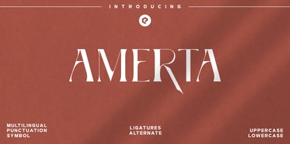 Amerta is a versatile, modern and unique serif font. Designed by Eotype Studio, It has a unique style with stylistic, alternates, ligatures and supports multilingual languages. Create unique & beautiful logotype, use it as an elegant solution for your next magazine layout, or choose Amerta for any graphics that require a bold look with a elegant flair.
 - Crosseur by Eotype,
$9.00 Crosseur is a versatile, modern and unique condensed san serif font. Designed by Eotype Studio, It has a unique style with stylistic, alternates, ligatures and supports multilingual languages. Create unique & beautiful logotype, use it as an elegant solution for your next magazine layout, or choose Crosseur for any graphics that require a bold look with a unique.
 - Cagila by Eotype,
$12.00 Cagila is a versatile, modern and elegant serif font. Designed by Eotype Studio, It has a unique style with stylistic, alternates, ligatures and supports multilingual languages. Create unique & beautiful logotype, use it as an elegant solution for your next magazine layout, or choose Cester for any graphics that require a bold look with a elegant flair.
 - TELETYPE 1945-1985 - Unknown license

- Eutemia II by Bolt Cutter Design is a unique and captivating font that strikes a beautiful balance between elegance and creativity. It belongs to the category of script fonts, known for their fluid a...
- Zirkle by Ingrimayne Type,
$9.00 Zirkle is a monoline font in which the upper-case letters were designed from circles or bits of circles, with interior straight lines. It was the first font I designed in Fontographer when Fontographer was still in version 2 and the most advanced Macintosh was the Macintosh II. I have heard from people who like it, but it was designed not to meet some need but to play with the geometry of circle-based letters. ZirkStressed is a “squared” version that was the result of playing with a font distortion program, which in this case produced a result that seemed interesting.
 - Palatino Arabic by Linotype,
$187.99 Palatino Arabic is a collaboration between Lebanese designer Nadine Chahine and Prof. Hermann Zapf. The design is based on the Al-Ahram typeface designed by Zapf in 1956 but reworked and modified to fit the Palatino nova family. The design is Naskh in style but with a strong influence of the Thuluth style as well. This is evident in the swash-like finials and the wide proportions of the letterforms. It is designed for use in print in both large and small sizes. The counters are wide open to allow for better readability in small sizes as well as to maintain an open and friendly appearance. The font has 1091 glyphs and includes a large number of extra ligatures and stylistic alternates as well as the basic Latin part of Palatino nova and support for Arabic, Persian, and Urdu. It also includes proportional and tabular numerals for the supported languages. Palatino Arabic wins Type Directors Club award. Each year, the New York-based Type Directors Club judges typeface designs from all over the world in their TDC2 contest. Linotype is pleased to announce that a very new typeface of its own is among 2008’s winners: Palatino Arabic. A collaboration between Nadine Chahine and Prof. Hermann Zapf, this face is an extension of Zapf’s Al-Ahram Arabic type from 1956 recreated to join the Palatino nova family.
 - Encorpada Classic by dooType,
$20.00 Encorpada classic brings the best features of the Didone genre, but with a 21st century look and feel. With smooth details Encorpada Classic is a elegant choice for your type library. The Encorpada family began in 2011 with the release of Encorpada Black. After that instant success, in 2012, dooType brought to us Encorpada PRO. Encorpada Classic retains the main look and feel of his predecessors, but is designed with more functional considerations. With 14 styles, Encorpada Classic is a fine choice.
 - Tres Tres Chic by dooType,
$39.00 First partnership between Firmorama.com & dooType studios, Très Très Chic is a display font, developed to be versatile and illustrative, with strong features that provide personality to the drawing. The characters were built based in primary geometric forms and the gentle delicate lines, in their main purpose, make this font very appropriate to the feminine universe. On the other hand, this font has its form filled with black, that could be applied evenly for a composition more dynamic and amazing, with variation of shapes and weight.
 - Geographica Hand by Three Islands Press,
$39.00 Geographica Hand replicates the neat hand-lettering typical of engraved British maps of the 18th century, including the work of cartographers Emanuel Bowen (circa 1694–1767), Geographer to King George II, and Thomas Jefferys (circa 1719–1771) Geographica ro King George III. A kindred font to our Geographica serif family, Geographica Hand exhibits long serifs, irregular edges, and a genuinely hand-made character. Use to simulate historical materials, vintage documents, or other time-worn text. The OpenType release of Geographica Hand comes with true small capitals, contextual and historical ligatures, a series of sketchy map ornaments (e.g., trees, churches, windmills, boats), and full Latin support.
 - Bestlady by Dhan Studio,
$19.00 Bestlady is a romantic textured brush font suitable perfectly for invitations, brand projects, logos, greeting cards, news, product packaging, posters blogs, everything including personal charm etc. This font is alternates all lowercase,also have equipped with 69 ligatures unique and beautiful: zz yy ww vv uu tt tl th st ss sh rr qq pp oz oy ow ov ou ot os or op oo on om ol ok oj oi og of od oc ob nt nn nl ng mm lt ll lh kk is ii id hh gg ff et el ee cl ck ch cc bl bb aw at ap an am al ah af ab aa
 - Kremlin Kourier II is a typeface that stands out due to its unique blend of historical essence and contemporary design. This font is reminiscent of the Cyrillic script, which is highly associated wit...
- Business Helpers JNL by Jeff Levine,
$29.00 Duluth, Minnesota's Horace P. Brouillet Syndicate (later known as Syndicuts, Inc.) was one of a number of stock cuts providers to the letterpress trade in the decades preceding paper, then electronic clip art. Brouillet's "Typeps" catalogs offered a wide range of images covering numerous subjects, as well as cartoons, catch words and automotive logos. Many of these images have been reproduced in a number of royalty-free clip art publications over the years. Twenty-Six of these newly-redrawn catch words are found within Business Helpers JNL in two styles. On the capital keys are the original white-on-black designs, modeled from the vintage source material. The lower case keys have the phrases separated from the decorative ovals and are in black type.
 - Hassan by Linotype,
$187.99Hassan is a traditional-style Arabic text face designed by Hassan Sobhi Mourad, an experienced calligrapher and teacher of the art and first produced by the Linotype Design Studio (U.K.) as a PostScript font in 1993. An individual Naskh style, Hassan cleverly combines elegant proportions, echoing an inscriptional Thuluth in its tall vertical stems and deeply rounded final jim and ain. The effect of verticality is enhanced by the tense, reined-in kerning strokes of ra and waw, the well-poised lam-alif, and the compactly drawn ligatures. The broad-band strokes of Hassan Bold smooth some of the angularity and relax the tension apparent in the Light. The traditional-style ligatures are rendered with an easy flow. Because of the economical character count, Hassan Light and Bold text may be headed by the compact titling styles (Hisham, Mariam) as well as designs like Ahmed or Kufi which answer to the inscriptional qualities of Hassan. In addition to other uses, Hassan would be particularly suited to document text-setting. Hassan’s two OpenType weights include Latin glyphs from Janson Text Roman, and Janson Text Bold, respectively, inside the font files, allowing a single font to set text in both most Western European and Arabic languages. The OpenType glyph ranges incorporate Basic Latin and the Arabic character set, which supports Arabic, Persian, and Urdu. The fonts include tabular and proportional Arabic, Persian, and Urdu numerals, as well as a set of tabular European (Latin) numerals. - The Carpenter by Fenotype,
$35.00 The Carpenter is an elegant and versatile connected script family of three weights. The Carpenter also has a set of ornaments, patterns and pictograms designed to support the script font. The Carpenter has plenty of OpenType features: To activate the alternates click on Swash, Contextual, Stylistic or Titling Alternates or Lining Figures in any OpenType Savvy program or manually choose from even more alternate characters from Glyph Palette. The Carpenter is an effective and easy to use font for creating ambitious headlines, logos & posters with a custom-made feeling. The Carpenter is loosely based on Fenotypes earlier release Mercury Script. For the best price purchase the complete The Carpenter Family.
 - Loncherita by Fabio Godoy,
$29.95 Loncherita is a typeface created by Fabio Eduardo Godoy Angel and has 5 files: Fill, Fill Outline, Shadow 1, Shadow 2 and dingbats variables. Its purpose is to serve as a childish fantasy modular typography useful in logo design and merchandising. It is also recommended to compose expressive titles that need the option in which letters can be colored by layers. In that sense Loncherita is a typeface with logic italic vertical logical and its amount of contrast between thick and thin strokes is monoline, its antlers are mullets and rounded ends. It is also important to note that ii has 26 Dingbats designed to be point of attention and illustrate countless children and playful issues.
 - Mersin by Hurufatfont,
$29.00 Mersin is a modern sans serif font family. The asymmetrical structure of the beginning and ending shapes of letters such as "Cc, Ss" is its most distinguishing feature. Mersin has a total of 20 fonts, includings 10 weights and their appropriate italics. With its 2-axis (Weight & Italic) Variable Version, Mersin offers the advantage of using a very rich weight between 100-900. It includes detailed ligatures such as "Th, Tl, Ti, Tä, Tä, Tü, Tö, iï, fä, fä, fö fü" for very wide and different accents. “Mersin Book” and “Mersin Book Italic” are specially designed for body texts and small fonts usages. Ideal for corporate identity, posters, brochures, guidance signages and all other kinds of graphic design works.
 - 1920 French Script Pro by GLC,
$42.00 This font was inspired by one of a standard French manual styles in use from the beginning of 1900s to the end of World War II, when people were writing most often with pen holders and metal nibs. This typeface is easily legible as it was used for the lithographic printing of university textbooks. All lower cases from a to z and numerals from 0 to 9 are doubled by a slightly different one to allow a varying manual aspect in texts. We have added a lot of diacritic characters, covering West (including Celtic) and North European, Icelandic, Baltic, Eastern European and Turkish language. A few special glyphs allows to make final loops or underlining.
 - Goose Creek JNL by Jeff Levine,
$29.00 The hand lettered credits from the 1942 British film comedy “The Goose Steps Out” became the model for Goose Creek JNL, a simple sans serif design available in both regular and oblique versions. According to the Internet Movie Database (imdb), “A bumbling teacher turns out to be the double of a German general. He is flown into Germany to impersonate the general and cause chaos and hilarity in a Hitler Youth college.” The title is a parody of the “goosestep” style of marching by German soldiers during World War II. As a variant on the movie’s title, the font was named for Goose Creek, South Carolina – a charming community just northeast of historic Charleston.
 - TE Nastaaliq by Tharwat Emara,
$59.00 TE Nastaaliq Font It is one of the Persian calligraphy or ta'liq line that appeared in Persia in the seventh century AH (thirteenth century AD), as it was extracted from the lines of naskh, patch and thuluth. It is a beautiful font whose letters are distinguished by precision and extension. It is also characterized by its ease, clarity and lack of complexity. It does not tolerate diacritics, despite its difference with the line of the patch, as it is one of the best fonts in the world and the best without a competitor and admires many Arab calligraphers, and no cultural or literary exhibition is devoid of a painting written in Persian script. It is one of the most beautiful lines that has a special character that distinguishes it from others, as it is characterized by gracefulness in its letters, so it appears as if it descends in one direction, and its beauty is increased by the soft and rounded lines in it, because it is more flexible in drawing and more flexible, especially if it is drawn with precision, elegance and good distribution, and the calligrapher may baptize In his use of decoration to reach strength in expression by taking advantage of arches and circles, in addition to the grace of painting, the artist may link the letters of one word and the two words to reach the composition of a frame or curved and wrapped lines in which he shows his genius in imagination and creativity.
 - Palsam Pro by Abjad,
$110.00 Since the beginning, Palsam was intended to be a super multilingual family, with a real cursive Arabic companion, and a display cut. The typeface was designed to be used for setting text and titles of contemporary Arabic content, specially magazines, and websites. The Arabic and Latin scripts were designed at the same time, to make a true authentic bilingual typeface. Both scripts have affected each other in several ways through the entire design process, which happened within ten years. Palsam has an inviting, approachable, fashionable and humanist look. Thanks to its low contrast, open apertures, detailed calligraphic strokes, and smooth counters, which also make it easy to read at smaller sizes. The main highlight for Palsam was the Cursive companion. For the first time, the calligraphic Ijaza style was used as a model for designing the Arabic cursive. Since the Ijaza is a hyper combination of Naskh and Thuluth, which makes it perfect to be a companion for the upright Naskh. Moreover this script was used in margins, and to highlight specific content inside a paragraph in older manuscripts. With true cursive companions in five weights, and many opentype features, Palsam grants all the tools needed to set complex information and editorial designs applications. More than 1000 characters are included per weight, including small caps, fractions, old style and lining numbers, ligatures, contextual ligatures, and discretionary ligatures. It supports over 40 languages that use the Latin extended, as well as Arabic, Farsi, and Urdu Languages. The latin script was designed in collaboration with the Slovenian type designer Alja Herlah.
 - Las Palmas by Fenotype,
$20.00 Las Palmas is a vintage type collection with print texture. • Brush - Two weights of a connected Brush Script with Contextual and Swash Alternates • Pen - A connected monoline Script with Contextual and Swash Alternates • Slab - Two weights of a chunky Slab Serif with rounded corners, Bold has the same proportions but fuller texture. • Condensed - A bold and tight condensed Sans Serif with rounded corners. Las Palmas fonts are designed to work together - in pairs or more. Las Palmas is great for branding, posters or any display use. If you need a clean version of Las Palmas try Steak And Cheese by Fenotype. All fonts are PUA encoded and have a wide language support.
 - Monday by Fenotype,
$35.00 Monday is a bold and strong script family of two weights and a matching ornament set. Monday has a polished 1950s hand lettering feeling to it and it is ideal for logo, packaging and brand design purposes. Monday is equipped with plenty of alternates and features: To activate the alternates click on Swash, Contextual, Stylistic or Titling Alternates or Lining Figures in any OpenType Savvy program or manually choose from even more alternate characters from Glyph Palette. If you need to write in caps Monday pairs up nicely with Peaches and Cream Caps. Monday is loosely based on Fenotypes earlier release No. Seven. For the best price purchase the complete Monday Family.
