10,000 search results
(0.084 seconds)
- Green Eggs and Spam - Personal use only

- Helmswald Post - Personal use only

- Black Tie by Scholtz Fonts,
$19.00 Black Tie is an art-deco font with the smooth sophistication of retro design. It is very readable and can be used at all sizes. It functions well as a display font and creates attention-attracting headers and subheaders. Black Tie comes in two styles: 1. Black Tie Regular: in which the caps and lower case have different baselines. Black Tie Regular is better for sub-heads and display. 2. Black Tie Baseline: in which all characters share a common baseline. This style is better for body text and smaller sizes. Fully professional, Black Tie contains a full character set Ñ Upper and Lower case, all numerals, punctuation, symbols and accented characters. It is suitable for layout work in all major European languages Ñ Spanish, Portuguese, German, French, Swedish and Italian (to name a few). The characters are spaced for readability and have been carefully kerned.
 - LTC Globe Gothic by Lanston Type Co.,
$24.95 This series of faces was designed initially by Morris Fuller Benton, circa 1900. The design is a refinement of Taylor Gothic from 1897. It features a sans serif thick and thin design with angular stems. Pre-dating art deco, this design feels quaint, yet it still has a touch of modernism. Frederic Goudy designed a bold version of Globe Gothic in 1905 for ATF. The Bold and Bold Italic digital versions have been added to the LTC library in early 2007.
 - Compass TRF by TipografiaRamis,
$29.00 Compass TRF is a reevaluation of an existing Compass typeface dated 2002. Compass is a geometric contrast serif typeface - "contemporary Didone". New Compass consists of four styles—regular, italic, alternate and flourish initials with small caps. Compass TRF is recommended for use as display typeface. It is suggested that flourish initials font to be used for decorative purpose only, not basic typesetting. Compass TRF generated as OpenType single master format with Western CP1252 character set.
 - MC Karviet by Maulana Creative,
$22.00 Karviet is a decorative experimental display font. Regular stroke, fun character with a bit of ligatures and alternates. To give you an extra creative work. Karviet font support multilingual more than 100+ language. This font is good for logo design, Social media, Movie Titles, Books Titles, a short text even a long text letter and good for your secondary text font with script or serif. Make a stunning work with Karviet font. Cheers, Maulana Creative
 - Goversy by Maulana Creative,
$15.00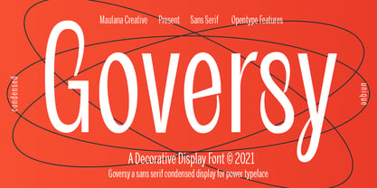 Goversy is a Decorative Condensed Display font. With Regular stroke, fun character with a bit of ligatures. To give you an extra creative work. Goversy font support multilingual more than 100+ language. This font is good for logo design, Social media, Movie Titles, Books Titles, a short text even a long text letter and good for your secondary text font with handwriting and script font. Make a stunning work with Goversy font. Cheers, Maulana Creative
 - Junior Clerk JNL by Jeff Levine,
$29.00 Junior Clerk JNL is the plain sans serif version of the lettering found on the cover of the sheet music for 1919's "The World is Waiting for the Sunrise". The song title was originally set in a decorative sans serif with an engraved line adorning each character. This version of the more fanciful design is available as the companion font Legal Eagle JNL. Junior Clerk JNL is available in both regular and oblique versions.
 - Astroph by Figuree Studio,
$18.00 Astroph - Retro Slab Serif Font Astroph Slab Serif font is perfect for your upcoming projects. Such as logo branding, editorial design, fashion, adventure apparel, stationery design, sport design, blog design, modern advertising design, card invitation, badge, art quote, home decor, book/cover title, special events, and more. Astroph is coming with 3 Styles: Astroph Regular Astroph Rough Astroph Aged That's it! Have fun with Astroph Slab Serif Font. Thank you! Figuree Std
 - Sergel by T4 Foundry,
$21.00Tobias Sergel was the greatest Swedish sculptor and draughtsman of the 18th century. The typeface that carries his name has a sculptural quality, with the white line decorating the stems and curves of the letters. "However," says Bo Berndal, the designer of Sergel, "the general shape of the typeface is timeless". The Sergel fontpack includes four fonts: Regular, Italic, Semibold and Semibold Italic, and is an OpenType typeface for both PC and Mac. - MC Sarscy by Maulana Creative,
$15.00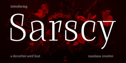 Sarscy is a decorative serif font. Regular stroke, fun character with a bit of ligatures and alternates. To give you an extra creative work. Sarscy font support multilingual more than 100+ language. This font is good for logo design, Social media, Movie Titles, Books Titles, a short text even a long text letter and good for your secondary text font with script or serif. Make a stunning work with Sarscy font. Cheers, Maulana Creative
 - Loophole by ArtyType,
$23.00 Loophole is a visually striking display typeface in 3 weights (Light, Regular & Bold), its DNA firmly rooted in the Cyclic Sans family which makes the perfect foil to this somewhat decorative font styling. The Loophole name is quite simply based on the ubiquitous hole motif, which is strategically deployed on each character across the 3 font styles. Each font contains an extended Latin character set covering Western & Central Europe, the Baltic States & Turkey.
 - Selatine by Larin Type Co,
$10.00 Selatine - a handwritten bold brush font with streaked. Fall in love with its incredible charm, and turn any design idea into a stunner. Use this font for branding or create a logo, beautiful frame for your home, decorate your any project. Or just use for your small business, book covers, stationery, marketing, blog, magazines and more.
 - Mouse Paw by Alexander Sharkov,
$5.00 My home mouse, Hector, drew this wonderful font for kids. He tried very hard and hopes that you will like the result of his work! This font is perfect for advertising various children's brands, decorating children's books, and generally any children's projects! Hector and I believe that the font Mouse Paw will help you in any business.
 - Superme by Forberas Club,
$16.00 Superme, This is the new serif in town i mean in my font family. It's super ready for any crafter, event planner, or thirsty idea seeker for making your project or crafting material. It will smooth your presentation font, or your novel book font, and making any invitation card, greeting card, gift, decorative font, or your branding image.
 - Overline Stencil by WAP Type,
$15.00 Overline Stencil font is perfect for your up coming projects. Such as logo branding, editorial design, fashion, stationery design, sport design, blog design, modern advertising design, card invitation, art quote, home decor, book/cover title, special events and any more.
 - Stencil Army by WAP Type,
$15.00 stencil army font is perfect for your up coming projects. Such as logo branding, editorial design, fashion, stationery design, sport design, blog design, modern advertising design, card invitation, art quote, home decor, book/cover title, special events and any more.
 - Borneo Dayak by ARToni,
$24.00 Borneo Dayak Font is a decorative font inspired by the very distinctive traditional art of the Dayak tribe in Borneo or Kalimantan, Indonesia. with its unique style makes it look elegant throughout the ages. its perfect for any design project.
 - Sugar Buttons by Supfonts,
$14.00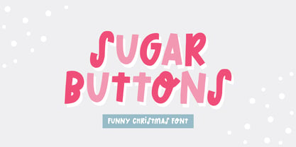 Sugar Buttons is perfect for your holiday projects. Use it for Christmas cards, winter crafts for decor and more! What's inside: - Sugar Buttons Script - Multilingual support - Cricut support If you have any questions, please contact me directly or in instagram @superdizigner
 - Pirouette by Linotype,
$40.99Pirouette is based on a logo that Japanese designer Ryuichi Tateno created for a packaging design project in 1999 (a shampoo container!). Tateno's logo experimented with complex, overlapped swash letterforms. He continued to develop these outside of the initial packaging project, until they took on a life of their own. Eventually, Tateno designed a full typeface out of the logo, Pirouette, which was the first place display face in Linotype's 2003 International Type Design Contest. The Pirouette typeface contains six different fonts. The basic font is Pirouette Regular. This is an engraver's italic lowercase paired with elaborate swash capitals. The swash capitals have two visual elements in their forms: thick strokes and thin strokes. Pirouette Text includes the same lowercase as Pirouette Regular, but the uppercase letters are much shorter and simpler. This "text" font can be used to set longer amounts of copy. Pirouette Alternate contains different lowercase glyphs and additional ligatures, which can be used as substitutes for the lowercase forms in the Pirouette Regular and Pirouette Text fonts. Pirouette Ornaments contains swashes and other knick-knacks that can either be added onto the end of a letter, or used as separate decorative elements or swooshes (accolades) on a page. Pirouette Separate 1 and Pirouette Separate 2 are two fonts that can be layered over top of one another in software applications that support layering (e.g., most Adobe and Macromedia applications, as well as QuarkXPress). Pirouette Separate 1 contains the thick stroke elements from Pirouette Regular's uppercase letters, as well as the same lowercase glyphs that can be found in Pirouette Regular and Pirouette Text. Pirouette Separate 2 contains only the thin stroke elements from Pirouette Regular's uppercase letters. By layering Pirouette Separate 1 and Pirouette Separate 2 over one another, you can give the uppercase letter's thick and thin stroke elements different colors and create unique, more calligraphic designs. The Pirouette family, Tanteno's first commercial typeface, was greatly influenced by the calligraphic and typographic work of the master German designer, Prof. Hermann Zapf, especially his Zapfino typeface. - Project Z - Personal use only

- hooge 05_55 Cyr2 - Unknown license

- TNG Monitors - Unknown license

- Mr Gabe by Leksen Design,
$- Check out Mr Gabe in motion! Mr Gabe is a typeface designed to dance. Not that it’s a flamboyant display face, but that it has a liveliness, especially in its heavier weights, that dances across the page. And the letters include a selection of exuberant flourishes that can be used to kick up a ruckus or make a sweeping gesture. Mr Gabe is a high-contrast serif typeface with vertical stress, a “modern” face in traditional type terms. Even in the regular weight, the contrast between thick and thin strokes is very obvious. Designer Andrea Leksen has given many of the lowercase letters ball terminals, teardrop shapes that make Mr Gabe seem decorated even when most of its letter forms are conservative. If you need more bells and whistles, or perhaps revolving mirror balls and dancing shoes, you can explore the font’s collection of ornaments and decorative borders. Mr Gabe comes in four weights, from Regular to Black, with italics for each. Each font includes over 57 ligatures, 31 illustrations and borders, small caps and proportional oldstyle numerals.
 - Royale Imogen by Jehoo Creative,
$16.00 proudly presents Royale Imogen the bold romantic vintage font. Royale Imogen is an elegant and magical serif font. Fall in love with its incredibly versatile style and use it to create gorgeous wedding invitations, beautiful stationery art, eye-catching social media posts, Cover, Magazine, Sticker, Clothes, Quotes and more! Royale imogen has 4 different weights from Thin, Regular, Bold, and Ultra Bold. which makes this font very suitable for any design, apart from being given a different size Royale imogen is also equipped with beautiful alternates and ligatures which are very suitable for a design with a romantic feel, if you want a bold design you just need to turn off the opentype feature. Royale Imogen features: standard capital and lowercase alternate decorations beautiful ligature international character
 - Caligraf by Mans Greback,
$29.00 Caligraf is a classical calligraphy script. It was drawn and created by Måns Grebäck during 2019 and 2020. The character design blends traditional soft flowing handwriting with a modern, sharp look, and its angle and weight balance gives it a determined and progressive pace. Caligraf is a multistyle font family, composed of Thin, Light, Regular, Bold and Black. Its range ensures usability in any context, while also giving the ability to emphasize phrases or words. Use it in an invitation, a diploma, a logotype or in a decorative body text. Being a font with over 850 glyphs, it is guaranteed to contain all characters you'll ever need, including all punctuation and numbers. It has an extensive lingual support, covering European and Asian Latin scripts.
 - Geon by cretype,
$20.00 Geon Family is a modern sans-serif typeface that is clean, simple and highly readable. Letters in this type family are designed with geometric shapes without any decorative distractions. The spaces between individual letter forms are precisely adjusted to create the perfect typesetting. Geon is a versatile type family of 54 fonts. Geon family consists of 9 weights (Thin, ExtraLight, Light, Regular, Medium, Bold, ExtraBold, Heavy & Black) & 3 widths (Condensed, Normal & Expanded)with their corresponding italics. The Open Type fonts contain complete Latin 1252, Cyrillic, Central European 1250, Turkish 1254 character sets. Each font includes proportional figures, tabular figures, numerators, denominators, superscript, scientific inferiors, subscript, fractions and case features. We highly recommend it for use in books, web pages, screen displays, and so on.
 - Jiho by cretype,
$20.00 Jiho Family is a modern sans-serif typeface that is clean, simple and highly readable. Letters in this type family are designed with minimal & modern shapes without any decorative distractions. The spaces between individual letter forms are precisely adjusted to create the perfect typesetting. Jiho is versatile type family of 18 fonts. Jiho family consists of 9 weights (Thin, ExtraLight, Light, Regular, Medium, Bold, ExtraBold, Heavy & Black) with their corresponding italics. The Open Type fonts contain complete Latin 1252, Cyrillic, Central European 1250, Turkish 1254 character sets. Each font includes proportional figures, tabular figures, numerators, denominators, superscript, scientific inferiors, subscript, fractions, old style-figures and case features. We highly recommend it for use in signage, books, web pages, screen displays, and so on.
 - Broader by SSI.Scraps,
$15.00 Broader is textured brush font using a contemporary approach to design. Handmade naturally with an irregular baseline, Broader is suitable for a number of display or decorative designs. It supports multilingual with complete punctuation. unique style just with combining the uppercase and lowercase. A true brush font you will love.
 - Artz by Hackberry Font Foundry,
$24.95Artz is a highly stylized sans serif with a Deco look in Narrow, Plain and Wide. It has oldstyle numbers and many special characters. - Obsessed by Zang-O-Fonts,
$25.00Eroded, skeletal and gaunt, Obsessed was one of Zang-O-Fonts first typefaces, and is loosely based on a couple of Art Deco faces. - Crosstown JNL by Jeff Levine,
$29.00Crosstown JNL is a serif treatment of Midtown JNL, an Art Deco typeface displayed in the pages of an old 'how to' lettering book. - Top Hat JNL by Jeff Levine,
$29.00Top Hat JNL is an new treatment given to Jeff Levine's Art Lover JNL capturing the classic look of Art Deco at its boldest. - Window Treatment JNL by Jeff Levine,
$29.00 Window Treatment JNL gives a classic thick-and-thin line treatment to the Art Deco design found in the monoline font Window Dressing JNL.
 - Gemline by Liz Conley,
$18.00 Gemline is an Art Deco inspired display font featuring Inline and Black weights with 2 fill options for adding colorful effects quickly and easily.
 - Photo Developer JNL by Jeff Levine,
$29.00 An image found online of a vintage storefront sign for the Kraus Photo Shop was the inspiration for Photo Developer JNL, which is available in both regular and oblique versions. The sign featured a thick and thin Art Deco style lettering with an inline cutting through the thicker strokes. Before the advent of digital photography, and way before chain stores offered in-house processing, neighborhood photo labs were the only place for getting prints from your roll film (unless you wanted to send the film into Kodak for developing and printing). Customers of these stores could also purchase additional film, cameras and photographic accessories from the same location.
 - Sign and Display JNL by Jeff Levine,
$29.00 Sign and Display JNL is a long-overdue companion font to 2009’s Sign and Poster JNL. The original design models were Art Deco influenced die-cut cardboard letters and numbers manufactured by the Duro Decal Company of Chicago. Square in shape with rounded corners, the thick cardboard letters were used for making show-cards and other display signage. Subsequently, Duro used the same style of lettering to manufacture water-applied decals for boat identification and other uses. It was a set of these decals (with a black outline and yellow interior) that inspired the outline typeface Sign and Display JNL, which is available in both regular and oblique versions.
 - Vagary JNL by Jeff Levine,
$29.00 For many decades, the fashion magazine “Vogue” featured superbly illustrated covers before photography became more commonplace. During the 1930s and 1940s those illustrations were accompanied by many creative styles of hand lettering for its monthly issues. The January, 1930 cover had the magazine’s name lettered in an Art Deco geometric monoline, which became the inspiration for Vagary JNL, which is available in both regular and oblique versions. A vagary [in a simple sense] is when something or someone changes in an erratic or unexpected way (as the wind’s direction or in a person’s mood or whim)… and thus seemed the fitting name for this type style.
 - Trade Convention JNL by Jeff Levine,
$29.00 An ad for the annual Variety Club Convention appeared in the March 18, 1940 issue of "The Film Daily. The main headline was hand lettered in a classic Art Deco "solid" style of sans serif - ultra bold and with no counters - but had one additional feature: 'engraved' lines to the left of each character. This has now been expanded into the digital typeface Trade Convention JNL, which is available in both regular and oblique versions. Variety Clubs (now know as Variety - The Children's Charity) was founded in Pittsburgh, Pennsylvania in 1928 by entertainers specifically to aid children. Their history can be found at https://variety.org/who-we-are/history
 - Pre Code Movies JNL by Jeff Levine,
$29.00 The hand lettered credits from the 1931 melodrama “Safe in Hell” inspired the typeface Pre Code Movies JNL, which is available in both regular and oblique versions. The design is strongly influenced by the popular Art Deco style of thick-and-thin characters and also features rounded corners. The font’s name comes from the early era of talking pictures and the short period before the establishment of the Hays Office in 1934 when Hollywood did not self-censor itself. Many then-taboo topics were exploited on film until Will Hays cracked down on such productions. To read more about Pre-Code Hollywood, visit the Wikipedia link: https://en.wikipedia.org/wiki/Pre-Code_Hollywood


