10,000 search results
(0.026 seconds)
- Geo Deco by Tipo Pèpel,
$28.00 Geodeco font family brings to you the recovery of the typographic forms from the beginning of the 20th century, with a strong ArtDecó flavour but from a new point of view: modernity and geometry. Modernity in the visual contrast between lowercase and capital letters, where rounded shapes are opposed to the breaks and graphic tensions of the strokes of the capital letters. which gives it an enormous originality. Generous doses of internal whites, assure a powerful legibility even with the spite of its short ascending and descending strokes. What we get is a coherent and martial look where fluidity and homogeneity is the main note. Soft and rounded minuscule, with large internal whites for super legibility, bombproof, especially on screens, where Geodeco lives with an astonishing naturalness. The capital letters, used alone as display, or as companions of the minuscule characters, give the family a touch of originality and exotic flavor. Like the spices in the food; a brief but intense note. Breaking the rectangular shapes so that the appearance of the letter comes out benefits from enlarging the internal whites and making them consistent with the white of the lower case. GeoDeco works very well in plain text with the obvious limitation that it is not a type for small bodies, but exceptionality weldon for plain text and signage. Maximum visibility, total beauty on screens. A family of this new century with the flavour of that epoch of experimentation that were the years 20. Extensive multilanguage support and almost all Opentype functionalities. Try it and it will convince you - for sure!
 - Deco Bevel by Open Window,
$- Deco Bevel is a filter font based on Deco, an original Open Window classic. It came about while I was experimenting with light and shadows using 3D rendering software and Photoshop. Its ideal use is as a display font.
 - Ornate Deco by Jeff Levine,
$29.00 Ornate Deco JNL is a thick-and-thin Art Deco serif typeface with diamond shapes inside the thicker parts of the characters. It is based on an alphabet example found in the 1949 French lettering book “Album de Lettres Arti”, and is available in both regular and oblique versions.
 - Smart Deco by Lindstrom Design,
$15.00 A nostalgic font referencing the 1920s and 1930s during the Golden Age of Hollywood, art moderne and the rise of luxury items. Highly geometric with wild variations in glyph widths that demand attention. Smart Deco is a display font with clean simple lines, tall ascenders and expressive Capitals that descend below the baseline. The intention is to create a sleek elegance that symbolizes the sophistication of a bygone era.
 - Core Deco by S-Core,
$20.00 Core Deco is font family inspired by Art Deco posters from 1920s, '30s, and '40s. The font family is anchored by two fonts: Core Deco, an elegant monolinear update of Art Deco lettering, and Core Deco C1, a vivacious weighted counterpart. Both channel the era's affinity for geometry and are accompanied by a host of alternate styles. Three variants of Core Deco (A1–A3) offer drop-shadow options on the monolinear style. Eight variants of C1 (B1–B6 and C2–C3) offer contemporary takes on Art Deco outlining and shading of weighted strokes. One variant (C4) offers a drop-shadow only option that may be layered with any of the weighted fonts. The Core Deco family supports complete Latin 1252, Central European 1250, and Turkish 1254 character sets. If you are looking for an Art Deco–style style font which is modern and immediately usable in various artworks, get this family!
 - Artie Deco by A New Machine,
$19.00 Completely new font inspired by 1920's design and architecture. This elegant font is suitable for titles and bold headers and would work great on invitations and posters.
 - Artisual Deco by Mans Greback,
$59.00 Inspired by 1920's Art Deco, Artisual Deco is a 2020's celebration dedicated to the hundred-year-old history of geometric design. This retro typeface will be the perfect fit for your logo designs or graphic project. Drawn, created and published in 2021, the typeface has vintage letterforms with a classy personality. Artisual Deco contains ten high-quality styles: Thin, Light, Regular, Bold and Black with each weight provided as Upright and Italic. It has extensive lingual support, covering all Latin-based languages, from North Europa to South Africa, from America to South-East Asia. It contains all characters and symbols you'll ever need, including all punctuation and numbers.
 - Luks Deco by Nasir Udin,
$24.00 Luks Deco took inspiration from the glory of Roaring 20’s when the Art Deco style rose to its heyday. The strong geometric shape emphasizes the touch of retro yet modern style. Luks Deco is a good choice who wants to give Art Deco vibes to their designs. Luks Deco’s weight range from light to black, suitable to cater of all you need. The O,C,G and Q letters (and all glyphs that have circle form) have a bit different shape from light to black which will give unique display look for overall design. - Uppercase
 - MB DECO by Ben Burford Fonts,
$25.00 All Caps Art Deco font with alternate characters in Upper and Lower Case glyphs, some nice ligatures to create interesting letter sets. Great for Logotypes, Headlines, Straplines and smaller descriptive text to give that authentic Art Deco look and feel.
 - Lettering Deco by Intellecta Design,
$23.90a classical art deco typeface - Colonia Deco by Typerookie,
$10.00 Named after Cologne, the city it was born, Colonia Deco is a modern Art Deco inspired display font. The mono line Sans Serif with a touch of vintage is a perfect choice for designs with a luxurious but minimalist look and feel. Used in headlines, logos or product packaging it will match beautifully with curly script fonts. The typeface can be used as an all caps version or by blending in the lower case glyphs - which function as real small capitals by design. Giving the "New Golden Twenties" a modern retro look this elegant typeface also comes with multilingual support and a variety of special characters, as well as two weight variations.
 - Alph Deco by Morganismi,
$15.00 Alph Deco is an artistic font designed to satisfy devoted friends of art deco. It supports West and Central European tongues as well as Baltic, Turkish and Romanian languages.
 - Deco Pro by Throndsen,
$10.00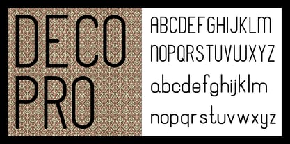
- Deco Metro by Greater Albion Typefounders,
$20.00 Deco Metro is a 1920s and 30s inspired display family, ideal for posters, banners, book covers and other promotional work. Two weights, regular (with an incised centre line) and bold (without the centre line) are offered. The family has an extensive range of features including discretionary ligatures, old-style numerals, Swash Letter and numeral forms, small capitals, Roman numerals and fractions.
 - Dwiggins Deco by MADType,
$21.00 This typeface was originally designed in 1930 by W.A. Dwiggins as the cover for the book American Alphabets by Paul Hollister. Only the 26 letters of the alphabet were included on the cover, so the rest of the numbers, punctuation, symbols, and accented characters have been crafted in a matching style. This strongly geometric Art Deco lettering style has been lovingly revived and is now available as an OpenType font. Over 3,300 kerning pairs are included.
 - Deco Donut by Just My Type,
$20.00 On the very northern edge of South Tucson lies an Old Pueblo institution, Le Caves Bakery, Home of the Vegetable Donut. That’s what they were called when Le Caves opened; now you’d say Vegan Donut, or No Animal Products Used. Radical concept in the Brave New World of 1935. I started with the letters from their sign and extrapolated the rest of the font from those. Deco Donut Fat is extrapolated from Deco Donut. If you want a donut, type a 0 (zero).
 - Saxo Deco by Eurotypo,
$35.00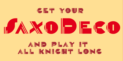
- Deco Pimp by Hanoded,
$15.00 Deco Pimp is a trashy, handwritten font with a deco-look to it. It has some unusual letters, but is very legible nonetheless.
 - Deco Sans by Alan Ronn,
$30.00This font was created while looking at the various shapes my handwriting consistently took, especially in the ways that letters would have breaks in them. Over the course of a few months I continually tweaked the letter forms and shapes, and lo and behold, I developed Deco Sans. This family currently only includes a thin weight, as I'm only one person, and very busy with college. I'm continuing work on a regular, bold, and possibly a future italic weight, but these may not be released for many months to come. As this is a very thin font, it should be used at sizes no smaller than around 16 or 18pt as it tends to get lost in whitespace, and looks best at large sizes. As such, this weight should be considered more of a display font than a text font, however, I predict a regular weight to be very readable and much more useable for the everyday. - Geometa Deco by Wiescher Design,
$39.50 Geometa Deco is based on Paul Renners Futura Classic. The design is timeless, but I always missed some decorative characters. So I sat down and did some. The type-designer for surprising solutions, Gert Wiescher
 - Praha Deco by Deniart Systems,
$20.00 Praha Deco was inspired by the Prague art deco movement at the turn of the 20th century. Spiced with our own creative blend, this is our tribute to that wonderful era in architecture. The Praha Deco typeface contains a large assortment of extended characters to support many of Europe's languages, including Czech, Danish, Dutch, Esperanto, Finnish, French, German, Italian, Hungarian, Polish, Portuguese, Romanian, Spanish, Swedish, Turkish & Welsh.
 - Deco Inline by BA Graphics,
$45.00A hot revival of the 60s and 70s a great headline face with that retro look. - Rigular Script by Gloow Studio,
$18.00 Rigular Script has inspirated from retro style and funky designs like signs and old poster. This font comes with an extra extrude to make the font look more retro/unique and save your time on making it. Font has an opentype features that allow you to modify it as you like as needed. Andala perfect for poster, logo, book covers, tshirt designs, packaging and more. Features : Uppercase Lowercase Number Punctuation Ligature Multilingual Language PUA encode Opentype Features Just enjoy with our product! Thank you
 - VNI-HLThuphap - Unknown license

- VNI-Thufap2 - Unknown license

- USIS 1949 - Personal use only

- Uno Estado - Personal use only

- UNITED BRK - Unknown license

- VNI-Thufapfan - Unknown license

- VNI-Thufap1 - Unknown license

- VNI-Thufap3 - Unknown license

- United States - Unknown license

- Shoplifters unite - Unknown license

- G-Unit - Unknown license

- United White by Balpirick,
$15.00 United White is a modern handwritten typeface that's perfect for adding a personal touch to your design projects! With its natural, organic feel and unique character. Crafted with care and attention to detail, this font is incredibly versatile and can be used for a range of design projects, including logos, branding, invitations, and more. Its modern, handwritten style gives it a unique character that's sure to make an impact. - also multilingual support Enjoy the font! Feel free to comment or feedback! Thank you!
 - Seibi Yuni by Nihon Literal,
$169.00 Originally intended for TV captions, this is a flattened style of font for horizontal typesetting. Although it can be used in vertical typesetting, this universal-design font maximizes legibility by directing the eye naturally along the line of text. 元々TVのテロップを想定した、ヨコ組用の平体デザインのフォントです。タテ組でも使用可能ですが、ヨコ組時に文字を追う視線がスムーズに進むよう考慮した横ラインの揃えと和欧混合文における英数字の視認性を高めたユニバーサルフォントです。エッジを丸みを持たせて、タテ画は太く、ヨコ画は細い明朝体のリズムを取り入れることでデジタルゴシック体特有の堅さや強さを軽減。デジタルフォントでも活字体のような目に優しく読みやすい文字を目指しました。
 - United Kings by Mans Greback,
$59.00 United Kings is a masterfully crafted formal script font that exudes an air of perfection and fine art. Designed for high-end projects and showcasing genuine, authentic craftsmanship, this font brings an unparalleled sense of balance and beauty to your creative work. The exquisite, well-crafted letterforms of United Kings make it an exceptional choice for logotypes, professional branding, and artisanal projects that require a touch of finesse and sophistication. Use ¤ to make tail swashes, or multiple for longer swashes. Example: Kingdom¤¤¤ Use underscores _ anywhere in a word to make an underline. Example: Belo__ved Use # after any letter to give it a crown. Example: Que#en The United Kings font family includes six elegant styles to suit various design needs: The weights Thin, Regular and Bold, enabling your design to range from a delicate and graceful style for a refined touch, to a more bold, assertive and captivating presence for impactful designs. In addition to the thicknesses, each style is provided as Italic. Built with advanced OpenType functionality, United Kings ensures top-notch quality and provides you with full control and customizability. It includes stylistic and contextual alternates, ligatures, and other features to make your designs as unique and impressive as the font itself. United Kings offers extensive lingual support, covering all Latin-based languages, from Northern Europe to South Africa, from America to South-East Asia. It contains all the characters and symbols you'll ever need, including all punctuation and numbers.
 - HGB Unik by HGB fonts,
$23.00 For many years I had repeatedly written names on certificates or designed texts for certificates of honor with a pen. I later digitized a font written with a broad pen from 1988 to make it easier to use. After the technical possibilities for this had developed, I made a PostScript font out of this document font. The "HGB-Unik" is a humanistic antiqua that arose from this written type. In 2009 Unik was chosen as the text font for a book. However, the book designers wanted to have an italic and a bold style as well. The cursive was developed from written texts that I also wrote for various occasions in the 1980s. The resulting font family was thoroughly revised several times until a usable text font with four weights was created. Although the Unik looks very idiosyncratic in display size, it shows a surprisingly balanced, pleasant typeface in read size.
 - FF Unit by FontFont,
$104.99 German type designer Erik Spiekermann and American type designer Christian Schwartz created this sans FontFont between 2003 and 2011. The family has 14 weights, ranging from Thin to Ultra (including italics) and is ideally suited for advertising and packaging, book text, editorial and publishing, logo, branding and creative industries, small text, wayfinding and signage as well as web and screen design. FF Unit provides advanced typographical support with features such as ligatures, small capitals, alternate characters, case-sensitive forms, fractions, and super- and subscript characters. It comes with a complete range of figure set options – oldstyle and lining figures, each in tabular and proportional widths. As well as Latin-based languages, the typeface family also supports the Cyrillic and Greek writing systems. In 2004, FF Unit received the TDC2 award. This FontFont is a member of the FF Unit super family, which also includes FF Unit Rounded and FF Unit Slab.
 - Univers Next by Linotype,
$53.99 Linotype Univers is a completely reworked version of the original Univers typeface family designed by Adrian Frutiger in 1957. After a long process of painstakingly detailed revision, Frutiger and the design staff at Linotype completed this large joint project in 1997. The result: a brilliant and cohesive font family of 63 weights and styles including the 4 monospaced typewriter weights. All the existing weights were completely redrawn, with careful attention paid to making the proportions more consistent with each other and improving fine details such as curves and thick-to-thin stroke ratios. The family was expanded from 27 to 63 weights, providing a much larger framework to graphic designers for choosing just the right style. The bold and condensed weights were reworked for improved legibility and on-screen application. The stroke weights were revised for consistency within each face as well as in relationship to the other weights. By following Frutiger's original designs, the humanist character of the sans serif Univers now comes through more distinctly. T he systemized numbering system has also been updated. With its sturdy, clean forms Univers can facilitate an expression of cool elegance and rational competence. In fact, the strong familial relationships between all the styles and weights make it a serviceable choice for large graphic design projects that require versatility with consistency. Frutiger was successful in staying true to his initial aims; the new Linotype Univers does indeed work in longer texts as well as for display settings. In 2010 the typeface family was extended and renamed into a more logical naming of "Univers Next" to fit better in the Platinum Collection naming. Univers Next Variable are font files which are featuring two axis and have a preset instance from Light to Heavy and Condensed to Extended. Univers® Next font field guide including best practices, font pairings and alternatives.


