10,000 search results
(0.12 seconds)
- Weiss by Linotype,
$29.99The German poet, painter, calligrapher and type designer Emil Rudolf Weiß originally created this eponymous typeface for the Bauer Foundry of Frankfurt. Long known and loved by metal type enthusiasts under the name "Weiss Antiqua," this design was inspired by typefaces from the Italian Renaissance while still distinctly reflecting the artistic and poetic personality of its twentieth-century designer. Weiss has tall ascenders, sharp apex points, and a low-slung midsection on the caps. The italic moves like a classical ballerina. Weiss is one of the earliest contemporary serif types to have italics based on the chancery style of writing. The Weiss family works well for warmly legible text typography; and it's also an original choice for refined headline and display graphics." - Brevier by CAST,
$45.00 Compact sans, ideal for setting long texts in small or very small type sizes: for packaging, instruction booklets, drug information leaflets and anything else that has to be legible at very small sizes. Lean and rhythmical, designed ideally to be used at less than 8 points (Brevier was the old typefounders’ name for 8-point type), Brevier holds up well even under adverse printing conditions. The apparently geometric letterforms hide Renaissance characteristics, the x-height and openings are very generous and the strokes slightly modulated. In order to offset ink spread – which is inevitable when printing very small sizes of type – Brevier has large white spaces between the letters. All internal angles have deep ink traps and many connections have been left open.
 - Figgins Brute by Intellecta Design,
$14.90"A capital titling face with numerals, erroneously labelled in Figgins specimen book of 1817 as an 'antique' or roman. With a very bold, nearly monoline construction and squared serifs as thick as the main stroke, this type surpassed even the fat face style in blackness, it was popularised by the advent of handbills and early advertising posters, which needed bold type styles to project commercial messages from a distance. A sign-writer friend of mine theorises that the Egyptian style originated with the North African campaigns (hence Egyptian) of Napoleon Bonaparte, and the type historian Ruari McLean also suggests that the Egyptian style originated with signwriters 'block' letters, just like the prototypical (and contemporary) sans serif of Caslon IV." (Ben Archer) - Shell Mera by Putracetol,
$24.00 Shell Mera is a slab serif inspired by 1970s cowboy and sheriff posters but made flexible enough for everyday use. What makes this font unique is the difference in the height of each character. The baseline is also not the same, so it makes this font seem irregular Shell Mera best uses for title, invitation, heading, cover, poster, logos, quotes, product packaging, merchandise, social media & greeting cards and many more The alternative characters were divided into several Open Type features such as Swash, Stylistic Sets, Stylistic Alternates, Contextual Alternates, and Ligature. The Open Type features can be accessed by using Open Type savvy programs such as Adobe Illustrator, Adobe InDesign, Adobe Photoshop Corel Draw X version, And Microsoft Word. This font is also support multi language.
 - Wood Nouveau JNL by Jeff Levine,
$29.00 The hand cut wood type which was the inspiration for Wood Nouveau JNL conjures up images of the artistic period between the Victorian Era and 1920s Moderne, as well as the hippie counterculture active in the later part of the 20th Century. During the late 1960s and early 1970s, rock posters, fliers, store signs and other printed ephemera of "the love generation" borrowed heavily from the Art Noveau style in both art and typography. An Alphonse Mucha-inspired flower girl could adorn a concert poster that also combined both vintage wood type and hand-lettered elements. Although this particular type design might well have preceded the actual start of the Nouveau period, the softer, rounder lines of each character lent themselves well to this emerging style.
 - Railroad Gothic by Linotype,
$29.99Railroad Gothic was originally designed in 1906 for ATF (American Type Founders). This uppercase-only typeface is very condensed and also heavy, giving it a distinct 19th American wood type feeling. Like those 19th Century classics, Railroad Gothic is best used when set really big. Originally designed for use in railroad signage, Railroad Gothic has since been adapted for use in many American tabloid journals, which employ it in screaming headlines. When you need to set something large and loud for the whole world to see, this old ATF classic may be right for you. Railroad Gothic is an all caps font, and is available in digital format exclusively from Linotype. The typeface is included in the Take Type 4 collection from Linotype GmbH." - Big by Walking Fearless,
$20.00 BIG is an elegant condensed display font created for strong and impactful headlines. It comes from a series of hand printed specimens taken from wood type found in Andrew Howard’s Studio in Porto (Portugal). A wooden type that reassembles the industrial victorian style which has now been expanded to 20 cuts, ranging from ExtraLight to Bold, with Italics and a stencil version, covering all your needs for a striking visual effect just with plain type with distinctive features and personality, standing out from the crowded world of display sans serif. The font was engineered with essential OpenType features, that allows the user to compose the headlines in two different heights, with case-sensitive punctuation, symbols and special ligatures such as “the”, “of” and “le”.
 - HWT Lustig Elements by Hamilton Wood Type Collection,
$24.95 'Euclid. A New Type,' originally designed in the 1930s by modern American designer Alvin Lustig (1915-1955), has been revived as 'Lustig Elements' through a collaboration of designers Craig Welsh and Elaine Lustig Cohen. Only twelve letterforms from the original font design had been retained in archive material in the many decades since its initial development. Lustig Elements combines four simple, geometric shapes aligned to an underlying grid with letterform designs that hold true to the spirit of the original font. Lustig Elements initially came to life in 2015 as wood type cut at Hamilton Wood Type & Printing Museum. The digital version expands on the basic character set with a pro expanded latin character set, small caps and even an Inline variation.
 - Diediedie - Unknown license

- !Sketchy Times - Unknown license

- Rocky Mountain Spotted Fever - Unknown license

- GarciaToons by Victor Garcia,
$40.00GarciaToons is a dingbats type family integrated by 3 styles: GarciaToons Bunny, GarciaToons Cat, and GarciaToons Mouse. GarciaToons can be defined as a type cartoon to read some text situations at a glance. It is a contemporary type tool for seasoning texts in a way that simple words are insufficient to express. GarciaToons is about funny and fresh real-life communication needs, the ones we facing anytime anywhere in our daily writing issues. Aim: To design an easy-to-understand and user-friendly symbol type code, able to combine with –or even to replace– words in a text. Idea: To develop a comic's faces dingbats series starting from the same pattern for the whole variants. The challenge was to represent different cartoon characters with minimal design changes. Designs are framed into a straight and geometric visual structure, just as logotypes themselves are. Face expressions are inspired on the worldwide understandable cartoons aesthetic. The result combines logo sharpness with cartoons flexibility. As it's said: A picture is worth more than a thousand words. - Caslon #540 by Linotype,
$29.99The Englishman William Caslon punchcut many roman, italic, and non-Latin typefaces from 1720 until his death in 1766. At that time most types were being imported to England from Dutch sources, so Caslon was influenced by the characteristics of Dutch types. He did, however, achieve a level of craft that enabled his recognition as the first great English punchcutter. The original Caslon specimen sheets and punches have long provided a fertile source for the range of types bearing his name. Identifying characteristics of most Caslons include a cap A with a scooped-out apex; a cap C with two full serifs; and in the italic, a swashed lowercase v and w. A few of the many interpretations from the early twentieth century were true to the source, as well as strong enough to last into the digital era. These include two from the American Type Founders company, Caslon 540 and the slightly heavier Caslon #3. Both fonts are relatively wide, and come complete with small caps, old style figures, and italics. - Samo Sans by CarnokyType,
$- Samo Sans is a modern sans-serif typeface with low contrast strokes and is balanced between technical shapes and dynamic feeling. The primary type family is consisted of complete set of Latin glyphs for lower and upper case. It also supports diacritics of all European languages including lining numerals, standard ligatures and other characters sufficient for regular typesetting. Characteristic features are lower spurs (a, b, d, u), and upper spurs (m, n, p, q, r) with distinctive wedge-shaped cuts. These parts are complemented by homogeneously designed diacritics, which is not disturbing and harmonizing with the whole unit. Another very strong feature of the type drawing are lower terminals of the round glyphs, which are finished by moderate narrowing. The type has got decreased caps height, also decreased numerals and optimal x-height, which makes it suitable for more extensive text typesetting. It can be effectively applied in corporate identities or in display typesetting. The narrowness of the basic set of Samo Sans typeface is supplemented by extended type family Samo Sans Pro .
 - Melodi by Diego Berakha,
$20.00 Melodi is the result of years of working with hand made types on my designs. Every time I draw the letters and words that I need for every design piece. One day I decided to go serious and make a real type of it and “Melodi” is the result of this work. It’s a calligraphic font, built using a regular stroke, and carefully crafted to have nice joins between all the letters. It has some playful but stylish capitals that brings lot of personality to the font. It work super nice either in lowercase writing as in all-caps texts. It looks specially good on lists of words or small sentences. Melodi is a playful but very versatile font, it can be used in lots of different scenarios. From creating a logo, writing the tittles of a catalogue or use it in a poster combined with other types (it work really well as counter point of more classical types) to motion graphics animations or advertising work. It can be cute but it also can do hard work!
 - Bohemia by Linotype,
$29.99Argentinean designer Eduardo Manso created the Bohemia type family in 2003. Bohemia's cunning and elegant essence shows off refined letters that evoke the Transitional style typefaces like Baskerville, though most Baskerville-like designs tend not to be as curvaceous as Manso's! True to form, Bohemia shines in smaller text sizes, like 9 point and above, while still maintaining a unique character and spirit. Bohemia is a great alternative to better-known text faces. The critics have been raving. Bohemia came to Linotype via its fourth International Type Design Contest (ITDC) [Link] in 2003, where it received one of the three top awards. Under the name Argot, this typeface received a Certificate of Excellence in Type Design from the Type Directors Club of New York in 2004. Bohemia was also selected for inclusion in the 21st International Biennale of Graphic Design 2004 in Brno, Czech Republic, and was later named one of the most relevant works in the Bienal Letras Latinas 2004 exhibition, which traveled through Buenos Aires, San Paolo, Santiago, and Vera Cruz." - VTC Bloke by Vintage Type Company,
$19.00 VTC Bloke is a revival of Miller & Richard’s classic metal typeface, ‘Egyptian Expanded’, including the three-dimensional, ‘Open’ style that was later introduced to the family. The roots of this typeface stem from the UK, where William Miller and his son-in-law Richard had their initial foundry in Edinburgh, Scotland. In addition to the beautiful and timeless type designs, the foundry gained a reputation for offering super small type sizes, designed for Bibles, dictionaries, documents, etc. Slab Serifs (or Egyptian Serifs) started to gain popularity in the early 19th century. It’s around this time, due to emerging industrial technologies, and an ever-expanding advertising industry, that type designers started to really experiment with letterforms that could help their clients distinguish themselves from the competitor, and catch people's eyes. The size of posters and advertising space was getting bigger, and bigger, and so was the type. All original letterforms have been re-drawn and cleaned up, with some more modern glyphs and characters added in. VTC Bloke supports Adobe Latin 1 Language Support.
 - Black Oak - Personal use only

- Signal To Noise - Unknown license

- Cinnamon Cookie by Tigade Std,
$10.00 Cinnamon Cookie is combination of cute-uppercase-display-font with beauty-lowercase-script-font. When it is used together, it is almost perfect for various usage such as; wedding invitation, signature, decoration, until the range of kids products. It also support international characters. Other than that, you will get couples of additional stylistic set characters to improve/enhance your design.
 - FeggoliteKeyed by Ingrimayne Type,
$9.00 FeggoliteKeyed has letters on rounded rectangles with shadows. The letter shapes are from a decorative, monospaced font called FeggoliteMono. The typeface contains characters that will add color to letters. There are two ways to do this. One uses layers and the other a combination of characters, some with zero-width. A file in the gallery explains the ways that this can be done.
 - We Love Nature Forest by kapitza,
$79.00 We Love Nature Forest is inspired by long walks in the woods and features decorative wintery pine needles, fir branches and cones. Perfect for designing your seasonal cards. It consists of 52 highly detailed, hand drawn illustrations. The illustrations can be used on their own to create beautiful designs, or in combination with other illustrations in the We Love Nature font collection.
 - Aquascape by Goodigital13,
$20.00 It will make your design project more beautiful. The font is suitable for any design like branding, fashion, print template, quotes, wedding and etc. Perfect to use for Logotype, Letterhead, Poster, Apparel Design, Label and etc. perfect for cards, prints, logos, invitations, arrange illustration and decoration. It has upper and lower case letters, numbers, special characters, accents. Perfect for Children!
 - Fireboys Outline by Sipanji21,
$10.00 Introducing, Fire Boys Font, this is a display and decorative with Burning fire looks!! very suitable for logos, clothing, branding and others. very easy to use without the hassle of drawing, Get inspired by its unique feel, and turn to add a lovely charm to any crafts project just by purchasing this font you can immediately use it for all your needs.
 - Evening Wear JNL by Jeff Levine,
$29.00 Evening Wear JNL, drawn from the elegant monoline lettering used as titling on the sheet music for "Smoke Gets In Your Eyes", conjures up images of 1930s New York at its apex. Fine restaurants, elegant night clubs and couples decked out in their best evening apparel were of a time long past when "doing the town" meant really dressing up for the occasion.
 - BonaVia by Greater Albion Typefounders,
$9.95 BonaVia is an adaptation of Greater Albion's Bonning and Bonnington families. Its purpose made to enable the construction of banners and mastheads in the style of traditional streetsigns, and offered in Regular and 'Blanc' faces. A selection of decorative ends and fleurons are included. BonaVia is splendid on posters, signage, book and CD covers and labels with a period feel.
 - Chocotea by Mevstory Studio,
$20.00 Chocotea - Fun Retro Font You Can Mix And Match for Your Awesome Project This fonts is ideal for crafting, branding and decorate your any project. This fonts are perfect for wedding invitation or your blog. Also with their help, you can create a logo or beautiful frame for your home. Or just use for your business, book covers, stationery, marketing, magazines and more.
 - Helsing by Great Lakes Lettering,
$30.00 Helsing is a serif style font inspired by Bram Stoker’s 1897 Dracula as well as Edward Gorey’s rendition of the story. Helsing is characterized by his slighting skewed baseline, subtle texture, thick and thin contrasts, and decorative legs. Made as a graphic style font, Helsing is perfect for illustrative titles, small bodies of text, and pairing with contrasting lettering style fonts like Asterism.
 - Lisboa Swash by Vanarchiv,
$45.00 Lisboa Swash is a display humanist sans-serif typeface and it was designed for big sizes purposes. The uppercase letterforms are much more decorative than the lowercase, but both contain hook-head terminals and few contrast. This typeface family contain stylish alternates characters which are more calligraphic than the main version. This typeface family has different encoding languages (Latin, Central Europe and Baltic).
 - Boomolla by Stefani Letter,
$12.00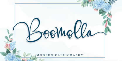 Boomolla is a beautiful handwritten font with a modern look. It features gorgeous swashes and ligatures that make this script incredibly versatile. Boomolla will add a decorative touch in an instant. This font is PUA encoded which means you can access all of the amazing glyphs and swashes with ease! It also features a wealth of special features including alternate glyphs and ligatures.
 - Bellanos by Letterara,
$12.00 Bellanos is a new, fresh, sweet, and unique handcrafted font. It's ideal for branding and decorate your projects. Bellanos font has a classy and modern look that can be used for logos, branding, invitations, posters, advertisements, stationery, animated films, social media posts, youtube channel, and much more! It is PUA coded which means you can access all the glyphs and sweeps easily!
 - Barbies by OtterType,
$22.00 Barbies is an outstanding display font for your inner princess. You can use it for a variety of design projects like posters, business cards, birthday and wedding invitations, games, covers, social media posts, quote photos, branding, editorials, and much more. Decorative curves add an amazing touch to create some cute accents. Barbies is a multilingual font, also supporting Cyrillic alphabet.
 - Lectores by Cuda Wianki,
$20.00 Lectores is based on 18th century chronicles of Benedictine monastery manuscript, so it is definitely oldish, rough but elegant. Thanks to many ligatures and alternate characters it is varied handwriting font. Lectores is decorative, it works nice with many occasional papers such as invitations, stationery and quotations. It is perfect not only for oldstyle and antique typography but also for modern designs.
 - Jarekuh by Differentialtype,
$10.00 Jarekuh is a neat decorative serif font. This font will look amazing in any context, whether it's used on a busy background or as a standalone title! Jarekuh has many alternative glyphs that can be combined to get an attractive and prominent impression. Of course this font is PUA encoded, which means you can access all of the glyphs and swashes with ease!
 - Quiky by Scratch Design,
$10.00 Introducing our Quiky! A playful, hand lettered font. It has smooth lines, a heavy weight, sweet curves and a lot of character that you can name it. Quiky suits for your design such as invitation design, stationery, branding, blog design, advertising design, card, art quote, home decor, book title, special events and more. This font also includes Latin Characters for language support.
 - Clobot by Tama Putra,
$15.00 Clobot is a tough and strong decorative display typeface. It is suitable for any design needs, branding, art quote, cover title, t-shirts, any lettering design needs and more. It has many alternative and ligature glyphs which make it very versatile font and it’s also multi-lingual. It comes with stylistic alternates and 10 stylistic sets. It provides flexibility to enhance your designs.
 - Lovely Style by Yoga Letter,
$15.00 "Lovely Style" is a very pretty handwritten font. This font features uppercase, lowercase, swashes, headings, uppercase alternative, lowercase alternative, binders, multilingual support, numbers, and punctuation. How to use letter decoration is very easy, and there is a guide in the preview. This font is perfect for weddings, valentines, engagements, stickers, banners, posters, invitations, Christmas, Easter, romantic moments, quotes, and more.
 - Giftbox by Gleb Guralnyk,
$12.00 Introducing a vintage font Giftbox. It's a classic style font with thin lines decoration. Giftbox font set includes a main font file with lots of ligatures and a simple one which will be more usefull in a small size. Giftbox font has a west european multilingual support (please check out a screenshot with all characters). Thank you and have a lovely day!
 - A Little of Love by Pixel Colours,
$19.00 A Little of Love is a handwritten font duo that includes lots of cute dingbats to decorate quotes, social media posts, greeting cards, etc. Make combinations between the uppercase sans and the script and design beautiful projects! Includes - A Little of Love Font: a combination of a sans and a script font - A Little of Love Dingbats: 80 cute illustrations
 - Tagged One by j.dsky,
$- This family is intended to be a universal font generator for languages of unknown civilizations or simply a tool for creating graffiti-like ornaments. Inspired by both my own paintings and drawings and graffiti. Set of 107 glyphs, available in 3 styles - thin, regular and black rounded. Picture font recommended for use as a decorative element and for creating new alphabets.


