8,647 search results
(0.072 seconds)
- Malitia Vetus Two by Intellecta Design,
$26.00 MalitiaVetus is a decorative blackletter font with influences of Old English, Lombardic and Tuscan styles. Is perfect to create authentic medieval documents
 - Wood Font Four by Intellecta Design,
$22.90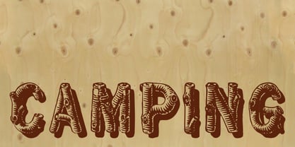 A display and decorative font built upon the theme of wood. Great for display purposes in projects about nature and environmental topics.
 - DavidFarewell by Ingrimayne Type,
$9.95 David Farewell is a decorative flare-serif typeface family with medium contrast. It has four styles: regular, bold, italic, and bold italic.
 - Malitia Vetus by Intellecta Design,
$25.00 MalitiaVetus is a decorative blackletter font with influences of Old English, Lombardic and Tuscan styles. Is perfect to create authentic medieval documents
 - Bat Ghost by Letterafandi Studio,
$14.00 Bat Ghost is a Halloween decorative font. Add it to your Halloween crafts, horror movie posters, t-shirts and other about Halloween.
 - Merchant by Aboutype,
$24.99A black weight decorative typeface with an engraved flare. Merchant was designed for all media and requires subjective display kerning and compensation. - Wood Font Five by Intellecta Design,
$22.90 A display and decorative font built upon the theme of wood. Great for display purposes in projects about nature and environmental topics.
 - Soft Fleurons by Intellecta Design,
$21.95 Soft Fleurons is a dingbats/decorative display font featuring many different styles of flourishes and ornaments. Great for a vintage antique feel.
 - Hellfire BB by Blambot,
$20.00An unconventional Gothic typeface with decorative caps and a whiff of fire and brimstone! Comes with a devilish compliment of European characters. - Stucco by Loshaj Foundry,
$20.00 Stucco is a construction material that is used as a decorative coating for walls, ceilings, exteriors, and as a sculptural and artistic material in architecture. Stucco can be applied on construction materials such as metal, concrete, cinderblock, or clay brick and adobe for decorative and structural purposes. In similar fashion, the Stucco font is designed to be a decorative piece and is intended to support a wide variety of mediums. The font is intended to be used as a header or headline font, but a creative designer will find other uses for it. The font contains 300+ glyphs which includes uppercase letters, lowercase alternates, numbers, symbols, accented characters for multiple language support.
 - Orbi by ParaType,
$30.00 The Orbi type system is a low contrast antiqua of elegant design with a well developed set of members. It consists of 10 roman and italic faces of different proportions and weights and 3 decorative calligraphic fonts. It also contains 3 additional fonts with various decorated initials. The roman includes small capitals. Thanks to its variety of styles the font is suitable for a wide range of applications - the basic styles are good for books and periodicals; the narrow styles work well in the columns and tables of business papers; the decorative styles are ideal for ceremonial typography where swashes, calligraphy and initials are usual. The fonts were designed by Natalia Vasilyeva. Released by ParaType in 2010.
 - Ben Cat Normal - Unknown license

- Lettering1 Weird - Unknown license

- Kidnapped At Old Times by Intellecta Design,
$11.90 Kidnapped at Old Times, by Intellecta Design, is a collection of 35 fonts (and growing) of some of the most decorative caps we have ever carried. Decorative caps can capture the attention of anyone when used well. These caps are remarkably interesting and very detailed. So many to choose from - the entire family has over 2000 exotic, intrincate and historical letters. Easier to just order the whole family!
 - Dolphins by Alandya TypeFoundry,
$15.00 Dolphins is a unique serif font family consisting of 16 styles. It is equipped with alternative decorative letters to be able to handle most typographic applications ranging from branding to body copying with various weights and inherent readability. Complete with decorative letters, it will be perfect and will look luxurious for many projects such as fashion, magazines, logos, branding, photography, invitations, quotes, blog headings, posters, advertisements, postcards, and more.
 - P22 Speyside by IHOF,
$24.95 Speyside is a round, curved and controlled sans serif with an additional set of decorated uppercase letters, initials and small caps. It's appropriate for text, titling and display. The origin of the name is taken from a small location in Tobago. The font is inspired by the local handicraft, the batik in particular. Each pro font style includes small caps and decorative initials as well as several OpenType features.
 - Bodoni Classic Swashes by Wiescher Design,
$39.50 Bodoni Classic Swashes is my personal addition to Bodoni’s family of typefaces. Bodoni did not design a decorative version. His quest was for purity in book design. Even though in his days it was not called design; he thought of himself purely as a printer. But I think, especially after visiting the Bodoni museum in Parma, if Giambattista were alive today he would design a decorative typeface. Yours classico, Gert Wiescher
 - With Lovely by Yoga Letter,
$15.00 "With Lovely" is a very pretty handwritten font. This font has beautiful decorations in the form of love, birds, and butterflies. This font features uppercase, lowercase, alternative, swashes, titling, binders, numbers, punctuation, and multilingual support as well. The font decoration is very easy to apply, and there are also instructions for use in the preview. Great for weddings, Valentine's Day, invitations, stickers, birthdays, Christmas, winter, Easter, and so on.
 - Poesie_Noire_DEMO - Unknown license

- Praitor - Unknown license

- Nevins Hand - Unknown license

- Arrowman by ZetDesign,
$15.00 Arrowman is a strong and bold decorative font with a Gothic feel. It will surely turn any design project into an eye catcher.
 - Fusion by Présence Typo,
$36.00Fusion is a titling and short text typeface inspired by medieval decorative initials (versals) and bodoni letters. Each sign exists in two versions. - Melay Script by Mans Greback,
$59.00 Melay Script is a monolined calligraphic typeface, with large and beautiful upper-case letters and a decorative style. It has elegance and confidence.
 - Lomidrevo by Juraj Chrastina,
$39.00 Lomidrevo is a grunge stencil family derived from Valibuk. In the free demo version, you can see numbers and lowercase letters without kerning.
 - OT Puppy by Overtype,
$35.00 OT Puppy is a decorative and fun brush font. Include Latin 2 and Cyrillic 1 language set. Good for postcards, packaging and posters.
 - Unique Wood by Solotype,
$19.95Wood type maker W. H. Page designed this in 1870. Caps, figures and points only. A great decorative for old-timey poster work. - Vacation Monogram by Selvia Design,
$15.00 “Vacation Monogram” is a script font combined with a monogram. This monogram is decorated with forms of tourism and traveling around the world.
 - Cicero Series by Alphabet Agency,
$15.00 Cicero Series is a bold decorative serif display font that exudes power, strength, magnificence, prestige. Add this grandiose piece to your font collection.
 - Tribalism by Intellecta Design,
$19.90 Tribalism is a dingbat/flourish font inspired by tattoos and more. Use these ornaments to decorate your type settings and or design work.
 - Hokkien by AdultHumanMale,
$12.00 HOKKIEN is an all caps sister to my other font Penang. It was inspired by some old pieces of Art Deco signage I had discovered in Penang Malaysia, The font is available in one weight for now. The font is loaded with plenty of foreign extras and currency symbols. I have also included an alternate cap S which works better visually in blocks of copy.
 - VVDS London Oatmeal by Vintage Voyage Design Supply,
$15.00 London Oatmeal - a new stylish font duo, an elegant modern art-deco inspired sans with a lot of ligatures with retro look stylish brush script. It's nice font pair for use it in blogs, posters, magazines, logo’s or greeting/wedding cards. The sans has caps lowercase, so you can combine them in many ways. More than 100 OpenType features as Alternates, Swashes and Ligatures.
 - Fairfield by Linotype,
$41.99 Rudolph Ruzicka designed his font Fairfield as a legible text font. His philosophy: The reader expects optical assistance with reading. He does not want to be distracted while interpreting and understanding the ideas of a text." Fairfield font is based on the forms of Venecian Old Face fonts as well as on the designs and details of Art Deco, giving the font a distinctive appearance"
 - Decour by Latinotype,
$26.00 Decour is a Slab Serif typeface that features low contrast between thick and thin strokes and whose proportions were based on those of Art Deco design. A big height difference between lower case and upper case letters makes Decour a very expressive font and well-suited for headings and subheadings. Its versatility also allows it to be used in other ways, such as publishing and retailing.
 - Power Talks by Essqué Productions,
$35.00 Inspired by fonts used in financial and law arenas. Bold style reminiscent of 1920s deco era. Great font for play cash or Monopoly-themed party invitations. Vibes of Wall Street movers and shakers. Includes letters from Latin, Greek, Hebrew, and Cyrillic Alphabets - with some common diacritics. Also includes small caps and English feature words like "the", "of", "with", "and", etc. for marquee style accents.
 - Bling by Hackberry Font Foundry,
$24.95 My second font for 2009, Bling is a hoot. This vaguely Deco, sparkly sans is for those heads that need bling. This is the first font released in a long time without my complete feature set. It has lining and oldstyle figures, many wild ligatures, the x-height is too high to make a small caps set worth the effort. It's just for fun. Enjoy!
 - Renard Moderne NF by Nick's Fonts,
$10.00Twentieth Century Poster, designed by Sol Hess for Lanston Monotype in the 1940s, provided the inspiration for this family of faces. Although, historically, the design falls outside the time period normally considered the Art Deco era, its sensibilities are pure Art Moderne. Both versions of this font contain the Unicode 1252 (Latin) and Unicode 1250 (Central European) character sets, with localization for Romanian and Moldovan. - Skyline Hotel by Open Window,
$19.95 Skyline Hotel is a brand new hand painted font from Dathan Boardman of Open Window. It utilizes Art Deco structures but is greatly amplified by organic paint brush strokes. The font would be best used in designs that require an organic degraded look and feel. Skyline Hotel… optimal for back alley graffiti mural or a poster to begin a political revolution. Geometric essentials betrayed by fluid expression.
 - Equa by Thousand Type Works,
$15.00 Equa is a font based on strict grid rules. The name "Equa" comes from the equal widths of the vertical strokes, inner spaces and counters and spaces between glyphs. Its geometric construction gives it a technical look with an art deco sensibility. A system of three "weight-widths" based various sized grids gives flexibility in uses, from large condensed headlines to small blocks of text.
 - St Friska by Stereotypes,
$34.00 St Friska, based on old movie title lettering, is made just for headlines. It comes with a slight touch and feeling of art deco but it’s designed to be contemporary in 2010 and beyond. Friska comes with a big bunch of OpenType features, so a designer can play with it like Lego, using it alongside old or new typefaces. It has stylistic sets and lots of ligatures.


