10,000 search results
(0.027 seconds)
- Deco Experiment 2 by Intellecta Design,
$22.90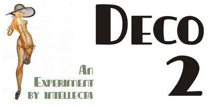
- Deco Revisited JNL by Jeff Levine,
$29.00 Inspired by a retro Art Deco poster as well as many of the true classic Art Deco type designs of the 1930s and 1940s, Deco Revisited JNL is a bold, black, stencil-influenced design with no counters. Although being a contemporary design, its use in any retro project will truly evoke a feeling for the “streamline” era. Deco Revisited JNL is available in both regular and oblique versions.
 - Deco Banner JNL by Jeff Levine,
$29.00 Deco Banner JNL is composed of reverse lettering on a black background with Art Deco end caps. To create a banner, first type the plus sign for the left end cap, then your text. To add a space between words, use the bar on the shift position of the backslash key then continue on. To add the right end cap, type the equal sign.
 - Deco Roundpoint JNL by Jeff Levine,
$29.00 On the sheet music cover of the 1931 song "When the Autumn Leaves of Life Begin to Fall", the title is hand-lettered using a round tipped nib pen. The combination of both an Art Deco lettering style and the rounded ends of the characters creates an exquisite, yet simple type design digitally preserved as Deco Roundpoint JNL; available in both regular and oblique versions.
 - Deco Francois JNL by Jeff Levine,
$29.00 The 1930s-era French alphabet collection entitled “La Lettre Dans le Decor & La Publicite Modernes” (which somewhat translates to “The Letter in Modern Decor and Advertising”) has page after page of attractive and unusual type interpretations. One particular Art Deco design puts an entirely different spin on the classic “rounded terminals and geometric design”. Unusual character shapes add a fresh new/old take to the “Streamline Movement”. The aptly-named Deco Francois JNL is available in both regular and oblique versions.
 - Free Form Deco by Jeff Levine,
$29.00 Toward the end of the 1920s, Art Deco influences were starting to creep into modern design. The hand lettered title on the cover of the1928 sheet music for “Fascinatin’ Vamp” not only embraced the new Deco movement, but sent it on a wild typographic ride. Letters of mixed thicknesses and stylings made up the two word title, and this unusual group of letter shapes became the inspiration for Free Form Deco JNL, which is available in both regular and oblique versions.
 - Deco Triline JNL by Jeff Levine,
$29.00 From the title on the sheet music for the 1935 composition "Along Tobacco Road" comes Deco Triline JNL in both regular and oblique versions. Reminiscent of Broadway if done as a neon sign, this typeface virtually shouts about the Manhattan nightlife of the 1930s. For maximum readability, space the letters a bit wider than normal.
 - Stylized Deco JNL by Jeff Levine,
$29.00 In their book "Lettering of Today" by W. Ben and Ed C. Hunt, an Art Deco "thick and thin" alphabet with some stylized characters (which leaned a lot toward a calligraphic style) stood out from the rest. This is now available as Stylized Deco JNL, in both regular and oblique versions.
 - Dutch Deco JNL by Jeff Levine,
$29.00 Although the Art Deco movement is generally attributed to the 1930s and 1940s, a number of design influences were showing up during the late 1920s in what is referred to as the Art Nouveau period. The Dutch illustrator Anton Kurvers’ hand lettering on the front cover of the (1927) magazine “Het Vlaamsche Volstooneel” clearly shows the clean lines and Avant Garde geometrics that foreshadow Art Deco. This attractive pre-Deco lettering has been recreated digitally as Dutch Deco JNL, and is available in both regular and oblique versions.
 - Team Deco JNL by Jeff Levine,
$29.00 In an online edition of Modern Screen Magazine for March of 1936, many of the article headlines were set in a bold, slab serif inline font which (although possessing some Art Deco traits) could double as a sports font. This is now available as Team Deco JNL in both regular and oblique versions.
 - Stencil Deco JNL by Jeff Levine,
$29.00Stencil Deco JNL was an experimental modification of Jeff Levine's Cardboard Cutouts JNL font, originally designed from an authentic stencil source circa the 1950s. This version is a fusion of the Art-Deco style and a modern, trendy approach to the stroke weights. - Empire State Deco by Comicraft,
$19.00 Every face tells a story but this font is 77 stories high (1,046 feet with antenna included)! A lofty companion to Empire State Gothic , Empire State Deco is a tall, stately font containing four different styles, sometimes contradictory, united by the desire to be modern. Those familiar with the Exposition Internationale des Arts Décoratifs et Industriels Modernes will notice a post-postmodernism combined with the fine craftsmanship and rich materials for which those awfully nice chaps at Comicraft are known. During its Art Deco heyday, Comicraft represented luxury, glamour, exuberance, and faith in social and technological progress -- this new font recaptures those halcyon days in letter form.
 - Streamline Deco Square by Intellecta Design,
$18.90a fifities style font - Deco Moderne JNL by Jeff Levine,
$29.00 The model for Deco Moderne JNL was the hand lettered title on the sheet music cover of "Did You Ever See A Dream Walking" (from the 1933 Paramount musical "Sitting Pretty" starring Jack Oakie, Jack Haley and Ginger Rogers). The typeface is available in both regular and oblique versions.
 - Drama Deco JNL by Jeff Levine,
$29.00 The movie poster for the 1936 film “Dodsworth” had its title hand lettered in a thin Art Deco sans serif with a mix of both stylized and squared characters. Expanding on this unusual lettering combination, the final results became Drama Deco JNL, which is available in both regular and oblique versions.
 - Deco Neue Wilde by Open Window,
$- Deco Neue Wilde is a filter font based on Deco, an original Open Window classic. It sort of speaks for itself but it reminds me of a lava lamp and the countless shapes that you could waste time watching appear.
 - Deco Experiment 5 by Intellecta Design,
$9.00a naive typeface from Art Deco ages - Deco Holiday JNL by Jeff Levine,
$29.00 A hand lettered Art Deco ‘stencil’ design used in various ads for “Holiday” and other Pathé films was found in the July 22, 1930 issue of “The Film Daily”. Similar in style to Futura Black and other like designs, it is now available as Deco Holiday JNL in both regular and oblique versions.
 - Oddly Deco JNL by Jeff Levine,
$29.00 A quirky and unusual Art Deco monoline typeface can be found within the pages of the Esterbrook Drawlet Pen instruction book [circa the 1940s]. Drawlet was the direct competitor to Speedball Lettering pen nibs. This unusual type design of varying width and character shapes is now available digitally as Oddly Deco JNL, in both regular and oblique versions.
 - Family Deco JNL by Jeff Levine,
$29.00 Family Deco JNL was inspired by the bold Art Deco hand lettering of the movie credits for the 1936 Laurel and Hardy comedy “Our Relations”, and is available in both regular and oblique versions.
 - Narrow Deco JNL by Jeff Levine,
$29.00 The hand lettered word ‘puzzles’ from the box cover of a 1940s set of metal “connected” puzzle pieces manufactured by the A.C. Gilbert Company was the initial typographic model, but some additions and changes were made. Instead of the right side of the ‘P’ being a semi-circle, it was changed to a more conservative ‘’squared’ look. After drawing out all of the necessary glyphs, the overall height of the characters was extended to make the letters and numbers appear taller and narrower. The end result is Narrow Deco JNL, which is available in both regular and oblique versions.
 - Fancy Deco JNL by Jeff Levine,
$29.00 This decorative, scalloped thick-and-thin Art Deco type design is one of the many inspirations found within the pages of the 1934 French lettering book “L'Art du Tracé Rationnel de la Lettre”. Now in digital format, Fancy Deco JNL is available in both regular and oblique versions.
 - Art Deco Neue by Mom,
$49.00 ArtDeco Neue was design to give a strong characteristic to the titles of the Portuguese Art Magazine. From classic sans fonts (usual used by artists and galleries) this font developed with the double geometric lines of Art Deco architecture creating a contemporary design. The final result of each word depends of the choices the designer makes for each glyph.
 - Solid Deco JNL by Jeff Levine,
$29.00 Solid Deco JNL was modeled after a small sign with the word "restaurant" in an unusual Art Deco solid lettering style. It was spotted within the same image of the Lenox Lounge in New York which gave forth the neon letters that became Sign Sans JNL.
 - 4 Point Deco by Deniart Systems,
$20.00 A whimsical array of deco pointers (up/down/left/right) - great for adding directions or pointers to documents, maps, posters, greetings, or simply used as decorative elements. See also 4Point Florals and 4Point GreekFret.
 - Deco Nights JNL by Jeff Levine,
$29.00 Sheet music for the tune "Put Your Arms Around Me Honey" (from the 1937 film "Coney Island" starring Betty Grable, George Montgomery and Cesar Romero) has the song title hand lettered in a condensed Art Deco sans serif design. This became the basis for Deco Nights JNL, which is available in both regular and oblique versions. For trivia buffs, the song was written by Junie McCree and Albert Von Tilzer and was first featured in the Broadway show "Madame Sherry" in 1910 and was revived for a second time in the 1949 Judy Garland -Van Johnson film "In the Good Old Summertime".
 - Deco Power JNL by Jeff Levine,
$29.00 A June 18, 1929 issue of the Hollywood trade paper “The Film Daily” ran an ad for a film called “The Power House”. The film’s title was hand lettered in an extra bold sans serif design with strong Art Deco influences. This is now available digitally as Deco Power JNL in both regular and oblique versions.
 - Deco Experiment 4 by Intellecta Design,
$9.00a naive art deco font - Kymmera Deco NF by Nick's Fonts,
$10.00The dreams that you dare to dream really can come true when you perk up your headlines with this re-imagining of Saul Bass's 1982 glitzy Deco classic, Rainbow Bass. For best results at large sizes, choose the TrueType version, rendered at a full 2,048 UPM. Both versions include the complete Latin 1252, Central European 1250 and Turkish 1254 character sets, as well as localization for Moldovan and Romanian. - Habana Deco ML by HiH,
$12.00 Habana Deco ML was inspired by a hand-lettered sign on the stucco exterior of a small pharmacy in modern-day city of Havana, Cuba. It, in turn, was based on the fat-faced Art Deco lettering of the late 20s and early 30s, especially the Futurismo posters out of Italy, as well as alphabets designed in The Netherlands, France, USA and even the Soviet Union. There are 24 stylistic alternate glyphs (SALT), many inspired by a variety of these sources, including a couple from the sign in the front of the Congress Hotel in South Beach, Miami. The others features of the Habana Deco include 363 glyphs, 184 kerning pairs (KERN), 14 ornaments and shapes (ORNM) and 15 discretionary ligatures (DLIG). This is a font with which you can have fun. The zip package includes two versions of the font at no extra charge. There is an OTF version which is in Open PS (Post Script Type 1) format and a TTF version which is in Open TT (True Type)format. Use whichever works best for your applications.
 - Deco Pen JNL by Jeff Levine,
$29.00 Hand lettering found across the sheet music cover of 1931's "Bend Down, Sister" [from the Eddie Cantor film "Palmy Days"] covered a couple of varying Art Deco styles; both made with a round-tipped pen nib. Deco Pen JNL combines the best of both styles into one design that's available in both regular and oblique versions.
 - Deco Sketch JNL by Jeff Levine,
$29.00 An interesting hand lettered example of Art Deco lettering (minus the letter ‘L’) was spotted on Pinterest and served as the inspiration for Deco Sketch JNL. Because there was no attribution as to the age or source of the alphabet, it can only be surmised that it was a scan from a 1930s or 1940s source. The original showed many of the irregularities of pen lettering, and had rounded terminals. The digital version has been redrawn more uniformly with flat terminals. Deco Sketch JNL is available in both regular and oblique versions.
 - CType AOE - Unknown license

- Ticker Tape - Unknown license

- Flat tyre - Unknown license

- Typo Negative - Unknown license

- Tape Loop - Unknown license

- Rip TAPE by TypoGraphicDesign,
$19.00 CONCEPT/CHARACTERISTICS The handmade, dirty and yet modern character of the font was designed with analog tape on paper and later digitized. The motto is sticky, wrinkled and rough APPLICATION AREA The dirty, rough and fancy font „rip TAPE“ would look good at display size for poster, flyer, comics and graphic novel lettering and logos. Headlines in magazines or websites, packaging, music covers or webbanner etc. TECHNICAL SPECIFICATIONS Headline Font | Display Font | Grunge/DIY Font „rip TAPE“ OpenType Font with & 78 glyphs & 2 styles (regular, fixed).
 - Tape Up by Ingrimayne Type,
$9.00 The letters in TapedUp are constructed from straight pieces of what could be masking tape. The letters have a unsophisticated or unpolished quality to them. The typeface is caps-only but many of the shapes on the lower-case keys differ from those on the upper-case keys. It was formed with a template used for several letterbat fonts and also typefaces Rumpled and Tinkerer. The family has six styles: regular, bold, shadowed, oblique. bold oblique, and shadowed oblique.
 - Tape One by Volcano Type,
$29.00


