10,000 search results
(0.042 seconds)
- Sans Autumn by Illushvara,
$14.00 Sans Autumn is a cute and friendly display font. This enchanting display font will turn any creative ideas into a true standout. Get creative with its unique playfulness, and use it to brighten up any crafting project such as quotes, product promotion, website, logotype, merchandise and more.
 - Cutie Shop by Goodigital13,
$20.00 This font can be used Such as logo branding, editorial design, stationery design, blog design, modern advertising design, card invitation, art quote, home decor, book/cover title, special events and any more. font suitable for logo, branding, greeting card, poster and any design that you create.
 - Death Stinger Horror by Sipanji21,
$15.00 Death Stinger - Horror Font is a horror fantasy hand lettered font. Work great for any design needs : logo, branding, modern advertising design, logos, poster quote, movie, game, novel, book / cover Title, editorial design, website / blog, card, custom mug, pillow, t-shirts, and any fantasy hand-lettered needs.
 - Stryke by Gassstype,
$27.00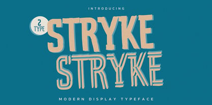 Hello Everyone, introduce our new product Stryke is Modern Display Typeface with a natural feel. This handmade font will make your design has a beautiful natural touch for each details. It is perfect for any design project as Invitation,logo, book cover, craft or any design purposes.
 - Mainstream by Mans Greback,
$59.00 Mainstream is a graffiti handwriting font, designed created by Måns Grebäck. It is vivid, artistic and contains a wide range of characters. Write underscores after any word to make an underline. Example: Mainstream_ Write * after any letter to put a crown on it. Example: Mainstre*am
 - Bella Notes by Attype Studio,
$14.00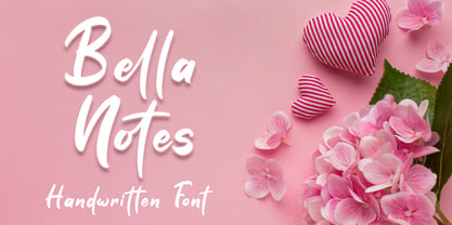 Bella Notes is lovely Handwritten font, including ligatures that perfect for any combination for your design. Bella Notes perfectly macth for design with valentine theme, any product like book cover, t-shirt, branding, promotion, social media post, quotes, wedding, photography and more. What's included: - Ligatures - Multilingual Support
 - Aqua Bubble by Rachel McBride Creative,
$9.00 Aquarian Bubble is a stackable font that's perfect for any project that needs quirk, youth, or fun without being illegible or exaggeratively dramatic. It comes with eight styles to suit any aesthetic or occasion. With a glyph count of 433, Aquarian Bubble supports most western languages.
 - Elcatraz by Almarkha Type,
$25.00 Elcatraz Family is a Fancy and Retro Sans full of charm. It will take any DIY-project to the next level! Elcatraz Family is perfect for Craft , product packaging, product designs, label, branding projects, logo, vintage social media posts, advertisements, watermark, invitation, stationery and any projects .
 - Checkmark by Set Sail Studios,
$14.00 Make your mark with Checkmark; a slick, high energy signature-style script font guaranteed to make a big impression. Digitally hand-drawn, it's super-clean smooth flow and high-intensity pen strokes make an unmistakeable impact in logo/branding projects, large header text and product packaging. Checkmark is packed full of extra features to give you plenty of customization options. This includes; a full set of upper and lowercase alternate letters, 20 ligatures (double letters) to help the script lettering flow more naturally, 26 swashes and a full set of lowercase end forms to give your text that extra flair and finesse. Here's a run through everything in more detail; Checkmark • A smooth-edged signature style font containing upper & lowercase characters, numerals, and a large range of punctuation. Checkmark Alt • This is a second version of Checkmark, with a completely new set of both upper and lowercase characters. If you wanted to avoid letters looking the same each time to recreate a custom-made style, or try a different word shape, simply switch to this font for an additional layout option. Checkmark Swash • A third font containing 26 hand drawn swashes. Simply type any a-z or A-Z character in this font to generate a swash. Perfect for underlining your Checkmark text and adding a bit of extra flair! Ligatures • 20 ligatures (double-letters) are included to help your lettering flow more naturally. Many programs will automatically have this feature switched on for you, but if you need any help accessing them, please feel free to drop me a message. End forms • Are available for all lowercase characters when using the Checkmark font. Use these characters at the end of your word to add a stylistic 'end-swash'. These are accessible via software with opentype capability, by turning on 'Stylistic Alternates', or via a Glyphs panel. Language Support • Checkmark fonts support the following languages; English, French, Italian, Spanish, Portuguese, German, Swedish, Norwegian, Danish, Dutch, Finnish, Indonesian, Malay, Hungarian, Polish, Croatian, Turkish, Romanian, Czech, Latvian, Lithuanian, Slovak, Slovenian.
 - ABTS Day Of The Dead by Albatross,
$19.95 ABTS day of the dead is a highly detailed and meticulously designed symbol font. It’s design is inspired by the Day of the Dead celebration, honoring the deceased. I think The Day of the Dead is one of the greatest reasons anyone should celebrate life, so I decided to make a font honoring that tradition. I'm not even sure If I got all of it right, (traditional symbols and such) but it was a joy to create. There are 2 fonts. The first is the Skulls. This includes uppercase and lowercase A-Z, a-z. There you will find the decorated skulls, blank skulls, and negatives. The second font is the symbols. If you wish to design your own Day of the Dead skull, you should purchase the symbols, as they are designed specifically for adorning the blanks. Purchasing both fonts will give you a discount. Please note, the symbol font will show up in your application of choice as “ABTS Day of the Dead Bold.” This is to avoid software problems with naming the font itself "Symbols." Skulls are awesome!!!
 - Arzachel by CAST,
$45.00 Arzachel is a humanistic sanserif with a big x-height and a specific organic look. Its design is scientifically sharp and efficient in small type sizes as well as rugged and dramatic in headlines. Arzachel’s essential feeling comes from several features: all the letters are slightly sloped, stem terminations are flared at the top, and the terminals in letters a, c, e, f… are widening with the inside parts completely flat. The stroke contrast is low in the regular weight while it increases in the black; finally the capitals have an inscriptional flavor. Despite being a sanserif (thus a product of recent typography) Arzachel’s roots stretch back to the Renaissance tradition: Olocco took inspiration from some of the early and rather weird types cut in Venice in the 15th century. Arzachel was conceived during Olocco’s MA in Reading to provide a companion for his Zenon for use in small type sizes. But instead of expanding the Zenon family with optical sizes, the designer decided on a sans with its own personality rather than a sanserif version of Zenon with chopped-off serifs.
 - Trendy by Estudio Calderon,
$69.90 Welcome fashionistas, we have designed a type family based on fashion and current trends. Trendy, the new font of our studio follows the same design line that represents us, processes with brush lettering, variety of characters, OpenType programming and a special touch that reflects a boho chic style. The soul of Trendy is inspired in the logotype of one of the most influential type foundries around the world. Because of its great contribution in graphic design we have decided to pay tribute by expressing our gratitude for being an icon in the design world, the most recognized type designers of the last years have been part of that type foundry and for being source of inspiration for new designers. Trendy represents a fashion house, a place that breathes fashion, there are inside 5 determining variables for designing time: Regular, Bold, Black, Display & Stencil. Discover this new way to see the glamour world all include in a type family. To know more about our new project, Trendy, visit our web site www.estudiocalderon.co and our portafolio in Behance.
 - Astrum by Fontex,
$40.00 Astrum is a very decorative script font using elegant caligraphic handwritten letters that are all mutually interconnected, creating a unique look & feel of a personalized human handwritting. Its clean and prefined lines makes Astrum very appealing and modern, although being very classical in its core essence. The idea for the creation of this font had originally came up from the need to create a beautiful design for Weddings, wedding occasions, etc., but none of the existing fonts were satisfactory - so I decided to create a new and unique typeface to fill this need. Letters and other characters are recognizeable by prefined ornaments, incorporated in a very subtle way. Whitespace between capital letters, lower-case letters, numbers and other characters are done in a way to minimize the need for kerning. The font Astrum, besides being a celebration of class and exclusivity, is a very luxurious and elegant handwritten font perfectly suited for Wedding cards. The character set for this font contains all western, central-european latin and cyrillic characters.
 - Detective Client JNL by Jeff Levine,
$29.00 There is no doubt that the 1941 version of “The Maltese Falcon” was superior to the prior two attempts by Warner Brothers at filming Dashiell Hammett’s 1930 novel. Sam Spade was perfectly portrayed by Humphrey Bogart, and the supporting cast of Mary Astor, Peter Lorre, Sidney Greenstreet and Elisha Cook, Jr. rounded out the main players in a great suspense film that is considered to be the first (if not one of the first) of the film noir genre. The title cards for the production and cast credits were hand-lettered in a spurred serif type style strongly reminiscent of the Art Nouveau period, so instead of naming the digital version with some “tough guy detective” moniker, it was decided that Detective Client JNL was more appropriate. After all, this is a reasonably attractive font, and in this kind of film it’s usually the “attractive damsel in distress” [be she the victim or the actual perpetrator] that gets the story rolling… Detective Client JNL is available in both regular and oblique versions.
 - Dynamic Duo by Comicraft,
$19.00 Batman & Robin! Thelma & Louise! Butch Cassidy & The Sundance Kid! Hip Flask & Farrell! Frodo & Sam! Sonny & Cher! Calvin & Hobbes! Bert & Ernie! Dynamic Duos exist in all forms of literature & entertainment, and now Comicraft is proud to introduce its latest alliterative offering, DYNAMIC DUO! A buddy movie in font form, Dynamic Duo is a team-up of Solid and Open weights who can’t decide who is the lead and who is the sidekick! In the fine tradition of all two-in-ones and company-wide comic crossovers, first they fight and then they team up — to take your design on the biggest, loudest, most intense adventure of All Time. Dynamic Duo features comic-book style hook caps and alternate uppercase letters which automatically cycle for a more natural, hand-drawn appearance. Solid and Open weights can be layered to create chromatic effects, and matching variable fonts allow near-infinite control of weight and slant. Each weight contains 478 glyphs and supports 220 languages. Comicraft fonts are created BY comic book letterers FOR lettering comic books. Accept no substitutes! Artwork by Axel Medellin from Elephantmen #73
 - Gridlite PE Variable by Rosetta,
$290.00 The two great technical constraints a type designer can tackle are low resolution, which limits detail and dictates proportions between negative and positive shapes, and uniform width, which restricts each letter to a fixed horizontal space. Wrestle with both at once, and each letter becomes a black-and-white chessboard that challenges every design decision. Sometimes battling these constraints gets in the way of a good idea, but other times, tinkering with fewer options can make the job irresistibly easy and lead straight to a grid addiction. Gridlite, an experiment with a modular negative space, is the side effect of such an addiction. It’s simplified, monospaced, and variable: foreground and background alike are ready to be animated, typed, scaled up, scaled down, rounded, or otherwise deformed. Gridlite is primarily a variable font with axes that control the size of the elements, their shape, and the background (one for the rectangular field and one for the compact envelope around the letters). The fonts cover Cyrillic, Greek, and Latin scripts. Small caps are included, for no apparent reason ... and there is a monospaced elephant, too.
 - Beatnik by Type Innovations,
$39.00 I was working at Bozell Worldwide, an advertising agency, on their yearly promotional pitch. An art director was looking for a condensed informal headline treatment to be used on one of the new ad campaigns. I took several different font designs and started to condense and scale the proportions in the hopes of finding several good solutions. They finally settled on a version of Times Roman, scaled horizontally to about 50 percent proportions. I liked the look so much that I later went back to the drawing board and refined the concept by adding slanted serifs and a varying alignment on all the letter forms giving the typeface a very casual and informal appearance. At about that time, I was reading a book by Jack Kerouac, and was so inspired by his writings on the ‘beat generation’ that I decided to name the font ‘Beatnik’. Afterwards, I added a set of true small capitals and old style figures. I'm currently working on additional weights and variations to expand this ‘hip’ new font series. Groovin' baby.
 - TT Norms Std Condensed by TypeType,
$35.00 TT Norms® Std Condensed useful links: Specimen | Graphic presentation | Customization options TT Norms® Std Condensed is the logical development of our bestselling TT Norms®. Since the release of TT Norms®, we received a bunch of requests to create its narrow version and even managed to make several custom projects of the narrow TT Norms® before we decided to start creating a full-fledged commercial version of the typeface. At the very beginning of the project, we did some research and tested several options for the possible width of the typeface. Despite the fact that TT Norms® Std Condensed has narrower proportions than the original family, it inherited the classic proportions of characters, attention to detail and meticulous elaboration of each character in the typeface. The TT Norms® Std Condensed font family consists of 18 faces (9 upright and 9 italics). Each style includes a sufficient set of characters that allow you to solve most of the problems that arise in the field of graphic design, branding, packaging design or website design.
 - Mr Tiger by Hipopotam Studio,
$30.00 After the success of our best-selling Mr Black, we decided to once more use my grandfather’s dry transfer lettering sheets. My grandfather was a Polish military cartographer and he left us some used-up sheets. The letters didn't transfer so well but we liked the way they were damaged. Mr Tiger has upper- and lowercase characters with up to four alternate glyphs. First three variations are only slightly damaged but the fourth one is usually more distorted. All of the glyphs have a very high resolution so they can be used in a large scale and they will still look great. One of the best things in Mr Tiger is the OpenType Contextual Alternates feature. It will automatically set alternate glyphs depending on frequency of appearance of the same character. The script doesn’t throw random glyphs. For example in the word “HIPPOPOTAMUS” you will automatically get three different “P” glyphs and two “O” glyphs. It really works great but of course you can always fine tune it by hand.
 - Rocaie by astype,
$37.00 The Rocaie fonts are base on antique Rococo letters from an gilding workshop. I was very lucky to acquire this set of metal letters in early 2018. Each of the letters has ornaments engraved by hand into its cast brass shapes. When drawing the digital outlines, I tried to preserve the handmade look of the original leaf engravings. Each of the letters uses a slightly different ornament pattern: no pattern is repeated identically. I expanded the very limited character set of the original, adding all the missing characters that today’s commercial fonts are expected to contain. I made additional font styles to easily add colour layers, outlines, and 3D shadows to the typeface. It’s up to you to decide how to “build” your colour font! You can combine the predefined font styles Regular, Pearl, Solid, Outline, and Magnum with each other, or with the Fill font styles. But you don't need to use all font styles to compose something nice! Have as much fun as I did with this Baroque beauty and enjoy the vintage.
 - Precious Sans Two by G-Type,
$60.00 Precious Sans Two is a complete reworking of the 2002 design which was only ever available in PostScript format. Over a decade later G-Type’s Nick Cooke decided to re-appraise the typeface, scrutinise the old letterforms and overhaul the family. Make no mistake though, Precious Sans Two is no rudimentary re-release; nearly every character has been redrawn, re-proportioned, respaced and improved. Precious Sans Two is now in cross-platform compatible OpenType format with extended Latin language support for Western & Central Europe, the Baltics & Turkey. The original quirkier glyphs (f, g, I) have been retained as an OT style set feature and the typeface now contains small caps and an extensive set of discretionary ligatures as well as both proportional & tabular figures. The character set is further enhanced with the addition of 20 directional single and double arrows in each of the six weights which range from Thin through to Black, all with accompanying italics. Precious Sans Two is a distinctively modern typeface, well equipped for advanced typographic use in print, web and digital publishing environments.
 - Generous Hospitality by Dear Alison,
$19.00 While there can be similar handwriting styles out there, no two handwritings are exactly the same. I like to think that I have the same handwriting style as my father, but I had never seen him write with lowercase letters, only in all capitals, except when signing his name on something in cursive. I recently came across a letter my father had written long ago to a friend. It was returned to sender, yet he kept it intact. The letter primarily thanked his friend for his hospitality when my father unexpectedly dropped in for a visit while traveling. I was so taken by the handwriting, that I decided to make it into a font, not only to remember my father, but also to forever preserve his handwriting. Generous Hospitality not only taps into the character of the person the letter was written to, it also reflects the personality of my father. If you are looking for a masculine handwriting type style for your designs, I think this font could be a nice fit.
 - Marzano by FontMesa,
$35.00 Marzano is a geometric sans serif font that's ideal for headlines, logos, text and advertising, the name comes from the ever so sweet and wonderful San Marzano plum tomato grown in Italy. Marzano includes stylistic alternates, small caps, swash caps, case sensitive forms, old style figures, tabular figures, small caps figures, small caps old style figures, small caps question mark and exclamation point. Since a lot of people today like to type in code using the copyright and trademark symbols in place of a C or R we've decided, the first time to offer two registered trademark symbols, one that's the same size as the copyright symbol and an alternate version that's reduced in size and sits at the caps height. Marzano Slant is set at 6 degrees and is perfect for when you want the look of an italic but don't have the horizontal space in your page design for a full 12 degree italic. At FontMesa all of our italic fonts are cleaned up placing all nodes at extremas.
 - Melodi by Diego Berakha,
$20.00 Melodi is the result of years of working with hand made types on my designs. Every time I draw the letters and words that I need for every design piece. One day I decided to go serious and make a real type of it and “Melodi” is the result of this work. It’s a calligraphic font, built using a regular stroke, and carefully crafted to have nice joins between all the letters. It has some playful but stylish capitals that brings lot of personality to the font. It work super nice either in lowercase writing as in all-caps texts. It looks specially good on lists of words or small sentences. Melodi is a playful but very versatile font, it can be used in lots of different scenarios. From creating a logo, writing the tittles of a catalogue or use it in a poster combined with other types (it work really well as counter point of more classical types) to motion graphics animations or advertising work. It can be cute but it also can do hard work!
 - Brigast by suhadidesign,
$17.00 Brigast modern retro typeface Hi Ladies and Gentlemen! According to the market demand for fonts that tend to be more modern, then I decided to make a serif font that is in your view. The Brigast font is a serif font with very beautiful and popular alternates, comes with a modern style hoping to become a market favorite. We keep this font looking elegant, classy, easy to read, stylish, attractive and easy to use. Brigast Font is a great choice for magazines, wedding invitations, retro designs, newspapers, books, brand names, branding, branding, quotes, album covers, and other projects. The Brigast font is here to take the quality of your designs to a higher level. Brigast Font is my thirtieth Font created in 2023 The Brigast font style will make you love designing and taking advantage of the cool design results for this font. Continue to follow us for updates on making further fonts :) Font Features: • Standard uppercase and lowercase letters • Stylistic alternate • Stylistic ligatures • Multilingual Support • Numeral and punctuation
 - Antica by Sudtipos,
$39.00 Antica has sharp triangular serifs, and in 8 weights with true italics, it forms a family that stylistically finds its origins in Latin styles of the nineteenth century. The font incorporates additional swashes, small caps and stylish alternates that advance the aesthetic from its roots and make it appropriate for modern design. Commonly named ‘Latin types’ did not vary in weight, but we decided to create Antica with a range that goes from thin to black and we also added extra curlicues to the letterforms. Antica borrows from the versatility and freedom granted to type founders of the nineteenth century – a time when the meteoric growth of mass-produced consumer goods led to an increased demand for publicity that needed fresh, attention grabbing typefaces. And as an homage to these Latin types we designed Antica to function well with an array of projects from stylized labels and formal editorial design requiring small type sizes to large-scale posters and billboards. The Antica family supports a wide variety of Latin alphabet-based languages.
 - Toboggan by Jeremy Nelson,
$11.00 TOBOGGAN | Utility Display Typeface Toboggan is a utility display typeface with classically influenced proportions, calligraphic elements, and sporting roots. With 9 weights, upright, and true italics, Toboggan comes in a total of 18 fonts. With flexibility from a crisp Thin weight to an imposing Super in both upright and italic, Toboggan thrives as a utility font spanning the columns of extended text, in artful editorial layouts, eye-catching motion graphics, or commanding headlines in a title role. First drafted around the frame of a perfect circle, Toboggan evolved by taking inspiration from the sweeping contours of the automotive world, expanding into wider proportions, and adopting an abrupt set of constructed features. Sturdy with the spirit of sport, Toboggan’s final form preserves a human connection through features of the written hand, while minimal contrast and its chopped terminals bring a decisive tone with clinical precision. Features: - Nine weights and true Italics - Multilingual support (Extended Latin - Includes Western European coverage and more) - OpenType features including small-caps, stylistic sets, contextual punctuation & more - Extensive numeral sets including stylistic sets, circled, and squared numbers
 - Oz Handicraft BT WGL by Bitstream,
$50.99Oswald Cooper is best known for his emblematic Cooper Black™ typeface. Although he was responsible for several other fonts of roman design, Cooper never drew a sans serif typeface. But that didn’t stop George Ryan from creating one. Ryan saw a sans serif example of Cooper’s lettering in an old book and decided that it deserved to be made into a typeface. Ryan’s initial plan was to make a single-weight typeface that closely matched the slender and condensed proportions of the original lettering. While the resulting Oz Handicraft™ typeface proved to be very popular, Ryan was not satisfied with the limited offering. So, between other projects – and over many years – Ryan worked on expanding the design’s range. The completed family includes light, semi bold and bold weights to complement the original design, plus a matching suite of four “wide” designs, which are closer to normal proportions. Fonts of Oz Handicraft include a Pan-European character set that supports most Central European and many Eastern European languages. - Scion by Type Innovations,
$39.00 ‘Scion’ is an original design by Alex Kaczun. The inspiration for the typeface came from the Toyota SCION logo, which bears its name. In Alex’s own words, "I loved the simplicity, proportions and hi-tech look of the logo and decided to create an entire new design series based on its unique look". The fonts come in five flavors: thin, light, regular, bold and black. All the font weights were designed systematically on tabular widths so that the user can make adjustments to overall type color without changing the line length. In addition, Alex Kaczun has provided us with several alternate glyph substitions to further enhance the overall appeal of this contemporary new design. The large Pro font character set, which supports most Central European and many Eastern European languages, makes this typeface series ideally suited for display copy as well as text composition. In the near future, Alex plans to include a narrow, compressed and ultra expanded, along with true-drawn italic variations to further expand the possibilities of this great new display series.
 - Givens Antiqua by Monotype,
$29.99Drawn by George Ryan and named after Robert Givens, the co-founder and first president of Monotype Imaging, the Givens Antiqua™ typeface speaks with elegance and subtle authority. The design's open proportions, generous x-height and soft serifs lend Givens Antiqua a gracious quality that invites reading. I didn't work from any single design model," Ryan recalls. "The face grew out of my experimenting with several characters from a hand-lettered headline in a magazine. I worked on the shapes and forms for some time before I put the drawings in a drawer." At that point Ryan had finished the basic alphabet in two weights, but had not yet tackled the italics. A new project came along that demanded his full attention, and it was two years before he revisited the drawings. He liked what he saw and decided to finish the job. "The italics were the most problematic designs in the family," says Ryan, "but once I had their basic shapes and proportions, the rest was basically a production project." Another year of sketching, testing, editing and reworking characters ensued before Givens Antiqua was ready for release. The result is a four-weight family of roman designs and small caps, with complementary italics for the lightest three weights and a suite of swash caps for the italic designs. Givens Antiqua and Givens Antiqua Light show a modest stroke weight stress and a light, even text color. Givens Antiqua Bold is an effective emphasizer for text copy and an authoritative communicator at display sizes. The Black weight performs best at large sizes and makes a powerful statement without shouting, while the italic swash capitals possess enough vitality to serve as standalone initial letters." - Atocha by Sudtipos,
$49.00 It was expected that Joluvian’s third type font would be inspired by the city where he currently resides: Madrid, Spain. His previous creations had originated in Venezuela (Zulia) and The Philippines (Salamat), both, places where he had once lived. Joluvian believes “now is the time to pay tribute and show gratitude towards a city that has bestowed me with so many fortunes.” He considers that Madrid’s people, streets, scents, flavor and sounds are gift enough to awaken the creative urgency in any artist. This time around, it is being expressed through the crafts of the Typographic industry. Since his arrival in Spain, Joluvian has been attached to the city’s central area, specifically to the renowned Atocha Street and its railroad station. It was precisely on that street that Joluvian and Mauco Sosa, his friend and partner, decided to establish the Patera Studio: a charming creative space that birthed the concept for this new font which they proudly named Atocha Script. The artists where still in the final phases of their previous script, Salamat, when the idea for Atocha came about. This dynamic is actually very typical of the artistic process, in which every finished product spawns the need to create its next level offspring. “Working on Atocha and Atocha Caps has been a very pleasant journey. We have given our best efforts, for we wanted to offer a typeface that was both versatile and user-friendly on a number of applications, showing a wide scope of alternatives in our glyphs,” says the artist. The illustrations were created by Mauco, to ensure visual integration that would showcase the work of both members of the Patera Studio and their complementing aesthetic voices. Atocha, as Salamat and Zulia before, was digitized by Alejandro Paul.
 - Salvador by Homelessfonts,
$49.00 Homelessfonts is an initiative by the Arrels foundation to support, raise awareness and bring some dignity to the life of homeless people in Barcelona Spain. Each of the fonts was carefully digitized from the handwriting of different homeless people who agreed to participate in this initiative. A biography/story of each homeless person captures their story, to help raise awareness and bring some dignity to the life of homeless people. Monotype is pleased to donate all revenue from the sales of Homelessfonts to the Arrels foundation in support of their mission to provide the homeless people in Barcelona with a path to independence with accommodations, food, social and health care. Salvador was born in a small village in the province of Seville, Spain where he lived until 2002. During many years he worked in restaurants, construction, and in the fields, until he decided to go try his luck in Palma de Mallorca. There he worked in hotels and in construction, until the economic crisis erupted and he was left without work or benefits of any kind and he began to live in the street: “The street has few good things, but it teaches you to be more selfless, to share with others what you have, even if it isn’t much.” In 2006, a friend encouraged him to come along to Barcelona and bought his plane ticket. Once there, things did not go much better and he had to continue living in the street. A year ago he left behind that life and now he explains his experience in guided tours to school groups: “I like it because I see that many of them are interested and they ask questions. It is good that they learn.”
 - FM Bolyar Sans Pro by The Fontmaker,
$29.00 This is Bolyar Sans font family. For us it is a dream-come-true. It took more than 1 year hard work to transform the existing Bolyar Pro from Serif to Sans Serif version. The result really surprised even us from The Fontmaker and we decided to develop it in 9 instead of 7 weights. So at the end we created 7 different styles of Bolyar sans each consisting from 9 precise weights. Bolyar Sans is not just another font family in our portfolio - it is the essence from all our efforts thru the past 5 years to create a powerful type tool that could easily meet very diverse and complex demands of modern design. Furthermore, like all its predecessors, Bolyar Sans is a type concept created by Designers for Designers. If you are in wine and spirits industry, packaging design, or you just love to work with strong headlines that effortlessly could turn into brand logos, then you should definitely try our Bolyar Sans. It is designed for this. Of course there are plenty of different features like multilingual support, ligatures, alternates, we even added adaptive over- and underlining to make it even more complex in its use. Bolyar Sans pairs perfectly with other members of Bolyar Family - Pro , Ornate and Typecraft . So as you see Bolyar is developed as a type platform with own character and style. By using it you could be vintage, classic, modern, soft, even bold, rough and ornate. It is a visual bridge between different typographic periods united under Bolyar name. With our Sans version we aim to be contemporary and to provide powerful type tool to those designers who often love to swim between past and modernity.
 - PythonianDeluxe - Unknown license

- Joy Of Reading by Typephases,
$25.00The theme in these illustrations is the pleasure of books and reading wherever you are, at any time. This series collects illustrations of people enjoying the pleasure of reading in the most diverse places and situations, some of them frankly absurd and funny, ranging from children reading tales to a witch with her magic brewing manual. A fraction of the contained images comes from other Whimbats, but most of them are exclusive. We hope you will feel like reading and start reading a good book! These illustrations are ready to use at any size and in any application (their vectorial format ensures they can be scaled to any size with no loss of sharpness). They can be used out of the box, or easily customized in any graphics program, adding colour or texture, resizing, combining... the variety of suggested uses is huge, from small spot illustrations to full-page layouts. Use them to great effect in magazine spreads, advertisements, stationery, packaging, bulletins or poster creative designs. - Pink Broccoli PB by Pink Broccoli,
$14.00 A soft-edged shortcaps typeface with enough funk to lighten any mood.
 - ALT Apollo13 by ALT,
$5.00 Apollo13 is a custom decorative typeface for any type of graphic design.
 - Balora MF by Masterfont,
$59.00 Nostalgic and elegant solution for any outstanding poster or banner. You choose..
 - Govia Sans by Marc Lohner,
$25.00 Let’s have some fun! Govia Sans adds plenty of joy to any logo, layout or UI. Geometric shapes and a funny look come together in this font family – thus, Govia Sans might be the perfect choice for toys, books, packaging designs, movieposters and many more. Although the fonts’ comic character shines through in every glyph, it keeps a surprising degree of legibility even in small sizes. Choose between a Medium and a Bold weight. Designed by Marc Lohner, Govia Sans speaks more than 200 languages. Funny ligatures, arrows, oldstyle figures and many more features will fulfill all your typographic needs.
 - Gradus by Brenners Template,
$19.00Gradus is a multi-purpose typeface designed to properly mix elegance and rhythm. The balance between modern and sophisticated touches and styles can achieve the effect of harmonizing well with any device and channel. The hardness of the rigid stem of the grotesque typeface is transformed into a soft touch that organically matches words and sentences. Langages. Basic Latin. Western European, Central European, South Eastern European, South American, Oceanian, Basic Cyrillic, Ukrainian OpenTypeFeatures. Standard Ligatures : fi, ff, ffi. Discretionary Ligatures : ai, ia, il, ill, illi, ma, md, mi, mu, na, nd, ni, nu. Fractions, ss01, ss02, and more.
