5,541 search results
(0.135 seconds)
- Cordelia by PintassilgoPrints,
$20.00 Impacting and vibrant, Cordelia family draws inspiration from covers of 'cordel literature’, small booklets of popular story-poems that played an essential role on the folk-popular cultural life of Brazil. Printed in coarse paper, usually with an woodcut illustration and lettering in the front, these booklets were sold on the streets, in marketplaces and town squares, hung in a cord - therefore the name ‘cordel’. The work of these humble printers and poet-singers of northeastern Brazil strongly served as source for acclaimed romances and movies and still inspires writers of all genres, movie makers, painters, musicians. And type designers too :) Cordelia doesn’t bring a picture font yet, but it goes pretty well with Chronic and Manicuore illustrations. It goes well with and without them. It definitely goes well. You bet!
 - Basika by NOS,
$15.00 Basika is a Display proto-typeface, a bridge from the past into the future of experimental typeface design. It’s a powerful communication tool for designers who want to create unique projects. The concept of Basika has been developed over many years and became a typeface throughout 2019. Basika was released in December of the same year. Basika comes in three styles, includes discretionary ligatures and stylistic alternates. Don't hesitate to get in touch at nos.ink. Basika current version: 1.2 - released in April 2022.
 - Snow Blue by Girinesia,
$17.00 Hello guys... We proudly presenting our new font. It's name SNOW BLUE. SNOW BLUE is modern display font. SNOW BLUE is a bold decorative font perfect for your celebration party like Halloween, Chrismast or New Year. SNOW BLUE would perfect for Titles for kid`s book, scrapbook, logo, icon, phrases or quotes for winter greeting cards ( Halloween, Christmas or New Year holidays), photo overlay, short phrases, children’s book, gift shops tag, presentation in social media Pinterest, Instagram, Facebook or others.
 - Ripple Crumb UltraCon - Unknown license

- Zono Dingbats - Unknown license

- Athena by Solotype,
$19.95This beautiful old design was originated at the Connor Foundry, New York, about 1888. Ideal for the small "in between" lines in modern versions of Victorian job printing. - Trango by Juraj Chrastina,
$29.00 A funny childish handwritten font, with a spirit. This typeface can tell fairy tales. Trango is a sans serif that goes well with the slab serif Besley Hand.
 - Shoebop by Stephen Rapp,
$49.00 Shoebop is a playful, rhythmic brush script with a delightful retro flair. Its joyful presence is ideal for web and print headlines, posters, signage, logos, and greeting cards.
 - Andrade Pro by DSType,
$26.00First designed in 2005, the award winning Andrade goes OpenType. Andrade Pro is available in six styles. Includes plenty of features, like SmallCaps, Alternates, Ligatures, Swashes and Greek. - Sabotage by Monotype,
$29.99Adam Roe founded in 1991 Lunchbox Studios as an experiment. Adam is also president and founder of his second company Reelhouse Footage und FK in Los Angeles, California. - Besley Hand by Juraj Chrastina,
$29.00 A funny childish handwritten font, with a spirit. This typeface can tell fairy tales. Besley Hand is a slab serif that goes well with the sans serif Trango.
 - Koch Antiqua LT by Linotype,
$29.99Koch Antiqua is based on forms of old Roman writings, chiseled in marble thousands of years ago. This contemporary version is more playful and reminiscent of the Roaring 20s. - Newshawk JNL by Jeff Levine,
$29.00Jeff Levine's Newshawk JNL emulates the tall, condensed headline fonts often used years ago when an urgent story broke and a newspaper rushed an "Extra" edition to the streets. - Jonah Brush by Jonahfonts,
$19.00 As once a sign-painter in my younger years I loved the quick brush strokes used to turn out quick 'Sale' posters. I tried to relive in this font.
 - King15 by Typo5,
$5.95King15 is a beautiful script font based on signatures dated back from hundreds of years. Its asymmetry and ink imperfections give it a strong and a truly unique character. - Thuner by Linecreative,
$16.00 Thuner is a chunky bold typeface perfect for any fun quirky design work! This font is equipped with ligatures and will be very good for your work such as posters, logos, t-shirt designs, branding, or even large scale artworks. What you get dear, you will get : 1. Thuner- A clean San serif font including Upper & Lowercase characters(ALL CAPS), 2. Ligatures Character (260 characters) 3. Supports Multi linguage (Latin Western Europe), Numbers and Punctuation
 - Pamplemousse by The Ampersand Forest,
$19.00 Meet Pamplemousse, a display font that's part fun, casual script and part elegant typeface! Pamplemousse is most decidedly a fellow who enjoys lazy Sunday mornings spent sipping mimosas or bloody marys over a plate of eggs benedict and the New York Times crossword puzzle. He enjoys dressing up for use in branding and headlines (he looks particularly dashing in all caps) and also sitting back and composing a casual note to a dear friend. Pamplemousse is mostly sweet and just a little sophisticated, and he likes being just as he is. Pamplemousse started out as a typeface based on the lettering of Gustav Klimt in his poster for the first exhibition of the Vienna Secession movement (Art Nouveau). This drifted into an homage to Rea Irvin's iconic masthead typeface for the New Yorker magazine. Finally, with the addition of a lowercase (absent from Irvin's typeface), a significant revision away from both Klimt and Irvin into a more casual space, Pamplemousse was born! Oh — why "pamplemousse?" "Pamplemousse" is French for grapefruit. What goes better in your Sunday gin and tonic than an aromatic slice of pamplemousse? Say it a few times. Preferably after a couple of those g & t's. You'll see how fun he can be...
 - Industria - Unknown license

- Mauritius by Canada Type,
$29.95 Ten years or so after his unique treatment of Garalde design with Trump Mediaeval, Georg Trump took on the transitional genre with Mauritius, which was to be his last typeface. He started working on it in 1965. The Stuttgart-based Weber foundry published a pamphlet previewing it under the name Barock-Antiqua in 1967, then announced the availability of the metal types (a roman, a bold and an italic) a year later. The global printing industry was already in third gear with cold type technology, so there weren't that many takers, and Weber closed its doors after more than 140 years in business. Subsequently, Trump’s swan song was unfairly overlooked by typography historians and practitioners. It never made it to film technology or scalable fonts. Thus, one of the most original text faces ever made, done by one of the most influential German type designers of the 20th century, was buried under decades of multiple technology shifts and fading records. The metal cuts of Mauritius seem to have been rushed in Weber’s desperation to stay afloat. So the only impressions left of the metal type, the sole records remaining of this design, show substantial problems. Some can be attributed to technological limitations, but some issues in colour, precision and fitting are also quite apparent, particularly in Mauritius Kursiv, the italic metal cut. This digital version is the result of obsessing over a great designer’s final type design effort, and trying to understand the reasons behind its vanishing from typography’s collective mind. While that understanding remains for the most part elusive, the creative and technical work done on these fonts produced very concrete results. All the apparent issues in the metal types were resolved, the design was expanded into a larger family of three weights and two widths, and plenty of 21st century bells and whistles were added. For the full background story, design analysis, details, features, specimens and print tests, consult the PDF available in the Gallery section of this page.
 - Vinchenso Regular by BA Graphics,
$45.00A strong powerful face that really works well for any application requiring a distinguished, clean look. Headlines, subheads, and text; anything goes. Vinchenso also has a matching Bold weight. - Sentry by Solotype,
$19.95Here's a good old Victorian job printing font. Faithful to the original issued by Barnhart Bros. & Spindler about 1880. Nothing wildly decorative about it, yet it clearly looks old. - Love Radiate by Seemly Fonts,
$12.00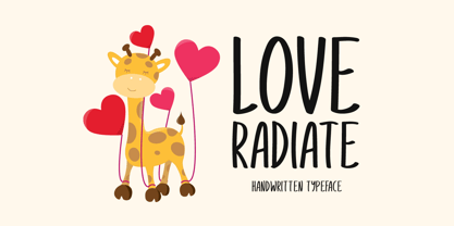 Love Radiate a joyful and casual handwritten font. Its natural and unique style makes it incredibly fitting to a large pool of designs. The only limit is your imagination!
 - Easter Discover by Seemly Fonts,
$14.00 Easter Discover a joyful and casual handwritten font. Its natural and unique style makes it incredibly fitting to a large pool of designs. The only limit is your imagination!
 - Century Oldstyle by Bitstream,
$29.99Century Oldstyle is Linn Boyd Benton’s and Morris Fuller Benton’s renovation of Phemister’s Miller & Richard Old Style for ATF forty-five years later, using the Century name for marketing purposes. - Lamar Pen by Three Islands Press,
$39.00 Mirabeau Buonaparte Lamar had an exotic name for a historic Texan, but he left his mark beginning in 1836, the year of Texas independence and the first year that pioneers other than mountain men made their way West. Lamar went on to become the young republic’s first elected vice-president (to President Houston) and second president -- and to author a number of interesting letters in his elegant, stylish hand. (Mirabeau B. Lamar grew up a well-to-do southerner from Georgia, and his penmanship shows it.) One of the most interesting aspects of designing old handwriting fonts, to me, is pausing to reflect on the actual moment that the letter-writer is sitting at his or her desk or table, pen in hand, putting thoughts to words -- 150 to 200 years ago. Has a complete character set, and plenty more.
 - Old Man Eloquent by Three Islands Press,
$29.00 John Quincy Adams, sixth President of the United States, didn't hit his stride until he'd left that lofty office. It was during his many years in Congress that he assured his legacy, not least because of his long, masterful oratory opposing slavery. His speeches, in fact, won him the nickname "Old Man Eloquent." So when I decided to simulate Adams's penmanship in his legendary diary (which he kept for nearly 70 years), it seemed fitting to call the font by that name. I focused on his handwriting from about 1810, when he was Ambassador to Russia, but also consulted pages from later years. Old Man Eloquent has both regular and bold weights. The OpenType version has more than 450 glyphs, including alternate uppercase characters, old-style and lining figures, and numerous ligatures; all formats contain several common (English) words.
 - Reina Neue by Lián Types,
$29.00 Hey! See Reina Neue in action here! INTRODUCTION When I designed the first Reina¹ circa 2010, I was at the dawn of my career as a type designer. The S{o}TA, short for the Society of Typographic Aficionados, described it as complex display typeface incorporating hairline flourishes to a nicely heavy romantic letterform². And it was like that; that’s what I was pursuing at that time since I was very passionate about ornaments and accolades of Calligraphy. Why? I felt that Typography, in general, needed more of them. These subtle flourishes could breathe life into letters. Maybe, I thought it was the only way I could propose something new into the field of type. However, after some years, I came across a very interesting quote: –Beautiful things don’t ask for attention– Wow! What did this mean? How could something be attractive if it’s not actually showing it. Could this be applied to my work? Sure. I think every type-designer goes through this process (aka crisis) regarding his or her career. At the beginning we love everything. We are kind of blind, we only see the big picture of a project. And that’s not because we are lazy. We actually can’t see the small mistakes nor the subtleties that make something simpler beautiful. We are not able. But, the small subtleties… They are actually everything: With experience, one puts more attention into the details and learns that every single decision in type has to be first meticulously planned. Here I am now, introducing a new Reina, because I felt there was a lot of it that could be improved, also the novelty of Variable Fonts caught my attention and I had to take that to my type library. THE FONT A thing of beauty is a joy forever Now, a decade later, I’m presenting Reina Neue. This font is not just an update of its predecessor: –A thing of beauty is a joy forever– is the first line of the poem ‘Endymion’ by John Keats, and despite the meaning of “beauty” may vary from person to person, and even from time to time (as read in the last paragraph), with Reina I always wanted to bring joy to the eye. In 2010, and now, in 2020. I believe the font is today much better in every aspect. It was entirely re-designed: Its shapes and morphology in general are much more clean and pure. The range of uses for it is now wider: While the old Reina consisted in just one weight, Reina Neue was converted into a big family of many weights, even with italics, smallcaps and layered styles. The idea behind the font, this kind of enveloping atmosphere made out of flourishes, is still here in the new Reina. This time easier to get amazing results due to the big amount of available alternates per glyph and also more loyal from a systemic point of view. However, and as read in the introduction -Beautiful things don’t ask for attention-, if none of the flourishes are activated the font will look very attractive anyway. Reina Neue is ready to be used in book covers, magazines, wedding cards, dazzling posters, storefronts, clothing, perfumes, wine labels and logos of all kind. Like it happened with the previous Reina, I hope this new font satisfies every design project around the world if used, and can be a joy forever. SOME INSTRUCTIONS Before choosing the right style for your project, hear my advice: -Reina Neue Display was meant to be used at big sizes. If you plan to print the font smaller than 72pt, I suggest using Reina Neue, not Display. Otherwise, if the font will be BIG or used on a digital platform, Reina Neue Display should be your choice. For even smaller sizes, use Reina Neue Small. This style was tested and printed in 12pt with nice results. (Note for variable fonts: Print them in outlines) -Reina Italic is not a slanted version of the roman, and this means some flourishes are different between each other. The Italic version has other kind of swirls. More conservative, in general. -All the styles of Reina Capitals have Small Capitals inside. -Reina Capitals Shine should be used/paired ONLY with Reina Capitals Black. The engraved feeling can be achieved if Reina Capitals Black and Reina Capitals Shine are used as layers, with the same word. Variable fonts instructions: -For more playful versions, choose Reina Neue VF, Reina Neue Italic VF or Reina Neue Capitals VF: With them you can adjust between 3 axes: Weight (will change the weight of the font) – Optic Size (will thicken/lighten the thin strokes and open/close the tracking) – Accolades (will modify the weight of the active flourishes). SOME VIDEOS OF REINA NEUE VF https://youtu.be/8cImmT5bpQM https://youtu.be/1icWfPmKAkg https://youtu.be/YC9GkJDL1a8 NOTES 1. The original Reina, from a decade ago: https://www.myfonts.com/fonts/argentina-lian-types/reina/ 2. In 2011, Reina received an honourable mention by S{o}TA. “Great skill is shown in the detailing, and an excellent feel for the correct flow of curves and displacement of stroke weight.” https://www.typesociety.org/catalyst/2011/ Reina was featured in the “Most Popular Fonts of the year” in MyFonts in 2011 https://www.myfonts.com/newsletters/sp/201201.html In 2012, the font was also selected in Tipos Latinos, the most prestigious competition of type in Latinoamerica. https://www.tiposlatinos.com/bienales/quinta-bienal-tl2012/resultados Also, chose as a “Favorite font of the year” in Typographica. https://typographica.org/typeface-reviews/reina/
 - ATF Garamond by ATF Collection,
$59.00 The Garamond family tree has many branches. There are probably more different typefaces bearing the name Garamond than the name of any other type designer. Not only did the punchcutter Claude Garamond set a standard for elegance and excellence in type founding in 16th-century Paris, but a successor, Jean Jannon, some eighty years later, cut typefaces inspired by Garamond that later came to bear Garamond’s name. Revivals of both designs have been popular and various over the course of the last 100 years. When ATF Garamond was designed in 1917, it was one of the first revivals of a truly classic typeface. Based on Jannon’s types, which had been preserved in the French Imprimerie Nationale as the “caractères de l’Université,” ATF Garamond brought distinctive elegance and liveliness to text type for books and display type for advertising. It was both the inspiration and the model for many of the later “Garamond” revivals, notably Linotype’s very popular Garamond No. 3. ATF Garamond was released ca. 1918, first in Roman and Italic, drawn by Morris Fuller Benton, the head of the American Type Founders design department. In 1922, Thomas M. Cleland designed a set of swash italics and ornaments for the typeface. The Bold and Bold Italic were released in 1920 and 1923, respectively. The new digital ATF Garamond expands upon this legacy, while bringing back some of the robustness of metal type and letterpress printing that is sometimes lost in digital adaptations. The graceful, almost lacy form of some of the letters is complemented by a solid, sturdy outline that holds up in text even at small sizes. The 18 fonts comprise three optical sizes (Subhead, Text, Micro) and three weights, including a new Medium weight that did not exist in metal. ATF Garamond also includes unusual alternates and swash characters from the original metal typeface. The character of ATF Garamond is lively, reflecting the spirit of the French Renaissance as interpreted in the 1920s. Its Roman has more verve than later old-style faces like Caslon, and its Italic is outright sprightly, yet remarkably readable.
 - Stemplate by Burghal Design,
$29.00Stemplate is a bold, no-nonsense font based on the common translucent green templates that are available now at an office supply near you! Stemplate includes upper and lower case letters, as well as numbers, symbols, punctuation, and accented foreign characters. Stemplate Outline is based on the common translucent green templates that are available now at an office supply near you, and includes upper and lower case letters, numbers, symbols, punctuation, and accented foreign characters. Stemplate Outline is particularly fetching with a neon glow. - Kraboudja - Unknown license

- Ps Strijkijzer by Fontopia,
$- Strijkijzer is a funfont. It originated as a joke between friends. Do not take too seriously for it. But it is complete. Download it for free and swing your iron.
 - Party Noid by PizzaDude.dk,
$20.00Party Noids goes all the way - from cartoonish to romantic, from funny to serious. Write in all caps, all lowercase or mix upper and lowercase to create ounces of fun! - Love Twins Solid by Sipanji21,
$10.00 Say hello to Love Twins font. Made with love and joy. Comic look, so it will make your design more beautiful, cute, fun, and colorful. outline and solid style inside.
 - Trafalgar Stencil JNL by Jeff Levine,
$29.00Trafalgar Stencil JNL gets its inspiration from a set of lettering stencils manufactured by Reese and Sons in Great Britain during the 1950s as does its counterpart, British Stencil JNL. - Island Sans by BA Graphics,
$45.00A beautiful face that really works well for any application a distinguished clean look. Headlines, subheads and text anything goes. Will also work as a bolder version of California Sans. - La Carte by AVP,
$19.00 Inspired by a series of handwritten menus produced in 1980, La Carte is a stylish but legible script that sets as well in body copy as it does in headlines.
 - My Left Foot by Rocket Type,
$14.00 Don’t let the name fool you! My Left Foot was made by hand. Alts, ligatures and Vietnamese all included in this whimsical typeface. Go ahead and dip your toes in!
 - Doodlebears - Unknown license

- FrankieDos by Type-Ø-Tones,
$40.00 Following in the footsteps of his brother Frankie, FrankieDos entered our catalogue a few years later. FrankieDos follows the same pattern: how to imitate analogic features in a vector-based typeface.
 - Holiday Penguins by Deniart Systems,
$24.00 It's always holiday time with this frolicking bunch of penguins. Whether celebrating the end of year holidays or prancing around on vacation, these 52 Holiday Penguins are always having a blast.


