10,000 search results
(0.023 seconds)
- Trochera by Sardiez,
$20.00 The agressive moves, the lateral spurs and the heavy leaf endings of Trochera resemble the silvan plants behavior giving it a very expressive and festive personality. Its features make Trochera very useful for flamboyant and colorful purposes, but it is also attractive in black and white, the saturation of the ornaments will give an appealing texture to headings.
 - Fauna by Del Alma,
$14.99 Fauna is the set of cute animals you were looking for! We know these animals will give their best in order to give a lovely touch to your work. With a total of 108 characters; the font family is divided into two styles of 54 each: Fauna Blanca and Fauna Negra. Choose one of them... or better, choose both!
 - Astroz by Gravitype,
$14.90 Astroz is a single weight display font inspired by sci-fi culture and space environments. It has been conceived for logos, headlines and posters. The sharp lines mixed with perfect circles give a wonderful futuristic aesthetic. In addition, alternates of letter “A” and number “1” are included to give you more stylistic options. Multilingual support is available.
 - Ysobel by Monotype,
$29.99 The Ysobel™ typeface family is not only elegant; it is also exceptionally legible and space economical. A collaborative design effort between Robin Nicholas, as lead designer and project director, Delve Withrington and Alice Savoie of Monotype Imaging, the project had the primary design goal of creating a typeface family for setting text in newspapers and periodicals. The result, however, is also ideal for any application that requires quick and easy assimilation of text. According to Nicholas, “The idea for the design started when I was asked to develop a custom version of Century Schoolbook. I wanted to give the design a more contemporary feel, although the client ultimately decided to keep their typeface closer to the original. The project nevertheless gave me ideas for a new design. Since designing Nimrod, some 30 years ago, I had wanted to make a more modern typeface family for newspapers and magazines – this seemed the ideal candidate.” Ysobel (pronounced “Isabel”) has the soft, inviting letter shapes of Century Schoolbook but contrasts these with more incised serifs and terminals. Its capitals are also narrower than those of Century Schoolbook, and care was taken to ensure that they harmonize perfectly with the lowercase. Ysobel’s x-height is full-bodied without disrupting lowercase proportions. In addition, curved terminals, such as those in the “C,” “c” and “e,” were drawn more open as an aid to legibility and readability in text copy. Weight stress is near vertical, and hairlines are robust to ensure character fidelity in small point sizes. Development began with the text version of the family, which has four weights, each with an italic companion. All weights feature lining and old style numerals, fractions, superiors and extended Latin language coverage. Small caps are also available in the Roman Regular design. Ysobel Display is a completely redrawn version of the typeface; it is narrower, and has a slightly smaller x-height, thinner hairlines and subtle design changes to improve its appearance when set at large sizes. The Display Italic received particular attention to make it ideal for setting headlines, subheads and short blocks of copy. Changes include a slightly greater italic angle and more cursive treatment of some letter shapes. Alternative styles of capital “J” and “Q,” to provide variation, are available in all weights.
 - Mustang by Robert Arnow,
$21.99 Mustang is a powerfully expressive brush font that combines an edgy urban aesthetic with a smooth feminine flow. Some have suggested that Mustang is romantic. Some say it has something to do with speed or freedom. While precisely what Mustang expresses is up to debate, there’s no doubt that it’s expressing it with intensity. The style was born in my high school years, when I would wreck my notebooks with multiple layers of graffiti tags which would start in the margins and then creep in to cover the entire page. I developed a sensibility towards a very fast, expressive use of my hand, which later easily and naturally translated into brush. I used this style typographically on several projects throughout the years, and even turned it into a signature illustration style. Mustang is the second font, after Streetbrush, to use this brushwork as its inspiration. Mustang will be especially evocative at large sizes, where the details and sharpness of the shapes really come to life. It also holds together well for use as body copy, but may lose some of its aesthetic integrity at really small sizes.
 - Schnebel Sans Pro by URW Type Foundry,
$35.99 It took me 12 years to bring this extensive font family to completion. A lot has been changed, transformed, peeled and developed in all those years. For many of my projects I used it as my quarry and so it might have become something like a synthesis of all my imaginations and experiences. To me »Schnebel Sans« represents the optimal design of a contemporary grotesque that perfectly unites dynamics with statics. For copy text the typefaces are very legible, neutrally and remain in the background, but despite this generate the necessary tension when set as headlines. »Schnebel Sans« is available in 48 different styles. It is available as a Pro Font, containing West, East Greek, and Cyrillic or as the Schnebel Sans ME, also containing Arabic and Hebrew. The scripts include small caps and various figure sets. This big range of styles from Thin to Black and from Compressed to Expanded offer many possibilities for design and fulfill all requirements for a professional use. Because of the supplement of several non-Latin character sets, the »Schnebel Sans« is perfectly suitable for global services too. Volker Schnebel, 2016
 - Plethora by Sudtipos,
$49.00 A few years ago I've discovered the work of one of the most prolific typeface designers of the Bruce type Foundry in NYC during late nineteenth century. Browsing Julius Herriet's work I found a very unique kind of ligatures in his patented "Old Style Ornamented" type design. Some letters were designed with a little top tail that allowed them to connect to each other. After that, I found that he also designed a single italic weight of the same font 7 years later. Since the beginning of the Opentype days I’ve been deeply obsessed with exploring different ways to build ligatures, so that lead me up to this point where I felt the need to create “Plethora”, this new font inspired by Herriet’s work. Extrapolating weights, adding variable technology and playing with additional interconnected letters and alternates. Definitely, Plethora means a large or excessive amount of something, and this font tries to bring back this abundance of details two centuries later. Available in 9 weights, from roman to italic, and also as variable format, “Plethora” supports plenty of latin languages and is a perfect choice for today’s design tides.
 - Authentic Romantic by SilverStag,
$14.00 A brand new year is here and a brand new font is here as well. I have to say I had so much fun working on this funky slab serif typeface. I have created some quirky letters and over 100 ligatures + the font comes in four weights - light, regular, medium & italic. The font also includes full language support, punctuation, numerals and detailed instructions how to use ligatures in most of the apps on your computer, as well as in Canva. I invite you to check out the preview images, and I hope you will be immersed in my vision for this creative typeface that, I am sure, will work for all kinds of interesting projects you might be working on this year. If you end up publishing your designs on Instagram, tag me - @silverstagco and I will make sure to showcase your design and work to my audience as well! Authentic Romantic - Slab Serif Font Includes: 100+ Ligatures Numerals & Punctuation Language Support Detailed instructions on how to use alternates in most of the apps on your computer as well for Canva Happy creating everyone!
 - Hickory by FontMesa,
$25.00Hickory is the revival of an old unnamed font dating back to 1852 and was sold through a few different type foundries including Bruce, MacKellar Smiths & Jordan and James Conner's Sons. By the year 1900 this font disappeared from the major type foundries, now with the digital age of type we're proud to revive this old classic font that hasn't been used in over one hundred years. The original font was only available as an uppercase with punctuation and an ampersand. Today the character set has been updated to include a new lowercase, numbers and accented characters for Eastern, Central and Western European countries. Three fill fonts have been created for the Hickory font making it easier for you to add different colors, textures and patterns to the letters. You will need an application that works in layers such as Adobe Photoshop or Illustrator in order to use the fill fonts, some fill fonts may look good as a stand alone font, the Hickory fill fonts however do not look good used apart from the Hickory main font. I hope you enjoy this old font as much as I did making it. - Ornery Polecat JNL by Jeff Levine,
$29.00 In January of 2006, Jeff Levine fonts debuted with ten releases. Many of those first fonts were based on vintage lettering stencils, which were the "school years" catalyst for Jeff's interest in lettering and type design. Eight years later, his collection of fonts has become a giant catalog of display type ranging from Wood Type revivals to Art Nouveau, Art Deco to stencil, reinterpretations of old favorites, experimental fonts, dingbat fonts and typefaces reflecting a particular decade's styles of cultural popularity. Designs from old lettering books, type catalogs and advertising have also been fodder for many alphabets not previously available in a digital format. Along the way, many unusual lettering sources were also mined for type ideas. Vintage packaging, hand-lettered signage, sign making kits, rubber stamp type, water applied decals and at times just a singular letter example inspired many of the releases within this collection. It was a source of pride for Jeff Levine Fonts to reach 500 releases and a determined goal to grow the type library as far as possible. With this in mind, February 2014 brings forth many new releases. This one in particular, Ornery Polecat JNL, is the 800th typeface release from Jeff.
 - Schnebel Sans ME by URW Type Foundry,
$35.99 It took me 12 years to bring this extensive font family to completion. A lot has been changed, transformed, peeled and developed in all those years. For many of my projects I used it as my quarry and so it might have become something like a synthesis of all my imaginations and experiences. To me »Schnebel Sans« represents the optimal design of a contemporary grotesque that perfectly unites dynamics with statics. For copy text the typefaces are very legible, neutrally and remain in the background, but despite this generate the necessary tension when set as headlines. »Schnebel Sans« is available in 48 different styles. It is available as a Pro Font, containing West, East Greek, and Cyrillic or as the Schnebel Sans ME, also containing Arabic and Hebrew. The scripts include small caps and various figure sets.This big range of styles from Thin to Black and from Compressed to Expanded offer many possibilities for design and fulfill all requirements for a professional use. Because of the supplement of several non-Latin character sets, the »Schnebel Sans« is perfectly suitable for global services too. Volker Schnebel, 2016
 - Apex Pro by Artyway,
$18.00 Unleash the Power of Motion and Speed with the ApexPro font – a dynamic, sporty font designed for those who crave action, speed, and innovation. This typeface is meticulously crafted to embody the essence of the automotive world, fitness, and cutting-edge technology. Key Features: Style: The ApexPro boasts a rounded and soft appearance with bold, italic, and slashed elements, giving it a sporty and energetic vibe. The letters are carefully crafted, providing a clean and sharp visual for maximum impact. Design Elements: Inspired by the sleek lines of high-speed vehicles, the font carries a rounded, beveled, and cutout aesthetic, adding a touch of modernity and innovation. The use of military and stencil elements infuses a sense of power and dynamism. Versatility: The ApexPro is not just a font; it's a statement. Perfect for automotive enthusiasts, gym-goers, and tech aficionados, it seamlessly blends into various contexts such as sports events, gaming interfaces, and futuristic designs. Target Audience: The ApexPro is tailored for individuals who appreciate the fusion of technology, speed, and style. The target audience includes: Age: 18-35, seeking dynamic and trendy design elements. Gender: Unisex, appealing to both males and females. Needs: Graphic designers, gamers, fitness brands, and automotive enthusiasts looking for a font that embodies speed and action. Why the ApexPro font? For Speed Enthusiasts: The ApexPro brings the thrill of high-speed action to your designs. For Fitness Brands: Reflect the energy and dynamism of your fitness brand with the ApexPro. For Gaming Interfaces: Elevate your gaming experience with a font that resonates with movement and power. File Inclusions: Languages Covered: Multilingual support for a global audience. Numbers, Symbols, and Punctuation: A comprehensive set for versatile use. Lowercase Letters: Lowercase letters for a balanced and cohesive look. Fuel your creativity with the ApexPro – the font that doesn't just communicate, but accelerates your message. Download now for an experience that goes beyond the ordinary.
 - Oktah Round by Groteskly Yours,
$25.00 Oktah Round Overview: 1600+ characters per font 16 static fonts 1 variable fonts Extensive OpenType features Support for 220+ Languages (Latin & Cyrillic) Special Symbols, Alternate Sets, and Features Free Trial Fonts Available Oktah Round is a rounded version of Oktah Neue. Oktah Round is soft and friendly, modern and warm. It's a typeface that combines human touch with high functionality. Oktah Round comes equipped with 1600+ characters per font and is available in 16 styles (from Thin to Black), and as a variable font that allows you to change weight and slant angle. Oktah Round supports more than 200 Latin languages and has amazing support for Cyrillic languages like Bulgarian, Serbian, Ukrainian, Macedonian, Russian, and others. Relying heavily on the geometric forms and proportions first introduced in Oktah, this rounded version does more than just smooth out a few corners. To make curves sharper and more uniform, some terminals were modified. Other visual features (like curving tails in 'l' and 't') were dropped to create more clear cut look. Oktah Round is perfectly balanced and finely tuned to be the font you'd want to use again and again. The variety or styles and availability of a variable font give Oktah Round a potential to be used across multiple mediums. Oktah Round supports most Latin based languages, it also has support for Extended Cyrillic. The remainder of the extensive 1600+ glyph character set is reserved for punctuation, numbers, special symbols, and all sorts of additional symbols like squared numbers, geometric shapes, etc. All characters are evenly spaced and carefully kerned, so that there are no overlaps or glaring gaps in any language. OpenType features include Legible Alternates, Case Sensitive Punctuation, Fractions, Sub- and Superscript, Black and White Circled Figures, Ligatures, Oldstyle Figures, Tabular Figures and many others. The variable font incorporates both axes (Weight and Slant) and can be used for web and graphic design alike. 16 static font styles can be purchased separately or as part of Oktah Round family. Two fonts can be downloaded free of charge.
 - Ambra Sans by Zetafonts,
$39.00 Designed by Cosimo Lorenzo Pancini with Francesco Canovaro as a development and reinvention of Tarif by Andrea Tartarelli, Ambra Sans is a humanist sans typeface family, drawn around a lively, expressive skeleton but developed with a contemporary, post-digital sensibility that implies low contrast and tall x-height. In designing Ambra Sans, the authors wanted to research the elusive natural signature of handmade humanist letter shapes, in the effort of preserving it while still developing all the capabilities of type as a technical tool in the digital age. Like a frail insect preserved in amber, humanist design is the "ghost in the machine" of this font, that aims at seducing the viewers with its soft, welcoming text flow, firmly opposing the rigid, formal tone of most sans serif fonts. Born to provide a useful tool to graphic designers with branding and editorial needs, Ambra Sans develops around two subfamilies with slight but fundamental differences. The display family offers a taller x-height, optimizing readability and spacing in headings and display use, while offering a single story lowercase g to provide more consistent branding usage. The text family, on the other side, goes for a smaller x-height to give more traditional proportion to the text and removes the slight tapering in the stems to provide better rendering on screen in small formats. Both subfamilies of Ambra Sans develop around a wide range of seven weights with corresponding true italics, with Ambra Display sporting an extra heavy weight for maximum versatility. In total the family counts 30 fonts, each with over 600 glyphs for a wide language coverage. Open type features and glyph alternates further enrich the usage possibility of this typeface that wants to offer contemporary designer an alternative, unexpectedly human approach to contemporary sans type, softly preserving the spirit of handmade calligraphy while encasing its frail nature in a transparent, strong and powerful design language.
 - Crown Jewels by TofinoType,
$120.00 Crown Jewels is a massive Super Pro font like no other. This must be one of the most complex font ideas ever imagined. Based on an original font by George Williams, Crown Jewels takes that original idea to a whole new level. Containing thousands of glyphs, it has the size and complexity for any fancy job. This font is like hundreds of fonts in one. Many OpenType features and sub-styles to give you hundreds of different looks. Every single capital letter has been hand-sculpted into a unique complex shape like no other. Multi-language support for numerous countries including Greece and Russia. It also has advanced Open Type features like converting numbers to Roman Numerals automatically for your art projects. Numbers from 1 to 3,999,999,999 can be converted automatically to two different Roman Numeral styles. This font also comes with a nice large pdf manual explaining every function so please read it in its entirety so you can use this font successfully. There is a optional add-on font of Flourishes containing over 800 complex glyphs that can be used with this font or any font you already own. It will bring your fonts and art projects to life. It also has numerous OpenType features programmed so that each feature simply outputs 94 flourishes at a time to your keyboard. There is also a complete color-coded pdf directory of each and every one so you can find the shape you want fast. Every single one is available in recent versions of Photoshop and InDesign by simply turning on a OpenType feature and hitting a key on the keyboard. There is also a separately programmed ligature feature in case that is the only OpenType feature you have and just with that feature every single glyph can be placed into your documents easily. Crown Jewels is priced so you don't have to lay siege to the tower to afford it. It has a very low cost per glyph and is actually one of the best values here. This font took over nine years to make and it’s still just pennies a glyph. Usage: Photoshop styles, InDesign, Promotion Logos, Monograms & Signatures....That’s where it shines and it’s made for art, cards, fancy documents, really super fancy labels & even notes to Mom. If you have a fancy art project that needs doing this is the font to use.
 - Acryle Script by Mans Greback,
$59.00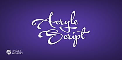 Clean high quality script font with multiple ligatures and alternate glyphs. Gives your project a creative touch.
 - Semantica MF by Masterfont,
$59.00 Formal, yet with very high legibility even in small point sizes. Many weights gives you design alternatives
 - Akvarel MF by Masterfont,
$59.00 Fine strokes make this elegant font family a great companion for invitations and signs, indoor and outdoor.
 - Katty Signature by Dieza Design,
$15.00 Give your design the feel of authentic craft. "Katty Signature" is perfect for stationary, logos and more.
 - Instrumenta - Personal use only

- Reactor Sans - 100% free

- EDGE - 100% free

- Sector 017 - 100% free

- Stripelane - Personal use only

- Ines - 100% free

- Future Brake - 100% free

- Polymoda - Personal use only

- Hertzace - Personal use only

- Básica-Unicode - Personal use only

- Gravitron - Personal use only

- The·Fire - Personal use only

- ITC Migration Sans by ITC,
$29.99 Through his hands-on experience choosing fonts as a graphic designer, type newcomer André Simard developed a type family with a good measure of design sensibility. His ITC Migration™ Sans suite of fonts offers five readable weights that can be utilized across a variety of projects. Expect more to come from this designer-turned-typophile.
 - Layla pro Arabic by Zaza type,
$29.00 Layla pro Arabic typeface is a modern Arabic typeface designed by Ahmed Zaza. the design is inspired by the Kufi calligraphic style and influenced by the Naskh style. The result is a hybrid that combines modern proportions with Classic Arabic scripts it’s suitable for branding, editorial, packaging, and advertising. Layla pro Arabic Features five weights from Light to Bold,
 - Shearman Std by UFF,
$25.00 Shearman STD has a simple design, based on industrial fonts, in particular at the typewriters fonts. It's a geometric font with curves elimination, noting in particular the O and Q letters. It has smooth angles and clean forms which combine in a font with modern appearance. It include five weights with two italics and an extended European character set.
 - Cajito by Rosario Nocera,
$19.99 Cajito is a font family with a medium contrast, developed for numerous uses, ranging from app to website and catalogue to corporate design especially for logo design, Cajito has ten alternative capitals and his terminal looks like the fins of a fish. Cajito font family consists of five weights from extra light to extra bold with matching italics.
 - Caronta by Ixipcalli,
$22.00 The Caronta typeface is a modern, clean and easy-to-read sans serif typeface. It has been used for texts and documents where you want to show a minimalist appearance. The contrast between the light and bold fonts makes for a visual game that is pleasing to the eye. It has ten styles, and five weights.
 - Ponte by SilkType,
$47.50 Ponte is a high-contrast display typeface with smooth serifs, designed for impactful headlines. The ten-style typeface features over 80 decorative ligatures, with roman and italics available in five weights, ranging from extra light to bold. This offers a variety of options for sophisticated design applications. Elevate your compositions with Ponte's timeless elegance and aesthetic precision.
 - Bodoni Egyptian Mono by Shinntype,
$39.00 As an ironic gloss on the unsophisticated “typewriter” genre, the Bodoni Egyptian Mono typeface channels the classic dignity of early 19th century letter forms, presenting a quite proper family of OpenType fonts, with a copious range of OpenType features—small caps, fractions, superior and inferior figures, alternate old style figures—rendered throughout five weights in both roman and italic.
 - PR Mysticon 01 by PR Fonts,
$5.00 There has long been interest in the talismanic value of different numbers and their varied many - pointed stars or patterns. This font presents star designs with points numbering between five and twelve, in solid form, outlined, interlaced, and placed within a circle. Whether your interest is mathematical or mystical, We hope you will enjoy this collection of forms.
 - Mersal Arabic by Zaza type,
$29.00 Mirsal Arabic typeface is a modern Arabic typeface designed by Ahmed Zaza. the design is inspired by the Kufi calligraphic style and influenced by the Naskh style. The result is a hybrid that combines modern proportions with Classic Arabic scripts it's suitable for branding, editorial, packaging, and advertising. Mirsal Arabic Features five weights from Light to Black.


