10,000 search results
(0.034 seconds)
- Fractura ND by Neufville Digital,
$29.60 Fractura ND is a stencil typeface designed by José María Cerezo. It includes, in addition to four fonts of different weights, an outline font, a pair of fonts to make bicolor sets and a dripped font. A geometric sans serif that, with the particularity of being a stencil, provides personality and wide compositional possibilities. Fractura is a Trademark of BauerTypes SL
 - Candombe Pro by Sudtipos,
$45.00 Prolific calligrapher Angel Koziupa and designer Alejandro Paul charm us once again with an imaginative typeface. Named after the Afro-Uruguayan drum-based rhythm, Camdombe conveys both a upbeat spirit and youthful joy. Its unique forms dance with each other, complementing their wild, brush-lettered origins. This inherent spontaneity makes it an ideal choice for signage, titles, and greeting cards.
 - Bubble Garden by Four Lines Std,
$15.00 Introducing "Bubble Garden" Font - Where Whimsy Meets Readability! Bubbling with Charm: "Bubble Garden" captures the essence of joy and creativity. Its rounded, bubble-inspired letters are like a burst of laughter on your screen or paper. Whether it's for party invitations, children's books, social media content, posters, sticker, thubnail or anything that needs a dose of fun, this font has got you covered.
 - Big Gorilla by Aminmario Studio,
$20.00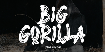 INTRODUCING This is a supercharged font, with natural brush, quick strokes and sharp details. Contains ALL CAPS, numbers, some punctuation and ligature. Perfect for challenging jobs, titles, movie,logos, apparel, t-shirts, hoodies, quotes, product packaging, or anything that needs a typographic turbo-boost and a typographic unique style. Thanks for checking out this font. I hope you enjoy it! AminMario
 - Christolas Gift by Ake,
$12.00 Christolas Gift is a delightful display font that uses the magic of the winter holidays to bring joy to the ones who use it. Its playful style makes it a perfect choice for a variety of products. You can use it with confidence on greeting and holiday cards, quotes. children’s books and activities, logos, mugs, gift bags, and many more.
 - Baby Angella by Violatype,
$14.00 Baby Angella is a cute and charming handwritten font. It will add an incredibly joyful touch to your designs. Add this beautiful handwritten font to each of your creative ideas and notice how it makes them stand out! Baby Angella font is perfect for logos, wedding invitations, clothes, souvenirs, magazines, quotes, crafts, and more, please try it yourself and perfect your design.
 - Arazatí by Underground,
$9.99 Arazatí was inspired by Edward Johnston’s typefaces, although its design is not based on a literal reconstruction. It has 48 variants of 422 glyphs each. In addition, it offers two monospaced variants for free. Arazatí is the name of the place where Johnston was born in 1872, located in San José, Uruguay. This typeface is a tribute to his birthplace.
 - Omels by Inumocca,
$21.00 Omels Display Font, fun and joyful character but strong and dynamic. simplel for access of Unique Alternates Exellent typeface to use for covering your Project, like Branding, Movie Title, Headline Letter, Bookcover or Book Content, Magazine cover, Poster, Quotes Lettering, Logos, and more your project design. - Unique glyphs - Multilingual Characters Support - UPPERCASE - Lowercase - Numeric - Symbol - Punctuation Character - Stylistic Set Alternates inumocca type
 - Acceptable JNL by Jeff Levine,
$29.00 Acceptable JNL is a typeface modeled from hand lettering on a piece of 1940s sheet music, and has a distinctly casual, yet Art Deco flair. It's name can also be mischievous, for when you're asked "which font should I use for the job" you can answer "the Acceptable font". This may well start a dialogue reminiscent of Abbott and Costello's "Who's On First?"
 - Ruby Lights by Bogstav,
$17.00 Say hello to Ruby Lights - a bold rounded font, made to bring fun and joy to your designs! Ruby Lights has no sharp edges, everything has gentle rounded corners and edges, leaving a soft yet vibrant look. Go ahead and use Ruby Lights for your children’s books, posters of any kind, invitations or maybe packaging - actually anything that needs a fresh handmade attitude!
 - Saihat by Alit Design,
$19.00 The Saihat font is inspired by Arabic or Middle Eastern style calligraphy. This font is made with Latin characters so that it can be read internationally which does not have to be able to read Arabic characters. This font is perfect for Middle Eastern or Muslim designs. In addition, the Saihat font can also be used for other decorative design concepts.
 - ALS Pobeda by Art. Lebedev Studio,
$20.00 Pobeda is a bright jobbing typeface inspired by the Moscow Victory Day Parade commemorating the 70th anniversary of the end of the Second World War. At the heart of the typeface is the recognizable rapid silhouette of the famous MiG-29. This cool typeface looks great on souvenir objects, in print and on the web, adding some technical flair to any material.
 - Granat by Hubert Jocham Type,
$29.90 The idea for Granat goes back to my mysterious typeface Telepiu and later Teleneue. The straight horizontal bars in combination with the round joins create a very unique character. With Granat I wanted to push this style even further. Like in Teleneue Granat comes with a monocase version without any ascenders or descenders for all 7 weights from Regular to Ultrabold.
 - Tenterhooks by Hanoded,
$15.00 I like the expression ‘being on tenterhooks’. Not that I’m on tenterhooks very often! Tenterhooks was made with a broken satay skewer (see poster 2 for the actual thing) and Chinese ink. It came out rather rough, but it does have a nice flow and a certain ‘wild elegance’. Comes with double letter ligatures and a whole bunch of diacritics.
 - Brasileiro by CastleType,
$19.00 Brasileiro, a CastleType Original, is a new art deco design inspired by the seven letters used for the masthead of the Brazilian magazine 'Para Todos' from the 1920s. Described as "great fun" and "nova e exuberante", Brasileiro captures the playful and joyful spirit of Brazil. Contains some alternates in the lowercase position, extensive language support for Latin and Cyrillic languages, and much more.
 - Silent River by Gleb Guralnyk,
$14.00 Hi, presenting a display font Silent River. It's a bold decorative font with nice classic shape. Silent River typeface supports most of the european languages and also has ukrainian cyrillic characters. Also there are an extra characters with modifyed letters shape, such as ligatures and alternates. Make sure that your app does support an OpenType features to access this extra characters.
 - Santa Robin by Balpirick,
$15.00 Santa Robin is a Modern Handbrushed Font. Santa Robin is a sweet and friendly handwritten font. This playful font will look gorgeous on a variety of design ideas. It will add a joyful and romantic touch to each of your projects! Santa Robin also multilingual support. Enjoy the font, feel free to comment or feedback, send me PM or email. Thank you!
 - Watchmaker by Ingrimayne Type,
$5.95 Watchmaker was designed with the limitations imposed by a simple LCD that is meant only to display numbers. Most LCD typefaces use some diagonals to make the letters look better. This one does not and from it you can see why a few diagonals are needed to display letters on a LCD. Watchmaker is monospaced and comes in plain and bold weights.
 - Okay Cotton by Okaycat,
$29.95 Okay Cotton is soft & gentle -- specially made for situations where a pointy hard-edged font just isn't up to the job. This font is extra-soft but stays true to form -- delivering your message with clarity. The small details make Okay Cotton friendly & inviting. Okay Cotton is extended, containing West European diacritics & ligatures, making it suitable for multilingual environments & publications.
 - Rembullan by SSI.Scraps,
$18.00 The Rembullan family font is a beautiful script calligraphy. It has so many alternative characters in every style. It will change your design to be prominent and attractive. In Holiday style you will find a unique glyph that matches with cheer and joyful design. Happiness is Rembullan. There is also a beautiful torn paper template as a bonus. Download the paper template here .
 - Gellatick by Ardian Nuvianto,
$23.00 Gellatick is a charming and whimsical script font that brings a delightful handwritten feel to any design. With its playful curves and bouncy letterforms, this font is perfect for adding a touch of joy and friendliness to your projects. Whether you're designing greeting cards, invitations, or social media graphics, Gellatick will infuse your creations with a sense of warmth and personality.
 - Likely by Adam Ladd,
$25.00 Likely is a joyful, brush script type family with complementary sans and extras styles. Hand drawn freely but carefully, each font is designed to work together to present a vibrant and natural package. Layer and colorize the free Counter styles to easily enhance the color palette or use the over 170 matching catchwords and shapes to make your designs even more fun!
 - Impact by URW Type Foundry,
$35.99 Impact As its name suggests, Impact, a bold sans serif, is designed to make an impression on the reader. Obviously a display font, Impact makes use of its thick strokes and blocked style, to catch and hold the eye. Because Impact is so striking, it is best placed in plenty of white space so that it does not overwhelm any accompanying text.
 - Murisa Betzmann by Murisa Studio,
$10.00 Murisa Betzmann is a very special font. We make it with enthusiasm and joy. Betzmann is an innovation and style in typography. We provide 4 alternates for each uppercase, and 4 swashes for each lowercase. You are also given various ligatures for variations of your writing. Multiple alternates, multiple swashes, multiple ligatures, a brilliant work of art. Get it right now.
 - Feeling Grateful by Olivetype,
$18.00 Bring joy to your designs with Feeling Grateful! This cheerful font offers a combination of adorable style and fun. Its bouncy and bold letters are the perfect addition to your logos, headlines, and other projects. Feeling Grateful is sure to make any design stand out with its positive vibes, so grab this font today and start adding some fun to your designs!
 - Nouvelle by Mina Arko,
$45.00Nouvelle is an elegant sans serif family of six fonts (light, regular, semibold and italics). This modular typeface works just as well as display typeface as it does in body text. Because of the high x-hight it stays readable in very small sizes. It has 1884 characters: oldstyle numerals, ligatures and extra characters that support almost all European languages. - Lined by Oscar Pastarus,
$18.00The Lined font started out with some scribbles - playing with lines and making shapes fold, underlap and overlap, eventually evolving into letters. This is a display/ornamental font and it was made in 2009, it's meant for decorative use and not in large bodies of text. For example it does well used as a headline font. It is proportionally spaced and uppercase only. - Ah, the Flame on! font, not just a typeface but a fiery declaration, a typographic torchbearer of passion and intensity! Picture this: each letter, ablaze, casting a warm, flickering glow across the ...
- Grunge Serifia is not a canonical font widely recognized under this name as of my last update in early 2023. However, the conceptual idea of a "Grunge Serifia" font paints a vivid image that blends t...
- TPG Tolle One by Tolstrup Pryds Graphics,
$15.00 TolleOne - a display font family of five weights, named after my wife, whose nickname is Tolle. The “One” indicates that she is number one, of course, but also that this is the first set of fonts I have published.
 - Tupelo by Canada Type,
$39.95 Philip Bouwsma’s offbeat mind, always working in mysterious ways, brings us one of the unlikeliest syntheses of historical influences in a perfectly fluid, organic, and highly expressive connected script. Tupelo takes its inspirational roots from the handwritings of two of the most influential men in world history: Elvis Presley and Abraham Lincoln. It took a little research and analysis on Bouwsma’s part to reveal that The King’s and Honest Abe’s methods of writing shared a common ancestor: a writing system they had both learned as youths during their early school years. While Tupelo’s lowercase maintains the slant, color, texture, and flourish of Elvis’s handwriting, its uppercase is the embodiment of Lincoln’s well-versed originality. This is the closest a typeface has ever come, in its timeliness and historic relevance, to making a statement about these modern days' fusion of politics and popular culture. Tupelo comes in two main fonts, plus a set of beginning lowercase, a set of ending lowercase, and plenty of alternates and extras. The non-Pro set consists of five fonts, while Tupelo Pro combines the lot in a single font of over 840 characters, which includes programming for push-button swash caps, stylistic alternates, oldstyle figures, beginning and ending letters. Elvis and Abe would be proud!
 - Verse Serif by Hubert Jocham Type,
$39.00 In 2006 the art director of Emotion, a women’s psychology magazine, asked me to design a copy typeface for them. Before I actually got the job I started to work on a serif. I wanted it to be feminine but still clear and modern. On one hand there are the floral round elements and on the other hand the angular serifs. In the composition I wanted the two extremes to work together. All the other elements had to be harmonized. The proportions needed to match the magazine’s requirements. The ascenders and descenders are short enough to work in narrow columns but long enough to work in small sizes. As you can imagine, the emotion-job never happened. Verse is now a serif and a san-serif with 7 weights with italics and smallcaps. In copy you should not get heavier than Heavy. Extrabold and Ultrabold work best in display.
 - Bord by Linecreative,
$16.00 Bord is a type of display font that gives a clean, minimalist and futuristic impression. This font is equipped with upper and lowercase letters (all caps) but the uppercase have futuristic characters and their lowercase give a clean impression, so the combination of upper and lower case letters can give unlimited impression of design, This font supports multiple languages as well.
 - Mono Spec by Halbfett,
$30.00 Mono-Spec is a monospaced family of sans-serif type. At least in default settings, all characters across the typeface share a common width. That fixed setting is condensed, and the aesthetic style of Mono-Spec’s letterforms is very industrial. A sister family, called Mono-Spec Stencil, is also available. Its design strays away from the mechanical nature of Mono-Spec, and it channels the spirit of resistance and street culture. Mono-Spec ships in two different formats. Depending on your preference, you can install the typeface as a single Variable Font or use the family’s five static OpenType font files instead. Those weights run from Light through Bold. While the static-format fonts offer a good intermediary-step selection, users who install the Variable Font have vastly greater control over their text’s stroke width. The Mono-Spec Variable Font’s weight axis allows users to differentiate between almost 1,000 possible font weights. That enables you to fine-tune your text’s exact appearance on-screen or in print. Whatever format you choose, the Mono-Spec fonts are equipped with several OpenType features. The most striking of these can be activated via a Stylistic Set. That will replace several letters – like “B”, “E”, “F”, “H”, and “I” with double-width alternates. Those alternates take up as much space as two characters placed next to each other otherwise word. The effect of Mono-Spec’s double-width alternates is striking, and their use strikes a strong chord in any display typography applying them.
 - Rabenau by Linotype,
$29.99 Rabenau (formerly Lucinde), the distinctly warm and legible type family For 30 years the graphic designer Axel Bertram worked at creating his typefaces: He developed complete new alphabets for magazines and typewriters as well as for the constant demand for typefaces for use by commercial artists. He has developed wall charts the size of advertising posters as teaching aids for training commercial and graphic artists to write in a clean, classic cursive script. In the eighties he used the American Chyron computer to design a screen font for television. In the mid-nineties he discovered for himself the fabulous possibilities offered by the Fontographer font software program and explored them playfully. From the results of these experiments, Axel Bertram selected a design for further development. From 2003 onwards the calligrapher and type designer Andreas Frohloff collaborated with him on the further development and production of the 16 fonts of the Rabenau™ typeface family.The Rabenau font was inspired by many factors: From the fonts used as book covers to typewriter fonts and even printed material from England dating from the beginning of the nineteenth century (e.g. those used by the skilled printer William Bulmer), Rabenau's relatively high contrast is offset by some organic tapers, subtley rounded bracketed serifs, and a fairly generous x-height. This makes for a typeface that looks especially good in print. Its broad repertoire of weights and styles - Condensed, Poster, and Shadow - give it added versatility, and make it ideal for setting both display and text in the same typeface. Throughout the heavier weights, the contrast is maintained. The Poster Italic sparkles, and will make a fine display type for dynamic headlines, or logotypes. This family of sixteen fonts works beautifully together. All Rabenau font styles have a large set of ligatures and thus cover typical letter combinations in many European languages. Besides the standard ligatures for ff, fi and fl, letter connections are also available for tt, th and fj or ffi, ffl and ffk. The range is completed with lovely arched transitions for the characters st, ck or ct. The latter gives the font that certain something, both in continuous text and above all in headlines.
 - Bookable Sans by Stiggy & Sands,
$24.00 A Sans Serif Family with a few unique relatives Our Bookable Sans Family was inspired by a lettering specimen from “Letters and Lettering” by Carlyle & Oring, but you'll find the inspiration has come a long way, baby. From its original reference of displaying a standard width and weight, to the two words showing a light narrow and a heavy wide, this friendly utilitarian display text face has grown to include three width families, with six weights from light to black each. The outliers of the family are Bookable Mondo: an uber heavyweight wide style exuding all brute power in an all-caps form, and Bookable Noir: a lightweight and narrow style with many unique alternate letterforms and ligatures that spoof film noir titling, but also goes off the rails having fun. Opentype features for the traditional families include: - Full set of Inferiors and Superiors for limitless fractions. - A small collection of f-based Ligatures. - Tabular & Proportional figure sets. - Ordinals. - Approx. 419 characters. Opentype features for Bookable Mondo include: - Full set of Inferiors and Superiors for limitless fractions. - Ordinals. - Approx. 391 characters. Opentype features for Bookable Noir include: - Full set of Inferiors and Superiors for limitless fractions. - Five Stylistic Alternate Sets. - Sixty-six unique ligatures. - Ordinals. - Approx. 701 characters.
 - Futura BT by Bitstream,
$39.99 Futura is the fully developed prototype of the twentieth century Geometric Sanserif. The form is ancient, Greek capitals being inscribed by the Cretans twenty-five hundred years ago at the time of Pythagoras in the Gortyn Code, by the Imperial Romans, notably in the tomb of the Scipios, by classical revival architects in eighteenth century London, which formed the basis for Caslon’s first sanserif typeface in 1817. Some aspects of the Geometric sanserif survived in the flood of Gothics that followed, particularly in the work of Vincent Figgins. In 1927, stimulated by the Bauhaus experiments in geometric form and the Ludwig & Mayer typeface Erbar, Paul Renner sketched a set of Bauhaus forms; working from these, the professional letter design office at Bauer reinvented the sanserif based on strokes of even weight, perfect circles and isosceles triangles and brought the Universal Alphabet and Erbar to their definitive typographic form. Futura became the most popular sanserif of the middle years of the twentieth century. Ironically, given its generic past, Futura is the only typeface to have been granted registration under copyright as an original work of art, and, further irony, given the key part played by the Bauer letter design office, the full copyright belongs to Renner and his heirs. This decision in a Frankfurt court implies that a further small group of older typefaces may also be covered by copyright in Germany, particularly those designed for Stempel by Hermann Zapf. This situation appears to be limited to this small group of faces in this one country, although protection of designers’ rights in newer typefaces is now possible in France and Germany through legislation deriving from the 1973 Vienna Treaty for the protection of typefaces. Mergenthaler’s Spartan is a close copy of Futura; Ludlow’s Tempo is less close. Functional yet friendly, logical yet not overintellectual, German yet anti-Nazi... with hindsight the choice of Futura as Volkswagen’s ad font since the 1960s looks inevitable.
 - Brass by HiH,
$8.00 The Brass Family has a lineage that extends into English history. About five hundred years ago a devout, but anonymous Englishman gave glory to the God he worshipped by designing the capital letters and decorations of these two fonts. Originally recorded in The History Of Mediaeval Alphabets And Devices by Henry Shaw (London 1853), they are described by Alexander Nesbitt in his Decorative Alphabets And Initials (Mineola, NY 1959) as “Initials and stop ornaments from brasses in Westminster Abbey.” I wish I could say I remember seeing them when I was there, but that was forty-two years ago and all I remember was seeing the tomb of Edward the Confessor. One definition of “stop” as a noun is a point of punctuation. I have heard people from the British Isles speak of a “full stop” when referring to a period. Some may remember a 19th century form of communication called a telegram being read aloud in an old movie, with the use of the word “stop” to indicate the end of a sentence or fragment. A full dozen of these stop ornaments are provided. They occupy positions 060, 062, 094, 123, 125, 126, 135, 137, 167, 172, 177 & 190. The Brass Family consists of two fonts: Brass and Brass Too. Both fonts have an identical upper case and ornaments, but paired with different lower cases. Although the typefaces from which the lower cases were drawn are both of modern design, both are interpretations of the textura style of blackletter in use in England when the upper case and ornaments were fashioned for the Abbey. Brass is paired with Morris Gothic, which matches the color of the upper case quite well. Brass Too is paired with Wedding Regular, which is distinctly lighter than the upper case. I find it very interesting how each connects differently. The resulting fonts are unusual and most useful for evoking an historic atmosphere.
 - Breathe Neue by Lián Types,
$37.00 Breathe Neue is not just an update of my renowned Breathe of 2010, this is something else... Many times I find myself looking for inspiration in my previous creations. The original Breathe has something on its essence: Something that almost 10 years later still caught my attention. Like its name suggests, letters seem to be breathing, moving, alive. Many years passed so I asked myself if there was still something I could do for it, something to get the most of that beautiful essence... Suddenly, I was already working on its curves: Many new loops, more polished, more refined. Also the proportion and spacing were altered to embellish the font. Breathe Neue’s swashes are addictive. I couldn't find another word. Irresistible? Maybe. Once you see some of its loops you want to see more. I believe this might be due to its very geometrical feel, which match well with the bodonian curves of the font. See also how well it works with Breathe Caps. And what if you combine them with Breathe Special? wow. I'm still young (yeah, sure) and I believe there're still many years ahead to enjoy this great profession, and to make many new (and astonishing, I hope) fonts. But I also think, it’s time to pamper my first creations. They deserve the best treatment, after all, they were once a success! This is what I did with my lovely Breathe. I hope you like it.
 - Rombi Technocrat by Mans Greback,
$39.00 Rombi Technocrat is a geometric, heavy font that features a unique combination of square shapes and slanting angles. Inspired by the dynamics of forward movement and the rigidity of structured design, this italicized font family brings a sense of purpose and direction to your creative projects. The Rombi Technocrat font family includes five weights: Thin, Light, Regular, Bold, and Black, providing a broad range of stylistic options for designs that call for a distinct, angular touch. The font is built with advanced OpenType functionality and has a guaranteed top-notch quality, containing stylistic and contextual alternates, ligatures, and more features; all to give you full control and customizability. It has extensive lingual support, covering all Latin-based languages, from Northern Europe to South Africa, from America to South-East Asia. It contains all characters and symbols you'll ever need, including all punctuation and numbers.