10,000 search results
(0.046 seconds)
- Hellshock by Comicraft,
$19.00 Check into your local lunatic asylum with this font, etched on the walls of his padded cell by Comicraft's left-handed right-hand man, Dave Lanphear, for Jae Lee's Image comic 'Hellshock'. Artwork from Elephantmen: War Toys by Starkings & Moritat
 - Bluesy Rain by Epiclinez,
$18.00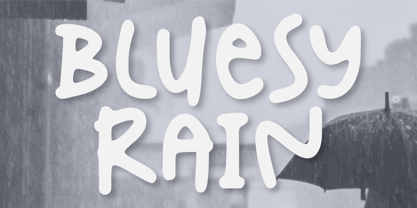 Introducing Bluesy Rain –a cute and fun typeface suitable for creating eye-catching posters, logos, and crafting projects. From its bouncy letterforms to its playful style, hopefully, Bluesy Rain can bring a touch of joy to your design. Thank You
 - Aroma Garlic by Goodigital13,
$20.00 It’s perfect for Christmas cards, branding, stationery, blog design, custom art, custom stamps, custom embossers, book, apparel, packaging, headline, Crafting, Logo, or much more! It will add a unique feel and looks stunning to any design project! Does not contain Caps.
 - SpeedSwash by Greater Albion Typefounders,
$16.00 SpeedSwash is a stylised oblique script-fraktur hybrid. That description could should bizarre - lets face it, it does - but the result is actually rather splendid we think. Lovely for poster work where a sense of life and motion is required.
 - Pattia by AEN Creative Studio,
$14.00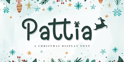 Pattia is a joyful and festive display font. It is ideal for Christmas Holiday-themed greeting cards and for any crafting project. This font is PUA encoded which means you can access all of the glyphs and swashes with ease!
 - Kinderline Script by Letterhend,
$15.00 Kinderline Script is a joyful and playful monoline script typeface. Very suitable to be used as a headline, instagram post and stories, logos, magazines, books, greeting/wedding cards, packaging, fashion, make up, stationery, novels, labels or any type of advertising purpose.
 - Cheat Sheet by Hanoded,
$15.00 Cheat Sheet is a handwritten typeface that looks like, well, handwriting. It is loose, legible and useful and comes with extensive language support. It goes without saying that I have never used a cheat sheet when I was in school… (ahum)…
 - Marujo by PintassilgoPrints,
$15.00 Marujo is a highly decorative typeface inspired by painted pieces of Arthur Bispo do Rosário, a striking Brazilian artist who lived for 50 years in a psychiatric institution. Besides its spirited Regular and Light cuts, Marujo family brings nifty eye-catching variations adorned with dots and stripes. It also brings complementary fonts to spice things up even more: there are 2 shadow options and yet a picture font packed with doodles, mostly on nautical subjects (which are strongly present on Bispo do Rosário, a former seaman apprentice.) Bispo do Rosário's works employs a multitude of materials and are often very intricate. Words are everywhere, painted or embroidered at most. He produced a vast amount of works, and is now - posthumously - widely recognized in Brazilian art scene. The psychiatric institution in which he lived is now a museum dedicated exclusively to his work. Marujo draws inspiration not only from Bispo's works, but also from this man's potency, a persistent man who produced amazing art locked in such a tough environment for a life-long. Marujo fonts are positively adventurous and will safely navigate through a sea of feelings, reaching free spirits everywhere. To navigate is precise...
 - Engria by Eclectotype,
$40.00 Engria is a type family of four weights with corresponding italics that treads the fine line between sans and serif. There are serifs, of a sort, inspired by the brush. Not the marks made by a brush, but the actual splayed shape the bristles make when clamped together. Wedge-like chunks that resemble engraved forms, as the name Engria hints at. But it also has the appearance of a stressed, flared sans. This mixed approach lends a unique voice. Highly legible at text sizes, as indeed it is optimized for, Engria does however shine at display sizes thanks to its characteristic details – flared stems, angular counterforms, rugged ink traps and fluid curves. (I would recommend tracking it a little tighter at larger sizes.) Engria started life way back in 2014, and has been worked and reworked tirelessly to get to this finished product. My intent was to really push the idea of the white shapes being as important, if not more so, than the black. Engria is equipped for typographically demanding applications, boasting as it does an array of OpenType features, including small caps, automatic fractions, stylistic sets, various figure styles, arrows, case sensitive forms and more. It will make a very useful addition to your typographic arsenal, with a flare (ahem) for editorial work, but the individuality for packaging, branding, and logo work.
 - MollyO by Atlantic Fonts,
$28.00 MollyO font family is based on the original, reliably cool handwriting of illustrator (and dear friend), MollyO of mollyOcards. Like MollyO herself, this font is unique, unpretentious, and beautiful. Part printed and part script, it has the authentic connections and stops of a contemporary, casual font. For the truest handwritten feel, keep discretionary ligatures on, or turn them off where you want more evenness. MollyO is expressive in all-caps, available in two weights, and with effortless warmth and inky flow, will bring a wide range of creative projects to life.
 - Wartech by Linecreative,
$16.00 Wartech slab serif inspired by vintage style with a touch of classic style. This font is built with solid foundations, strong visuals, old-school movement, and a modern minimalist style. Wartech is perfect for Jersey , athletic, poster, branding projects, Logo design, Clothing Branding, product packaging, for magazine titles. for something with the theme of sports, album title, etc What you get dear, you will get : Wartech- A clean Slab serif font including Upper & Lowercase characters(ALL CAPS), Ligatures Character Supports Multi linguage (Latin Western Europe), Numbers and Punctuation
 - Gulyesa Script by Ahmet Altun,
$39.00 Gulyesa script font is a handwriting typeface. It offers stylish alternatives at the first and last letters of the words. In addition to that the font contains a great number of alternates as stylistic, titling, contextual alternates... Also it contains Swashes, Oldstyle Figures and Ornaments. Gulyesa script font is a stylish handwriting font that can be used in everywhere the designers choose and admire. The name of Gulyesa Script Font consists two words; gul means Rose and yesa means a praised person. The name comes from my dear daughter's name.
 - Go by Canada Type,
$24.95 Five years into the 21st century and the promise of nanotechnology, high-end popular culture design seems to thrive on combining opposites and drawing a fine line between traditionally contradictory ideas. This is seen in modern society's usual cultural frontrunners - like consumer electronics, fashion items, music packaging and publications, where it is evident that traditionally complex marketing statements of fashionability and lifestyle are attempted with simple minimalism. But at the typographic end of this realm, the creative majority still uses old faces that help the modern statement only in passing. Some of the more adventurous creative professionals actively seek new elements to emphasize contemporary impact in their modern design. To those adventurous types (pun intended), Canada Type presents this new face called Go. It is very much a child of the new millennium, inspired by the unmistakable minimalist style of modern 21st century corporate logos, recent design shifts in electronic music and club-marketing collateral, and disc jockeys who have enthusiasm, energy, precision and total control of each and every vibration traveling from mixer to speakers. Go is an original modern techno-lounge face that offers the eyes pleasing collages of friendly minimal forms that give the words an impression of simplicity and depth at once. This is a font that prides itself on its precise grouping of elements and just enough original creativity in combining those elements. The precision builds the sharp edge sought for modern statements, while the creativity keeps the message rejuvenated, clear and interesting. Go's character set consists of a versatile and unexpected, yet mild mix of the uppercase and lowercase forms, with multiple variations on the majority of the letters. The e being a vertical mirror of G is only the first of the pleasant surprises. More than 30 alternates are inside the font. All the accented characters in Go have been meticulously (perhaps obsessively) drawn to be unusual for logos and short statements. Take a look at the character map and be ready for a space-age surprise. To borrow a Star Trek cliché, this font can Go where no font has gone before.
 - Gratitude Script by Sudtipos,
$59.00 The quality or feeling of being grateful or thankful. An appreciation for the world around us. Gratitude for being a part of it all. No matter what’s happening in our lives, there’s always something to be grateful for. When we have an appreciation for all we have, life gives us more to feel grateful for. It’s a naturally occurring cycle. Some of the most profoundly grateful times in our lives can be felt when we find ourselves surrounded by beauty: in art, nature, music, special places, the seasons, family, loving relationships, a cozy home, meaningful work; in doing what brings us joy, comfort, and feelings of deep love and satisfaction. There is beauty everywhere, and creating beauty is an artist’s mission. We all have the ability to create and experience beauty. In this high-tech, fast paced world of strict, unbending rules, we give you Gratitude Script: A celebratory font that’s deeply rooted in tradition letterforms but with a modern, updated twist; a casual, whimsical, fun look that is also elegant and versatile! Partnering with Ale Paul is seasoned wedding calligrapher Kathy Milici, who is well known for her passionate writing style and highly ornamental pen flourishing. With its signature hand-written look, flowing lines, graceful curves and flourishes, Gratitude Script’s space saving, vertical style is perfect for small printing areas as well as large format presentations. An extended variety of alternates makes it a perfect and versatile addition to your font repertoire.. These are tender times. Long hours and work pressures add to our stress. Time spent with family and friends is more valuable than ever before, as we try to balance it all. It’s important to mark time with special, happy events in our lives that we can all appreciate and enjoy. Let’s be grateful for it all! Hooray for Gratitude, and Gratitude Script! About the font: Gratitude Script is an OpenType font that contains more than 1400 glyphs icluding ligatures, alternates, endings , a wide range of latin languages and a set of ornaments and words specially designed to use in stationery for weddings, birthdays, etc. There is a smooth version of Gratitude Script too. To access to all the extra characters you will need to use software that actually supports OpenType like Adobe CS apps or later where we recommend the use of the Glyph palette. About the presentation: Every time we publish a new typeface we love to invite an artist to collaborate. Vero Scherini, an argentinian and very talented designer and illustrator, fits perfectly with Gratitude.
 - Struffoli by Hanoded,
$15.00 Struffoli are small, marble sized deep fried dough balls from Naples. They are served with a variety of sweet condiments, like honey, sugar and sprinkles. There is nothing deep fried about Struffoli font, nor does it resemble a deep fried dough ball: I just liked the name and at least now I can say what Struffoli are! Struffoli was handmade using a brush and Chinese ink. It does look like a connected script font, but it is not (really): only a few letters connect, making it a more versatile font. Use it for your cookbooks, posters and toy packaging. Rest assured, it comes with a generous serving of diacritics.
 - Whimsies by Typephases,
$25.00The Whimsies series goes further in our fixation with invented little people: the three dingbats of this series contain mostly imaginary situations, drawn first with ink on paper. All but a tiny fraction of the illustrations (a total of 114) have been drawn from one's imagination, with no previous models. The themes depicted here are varied and often humorous, though the humour is on the darker side, you are warned. The themes have a definite retro - victorian feel, with top hats, moustaches, long coats, walking canes and the like. Together with their close relatives, our Illustries, Bizarries, Ombres, Absurdies and Genteta dingbats (we give this bizarre collective the common name of Whimbats) you can use the Whimsies in an endless variety of projects, ranging from small spot illustration to whole pages, page spreads or posters applications. You can use them as they come in the digital font, or customize them easily in your favourite graphics program. A touch of texture or color will give them a completely new look. The vectorial nature of digital fonts means you can enlarge them to any size, with no loss of crispness in their outlines. - Naive Deco Sans by S&C Type,
$8.00 Naïve Deco Sans is a layered sans serif handwritten font designed by Fanny Coulez and Julien Saurin in Paris. Our goal was to draw a font with finely irregular lines that give a human and whimsical feeling. It is available in two versions: double or triple lines. The font is also decomposed in three different parts that you can use to improve your designs with multiple colors, giving to the font a deco touch. To do so, you can simply superimpose the parts with a compatible software like Photoshop and choose a color for each. This font is part of our Naïve superfamily that contains lot of variations: Line, Inline, Serif, Sans Serif... Just click on our foundry name to see them all! We hope you will enjoy our work. Merci beaucoup!
 - ITC Cyberkugel by ITC,
$29.99ITC Cyberkugel is the work of British designer Timothy Donaldson, who occasionally likes to write with an extra-fine ballpoint pen. I like the spindly scrawny forms that it gives me when I follow all the usual 'italic' writing conventions", he says. And there lie the origins of ITC Cyberkugel, although the creative process was moved from pen and paper to software and a Wacom tablet. "I like the fact that people will be buying it to give them a 'human', 'organic', 'non-digital' look, and yet no ink has soiled paper. Although the movements of the hand are still the essence, the whole thing was created in cyberspace." The name comes from combining cyberspace and Kugelschreiber, the German word for ballpoint pen. ITC Cyberkugel is a fresh interpretation of traditional calligraphy." - Rikos by Fenotype,
$19.95 Rikos is an Alien-influenced unicase font family from the future. Use all the five members of the family for maximum impact!
 - Abandon by Suomi,
$35.00 A Sans font family of five weight for headline and text use, with old style numerals and small caps, and extensive kerning.
 - Yasmine Mutlaq by Arabetics,
$29.00 The Yasmine Mutlaq type family follows the guidelines of the Mutamathil Mutlaq type style. It has one glyph per basic Arabic Unicode character or letter. Each glyph is completely symmetrical around its vertical axis to facilitate bi-directional ordering. This family does not include any required ligatures and does not use glyph substitutions or forming but it does use marks positioning. Text strings composed using types of this family are non-cursive with stand-alone isolated glyphs. Yasmine Mutlaq employs four x-height values, two above and two below the x-axis. Its design uses curves with equally distributed weight. This family includes both Arabic and Arabic-Indic numerals, all required diacritic marks, in addition to all standard English keyboard punctuations and major currency symbols. It is available in regular styles. Also included is an additional font, Yasmine Mutlaq bidi that encodes same glyphs as symbols to facilitate user input from left to right using a Latin keyboard. The fonts in this family support the following scripts: Arabic, Persian, Urdu, Pashtu, Kurdish, Baluchi, Kashmiri, Kazakh, Sindhi, Uyghur, Turkic, and all extended Arabic scripts.
 - New Ayres by MaGo Fonts,
$20.00 Based on my very first font creation, New Ayres keeps the same feel, but raised to high-quality level. Its long clean lines and soft curves merge old style and modern, giving a new meaning to timeless elegance. Perfect for titling; with at least five alternates per letter, the possibilities become endless. Choose the one better suited for your project and make your text stand out immediately! 703 glyphs take part in this font, including a large set of alternates, ligatures and swashes for you to choose from. With accents and special characters for languages, New Ayres supports 88 languages: Afrikaans, Albanian, German, Swiss German, Upper Sorbian, Asu, under Sorbian, Bemba, Bena, Norwegian Bokmal, Bosnian, Catalan, Czech, chiga, cornic, Creole Cape Verdean, Creole Mauritian, Croatian, Danish, embu, Slovak, Slovene, Spanish, Esperanto, Estonian, Euskera, Faroese, Filipino, Finnish, French, Rialan, scottish Gaelic, Galician, Greenlander, gusii, Hungarian, Indonesian, Irish, Icelandic, Italian, Kalenjin, Kamba, Kikuyu, Kinyarwanda, Kiroundi, kölsch, latvian, lithuanian, luo, luxembourgish, luyia, machame, makhuwa-meetto, makonde, malay, malagasy, maltese, manx, meru, Northern ndebele, nyankole, norwegian nynorsk, oromo, polish, portuguese, romeo, rombo, romanian, rwa, samburu, sango, sena, shena, shamble, Shona, rope, somali, swedish, swahili, taita, teso, Turkmen, vunjo, walser, zulu. This font is PUA encoded: this means each character has a unicode name, and you may access any of them through this codes. Open Type features on the open type file: easy access for alternates and ligatures! The download includes both .otf and .ttf files, so you may choose which one suits you better. With a strong personality, but yet adaptable into many styles, New Ayres is everything you are needing for your projects!!
 - Grabnika Unix by DePlictis Types,
$46.00 Grabnika Unix is a unicase style typeface with a straight and a bit tall look and it has a residual influence of monospaced fonts. One of the major characteristics of this typeface are those sharp cuted ears and joints that appears repeating at some of the letters and gives him a distinctive personality and a minimalist design approach on other group of letters that creates an alternative interesting fill of the spaces. It is suitable for signage purpose and headlines or relatively short body texts and also for logo design and branding. It is a loud and fresh display that could give a certain distinctive and young personality to your designs. As a fun fact, the name of this font comes from the romanian word “grabnic” that means “fast” and I developed this font by chance as a custom lettering for a logo design project, so I saw it proper as an alternative in the actual wide font markets and I decide to finishing it as a multilingual support typeface. Enjoy!
 - Six Feet Over by Brad Mead,
$10.00 Six Feet Over is tall, cool and near impossible to read - what's not to love? This super condensed and trippy typeface was designed to be elusive and is perfect for those that love condensed, compressed - or any other word for squished - fonts.
 - Hey Comrade by Hanoded,
$15.00 Hey Comrade is a very messy script font. It was made with a bamboo satay skewer (which I had soaked in ink). Hey Comrade would look good on book covers, packaging and in magazines. Comes with a 5-year plan of diacritics.
 - Trollslayer by Hanoded,
$20.00 Picture this: you are in the woods, hunting for Elk, when all of a sudden you hear the sound of battle horns coming from the village. Troll attack! Thank Wodan you are armed with this brand new font: Trollslayer. Let the fight begin!!
 - Square Dance by Solotype,
$19.95Animated types like this one have been around for fifty or more years. They certainly add a sense of liveliness to a headline. This one trades upon the "wrong way weights" of the old French Clarendon. Think of it as Barnum with Bounce. - Ongunkan Atlantis Hollow by Runic World Tamgacı,
$40.00 Atlantis: The Lost Empire is a 2001 I made the alphabet prepared for Atlantis Lost Empire, the first feature-length animated movie of Walt Disney in 2000 years, in 2 versions in accordance with the original. It is suitable for today's use.
 - Streamwood JNL by Jeff Levine,
$29.00 Streamwood JNL is an outline sans wood type re-drawn from vintage source material. The design bears strong resemblance to Woodlawn JNL; but is a bit narrower and has a much different set of numbers as well as a more stylized letter "Q".
 - Loyola Next by RodrigoTypo,
$29.00 Loyola Next - the new version of Loyola "the previous year" - is a geometric typographic family with an organic touch. Contains 14 fun variants, Loyola is a perfect typeface for posters, packaging, logos and any visual communication application inherent to children and youth designs.
 - Bruce Old Style by Bitstream,
$29.99This is the Bruce Foundry’s Old Style No.20, which was loosely based on the Miller & Richard Old Style. It was recut at Lanston under Sol Hess’ direction in 1909, and survives as the second text face in the Sears Roebuck Catalogue. - Headlock by Hanoded,
$15.00 Headlock is a handmade serif. My 6 year old son just had his first real Judo exam and the one thing he excels at is the headlock. Headlock comes with double letter ligatures and all the diacritics you need, plus basic Cyrillic!
 - Bispo by Custom Types,
$- Bispo is a script typeface family made based on italic chancery calligraphy. After one year of it first launch, Bispo family now has another variant, a Bispo Pro version. The Pro version now contains more than 450 glyphs and new OpenType features, enjoy!
 - Born Strong by Rook Supply,
$16.00 Born Strong is built with athletics in mind. The goal was to make the perfect typeface for sports teams, college football, athletic wear and everything in between. The font family supports a wide range of languages and is available in many different weights.
 - Zorro by Solotype,
$19.95A reasonably accurate rendering of an old favorite font from Victorian times. Quite readable in lowercase, and very eye-catching in all-caps. We got the proof for this in London many years ago, but neglected to learn the name. Zorro sounds good. - Selectric by Indian Summer Studio,
$55.00 Selectric typewriter font. The part of the large, many years project on revival and further development (over 1000 glyphs) of the 20th century’s most famous typewriter Selectric golfball fonts, lost for many decades, not being created since then in digital vector form.
 - Threefonte by Girinesia,
$13.00 Hello guys... We proud presenting our new font. It's name THREEFONTE. THREEFONTE is cute and unique stacked font. THREEFONTE would perfect for kids poster, t shirt, flyer, cover children book, cartoon, comic , cristmast invitation, greting card, valentine card, new year party and etc.
 - Blanchard by Canada Type,
$39.95 Blanchard is a revival and elaborate extension of Muriel, a 1950 metal face made by Joan Trochut-Blanchard for the Fonderie Typographique Française, that was published simultaneously by the Spanish Gans foundry under the name Juventud. Blanchard is a script that embodies the post-war narrow decorative aesthetic that would become the instantly recognizable feature of that era’s design. Its high ascenders corners make it the tuxedo of fonts, with slight and casual angles gradually revealing a trustworthy confidante, and sharp corners signaling a most expressive ally. Font. James Font. This digital version updates the original metal shapes to work within today’s design tools and designer needs. Some of the questionable metal shapes were optimized, plenty of alternates were added, and as many as five ending forms were built for most lowercase letters. Overall, this is one of the most useful packages for book cover, magazine and packaging design. Blanchard is available in all popular formats. Blanchard Pro combines all five fonts into a single one that makes use of OpenType’s cross-platform compatibility and programs that support OT’s fine typography features, like recent versions of Adobe InDesign and QuarkXpress.
 - Futura Headline EF Pro by Elsner+Flake,
$103.00 The design of Futura seems to be timeless. This typeface family which had been developed in 1926 by Paul Renner for the Bauer Type Foundry in the style of constructivism and as part of the Bauhaus movement, experienced, however, in the course of the past 90 years, repeated time-appropriate revivals which guaranteed its on-going popularity. The version of the Futura EF Pro contains the original character constructions which Dennis Megaw described as the “first designs of Futura” in 1938 in “20th century sans serif types, Typography no. 7” (See: Dr. Christopher Burke: Paul Renner, Princeton Architectural Press, New York 1998). What makes it exceptional is the extension into three weights: “Text”, “Headline” and “Index” which came about as part of a degree dissertation at the Hochschule für Bildende Künste (HFBK) in Hamburg. In this context, the accompanying documentation “Die Kritik der reinen Futura” (“The Critique of the Pure Futura”) by Katharina Strauer was published by the Materialverlag, Hamburg, in 2003. Some copies are still available at Elsner+Flake.
 - Futura Text EF Pro by Elsner+Flake,
$103.00 The design of Futura seems to be timeless. This typeface family which had been developed in 1926 by Paul Renner for the Bauer Type Foundry in the style of constructivism and as part of the Bauhaus movement, experienced, however, in the course of the past 90 years, repeated time-appropriate revivals which guaranteed its on-going popularity. The version of the Futura EF Pro contains the original character constructions which Dennis Megaw described as the “first designs of Futura” in 1938 in “20th century sans serif types, Typography no. 7” (See: Dr. Christopher Burke: Paul Renner, Princeton Architectural Press, New York 1998). What makes it exceptional is the extension into three weights: “Text”, “Headline” and “Index” which came about as part of a degree dissertation at the Hochschule für Bildende Künste (HFBK) in Hamburg. In this context, the accompanying documentation “Die Kritik der reinen Futura” (“The Critique of the Pure Futura”) by Katharina Strauer was published by the Materialverlag, Hamburg, in 2003. Some copies are still available at Elsner+Flake.