7,018 search results
(0.021 seconds)
- Aquaduct Reverse Italic - Personal use only

- Sandor by Eko Bimantara,
$18.00 Sandor is experimental serif font. Its fit for brand, titles, heading and display purposes.
 - Lawyerbait by Zang-O-Fonts,
$25.00Lawyerbait was designed to be a clean, light and easy to read display face. - Hebrew Rinat Kids by Samtype,
$34.00 This is font to help children read. The Diacritic Marks (Nikud) are 25% bigger.
 - Jaguarundi by Dharma Type,
$9.99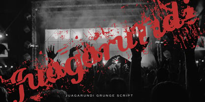 This extremely scratched and decadent font is suitable for posters of rock or grunge.
 - F2F OCRAlexczyk by Linotype,
$29.99The Face2Face (F2F) series was inspired by the sound of 1990s music, personal computers, and new font creation software. For years, Alexander Branczyk and his friends formed a unique type design collective, which churned out a substantial amount of fresh, new fonts, none of which complied with the traditional rules of typography. Many of these typefaces were used to create layouts for the leading German techno magazine of the 1990s, Frontpage. The typeface F2F OCRAlexczyk is one of the Face2Face fonts in Linotype's Take Type Library. It is based on the popular computer font OCR A, which was developed by the American National Standards Institute in 1966 as a system of letters that both humans and machines could easily read. Alexander Branczyk made a more 1990s/techno version, which later became this font. - Breathy Signature by Nathatype,
$29.00 Reveal your very best design result that makes everyone brainstorming easily with Breathy Signature. It's a versatile monoline signature font. The brushstrokes and curves style applied to the characters that resemblance to actual handwriting gives this font natural yet elegant feels. This font also easy to read and will look great in a variety of sizes. Features: Stylistic Sets Ligatures Swashes Numerals and Punctuations PUA Encoded It can be used for many design projects, such as poster, logo, book cover, branding, heading, printed product, merchandise, quotes, social media campaign, etc. Get more inspiration about how to use it by seeing the font preview. Thank you for purchasing our fonts. Please don’t hesitate to contact us, if you have any further question or issues. We’re happy to help. Happy Designing.
 - F2F Frontpage Four by Linotype,
$29.99The Face2Face (F2F) series was inspired by the techno sound of the mid-1990s, personal computers and new font creation software. For years, Alexander Branczyk and his friends formed a unique type design collective, which churned out a substantial amount of fresh, new fonts, none of which complied with the traditional rules of typography. Many of these typefaces were used to create layouts for the leading German techno magazine of the 1990s, Frontpage. Branczyk and his fellows would even set in type at 6 points, in order to make it nearly unreadable. It was a pleasure for the kids to read and decrypt these messages! F2F Frontpage Four is one of 41 Face2Face fonts included in the Take Type 5 collection from Linotype GmbH. Branczyk designed 16 of these himself." - The Sculptor by Comicraft,
$39.00 In much the same way that the leading character in Scott McCloud's first full-length graphic novel has given his life to art, Comicraft's John 'JG' Roshell has given HIS life to sculpt a unique font to suit it. Well, not his LIFE, but at least a couple of days. However, unlike the eponymous hero of THE SCULPTOR, you don't have to make a deal with Death to get your own copy of The Sculptor font! You too can letter anything with your bare hands! And a keyboard. And a computer. And some operating programs and software, obvs. Because creating anything is always going to be harder than you think, especially when you have only 200 days to live. Not you, The Sculptor. In all good bookstores now!
 - Conso Serif by Larin Type Co,
$16.00 CONSO SERIF is an elegant, modern and contrast font family. It includes upright and Italic style, each of them has seven weights from thin to bold. This is a multi-purpose font that is perfect for any project, it is contrasted, modern and easy to read. With it, you can create logos, use in advertising, packaging, book covers and magazines, headings, descriptions and much more. CONSO includes stylistic alternates with a teardrop-shaped tail for uppercase and lowercase, with them, you can change the style of your project and add personality to it and make it more stylized. This font is easy to use has OpenType features and all characters in this font have PUA encoding. Full alphabet with Uppercase and Lowercase A-z Numbers, fractions Punctuation and symbols Alternates for uppercase Alternates for lowercase
 - F2F Burnout Chaos by Linotype,
$29.99The Face2Face (F2F) series was inspired by the techno sound of the mid-1990s, personal computers and new font creation software. For years, Alexander Branczyk and his friends formed a unique type design collective, which churned out a substantial amount of fresh, new fonts, none of which complied with the traditional rules of typography. Many of these typefaces were used to create layouts for the leading German techno magazine of the 1990s, Frontpage. Branczyk and his fellows would even set in type at 6 points, in order to make it nearly unreadable. It was a pleasure for the kids to read and decrypt these messages! F2F Burnout Chaos is one of 41 Face2Face fonts included in the Take Type 5 collection from Linotype GmbH. Branczyk designed 16 of these himself." - F2F Haakonsen by Linotype,
$29.99The Face2Face (F2F) series was inspired by the techno sound of the mid-1990s, personal computers and new font creation software. For years, Stefan Hauser and his friends formed a unique type design collective, which churned out a substantial amount of fresh, new fonts, none of which complied with the traditional rules of typography. Many of these typefaces were used to create layouts for the leading German techno magazine of the 1990s, Frontpage. Hauser and his fellows would even set in type at 6 points, in order to make it nearly unreadable. It was a pleasure for the kids to read and decrypt these messages! F2F Haakonsen is one of 41 Face2Face fonts included in the Take Type 5 collection from Linotype GmbH. Hauser designed two of these himself." - F2F El Dee Cons by Linotype,
$29.99The Face2Face (F2F) series was inspired by the techno sound of the mid-1990s, personal computers and new font creation software. For years, Thomas Nagel and his friends formed a unique type design collective, which churned out a substantial amount of fresh, new fonts, none of which complied with the traditional rules of typography. Many of these typefaces were used to create layouts for the leading German techno magazine of the 1990s, Frontpage. Nagel and his fellows would even set in type at 6 points, in order to make it nearly unreadable. It was a pleasure for the kids to read and decrypt these messages! F2F EI Dee Cons one of 41 Face2Face fonts included in the Take Type 5 collection from Linotype. Nagel designed nine of these himself." - Neue Konstrukteur Round by HouseOfBurvo,
$15.00 Neue Konstrukteur Round is an engineered, mechanical typewriter font with a hint of heritage blackletter. Inspired by a trip to Germany this font has five weights from Thin to Black with accompanying italics. That makes 10 font files in total, enough for the most demanding projects. Also check out its sister font Neue Konstrukteur Square.
 - Klute by Alias Collection,
$60.00 Klute references stylised forms of writing; historic Germanic, blackletter letterforms and graffiti and tagging. Its references are based on a personal idea of lettering - the action of writing is more personal and human than the craft of calligraphy or the mechanics of typing. These references suggest the idea of saying something particular and personal.
 - Neue Konstrukteur Square by HouseOfBurvo,
$15.00 Neue Konstrukteur Square is an engineered, mechanical typewriter font with a hint of heritage blackletter. Inspired by a trip to Germany this font has five weights from Thin to Black with accompanying italics. That makes 10 font files in total, enough for the most demanding projects. Also check out its sister font Neue Konstrukteur Round.
 - Trencher JNL by Jeff Levine,
$29.00 Trencher JNL is based on hand-cut stencils spray-painted onto a vintage 1947 Cleveland Trencher acquired by the Marine Corps Mechanized Museum at Camp Pendleton, California. Restoration volunteer Brian Platzer supplied to Jeff Levine the images of the stencil markings - and they were quickly re-drawn and turned into a digital type face.
 - Nature Keystone by Wildan Type,
$15.00 Nature Keystone is a modern sans serif font with a unique ligature and aletrnate style. A simple sans serif with special impression. Combaine with high contrast and slat style perfect for classy logo signs, fashion heads & editorial designs, branding projects, Clothing Branding, packaging, magazine headings, advertising, T-shirts, postcards and much more.
 - Florisa by limitype,
$10.00 Florisa is a typeface inspired by the unique shape of flower petals, which are made into unique letters. Florisa can be used for displays, headlines, logos etc. Florisa comes with capital letters, numbers and some symbols, and line version
 - Flanker Tanagra by Flanker,
$12.00 In order to give new imput to the art of typeface design in Italy, Nebiolo Company held, in March 1910, an artistic competition for a new alphabet conception, so the best-ranked design would be transformed into a real new typeface. 42 competitors participated and, although the first prize was not technically awarded, "Ancora" resulted as the best typeface, created by the designer-typographer Natale Varetti of Turin. Nonetheless, the new alphabet was transformed into a full-fledged metal typeface in 1924, renamed "Tanagra" in honor of the Greek city in the center of Boeotia. The new font, although not significantly detached from the classical Roman form, introduced decorative elements that allowed its use in both rational and artistic compositions. This font appears very clear and easy to read, with very high ascenders and some decorations that make it distinctly retrò. Finally, after almost 100 years, this peculiar character has been digitized taking it as a model the shapes of the 16 points size (other dimensions have significantly different contrasts and proportions). To adapt it to modern use, some glyphs have been modified, but all the originals are available as Stylistic Alternate OTF, as well as all the swashed variants while the missing ones were added.
 - Aquaduct - Personal use only

- Ardour GM - Personal use only

- Yellow Swamp - Unknown license

- Ardour 3D GM - Personal use only

- MHF Headbanger by MetalHead,
$14.95 A balance of ballad-meets-distortion that will make you want to Bang Your Head!
 - Promenadenmischung - Personal use only

- Futurex Bitmax - Unknown license

- Futurex Voyager - Unknown license

- Caracas by John Moore Type Foundry,
$20.00 Caracas is a new family of sans serif fonts, looking friendly, sweet and comfortable to read. Where text flow between straight lines and round by becoming transparent in the interest of readability. Caracas is ideal for working in small letters and texts of a technical nature. Caracas is a humanistic approach to reading sans forms.
 - Malabar eText by Linotype,
$103.99 A clear and enjoyable reading experience hinges on the legibility of text copy, especially when reading on screen. This is why Monotype has developed the eText collection of fonts specifically tailored for the text-heavy display environments of e-readers, tablets, mobile devices, and the Web. The original Malabar was designed by Dan Reynolds.
 - Futura ND Black by Neufville Digital,
$45.25 Designed by Paul Renner and published in 1929. It shows an alternative method of giving maximum thickness to a font by being designed to resemble the use of a stencil. It was a very fashionable typeface during the avant-garde period. It is still an excellent typeface for display use. Futura is a Trademark of BauerTypes SL
 - Bastinado by Elemeno,
$25.00Big, thick and chunky, Bastinado is imposing, but the bat-like, scalloped edges give it a sinister presence. Bastinado is an ancient Asian method of torture in which the bottoms of the victim's feet are beaten until he can no longer walk. This font looks like it wants to catch other fonts in a dark alley. - Mekanik by ITC,
$29.99Mekanik font is the work of British artist David Quay and as the name suggests, this geometric typeface reflects the simplicity of mechanical sans serif type design. It is an echo of the type styles developed by the Soviet Constructivists in the early 1920s. Mekanik font is excellent for use where a feeling of precision and strength is desired. - Cloudia by PHDesign,
$30.00 Cloudia is a versatile, modern font with an attention-grabbing angularity. It has a thoroughly mechanical, science fiction look; but with slightly unconventional vowel shapes to give it a dynamic edge. Its precisely cut letters need to be displayed as large as possible for maximum impact. Perfect for book titles, magazines, band logos, movie titles, stencils and video games.
 - SpaceLab by John Moore Type Foundry,
$15.00 As a display typeface in expanded form, SpaceLab is a futuristic font of rigorous geometric construction designed for headlines or to label the intergalactic ships and other electronic and mechanical devices of the future. SpaceLab has a set of ligatures that make it more versatile to use. SpaceLab comes in two versions: Regular, Regular-Italic, Bold and Bold-Italic.
 - Misket by Altay,
$9.00 Misket is a display typeface designed by Altay Dagistan. The glyphs were drawn one by one by hand, using traditional calligraphy methods. The font features a modulation called “reversed contrast”. Instead of the stems being thicker than the horizontals like in most typefaces, the contrast is reversed so, the stems are much thinner than the horizontals.
 - Mr J Smith by Volcano Type,
$29.00When there is no picture of a "most wanted" or "Missing Persons", photofit pictures are used. Once drawn by hand, they are now more and more substituted by photomontage. The personality is created with different modules like head, eyes, nose and mouth. The vague memory of a witness leads to the image of a "concrete" person. Sometimes different combinations of possible looks are attributed to a same person. This new virtual image finds itself soon in thousands of archives and data bases. Anyone can easily have access to those images by internet. To increase security and help track criminals, unknown death (Mr. Smith) or lost and kidnapped people, government asks citizen to help search those people. "Mr. J. Smith" is a font family consisting of 4 portrait-fonts and one letter-fonts. The portrait font "Mr. J. Smith" is a portrait-construction-kit. By layering the fonts "Head", "Eye", "Nose", "Mouth" one over the other, you can design over 7 million different faces. The font "Wanted" gives you the possibility to join names and registration numbers to the unknown or most wanted persons. What is nice about this font is the "surprise moment". Just write a word , "security" e.g., and you will get a nice shot of 8 different characters! - Brassiere Line - Unknown license

- OCR-A by Bitstream,
$29.99A set of capitals adequate for machine reading only; this barely legible pioneer sees declining use. - NewRocker - 100% free


