7,018 search results
(0.023 seconds)
- Falena by Typoforge Studio,
$19.00 Falena is a type family designed by Gianluca Boffito. This simple, easy-to-read, geometric-style sans serif family is published by Typoforge Studio and consists of 18 weights (together with italics). It has more than 300 glyphs per style (including special characters). Falena works equally well in long form type settings and for titles, headings, posters. It comes with two sets of original dingbats (set 1 contains 52 ornaments, set 2 contains 52 truly distinctive and stylish icons).
 - Agistra by Krismagraph,
$19.00 Agistra is an elegant and modern Ligature san serif font . Comes with 83 unique ligatures . Agistra font is a multipurpose font that is perfect for any project, with high contrast glyphs, giving it a feminine and masculine quality, modern, and easy to read. Great in layout design for quotes or body copy, best used as a display for headings, logos, branding, magazines, product packaging, invitations, and others. This font is easy to use and has OpenType features.
 - 26 Flowers by Celebrity Fontz,
$24.99 26 Flowers is a digital revival and restoration of a beautiful collection of 26 individually unique ornamental letters from historical texts. Each of the 26 letters of the alphabet are contained in a square frame with a different flower in the background and an antique letter in the top right corner; hence, the name 26 Flowers. This highly ornamented typeface is perfect for leading off paragraphs or in any text dealing with the subject of flowers.
 - Niko by Ludwig Type,
$50.00 Niko is a contemporary, humanist sans with a friendly yet clear and distinct personality. It is designed for excellent legibility, particularly for long continuous reading. The wedge-shaped stem heads add liveliness and variety to the carefully crafted letterforms. Niko, a highly versatile type family consisting of 54 styles that are designed to work equally well on paper and on screen. The family includes condensed, as well as extra-condensed variations, for situations where space-saving typography is required.
 - Amici by Greater Albion Typefounders,
$12.00 Amici means 'friends' and the Amici family was conceived as a big friendly Roman typeface for headings, posters, signs and anywhere else that an approachable easy-reading typeface is needed. It's the sort of thing you used to see in Magazine mastheads before everything went boringly sans serif. Three faces are offered within the family, Regular - solid and clear, Bold - with that bit more body and presence and italic - bringing in script elements to its design.
 - GetaRobo by The Northern Block,
$12.80 A mechanical typeface influenced by Japanese animation (Anime). Examples Include: Getter Robo and Gatchaman aka (Battle of the Planets).
 - Sebaldus by RMU,
$25.00 The former hot-metal font Sebaldus Gotisch, a 19th century Berthold in-house design, was carefully redesigned and updated for today’s use. This font contains a long s which you can access by typing alt b or by using the historical alternate OTF feature.
 - Department Store JNL by Jeff Levine,
$29.00 Amongst a number of items for sale in an online auction was a font of metal type featuring a thin, condensed serif font with decidedly Art Deco styling. This was the inspiration for Department Store JNL, which is available in both regular and oblique versions.
 - Excelsis by Solotype,
$19.95This font began life as a metal type called Duerer, from the Boston Type Foundry about 1890. A wood type maker copied it, and that's where we got it (in Guadalajara, Mexico, already! Some people travel to see the sights; we travel to collect type.) - Victorian Typewriter JNL by Jeff Levine,
$29.00 The titles in various sections of an 1890 catalog for stencil manufacturing supplies were set in metal type that closely resembled the lettering found on a typewriter. These examples became the basis for Victorian Typewriter JNL, which is available in both regular and oblique versions.
 - Violent Brave by Alit Design,
$24.00 Introducing the "Violent Brave Brutalism Typeface" - a cutting-edge font that seamlessly merges modern aesthetics with a fearless and commanding metal concept. This typographic masterpiece is designed for those who seek to make a bold statement with their visual communication. Design Concept: The Violent Brave Brutalism Typeface exudes an uncompromising and audacious personality. Inspired by the world of heavy metal, the font features fierce and firm spines, capturing the essence of raw power and strength. The design strikes a perfect balance between modernity and bold brutality, making it a standout choice for those who crave a unique and impactful typographic experience. Style Characteristics: The font boasts a distinctive metal-inspired aesthetic with sharp edges and robust letterforms. Each character is meticulously crafted to convey a sense of aggression and intensity, creating a visual impact that leaves a lasting impression. Glyph Diversity: With an expansive set of 1240 glyphs, this typeface goes beyond the ordinary. It includes ligatures, alternates, and a comprehensive multilingual character set. The ligatures and alternatives add fluidity and variation to the text, allowing for a dynamic and expressive display of content. The multilingual PUA Unicode support ensures compatibility across various languages, making it a versatile choice for global communication. Usage Scenarios: Ideal for graphic designers, musicians, and artists who want to inject a dose of unapologetic boldness into their projects. Whether used in album covers, posters, merchandise, or any other creative endeavor, the Violent Brave Brutalism Typeface is designed to command attention and convey a sense of fearless individuality. Key Features: Modern and bold metal-inspired design. Fierce and firm spines for a powerful visual impact. 1240 glyphs with ligatures and alternates for versatility. Multilingual PUA Unicode support for global accessibility. Incorporate the Violent Brave Brutalism Typeface into your projects and let your words roar with the intensity of a metal anthem, making a lasting impression on anyone who encounters your design.
 - ITC Blair by ITC,
$50.99 The ITC Blair™ typeface is a revival and reimaging of an early 20th century metal typeface of the same name. Even though only available as single weights of extended and condensed proportions, metal fonts of the face were sold well into the 1950s. In 1997, Jim Spiece resurrected the original extended design for digital imaging and, in the process, added two new weights. Almost 20 years later, he collaborated with Monotype type designers to extend the basic family again. The result was a new suite of three condensed designs and italic complements for all the roman weights. The family also benefits from a large set of alternative glyphs and many OpenType® features.
 - CA Mechano by Cape Arcona Type Foundry,
$19.00 CA Mechano is quite what the name suggests – A mechanical typeface. Pretty straight forward and all-caps as long as you don’t activate the stylistic set "disorder". You will see what happens then: a lot of fun for the typographic eye. A more consumable distraction is offered by the other stylistic set. You will discover peacefully rounded letters in the neighborhood of strictly mechanically constructed glyphs.
 - Mild Mannered by Comicraft,
$59.00 When this font slips on a pair of ordinary, over-the-counter spectacles, applies a little hair gel and straightens its red, white and blue tie, it disappears amongst common mortals like you and I... But when danger raises its ugly head, when Truthiness, Justice and the American Way are threatened, MildMannered abandons its secret identity, rips open its shirt and takes to the skies to fight evil... ... and, of course, to help sell colorful paper plates, halloween costumes and happy meals.
 - Choob Stripes by Aah Yes,
$2.95Choob Stripes is reminiscent of pipes and tubes, and other mechanical works. Upper Case has the small circle, lower case doesn't. - Tiki by Pelavin Fonts,
$15.00 It's here, it's new and it's bamboo. Not to be mistaken for the lush magic of a read tropical rain forest, Tiki evokes more of a feeling of a tacky Hawaiian party or your weird friend's father's basement "Tiki" bar, with bamboo furniture , photos of Tahitian beauties, polyester grass mats and bobble head Hula dolls. Tiki comes as a family of two fonts, the basic outlined version and a solid version, which may be used separately or combined to produce multi-colored effects.
 - AT Move Wolfszn by André Toet Design,
$39.95 WOLFSZN Anniversary! WOLFSZN is the tenth Font of André Toet. The inspiration for this capital alphabet came from the trails of an agricultural machine (think tractor) leaves in the soil after working the land. But it’s not meant to be ‘like a heavy workload’, in fact to us it seems like a very useful Font for headings, logotypes, advertising or films. We hope WOLFSZN will be happily and wisely used by my dear colleagues. Concept/Art Direction/Design: André Toet © 2017
 - F2F Provinciali by Linotype,
$29.99Heavy techno music, a personal computer, a font creation program and some inspiration had been the sources to the Face 2 Face font series. Alessio Leonardi and his friends had the demand to create new unusual faces that should be used in the leading german techno magazine Frontpage". Even typeset in 6 point to nearly unreadability it was a pleasure for the kids to read and decrypt the messages. The Provinciali letters look like they would be reversed in the spotlight." - Posterizer KG Rough by Posterizer KG,
$30.00 Posterizer KG Rough is basically a hand-printed texture version of the Egyptian Slab Serif font Posterizer KG that already exists. Posterizer Kg Rough looks good on substrates with a rustic texture like wood, metal, textile, rough paper. It contains all the Latin and Cyrillic glyphs.
 - Elite Resort JNL by Jeff Levine,
$29.00 A 1940s sheet music edition of an early 1900s song entitled "You Taught Me How to Love You, Now Teach Me to Forget" was set in a popular metal type slab serif face. It is presented digitally as Elite Resort JNL, in both regular and oblique versions.
 - Favorite Stencil JNL by Jeff Levine,
$29.00 Favorite Stencil JNL is inspired by and modeled after the classic hot metal typeface "Ludlow Stencil"; a design that enjoyed popularity around the 1950s and is not to be confused with Ludlow's similarly-named "Stencil" which was released in 1937. Available in both regular and oblique versions.
 - Demon Beast Blackmetal by Sipanji21,
$19.00 Demon Beast is a font filled with dark and menacing vibes, making it a perfect choice to evoke an intense Black Metal atmosphere that aligns well with Halloween themes. Inspired by terrifying creatures and symbols associated with darkness, each character in the Demon Beast font portrays power and fear. With sharp lines and angular shapes, it exudes a strong and mysterious impression, creating an eerie and captivating aura. This font embraces gothic elements, featuring intricate artistic touches and sharp details. Each letter resembles icons related to the supernatural world, as if conjuring up frightening creatures from the depths of darkness. With Demon Beast, you can create text that is captivating, powerful, and enchanting. It is well-suited for use in designing posters, stickers, greeting cards, or graphic elements to celebrate Halloween, adding a mystical and spine-chilling touch necessary to set the right atmosphere for Halloween-related projects. If you're seeking a font that exudes a strong Black Metal aura and embodies terrifying darkness, Demon Beast is the perfect choice. With its captivating and mesmerizing appearance, this font will serve as a powerful asset in embodying the aesthetics associated with Halloween and the Black Metal music genre.
 - Blanchard by Canada Type,
$39.95 Blanchard is a revival and elaborate extension of Muriel, a 1950 metal face made by Joan Trochut-Blanchard for the Fonderie Typographique Française, that was published simultaneously by the Spanish Gans foundry under the name Juventud. Blanchard is a script that embodies the post-war narrow decorative aesthetic that would become the instantly recognizable feature of that era’s design. Its high ascenders corners make it the tuxedo of fonts, with slight and casual angles gradually revealing a trustworthy confidante, and sharp corners signaling a most expressive ally. Font. James Font. This digital version updates the original metal shapes to work within today’s design tools and designer needs. Some of the questionable metal shapes were optimized, plenty of alternates were added, and as many as five ending forms were built for most lowercase letters. Overall, this is one of the most useful packages for book cover, magazine and packaging design. Blanchard is available in all popular formats. Blanchard Pro combines all five fonts into a single one that makes use of OpenType’s cross-platform compatibility and programs that support OT’s fine typography features, like recent versions of Adobe InDesign and QuarkXpress.
 - Arial Narrow OS by Monotype,
$54.99Arial was designed for Monotype in 1982 by Robin Nicholas and Patricia Saunders. A contemporary sans serif design, Arial contains more humanist characteristics than many of its predecessors and as such is more in tune with the mood of the last decades of the twentieth century. The overall treatment of curves is softer and fuller than in most industrial style sans serif faces. Terminal strokes are cut on the diagonal which helps to give the face a less mechanical appearance. Arial is an extremely versatile family of typefaces which can be used with equal success for text setting in reports, presentations, magazines etc, and for display use in newspapers, advertising and promotions. - Clavo by Dada Studio,
$29.00 Clavo was picked for the EXHIBITION CALL FOR TYPE - NEW TYPEFACES and is presented in the Gutenberg Museum in Mainz, Germany. Clavo is a multipurpose font family. Its warmth comes from subtle details, classical proportions and traditional forms, while harmonious structure prevents distraction while reading. This makes Clavo a universal typeface. In all sizes, from caption to display. The family consists of ten weights. They were not created in a linear way. The steps between the weights were adjusted carefully to avoid a mechanical graduation, in favor of optical harmony. Clavo covers all latin languages. It contains a wide set of numerals, small capitals, fractions and other OpenType goodies. And of course every weight comes with matching italics.
 - Arial for Ortho Clinical by Monotype,
$45.99Arial was designed for Monotype in 1982 by Robin Nicholas and Patricia Saunders. A contemporary sans serif design, Arial contains more humanist characteristics than many of its predecessors and as such is more in tune with the mood of the last decades of the twentieth century. The overall treatment of curves is softer and fuller than in most industrial style sans serif faces. Terminal strokes are cut on the diagonal which helps to give the face a less mechanical appearance. Arial is an extremely versatile family of typefaces which can be used with equal success for text setting in reports, presentations, magazines etc, and for display use in newspapers, advertising and promotions. - Arial Unicode by Monotype,
$208.99Arial was designed for Monotype in 1982 by Robin Nicholas and Patricia Saunders. A contemporary sans serif design, Arial contains more humanist characteristics than many of its predecessors and as such is more in tune with the mood of the last decades of the twentieth century. The overall treatment of curves is softer and fuller than in most industrial style sans serif faces. Terminal strokes are cut on the diagonal which helps to give the face a less mechanical appearance. Arial is an extremely versatile family of typefaces which can be used with equal success for text setting in reports, presentations, magazines etc, and for display use in newspapers, advertising and promotions. - Arial Paneuropean by Monotype,
$92.99Arial was designed for Monotype in 1982 by Robin Nicholas and Patricia Saunders. A contemporary sans serif design, Arial contains more humanist characteristics than many of its predecessors and as such is more in tune with the mood of the last decades of the twentieth century. The overall treatment of curves is softer and fuller than in most industrial style sans serif faces. Terminal strokes are cut on the diagonal which helps to give the face a less mechanical appearance. Arial is an extremely versatile family of typefaces which can be used with equal success for text setting in reports, presentations, magazines etc, and for display use in newspapers, advertising and promotions. - Cantilever by Meat Studio,
$9.00 Cantilever is a variable, 20 style display typeface designed by Stew Deane. The idea came from using variable type mechanics to create a typeface that became more than type — it's designed to be impactful, fill space and turn text into something graphic and visual. Being fixed-width (at whatever width you choose) means it is perfect for stacking, as well as stretching ultra wide. It's a typeface designed to take centre stage and own space. By using the variable sliders in your design software you can give your typography a bespoke, ownable aesthetic. The sliders in Cantilever are Weight and Width, and are designed for maximum impact in any space. Play around.
 - MC Robo City by Maulana Creative,
$17.00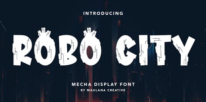 Robo City mecha display font. Heavy stroke, fun character with a bit of ligatures. To give you an extra creative work. Robo City mecha display font support multilingual more than 100+ language. This font is good for logo design, Social media, Movie Titles, Books Titles, a short text even a long text letter and good for your secondary text font with script or serif. Make a stunning work with Robo City mecha display font. Cheers, Maulana Creative
 - Jolie by Scholtz Fonts,
$22.00 Jolie personifies romance. With its dramatic swashes, generously curved lines, and full, richly fashioned upper case characters, it evokes floral perfumes, roses, violin music and romantic evenings. The richly complex uppercase characters provide a backdrop and a contrast for the simple elegant and readable lowercase characters. The font is perfect for wedding stationery, clothing branding, packaging, music posters and all other romantic possibilities Jolie introduces a simple method for applying the elegantly beautiful end-of-word or end-of-sentence swashes. Simply type in a three-character code and [hey presto] the swash suddenly appears. Clear and readable, Jolie has all the features usually included in a fully professional font. Language support includes all European character sets, Greek symbols and all punctuation. Jolie makes use of OpenType features to avoid the mechanical look caused by two identical characters that are placed side by side.
 - Palatino Nova Paneuropean by Linotype,
$67.99Palatino® Nova is Prof. Hermann Zapf's redesign of his own masterpiece, Palatino. The original Palatino was cut in metal by August Rosenberger at D. Stempel AG typefoundry in Frankfurt, and released in 1950. Palatino was later adapted for mechanical composition on the Linotype machine, and became one of the most-used typefaces of the 20th Century. Palatino was designed for legibility, and has open counters and carefully weighted strokes. The type was named after Giambattista Palatino, a master of calligraphy from the time of Leonardo da Vinci. Palatino is a typeface based on classical Italian Renaissance forms. A modern classic in its own right, Palatino is popular among professional graphic designers and amateurs alike, working well for both text and display typography. Hermann Zapf and Akira Kobayashi redeveloped Palatino for the 21st Century, creating Palatino Nova. Released by Linotype in 2005, the Palatino Nova family is part of Linotype's Platinum Collection. Palatino Nova includes several weights (Light, Regular, Medium, and Bold), each with companion italics. Four styles (Regular, Italic, Bold, and Bold Italic) have Greek and Cyrillic glyphs built into their character sets. The Palatino Nova family also includes revised versions of Aldus (now called Aldus Nova), as well as two titling weights. The first titling weight, Palatino Nova Titling, is based on Hermann Zapf's metal typeface Michelangelo, including Greek glyphs from Phidias Greek. The heavier titling weight, Palatino Nova Imperial, is based on Sistina. The fonts in the Palatino Nova family support all 48 Western, Central, and Eastern European languages. Additional features: ligatures and historical ligatures, Small Caps, ornaments, and a range of numerals (proportional & tabular width lining and Old style Figures, fractions, inferiors, and superiors)." - Palatino Nova by Linotype,
$50.99 Palatino® Nova is Prof. Hermann Zapf's redesign of his own masterpiece, Palatino. The original Palatino was cut in metal by August Rosenberger at D. Stempel AG typefoundry in Frankfurt, and released in 1950. Palatino was later adapted for mechanical composition on the Linotype machine, and became one of the most-used typefaces of the 20th Century. Palatino was designed for legibility, and has open counters and carefully weighted strokes. The type was named after Giambattista Palatino, a master of calligraphy from the time of Leonardo da Vinci. Palatino is a typeface based on classical Italian Renaissance forms. A modern classic in its own right, Palatino is popular among professional graphic designers and amateurs alike, working well for both text and display typography. Hermann Zapf and Akira Kobayashi redeveloped Palatino for the 21st Century, creating Palatino Nova. Released by Linotype in 2005, the Palatino Nova family is part of Linotype's Platinum Collection. Palatino Nova includes several weights (Light, Regular, Medium, and Bold), each with companion italics. Four styles (Regular, Italic, Bold, and Bold Italic) have Greek and Cyrillic glyphs built into their character sets. The Palatino Nova family also includes revised versions of Aldus (now called Aldus Nova), as well as two titling weights. The first titling weight, Palatino Nova Titling, is based on Hermann Zapf's metal typeface Michelangelo, including Greek glyphs from Phidias Greek. The heavier titling weight, Palatino Nova Imperial, is based on Sistina. The fonts in the Palatino Nova family support all 48 Western, Central, and Eastern European languages. Additional features: ligatures and historical ligatures, Small Caps, ornaments, and a range of numerals (proportional & tabular width lining and Old style Figures, fractions, inferiors, and superiors)."
 - Garcog by Patria Ari,
$24.00 Garcog : The Ultimate Typeface for Mechanical Aesthetics. Inspired by the intricate design of gears and cogs, Garcog features upper shapes cut like precision engineering. This unique font adds a touch of industrial sophistication to your projects, making it the perfect choice for conveying precision, innovation, and mechanical excellence. Ideal for engineering, manufacturing, and tech-related designs, Garcog is the font that propels your message into a new dimension of creativity.
 - Carpenteria by studiocharlie,
$24.00 In Carpenteria each letter is hand-designed based on a geometrical old mechanical style. You can use it for posters or impact graphics.
 - Heft by Device,
$39.00 Heft is a heavy slab serif that packs a powerful punch. Available in square-cornered and rounded versions, each with italics, plus two distressed variants — an inky version that evokes the urgency of cheap hot-metal printing, and a worn, distressed version that suggests vintage woodtype or photocopied text.
 - Landry Gothic by E-phemera,
$12.00Landry Gothic is inspired by a wood type alphabet by an unknown designer. It was digitized in order to make prop signage for movies and television. Its imperfect lines and rounded corners are meant to capture the feeling of real wood or metal type that's worn from use. - Rotham Industria by Greater Albion Typefounders,
$18.00 Rotham Industrial. Stylised lettering for industrial flavoured projects. Imagine, if you will letters shaped from metal tube, or perhaps from a solid rod, or perhaps made from brass handrails? You get the idea. A stylised and fun typeface for those occasions where you want to suggest an engineering influence.
 - P22 Allyson by IHOF,
$39.95 P22 Allyson is based on an old metal font by Barnhart Bros. & Spindler named Hazel Script. This font is perfect for elegant invitations and certificates and has been expanded to meet the needs of today's computer user to include a full character set. Allyson Pro contains OpenType features.
 - Affiche by RMU,
$35.00 Based on the fin-de-siècle Helios Reklameschrift of the Klinkhardt foundry, Leipzig, Affiche preserves the beautiful art nouveau character of its hot-metal forerunner and was carefully extended to make it multilingual. For more historical authenticity, you can use the long s by typing [alt] and [b].