3,079 search results
(0.023 seconds)
- Skriva by Letradora,
$16.00 Skriva is the handwriting we'd all like to have: neat and legible, still natural looking. It as a super complete character set with support for over 200 latin languages. It includes advanced OpenType features, such as random alternate characters, to make it look even more natural. Skriva has 4 variants: light, regular, bold & inky. Use Skriva wherever you need a personal touch on your texts.
 - Hungry Chalk by Storictype,
$9.00 HungryChalk Still with a chalk concepts, This is good for projects like a menuboards it's specially designed cafe or restaurant ,background photoboots wedding, t-shirt, posters,etc and a touch of vector pack theme dessert, that allows you to mix and match pairs of ornaments to fit your design . Above the description of this font, I hope you're satisfied with what I have created. Thank You
 - Goudy Type by Matteson Typographics,
$19.95 Goudy Type was designed by Frederic Goudy for ATF in 1916. He endeavored to create a lively design with some brush-lettering qualities. In his words, he believed he was still attempting to ‘find himself’ as a designer. Thirty years later he was shown the design and could hardly recollect its creation. Steve Matteson has digitized Goudy Type to preserve its place in typographic history.
 - Pragmata by FSD,
$59.00 2001 description: No monospaced typeface I used for coding development or just plain e-mail correspondance satisfied me in aliased mode. All common monospaced fonts have hinting imperfections from 9 to 12 points and above. All but Pragmata. 2021 description: Pragmata is still a good font for graphic design. Take a look at Pragmata Pro if you looking for a perfect and complete antialiasing coding font
 - OKASA by Twinletter,
$15.00 Okasa, our newest typeface, is now available. We present to you a quirky and contemporary typeface, which you can use to produce an optimal visual display in each of your projects and to impress all of your audience with the unique look of your project. Because everyone does not necessarily understand Japanese letters, we supply fonts with letters that can be utilized for your project. We produced this display font with a Japanese theme or an Asian font, which we designed to fulfill the needs of your Japanese-themed project. Of sure, your initiative will be understood by people all around the world. Logotypes, food banners, branding, brochure, posters, movie titles, book titles, quotes, and more may all benefit from this font. Of course, using this font in your various design projects will make them excellent and outstanding; many viewers are drawn to the striking and unusual graphic display. Start utilizing this typeface in your projects to make them stand out. Caps only fonts
 - Rushen by Arterfak Project,
$18.00 Presenting to you Rushen. A vintage display sans serif with 5 styles. Designed with a bold weight that is awesome to be used for many purposes such as headline, branding, logo, apparel, logotype, cards, labels, poster, packaging, and many more. These fonts are all-caps fonts complete with multilingual support. Be Bold with Rushen! What you'll get : Regular: The basic one, with sharp geometrical shapes, formal and elegant look. Good to apply in Books, newspapers, letterhead. Curvy: Inky inspired from the old-school advertising, can be combined with your favorite fonts. Perfect for labels, posters, and short editorial. Stencil: The most explored with some adjustments that look good for a manly theme, urban style, military themes, brave, and youth. Shadow: The complement from all, but still can be stand-alone for western design, old school, and food themes. Distressed: The vintage-inspired with the neat ink effect and minimal anchor points to keep font still ergonomic. Thank you for your support!
 - Montez Pro by Stiggy & Sands,
$39.00 Straight from the beauty product ads of the 1960's comes Montez Pro, full of sweeping strokes which lend to a feeling of joy and elegance throughout its letterforms. It is the ideal font for display uses that require a little drama, "joie de vivre" or Joy of Life. The stylings of the standard typeset Montez Pro lend itself to holiday and celebration designs most effectively. And while it is usually a typographic no-no to set a script in all capitals, Montez Pro contains a small caps feature that has specially redesigned capitals that allow an appealing all capitals setting. Montez Pro is loaded with features to give you plenty of customisation options: - Stylistic Alternates offer variations of the L, t, and w-smallcap characters - Small Caps offer tailored back and normalized short capitals - 44 Ligatures to make typesetting more interesting - A Full set of Inferiors and Superiors for Limitless Fractions - Proportional and Oldstyle numeral sets
 - 1546 Poliphile by GLC,
$38.00 This family was inspired from the French edition of Hypnerotomachie de Poliphile ("The Strife of Love in a Dream") attributed to Francesco Colonna, 1467 printed in 1546 in Paris by Jacques Kerver. He was using a Garamond set (look at our 1592 GLC Garamond), including two styles: Normal and Italic (Normal carved by Claude Garamond, Italic we don't know; it was an Italic pattern very often in use in Paris at that time). We have modified the slant angle of the Capitals used with Italics because the Normal capitals were used in both styles in the original. The present font includes all of the specific latin abbreviations and ligatures used in this edition (with a few differences between the two styles). Added are the accented characters and a few others not in use in this early period of printing. Decorated letters such as 1512 Initials, 1550 Arabesques, 1565 Venetian, or 1584 Rinceau can be used with this family without anachronism.
 - 1529 Champ Fleury Initials by GLC,
$42.00 In 1529, Geofroy Tory, French scholar, engraver, printer, publisher and poet, was publishing the well known so called Champ Fleury, printed by Gilles de Gourmond, in Paris. It is a fully illustrated handbook where the author explains how to draw Roman characters. The font used for the text - a Humane/Jenson type - was not a very beautiful one, but rough and ready, and the book is well known for its capital letters designs. We are offering here the two complete historical type sets and more -- we have entirely redrawn the lacked letters: J, U and W, Eth, Lslash, Thorn and Oslash in the two initial forms. The text font, 1529 Champ Fleury Regular is now containing all characters for West European (including Celtic), Baltic, East and Central European and Turkish language, and the Initial set 1529 Champ Fleury Init is containing two complete alphabets, with a very great effort to be as close as possible to the original pictures.
 - Alta California by steve mehallo,
$18.80 Alta California became designer steve mehallo's "vector-based artist's response" to the early Apple Macintosh bitmapped font San Francisco. Alta California was developed using "sampled" wood type and letters from numerous historical sources. The name comes from the Alta California newspaper, the first daily published in California, one of a dubious Barbary Coast nature, a sheet that shaped the bias of San Franciscans and attracted its own grade of reporters, including a printing specialist who went under the nom de plume Mark Twain. Alta California's edges were meticulously redrafted by hand, with letterpress-inspired fallout and 19th century pointing hands. The final collection of rough hewn letters jump, dive, fall, zag and zig. Alta California looks great on greeting cards, food packaging, as retail signage for boutiques, vintage stores or at D.I.Y. sales, on band posters or club cards, in and around historical quarters, or for use on any ransom note that needs to evoke a wild west look and feel.
 - Aleesya Rose by Brenners Template,
$19.00 Aleesya Rose is a Stylish Font Family to bring a touch of elegance to any design. The clear contrast blends into all styles - even thin styles - and the strong individuality by weight delights the designer's imagination. 14 styles including 7 weights and italics are essential for designers to complete more detailed and sophisticated typography. This style has 426 glyphs each, check the glyph window in your app. The upright standing of the vertical stems stably supports the center of gravity of the entire font. And the thin strokes used as finishing touches will convey an elegant personality to the layout. The ligatures are designed to appeal to the reader with their beautiful tenderness, and they are: Ba, Be, Ha, He, LO, Le, Lo, Re, Ro, ck, de, do, ee, ff, fi, oo, rr, th. In particular, we recommend that you choose this font family to achieve the following purposes: Editorial design, Personal branding, Branding business, logo design, portfolio, and any special design.
 - 1589 Humane Bordeaux by GLC,
$38.00 This family was created inspired from the Garamond patern set of fonts used by S. Millanges "imprimeur ordinaire du Roy", in Bordeaux, circa 1580-1590. Especially for reprint L'instruction des curés (Instructions to parish priests), from Jean Gerson. The set contains two styles, Normal and Italic, the second one with a lot of caps and ligatures variants. The initials, except a few decorated letters (six in total) where only large caps, covering no more than three lines. Added are a few fleurons. It can be used as variously as web-site titles, posters and flyers design, publishing texts looking like ancient ones, or greeting cards, all various sorts of presentations, as a very elegant and legible font... This font supports strong enlargements as easily as small size (legible from 6 points when printed) remaining very smart and fine. Its original cap height is about five millimeters. Decorated letters like 1512 Initials, 1550 Arabesques, 1565 Venetian, can be used with this family without anachronism.
 - AW Conqueror Std Slab by Typofonderie,
$59.00 Slab serif with a 70’s aesthetic A version of AW Conqueror Sans, AW Conqueror Slab draws inspiration from geometrical slab serifs of the 1930s, of which Rockwell is a perfect example. Lubalin Graph, a reworking of the genre, came out in the wake of the Avant Garde wave of the early 70s. In recent years, ‘slabs’ have made a comeback in the graphic design world. AW Conqueror Slab advances the cause quite happily. AW Conqueror superfamily AW Conqueror Didot is part of a larger family, who include 4 others subfamilies with great potential: They’re but based on same structure, with some connection between them (width for example), to offer a great & easy titling toolbox to any designers, from skillful to beginner. Each of the members try their best to be different from the others because of their features. They should work harmoniously in contrast. Club des directeurs artistiques Prix 2010 European Design Awards 2011
 - Macondo Pro by JVB Fonts,
$30.00 The first purpose of this typeface was to provide an original and systematized style of calligraphy adapted into a modern digital font. The forms are inspired by some illustrations created for a tarot card game, itself inspired by the work of Colombian literature Nobel prize winning author, Gabriel García Márquez, "Cien Años de Soledad". Early versions of this font were made in 1997, but recently in 2009 it was substantially improved. Macondo includes several cap swashes and other stylish alternates. Macondo, as original typographic proposal was selected at Tipos Latinos 2012 Biennial, now the complete set of extended range for this typeface is prepared and improved to be commercialized. The new Macondo Pro can be available with extended capabilities of OpenType, as old style numbers, Swash Caps, slashed zero, some end-position lowercase, fractions, super and sub numbers, some stylish lowercase and discretional and/or contextual ligatures. The font also supports cyrillic, Greek and some East Europe languages.
 - Dutch Mediaeval Book ST by Canada Type,
$39.95 Dutch Mediaeval Book ST is a special version of the popular Dutch Mediaeval Book text fonts, engineered specifically for science writing. It is equipped with SciType, a combination of additional characters and OpenType programming included in the fonts to help in typesetting science text. For more information about SciType, please consult the SciType FAQ available in the Gallery section of this page. The Dutch Mediæval design is the historically renowned one made in 1912 by S. H. de Roos. It stands out as one of the most classic Dutch text faces. This Book version comes in two weights and an italic, optimized for body copy use between 8 and 12 pt. Aside from the SciType additions, all the fonts contain OpenType features for ligatures, ordinals, automatic fractions, eight kinds of figures, and a few ornaments. For details about the functionality of Dutch Mediaeval Book ST, please consult its Access Chart PDF available in the Gallery section of this page.
 - Hyper Fatos by Bisou,
$15.00 Crafted with passion in La Chaux-de-Fonds, Switzerland, the Hyper Fatos typography was born in a moment of pure delight as the creator (Bisou) indulged in a delicious pizza. Inspired by the excitement and satisfaction that come from the most indulgent culinary pleasures, he designed this unique typography to capture the essence of gluttony and the irresistibility of the most appetizing dishes. Hyper Fatos was meticulously crafted to evoke an undeniable sense of indulgence. Its boldness and rounded forms bring to mind juicy hamburgers, crispy fries, and donuts overflowing with icing. It's the perfect typography for fast-food restaurant signs, tantalizing menus, or even advertising campaigns for giant burgers and decadent milkshakes. Picture Hyper Fatos in bright letters above a hot dog stand, and you'll see lovers of greasy food rushing to satisfy their most voracious cravings. This typography is the ultimate choice to whet your customers' appetites and encourage them to indulge in culinary delight.
 - Ceciliany by Brenners Template,
$19.00 Ceciliany is a classy font family that adds calligraphic touches to the basic structure of the display serif. Italic styles share a language set and OpenType Features compared to static styles, but have a completely different metrics In addition, an elaborate and detailed kerning system is also operated separately. 9 weights and 18 unique styles offer designers the amazing creativity of the serif font family. It offers a variety of options for editorial design as well as typography work for various channels. Features 9weights, 18styles Optimized Kernings Stylistic Set Fractions Oldstyle Figures Discretionary Ligatures : AM, AR, BA, BR, CA, CH, CR, DE, EA, El, FR, GA, GH, HR, IL, IM, JA, KA, KR, Ki, LA, LE, LO, MA, Ma, Me, NA, NE, NT, Nu, PS, RA, RE, RO, Ro, SA, ST, TH, UB, Ze, Zo, ft, li. Standard Ligatures : ff, fi, fl. * In particular, ligatures displayed in preview images can be easily applied to Adobe apps. Check out the ligature features of the software you are using.
 - Dutch Mediaeval Pro ST by Canada Type,
$49.95 Dutch Mediaeval Pro ST is a special version of the popular Dutch Mediaeval Pro family, engineered specifically for science writing. It is equipped with SciType, a combination of additional characters and OpenType programming included in the fonts to help in typesetting science text. For more information about SciType, please consult the SciType FAQ available in the Gallery section of this page. The Dutch Mediaeval design is the historically renown one made in 1912 by S. H. de Roos. It stands out as one of the most classic Dutch text faces. This digital version comes in two weights and their italic counterparts. Aside from the SciType additions, all the fonts contain OpenType features for small caps and caps-to-small-caps, ligatures, ordinals, automatic fractions, seven kinds of figures, and a few ornaments. For details about the functionality of Dutch Mediaeval Pro ST, please consult its Access Chart PDF available in the Gallery section of this page.
 - Hyper Turfu by Bisou,
$10.00 Made in La Chaux-de-Fonds (Switzerland), HyperTurfu was born during the shooting of “The Return of Hyperturfu Xpress 2”. A GoPro on a lego electric train, meters and meters of rails, an empty industrial space, loads of puppets, paper, cardboard, pizza boxes, lights, hot glue and a bunch of friends preparing a one shot scene for a month. The title of the movie was made out of lego pieces, painted with golden spray and hanged over the rails. It was the first inspiration for this awsome superbold font. HyperTurfu is thought from ground up to give a strong impact. It’s gothic retro science fiction 80’s style makes it best suitable for metal music albums or posters. As the “Banco” font it works perfectly with short texts for advertisement, bar, cofee shops concert places or even fancy hairdresser. Just hang it over a pet shop and see what cool animals will come in.
 - Espinosa Nova by Estudio CH,
$- Espinosa Nova is a revival based on the types used by Antonio de Espinosa, the most important Mexican printer of the sixteenth century and very probably the first punchcutter anywhere in the American continent (1551). In 2010, its main fonts were awarded two certificates of excellence: one by TDC2 (Type Directors Club Typeface Design Competition), one by Tipos Latinos (Biennial of Latin American Typography). According to Robert Bringhurst, it is “an unusually intelligent family of type, reaching back to one of the most exciting moments in typographic history and reaching forward to the typographic future”. All of the fonts intended for setting text include small caps, five sets of figures (oldstyle and lining, both proportional and tabular, plus tabular small caps), many f and long s ligatures, and capital sharp S (U+1E9E). In addition, the Capitular fonts allow to create interesting effects by overlapping layers. This family feels very comfortable in books, but it can be used everywhere a touch of classic & elegance is required.
 - 1557 Italique by GLC,
$38.00 Italic type was invented by Aldus Manutius in 1499 or 1501, first, before to be a style name, it was a plain font familly name. This Italique style font was inspired from these who was used by Jean de Tournes in Lyon (France) to print La mÈtamorphose d'Ovide figurÈe, a splendid book with numerous gothic style wood carved pictures. The original font contains almost all modern usual characters except accented ones, no longer in use on that time. They have been added, with some others, with respect for the original design. . A render sheet, enclosed in file, help to identify various others unusual letters on keyboard. It is used as successfuly as web-site titles, posters and fliers design, editing ancien texts or greeting cards, invitations, gastronomic menus... and much more, as a very decorative and elegant font... It supports easily as enlargement as small size, remaining clear and easy to read from 8 or 9 points to 72 and more, particularly on prints.
 - Holiday by alphArt,
$13.00 Introducing our UPDATE "Holiday - Script Handwritten Font" Two years ago we created a script handwritten font that we named Holiday, we didn't expect, hundreds of designers have use the Holiday font, this is really cool font. And today, we've been working hard to make this Holiday font even better, it's the best script handwritten font we've ever made, we've named it Holiday2. Holiday2 - Script Handwritten Font is a handwritten script font with a simple and classy style, this font is great for your next creative projects such as branding, watermark on photography, signature or signature logo design, quotes, album cover, business card, and many other design project. From business cards to photo watermarks, Holiday2 is here to elevate your work to the highest level. However, we still included our old Holiday font, we created Holiday2 to be easier to read and of course with a better design and clean. Holiday comes with uppercase letters, lowercase letters, lowercase alternative letters, numbers, punctuation, ligature and multi lingual support To use alternative end text is just block end letters and select alternative letters on glyphs option. it may be used in almost any program by using your Operating System’s utilities (CharacterMap for Windows and Font Book for Mac.), as well as Illustrator, Photoshop CC 2017 and several other applications. we hope you enjoy this font. If you have any questions please don't hesitate to drop me a message :) Thank you, Best regards alphArt
 - Beef'd - 100% free

- Wedding by HiH,
$10.00 Wedding Regular was originally designed by Morris Fuller Benton for ATF and released as Wedding Text in 1901. It is a lighter version of his ENGRAVER'S OLD ENGLISH of the same period. Wedding Regular is based on the Textura style of blackletter that continued in popularity in England into the 16th century, long after the Dutch, French and Italians had moved to a Roman model that expressed the Renaissance humanism of the period. Wedding Headline is a still lighter version of the regular text face, suitable for setting larger sizes while still preserving the delicacy of the decorative hairlines. Textura continues in use in England and the United States for newspaper mastheads, gift shop signs, wedding invitations and programs and other applications where a feeling of tradition is desired. I recently saw an 1980ish photo of a “Tubby Isaac” sign in London using textura. I believe Benton’s design captures that feeling without being heavy-handed and still remaining quite readable for eyes accustomed to Roman lettering. Both Wedding Regular and Wedding Headline convey a comfortable familiarity. These two fonts may be purchased together at an attractive discount or they may be purchased separately. The full character set may be found in the pdf file that you can download from the gallery section. The two monks (alt-0172 and alt-0177) are from a set of sixteenth century decorative initial letters by Gering and Renbolt. Please note that there are two different eszetts, the blackletter style at alt-0126 and the antiqua style at the alt-0223.
 - OkayPaint by Okaycat,
$24.50The design process of OkayPaint began as hand-painted letters on paper. Thus, a variety of distressed paint effects can still be seen in the details, from splatters to dry-brush. This makes for a textured, artistic look. Use OkayPaint to create eye catching designs - perfect for grunge, surf, any casual cool setting. OkayPaint is extended, containing the West European diacritics & ligatures, making it also suitable for multilingual environments & publications. - Envelope by HyperCGI,
$59.00 Whether or not you still use snail mail, there's something about folding a piece of card or paper and putting it inside a pristine white envelope. A sense of nostalgia or the tactile pleasure of mailing a card to someone you care for. The Font "Envelope" reminds us of the often overlooked innocent and fine wrapping. Envelope is an excellent display uppercase-only font for use on larger font display purposes.
 - Magical Source by Java Pep,
$19.00 Introducing Magical Source is a stylish serif font, every character uppercase and lowercase have alternates font. This font is equipped with more than 200 alternative fonts so you can mix and match every alternate based on your taste. This font still outstanding look, although you don't switch on the alternate. Magical Source font is a versatile font, the font can covering to headlines, titles, logotype, branding, pull quotes & monograms, and etc.
 - Ultra Pro by Stiggy & Sands,
$29.00 Our Ultra Pro is an ultra bold slab typeface with nods to wood type styles like Clarendon and Egyptian. Its powerful and dramatic letterforms are both serious in form but friendly in appearance yet it is still easily legible. Perfect for power headlines and titling for impact, the SmallCaps and extensive figure sets only work to further expand the usefulness of the typeface across a wider gamut of design options.
 - Donatella by Arendxstudio,
$18.00 Donatella - Handwritten Fonts are elegant handwritten fonts, with texture, to be as authentic as possible while still being able to read clearly on your project. Donatella is a truly versatile font - combining sophisticated, casual and even fun sides depending on the style you use. A complete set of upper and lower case letters, and a second set of lowercase letters, Donatella - Handwritten Font also has 37 Ligatures for question just email.
 - Kinemon by Mightyfire,
$10.00 Kinemon is a font that has modern minimalist looks but still has an uniqueness on it. Look at the letters, each letter has their own characteristic. Firm, clean and modern. Kinemon perfectly use for a magazine, book, headline or even a poster. We have three styles that can cover your needs. We hope and be honored if Kinemon can be the part of your special moment. Thank you! :)
 - Luxus Brut Sparkling by phospho,
$25.00 Luxus Brut Sparkling developed from sketches for a bolder version of Luxus Brut that I made for a poster design. Interventions like slightly tightening the (still generous) spacing and amplifying the contrast between thick and thin strokes ended in a complete rework of the original font. All the shapes have been redrawn in respect of their distinctive origin in mid 1900’s signage lettering. It has now even more timeless elegance!
 - Rummy Tall by Bunny Dojo,
$23.00 Rummy, the stout, scrappy font inspired by sports branding and 1940s film, has grown up and is ready to take on new responsibilities. The result: Rummy Tall. Still powerful, precise, and packed with personality, Rummy Tall's added height brings with it even more versatile charm. Track Rummy Tall tightly for a sturdy foundation, or give Rummy Tall some breathing room for an unexpected air of nobility. Reach new heights!
 - Blastand by ZetDesign,
$15.00 blastand is a display font created by combining sharp edges and curves for a unique shape. This font also adopts a handwritten shape at the end of the letter to present a bold writing yet still creates a classy and friendly impression. This font is also created in italic style and has open types such as ligature, stylistic alternate, etc. to provide options for designers to create awesome work.
 - Vamp by Burghal Design,
$29.00A quintet of remorseless homewreckers, each member of the Vamp family contains hypnotic dingbats to lure you into their web. The Vamp family consists of the bewitching Vamp, the bigger, brasher Vamp Bold, the dangerous, psychedelic Psycho Vamp, as well as the lean (but still mean!) Vamp Slim and Vamp Slim Oblique. The Vamp family's seductive art deco form and fiendishly geometric wiles will break your heart and steal your soul. - Benz Grotesk by Sign Studio,
$24.00 Benz Grotesk can be used to style text that requires attention in a sentence but still has subtlety. We try to keep every corner well proportioned. With more than 400 characters, we hope that Benz Grotesk can support a fairly complete language. Has a fairly high detail with inktrap on some corners of the body. This font will help you when designing posters, headlines, product branding, logotypes, minimalist typography and more.
 - Botany by Adam Ladd,
$25.00 Botany is a distinct, hand-drawn display font with flourish designed to be unique and beautiful, yet functional — carefully drawn for quality but still rough enough to display the handmade, textured appearance. Capitals evoke a natural elegance and grab attention. Botany is great for display, branding, logos, packaging, titles, and more. Botany features: display (flourish) and text styles; regular and italic styles; flourish stylistic alternates; closed counter stylistic alternates.
 - Bornholm Sandvig by Trine Rask,
$25.00 Bornholm Sandvig is named after the village, "Sandvig", on the only rocky island in Denmark, Bornholm. It is the second face in a series of rough stone cut typefaces, that shares proportions, but differs in any other aspect like different pieces of rock. It is a powerful face, but still very friendly. Good for very big sizes, but can be used for small texts, movie titles, cartoons, etc.
 - Kiez by Blackmoon Foundry,
$24.00 The “Kiez“ is an old school style font designed by Elena Albertoni in 2016. Inspired by shop and bar signage of the sixties and seventies, which can still be found today in the so called “Kiez“ in Hamburg St. Pauli or in one or another “Kiez“ in Berlin, which means neighborhood here. It also has a cinematic touch, again: think of the sixties and seventies or your favorite b-movie.
 - North Avellion by Letterhend,
$16.00 North Avellion has a classic style yet still looks great for modern design. It works perfectly for headlines, logotypes, apparel, invitations, branding, packaging, advertising, and more. Features : uppercase & lowercase numbers and punctuation multilingual ligatures alternates swashes PUA encoded We hope you enjoy the font, please feel free to comment if you have any thoughts or feedback. Or simply send me a PM or email me at letterhend@gmail.com
 - Caramel Chestnut by Letterhend,
$19.00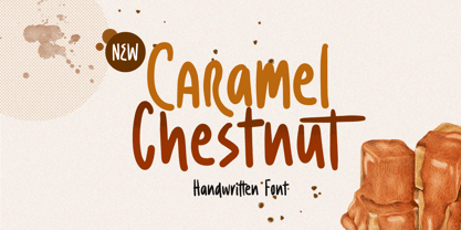 Introducing, Charamel chestnut! this font is a carefully crafted display font but still have an organic touch. this font is perfect for branding, packaging, headline, title, etc. Features : uppercase & lowercase numbers and punctuation multilingual alternates and ligatures PUA encoded We highly recommend using a program that supports OpenType features and Glyphs panels like many of Adobe apps and Corel Draw, so you can see and access all Glyph variations.
