1,237 search results
(0.007 seconds)
- Cul De Sac by Hanoded,
$25.00 Cul De Sac is a beautiful cartoon-like font. It was hand drawn, using an old fashioned pen and India ink. Use it for your ads, posters and websites.
 - Relation De Luxe by Prioritype,
$19.00 Relation De Luxe - Font Duo This paired font looks modern and classic. Charming with round and blurred effects. It is suitable for you to apply to logo designs, branding, magazine covers, social media posts, quotes, wedding invitation, packaging labels, business card and much more to be applied. Features: Uppercase, Lowercase, Numeral, Punctuation, Multilingual, Alternates, Ligatures, & PUA Encoded. Multilingual contained: Afrikaans, Albanian, Asu, Basque, Bemba, Bena, Breton, Catalan, Chiga, Cornish, Danish, Dutch, English, Estonian, Filipino, Finnish, French, Friulian, Galician, German, Gusii, Indonesian, Irish, Italian, Kabuverdianu, Kalenjin, Kinyarwanda, Luo, Luxembourgish, Luyia, Machame, Makhuwa-Meetto, Makonde, Malagasy, Manx, Morisyen, North Ndebele, Norwegian Bokmål, Norwegian Nynorsk, Nyankole, Oromo, Portuguese, Quechua, Romansh, Rombo, Rundi, Rwa, Samburu, Sango, Sangu, Scottish Gaelic, Sena, Shambala, Shona, Soga, Somali, Spanish, Swahili, Swedish, Swiss German, Taita, Teso, Uzbek (Latin), Volapük, Vunjo, Zulu. Thanks :)
 - Mon de Tresor by Reyrey Blue Std,
$14.00 Mon De Tresor is an elegant and thin lettered sans serif font. Perfect for editorial projects, Logo design, Clothing Branding, product packaging, magazine headers, or simply as a stylish text overlay to any background image. It will add a luxury spark to any design project that you wish to create! Includes: Uppercase and Lowercase Ligatures Stylistic Alternate
 - Dos De Tres by Volcano Type,
$19.00 This is an idea to reproduce the masks of the Mexican wrestlers of the late 60s and 70s. The typography is based in keeping the shape of the face in the wrestler's masks.
 - De Hyang Script by Wacaksara co,
$16.00 De Hyang Script is a hand lettering script font. Perfect for adding a unique impression that looks natural like manual handwriting when opentype is active. This font is great for your next creative project such as Logotype, printed quotes, invitations, cards, product packaging, headers, letterhead, poster, apparel design, label, book cover and etc ~ Wacaksara Co
 - Oro De Maya by Fat Hamster,
$25.00 Oro de Maya is a hand drawn ancient sans serif / display typeface. Oro de Maya font was inspired by the Maya civilization culture, their marvelous art, architecture and glyphs. This fantastic ancient font has a bold character.
 - Durazno de Chile by Ocha Puyaber,
$10.00 Durazno de Chile are cursive fonts based on Chilean school script. It can be written in Aymara, Mapuche and Rapa Nui from Chile. It can also be written in Dutch, Maltese, and other languages. This font family is cute. The style is wide and rounded. It has wide and open loops. The strokes are drawn with a round cap tool, with no contrast. It is cursive and connected. The form is upright because upright is the Chilean script standard. It is easy to read in Chile. Parts A have capitals with high starts. Parts B have capitals with low starts. Parts F are Final forms.
 - Gaufre de Bruxelles by TypeAddiction,
$10.80 TypeAddiction presents “Gaufre de Bruxelles”, a playful handmade uppercase font. Lowercase letters have filled letters (A, B, D, O etc) and the uppercase letters have unfilled letters. "Gaufre de Bruxelles" means a Brussels waffle in English. The Brussels waffle is a rectangular-shaped waffle and is a Belgian culinary speciality. The characters of the font were inspired by the waffle dough and more specifically the shape that the dough takes when it is poured into the waffle iron.
 - Gens De Baton by HiH,
$10.00 Gens De Baton is based on a charming lower case alphabet that appeared in the Almanach des Enfants pour 1886 (Paris 1886) under the heading “Amusing Grammar Lessons.” Gens De Baton means simply “Stick People.” The unknown designer turned the bare letter forms into drawings of people for the enjoyment of the children for whom the almanac was intended. The letter forms themselves were based on the French Romain du Roi (King’s Roman), except for the ‘g’ and the ‘j’ -- which were based on Baskerville. The letters ‘w’ and ‘y’ were not included, as they are seldom seen in French. We have left the letters somewhat rough, as they appeared in the Almanach des Enfants , resisting the temptation to clean up all the lines and render them with digital perfection. We have used our HiH Firmin Didot to supply an upper case and auxiliary characters, as Didot was originally a modified version of Romain du Roi. It is interesting to observe the contrast between the polished look of the Didot upper case and the rough, hand-drawn look of the lower case. Purchasers of this font have our permission to use it for the amusement of adults as well as children. We recommend setting Gens De Baton at 24 points or larger.
 - Clair De Lune by Hanoded,
$20.00 Clair De Lune is part of the famous Suite Bergamasque, written by Claude Debussy in 1890, and published in 1905. It means Moonlight in French, a kind of romantic name. The name is exactly what I had in mind for this übercute font. Clair De Lune can be used to design postcards and posters, liven up websites and give your designs an overall happy feel. Clair De Lune was handmade using a 0.5 pen, eco friendly Italian paper and a wooden kitchen table.
 - Charlietta de Angela by Almarkha Type,
$35.00 Introducing Charlietta de Angela - Brush Script Signature is a Authentic brush script that is written casually and quickly. Letters are made with brushes on paper. Then scanned and carefully drawn into vector format. That is why Charlietta de Angela has charming, authentic and relaxed characteristic more natural look to your text with a more natural look to your text. You can activate Ligature OpenType panel, Charlietta de Angela Perfect for designs, branding projects, Logo design, Quotes product packaging.
 - Duc de Berry by Linotype,
$29.99Duc de Berry is a part of the 1990 program Type before Gutenberg, which included the work of twelve contemporary font designers and represented styles from across the ages. Linotype offers a package including all these fonts on its web page, www.fonts.de. The design of Duc de Berry was influenced by those of typefaces created between the 13th and 16th centuries. The font was named after Duc de Berry, whose beautiful missals inspired typefaces of the 15th century. The capital letters are especially elegant and can be used either as initials or as contrast to the much more reserved lower case letters. - Pirates De Luxe by Intellecta Design,
$22.90 Dingbats based on authentical and historical pirate's flags and other devices in your universe.
 - Suco De Laranja by Hanoded,
$20.00 I like orange juice. Come on, who doesn't? Orange juice is the drink of heroes; it's the elixir of life; it's the gods' own ambrosia. Suco De Laranja means orange juice in Portuguese and I named this font thus, just because I love the stuff! Suco De Laranja is a very narrow, very gentle typeface with a rough edge. It comes in a variety of languages and guess what? I have added Cyrillic as well. Just to be complete. So there you have it: a font named after a juice. Take a sip and enjoy! На здоровье!
 - Noodle soup - Unknown license

- Boule Plus by Ingo,
$33.00 CAPITALIZED, geometric, bold and round. If the typographer sees a font like that, it's enough to make his toes curl. But sometimes it just has to be that way. Geometrically constructed fonts do not necessarily have to be pointed and angular; It also works consistently around. And if I say it consistently, then in this case, that's done consistently. The basis for the BOULE is the circle. The letters are drawn with constant line width, the “corners“ and endings all have the same radius, the lines are all the same thickness. The BOULE consists only of capitals. There is only one difference in the use of uppercase and lowercase letters: in the uppercase letters, the round letters are circular, while the lowercase letters are narrow. The character set of the Boule contains all letters and accents to support the Western, Northern, Central and Eastern European languages with Latin alphabet. The BOULE is not only very fat, it also runs very tight; that is, the glyphs are very close to each other. To avoid "holes" due to unfortunate letter combinations, the BOULE contains ligatures for FT, ST, TT and TZ. There are also other versions of the font: BOULE Brillant on the one hand. In this version, simple highlights simulate a light incidence from the top right. These light edges give the font a decorative effect that makes it easy to think of wet sausages or balloons in some shapes. And finally the BOULE Contour. As the name implies, it is the outer contour of the letters, combined with a shadow at the bottom left. The name BOULE (French for ball) says it already: this font is globated. Therefore, it is also very suitable for all three-dimensional alienation effects. With simple light and shadow you can achieve a very convincing 3D effect with little effort.
 - Bitter & Sour by Letterhend,
$17.00 Bitter & Sour is a Bouncing typeface with fun and playful looks. Comes with doodle dingbats! This type of font perfectly made to be applied especially in fun, playfull, storybook children or child theme which is need a standout font, and the other various formal forms such as invitations, labels, logos, magazines, books, greeting / wedding cards, packaging, fashion, make up, stationery, novels, labels or any type of advertising purpose. Features : Uppercase & Lowercase Doodle dingbats numbers and punctuation multilingual ligatures PUA encoded We highly recommend using a program that supports OpenType features and Glyphs panels like many of Adobe apps and Corel Draw, so you can see and access all Glyph variations.
 - Pumpkin Soup by Hanoded,
$20.00 Pumpkin Soup is delicious! And so is the font. 'Nuf said!
 - Cream Soup by Fikryal,
$15.00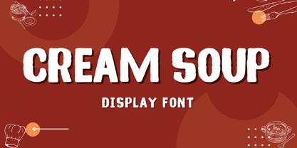 Cream Soup – Font is a display brush font. It’s perfect for logos, branding, title, social media posts, advertisements, product packaging, product designs, label, photography, watermark, special event, magazine, web designs, etc. If you have any questions please don’t hesitate to contact me. follow my Instagram: fkryall Thank you 🙂
 - Chicken Soup by BA Graphics,
$45.00An animated gothic with just a slight bounce, a nice fun font with many applications from headlines to text. - Alphabet Soup by Bitstream,
$29.99 - Sour Crunch by DM Studio,
$15.00 Introducing Sour Crunch! It's a 'crunchy' comical Display Font, inspired by pop art style comic fonts. It's a good choice for both personal and commercial project purpose, for creating logos, packaging, posters, headers, wall arts, cafe banners, t-shirt designs, advertisements, kids stuff, social media posts and much more! Sour Crunch feature : - All in CAPS with standard character set, including numeric and symbols. - Multilingual Supports ( Afrikaans, Albanian, Catalan, Danish, Dutch, English, Estonian, Finnish, French, German, Italian, Norwegian, Portugese, Spanish, Swedish, Zulu ) If you have any question please kindly send us a message. Hope you enjoy this font. Thanks and Stay Creative!
 - Instant Soup by PizzaDude.dk,
$20.00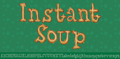
- Whiskey Sour by Fenotype,
$25.00 Whiskey Sour, a robust vintage serif that is as delightful as it is confident. With its soft and warm aesthetic, this typeface effortlessly captures the essence of approachable confidence, making it a tasteful choice for your typographic needs. Whiskey Sour is based on Tomato Ketchup, an earlier release of Fenotype. It has larger and taller uppercase and plenty of differences in lowercase characters, the most significant ones being letters a, h, m and n. Whiskey Sour is an excellent choice for modern graphic design, offering a distinctive touch of familiarity. Whether gracing logos, packaging, restaurant graphics, or any display application, this versatile typeface shines in headlines and shorter texts. Experiment with reduced tracking for a more compact visual impact, or, when using it in small sizes, add a touch of tracking to ensure legibility. Whiskey Sour is naturally equipped with lots of OpenType features: try spicing up your designs with Swash, Stylistic, or Titling Alternates or Discretionary Ligatures. In total Whiskey Sour has 134 Alternate glyphs that can be accessed from OpenType controls or Character Window. See the full selection of Alternates in the specimen posters.
 - Udon Soup by Hanoded,
$15.00 Udon Soupis my all time favourite Japanese food! I like it so much that I decided to name a font after it. Udon Soup font is a handmade script font, kind of messy, kind of weird, but very legible and useful. Comes with oodles of diacritics and double letter ligatures.
 - Hello Seoul by Ditatype,
$29.00 Hello Seoul is a striking display font that is inspired by the vibrant energy of Seoul. With Hello Seoul, you have a display font that says "hello" with a contemporary flair; it's a celebration of Korean style and modern design. The characters in Hello Seoul stand tall with a sleek, non-thick weight, offering a refined and contemporary look. The rectangular shapes and sharp corners lend a structured and modern vibe to each letter, reflecting the architectural and cultural landscape of Seoul. Hello Seoul is more than a font; it's an invitation to explore the dynamic spirit of the city. In addition, enjoy the features here. Features: Alternates Multilingual Supports PUA Encoded Numerals and Punctuations Hello Seoul fits in headlines, logos, posters, flyers, branding materials, greeting cards, print media, editorial layouts, and many more designs. Find out more ways to use this font by taking a look at the font preview. Thanks for purchasing our fonts. Hopefully, you have a great time using our font. Feel free to contact us anytime for further information or when you have trouble with the font. Thanks a lot and happy designing.
 - La Pejina ffp - Personal use only

- La Jolla ES - 100% free

- A La Nage - Unknown license

- A La Nage - Personal use only

- La Rosa Muerta - Unknown license

- La Belle Aurore - Personal use only

- Bacca la Hurra by Ilhamtaro,
$17.00 BACCA LA HURRA is a vintage font in the style of sign painting, characterized by bold strokes and squares. Consisting of Uppercase, Lowercase, Numerials and Punctuations, this font is perfect for vintage food packaging designs or other vintage branding. To enable the OpenType Stylistic alternates, you need a program that supports OpenType features such as Adobe Illustrator CS, Adobe Indesign & CorelDraw X6-X7. Cheers!
 - Shangri La NF by Nick's Fonts,
$10.00An unusual handlettered alphabet from the 1922 chapbook Modern Show Card Writing, by Joseph Bertram Jowitt, provided the pattern for this whimsical face. Its letterforms, as well as its name, conjure up visions of faraway places, and is sure to add a unique charm to your next project. This font contains the complete Latin language character set (Unicode 1252) plus support for Central European (Unicode 1250) languages as well. - 1781 La Fayette by GLC,
$42.00 This font was inspired from the numerous font-types looking like Hand-carved in the 1700's. The capitals are mainly inspired from the font carved by Fournier in year 1781, the year of the famous American and French decisive victory at Yorktown, and drawn by Benjamin Franklin himself, and the lower cases are inspired from the well known "bâtarde coulée" style, ornamented with final loops and enriched with alternates and ligatures. The font is available for English, Western Europe (including Celtic) Icelandic, Baltic, Eastern Europe and Turquish languages.
 - La Belle Zabriella by Julia Visht,
$19.00 “La Belle Zabriella” - new elegant luxury font family from Julia Visht. Classical font collection: luxury modern Serif (Bold, Regular, Light) with stylish decorative elements and classy authentic Script! La Belle Zabriella is a must-have for your collection of fonts. Main features: -Ligatures. Set of opentype ligatures allows to make your design truly unique. -Alternates. Set of lowercase alternates allows you to create even more authentic custom-feel text. - OpenType Style Set. Open Type Style Sets allow to create many perfect styles of your text. -Multyfunctionality. It's perfect for: elegant modern branding, web-design, logo creating, posters, headers, advertising, wedding stationery, book cover designs, classy packaging, album covers, handwritten quotes, greeting cards, wall art, websites, photos, and so much more. -Multylangual support. English, German, Italian, French, Danish, Norwegian, Swedish, Italian, Spanish, Filipino, Scottish Gaelic, Indonesian, Irish, Swiss German, Portuguese. Stylish font family for stylish projects! Happy creating! Designers: Julia Kruk Publisher: Julia Visht
 - La Paloma Script by Make Media Co,
$16.00 Add a touch of elegance to your work with La Paloma Script - A clean, modern, hand-written typeface with over 170 Ligatures and Decorative End Characters to add a dash of luxury to any project. And if you're looking for a lovely logo font, you just found it! La Paloma was designed with Branding in mind! But don't stop there, use this chic type in headlines & titles, signage, greeting cards, invitations & more!
 - La Coupole NF by Nick's Fonts,
$10.00Lettering on a 1927 menu by prominent poster artist Razzia provided the inspiration for this decidely Deco typeface. The restaurant itself was the setting for one of Georges Simenon’s many Inspector Maigret novels. Both versions of the font include 1252 Latin, 1250 CE (with localization for Romanian and Moldovan). - La Moda NF by Nick's Fonts,
$10.00An unusual blend of block and script letterforms, based on poster lettering for an Italian fashion house of the same name, designed by Wilman Schiroli in 1935, and notable for its very jolly lowercase c. Both versions of the font include 1252 Latin, 1250 CE (with localization for Romanian and Moldovan). - La Chore Typeface by Krismagraph,
$17.00 La Chore is a modern & elegant serif typeface with a high contrast version of the famous Didot look that has been synonymous with fashion for decades. This font has multiple ligatures with multilingual fonts included. This font is modern and nostalgic and is perfect for logos, masterheads, sharp displays, magazines, blog titles, wedding invitations, social media, prints and quotes. Accessible in the Adobe Illustrator, Adobe Photoshop, Adobe InDesign, even work on Microsoft Word. PUA Encoded Characters – Fully accessible without additional design software. Fonts include multilingual support Image used : All photographs/pictures/vector used in the preview are not included, they are intended for illustration purpose only. Feel free to follow, like and share. Thanks so much for checking out my shop! If you need a custom license or have questions, please email to: krismagraph@gmail.com


