10,000 search results
(0.045 seconds)
- Megatropolis by Just My Type,
$35.00 Introducing Megatropolis : intellectual, architectural, urban and urbane. What started as an idea where the counters would be letters (3 scribbled glyphs on a piece of scrap paper), has grown into a mighty font family of eight stackable fonts. First came Megatropolis itself, a Deco font within a Deco font; Double Deco, you might say. In Illustrator, you can deconstruct it to make solid letters, outline letters or just the inset letters on their own, and you can stack them how you wish. Or you can get the whole Megatropolis family with Black , Outline , Inset , Smog , Shade and Shade with Inset and keep them all separate stackable, editable fonts. In addition, there’s Megatropolis Benday (available in TT only), with its fabulous stackable comic dots. Megatropolis is a typographer’s playground.
 - Thinpaw by upirTYPO,
$4.00 Thinpaw is a serif handwritten font perfect for usage in a really big sizes (50 pt+). The stem width is about 0.5 mm (0.019") in 100 pt size. The font comes with central european character set and a set of various glyphs and icons (see preview images). Opentype features: - Standard ligatures - fi, fl, ff - Discretionary Ligatures - ft, fb, fh, fk, fj - Contextual Alternates - a, e, f, g - Stylistic set 01: A Stylistic set 01 changes every dot into the heart shape symbol. It turns every writing into a nice looking love letter! Thinpaw is perfect for wedding proposals, wedding invitations, happy birthday cards or anything personal. For usage on the computer screen, the stem width is about 1 pixel for 50 pt size, and 2 pixel for 100 pt size.
 - Nadishaq by Putracetol,
$24.00 Nadishaq - Arabic Font is a captivating typeface with a unique Arabic letter theme. Each character in this font is meticulously crafted using the basic Arabic letterforms, resulting in a font that authentically captures the essence of Arabic script. It retains the distinctive features of Arabic letters, such as dots and swashes, which adds an extra layer of authenticity to your designs. Perfect for logos, packaging, branding, books, titles, and posters designed with an Arabic theme, Nadishaq seamlessly integrates into designs focusing on the Arabic language and culture. It's a font that encapsulates the beauty and intricacies of Arabic script, making it a versatile choice for a wide range of projects. With its Arabic-inspired design, Nadishaq allows you to infuse an authentic Arabic touch into your creative works, making them truly stand out
 - Barchowsky Fluent Hand by Swansbury,
$24.00Swansbury, Inc. provides handwriting instruction to all ages, accompanied by two exemplar fonts, Barchowsky Fluent Hand.otf and Barchowsky Dot.otf. The basis for the design of the characters is the italic of the Renaissance. With the advantage of contextual alternates, Barchowsky Fluent Hand automatically joins lowercase letters so it can be used in any venue where a clean and elegant appearance of handwriting is desired. The fonts allow maximum instructional flexibility. Aside from their use in lesson plans, educators can customize pages for specific student interests, studies and needs. Included are all math symbols that one typically encounters in school curricula. Nan Jay Barchowsky, designer of this font, believes that children should hone their handwriting skills as they learn all subjects, reading, math, history and foreign languages. Both fonts support all Western European languages and Turkish. Barchowsky Dot is for young children or others who need remediation. The letterforms are identical to those in Barchowsky Fluent Hand. Used at a large point size open dots appear within the lines that form the characters indicating where one should start each stroke in a letter or number. Once formations are learned Barchowsky Fluent Hand can be used with the contextual alternates turned off until students are ready to write in the joined-up manner of a true cursive. Specifications: The technology for fonts that automatically join letters, or allow them to be unjoined is relatively new. At present, both fonts work on Windows XP with Service Pack 1 or later (or Vista), using AbiWord, a free word processor (go to abisource.com). They also work well with InDesign 2. Currently there is an unknown factor in later versions of InDesign for Windows that disallows joining. Macs completely support the fonts using InDesign 2 and later, PhotoshopCS and IllustratorCS. If you do not have these applications, there is an inexpensive word processor for Macs. - Novera by René Bieder,
$29.00 The Novera family is a sharp geometric sans in ten weights plus matching italics, available in two versions – Modern and Classic. It has a contemporary, approachable and multifunctional yet characteristic design, that comes with an extensive glyphs set of 1000+ glyphs per font, meeting all typographic demands. The Design Vertical terminals, circular shapes and angular apexes – Novera truely breathes geometry! But the concept goes beyond the application of rational geometry. The intension was to create a highly legible family suitable for every day usage inspired by the work of Paul Renner, Eric Gill or Jakob Erbar, combining the geometric with the human and the functional with the unconventional. Although Novera is inspired by the past, its appearance is unmistakingly modern. Modern vs Classic Novera is available in two versions - Modern and Classic - born from the same source file but with different characters set as default. This creates subtle but effective distinctions such as the double-storey a (Novera Modern) which is optimized for legibility in longer text paragraphs, as opposed to the single-storey a (Novera Classic) which allows a purely geometric appearance. Another distinguishing feature are the ascenders on Novera Mondern, which extend above the cap height for an elegant presence, compared to the ascenders on Novera Classic, ending at the cap height, for a compact and helvetica-flavored look. Novera Modern was intended for usage in body copy, whereas Novera Classic was planned for headlines, short paragraphs or logos, but both versions can be used vice versa too, of course. Alternate Characters To maintain neutrality and a modern appearance, the standard character set largely dispenses with idiosyncratic forms. This is in contrast to the alternative forms with the gill-like lowercase letters g and t as well as a traditional shape of S and the German ligature t/z, which traces back to old German spellings. Also inspired by German poster designs from the early 20th century are the elongated i-dots and dieresis-dots that can create eye-catchers in headlines or logos. By the way, both versions, Novera Modern and Classic, can be created via stylistic set 1, 17 and 18. Opentype Features and Symbols The family comes with many opentype features to support modern typesetting. This includes ligatures, different number sets or alternative shapes for texts set in all caps. If you like arrows and other shapes, you will love Novera! The family has a built-in extensive symbols-set including 48 different arrows and various geometric shapes or icons. Weights With its 40 styles and 1000+ glyphs per font, the Novera family covers all thinkable design scenarios from branding to web, app or editorial usage. It blends in perfectly in text heavy paragraphs with its mid-weights like Light, Regular, Medium or Bold or stands out like a monument in headlines and posters with its extreme weights like Thin, ExtraLight, Black or Ultra. Testfonts If you like to test the fonts before buying the full version, please follow the link below. Please note, all test fonts are available for evaluation purposes only and contain a limited character set! A commercial license for the full version must be purchased separately. Please send a mail to contact@renebieder.com for more information. Download the test fonts here: https://www.renebieder.com/test-fonts
 - Prat Parpar MF by Masterfont,
$59.00 Your next annual report or your next tattoo or embossing - just choose one.
 - Orange Energy by PizzaDude.dk,
$18.00 A powerful handmade font with a crunchy outline and a lot of attitude. It’s slightly based upon my own handwriting, when I really really concentrate on making each letter both legible and related to the other letters. Otherwise my handwriting is really garbage! :) I’ve added ligatures of repeating letters, such as bb, cc, dd, ee… and more - a great way to sparkle a little more energy in the font and the design it’s used for.
 - The font "3x3 dots Outline" by dustBUSt Fonts is an intriguing and distinctive typeface that captures the essence of both minimalism and creativity. True to its name, this font utilizes a unique comp...
- Mr Robot by Hipopotam Studio,
$16.00 Mr Robot is a typeface designed for our next book for children. We wanted to have a colorful, dimensional and edgy looking letters for headlines. There are three ways to use Mr Robot. You can align three text frames with same text but with different colors and font styles (Regular, Shadow 1 or Shadow 3 and Shadow 2) or with ALLinONE font style but select a different OpenType Stylistic Sets (set 1 is like Shadow 1, set 2 like Shadow 2 and set 3 like Shadow 3). This works great but we don’t like to have unnecessary text frames in our layouts so we added a very cool Contextual Alternates OpenType feature. You just need Mr Robot ALLinONE style and only one text frame. First make sure that Contextual Alternates is off. Type every character three times (RRROOOBBBOOOTTT), select colors for each letter (first letter of every three is a side shadow, second is bottom shadow and third is a front of the dimensional letter). When everything is set just turn Contextual Alternates back on. Styles and alignment will be set automatically. Check out the Users Manual for a visual explanation. For web fonts it is better (at least for now) to use the first method (with font styles) as the OpenType features are not supported in older browsers.
 - Il Coliseum by Jonahfonts,
$30.00 A formal text font designed for legibility, suitable for documents, books and intense text requirements.
 - Comtype by Octopi,
$7.00 Ridiculously wide, mathematical and angular, and yet, looks good in vast blocks of text. Comtype is a cross and exaggeration between vintage computer text and old-school typewriter text. Five weights for your typesetting pleasure.
 - Green Fairy by Maria Montes,
$39.00 Green Fairy is a chromatic font family highly ornamented for display purposes. Green Fairy’s characters have been specifically designed to accommodate its loops and ornaments following a modern typeface structure. Green Fairy has four chromatic weights: 1. Green Fairy Outline 2. Green Fairy Dots 3. Green Fairy Stencil 4. Green Fairy Full The outline weight has been created as the base or structure for the other weights. You can combine these weights as well as add colours to obtain multiple effects and type styles. Green Fairy has also three combined weights (combos) to simplify your work flow, for these occasions when you only want to use one single colour in your font: 5. Green Fairy Dots Combo 6. Green Fairy Stencil Combo 7. Green Fairy Full Combo GREEN FAIRY ORIGINS The origin of this typeface is the lettering I designed in October 2015 as part of my illustrated cocktail artwork called “Absinthe. La Fée Verte (The Green Fairy)”. Originally, this lettering only featured eight letters “AB·SINTHE” vector drawn in Illustrator. Right after creating the full-colour artwork, I designed a fountain-letterpress print version of it, in collaboration with Ladies of Letters, A.K.A. Carla Hackett and Amy Constable from Saint Gertrude Fine Printing. At the beginning of 2016 –and thanks to the project @36daysoftype– I found the motivation, and most importantly the deadline, to draw the rest of the twenty-six letters of the uppercase alphabet using Illustrator. I started 2017 having my first two calligraphy courses sold out, so I took this amazing opportunity to devote myself to Green Fairy for a few months. In February 2017, I purchased the font software Glyphs and I started to re-draw all twenty-six letters of the uppercase alphabet again. PRODUCTION PROCESS Green Fairy started being one weight, but quickly turned into a layered/chromatic font. Things were going more or less fine till I arrived to the Dots weight: 1) I started drawing squares following a grid; 2) Then, the squares turned into diamonds following the same grid; 3) Then, the grid wasn’t working so well on the round letters so I tried randomising the position of the diamonds but it didn’t work; 4) So I went back to the grid, and this time scaled down the size of the diamonds creating a visual half-tone effect. I spent over four weeks working on the Dots weight and I felt like I was in the middle of a very long tunnel and I couldn’t see the light at the end. I encountered many other problems along the way but by June 2017, I felt I was back on track again. I kept working, tweaking, re-drawing and re-adjusting, and then the diacritics came on board… And then more re-drawing, re-tweaking, re-adjusting and then numbers… And then spacing, symbols, and currencies… And then more spacing, kerning, contextual kerning for triplets… In September 2017 I told myself “that’s it, I’m going to finish it now!” But guess what? More re-tweaking, testing, hinting, testing, rendering, testing… For those of you not familiarized with typeface design, it is extremely time consuming and it requires a lot of hard work, focus and determination. This project could not have been possible without the help of these generous professionals: Jose Manuel Urós, typeface designer based in Barcelona and my teacher twice in the past; Jamie Clarke, freelance letterer and typeface designer who has released a couple of chromatic fonts recently; Troy Leinster, Australian full-time typeface designer living and working in New York City; Noe Blanco, full-time typeface designer and hinting specialist based in Catalonia; And Nicole Phillips, typographer currently relocating from Australia to New Zealand. To all of you: THANK YOU VERY MUCH!
 - Haboro Serif by insigne,
$- The polls are in. Now here by customer request--Haboro Serif, the newest edition of the Haboro Hyperfamily. The Haboro fonts are an outstanding upstart success from the first part of 2016. Following the release of the popular Haboro, Haboro Sans and Haboro Slab have both been welcomed additions to the family, too. Now, Haboro Serif continues to build on the base of these related designs. Serif maintains the unique, script-like terminals of the original. These terminals, along with the optimized stroke weight of this face, make it useful for text settings. Prefer standard serifs? These are also available as OpenType alternates within the font, giving you a wider variety of options without compromising its effectiveness in the same text settings.. Haboro Serif works with many other members of the Haboro family as well. Try the original Haboro for your headlines, and pair your Serif text with Haboro Sans for a balanced design that appeals to the reader. Add Serif to your box today, and try this all-around “Renaissance man” of a typeface for a touch of practical elegance on your next job.
 - Opa-locka JNL by Jeff Levine,
$29.00 Opa-locka JNL is named for a city in Miami-Dade County, Florida and is based on an Art Nouveau-era bit of hand lettering found on vintage sheet music. Legendary aviation pioneer Glenn Curtiss (who successfully developed the city of Miami Springs and the city of Hialeah with James Bright) began the development of Opa-locka around 1925 as a planned community with a "1001 Arabian Nights" theme. Plans for this exclusive community included a country club and a small private airfield, but the hurricane of 1926 derailed Curtiss' original vision of the city. Opa-locka gradually took shape as a residential area for middle-class families, but the closing of a long-established Marine base, changing demographics and a reputation for being a hot-spot for crime, drug abuse and corruption tarnished this once-grand community (which boasts the largest collection of Moorish Revival architecture in the Western hemisphere). Old-time Miamians bristle when the city's name (an abbreviation of a Seminole place name, spelled Opa-tisha-wocka-locka) is mis-spelled as "Opa-Locka", "Opa Locka" or "Opalocka". The correct name is hyphenated, and the second part is in lower case.
 - pf.animals - Unknown license

- Abella Script by Joelmaker,
$18.00 Abella Script, is a calligraphy manuscript, handwritten modern and classic, so soft, perfect for your next design, such as logos, printed quotes, invitations, cards, product packaging, headers and anything else about your imagination. Abella Script allows you to create custom dynamic text. you can access by turning on; Stylistic Alternates, Swash, as well as ligatures in Photoshop, Adobe Illustrator, Adobe InDesign or through a panel of glyphs such as Adobe Illustrator, Photoshop CC, Let's switch from the regular character into character alternative to get the text with the layout of your dreams. Abella Script features 1000 glyphs and has given PUA encoded (specially coded fonts), with tons of alternate characters. The pack can be accessed in full by any crafter or designer, without the requirement for extra design software. Language Support Albanian, Basque, Breton, Chamorro, Danish, Dutch, English, Faroese, Finnish, French, Frisian, Galician, German, Icelandic, Italian, Malagasy, Norwegian, Portuguese, Spanish, Swedish.
 - Kindersley Sans by K-Type,
$20.00 Many street nameplates in Britain use versions of Kindersley serif capitals designed by David Kindersley in the 1950s. K-Type Kindersley Sans is an unfussy alternative to the signage stalwart, perfectly suited to newer environments and more contemporary tastes. Kindersley Sans is a humanist sans-serif that conserves the Gill-inspired character and some of the calligraphic qualities of Kindersley’s lettering, it retains the Roman proportions and its Britishness, but traditional prettiness and intricacy are discarded in favour of a clean modernity. For purposes where Transport (MOT) is considered too formal and Kindersley too old-fashioned, Kindersley Sans offers an open and amiable up-to-date alternative. The typeface is comfortably spaced and carefully kerned to deliver beautiful results with ease, and although designed with nameplates in mind, it excels as an all-purpose text face in print and on screen. The tail of the uppercase Q has minimal descent to avoid constriction. Kindersley Sans includes a lowercase designed for signage with short descenders to prevent unsightly congestion. A generous x-height assists legibility, and characters are designed for easy reading and distinctiveness. The curved foot of the lowercase L distinguishes it from the uppercase i. The six fonts contain a full complement of Latin Extended-A characters, Welsh diacritics and Irish dotted consonants, so European language nameplates need not be a source of frustration. The ascent and descent of accented characters has been kept to an acceptable minimum.
 - ITC Ellipse Neo by Typorium,
$30.00 The Typorium presents a new optimized and enriched version of ITC Ellipse which first appeared in 1996 in the International Typeface Corporation typeface library. ITC Ellipse Neo design has been lightly modified. Three weights have been added (light, Medium, Extra Bold, including Italics) to the original Regular and Bold styles. ITC Ellipse Neo is both modern and classic. Modern in the unusual shape based on the geometric ellipse form. And classic in the structure of some letters like the lower cases c, e, g, o, s. These letters alone could come from a traditional typeface, but they fit perfectly with the atypical rest of the alphabet giving it a present-day and traditional mix. Furthermore, the ellipse shape fits naturally in the italic styles, giving the font an organic and fluid feeling. ITC Ellipse Neo offers OpenType features such as alternate characters for upper and lower case, and an extended accented character set to support many languages. Five weights have been created for each style to offer a wide range of graphic possibilities in a tidy digital footprint. Designer: Jean-Renaud Cuaz Publisher: Typorium MyFonts debut: December 15, 2020 Le Typorium présente une nouvelle version optimisée et enrichie d'ITC Ellipse qui est apparue pour la première fois en 1996 dans la bibliothèque de caractères de l'International Typeface Corporation. Le design de ITC Ellipse Neo a été légèrement modifié. Trois graisses ont été ajoutées (léger, moyen, extra gras, y compris les italiques) aux styles originaux Regular et Bold. ITC Ellipse Neo est à la fois moderne et classique. Moderne dans le dessin inhabituel basé sur la forme géométrique de l’ellipse. Et classique dans la structure de certaines lettres comme les minuscules c, e, g, o, s. Ces lettres pourraient provenir d'une police de caractères traditionnelle, mais elles s'intègrent parfaitement avec le reste de l'alphabet plus insolite en lui donnant un mélange de modernité et de tradition. De plus, la forme de l'ellipse s'intègre naturellement dans les styles italiques, donnant à la police une sensation organique et fluide. ITC Ellipse Neo offre des fonctionnalités OpenType telles que des caractères alternatifs pour les capitales et les bas de casse, et un jeu de caractères accentués étendu pour prendre en charge de nombreuses langues. Cinq graisses ont été créés pour chaque style afin d'offrir un large éventail de possibilités graphiques pour une empreinte numérique rigoureuse.
 - Reyhan by Plantype,
$30.00 Reyhan is a low contrast typeface that looks legible and clean in small sizes. On large sizes, it wraps the space around. Finely drawn negative spaces, neat and minimal shapes define Reyhan. Simple and clean lines give the typeface a solid and finished look. Reyhan is pure and powerful with well designed proportions. Different alternatives such as square dots, alternate /a /l /y /R /1 /6 /9, coverage of 94 Latin languages, various Opentype features, and 18 styles expand the usage area of Reyhan, making it a versatile workhorse. With high-quality spacing, Reyhan looks good on all sizes, making it not only a valuable tool for graphic designers but also a total typeface solution for every person who communicates with type. Reyhan is a typeface designed to adapt requirements of modern and traditional communication. For more information please visit www.plantype.co
 - Cryptic by Jessie Makes Stuff,
$16.00 Cryptic is a font family of caps and small caps whose unique design was inspired by Morse Code. The traditional dots and dashes have been re-imagined as diamonds that you can read from top to bottom on the letters themselves. Secret code hidden within the letters, hence - Cryptic. This font family is truly versatile! The letters are all based on the character shapes of the Naked style, and all the diamonds have the same proportions, so you can stack and layer as many as you like to create a custom look for any project. Cryptic is perfect for website headers, posters, t-shirts, billboards, book covers, SVG cutting files, and anything else you want to add a little mystery, intrigue, or glitz to. Please note that some styles are better suited for larger scale projects to show off the fine details.
 - Cindie Mono by Lewis McGuffie Type,
$34.99 Cindie Mono is a multi-width display font. Six different widths – A (condensed) through F (super extended) – mathematically correspond with one-another creating a stackable type family. Each face contains all caps full West, Central and East European language support. All diacritics and marks are done in a hairline to add style and contrast. And Cindie Mono is ideal for posters, headlines and display lettering. The inspiration for Cindie Mono came from the lettering styles on optometrists sight-test posters. Then through several stages of development the overall concept for Cindie became of a half-broken Commodore64 and the computer from the 1985 movie 'Weird Science' hooked up to a dot-matrix printer spitting out reams of mechanical but distorted mono-lettering all the while an old modem you can't seem find keeps beeping and beeping and beeping...
 - Allogist by Dora Typefoundry,
$17.00 Introducing Elegant Serif Font Allogist is a new elegant serif font that will add a touch of luxury and sharp diamond dots add a slick yet legible Persian style. This versatile font is Perfect for editorial projects, magazine headers, Logo designs, Clothing Branding, product packaging, and showcases masculine and feminine qualities. Allogist is equipped with uppercase, lowercase, numbers and full punctuation + Multi language support and PUA-encode. To activate the OpenType Stylistic alternative, you need a program that supports OpenType features such as Adobe Illustrator CS, Adobe Indesign & CorelDraw X6-X7, Microsoft Word 2010 or a later version. Features: • 3 Font weight • Uppercase & Lowercase letters • Alternative & Ligature Styles • Numbers & Punctuation • Characters with accents • Supports Multiple Languages This type of family has become a work of true love, making it as easy and enjoyable as possible. I really hope you enjoy it!
 - Ethna by NREY,
$19.00 Ethna is a modern sans-serif font. It perfectly represents modern and vintage esthetics. The font includes uppercase and lowercase letters and multilingual support. This font looks amazing as standalone words and as full text blocks. Also it good for bright captions and unforgettable logos. Language support for more than 30 languages: Afrikaans, Basque, Bosnian, Catalan, Croatian, Czech, Danish, Dutch, English, Estonian, Filipino, Finnish, French, Galician, German, Indonesian, Irish, Italian, Latvian, Lithuanian, Malay, Norwegian Bokmal, Portuguese, Romanian, Russian, Slovak, Slovenian, Spanish, Swahili, Swedish, Zulu etc. Download Ethna for your next project today! Thank you and have a great day!
 - Roxies by Gassstype,
$23.00 Hello Everyone, introduce our new product Font ROXIES is a Modern Font.This is a Textured Natural Style and classy style with a clear style and dramatic movement. This font ROXIES is great for your next creative project such as logos, printed quotes, invitations, cards, product packaging, headers, Logotype, Letterhead, Poster, Design this font is great for your creative projects such as watermark on photography, and perfect for logos & branding, in wedding designs,label ,product packaging, special events or anything that need handwritting taste. That is has charming, authentic and relaxed characteristic more natural look to your text You can activate Alternate OpenType panel.
 - Perfectly Splendid by VP Creative Shop,
$20.00 Introducing Perfectly Splendid serif typeface - 5 weights Perfectly Splendid is magical, sophisticated typeface with 5 fonts to enchant your next project. Very versatile fonts that works great in large and small sizes. Basic latin and advanced latin character sets are supported! Perfectly Splendid is perfect for branding projects, home-ware designs, product packaging, magazine headers - or simply as a stylish text overlay to any background image. Uppercase numeral, punctuation & Symbol Hairline, Light, Regular, Bold, Black Ligatures Multilingual support Feel free to contact me if you have any questions! Mock ups and backgrounds used are not included. Thank you! Enjoy!
 - Anlinear by Linotype,
$29.99Anlinear is part of a series of constructed typographic experiments from the young Swiss designer Michael Parson. In the Anlinear family, which contains three separate weights, Parson has successfully created a fabulous display of alphabets out of the sole arrangement of lines at right angles to each other. The letters in this face virtually groove with the beat as you set them in text. Like a musical score, they provide a fantastic look just right for your next flyer. This family of fonts looks best when set in larger point sizes, in headlines or other display settings. - Mrs White by Hipopotam Studio,
$40.00 We designed Mrs White for our next book for children. We needed a clean script that would give a feeling of a primary school handwriting. Mrs White is filled with ligatures and contextual alternates which gives her very smooth line of text. Scripts shouldn't be used without lowercase letters so we added a small caps for headlines and acronyms. Check out the manual for more information on how to use Mrs White. Polish language use latin characters but we would like our Eastern neighbors to be able to enjoy Mrs White so we added cyrillic alphabet (script and caps).
 - Citrine by XO Type Co,
$40.00 Citrine is a study in curves, based upon word-processing and in-game text. A tall lowercase makes for easy reading, curved joints give it friendliness, and broad spacing delivers distinctive all-caps treatments. Here’s a downloadable PDF specimen. Citrine’s basic idea began as “a Havelock for reading.” Essential geometry delivers a sense of harmony, and forms sit broadly next to each other to be easily read, even onscreen and very small. Citrine includes case-sensitive alternate shapes for smooth all-caps typesetting, small caps, and a wide range of diacritics to cover a multitude of latin-based languages.
 - Huova by VP Creative Shop,
$20.00 Huova is classic, sophisticated typeface with 4 fonts to enchant your next project. Very versatile fonts that works great in large and small sizes. Basic latin, advanced latin, basic Cyrillic and advanced Cyrillic character sets are supported! Huova is perfect for branding projects, home-ware designs, product packaging, magazine headers - or simply as a stylish text overlay to any background image. Uppercase numeral, punctuation & Symbol Light, Regular, Bold, Black Multilingual support Basic and Advanced Cyrillic support Feel free to contact me if you have any questions! Mock ups and backgrounds used are not included. Thank you! Enjoy!
 - Rassie by Gassstype,
$23.00 Hello Everyone, introduce our new product Font Rassie is a Rough Brush Font.This is a Textured Natural Style and classy style with a clear style and dramatic movement. This font Rassie is great for your next creative project such as logos, printed quotes, invitations, cards, product packaging, headers, Logotype, Letterhead, Poster, Design this font is great for your creative projects such as watermark on photography, and perfect for logos & branding, product packaging, special events or anything that need handwritting taste. That is has charming, authentic and relaxed characteristic more natural look to your text. You can activate 13 Ligatures OpenType panel.
 - Backstabber by Gassstype,
$23.00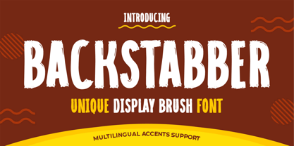 Hello Everyone, introduce our new product font Backstabber is a Unique Display Brush Font.font is a Natural Style and classy style with a clear style and dramatic movement. This font Backstabber is great for your next creative project such as logos, printed quotes, invitations, cards, product packaging, headers, Logotype, Letterhead, Poster, Design this font is great for your creative projects such as watermark on photography, and perfect for logos & branding, invitation,advertisements,product designs, stationery, wedding designs,label ,product packaging, special events or anything that need handwritting taste. That is Backstabber has charming, authentic and relaxed characteristic more natural look to your text.
 - Rapier by ITC,
$40.99 Rapier, designed by Martin Wait for ITC in 1989, is an impulsive, energetic script font with strong ties to the brush and advertisement typefaces of hte 1940s. The zestful capitals contrast with small, narrow lower case letters, lending the font its dynamism and liveliness. Desinger Wait reached the energetic, almost aggressive feel of Rapier with snappy base forms and especially with ascending strokes. For an optimal look it is advisable to set Rapier's forms near to one another, so that the ends of the strokes of one figure touch the beginning of the next. Rapier is best used for headlines and short texts.
 - Ginuk by Twinletter,
$15.00 Take your message to the next level with this Ginuk font. With its versatile style, this font can be used in a variety of ways in your projects so you can demonstrate your ideas in a captivating way. This font is equipped with the Latin ISO standard so you don’t have to worry about the completeness of the character. of course, your various design projects will be perfect and extraordinary if you use this font because this font is equipped with a font family, both for titles and subtitles and sentence text, start using our fonts for your extraordinary projects.
 - Margo by Jen Wagner Co.,
$17.00 Margo is a playful font duo that includes a signature script and a hand-drawn serif – already matched up and ready to be used together for your next design! You can see how Better Homes and Gardens used Margo throughout their October 2019 issue. FEATURES: Margo Script includes: • 108 ligatures, which will help make your text look even more hand-written • Alternate letters to help avoid duplicating letters in your words • Foreign language accents & characters for the international designer Margo Serif includes: • Alternate letters (the lowercase letters function as alternates of each uppercase letter!) • Foreign language accents & characters
 - Typrighter V1 by Jadugar Design Studio,
$75.00 Here is a revolution in typewriter fonts.......typrighter.......yes! typrighter V1 and typrighter V2.....We applied Contextual Substitutions feature in Fontlab with 6 different alternative of each letter (standard English alphabets). No more repeating same contours of letters which a typical typewriter fonts does......a next same letter replaces itself automatically to 6 variations to give you real typewriter text flowing out of your computer keyboard...... Please watch a short demo and enjoy the open type features in word, illustrator and Photoshop.... https://www.youtube.com/watch?v=HMM98Wmb_sg The basic version is bold version but does not have Contextual Substitutions option.
 - Italian VP by VP Creative Shop,
$10.00 ntroducing Italian Slab Serif Typeface - 24 fonts Italian is long, clean typeface with 24 fonts to enchant your next project. Added and 8 compositions and 15 elements in 4 premade colors. Very versatile fonts that works great in large and small sizes. Italian is perfect for branding projects, home-ware designs, product packaging, magazine headers - or simply as a stylish text overlay to any background image. Uppercase numeral, punctuation & Symbol Light Regular Medium Bold 3 styles Italics Multilingual support Feel free to contact me if you have any questions! Mock ups and backgrounds used are not included. Thank you! Enjoy!
 - Badbad by DYSA Studio,
$19.00 Badbad is a monoline script font. This another collection of script is perfect for your next personal branding project, excellent for "Logotype". Badbad have a smooth edges, so this font gives an authentic handcrafted feel style. Badbad is perfect choice for people looking for clean, modern, minimalist, elegant, beauty design styles. Suitable for almost any graphic designs such as logo, branding materials, business cards, gift cards, t-shirt, cover, thumbnail, print, poster, photography, quotes .etc sans-serif, legible, geometric, clean, sans, modern, display, grotesque, corporate, branding, magazine, contemporary, text, headline, elegant, sans serif, grotesk, advertising, classic, swiss, poster, logo, editorial, technical, logotype
 - TF The Fest by Tyfomono,
$29.00 Take your design game to the next level with a bold, thick and expressive font that truly looks hand painted. The Fest uses authentic looking fonts and is sure to grab the attention of customers and designers alike. We made 2 styles for The Fest, it lets you explore and improve the personality of your design works. This version is also great for blocks of text and small print. Slanted - With a little improvement for the slanted version, The Fest Slanted is fit for the any size. These style is alternative of your choices for the look.
 - Anavio by Greater Albion Typefounders,
$14.95 Anavio is named in honor of the ancient Roman name of an English Derbyshire town. Anavio is a classically inspired family of Roman faces, emphasizing simplicity of form and elegance. Regular and Bold weights are offered, along with condensed forms. Anavio is offered in both upper and lower case and small capitals faces. Its simple lines are immediately legible, lending it to both text and display uses. A range of ligatures, both standard and discretionary, are included as are stylistic alternates and two styles of numerals. Use Anavio to lend that indefinable air of elegance to your next project.
 - Knockoff by Gassstype,
$23.00 Hello Everyone, introduce our new product Font Knockoff is a Fun Display Font.This is a Textured Natural Style and classy style with a clear style and dramatic movement. This font Knockoff is great for your next creative project such as logos, printed quotes, invitations, cards, product packaging, headers, Logotype, Letterhead, Poster, Design this font is great for your creative projects such as watermark on photography, and perfect for logos & branding. That is has charming, authentic and relaxed characteristic more natural look to your text You can activate 6 Alternates glyphs and 14 Ligatures glyphs OpenType panel.
