10,000 search results
(0.046 seconds)
- ALS Scripticus by Art. Lebedev Studio,
$63.00 There are many script typefaces but there is only one Scripticus. Scripticus is like a chameleon: In whatever surroundings you put it, it adapts itself and looks like it couldn't be anywhere else. Be it a sales advertisement, a music Website, a comic strip or a journal with complex chemical formula – Scripticus always solves the problem in a natural and leisurely way. And it never makes compromises concerning clarity. But where does Scripticus come from? … From the good old high school blackboard! Blackboards have become almost obsolete in teaching, but be it a black or white background – clear, strong characters placed on the board while the facts are explained are still one of the best ways to make and keep things understandable. Scripticus is dedicated to my high school chemistry teacher who was an expert in just this. While the letterforms come from different inspirations, its aim is the same as the pedagogical aim of my teacher: Combining clarity with a strong personality. Scripticus has a special trick to give it its natural look: Four alternates for each letter and each number plus rotation coding make the glyphs appear in lively melodic flow. In this way even mathematic equations look nice! Scripticus has a lot of OT-features that help it do its job. They are: capital spacing, localized forms, subscript, scientific inferiors, superscript, numerators, denominators, fractions, ordinals, tabular figures, historical forms, ligatures, stylistic alternates, stylistic set and ornaments. Finally, as is my general goal in type design – Scripticus supports close to one hundred languages from Latin extended to Cyrillic extended.
 - Untalin by RGB Studio,
$19.00 Untalin is a Vintage retro font. Inspired from retro typography and lettering in the 70's and 80's combine with bold typography style. This font perfect for vintage and retro design, badge, logos,t-shirt, poster, branding, packaging, signage, book coverand so much more! Untalin with almost 490 glyphs inside the font, you can also create many of other typography designs. Stylistic Alternates, Swashes, Contectual Alternate and Ligatures is a list of features from OpenType which you can use to pairing the letters each other powerfully. Files Include : Basic Latin A-Z and a-z Numbers Symbols PUA Encode Multilanguage Support Thanks and have a wonderful day, If you have any questions, please get in touch with us Don't forget to check out our other products.
 - Rinterland by RGB Studio,
$19.00 Rinterland is a Vintage retro font. Inspired from retro typography and lettering in the 70's and 80's combine with bold typography style. This font perfect for vintage and retro design, badge, logos,t-shirt, poster, branding, packaging, signage, book coverand so much more! Rinterland with almost 500 glyphs inside the font, you can also create many of other typography designs. Stylistic Alternates, Swashes, Contectual Alternate and Ligatures is a list of features from OpenType which you can use to pairing the letters each other powerfully. Files Include : Basic Latin A-Z and a-z Numbers Symbols PUA Encode Multilanguage Support Thanks and have a wonderful day, If you have any questions, please get in touch with us Don't forget to check out our other products.
 - Imperial Tea by Hanoded,
$15.00 I am a coffee person, but two years ago, just before the whole Covid-thing happened, I came down with what I assumed to be the flu. It was a really nasty flu as well: I was down for 10 days or so and when I sort of recovered, nothing tasted the same. Coffee tasted like cardboard and I couldn't stand the taste of it, so I decided to drink tea instead. The 'supermarket tea' we have in Holland is quite bad and tasteless, so I ordered some proper strong English tea online and I have been drinking it ever since. Of course I was thinking of this when I created Imperial Tea font. Imperial Tea font was made with... yes, you've guessed it: Chinese ink and a brush. Imperial Tea is a nice, 'oriental-ish' looking font that comes with a set of alternate glyphs and an impressive language support, including Vietnamese and Greek.
 - Driveway Stencil JNL by Jeff Levine,
$29.00We've all seen the informational markings on commercial driveways or roadways instructing us which way to turn, where to park, etc. They are usually in stencil lettering 16 inches or taller, with compressed letters that make the horizontal strokes look slightly thicker than the vertical ones. By condensing the lettering in Narrow Stencil JNL by 20 percent, the result is Driveway Stencil JNL - a digital emulation of those painted road markings. - Growling by Alexandr Galuzin,
$26.00 The font is well suited for stencils. Can be successfully used in outdoor advertising, a poster and any large inscription. In small size, font details may be lost. The characteristic stylization of the font makes it possible to use it in a variety of works. There is a regular and oblique outline.
 - Major Pro Extras NF by Nick's Fonts,
$10.00A supplement to Major Production NF, which includes an assortment of symbols and logos for video, web and mobile applications, including the Blu-ray logo with its region designators. Please remember that logotypes are the property of their respective copyright holders, and should be used solely in accordance with the copyright holder’s guidelines. - Bellissa by Letterara,
$12.00 Bellissa is a beautiful Calligraphy font designed with an incredibly modern feel. This font is PUA encoded which means you can access all of the glyphs and swashes with ease! It features a varying baseline, gorgeous glyphs and stunning Swash. Use this gorgeous and unique Calligraphy font to bring any DIY project to life!
 - Bork by Harbor Type,
$50.00 🏆 Selected for Tipos Latinos 9. Bork is a display typeface that was inspired by an exercise in blackletter calligraphy. The style’s characteristic dark texture is seen mainly in the lowercase, with uniform spacing (where counterspace equals letterspace), shapes that recall the straight, interrupted strokes used in that style of writing, and the peculiar construction of certain letters. On the other hand, the uppercase aims for a more conventional roman construction, making it more legible for modern-day readers. It features an extensive character set that includes contextual and stylistic alternates, superior/inferior figures, arbitrary fractions, as well as several unusual ornaments, symbols and punctuation. Bork is especially suited for use in book covers, headlines, packaging and logotypes.
 - Police JNL by Jeff Levine,
$29.00Police JNL was modeled from one of the many fonts created by the late Alf Becker exclusively for Signs of the Times magazine during the 1930s through the 1950s. This was a bit of a difficult design to translate into a digital font file, because the individual characters did not follow a formal structure as to the width and length of the cast shadows or the letter shapes—such is the way of the hand-lettered alphabet. Special thanks to Tod Swormstedt of ST Publications (and curator of the American Sign Museum in Cincinnati) for providing the archival material to work from in creating this font. Police JNL has a limited character set. The basic A-Z character is on the upper and lower case keys, along with numbers, some punctuation and the dollar and cents signs. - Finnegan by Linotype,
$40.99German designer Jürgen Weltin designed Linotype Finnegan, a modern text design with roots in the humanist letterforms of the Renaissance. As the recognizable direction of movement in writing runs from upper left to lower right, Weltin mimicked this in his design: Linotype Finnegan's up and down strokes end in residual serifs. All of the thick strokes have a taper; horizontal strokes and curves are noticeably thinner than the verticals. This dynamic nature lends a combination of individualness and energy, along with a high degree of variety, to Linotype Finnegan. Linotype Finnegan is a wholly new and unique typeface. It distinguishes itself through its extreme legibility, originality, and formal excellence. Linotype Finnegan makes fun to read longer texts non-stop. However, the typeface never distracts the attention from the text's content by forcing itself too much into the foreground. - WILD1 Toxia by The Fontry,
$7.00 Toxia is a creepy—yes, eerie face, like something wet and poisonous clambering out of the swamp. It’s spooky too—yes, but it’s also frighteningly easy to read. Just don't let it drip on you! Toxia is just one font in a package of five known as Wild Bunch Pak #1.
 - Deserved by Ronny Studio,
$19.00 Deserved is an elegant look typeface. A unique font, with bold and thin sizes, adds to the impression of elegance, luxury and class. This typeface is perfect for logos, branding, travel promotions, social media posts, magazine layouts, product packaging, quotes, or simply as a stylish text overlay onto any background image. 2 Style Font : Regular Italic Deserved Features : Uppercase Lowercase Numbers & Punctuation Multilingual Support Simple installation All of features and special characters of this font are included in one file. So it is easy to accessed by using program or software that support the opentype like Adobe Illustrator, Adobe Photosop, and Adobe Indesign). This font also very easy to use because compatible for all software even for non-opentype supported. Please comment us if you have any questions Thank you and have a nice day. thank you
 - Coastly by Design A Lot,
$14.00 Meet Coastly, a handwritten font that makes you think about vacation, summer, holidays, friends and family. It’s a calm and relaxing font that works great headlines, posters, product design, quotes, branding, marketing materials and more. This font supports latin alphabet with its accents and glyphs. It also covers the most used punctuation marks and glyphs. Coastly is your friendly go to font. We made it thinking of the Amalfi Coast in Italy and its lemons, explaining its name and colour palette. Thinking of limoncello, lemonade from fresh squeezed lemons, granita, ice cream, beach and ferry trips. But we’ve also associated Coastly with your yearly holidays as: Christmas, Thanksgiving, Easter, New Years Eve, Mothers Day and so on. It’s a celebration of life and what its delights.
 - Sasmitha Script by Cooldesignlab,
$13.00 Sasmitha is a Modern Script font that comes with a very beautiful character change, a classic copper decorative script font with a modern touch, designed with great detail to present an elegant style. Sasmitha is interesting because the typeface is pleasing to the eye, clean, feminine, sensual, glamorous, simple and very easy to read, because of the many luxurious letter connections.I also offer a number of decent stylistic alternatives for some of the letters. Thank You
 - Crazy David No 1 by 066.FONT,
$9.99 Crazy David No 1 is a display font that draws inspiration from the distinctive aesthetic of 90s zines, and exudes a varied and extravagant style that lends a certain nonchalance to projects. Its expressive and daring letters are perfect for creative projects such as posters, invitations or branding materials. Crazy David No 1 perfectly captures the striking look and distinctive character of the text, which is associated with the unique spirit of that decade. Remastered in 2022.
 - Benghane Mastugan by Kartiny Type,
$12.00 Benghane Mastugan is a Modern Script font that comes with a very beautiful character change, a classic copper decorative script font with a modern touch, designed with great detail to present an elegant style. Benghane Mastugan is interesting because the typeface is pleasing to the eye, clean, feminine, sensual, glamorous, simple and very easy to read, because of the many luxurious letter connections.I also offer a number of decent stylistic alternatives for some of the letters. Thank You
 - Rigrok by Meat Studio,
$38.00 Rigrok is a 14 style semi serif designed by Stew Deane. The design of the typeface was intended to create a premium feel that is suitable for the widest range of tasks, while still maintaining a unique sense of character. Stew designed Rigrok to draw on his graphic design experience to create a typeface that is suitable for many a design or branding job. The result is an easy to use, versatile typeface that charms with personality and character.
 - Crazy David No 2 by 066.FONT,
$9.99 Crazy David No 2 is a display font that draws inspiration from the distinctive aesthetic of 90s zines, and exudes a varied and extravagant style that lends a certain nonchalance to projects. Its expressive and daring letters are perfect for creative projects such as posters, invitations or branding materials. Crazy David No 2 perfectly captures the striking look and distinctive character of the text, which is associated with the unique spirit of that decade. Remastered in 2022.
 - Hiruko Stencil by Thinkdust,
$10.00 Building on Hiruko’s success, Hiruko Stencil continues the tradition of minimalism and clarity with support for a wide range of languages. Cut in such a way that each character works well with those surrounding it, this font is created with an understanding that even the most minor seeming things can make a big difference. The thick nature of the font makes it work wonderfully at larger sizes, but thanks to the carefully considered cuts in each letter, it remains incredibly legible even when shrunk down, so it’s useful in whatever you intend to craft.
 - Prickly Pear by TYPEHEIST,
$19.00 Here's a font with a special backstory. Prickly Pear is a handwritten font, created in a moving car, on the way to the Simpson Desert. At the mercy of every bump, hump and hole in the road, this font is as rough and realistic as its conception. A unique and messy handwriting font reminiscent of the rugged landscape; it'll be perfect for that design project where you need a little raw authenticity. Prickly Pear has a comprehensive character set of over 160 custom ligature combinations and 56 multi-lingual characters.
 - !Disc Inferno® BASIC - Unknown license

- Hellbound - Unknown license

- Pistol Twelve JNL by Jeff Levine,
$29.00Pistol Twelve JNL is a novelty version of Jeff Levine's Twelve Oaks JNL wood type font, with the addition of random bullet holes in the upper case characters. The font design was suggested by fellow type designer Ray Larabie. Pistol Twelve JNL is a two-fold pun. Initially, this conveys the obvious fact that the design is a variation of Twelve Oaks JNL with bullet holes... but the name is also a play on an old, old joke. One person asks the other: "Would you care to join the Pistol Club? You drink 'til twelve and..." Well, you get the picture! - Office Visit JNL by Jeff Levine,
$29.00 Dan Hardie, a Miami-based graphic artist and creative consultant at Mutiny, Inc. shared an image he’d spotted online of some interesting signage formerly on the front of the Miami Medical Building. Comprised of hand-cut metal characters (with a thoroughly avant-garde “Art Deco meets Modernist” approach), this instantly became a font design idea unusual and quirky enough to develop as a digital typeface. The end result is Office Visit JNL, which is available in both regular and oblique versions.
 - Côte by TEKNIKE,
$45.00 Côte is a display monospace handwriting font. The typeface is a distinct hand drawn font using a felt marker. The Côte name is derived from the French word meaning "coast" and is also used to describe winemaking vineyards and regions throughout France. One of the most popular regions in the south of France is the French Riviera also known as the Côte d'Azur. Côte is great for display work, invitations, writing, architecture, posters, wine labels and headings.
 - P22 Morris by P22 Type Foundry,
$24.95 William Morris (1834-1896) was probably the most influential figure in the decorative arts and private press movements of the late 19th and early 20th century. In reaction to the increasing lack of quality that the industrial revolution brought on, Morris sought a return to the ideals of the medieval craftsman. Dissatisfied with the commercially available typefaces of the day, he undertook the design of the fonts for his books himself. The P22 Morris font set features new versions of Morris's famous type designs for his Kelmscott Press. The two main fonts include full international character sets for Western European languages. P22 created MORRIS GOLDEN with a rough edge to simulate the look of printing on handmade paper. There is a more "refined" recent version of Golden, but its sterile digitization does not approach the effect that Morris achieved in his Kelmscott books. You'll notice the handmade effect less in the smaller sizes but will find it quite decorative in the larger sizes. (Morris cut his Golden type in only one size for the Kelmscott Press, approximately equal to 14 points.) P22's version of MORRIS TROY is more smooth than Morris Golden and is true to the original Morris design. It is based on the Kelmscott Troy type (an 18 point font) and its smaller counterpart, the Chaucer type (a 12 point font). American Type Founders made an unauthorized version of Troy, "Satanick," 189?, contrary to Morris's wish that it not be made available commercially.(Legend has it that the naming of Satanick comes from William Morris telling the agent inquiring about making copies of his fonts available to go to hell) Several digital versions of Troy (and Satanick) have appeared over the years. The P22 version offers a much more accurate rendering than any previous version. Morris designed the original Troy font to be spaced very tightly; our version reflects and honors his intention. The MORRIS ORNAMENTS are based on those Morris designed and used in his Kelmscott Press books. Characters in the positions of the letters A to Z are decorative drop cap initials. Characters in the number key positions reproduce other Morris embellishments. (See the accompanying key chart.) As with all headline fonts and complex dingbats characters, this font is best used at larger point sizes (e.g., 48, 72, 120). Use in body text or at small point sizes on-screen may not achieve desired results. P22 is grateful to William S. Peterson, Steven O. Saxe and the Lightsey-Offutt Library who gave invaluable research assistance to this project.
 - Dopestar by 38-lineart,
$15.00 Street art has become so inspiring that it's been featured on a range of mediums from advertising to album art. Thanks to the emergence of street art in the mainstream media. Dopestar is a heavy font that has a bold grafitti feel whilst being super clear to read, Dopestar is certainly versatile. Dopestar is a great typeface for display and it comes with a full set of characters with loads of variants and all the punctuation you'll need.
 - Orena - Personal use only

- Equ - Personal use only

- Pulp Fiction by Comicraft,
$19.00 The name's Heironymous Flask. Some of my acquaintances call me 'Hip.' Those that know me really well don't call me at all. In my game, you don't make friends. You make excuses. Like it says on the door, I'm a private hippopotamus. This is my story. This is my font. Features: Six weights (Regular, Italic, Bold, Bold Italic, Heavy & Heavy Italic) with upper and lowercase alphabets.
 - Thick Fun by PizzaDude.dk,
$17.00 This is not a brush font! This is an imitation of brushstrokes, done by pen. But I guess you've already noticed that - the brushstrokes are way too obvious, to have been made by brush. Although being a "fake", the letters leaves you with quite a good impression. Letters were inspired by an old horror movie poster, but is very useful for something less terrifying!
 - Shire Script by Bean & Morris,
$35.00 Shire Script includes alternate characters and discretionary ligatures to help you create settings when informality is called for. Variety in the lowercase x heights and connectors give an overall effect of handwritten headings and text. However, by considered drawing, legibility is not compromised.
 - Zamroot by Evo Studio,
$16.00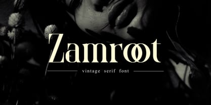 Zamroot a distinct and unique serif font. It feels playfully nostalgic and delivers an incredible vintage aesthetic. Zamroot will elevate a wide range of design projects to the highest level, be it branding, headings, wedding designs, invitations, signatures, logos, labels, and much more!
 - Jumping Squid Graffiti by Sipanji21,
$16.00 Jumping Squid is a Handwritten font with a Natural monoline graffiti style, perfect for your awesome urban designs. It will elevate a wide range of design projects to the highest levels, be it branding, headings, designs, invitations, signatures, logos, labels, and much more!
 - Vandal Zoy Graffiti by Sipanji21,
$18.00 Vandal Zoy is a Thick font with a graffiti style and bubble looks. It will elevate a wide range of design projects to the highest level, be it branding, headings, wedding designs, invitations, signatures, logotype, wall art illustration, apparel, labels, and much more!
 - Justin Brown Monoline by Gatype,
$5.00 Justin Brown is a Sans serif display font with a modern, classy, fun, unique and versatile style. It looks amazing on any screen size and is easy to read in any text size. This font also has tons of unique alternatives and binders that will make for stunning design projects. This will add a fun and friendly touch to any of your projects. This font is PUA encoded which means you can access all the glyphs and sweeps easily and more.
 - Amel by Nandatype Studio,
$9.00 Amel is a modern display font. This font will look great on a variety of design ideas, perfect for feminine logo signs, fashion & editorial design heads, branding projects, Apparel Branding, packaging, magazine titles, advertisements, T-shirts, postcards, valentines, posters, invitations, weddings, branding projects, social media posts, magazines, book covers, and more. This will add a fun and friendly touch to any of your projects! This font is PUA encoded which means you can access all the glyphs and sweeps easily and more.
 - Gorod.Volgograd by FontCity,
$15.00The general idea: Can You imagine to yourself, what the hydroelectric power station is? The building of this electricity production foundry is half hidden under the water, but the visible above-water part astonishes your sense. It is a construction almost 1,5 km length dammed out the powerful river stream. Besides thousand of electricity conduction lines supports it bears also the highway and the railroad. From a faraway distance the train seems like a caterpillar that has climbed up the stout tree. There are also the navigable sluices, the flood channels and other erections. The idea of this typeface outlines arrived to the authors exactly on the viewing platform, under the impression of the waterfalls, which are escaping from the dam womb, falling from almost 50 meters altitude and becoming white-haired during this flight. Release: in the form of "gorod.Volgograd" font with the one style. We work with other styles now and sometime we will be very glad to introduce the Bold and Italic styles to You. We should explain the font name meaning. "Gorod" is "city of" in Russian and Volgograd is the old, big and famous Russian city. The Volga hydroelectric power station of a name of XXII congress of the CPSU caused the Volgograd sea formation. It expands of 14 km width and more than 600 km along the Volga river-bed. But HEPS isn't the sole Volgograd sight. There are many interesting places here. The most known tourist sight, the visit card of Volgograd is the Mamaev Hill. Being here You can see almost all 100 kilometers of city length. Due to its geographical position, Mamaev Hill has got a great importance during the Great Patriotic War (1941-1945). It became and still is the Main Height of Russia. Soviet people have built the huge stately memorial ensemble here. There are many other witnesses of the heroic past of Volgograd: the Alley of Heroes, the Perished Fighters Square, the Soldiers Field and others. The line of tank turrets is stretched out along all town not far from Volga bank. It marks the line, where fascist troops was stopped in 1943. It is very amazingly when You dive under the ground on a usual tram. Volgograders have built a few underground station for the high-speed tramway. The river tram need a quarter of an hour to get an island in the Volga. And You need the same time to walk across the river station. The Volga-Don navigable channel starts from Volgograd. There are planetarium, circus, some theatres, many museums in Volgograd. One of football matches of Euro-2004 qualifying round took a place in the "Rotor" stadium in Volgograd. Volgograd holds the longest - above 50 km - park in the world. Its avenues, squares, embankments are beautiful, Volgograd central districts are built in unique architecture style called the Stalin Empire. You can enjoy fountains, parks, attractions, water-pools and other Volgograd sights. If You visit Volgograd once You'll never forget it. You can read about the ancient history of Volgograd city on the Tsaritsyn font page. Also we plan to create the Stalingrad font and give You a short story about another period in Tsaritsyn-Stalingrad-Volgograd history. - Diecast by Device,
$39.00 A companion piece to Mulgrave, this font is the intermediary design between the chunky Victorian style that Mulgrave reproduces and the Ministry of Transport sans introduced in 1933 and digitised as Ministry. Although they date from between 1910 and 1933, these signs show the beginnings of several features Ministry later incorporated, notably the thinner strokes and the more modern forms of the G, M, R and S. The letter widths are approaching a monospace - the L, F and E are relatively wide compared to the W and M, a feature that may have something to do to the casting process. These idiosyncracies were all ironed out when the first version of the MOT alphabet was produced. The Device digitization, as with Mulgrave, stays true to the worn and repainted original metal source material and preserves the unusual widths.


