10,000 search results
(0.044 seconds)
- Spooky Witch by Arkrist Letter,
$13.00 Spooky Witch is the latest Halloween font from Arkrist Letter studio. A serif font designed with elegant characters, but looks scary. Spooky Witch font is suitable for design, logo, greeting card, invitation, etc. make your day more spooky with Spooky Witch!
 - Cruisader II by ARToni,
$14.00 Cruisader II is a cool, fresh and bold display font. This font reads as strong, confident, and dynamic and can add tons of nostalgic character to your designs.
 - SF Article by Sultan Fonts,
$40.00 About Sf Article font family: Sf Article is An Arabic and Latin typeface for desktop applications ,for websites, and for digital ads. The main types of Sf Article font family weight are regular and bold. The regular weight is perfect for reading, it is helpful during long reads, Bold Sf Article styles are designed to draw attention to short phrases. The Sf Article font family is characterized by short heights and dynamic stretching of letters through the paragraph, where the space In the line is automatically filled. In Sf Article font family, we have developed two italic fonts: regular and bold, to help with the diversity of stylistic expression in the Article, document and research work. Sf Article typeface comes with many OpenType features including stylistic sets. Designer: Sultan Maqtari Design date: 2021 Publisher: Sultan Fonts
 - Engebrechtre Expanded - Unknown license

- Baloon Everyday by Arterfak Project,
$16.00 Baloon every day is a layered font. Consists of 4 elements that you can combine to get a cute & stylish word. There is Regular, Shadow, Emboss, and Glossy. This font set is bold, fatty, rounded and funny and suitable for kids' themes or entertaining design. Equipped with stylistic alternates and multilingual support. Thank you for watching!
 - Facsimile by Linotype,
$29.99Linotype Facsimile is part of the Take Type Library, which features the winners of Linotype’s International Digital Type Design Contest. Designed by J. Luigs and S. Wicker, the forms were constructed for electronic readers, just as the OCR fonts were. The increasing use of computers accompanied the growing number of fonts suitable for electronic reading. The standard has long been set, but designers are always creating new interpretations and new symbols. Typefaces like Facsimile are here to stay and personify the Zeitgeist of the late 20th century. - Fini by Atlantic Fonts,
$26.00 Fini. Done. You've just discovered an infinitely useful font that polishes things with youthful and stylish vigor. Fini provides playfulness with double letter ligatures with a twist of friendly sophistication. Fini Things, also designed by illustrator and font designer, Amy Dietrich, is a decorative collection of 26 loopy, spotty repeating border designs and kid oriented icons (like a pea coat, owl hat, hoodie, rubber duckie etc, plus a coffee cup - for mom and dad). Fini Things coordinates with Fini font, and in fact, works very nicely with Merci, and other Atlantic Fonts.
 - Autumn Leaves by Matthias Luh,
$15.00 These modern, handwritten letters can be used for fancy headings or images. The characters aren't oriented straight or orderly, but a bit random. So they look like they were written by a human.
 - Kitetsu Faux by Twinletter,
$15.00 Kitetsu is a spoof Japanese typeface that we created especially for those of you who need writing for a Japanese-themed design. Of course, this typeface is also very attractive when used for other graphic display purposes. If you choose this typeface, your project will leave an impression on your audience because of its unique, abstract, and different shape, which will set it apart from the rest. Logotypes, food banners, branding, brochure, posters, movie titles, book titles, quotes, and more may all benefit from this font. Of course, using this font in your various design projects will make them excellent and outstanding; many viewers are drawn to the striking and unusual graphic display. Start utilizing this typeface in your projects to make them stand out.
 - Lid by One Fonty Day,
$15.00 Lid is a handwritten, versatile typeface. The non-cursive script is uncomplicated, unpretentious and easy to read. The typeface comes in three different styles; Pen, Brush and Marker. Each style has a different touch, but all three styles come together perfectly. Most of the european languages are supported.
 - Agent by Canada Type,
$24.95 Agent was inspired by the classic fun lettering of 1930s Dutch alphabetician Martin Meijer. Casual and playful, Agent is a carefully considered amalgam of the art brush's organic forms and the easily read, ironic forms of the comic book. Ideal for signs as well as packaging of products aiming to be memorable and fun. Agent ships in all common formats, and contains plenty of alternates, as we all as support for a wide range of Latin-based languages.
 - Gill Sonos - Unknown license

- Karlo by The Northern Block,
$28.95 Karlo is a super family of several branches, originating in the same lightweight skeleton. The lightweights are based on a pen of an even stroke-width. Inspired by the writings of calligrapher Edward Johnston, the family moves on in two directions in the heavier weights. Johnston demonstrated that the broad nib pen can produce different writing styles. Following this, one heavy weight has a humanistic low stroke contrast (KarloSerifBold and KarloSansBold), and another has a high stroke contrast of vertical axis with references to the 19th century jobbing typefaces (KarloOpen). The latter is inspired by Johnston’s demonstration of the broad nib pen, where he suggested fastening two pencils together. With each pencil representing an edge of the pen, it becomes more evident how the pen works in writing. The friendly informal look makes KarloSans and KarloSerif usable for both running text and for display sizes. KarloOpen, on the other hand, is solely designed for display purpose showing few words at a time. In Denmark, a guy named Karlo would typically be an old fellow with a slick hairstyle that makes an effort with his appearance. He is a handyman who can do a bit of this and that when needed. He is a happy go lucky kind of guy that takes one day at a time. To me, the typeface family has some of the same qualities. Check out Pyke which is a great pair for Karlo.
 - Karimshine by Nathatype,
$29.00 Introducing Karimshine, a captivating display font that seamlessly merges the artistry of Arabic script with modern design principles. Karimshine draws its inspiration from the graceful curves and strokes of Arabic calligraphy. It captures the essence of this artistic tradition, infusing each character with the timeless beauty of Arabic writing. The font retains the integrity of Arabic script while prioritizing readability through consistent proportions and low contrast. In addition, enjoy the features here. Karimshine fits in headlines, logos, posters, flyers, branding materials, print media, editorial layouts, and many more designs. Find out more ways to use this font by taking a look at the font preview.
 - Linex Sweet by Monotype,
$29.99Linex Sweet was designed by Albert Boton in the late 1990s. It's a smallish family of three weights; the middle weight has an italic companion face. With its soft corners and slightly quirky head-serifs, Linex Sweet is a friendly design that sees much use. - ALS Story by Art. Lebedev Studio,
$63.00 Story is a modern magazine typeface equally suitable for large pieces of text, headings and everything in between. It includes four styles. Body copy set in it looks modest and relaxed and is highly readable, not in the least distracting your attention from the article.
 - Big Stomach by Haksen,
$13.00 "Big Stomach" is a stylish modern handwritten font with casual quirky style. It is perfect for branding, birthday/valentine invitation, promotion, product packaging, and other needs. You will get full set of lowercase and uppercase letters, numerals and punctuation, multilingual symbols, ligatures and extra swashes that giving realistic hand-lettered style. In order to use the beautiful swashes, you need a program that supports OpenType features such as Adobe Illustrator, Adobe Photoshop, Adobe Indesign and Corel Draw. Or please check the end of the preview to know how to get the swashes. Thanks and have a wonderful day, Haksen Std
 - Baby Bloom by Haksen,
$14.00 "Baby Bloom" is a stylish modern handwritten font with casual quirky style. It is perfect for branding, birthday/valentine invitation, promotion, product packaging, and other needs. You will get full set of lowercase and uppercase letters, numerals and punctuation, multilingual symbols, ligatures and extra swashes that giving realistic hand-lettered style. In order to use the beautiful swashes, you need a program that supports OpenType features such as Adobe Illustrator, Adobe Photoshop, Adobe Indesign and Corel Draw. Or please check the end of the preview to know how to get the swashes. Thanks and have a wonderful day, Haksen
 - Gatsby Modern by Nicky Laatz,
$15.00 Gatsby Modern Serif takes its cues from the "Roaring Twenties" , an era when breaking from the norm was the order of the day, when femininity took on a charming 'boyishness', and a time when anyone who’s anyone, needed to be bold and ever so slightly, or even not so slightly, eccentric. Perfect at any size - Gatsby Modern does well from large eye-catching headlines , to large paragraphs of small text. Great for modern branding, posters, logos, social media projects, headers, advertising and so much more. Gatsby Modern is available in two weights, regular and a heavier set bold to suit your project needs.
 - Valentine Heart by Haksen,
$13.00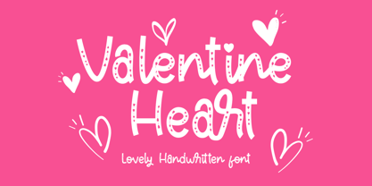 "Valentine Heart" is a stylish modern handwritten font with casual quirky style. It is perfect for branding, birthday/valentine invitation, promotion, product packaging, and other needs. You will get full set of lowercase and uppercase letters, numerals and punctuation, multilingual symbols, ligatures and extra swashes that giving realistic hand-lettered style. In order to use the beautiful swashes, you need a program that supports OpenType features such as Adobe Illustrator, Adobe Photoshop, Adobe Indesign and Corel Draw. Or please check the end of the preview to know how to get the swashes. Thanks and have a wonderful day, Haksen
 - Brush Type Michiko by Brush Art Design Office,
$45.00I have created the brush font named “ BrushType Michiko” in my unique brush style. This is wider than “BrushType Standard ”. I made it for ad designers. I believe this is the only one brush font in the world, so using it will enable them to get easily satisfied on their work. Brush handwriting in Japan has a long and proud Tradition and History. I tried to interject this feeling of Tradition into my font designs for you to comprehend its true meaning. I trust I have succeeded to convey my feelings to you. In addition, I can say each letter of the “ BrushType Michiko” is truly art. I am a pioneer of Brush Art. You are the first person to see and use it in the world. - Athletic Pro by Mandarin,
$29.00 Athletic Pro is an updated and revised version of Athletic Condensed. Added weight styles and a brand new designed Cyrillic alphabet. Practical and timeless, this display font does an excellent job on laying headlines and bold messages. With the variable font file you will have further personalisation and broader range of styles, it also contains the standard weights and styles.
 - Acceptable JNL by Jeff Levine,
$29.00 Acceptable JNL is a typeface modeled from hand lettering on a piece of 1940s sheet music, and has a distinctly casual, yet Art Deco flair. It's name can also be mischievous, for when you're asked "which font should I use for the job" you can answer "the Acceptable font". This may well start a dialogue reminiscent of Abbott and Costello's "Who's On First?"
 - Paperclip Wire by Blackout,
$20.00Paperclip Wire is a great font for anyone looking to have a straightforward yet elegant look. All letters consist of Capitals yet the uppercase letters are exaggerated. Because of the nature of the font I suggest using it in no less than 20 pt. font. However, because it is simple it can easily be read when printed. This typeface was developed loosely based on a paper clip itself. the x-height was determined based off the size ratio of the clip and the cap height was based off of a paper clip as it is folded open. The overall shape is straight lines and subtle curves, all relating to each other to allow for a constant flow of letters. - American Scribe by Three Islands Press,
$39.00 The Declaration of Independence was authored by Thomas Jefferson, but his is not the classic handwriting on the engrossed copies familiar to most Americans. That belonged to Timothy Matlack, an early patriot who fought in the Revolution, sat as prosecutor at Benedict Arnold’s court martial, and also penned copies of a number of documents for then-General George Washington. Matlack’s script was compact but legible, perfect for the first and most famous of American documents. Now you, too, can write that way. Please note: The font does not include any of the signatures from the Declaration of Independence.
 - LHF Cafe Corina by Letterhead Fonts,
$39.00 Enjoy this one-of-a-kind custom creation from Chuck Davis. Beautiful curves make it a must have.
 - Calsera by Ironbird Creative,
$15.00 Calsera is a vintage display font duo. Inspired by 50s-60s signages, this font made to bring back the good ol' days. This type of font perfectly made to be applied especially in logo, headline, signage and the other various formal forms such as invitations, labels, logos, magazines, books, greeting cards, packaging, fashion, make up, stationery, novels, labels or any type of advertising purpose. ADDITIONAL INFORMATION : For upgrading license please contact me. Upgraded licenses are required for apps, books, television, commercial exhibition, film, gaming, print on demand products, etc. simply email me to : ironbirdcreative@gmail.com We hope you enjoy the font, please feel free to comment if you have any thoughts or feedback. Thanks for purchasing and have fun! Regards, Ironbird Creative
 - SF Fourche - Personal use only

- Fran Hand by Signs of Gold,
$25.00 The "Architect's Font" for Everyone! Having taught Mechanical Drawing - BC (before computers), I have always wanted to digitize my every day lettering as I have previously done with my calligraphic lettering. Based on my own daily lettering style, which in turn is modeled after the hand lettering of draftsmen and architects, Fran Hand comes with Regular and Italic versions each for the same low price. Use "Fran Hand" for writing letters, fax cover sheets, invoices, spec drawings, or for enjoying a change from the prosaic and commonplace.
 - LCT Sbire by LCT,
$49.00 This Font is born basing itself on several standard typographic models. Inspired by our calligraphic drawings, the idea was to synthesize these many shapes into a unique font that can be used commonly. The slab base has been gradually humanized. The serifs have been carved, refined, rounded off, in order to galvanize the font and ease the task of reading in lower case. The angle of attack of the round letters is an echo of the 15 Century typographic heritage. It was important for us to create an expressive and humanized font, which could also be used for edition. The purpose was to confront the Ancient typographic canon of beauty with some funny and fancyful elements.
 - Linotype Devanagari by Monotype,
$103.99 The new Linotype® Devanagari typeface is a traditional text face now available in five weights (from Light to Black) and suitable for a wide variety of print and digital uses. A compact design, Linotype Devanagari also provides economy of space where textual real estate is at a premium. In addition, its large character set enables the setting of Hindi, Marathi, Nepali and is suitable for Sanskrit passages. The design’s open counters ensure high levels of legibility at small sizes and at modest resolution. The history of Linotype Devanagari is quite extensive. Inspired by the late 19th and early 20th century Nirnaya Sagar designs, it was originally designed in 1977 by Mathew Carter for phototypesetting systems. It was then revised and expanded for digital typesetting by the Linotype letter-drawing studio headed by Georgie Surman under the art direction of Fiona Ross. This new, enhanced revival was designed by Lisa Timpi and Gunnar Vilhjálmsson with Fiona Ross as a consultant. This new Linotype Devanagari is part of a project to refresh the pivotal Linotype Bengali and Linotype Gujarati typefaces and make them available for the first time in the popular OpenType font format.
 - Patmos Sans by DimitriAna,
$35.00 Patmos Sans is a carefuly hand crafted sans serif font, inspired by the art of the cyrillic calligraphy, as well as the script of the Greek Orthodox art. The font contains Latin, Greek and Cyrillic alphabets and supports Central, Eastern, Western European, Baltic, Turkish, Greek and Russian languages. Patmos Sans has a variety of stylistic alternates and classes, titling altrenates, discretionary and standard ligatures and it is fully unicode-mapped (PUA encoded). The standard ligatures of the font, are 4 decorative ornaments, that you may add at the end of a word and they fit perfectly with the titling alternates. All you have to do is to make sure that ‘standard ligatures’ are activated in your application, then type "d" and a number from 1 to 4.
 - Imperio by Juan I. Siwak,
$40.00 Imperio is a font inspired by old posters, especially those related to constructivism and futurism. It reflects both the rationalism of Bauhaus as a propagandist and revolutionary spirit of an era. On the other hand it is not nostalgic, but instead looks for its own way to get diagonals where there was rigidity. The poster itself is the language of graphic design, and geometry is its ally. This font aims for that goal. It has two variants that derive from its source. Imperio Giga Black attempts to be a negative typography, starting with the black and then searching for small windows in which they begin to uncover the morph. This is an extreme and modern font. Imperio West is a metamorphosis of the original one, with decorative details which transform it into a typeface of wood and saloon font. In all cases we recommend its use in large sizes (up to 20pt) and main titles. Imperio UltraBlack can work in smaller sizes than Imperio Regular.
 - Beautification by Arendxstudio,
$15.00 Introducing Beautification Signature, a handwritten font which is very elegant and modern and for you to use may your design interests be in logos, branding names, posters, podcasts and so on. This is perfect for you all. Featuring upper- and lowercase, numbers and punctuation, multi-lingual support and ligatures. There it is! I really hope you enjoy it - comments & likes are always welcome and accepted. More importantly, don't hesitate to send a message if you have a problem or question. Now just read this, go there and make it happen.
 - Gens De Baton by HiH,
$10.00 Gens De Baton is based on a charming lower case alphabet that appeared in the Almanach des Enfants pour 1886 (Paris 1886) under the heading “Amusing Grammar Lessons.” Gens De Baton means simply “Stick People.” The unknown designer turned the bare letter forms into drawings of people for the enjoyment of the children for whom the almanac was intended. The letter forms themselves were based on the French Romain du Roi (King’s Roman), except for the ‘g’ and the ‘j’ -- which were based on Baskerville. The letters ‘w’ and ‘y’ were not included, as they are seldom seen in French. We have left the letters somewhat rough, as they appeared in the Almanach des Enfants , resisting the temptation to clean up all the lines and render them with digital perfection. We have used our HiH Firmin Didot to supply an upper case and auxiliary characters, as Didot was originally a modified version of Romain du Roi. It is interesting to observe the contrast between the polished look of the Didot upper case and the rough, hand-drawn look of the lower case. Purchasers of this font have our permission to use it for the amusement of adults as well as children. We recommend setting Gens De Baton at 24 points or larger.
 - Makro by Tokotype,
$50.00 Makro is a family of extended display sans fonts with an imposing profile with six weights, ranging from Light to Black. This series is distinguished by the excessively contrasting shapes and tones of the shapes on each opening joint and adjusted open counter. This font was designed primarily for large display text that demands more space, such as on out-of-home graphics, headings, titles, or another similar application. The most recent version of Makro supports variable weight and italic axes, as well as OpenType features such as alternatives, circled numbers, etc. In addition, the family has enlarged its linguistic repertoire to incorporate Cyrillic in addition to Latin.
 - Cristal Text by Johannes Krenner,
$5.00 »Cristal Text« has nice to read lower case letters. It contains 636 letters per font style and some Open Type features: Different stylistic alternates and different sets of numerals. It is not monospaced: Therefor it stays not true to an underlying grid like it’s bigger brother »Cristal True«. But this offers a better legibility. The basis of this font is a Union-Jack or sixteen-segment display (SISD). I have found myself in the need of a precise and well-made font, that simulates the look of such a LCD display. Also it should offer enough letters and language support for the whole European region as well as different font styles.
 - Open Serif by Matteson Typographics,
$19.95 OPEN SERIF - answering the question “what font pairs well with Open Sans?”. Designed by Steve Matteson for extraordinary legibility and comfortable reading on screen and in print. Open Interpretation: Not quite Veronese – not quite Egyptian. A dash of panache in an otherwise sturdy serif typeface. Open Serif is an elegant text and display typeface family. Open Interiors: Visually open and legible at text sizes just like its cousin Open Sans. Open Serif reads smoothly but has an energetic texture. The chancery style italic contrasts nicely to the roman in a full bodied nod to Italian Renaissance forms. Open Type: Open Serif is full of OpenType features including Small Capitals for the Roman, Italic Swash Capitals and Old Style Figures for both. Open Translation: Supporting all the languages available in Open Sans, Open Serif completes the translation capabilities of international companies. Extended text is more pleasant to read in a serif typeface so go global with a unified typeface family! Open Face: Open Serif Titling is an elegant companion to round out the family. These ‘open-face' capital letters are ideal for initial letters, mastheads, titles and decoration.
 - Tibet - 100% free

- VVDS Hickory Dickory by Vintage Voyage Design Supply,
$15.00 Glad to introducing you Hickory Dickory - a stylish serif with an eighties mood. I really love this old advertising from those magazines. It was a new era of minimalism in photography and typographic design. The playful, stylish and modern. This font will fit perfectly not only this type of design - you may use the alternates characters and get a really playful typography at your project. Hickory Dickory has a lot of alternates, some letters have them up to 17. More than 620 glyphs total! Also, there is a true italic for perfect pairing. Normal & True Italic A lot of stylistic alternates 620+ Glyphs total Decimal and fraction figures


