10,000 search results
(0.034 seconds)
- Voltdeco V02 by Owl king project,
$29.00 Finally, voltdeco V02 is basically capital letters (all-caps) for display, then to complement various needs for body text and headline layouts, it is developed into a font family. Voltdeco is an art deco uppercase font with a modern style, Voltdeco works great in short sentences or words, but the (20 weight) fonts allow for more options for exploration. Voltdeco can also work well for medium or regular text. Explore with voltdeco for creative works, whether printing the final design or digital design, happy exploring with voltdeco.
 - Rambla Alt by TipoType,
$- Rambla Alt is a variation of Rambla, which has certain modifications without altering its main structure (Rambla is also available in Myfonts). For this reason Rambla Alt is great when used together with Rambla. Rambla Alt is a humanist sans for medium-long texts. It’s slightly condensed, with a generous x-height and short ascender/descenders. Its proportions have the objective of gaining space in height and width. It’s elegant in large sizes and legible at the same time, with a lot of rhythm in small sizes.
 - Hupaisa by Melvastype,
$22.00 Hupaisa is a geometric sans serif with a casual hand-drawn feeling. It has six weights: thin, light, regular, medium, bold and black. Although Hupaisa is a display font, it is very legible also in small sizes. That makes Hupaisa very useful in design projects. You can use it on titles and body texts. Create interesting typography with a proper hierarchy. Hupaisa also includes many alternate characters, ligatures and swashes to give you options to play with. Use them to create interesting titles, wordmarks, quotes or logos.
 - Grovana by Larin Type Co,
$15.00 Grovana is a modern family of sans serif fonts, which includes 12 fonts: 3 styles - regular, round and rough, each of them has 4 weight - light, regular, medium and bold. I also prepared many ligatures and alternatives that give you more opportunities to create your project. with them you can be unique and experiment with your design. This font is easy to read and universal, perfect for creating logos, book and magazine covers, advertising, branding, wedding invitations, posters, postcard, labels, business cards, packaging and much more.
 - Erbar by URW Type Foundry,
$49.99Erbar or Erbar Grotesk, designed by Jakob Erbar (Ludwig & Mayer) in the early 1920s, is a truly key design from a historical viewpoint. None other than Paul Renner studied Erbar and used this knowledge in the design of his famous Futura. Erbar is a beautiful constructive Grotesk perfectly mirroring the Zeitgeist of the 1920s. The newly expanded Erbar family of URW++ comes in nine styles, of which seven have been digitally remastered recently in URW's design studio (light, book, medium, bold, italic, bold italic). - Paulette by Rosario Nocera,
$22.99 Paulette is a script typeface, the capital letters are completely unpublished, some of them have a smile-similar ornament (A,F,O,H,Q,B,C,P,G), whereas minuscule letters are inspired to Edwardian font script. The font is very versatile and is very suitable for typographic compositions with large letters and for medium and small ones. It includes a complete series of internationals letters, 342 glyphs and 6 new ligatures. Paulette is an elegant letter and it's available in two versions, regular and eroded.
 - Automata by NOS,
$29.00 Introducing Automata, the typeface that combines futuristic appearance and easy readability. Great for titles but also for logos and text at medium/small sizes, making Automata suitable for a wide range of applications. In addition to its smooth, clean lines and geometric aesthetic, Automata offers a variety of customizable options such as stylistic alternates, logo discretionary ligatures and multiple weights including extra-light and black. The support for many languages makes Automata a global typeface. Add a touch of the future to your design work.
 - Moyt by Outerend,
$20.00 "Moyt" is a display slab font that has an art deco retro feel in a slanted modern design. This family is perfect not only for TV and film titles and credits but also for holiday season materials such as greeting cards, Christmas cards and many other purposes. Individual fonts - light, regular, medium and bold - are available in addition to a variable version which can be perfect if you would like to adjust its weights in detail. Hope you’ll have fun using this typeface for your projects.
 - Foundry Dit by The Foundry,
$50.00 Foundry Dit is created with a common horizontal dash grid structure for accurate layering when characters are superimposed. Foundry Dit functions as a legible correspondence font, with a ‘typewriter’ feel. Foundry Dit’s companion family Foundry Dat has an integrated background grid. Each family contains: light, regular, medium and bold weights. Foundry Dat comes with a series of dashes to extend the grid. Characters can also be offset to make different patterns – in the process becoming images – a graphic language with total integration of form and function.
 - Brogi by Factory738,
$15.00 Brogi is a stylish sans serif font designed specifically for logo and brand designs. Brogi exuded a sense of boldness and sophistication despite his menacing styles. Ligature fonts can be used for almost any purpose you can imagine. 10 Weights (Light, Regular, Medium, Bold and Black) 2 Styles (Regular & Italic) Basic Latin A-Z and a-z Numerals & Punctuation Stylistic Ligatures Multilingual Support for ä ö ü Ä Ö Ü ... Free updates and feature additions Thanks for looking, and I hope you enjoy it.
 - The Pretender by Vintage Voyage Design Supply,
$10.00 Proudly Introducing you my new font collection – The Pretender. This collection was born and inspired by American sign painting typography and vintage package design. Wide range of styles for a wide range of use. This collection gives you awesome vintage look effect, which one will add the hand-touch feeling for your project. Light, Regular, Medium and Bold widths goes as Sans and Serifs and Normal or Expanded! And, of course, vintage candy Script! But that's not all – Every font comes as a Clear and Pressed style!
 - Calligri by SummitType,
$25.00 Someday, as computers become the new medium for writing, the art of cursive handwriting will slowly become a lost art. Calligri seeks to preserve this endangered style with tastefully drawn letters that connect with each other in classical artistry. Calligri includes a full character set (UPPER and lower case), all punctuation, all special characters, Euro symbol, and all Latin Extended-A characters, making this font a perfect match for any project including personal messages or notes, holiday cards and newsletters, and wedding invitations and announcements.
 - Chillgangs by Patria Ari,
$15.00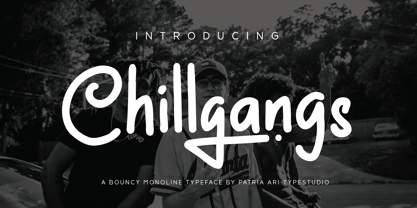 Chillgangs is a monoline display typeface inspired from graffiti culture, with alternative glyphs and swashes. Chillgangs is perfect for apparel, logo, social media posts, advertisements, product packaging, product designs, label, and many more.
 - Ditho by Mifiq,
$14.00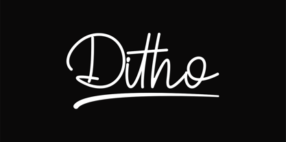 Ditho is an excellent handwritten script font. Ditho is suitable for social media posts, advertisements, logos & branding, invitations, product design, photography, watermarks, labels, wedding designs, product packaging, any event that requires a handwriting.
 - Priscilla by Rockboys Studio,
$26.00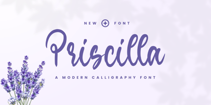 Priscilla is a beautiful and refined script font. It has a classy, elegant and modern look that can be used for logos, branding, invitations, stationery, wedding designs, social media posts, and much more!
 - Retro Vintage by Nirmana Visual,
$15.00 Retro Vintage , Inspired by 70s Design Era. Retro Vintage offers beautiful typographic harmony for a diversity of design projects, including logos & branding, social media posts, advertisements & product designs. Includes a shadow/extrude version.
 - Santup by Jadatype,
$15.00 Santup is a display font that comes with a playful style. suitable for posters, tshirt, branding, social media, and so on. contains standard English letters, numbers, punctuation, and several accents that support multilingualism.
 - Retro Sanderia by Nirmana Visual,
$19.00 Retro Sanderia, Inspired by 70s Advertising Design With 2 Style : Regular & Shadow Retro Sanderia offers beautiful typographic harmony for a diversity of design projects, including logos & branding, social media posts, advertisements & product designs.
 - Pitch Pipe by Aboutype,
$24.99Graphically drawn condensed bold style with abbreviated square serifs. PitchPipe was designed for all media and can be used in a wide range of point sizes. PitchPipe requires subjective display kerning and compensation. - Trostie Love by Lemonthe,
$9.00 Trostie Love is a handwritten font, cute and fun. This font is perfect for quotes, headings, blogs, logos, invitations, wedding, watermark, social media posts, product packaging, product designs, label, special events and more!
 - Retro Styla by Nirmana Visual,
$15.00 Retro Styla , Inspired by 70s Design Era , With 2 Style : Regular & Shadow, Retro Styla offers beautiful typographic harmony for a diversity of design projects, including logos & branding, social media posts, advertisements & product designs.
 - Bellowers by Aestherica Studio,
$12.00 Introducing a new handwritten script font by Aestherica Studio. Bellowers is perfect for product packaging, branding projects, magazines, social media, wedding, or just used to express words above the background. Enjoy the font.
 - Cybestpunk by Jadatype,
$15.00 Cybestpunk is a display font that comes with a cyber tech style. suitable for tshirt, branding, social media, and so on. contains standard English letters, numbers, punctuation, and several accents that support multilingualism.
 - Castonvilla by Rockboys Studio,
$19.00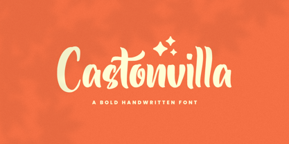 Castonvilla is a beautiful and refined script font. It has a classy, elegant and modern look that can be used for logos, branding, invitations, stationery, wedding designs, social media posts, and much more!
 - Hello Signature by Romie Creative,
$15.00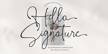 Hello Signature is a handwritten script font, this font is perfect for logos, invitations, stationery, wedding designs, social media posts, advertisements, product packaging, product design, labels, photography, watermarks, special events, or anything else.
 - Oliver Notes by Sronstudio,
$15.00 Oliver Notes is a new modern and stylish handwritten font. It's perfect for logo, invitation, stationery, wedding designs, social media posts, advertisements, product packaging, product designs, label, photography, watermark, special events or anything.
 - Qundeasy by Tanya Savchenko,
$12.00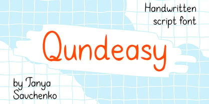 Qundeasy is a sloppy and cute handwritten font. First of all, it is suitable for handmade style design. Сan create interesting logos, posters, banners, social media creatives, postcards and greetings with this font.
 - Magnefida by Adante Creative,
$23.00 Introducing by Adante.Creative Magnefida A Handwritten Script Font Magnefida is perfect for product packaging, branding project, megazine, social media, wedding, or just used to express words above the background. Magnefida also multilingual support.
 - Xerochasy by Ali Hamidi,
$15.00 Xerochasy is a bold script with classic touch and very readable at glance. Really perfect for you who needs a typeface for especially logotype, apparel, invitation, branding, sticker, social media, packaging, advertising etc.
 - Hellowhiten by Rockboys Studio,
$17.00 Hellowhiten is a thin lettered and graceful script font. Fall for its ravishing style and use it to create gorgeous wedding invitations, beautiful stationary art, eye-catching social media posts, and much more!
 - Juliane by Just Lett,
$13.00 Juliane is a thin lettered and delicate script font. Fall for its ravishing style and use it to create gorgeous wedding invitations, beautiful stationary art, eye-catching social media posts, and much more!
 - Scrouble Outline by Jadatype,
$12.00 Scrouble is a display font that comes with a playful scribble style. suitable for tshirt, branding, social media, and so on. contains standard English letters, numbers, punctuation, and several accents that support multilingualism.
 - Quillain by Nurf Designs,
$16.00 Quillain is a casual, fun handwritten font, created by using a marker. Clean and stylish, this font is the perfect fit for all of your logos, branding, social media, and crafty DIY projects.
 - Downtown by Aboutype,
$24.99Mono-weight extra condensed display face. Lowercase sits on a floating baseline. Downtown was designed for all media and works best at 24 point and above. Downtown requires subjective display kerning and compensation. - Avengeline by Rockboys Studio,
$22.00 Avengeline is a beautiful and refined script font. It has a classy, elegant and modern look that can be used for logos, branding, invitations, stationery, wedding designs, social media posts, and much more!
 - Fionetta by ARToni,
$18.00 Fionetta is a thin lettered and graceful script font. Fall for its ravishing style and use it to create gorgeous wedding invitations, beautiful stationary art, eye-catching social media posts, and much more!
 - TA Bankslab by Tural Alisoy,
$33.00 The building of the Northern Bank of St. Petersburg's Baku branch was built in 1903-1905. It was the first Art Nouveau-style building in Baku, Azerbaijan. Later the bank was transformed into the Russian-Asian Bank. After the oil boom in Baku in the 19th century, branches of many banks and new banks were opened in the city. The branch of the Northern Bank of St. Petersburg was among the first banks that was opened in Baku. N.Bayev was the architect of the building for the branch of the Northern Bank of St. Petersburg located at Gorchakovskaya 3 in 1903-1905. The building currently houses the Central Branch of the International Bank of Azerbaijan. My purpose in writing this is not to copy and paste the information from Wikipedia. What attracted me to the building was the word "Банкъ" (Bank) written in Cyrillic letters, which was also used in Azerbaijan during the Soviet era. The exact date of the writing is not known. Every time I pass by this building, I always thought of creating a font of this writing someday. I had taken a photo of the building and saved it on my phone. I did a lot of research on the font and asked a lot of people. However, some did not provide information at all and some said they did not have any information. I was interested in the history of this font but I do not know if this font really existed or it was created by the architect out of nowhere. If there was such a history of this font, I wanted to recreate this font and make it available. If not, I had to create it from scratch in the same way, using only existing letters on the building. Finally, I made up my mind and decided to develop the font with all letters I have got. It was difficult to create a font based on the word, Банкъ. Because in the appearance of the letters, the midline of the letters on A, H, K was very distinct, both in the form of inclination and in more precise degrees. The serif part of the letters, the height of the upper and lower sides, differed from each other. I don't know whether it was done this way when the building was constructed or it happened over time. I prepared and kept the initial version of the font. I took a break for a while. I started digging on the story of the font again. Meanwhile, I was researching and got inspired by similar fonts. Unfortunately, my research on the font's history did not yield any results. I decided to continue finishing up the font. After developing the demo, I created the font by keeping certain parts of these differences in the letters. In addition, I had to consider the development of letters in the Cyrillic, as well as the Latin alphabet, over the past period. Thus, I began to look at the appearance of slab-serif or serif fonts of that time. In general, as I gain more experience in developing fonts, I try to focus on the precision of the design for each font. In recent years, I specifically paid attention to this matter. YouTube channel and articles by Alexandra K.'s of ParaType, as well as, information and samples from TypeType and Fontfabric studios on the Cyrillic alphabet were quite useful. I gathered data regarding the Latin alphabet from various credible sources. I do not know if I could accomplish what I aimed at but I know one thing that I could develop the font. Maybe someday I'll have to revise this font. For now, I share it with you. I created the font in 10 styles. 7 weight from Thin to Extra Black, an Outline, Shadow, and Art Nouveau. The Art Nouveau style was inspired by the texture in the background used for the text on the building. The texture I applied to capital letters adds beauty to the font. If you like the font feel free to use it or simply let me know if your current alphabet doesn't support this font.
 - TT Ramillas by TypeType,
$39.00 TT Ramillas useful links: Specimen | Graphic presentation | Customization options TT Ramillas in numbers: • 28 styles: 7weights, 7 true italics, 4 decorative styles, 7 initials styles, and 3 variable fonts • 900 glyphs in each style (except decorative & initials styles) • Support for more than 180+ languages: extended Latin, Cyrillic • 25 OpenType features in each style (except outline styles): small capitals, ligatures, old-style figures, arrows and other useful features • Amazing Manual TrueType Hinting TT Ramillas is a fully reconsidered high contrast transitional serif, which is perfectly adapted to modern realities and requirements. When starting this project, we wanted to try to draw a modern serif with the precisely verified shapes, high contrast and detailed elaboration of each character. The visual features of TT Ramillas are high contrast, small flared serifs, variable slope of ovals, open aperture of signs, contrasting thin nodules and no drops. In addition, TT Ramillas has a characteristic flame-like element in the lowercase Cyrillic letter ? and a bright "tongue" in the letters ??, ductile legs in ??, ??, and ??, as well as a very interesting upper terminal in the letter a. TT Ramillas is perfect for use in magazines, in the fashion industry, in the branding of premium goods and services. TT Ramillas is quite versatile and suitable for use both in headings and in text arrays. In addition, we have done manual hinting in the typeface, and now it can be used with a clear conscience in the web and applications. In the process of working on TT Ramillas, we wanted to expand the functionality of the typeface a little more, and thus, after a few experiments, two pairs of decorative fonts were born: Outline, Decor and their oblique versions. These decorative fonts work great for headlines and bold accent lettering. We thought that in these decorative fonts, small caps and some specific features would not be needed, otherwise the composition of decorative fonts is identical to the basic ones. The TT Ramillas typeface consists of 28 styles: 7 weights and 7 corresponding italics, 4 decorative ones, 7 initials styles and 3 variable fonts. Each typeface style consists of 900 glyphs (except for the decoratives). TT Ramillas supports over 180+ languages, including Cyrillic support and Extended Latin support. When creating the typeface, we did not forget to add small caps, ligatures, old style figures, arrows, hands, card suits and many other useful characters and OpenType features. For the most demanding users, we have prepared a variable version of basic styles. Using the variability slider, you can adjust and select the individual thickness, without reference to the existing weight distribution. An important clarification — not all programs support variable technologies yet, you can check the support status here: https://v-fonts.com/support/. TT Ramillas OpenType features list: aalt, kern, ccmp, locl, subs, sinf, sups, numr, dnom, frac, ordn, tnum, onum, lnum, pnum, calt, ss01, ss02, ss03, ss04, c2sc, smcp, liga, dlig, case. TT Ramillas language support: Acehnese, Afar, Albanian, Aleut (lat), Alsatian, Aragonese, Arumanian, Asu, Aymara, Azerbaijani, Banjar, Basque, Belarusian (cyr), Belarusian (lat), Bemba, Bena, Betawi, Bislama, Boholano, Bosnian (cyr), Bosnian (lat), Breton, Bulgarian (cyr), Catalan, Cebuano, Chamorro, Chichewa, Chiga, Colognian, Cornish, Corsican, Cree, Croatian, Czech, Danish, Dutch, Embu, English, Erzya, Esperanto, Estonian, Faroese, Fijian, Filipino, Finnish, French, Frisian, Friulian, Gaelic, Gagauz (lat), Galician, Ganda, German, Gusii, Haitian Creole, Hawaiian, Hiri Motu, Hungarian, Icelandic, Ilocano, Indonesian, Innu-aimun, Interlingua, Irish, Italian, Javanese, Jola-Fonyi, Judaeo-Spanish, Kabuverdianu, Kalenjin, Karachay-Balkar (cyr), Karachay-Balkar (lat), Karaim (lat), Karakalpak (lat), Karelian, Kashubian, Kazakh (lat), Khasi, Khvarshi, Kinyarwanda, Kirundi, Kongo, Kumyk, Kurdish (lat), Ladin, Latvian, Leonese, Lithuanian, Livvi-Karelian, Luba-Kasai, Ludic, Luganda, Luo, Luxembourgish, Luyia, Macedonian, Machame, Makhuwa-Meetto, Makonde, Malagasy, Malay, Maltese, Manx, Maori, Marshallese, Mauritian Creole, Minangkabau, Moldavian (lat), Montenegrin (cyr), Montenegrin (lat), Mordvin-moksha, Morisyen, Nahuatl, Nauruan, Ndebele, Nias, Nogai, Norwegian, Nyankole, Occitan, Oromo, Palauan, Polish, Portuguese, Quechua, Rheto-Romance, Rohingya, Romanian, Romansh, Rombo, Rundi, Russian, Rusyn, Rwa, Salar, Samburu, Samoan, Sango, Sangu, Sasak, Scots, Sena, Serbian (cyr), Serbian (lat), Seychellois Creole, Shambala, Shona, Silesian, Slovak, Slovenian, Soga, Somali, Sorbian, Sotho, Spanish, Sundanese, Swahili, Swazi, Swedish, Swiss German, Tagalog, Tahitian, Taita, Tatar, Teso, Tetum, Tok Pisin, Tongan, Tsonga, Tswana, Turkish, Turkmen (lat), Ukrainian, Uyghur, Valencian, Vastese, Vepsian, Volapük, Võro, Vunjo, Walloon, Welsh, Wolof, Xhosa, Zaza, Zulu.
 - TA Bankslab Art Nouveau by Tural Alisoy,
$40.00 TA Bankslab graphic presentation at Behance The building of the Northern Bank of St. Petersburg's Baku branch was built in 1903-1905. It was the first Art Nouveau-style building in Baku, Azerbaijan. Later the bank was transformed into the Russian-Asian Bank. After the oil boom in Baku in the 19th century, branches of many banks and new banks were opened in the city. The branch of the Northern Bank of St. Petersburg was among the first banks that was opened in Baku. N.Bayev was the architect of the building for the branch of the Northern Bank of St. Petersburg located at Gorchakovskaya 3 in 1903-1905. The building currently houses the Central Branch of the International Bank of Azerbaijan. My purpose in writing this is not to copy and paste the information from Wikipedia. What attracted me to the building was the word "Банкъ" (Bank) written in Cyrillic letters, which was also used in Azerbaijan during the Soviet era. The exact date of the writing is not known. Every time I pass by this building, I always thought of creating a font of this writing someday. I had taken a photo of the building and saved it on my phone. I did a lot of research on the font and asked a lot of people. However, some did not provide information at all and some said they did not have any information. I was interested in the history of this font but I do not know if this font really existed or it was created by the architect out of nowhere. If there was such a history of this font, I wanted to recreate this font and make it available. If not, I had to create it from scratch in the same way, using only existing letters on the building. Finally, I made up my mind and decided to develop the font with all letters I have got. It was difficult to create a font based on the word, Банкъ. Because in the appearance of the letters, the midline of the letters on A, H, K was very distinct, both in the form of inclination and in more precise degrees. The serif part of the letters, the height of the upper and lower sides, differed from each other. I don't know whether it was done this way when the building was constructed or it happened over time. I prepared and kept the initial version of the font. I took a break for a while. I started digging on the story of the font again. Meanwhile, I was researching and got inspired by similar fonts. Unfortunately, my research on the font's history did not yield any results. I decided to continue finishing up the font. After developing the demo, I created the font by keeping certain parts of these differences in the letters. In addition, I had to consider the development of letters in the Cyrillic, as well as the Latin alphabet, over the past period. Thus, I began to look at the appearance of slab-serif or serif fonts of that time. In general, as I gain more experience in developing fonts, I try to focus on the precision of the design for each font. In recent years, I specifically paid attention to this matter. YouTube channel and articles by Alexandra K.'s of ParaType, as well as, information and samples from TypeType and Fontfabric studios on the Cyrillic alphabet were quite useful. I gathered data regarding the Latin alphabet from various credible sources. I do not know if I could accomplish what I aimed at but I know one thing that I could develop the font. Maybe someday I'll have to revise this font. For now, I share it with you. I created the font in 10 styles. 7 weight from Thin to Extra Black, an Outline, Shadow, and Art Nouveau. The Art Nouveau style was inspired by the texture in the background used for the text on the building. The texture I applied to capital letters adds beauty to the font. If you like the font feel free to use it or simply let me know if your current alphabet doesn't support this font.
 - H-AND-S by AND,
$89.00 A common creation: (to pass from one hand to the other): For the first time, various hand-signs from diverse sources are unified into one single visual style. This compendium is the result of 15 years of incubation and 7 years of creation. In his travels throughout the world, graphic designer Jean-Benoit Levy, principal of the visual studio AND, has collected pictures of multiple hand signage. Uncertain what to do with those signs, he kept them year after year until the idea came to unify almost 200 handsigns into one single family. In accordance with this entire collection, the name of the typeface is a mix: "h-and-s". A global collection: (To put in good hands): We all have one thing in common: Hand-signs are an international language, they are meant to be understood by all of us. Each of us regularly comes in contact with modern hieroglyphs such as the hand-sign-codes that are so prevalent in our daily life. This way of communication belongs to no one in particular and to all of us in general. Even if the sense of certain signs varies from one culture to the other, there is a common hand-sign language. We are surrounded by this language of handsigns each time we step in a store, we eat, open a container of milk, we clean up, use package of wash-powder, by shaving, when we work, use tools, at home, by tearing the envelope of a condom, by traveling, etc. When we encounter these signs, we all understand them easily. A visual connection: (To go hand in hand): This typeface is a global visual statement. Collecting, ordering, redrawing, unifying. Reconstructed and assembled into one original alphabet, H-AND-S is a unique and complex signs program. Our choice is based on daily gestures and global hand-codes. Logically this typeface starts with the "American Sign Language" and expands on two type-variations, each on two levels of keyboard. The international team of H-AND-S would like to send his special thanks to all of the anonymous graphic designers throughout the world who designed different hand-signage and who influenced and inspired to create such a sign collection into one unified family. We, the global nomad team of AND, hope that you will enjoy our H-AND-S. Additional Credits Production: Studio AND. www.and.ch. Concept, Idea & Creative Direction: Jean-Benoît Lévy, Switzerland / USA. Research & Sketches: Eva Schubert, Germany. Illustration, Graphic Design & Visual Fusion: Diana Stoen, USA. Transfer, Adaptation & Refining: Moonkyung Choi, Korea. Finalization & Checking: Sylvestre Lucia, Switzerland. Coaching & Technical Advice: Mike Kohnke, USA. Creative Energy & Implementation: Joachim Müller-Lancé, Germany / USA.