949 search results
(0.008 seconds)
- Bilibin - Unknown license
- CarrickGroovy - Unknown license
- ITC Snap by ITC,
$40.99ITC Snap is the work of American designer David Sagorski and represents both the creativity and humor of the native Kansan. It clealy displays the influence of cartoon graphics of the 1960s and 70s, but does not need to be limited to period or animated graphics. ITC Snap is ideal for headlines which demand attention. - ITC Juice by ITC,
$40.99ITC Juice is the work of American designer David Sagorski and shows a clear influence of cartoon graphics of the 1960s and 70s. The typeface has a number of unique letter forms as well as an extensive set of alternate characters. The creative, humorous ITC Juice hides a subtle sophistication beneath its funky exterior. - Machtwerk by Volcano Type,
$29.00Religions are filled with signs and symbols. Some of them, like the the star of David and the Swastika-Rune received other significance during the third Reich. The superimposition of these two shapes creates the basis for this font. Matchwerk is a font, that critically questions and recalls the darkest chapter of our history. - BLU Esoteric - Unknown license
- Eyeballs by Bitstream,
$29.99Eyeballs was designed at Bitstream by designer David Robbins. Its beginnings can be found in Bitstream’s Old Dreadful No. 7, where Mr. Robbins first conceived the capital I. He was later asked by Bitstream to develop the entire character set. The result is a humorous meld of cartoon and typography. A word of caution: Watch how you use it! - Mo' Funky Fresh by ITC,
$29.99Mo' Funky Fresh is the work of New York designer David Sagorski. It is an all capital typeface which includes a set of alternative capitals, compatible symbols and lively illustrations. Mo' Funky Fresh brings to mind sunny days, tiki bars, surfboards and cool drinks and is a great choice for headlines requiring a vital, energetic look. - Alchemite by Comicraft,
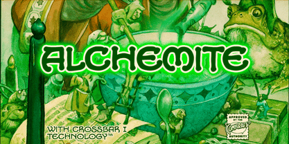
$19.00Turn base letters into gold, bring a norse flavor to your dialogue, and may you live happily ever after! Conjured up by John Roshell of Comicraft for Kurt Busiek and David Wenzel's 'Wizard's Tale', this font should be handled with great care, lest it turn you into a toad. Artwork from The Wizard's Tale by Busiek & Wenzel - Mekanik by ITC,
$29.99Mekanik font is the work of British artist David Quay and as the name suggests, this geometric typeface reflects the simplicity of mechanical sans serif type design. It is an echo of the type styles developed by the Soviet Constructivists in the early 1920s. Mekanik font is excellent for use where a feeling of precision and strength is desired. - Circles JY by JY&A,
$39.00Based on electrical circuitry, David Philpott's Circles typefaces are oddly legible, even though one might think they were destined for display usage only. The circle is the base form, repeated throughout the design. Originally drafted during his time at the Massey University School of Design, subsequent refinements have turned Circles into two complete fonts with a full character set. - La Bamba by ITC,
$29.99La Bamba is the work of British designer David Quay and heavily influenced by the style of the 1950s. It comes with complete upper and lowercase alphabets as well as a set of decorated initialling capitals for added variety. La Bamba is a casual design with wedge-shaped serifs and radiates a gay, light-hearted mood. - FF Beadmap by FontFont,
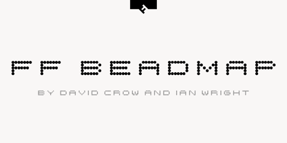
$41.99British type designers David Crow and Ian Wright created this display FontFont in 2002. The family contains 2 weights and is ideally suited for advertising and packaging, editorial and publishing as well as poster and billboards. FF Beadmap provides advanced typographical support with features such as ligatures and case-sensitive forms. It comes with tabular lining figures. - BLU Esoteric - Unknown license
- LHF Cafe Corina by Letterhead Fonts,
$39.00 - Azaelia by Cultivated Mind,
$24.00 - Becka Script by ITC,
$29.00Becka Script was designed by David Harris in 1985 and is a wide running typeface with varying stroke contrasts. This font looks as though written with a broad tipped pen and its slight slant to the right makes clear its similarity to callipgraphy fonts. Becka Script is reminiscent of the 1950s and its strong strokes make it best for headlines or shorter texts. - Blackmoor by ITC,
$29.99Noted British type designer David Quay designed Blackmoor in 1983. Based on an old English letter style, this textura-style Blackletter evokes a mediaeval character, expertly mixing a gothic lowercase together with Lombardic capitals. Blackmoor's rough, distressed features make it ideal for a variety of applications, from serious historical publications to horror movies, and comics. Featured in: Best Fonts for Tattoos - Boomerang JY by JY&A,
$39.00Based around the Australian boomerang, Greg Bastin’s design originally appeared on private Christmas cards and individual projects. It was formalized into a font in 2002 by David Philpott (JY Circles) and brings a quirky antipodean style to the JY&A Fonts range. This display family is available in Solid and Outline forms, the latter containing patterns that parody those of Aboriginal culture. - Mundbind DK by PizzaDude.dk,
$15.00A few days ago, my good friend David from Hanoded.com visited me for a few days. We drank a lot of coffee and walked the streets of Copenhagen - we even took a trip up in Rundetårn! :) Well, on one of our walk (of course looking for inspiration for new fonts) we spotted this handmade sign. We agreed to make a font of the 7 letters available, using our own imagination and style! I called my font Mundbind DK and David named his Mundbind NL - of course it is the landcodes of Denmark and Holland. As you can tell, the font is uneven and somewhat unpredictable - following only the "rules" of the person who handprinted that sign ... and not many of the rules of the good old and respected painter who make beautiful signs ... however, this sign had it's beauty in a natural and innocent way. - Amelia by Tilde,
$39.75Stan Davis drew this face for VGC in 1967, following the structure of the MICR figures to suggest a ‘computerized’ effect. - Amelia by Bitstream,
$29.99Stan Davis drew this face for VGC in 1967, following the structure of the MICR figures to suggest a ‘computerized’ effect. - Maccaroni by URW Type Foundry,
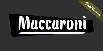
$39.99David Kowalski’s typeface Maccaroni is based on a logo type and has been designed to a complete typeface in Prof. Veljovic’s Type Design course at HAW Hamburg. Maccaroni breaks the traditional brush scripts and offers a unique design. Each letter is present in triplicate in order to achieve the illusion of a hand-written typeface. The OpenType programming ensures that two identical letters won’t follow each other. - Apres by Font Bureau,
$40.00David Berlow and staff drew Apres as part of a series designed originally for the Palm Pre smart phone, for use both on the device and in print marketing. Simple, open letterforms and generous proportions provide a clear, comfortable, and inviting experience for navigation and readability. The plain-spoken geometry is regular and balanced, without being static or mechanical, for a friendly and forthright familiarity; FB 2008 - FB Titling Gothic by Font Bureau,
$40.00Titling Gothic FB is an immense series of nearly fifty styles inspired by that century-old favorite ATF Railroad Gothic. Led by the Los Angeles Times and Gentleman’s Quarterly, U.S. publications are using David Berlow’s series to unify the structure of headlines from its wide spectrum of options. Titling Gothic FB started as a relative of Berlow’s Rhode family, but took its own direction; FB 2005 - Bordeaux by ITC,
$40.99David Quay designed Bordeaux to exhibit characteristics common in the typefaces of the Romantic era, the period which produced the novels of Victor Hugo, the music of Berlioz and the fairy tales of Hans Christian Andersen. Bordeaux displays the emotive quality one associates with the times. The font is intended for titles and headlines and combines well with Syntax for the body of the text. - Kis FB by Font Bureau,
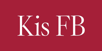
$40.00Transylvanian punchcutter Nicholas Kis cut a leading figure in 18th century Amsterdam. Series of his matrices survived at the Ehrhardt typefoundry. From these Chauncey Griffith at Mergenthaler cut the Janson series in 1936. Morison at Monotype followed with Ehrhardt. David Berlow takes full advantage of current techniques to produce these splendid and adventurous display series to complement one of the great oldstyle texts; FB 2007 - Rhode by Font Bureau,
$40.00Generous curves above and below the straight-sided Railroad Gothic parallel those of Figgins’s elephantine Grotesques, lending to both British and American series their monumental qualities. Shrinking the center strokes and counters to emphasize a massive periphery, David Berlow has used this curious similarity to suspend a complete family of sanserifs between the two forms, a manly series of great dignity and presence; FB 1997 - Titling Gothic FB by Font Bureau,
$40.00Titling Gothic FB is an immense series of nearly fifty styles inspired by that century-old favorite ATF Railroad Gothic. Led by the Los Angeles Times and Gentleman’s Quarterly, U.S. publications are using David Berlow’s series to unify the structure of headlines from its wide spectrum of options. Titling Gothic FB started as a relative of Berlow’s Rhode family, but took its own direction; FB 2005 - Ah, the Abysmal Gaze font - a creation that seems to hail from the depths of an artist's most intriguing nightmares, or perhaps, their most whimsical dreams. Crafted by the hands and imaginative geni...
- Ekberg Demo - Unknown license
- Section by Monotype,
$29.99The Section Bold Condensed font is patterned with lines dividing each letter into small sections. Section Bold Condensed is a headline face with uses ranging from book titles on technological subjects to embroidery books. - Berlin Sans by Font Bureau,
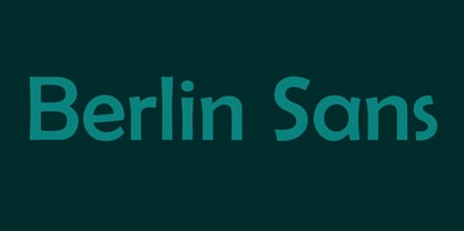
$40.00Berlin Sans is based on a brilliant alphabet from the late ’20s, originally released by Bauer with the name Negro, the very first sans that Lucian Bernhard ever designed. Assisted by Matthew Butterick, David Berlow expanded this single font into a series of four weights, all complete with expert character sets, plus a dingbat font. Imaginative & little-known, it promises enticing opportunities to the adventurous typographer; FB 1994 - Meyer Two by Font Bureau,
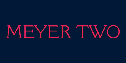
$40.00Meyer Two captures the early Hollywood flavor and nostalgia of silent-film intertitles. From 1922 through 1928, Mergenthaler Linotype cut five fonts to Louis B. Meyer’s personal specifications. Meyer Two, drawn in 1926, curiously combines Cleland’s ATF Della Robbia capitals of 1902 with lowercase and figures from ATF Post Monotone No. 2, also from the same period. Meyer Two was revived, with a Condensed added, by David Berlow; FB 1994 - Vonnes by Font Bureau,
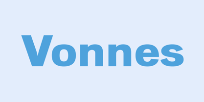
$40.00Vonnes was designed by David Berlow working closely with Neville Brody on corporate redesign for Jim Von Ehre at Macromedia. Core weights are loosely based on Bauer’s Venus, 1907–1910. Berlow expanded the ideas behind the series to 56 fonts, the heart of the redesign. The Macromedia program was hailed as one of the most successful models of modern total design for innovative cutting edge companies; FB 2007 - Poynter Serif RE by Font Bureau,
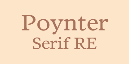
$40.00Inspired by the work of Hendrik van den Keere, Tobias Frere-Jones and David Berlow designed a family of typefaces focused on the challenges of newsprint publishing. This version of the family is part of the Reading Edge series of fonts specifically designed for small text onscreen, having been adjusted to provide more generous proportions and roomier spacing, and having been hinted in TrueType for optimal rendering in low resolution environments. - Giza by Font Bureau,
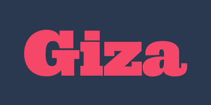
$40.00The sixteen styles of Giza bring back the colorful power and variety of the original Egyptian letterforms, a glory of the Victorian era. Designer David Berlow based the family on showings in Vincent Figgins’ specimen of 1845, the triumphant introduction of this thunderous style. The truly unforgettable “Nine” weights were designed for ultimate emphasis in posters, and do their most effective work in the very largest of sizes. - Belucian by Font Bureau,
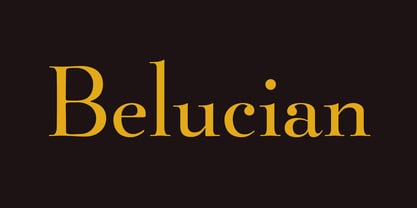
$40.00The Belucian series offers a distinguished text design supported by dynamic headline structure. In need of a distinctive display style, Smart magazine asked Font Bureau in 1990 to revise the work of Lucian Bernhard from 1925. David Berlow prepared Belucian Demi, now accompanied by Kelly Ehrgott-Milligan’s 1994 Demi Italic, added Book and Book Italic for text, and designed Ultra for dynamic impact in headlines; FB 1990–94 - Belizio by Font Bureau,
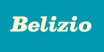
$40.00The eight-part Belizio series updates the first Font Bureau typeface. David Berlow’s family is based on Aldo Novarese’s Egizio, designed in 1955 for Nebiolo. It was first prompted by the popularity of Haas Clarendon, designed by Hoffmann and Eidenbenz, an impeccably Swiss revival of the traditional English letterform. Aldo Novarese was among the first to investigate a true italic designed in the Clarendon style; FB 1987–98 - Romeo by Font Bureau,
$40.00David Berlow drew Romeo Medium Condensed during winter of 1990, basing the design on the Estrecha Fina weight of Electra, a spectacular art deco sanserif with an unusually fine condensed series. Carlos Winkow designed it circa 1940 for the Nacional typefoundry of Madrid, the leading typefoundry in Spain. Jill Pichotta drew the ultra-light Skinny Condensed, a digital tour de force released with Medium Condensed; FB 1990–91


