10,000 search results
(0.069 seconds)
- Scriptease by ITC,
$29.99Scriptease is the temperamental creation of Phill Grimshaw, based on the forms of copperplate typefaces. At the same time, the playful forms display a variety of Rococo elements. Richly ornamented with vivacious swirls, especially on the capitals, the forms of this font dance across the paper. The capitals can also be used as initials combined with other alphabets. Scriptease looks as though it were made for the light, carefree side of life. - Gesto by Neoflix Studio,
$9.00 Gesto is a extra wide retro sans serif with modern design. Gesto is a display typeface designed for use in wide size. Inspired by style design that is a currently popular. Gesto have some alternative letter and ligatures to make it easier for you to choose a letter that fits your design. Gesto is perfect use poster, headline, cover books, t-shirt and all you needs of every idea that you will pour in this modern era. Gesto was build 535 glyphs with numbers, punctuation, symbol with +75 languages.
 - Isagi Blue by Lurinzu Studios,
$10.25 A techy, sci-fi condensed typeface that is inspired by the mixture of futuristic and athletic vibes into one out of this world headline typeface. This headline font best fits in large scale design when you want to immediately capture the attention of the viewers. This also fits with school-related, athletics, sports, future and science themed designs. *This font includes letters, numbers, multi-language, and all essential marks needed.
 - Pagnol by Typorium,
$15.00 The Pagnol typeface has been designed with a principle developed by A. M. Cassandre in 1937, when the great French designer created the Peignot typeface following paleographic studies on the evolution of letterforms. Researches in the history of writing have proved that the lowercase "a" is at its origin nothing but the "A" shape transformed through centuries by scribes until the invention of printing. A large number of lowercases meanwhile kept their original shapes. If the scribes’ hand didn’t find the necessity to simplify them, it is only because these letters could be easily written. Integrating the classical shapes of capitals to the lowercases has already been used, keeping the lowercases which are only a deformation of capitals. Nevertheless, the respect of readability imposes to keep ascendants and descendants from traditional lowercases which serve as optical focus points in a text and make reading easier. The particularity of Pagnol is to use rounded shapes on top and bottom of pointed capital letters to make them fit with corresponding lowercases (Aa, Mm, Nn, Vv, Ww, Zz). Lowercases proportions are wide, to be in tune with classic lowercase shapes in order to optimize readability. Five weights in roman and italic have been designed to offer a wide palette of typographic possibilities in all sizes and all paper and screen supports.
 - Kinglet by Atlantic Fonts,
$26.00 Digging a typeface with a sweet mood? Kinglet is sassy, hand-drawn, and sports a royally fun set of double letter ligatures. Like it's namesake, Kinglet is lively and lovable.
 - Contane Text Cnd by Hoftype,
$49.00 Contane Text Condensed is the text optimized version of Contane Condensed. More solid, more robust, it embodies the power addition to the more delicate members of the Contane Condensed family. Stronger hairlines and stronger serifs also make it appropriate for smaller text size applications. Contane Text Condensed supports up to 80 languages and it’s OpenType format allows a wide range of typographic applications. 20 styles offer fine graduation of the weights. All weights contain small caps, ligatures, superior characters, proportional lining figures, tabular lining figures, proportional old style figures, lining old style figures, matching currency symbols, fraction- and scientific numerals, matching arrows and alternate characters.
 - Fleurons One by Wiescher Design,
$39.50 Fleurons are embellishments and this is my first fleurons font. I looked at some old ones and made some new ones. They should go very well with my script Nadine!!! Yours in a beautiful mood Gert Wiescher
 - Linden by Journey's End,
$12.00I hope that you enjoy the "Linden" font. The basis for this new font is my Leaf font. As much as I love the Leaf font, however, I felt (and still feel) the desire to have a larger font, for three reasons: 1. I enjoy customizing my internet browser to show different fonts. The original "Leaf" font was a bit too small for that. The new "Linden" font is perfect for this function. 2. Some of the fonts that I use in writing e-mails look their best at sizes 24 or 36. That’s fine for me, but unless I want to go to the trouble each time of changing the size, then the recipients oft my e-mails get wolloped with an enormous-sized font. When I use "Linden" for my e-mails, it’s automatically a perfect size at 12 or 14, solving this problem. 3. I also enjoy customizing the font in which I read my e-mails. Unfortunately, there are only a few which are legible in the tiny size in which this is configured. Again, "Linden" is configured to be large enough automatically so that it can easily be read by anyone. I am pleased to offer a pleasant font for use in any or all of the scenarios; I love fun solutions and hope that you will enjoy the "Linden" font. (Just a tip: when printing out documents using the "Linden" font, I love it best in font size 11!) - ITC Tempus Sans by ITC,
$29.99ITC Tempus is the work of British designer Phill Grimshaw. He claims that every calligrapher's aspiration is to draw perfect roman capitals with a pen, but admits that this is extremely difficult. For this typeface, Grimshaw used a fountain pen on cheap, porous paper and, of course, the ink bled. The resulting forms are classic but their rugged edges deviate from the perfection of roman type. And Tempus Sans is just Tempus with the serif surgically removed, yet the proportions of the characters work nicely," says Grimshaw. Because of its rough quality, the typeface works best in larger point sizes, yet maintains its characters even in smaller sizes." - ITC Tempus Serif by ITC,
$29.99ITC Tempus is the work of British designer Phill Grimshaw. He claims that every calligrapher's aspiration is to draw perfect roman capitals with a pen, but admits that this is extremely difficult. For this typeface, Grimshaw used a fountain pen on cheap, porous paper and, of course, the ink bled. The resulting forms are classic but their rugged edges deviate from the perfection of roman type. And Tempus Sans is just Tempus with the serif surgically removed, yet the proportions of the characters work nicely," says Grimshaw. Because of its rough quality, the typeface works best in larger point sizes, yet maintains its characters even in smaller sizes. - Linotype Devanagari by Monotype,
$103.99 The new Linotype® Devanagari typeface is a traditional text face now available in five weights (from Light to Black) and suitable for a wide variety of print and digital uses. A compact design, Linotype Devanagari also provides economy of space where textual real estate is at a premium. In addition, its large character set enables the setting of Hindi, Marathi, Nepali and is suitable for Sanskrit passages. The design’s open counters ensure high levels of legibility at small sizes and at modest resolution. The history of Linotype Devanagari is quite extensive. Inspired by the late 19th and early 20th century Nirnaya Sagar designs, it was originally designed in 1977 by Mathew Carter for phototypesetting systems. It was then revised and expanded for digital typesetting by the Linotype letter-drawing studio headed by Georgie Surman under the art direction of Fiona Ross. This new, enhanced revival was designed by Lisa Timpi and Gunnar Vilhjálmsson with Fiona Ross as a consultant. This new Linotype Devanagari is part of a project to refresh the pivotal Linotype Bengali and Linotype Gujarati typefaces and make them available for the first time in the popular OpenType font format.
 - Pueblo by Monotype,
$29.99Like many of Jim Parkinson's alphabets, Pueblo began as poster lettering. It shows a range of influences: turn-of-the-century sign painting, old Speedball lettering books, and a touch of art nouveau. While developing Pueblo, Parkinson debated whether to make the ends of the serifs rounded or square. Rounded looked more like the work of a Speedball lettering pen, but squared stroke endings made the letters more legible at small sizes. The finished design sports serifs that are just slightly rounded. According to Parkinson, the design feature is “enough to be noticed at large sizes, while going virtually unnoticed at smaller point sizes,” adding to the versatility of this distinctive typeface. - FS Albert Arabic by Fontsmith,
$150.00 Brother To create a truly global font family, FS Albert needed an Arabic script sibling. Emanuela Conidi set about the delicate task of creating an alphabet to harmonise visually with its Latin sans serif counterpart so that the two could be used side-by-side in bilingual publications. Working with the Kufic style of script, with its simpler, geometric forms, Emanuela sculpted letters with the a similar optical size, weight and rhythm as FS Albert, with open counters and monolinear strokes. It never hurts to Naskh But there’s more to FS Albert than a simple, geometric structure. To match Albert’s cheery, charming character, FS Albert Arabic needed an injection of warmth and informality. Emanuela incorporated some of the more expressive, calligraphic shapes of the Naskh script style, which lent the letterforms a looser, softer, more handwritten quality, while remaining functional and structured. The Naskh influence is most noticeable in the bowl of characters such as Jim, Qaf and Nun, in the curved tail of Waw and Reh, and the deep joining of Tah. Follow the script The end result is an Arabic script that’s the perfect partner to FS Albert: open counters, monolinear strokes and a friendly, rounded appearance. FS Albert Arabic is available in Opentype format, in five weights from Thin to ExtraBold. It supports Persian and Urdu, with proportional and tabular numerals for both, plus full vocalisation and the Hijra feature.
 - Surface Stencil JNL by Jeff Levine,
$29.00 A hand-cut antique brass stencil for marking barrel tops of dill pickles was the source of inspiration for Surface Stencil JNL, available in both regular and oblique versions.
 - Architype Renner by The Foundry,
$99.00 The geometry of Paul Renner’s sans letterforms was tempered by optical correction to follow earlier typeface proportions, with capitals close to old-style forms, yet still retaining the spirit of the New Typography. His early experimental characters were included as alternatives in the sans which was to become the Futura released by Bauer in 1927–30. Unusually, old style figures also appeared in his early versions but they too were soon discarded. Foundry Architype Renner as a new four weight family has been developed from the original Renner Regular and Bold, created by The Foundry for the first Architype Collections in the early 1990s. This new family features the old style figures and the experimental elements.
 - Adorable by DainType,
$15.00 'Adorable' has a happy mood. It also feels lively because you can feel the rhythm in the strokes. This typeface is suitable for any place where a happy atmosphere is needed, such as printouts for children, gift cards, children's clothes, birthday cards, and cheerful advertisements. It contains Latin extended characters.
 - PR Ex Cathedra by PR Fonts,
$10.00 This font is closely based on classical proportions, with flared terminals. Small Capitals are 7/8 the size of the capitals
 - Stabia by Eurotypo,
$29.00 Stabia is a multi-purpose typeface with large wedge-angular serifs. It is delicate and highly readable at very small sizes but reveals all its strength and personality when used at big sizes. The contrast of the sharped serifs provides a fresh and very contemporary look. The family has 5 weights, ranging from Light to Black (including italics) and is ideally suited for advertising and packaging, book text, editorial and publishing, logo and branding, small text as well as web and epub. Stabia provides advanced typographical support with features such as ligatures, small capitals, alternate characters, case-sensitive forms, fractions, and super- and subscript characters. It comes with a complete range of figure set options – oldstyle and lining figures, each in tabular and proportional widths. As well as Latin-based, the typeface family also supports Central European languages. Stabiae was an ancient Roman town, located close to the modern town of Castellammare di Stabia approximately 4.5 km southwest of Pompeii. According to the account written by his nephew, Pliny the Elder was at the other side of the bay in Misenum when the Mount Vesuvius eruption started. He travelled by galley ship across the bay, partly to observe the eruption more closely, and partly to rescue people from the coast near the volcano. Pliny died at Stabiae the following day, probably during the arrival of the sixth and largest pyroclastic surge of the eruption caused by the collapse of the eruption plume.
 - Gardenia by W Type Foundry,
$25.00 Gardenia is a grotesk sans-serif. It comes in 9 weights with matching italics. It was designed by Salvador Rodríguez in 2015/2016. It is characterized by legibility in the medium sizes, black and thin weights are great performers in display sizes. Gardenia is well suited for longer texts and headlines. It’s perfect for graphic design, web, print, motion graphics, interaction design etc… Gardenia is equipped with a wide range of opentype features. Learn about upcoming releases, work in progress and get to know us better! On Instagram W Foundry On facebook W Foundry Check out our website!
 - Office Stamps JNL by Jeff Levine,
$29.00Office Stamps JNL is a collection of twenty-six images recreating the familiar 'stock' rubber stamps used in offices for decades before self-inking stamps and desktop printing made them relics of the past. Modeled from vintage sources, all of the images have been re-drawn by Jeff Levine to have a crisper look than simply utilizing scanned imprints of old marking devices. - Frances Uncial by ITC,
$29.00Frances Uncial is the work of Michael Gills, who gave the font a strong tactile appearance by lino-cutting the forms before scanning them into digital form. The result is a captivating typeface with classic, antique-looking forms. The rough edges of Frances Uncial font are best highlighted in larger point sizes yet its legibility is retained in smaller sizes. - Ponderosa by Adobe,
$29.00Ponderosa font is a joint work of the typeface designers K.B. Chansler, C. Crossgrove and C. Twombly, who also created Rosewood, Zebrawood and Pepperwood together. As the name suggests, it is so-called wood type. The origins of this kind of typeface can be found in the early 19th century. Called Italian or Italienne, these typefaces quickly became very popular. They are distinguished by square serifs whose width is larger than the stroke width of the characters. When the letters are set together, the heavy serifs build dark horizontal bands. The distinguishing characteristic of Ponderosa lies in its extremely fine figures between heavy serifs. The designers approached the boundaries of the impossible with this contrast. The typeface is reminiscent of the Wild West with its shootouts and heroes as well as of the 1970s with their platform shoes and wild hair-dos. When used carefully in headlines, Ponderosa font will surely attract attention. - Komet Pro by Jan Fromm,
$65.00 Komet is a sturdy typeface with a calm and upright feel. Although it derives inspiration from classical English sans-serifs, it’s not too closely related to that model. Komet, instead, feels rather more lively and contemporary. Its compact spacing, low stroke contrast and heavy dots and accents give it an almost monolinear quality. The diagonals are slightly curved and the counters of the round letters such as b, o and q are generously wide. The muted, understated middle weights are built for extended body copy, while Komet’s thin and dark weights look brisk and assertive and make for subtly expressive headlines. Komet is an ideal choice for editorial design, branding and corporate design. The Komet Pro family comes in eight weights with matching italics, from Thin to Black. Each font contains around 850 glyphs, including a rich repertoire of OpenType features. Small caps, ligatures, ten different figure sets with matching currency symbols, stylistic alternates and arrows make Komet Pro a comprehensive toolkit for ambitious typography.
 - Sundash by Jehoo Creative,
$16.00 Sundash versatile typeface with wide allternate allcaps. This bold modern font explores the style of Allcaps, we add a wide character to make it look more flexible. based on forms inspired by free urban culture, Sundash has a modern and vibrant spirit. Sundash explores how the shapes and curves of letters change their Focus. This font has a variable weight of 5 Light, regular, medium, bold, extrabold to make the sundash more solid. Sundash has 247 glypghs with a unique and bold character perfectly suited for a wide variety of applications from editorial design to branding, advertising, publications and digital.
 - Tango Silver by Letterara,
$16.00 Tango Silver is a Bold serif font family with a unique style. It has a modern and strong look. this font is suitable for many projects, for modern or even retro vintage design, branding, crafting, sticker, sublimation, wedding invitation, advertising, vintage mood boards, logotype, packaging, titles, editorial design, and many more. This font is PUA encoded, which means you can easily access all of the glyphs and swashes!
 - Great Warrior by Letterara,
$16.00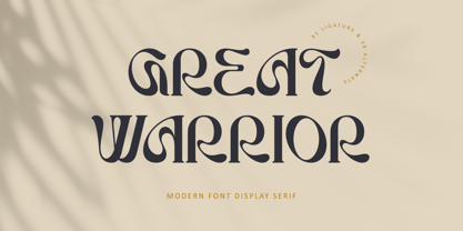 Great Warrior is a modern serif font family with a unique and classy style. It has a modern and vintage look. this font is suitable for many projects, for modern or even retro vintage design, branding, crafting, sticker, sublimation, wedding invitation, advertising, vintage mood boards, logotype, packaging, titles, editorial design, and many more. This font is PUA encoded, which means you can easily access all of the glyphs and swashes!
 - Klex Plus by Ingo,
$42.00 A calligraphic alphabet in bold/light brushstrokes Actually, a typeface like this one should be written with a wide brush; this one was written with a thick, pointed brush. Thus were created the round or misshapen ends of the stems, and the sometimes excessively pointed ends of the hairlines. For each character of KLEX, the large brush was dipped in the ink anew. Using this method, the forms turned out very soft, in spite of their geometrical rigidity. The individual characters are heavy, simple, and monumental, so that they are also suitable as initials.
 - Malambo by Sudtipos,
$59.00 The master of the dancing brush, Angel Koziupa, and the node-obsessed perfectionist, Alejandro Paul, offer up another bucket of fun with Malambo. This time Koziupa allows his brush to jitter one whole millimeter, and Paul digitizes with two eyes instead of his usual three. Follow your heart, but consume an ounce of peroxide first. Full of energy and cheeky mischief, Malambo tells the eye amusing stories of mirrorless shaving accidents, wine mistakenly poured over the morning cereal, and someone who trips over his own shadow on the dance floor, yet keeps on dancing. And dancing is what this typeface is all about. Malambo is a traditional Argentine dance performed by the gauchos (the Argentine equivalent of 19th century North American cowboys?). The gauchos are still around in the less than touristic areas of Argentina. And although they dance quite passionately and make the heartiest parrillas, most of them probably don't know what a font is. But you know, and we know. And that's something. Malambo was selected as the Best in show display font at the Biennial Letras Latinas.
 - Gomme Sans by Dharma Type,
$29.99 Gomme Sans is a wide and masculine sans-serif family for text designed by Ryoichi Tsunekawa and the whole family consists of 6 weights from ExtraLight to ExtraBold and their matching Italics. The basic concept of this family is not only to make an impact by masculine, squarish letter form but also to be legible and readable even on small size screen by the sophisticated design, and their large x-heights. Gomme Sans supports almost all European languages: Western, Central, South Eastern Europeans and afrikaans. And proportional figures, superior figures, inferior figures, denominators, numerators, fractions, ordinals and case-sensitive-forms can be accessed by using OpenType features.
 - Origram Pro by Nuno Dias,
$21.00 ORIGRAM PRO is the full version of ORIGRAM Free Font, a font with over 100k downloads, and counting! This font was already featured in dozens of websites and Design Blogs. I decided to remake this font, smoothing out a few rough edges - so to speak - and adding value to the end result, with several different interesting tweaks and updates. Inspired in the Origami and Tangram tradition, the basic shape is an octagon. Geometrical and regular, resulting in a neat and captivating display font. Not particularly conceived to be used in common text, this stylized font will add value to any large scale image within the realm of logos & branding, outdoors, packaging, titles, magazines, posters, signs, shirts, scrap-booking... Your imagination is the limit. This display font comes now with Uppercases, updated Lowercases, Numbers, and a slew of new Diacritic Marks and Punctuation Marks. A large number of special characters was included in the package, enriching the font’s versatility and usability.
 - Interlaken by ROHH,
$20.00 Interlaken™ is a modern display & branding typeface allowing to design creative logotypes, posters and headlines with ease. It is an uppercase family of six OpenType fonts and one 2-axis variable font, packed with features such as stylistic alternates and tons of original ligatures. The family’s purpose is to make the creative process of designing logotype a blast. It has a wide set of OpenType features crafted especially to make your life easier, allowing you to accomplish your projects in less time. Interlaken has a powerful and very modern character, it comes in three width variants, making it a good fit in various design scenarios. Its cutout details make it look unique and create an impression of inner shadows when set on a dark background. Interlaken is a great typographic tool for such industries as sports, fitness, modern technology, fashion and gaming. It works perfect as a pairing typeface with Rothorn, Conthey and Conthey Inline and Axalp Grotesk.
 - Suboel by Subtitude,
$- This bitmap font is made of 97 icons to use to express this time of the year... You will find christmas tree, Santa, cake, stars, gobelin, and a lot more. They work well for background tiling, just as symbols, or for anything else. We hope you like them ! Best size in bitmap is 20pt.
 - FF Good Headline by FontFont,
$72.99 FF Good is a straight-sided sans serif in the American Gothic tradition, designed by Warsaw-based Łukasz Dziedzic. Despite having something of an “old-fashioned” heritage, FF Good feels new. Many customers agree: the sturdy, legible forms of FF Good have been put to good use in the Polish-language magazine ‘Komputer Swiat,’ the German and Russian edition of the celebrity tabloid OK!, and the new corporate design for the Associated Press. Although initially released as a family of modest size, the typeface was fully overhauled in 2010, increasing it from nine styles to 30 styles, with an additional 30-style sibling for larger sizes, FF Good Headline. In 2014, the type system underwent additional expansion to become FontFont’s largest family ever with an incredible 196 total styles. This includes seven weights ranging from Light to Ultra, and an astonishing seven widths from Compressed to Extended for both FF Good and FF Good Headline, all with companion italics and small caps in both roman and italic. With its subtle weight and width graduation, it is the perfect companion for interface, editorial, and web designers. This allows the typographer to pick the style best suited to their layout. As a contemporary competitor to classic American Gothic style typefaces—like Franklin Gothic, News Gothic, or Trade Gothic—it was necessary that an expanded FF Good also offers customers both Text and Display versions. The base FF Good fonts are mastered for text use, while FF Good Headline aims for maximum compactness. Its low cap height together with trimmed ascenders and descenders give punch to headlines and larger-sized copy in publications such as newspapers, magazines, and blogs.
 - Oculi Magni by TeGeType,
$25.00 Oculi Magni is a new sans serif type family of 8 weights with italics. This font was specially designed for the composition of texts in small size as captions or footnotes but the thin and black weights can also be used in display sizes. The x-height, as tall as possible, allows the composition of very tight, very dense texts while maintaining a perfect readability.
 - Wiggles - Unknown license

- Wobbles - Unknown license

- Wibbles - Unknown license

- Royal Bavarian by Wiescher Design,
$39.50 RoyalBavarian was comissioned by King Ludwig the First of Bavaria about 1834. He was probably the greatest king Bavaria ever had, but he fell in disgrace for a short affair with the infamous Lola Montez and subsequently had to resign. He died in 1868, peaceful and happy in Nice on the French Riviera. I happened on an original etching of his type-guidelines for official writers of those days about 20 years ago. I always thought it was a very nice Fraktur (Blackletter), not a sturdy militaristic one as most of them are. Being me, I started with first tests immediately and then just forgot the font on my computer. When I was sorting out old stuff a couple of months ago I happened on the etchings once again and kept on working intermittently on the letters. The Plain cut is pretty much like the king wanted it. The Fancy cut is more to my liking and very decorative. Yours in a royal mood, Gert Wiescher.
 - Bookseller Bk by Cyanotype,
$20.00 Bookseller Bk is a typeface designed for books and legible text at a small sizes, with an old book feeling. This typeface is the reinterpretation of a sample found in a French book, published between 1882 and 1893 and its author —Ernest Michel— lived between 1837 and 1896. This sample has influence from Didot, Scotch Roman and Clarendon (typefaces which were in use at that time). This reinterpretation expands the basic set for the contemporary era. Bookseller Bk includes small caps, old style figures, lining figures, fractions and basic Cyrillic alphabet. Everything in 3 different optical widths. You can save some lines with Reduced weight or fill some lines with Ample weight. All of them with italics, bold and bold italics. Bookseller Bk is also available in Caption size. 12 fonts for legibility at smaller sizes. Subhead & Title sizes are now in development. Finally this typeface was the result of the course Digital Reinterpretation of Classic Typography by Oscar Guerrero Cañizares at Domestika. Do you require additional glyphs? Please contact me to consider your request in order to expand Bookseller in further updates.
 - Bookseller Cp by Cyanotype,
$20.00 Bookseller Cp is a typeface designed for books and legible text at a smaller sizes, with an old book feeling. This typeface is the reinterpretation of a sample found in a French book, published between 1882 and 1893 and its author —Ernest Michel— lived between 1837 and 1896. This sample has influence from Didot, Scotch Roman and Clarendon (typefaces which were in use at that time). This reinterpretation expands the basic set for the contemporary era. Bookseller Cp includes small caps, old style figures, lining figures, fractions and basic Cyrillic alphabet. Everything in 3 different optical widths. You can save some lines with Reduced weight or fill some lines with Ample weight. All of them with italics, bold and bold italics. Bookseller Cp is also available in Book size. 12 fonts for legibility at small sizes. Subhead & Title sizes are now in development. Finally this typeface was the result of the course Digital Reinterpretation of Classic Typography by Oscar Guerrero Cañizares at Domestika. Do you require additional glyphs? Please contact me to consider your request in order to expand Bookseller in further updates.


