10,000 search results
(0.159 seconds)
- Rotis Sans Serif Paneuropean by Monotype,
$98.99Rotis is a comprehensive family group with Sans Serif, Semi Sans, Serif, and Semi Serif styles. The four families have similar weights, heights and proportions; though the Sans is primarily monotone, the Semi Sans has swelling strokes, the Semi Serif has just a few serifs, and the Serif has serifs and strokes with mostly vertical axes. Designed by Otl Aicher for Agfa in 1989, Rotis has become something of a European zeitgeist. This highly rationalized yet intriguing type is seen everywhere, from book text to billboards. The blending of sans with serif was almost revolutionary when Aicher first started working on the idea. Traditionalists felt that discarding serifs from some forms and giving unusual curves and edges to others might be something new, but not something better. But Rotis was based on those principles, and has proven itself not only highly legible, but also remarkably successful on a wide scale. Rotis is easily identifiable in all its styles by the cap C and lowercase c and e: note the hooked tops, serifless bottoms, and underslung body curves. Aicher was a long-time teacher of design with many years of practical experience as a graphic designer. He named Rotis after the small village in southern Germany where he lived. Rotis is suitable for just about any use: book text, documentation, business reports, business correspondence, magazines, newspapers, posters, advertisements, multimedia, and corporate design. - Fusaka by Adobe,
$29.00Fusaka was created by graphic designer Michael Want, a highly original and specialized display typeface which bridges Kanji and Roman letterform styles. As in Kanji, each character fits into a square. The shape and the placement of letter and decorative strokes can make Fusaka look like Asian writing at first glance and allow it to be set either horizontally or vertically. Use Fusaka for a unique look on CD covers, magazine headlines, book titles and Web sites. - Kinfolke by Unitype Studio,
$19.00 Introducing Kinfolk sans-serif font. The perfect choice for designers and creatives looking to add a modern, minimalistic touch to their projects. Crafted with precision and attention to detail, our sans-serif font offers a clean and stylish look that will elevate your designs to the next level. With its versatile design and legibility, it's ideal for a wide range of projects, including logos, branding, web design, and print materials. Thanks for downloading, and I hope you enjoy it!
 - Fancy by Arodora Type,
$15.00 Fancy Font Family is a font that I have been working on since 2012 and I have been trying to complete it for a long time. Thanks to its wide lines, you can use it easily in your paragraphs and poster designs. In fact, the purpose of using a font is entirely related to your imagination and your originality. The Fancy Font Family adapts to any design format you need and does not let you down.
 - Clydesdale by Red Rooster Collection,
$60.00 Clydesdale is a five-weight compressed sans serif font family. It was designed by Steve Jackaman over a several-year period, and was released in 2017. Clydesdale, much like its sister typefaces Coliseum and Torpedo, was inspired by authoritative Roman display typefaces. The font family excels in displays, but is a great performer in all text sizes. It is perfect for users who enjoy the impressiveness of Coliseum Pro and Torpedo, and need a complementary sans serif typeface.
 - Sheko by Valentino Vergan,
$14.00 Sheko is a creative headline pixel font that looks great on any retro design. Sheko is designed to be very eye catching, it’s tight kerning and bold letters makes it great for bold headline vintage designs. You can use Sheko for a wide range of projects, including print and web. If you are looking for something bold and retro for you next project, Sheko is the font for you. I hope you enjoy using the Sheko font.
 - Manifestor by Stawix,
$40.00 Manifestor is designed to be an urban culture typeface, it can effortlessly fit, blend and be in very situation at any time without taking up too much attention. It has a clean san-serif structure and proportion, kind to the eyes when set in texts while also look reliable when use in big scale. Manifestor has the simple - easy - comfortable feature, therefore it is a type appropriate for a very wide range of occasion. Manifestor also comes in Variable!
 - Rebrand by Latinotype,
$29.00 Rebrand is all about geometry, a typography that boosts confidence. However, contrary to pure, cold mathematics, this font seeks a more jovial and friendly face. The goal with Rebrand is to offer a Geometric Sans Serif font that can work in various instances, from symbols and titles, to text, and everything in between. It also creates a whole lot of personality, ideal for branding. There are two versions: Display, which is more fluid and dynamic with nine programmed weights for a wide array of intensity. This version also has various alternative characters and swashes. Text, which has the same attitude as Display, but is a little more serious with seven programmed weights to provide distinctive extremes and subtle variations among the mid-tones. Both cover basic Cyrillic and come in small caps. Both create one phenomenal typography: Rebrand.
 - Periodico by Emtype Foundry,
$69.00 Periódico (newspaper in Spanish), was originally commissioned by the Spanish daily newspaper ABC. Inspired by old Spanish typographic engravings, mostly from the second half of the 18th Century, we picked out the most relevant details of Spanish typography as the source of that inspiration, and instead of making a revival or an interpretation of these models, we started from scratch to create a truly original font family. The goal was to achieve a very distinctive family, functional and versatile at the same time, and reminiscent of old Spanish typography. Although we have borrowed many details from the old Spanish typography, like the nail, which is present in the letters U, G, or J, which we worked and evolved in order to be applied on other letters, we have also left behind several others. One example is the tilde of the ñ engraved by Gerónimo Gil, a very distinctive element of Spanish typography that was intentionally omitted for being too atypical to be used in a contemporary font. The letters a and g are probably the most distinctive of the Periódico family. The shape of the bowl in the letter a, with the top arch in diagonal position, is very characteristic of old Spanish types. In Periódico, we emphasized this detail by applying it to many other letters (such as g, j, and t) up to a point that it became the leitmotiv of this family. The formal finish of serifs and terminals is something that gives great personality to any typeface, so we came up with plenty of alternatives in order to find the exact shape we wanted: sober, elegant, and contemporary. Even though the serifs are geometric, the upper terminals have a curve with a dynamic very similar to the arch in the a or the notch in the j. The terminals in the capitals follow the same style, but, in this case, the inspiration comes from Pradell’s Missal, which on the other hand has been influenced by the types engraved by Johann Michael Fleischman in the Netherlands. Eighteenth-Century types were mostly used for printing books. Therefore, they had very generous proportions (large ascendents and descendants) and high contrast, but today, these characteristics do not work well in newspapers because of the worldwide demand for more space-saving fonts. The adaptation of the type’s proportions to be used for a newspaper was one of the most interesting parts of the project, specially the time taken to find the perfect balance between the x height\ and legibility. Periódico is presented in 30 different styles, for a total of 30 fonts—10 for text (from Light to Bold) and 20 for display sizes (from Thin to Ultra Black); this family results in an extensive system capable of solving all the needs of a large publication.
 - Neutraface Text by House Industries,
$33.00 Although better known for his residential buildings, Richard Neutra’s commercial projects nevertheless resonate the same holistic ecology—unity with the surrounding landscape and uncompromising functionalism. His attention to detail even extended to the selection of signage for his buildings. It is no wonder that Neutra specified lettering that was open and unobtrusive, the same characteristics which typified his progressive architecture. House Industries brings the same linear geometry to Neutraface without sacrificing an unmistakably warm and human feel. FEATURES AUTOMATIC SMALL CAPS: If you specify “Small Caps”, InDesign and Photoshop will automatically substitute the true small caps charac- ters as well as the corresponding figures and punctuation for any lowercase characters. NEUTRAFACE TEXT ALTERNATES: Neutraface Text contains several stylistic alternate characters. LIGATURES: This feature is on by default. It will substitute a long list of “f” and “t” ligatures. For example, open InDesign or Photoshop and type “ff” or “tt”. Like all good subversives, House Industries hides in plain sight while amplifying the look, feel and style of the world’s most interesting brands, products and people. Based in Delaware, visually influencing the world.
 - Seashore Pro by Sudtipos,
$59.00 A feminine, graceful script whose thicker horizontals create a wave-like rhythm — hence the name. Seashore is loosely based on an "eccentric" (left-leaning) penmanship style of the late 19th century. Used mainly by professional "engrossers" in certificates and tributes, or by society ladies in their stationery and invitations, it sent a message of true refinement, as the style would have been only been mastered after the more common business, Spencerian, and standard ornamental styles. In fact, unusual script styles were in such demand that type foundries of the era exploded with metal-type knockoffs of increasing fanciness. Seashore includes a wide variety of swash capitals, alternate endings, and contextual ligatures, over 900 glyphs in all. Seashore is best used in short display settings — in names and addresses on formal invitations, in menus and food packaging, or fashion and beauty contexts.
 - Gamila by Romie Creative,
$15.00 Gamila is a modern classic style script font inspired by classic handwriting in books. This font comes with 110+ stylistic sets, Contextual Alternative, ligatures and also multi-language support which adds to the aesthetic that makes your work more attractive. This font is perfect for your creative projects like Logotype, printed quotes, invitations, cards, product packaging, headers, Letterheads, Clothing, Web design, Magazines, Books, etc. FEATURE: Total Glyphs: 322 Uppercase Lowercase Punctuation and Marks Symbol Contextual Alternative 110+ styles & Ligature sets If you have any questions or problems please contact email: sikemstudio@gmail.com. thank you and good job
 - Rangile by Gian Studio,
$16.00 Hi Everyone Rangile We are proud to present our new font. The new natural Rangile look with a classy and modern style makes this font look elegant, natural, stylish. Rangile will be perfect for invitations, logos & branding, photography, advertising, watermarks, social media posts, product packaging, product designs, labels, wedding designs, stationery, special events or anything else needed to create a theme. What does this font include: Rangile is built with OpenType features and includes initial and final language styles, alternative characters for most lowercase letters, numbers, punctuation marks, alternatives, ligatures, and also supports other languages. Enjoy!
 - Maver by Ani Dimitrova,
$30.00 Maver is a 7 - style font family designed by Ani Dimitrova. Maver containing Regular, Italic, Round, Round Italic, Modify and Modify Italic weights. All weights contain standard ligatures, proportional figures, tabular figures, old-style figure, numerals, and arrows, matching currency symbols and fraction. The fonts are carefully hinted and its wide proportions make them a perfect choice for screen usage. This style palette offers a flexible range for display typography. The Maver type family is ideally suited for magazines, branding, posters, as well as web and screen design and more.
 - Petrarka by HiH,
$12.00 Petrarka may be described as a Condensed, Sans-Serif, Semi-Fatface Roman. Huh? Bear with me on this. The Fatface is a name given to the popular nineteenth-century romans that where characterized by an extremity of contrast between the thick and thin stroke. The earliest example that is generally familiar is Thorowgood, believed to have been designed by Robert Thorne and released by Thorowgood Foundry in 1820 as "Five-line Pica No. 5." Copied by many foundries, it became one of the more popular advertising types of the day. Later, in the period from about 1890 to 1950, you find a number of typeface designs with the thin stroke beefed up a bit, not quite so extreme. What you might call Semi-Fatfaced Romans begin to replace the extreme Fatfaces. Serifed designs like Bauer’s Bernard Roman Extra Bold and ATF’s Bold Antique appear. In addition, we see the development of semi-fatface lineals or Sans-Serif Semi-Fatfaces. Examples include Britannic (Stephenson Blake), Chambord Bold (Olive), Koloss (Ludwig & Mayer), Matthews (ATF) and Radiant Heavy (Ludlow). Petrarka has much in common with this latter group, but is distinguished by two salient features: it is condensed and it shows a strong blackletter influence, as seen in the ‘H’ particularly. Petrark was released about 1900 by the German foundry of Schelter & Giesecke of Leipzig and is one of the designs of the period that attempts to reconcile roman and blackletter traditions. Making a cameo appearance in this Multi-Lingual font is the Anglo-Saxon letter yogh (#729), which, along with the thorn and the eth, is always useful for preparing flyers in Old English. There are still pockets of resistance to the Norman French influence that washed up on England’s shores in 1066. This font stands with King Canute, seeking to hold back the tide (ignoring the fact that Canute was a Dane). Support the fight to preserve Anglo-Saxon culture. Buy Petrarka ML today. Petrarka Initials brings together the Petrarka upper case letters with a very sympatico Art Nouveau rendering of a female face.
 - Akagi by Positype,
$25.00 Akagi started as a rough sketch while on a really long plane ride to Tokyo in 2007. I wanted to develop a sans that was a complete departure from my successful Aaux Pro (now Aaux Next) sans serif family. Whereas Aaux and its siblings are rather unforgiving and stark in their presentation, I wanted this new sans serif to "smile" at you when it's on the page. When the plane landed and I realized I did not sleep through the 15 hour trip, my brain shut off, the laptop closed and I hopped in the car to the hotel—forgetting the "new sans" folder on my desktop. Fast forward a few months and I found myself seeing a lot of crisp, rigid, robot-like sans serif typefaces everywhere... I enjoy these new crop of faces but wanted to see something "friendlier" and remembered my earlier sketch work. The groundwork was there screaming at me to complete and Akagi arose from the ashes. To be truly satisfied with it personally, a great deal of time was spent trying to create a harmony between line and curve in an attempt to show that you can be crisp, clean and legible and still keep some personality. The Light and Fat weights (regular and italic) are my favorites and I hope to see them as the workhorses of the typeface.
 - Blog Script by Sudtipos,
$39.00 Technology is making it so that we’re all connected without the need for the physical-presence kind of being connected. That is strange, fascinating, and has a certain magnetism that is very difficult to resist. What’s at stake is no less than the transformation of centuries of human behaviour, and that’s part of the fascination. But while our existence morphs and we rush headlong into our socially minimalist future, we use our present culture to helplessly signal our nostalgia about our past. We know what our future will be missing, and we’re already full of nostalgia about it, but we know that what little we can do about isn’t going to affect the outcome that much. So, almost in full hindsight now, the DIY implosion of the past few years must have really been a reaction to our technological dis/connection. In typography, the minimalist future is already here, with something as austere as the sans serif having become the preferred expression of progress and fortune, both part of the connected isolation we are undergoing. But when physical interaction must take place, like coffee shops and gin joints, our organic alphabets ride high and mighty. That sense of human heritage — elegance and exuberance in our writing, the use of flaws to charmingly brand our own individualism — keeps turning up in all kinds of places, most unexpected of which is the digital world. The overall message seems to be that we’re still creative, imaginative, and unique. In the digital world, on blogs where we write about our puny music and fashion preferences, we’re just articulating this individualism of ours, this third domain of existence our future seems eager to dismiss. These were the thoughts behind Blog Script, the second collaboration between Carolina Marando and Alejandro Paul, after their successful stint with the Distillery set of fonts. This typeface comes in two weights, alternates for most letters, and a strong aesthetic rooted in individuality and freedom of spirit. Use it to be alone together, to tell the world that we’re still human, for now.
 - Straight Ahead by Ronny Studio,
$19.00 Straight Ahead is a dazzling handwritten font. With a modern style, this versatile script font has a wide spectrum of applications such as for branding, logotype, and more. Straight Ahead is PUA coded which means you can access all the glyphs and sweeps easily! It is suitable for branding, Poster Design, Event, logotype, product packaging, decoration, t-shirts, poster labels, etc. 2 Style Font : Regular Italic Straight Ahead Features : Uppercase Lowercase Numbers & Punctuation Ligature Alternative Wash Multilingual Support Simple installation All of features and special characters of this font are included in one file. So it is easy to accessed by using program or software that support the opentype like Adobe Illustrator, Adobe Photosop, and Adobe Indesign). This font also very easy to use because compatible for all software even for non-opentype supported. Please comment us if you have any questions Thank you and have a nice day. thank you
 - Stenblak by Ascender,
$29.99Stenblak is a rough, stencil blackletter design created by Terrance Weinzierl. There is just the right amount of grunge and texture to make Stenblak stand out from other formal blackletter designs. Stenblak would be great for any printed Halloween materials as well as posters, flyers and greeting cards. Stenblak is available in OpenType and TrueType font formats and is best used in medium to large headline sizes. - Nitro Chargers by Mevstory Studio,
$25.00 Nitro Chargers an awesome sports fonts, modern cutouts, and dynamic slant. Ideal for fast car racing sports titles, running matches, cycling, automotive game logos and monograms or other modern dynamic text. Nitro Chargerscompare favorably with legibility and size, creating the effect of power and speed. Designed as a fast and dynamic font, but with a slightly different font design, check it out and grab it right away.
 - Board Deluxe by Katatrad,
$29.00Display block letters inspired by train station LED board. Board Deluxe is a humanist version of previously release Board based on bitmap diamond cells pixel font. Original Board (released by T.26) provided rounded corners diamond shape cells deliver surprisingly nice texture when use in extra large size. Board Deluxe gives you solid headline letters that spell out the midpoint between Digital and OldStyle. - Maranello by Mevstory Studio,
$25.00 Maranello an awesome sports fonts, modern cutouts, and dynamic slant. Ideal for fast car racing sports titles, running matches, cycling, automotive game logos and monograms or other modern dynamic text. Adegor compare favorably with legibility and size, creating the effect of power and speed. Designed as a fast and dynamic font, but with a slightly different font design, check it out and grab it right away.
 - Flick by Trequartista Studio,
$25.00 Flick an awesome sports fonts, modern cutouts, and dynamic slant. Ideal for fast car racing sports titles, running matches, cycling, automotive game logos and monograms or other modern dynamic text. Flick compare favorably with legibility and size, creating the effect of power and speed. Designed as a fast and dynamic font, but with a slightly different font design, check it out and grab it right away.
 - Manju by Eko Bimantara,
$19.00 Manju font family represents retro 70s styles which have soft and chewy characteristics. Designed to be fit for display, titling, good for logo, header, and large size usage. The light styles can be also used for short text. It consists of 10 styles from thin to heavy with matching obliques. It has several opentype features such as alternates and ligatures, it also supports broad latin languages.
 - Catchfire by Alan Smithee Studio,
$10.00 Warm and human, yet reliable and precise. Catchfire blends humanist proportions and geometric features. The result is a sans serif typeface with strong personality traits, but that can fulfil everyday needs. It is very legible due to its open counters. It boasts a large character-set, OpenType features, circled numbers, wide range of weights, cursive italics : everything needed to become your new companion for years to come!
 - Beagley by Seniors Studio,
$35.00 Beagley Display is a contemporary serif typeface, special designed for printing and advertising. With deliberately tight kerning. Beagley provides a warm and friendly atmosphere. Suitable for logotypes, brands, magazines and editorial. The font contains 6 styles from condensed, normal and expanded, plus matching italics. 250 glyphs include ligatures, discretionary ligatures and a wide range of flexibility for Latin language support for every typographical needs.
 - Portland Grotesk by QUADRAAT,
$35.00 Portland Grotesk is a grotesque sans serif typeface with chubby proportions in 5 weights Light - Regular - Medium - SemiBold - Bold and supports all latin languages. Easy to use and easy to read. The character set contains 1109 glyphs with a wide range of alternates characters and includes: - Small Capitals - Fractions - Superiors, denominators - Open type features such as case sensitive, standard ligatures and several stylistics sets Portland Grotesk fits perfectly for all types of communication (Books, magazines, posters)
 - Sweet Gothic Serif by Sweet,
$39.00Sweet Gothic Serif is a 2009 addition to the Sweet Collection of engraved lettering styles from the 20th Century. It is a serif variant of Sweet Gothic. Sweet Gothic Light (without serifs) is closely based on lettering from an engravers pattern from the early 1900s that was used for tracing letterforms with the engraving machine (pantograph) to make steel engraving plates. The design is related to many similar engravers gothics developed in the early 1900s, but as each engraving house created by hand their own patterns for popular styles of the time, there is variation among the models. Sweet Gothic offers contrast in stroke weight and its unique personality. The bolder weights are new designs, based on the characteristics of the Light. Sweet Gothic Serif has been developed to expand the usefulness of the Sweet Gothics, offering an alternative to Copperplate Gothic. As such, most of the fonts are new designs, yet may seem familiar and ubiquitous given their model. The fonts offer two sizes of figures and monetary symbols: one set is intended for use with upper- and lowercase settings; the second set is the same height as the small caps. - Rush Funky by HansCo,
$15.00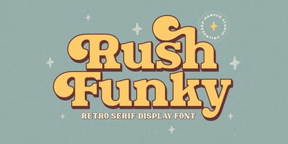 Rush Funky is a serif typeface with vintage and retro look!. Equipped with all complete characters ranging from uppercase letters, lowercase letters, numbers, punctuation marks and multi-lingual support, this font is ready to be used in any project. Uppercase & Lowercase Numbers & Punctuation Multilingual Alternate character & ornament How to access alternate / ornament ? : https://hanscostudio.com/tutorial/ Enjoy!
 - Logx 10 by Fontsphere,
$12.00 LOGX-10 is a geometric minimalistic all-caps display typeface. Designed for strong headers, original graphic designs, visual identification and for many types of designs. It works not only in headings and subtitles but also in arrangements of various sizes and long text.
 - P22 Flora Mambo by P22 Type Foundry,
$24.95 P22 Flora Mambo is based on the distinctive style of 20th century illustrator Jim Flora. Most widely known for his Jazz album covers of the 1940s & 50s, Flora's style shows his fantastic imagination and bold graphic style. The P22 Flora Mambo Set contains 3 fonts- Flora Mambo, a 2-part font that can be used to achieve 2-color text in the style of Flora's iconic 1955 album design, Mambo for Cats and Flornaments, a set of 72 ornaments that features a variety of Flora's illustrative styles from his Jazz album covers to children's books to his fine art prints. Please note that P22 Flora Mambo B is not intended to be used on its own but rather is included with P22 Flora Mambo to create 2-color text. For best results, use with page layout applications. The fonts contained in the P22 Flora Mambo Set are licensed through the Estate of James Flora and JimFlora.com .
 - Ametis by Larin Type Co,
$20.00 Ametis is a modern elegant serif display font. In this font you will find many ligatures and alternates that give great potential for creating logos, branding, arranging wedding invitations, business cards, packaging and much more. This font will help to realize all your ideas and will not leave indifferent even the most sophisticated. Try it, change alternates and ligatures and you will see how many options you can get by creating in a classic style or a more elegant style. Lowercase completely duplicate uppercase, they have the same alternates and ligatures, but differ in size from uppercase. This font is easy to use has OpenType features.
 - Monumentum by Harvester Type,
$15.00 Monumentum is a font that matches its name, it is wide and large. It creates an atmosphere of significance, perseverance and seriousness. Its application is very wide. With 5 scales and great language support, everything is limited only by your imagination. Perfect for covers, logos, text, posters, banners, merch, headlines, and much more. If you find an error or an error in kerning somewhere, write to me and I will fix it: bunineugene@gmail.com
 - Doubledecker by Hanoded,
$15.00 I love riding English double decker buses! I haven’t been on one lately, but for some reason I had an image of a red double decker bus in my head when I made this font. Doubledecker is a bold, cartoon-like, handmade font. It comes in regular and dots, plus a bonus doodle font called Doubledecker Stuff. Use it for any design that needs a tad of loud, a pinch of unusual and a wee bit of polka.
 - TT Bells by TypeType,
$29.00 TT Bells useful links: Specimen PDF | Graphic presentation | Customization options About TT Bells: TT Bells combines the elegant softness of antiqua with a complex and daring temper reflected in straight stroke terminals and arrowheaded serifs. The family is based on broad nib, which was typically used for old style fonts and creates these hallmark terminals and serifs. We've taken the best from old style fonts created before the digital age and added sharp and contemporary geometric shapes to the traditional style. That’s how TT Bells refers the spectators and font enthusiasts to the origins and, at the same time, reminds us that we live in the digital era when geometry and screens rule the world. TT Bells is suited for different types of text–from the shortest headings to large text arrays. When the font size is decreased, the boldness and sharpness of the font soften, it becomes more classic. The font family is created according to the traditional TypeType formula (Thin, Light, Regular, Bold, Black & Italics). FOLLOW US: Instagram | Facebook | Website TT Bells OpenType features: tnum, onum, pnum, numr, dnom, frac, case, ordn, subs, sups. TT Bells language support: Acehnese, Afar, Albanian, Alsatian, Aragonese, Arumanian, Asu, Aymara, Banjar, Basque, Belarusian (cyr), Bemba, Bena, Betawi, Bislama, Boholano, Bosnian (cyr), Bosnian (lat), Breton, Bulgarian (cyr), Cebuano, Chamorro, Chiga, Colognian, Cornish, Corsican, Cree, Croatian, Czech, Danish, Embu, English, Erzya, Estonian, Faroese, Fijian, Filipino, Finnish, French, Friulian, Gaelic, Gagauz (lat), Galician, German, Gusii, Haitian Creole, Hawaiian, Hiri Motu, Hungarian, Icelandic, Ilocano, Indonesian, Innu-aimun, Interlingua, Irish, Italian, Javanese, Judaeo-Spanish, Judaeo-Spanish, Kalenjin, Karachay-Balkar (lat), Karaim (lat), Karakalpak (lat), Kashubian, Khasi, Khvarshi, Kinyarwanda, Kirundi, Kongo, Kumyk, Kurdish (lat), Ladin, Latvian, Laz, Leonese, Lithuanian, Luganda, Luo, Luxembourgish, Luyia, Macedonian, Machame, Makhuwa-Meetto, Makonde, Malay, Manx, Maori, Mauritian Creole, Minangkabau, Montenegrin (lat), Mordvin-moksha, Morisyen, Nahuatl, Nauruan, Ndebele, Nias, Nogai, Norwegian, Nyankole, Occitan, Oromo, Palauan, Polish, Portuguese, Quechua, Rheto-Romance, Rohingya, Romansh, Rombo, Rundi, Russian, Rusyn, Rwa, Salar, Samburu, Samoan, Sango, Sangu, Scots, Sena, Serbian (cyr), Serbian (lat), Seychellois Creole, Shambala, Shona, Slovak, Slovenian, Soga, Somali, Sorbian, Sotho, Spanish, Sundanese, Swahili, Swazi, Swedish, Swiss German, Swiss German, Tagalog, Tahitian, Taita, Tatar, Tetum, Tok Pisin, Tongan, Tsonga, Tswana, Turkish, Turkmen (lat), Ukrainian, Uyghur, Vepsian, Volapük, Võro, Vunjo, Xhosa, Zaza, Zulu.
 - Freehand Brush by Zetafonts,
$39.00 Freehand is a type system designed by Debora Manetti and Francesco Canovaro to emulate the natural appearance of handmade brush writing. Open type ligature substitutions are used to randomly alternate between different versions of each character to give the final output a realistic, uneven look. The main typeface of the system is a wide freestyle brush cursive, featuring over four hundreds of alternate version for characters and double letter ligatures. A "brush easy" version is included without the substitutions if you need more consistent look in your design and better control over letter variation through the glyph panel. The two freehand brush weights are complemented by two sets of icons of matching style, one for ui design with navigation icons and one with food icons. The system also includes a blockletter family in two weights, to be used together with the other fonts to create variation and contrast in your design. Freehand covers over 40 languages that use the Latin alphabet, with a full range of accents and diacritics.
 - Nevison Casual by Linotype,
$29.99Nevison Casual was designed by T. Nevison in 1967 and is an informal, lively, modern handwriting. While the capitals are generous and wide, the lower case letters have reserved, narrower forms, an eye-catching contrast that gives the typeface its zest and energy. The unconventional Nevison Casual combines well with sans serif typefaces. - Ezra by Sarid Ezra,
$20.00 A modern and slightly wide sans serif, Ezra Sans Family! Ezra Sans is a casual and modern sans. With slightly wide form and modern details, this font looks more casual for your any project and designs. This font also contain an alternate in selected characters that will make this font even more stunning. You can use it for a tittle, logo, quotes, or become a pairing in any font. This font also support multi language! Support Multilingual up to 14 languages
 - Slinkster by Will Ryan,
$- Big. Bold. Beautiful. Slinkster is an intricately unique display face created by carefully overlapping equally-sized circles. The geometric patterns formed become increasingly mesmerizing the larger the type is set. Slinkster works best for display, headers, logotypes, and any other large-scale applications that allow the viewer to become hypnotized by its complexity. Due to how detailed Slinkster is, you may experience some lagging as it can take a while to render. Like this font? Consider donating to encourage further development and new fonts! Donations accepted through this Paypal address: willryan042@gmail.com
 - Agatha by Underground,
$25.00 2015 First Prize TipoType award. Agatha is a new typeface for titles and short texts in big sizes. It can be use both in editorial publishing and brand design. From gothic geometric bases, the letters resemble the Nordic style in order to be more feminine, rhythmical and vertical. The two versions, Regular & Outline, let the designer choose between two contrasts: one heavy version that emphasize the rhythm and a lighter one that intensifies the subtlety. The third version, Blossom, combines light and color with ornaments that highlight the style. The three fonts have in addition a ligature set and some decorative glyphs that increase the possibilities of use.