10,000 search results
(0.207 seconds)
- Chizz Wide High - Unknown license

- D3 Roadsterism Wide - Unknown license

- Whackadoo Upper Wide - Unknown license

- Qurve Hollow Wide - Unknown license

- Aaux Next Wide by Positype,
$22.00 When the original Aaux was introduced in 2002, I intended to go back and expand the family to offer more versatility. Years went by before I was willing to pick it up again and invest the proper time into building a viable and useful recut. Just putting a new designation and tweaking a few glyphs here and there would not do the designer or the typeface justice; instead, I chose to redraw each glyph's skeleton from scratch for the four main subsets of the super family along with their italics. Each glyph across the super family is 'connected at the hip' with each style—each character carries the no frills, simple architecture that endeared so many users to it. The new recut expands the family to an enormous 72 typefaces! The original has spawned Compressed, Condensed and Wide subsets—all with corresponding weights—for complete flexibility. Additionally, all of the original weight variants have all been incorporated within the OpenType shell: Small Caps and Old Style Figures are there along with new tabular figures, numerators and denominators, expanded f-ligatures and a complete Central European character set.
 - Let Me Ride by Mans Greback,
$59.00
- Ride my Bike by Latinotype,
$39.00 Ride my bike is a fresh handmade typeface inspired by street style and the new culture that moves pedaling around the city. Perfect for use in headlines, brands and fashion photography compose alternative, thanks to its leading characters, terminals, alternate characters and ligatures that you can find in the Pro version. This version contains more than 600 glyphs. The 'Dingbats' font in this family has 91 dingbats, very fun to compliment and accentuate the handmade design. If you do not want to ride so fast, you can find a version without OpenType features - Essential. Come! Get on it and let’s go ride my bike! Photography by Seba Sanchez.
 - Hugh Ultra Wide by Fateh.Lab,
$15.00 Hugh is the development of a wide type font, we create a work of art that combines a very strong spirit of wide type, for those of you artistic art lovers, this good news for you, because Hugh has a high artistic soul. This is the start of a happy year for you, get this font right away and develop your wild ideas, Hugh is the answer for you now. Its weight is superior in posters, social media, headlines, titles, large format print - and wherever you want to be noticed
 - Deco Wide JNL by Jeff Levine,
$29.00 A unique and stylized type design with Art Deco influence was found within the French publication “Modèles de lettres modernes par Georges Léculier” (“Models of Modern Letters by Léculier”). This lettering is now digitally available as Deco Wide JNL in both regular and oblique versions.
 - Tide Sans Condensed by Kyle Wayne Benson,
$6.00 Tide Sans Condensed is fresh, carefree, and just as good looking as its extended brother, Tide Sans. The Tide Sans family includes beautiful italics and an overall affable look lost somewhere between a humanist and a neo grotesque. Tide Sans does the work for you by providing a ridiculously large stylistic alternates set, fine tuned small caps, and a whole beach of alternate (amper)sands to feel between your toes.
 - Super Wide MF by Masterfont,
$59.00 - Hellenic Wide JF by Jukebox Collection,
$32.99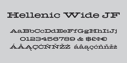
- Wide Chamfer JNL by Jeff Levine,
$29.00 Inside the pages of an untitled sign painting textbook (circa 1902) was an example of the classic chamfered sans serif alphabets used by tradesmen of the time. This version was wider than most, and perfect for a digital version called Wide Chamfer JNL, which is available in both regular and oblique versions.
 - Oksana Sans Wide by AndrijType,
$33.00 Oksana Sans Wide is designed for short and big texts. It has six weights from Thin to Heavy. Supports Western, Central, Baltic Latin and European Cyrillic code pages. Old-style digits, some ligatures, alternative characters and Ukrainian hryvnia sign are also included.
 - High Tide AT by Arctype,
$12.00 High Tide is inspired by the lettering made by the fisherman of Cornwall. Shapes made by hand that are created to be functional with a geometric precision, yet appear hand-drawn and human for an honest and sincere quality.
 - Born To Ride by Gassstype,
$25.00 Here comes a New font, Introducing BORN TO RIDE It's Weird Display Typeface is a Natural Brush Style and Authentic classy style, this font is great for your creative projects such as watermark on photography, and perfect for logos & branding, invitation,advertisements,product designs. It also features a wealth of special features including You can activate 22 Ligatures OpenType panel.
 - MCM Hellenic Wide by Victory Type,
$15.99 Victory Type Studios is pleased to announce the release of MCM Hellenic Wide, the first typeface from the upcoming Mid-Century Modern Collection--a set of vintage American typefaces rescued from the dustbin of history and rendered for digital use. You've seen it before. But it’s been a while... MCM Hellenic Wide is an extended slab-serif typeface that was painted on railroad cars and stamped on posters; it was found in textbooks and once proudly graced letterheads. MCM Hellenic Wide lacks frills and flourishes. Its trademark single-thickness alphabet features broad and squared-off serifs. Now that retro is en vogue, do yourself a favor and download MCM Hellenic Wide today. This digital revival of a once pervasive unappreciated typeface was rendered from scans of primary source material. MCM Hellenic Wide will add a bit of classy Americana to your next design. MCM Hellenic Wide is available for Mac and PC, in TrueType, OpenType and PostScript formats. Includes kerning.
 - Sequel 100 Wide by OGJ Type Design,
$35.00 Sequel 100 Wide is a static sans-serif or neogrotesque with generous horizontal proportions. A variant of the original Sequel Sans, it considerably expands the stylistic scope of the Sequel superfamily. In addition to its wider letterforms, it has got a larger x-height, slightly shifting the historical flavor from the 1950s to the 1960s. Yet, at its core, it’s as clean and functional as the main font family, with perfectly horizontal stroke endings and vertical terminals. Six weights from 45 (Regular) to 95 (Black), matching italics, and limitless possible interpolations by means of two Variable Fonts offer a rich typographic palette for any situation.
 - Rude Slab Wide by DSType,
$50.00 Rude was designed as a dichotomy between the Grotesque and Humanistic typographic shapes: a no-nonsense Sans and a very muscular Slab Serif companion. Showing the historically demanded consistency for such kind of typefaces, this is one of DSType's most wide-ranging and flexible type systems, introducing seven weights across seven widths, from Thin to Black and ExtraCondensed to ExtraWide, along with a wonderful set of Icons.
 - Spur Wide JNL by Jeff Levine,
$29.00 Spur Wide JNL was modeled from an example of hand lettering from the antique French alphabet book L'Art du Tracé Rationnel de la Lettre. Heavy Roman style letters with spurs (often referred to as Latin) were most popular with sign painters and show card writers in the early part of the 20th century. Spur Wide JNL is available in both regular and oblique versions.
 - Linotype Pide Nashi by Linotype,
$29.99Linotype Pide Nashi is part of the Take Type Library, chosen from the entries of the Linotype-sponsored International Digital Type Design Contests of 1994 and 1997. German artist Verena Gerlach created a typeface which looks almost like Arabic at the first glance, only with the second do the familiar forms become clear. Rounded lower case letters, generous, sweeping capitals and diamond-shaped ornaments give the font its Arabic feel. The exotic Linotype Pide Nashi is best suited for short and middle length texts and headlines and especially for ornamental texts. - No Harmony Left Side Cut - Unknown license

- This by Suomi,
$40.00 An all new rounded type family with Sans, Serif, Geometric and Blackletter!
 - Thei by Andfonts,
$29.00 Thei is a calligraphy font that helps designers to create beautiful compositions. It looks stunning on wedding invitations, cards, quotes, greeting cards, logos, business cards and every other design which needs a customized touch. How quickly to create main decor element: 1.Type == (equal signs). Or type any Text========== Then move decor elements in the right position. ***Don’t change size of text during this process, because it may not create decor elements (ligatures). Or choose the décor element in Glyphs category.
 - Tme by bb-bureau,
$65.00 Tme, new lineal — Tme is an update of Sl (T = S + 1, m = l + 1 and e for natural logarithm), drawn in 2006 for the University of Arts Saint-Luc de Tournai. Its geometrical drawing is based on the directions of the hexagon, a scrupulously followed constraint which confers on some glyphs a very particular drawing. in light, regular and bold language: all latin glyphs
 - DejaVu Sans Mono - Unknown license

- Verily Serif Mono - Unknown license

- Leftist Mono Serif - Unknown license

- KR Morning Must! - Unknown license

- KR Morning Must - Unknown license

- KR Mood Ring - Unknown license

- Moronic Misfire BRK - Unknown license

- Moronic Misfire (BRK) - Unknown license

- BN Moog Boy - Unknown license

- Aurulent Sans Mono - Unknown license

- Yoon Gothic 700 by Yoon Design,
$400.00 YD Gothic 700 is a modern sans serif typeface consisting of 9 weights. It supports up to 13 different languages such as English in Latin and other scripts
 - PF DIN Mono by Parachute,
$45.00 PF DIN Mono is the latest addition to the ever-growing set of DIN super-families by Parachute. It was based on its proportional counterpart DIN Text Pro but was completely redesigned to reflect its new identity. DIN Mono is a monospace typeface which is comprised of characters with fixed width. Traditionally, monospaced fonts have been used to create forms, tables and documents that require exact text line lengths and precise character alignment. DIN Mono, on the other hand, can prove to be more than a useful typeface for technical applications. In the world of proportionality, DIN Mono stands out as a fresh new alternative to the popular standard, particularly for publishing and branding applications. Additional care was given to the aesthetic form and its pleasing characteristics. The spacing attributes of the glyphs were redefined and legibility was further improved by revising or changing the shape of the letterforms. Furthermore, kerning was not included in order to preserve the monospace nature of this typeface. The family consists of 12 weights including true-italics. Currently, it supports Latin, Eastern European, Turkish and Baltic.
 - Andale Mono Paneuropean by Monotype,
$92.99 - Mono Amono NF by Nick's Fonts,
$10.00Here’s a techno typeface with a difference. Its monoline stroke and sharp terminals are softened by rounded corners, and its perceptual monospaced widths have been subtly altered and strategically kerned to improve the visual flow. This font contains the complete Latin language character set (Unicode 1252) plus support for Central European (Unicode 1250) languages as well. - Grieshaber Monos NF by Nick's Fonts,
$10.00 The name says it all: here's a faithful revival of a Schelter und Geiseck release from 1911, designed by Moritz Greishaber and originally called Monos. Although it predates the Art Deco era, it has a Deco vibe. Both versions of this font support the Latin 1252, Central European 1250, Turkish 1254 and Baltic 1257 codepages.


