10,000 search results
(0.073 seconds)
- Huckleberry by Canada Type,
$24.95Huckleberry is a revival and expansion of a 1973 typeface called Mark Twain, which was G. Jaeger's reaction to the popularity of VGC's Eightball (also digitized and expanded as Orotund by Canada Type) from across the ocean. Jaeger's reaction was typical German efficacy, with majuscules that surpass their inspiration in art and humour, and minuscules that could have been just the thing if one wanted to make the Eightball lowercase friendlier. Back in its day, this font reached its own heights of popularity in Western Europe, but in the Americas it was less known because art nouveau faces were being made by the hundreds in the 1970s. Round, happy and bouncy, Huckleberry comes as a timely response to public demand for big and cheerful letters. Huckleberry is also very effect-friendly. Stretch it a bit, drop-shadow it, warp it, and it will still keep its cheer and communicate the message with a smile. Huckleberry comes in all popular formats, and contains plenty of alternates sprinkled throughout the character set. - Sign Work JNL by Jeff Levine,
$29.00 The 1951 sheet music of "I Like the Wide Open Spaces" has the cover title set in a casual type design that emulates the "one stroke" or "speed letter" style so popular with sign painters in that decade. Taking the lettering on the sheet music and expanding the character set with a new interpretation, the result is Sign Work JNL which is available in both regular and oblique versions.
 - Zim by Scholtz Fonts,
$19.00 Zim is a bold, earthy font, named for the Great Zimbambwe ruins (a World Heritage site). Its solid silhouette represents the timelessness of this ancient structure. The font is very readable, and its bold, rugged shape make it ideal for display purposes, for posters and headlines. Fully professional, it contains a complete set of 255 characters — Upper and Lower case, all numerals, punctuation, symbols and accented characters. It is suitable for layout work in all major European languages — Spanish, Portuguese, German, French, Swedish and Italian (to name a few). The characters are spaced for readability and have been carefully kerned.
 - Megabold by Justin Penner,
$25.00 Megabold is the overweight champion of type. Designed to consume as much space as possible while retaining a modicum of legibility, Megabold is ideal for posters, logos and bold headlines. Simple yet immense letterforms make it friendly but at the same time, unstoppable. Express your own slant with left and right oblique styles ranging from 2–16 degrees, or fine-tune precisely with the included variable font ¹. ¹ Variable fonts are widely supported by web browsers, but not all desktop applications support them fully yet. Adobe Illustrator, Photoshop and InDesign support variable fonts if you’re using the latest versions.
 - Saffron Grotesk by S6 Foundry,
$20.00 Saffron is an elegant contemporary neo-grotesque sans-serif typeface with strong stylistic geometric contrasts, drawing on the aesthetics and the typographic standards of Swiss modernism. The distinctive wide-open stance was designed to give the right visual consistency for branding and communications. This authentic and original typeface represents the shifting contemporary aesthetics. Saffron is perfectly suited for headlines, large-format prints, brand identities, social media, advertising, editorial design, posters, magazines, logos, headings, and more. The Saffron family includes six weights, with their relative italics with over 700 glyphs and multi-language support.
 - Syphon Spritz - Personal use only

- Bobar by Valentino Vergan,
$14.00 Bobar is a retro inspired variable font. Bobar is very eye catching, its groovy design and bold chunky shape makes it great for retro projects. Bobar comes with standalone fonts and a variable version, the variable version allows you to manually adjust the slant. Bobar is designed with creative alternate and engraved characters, this makes it perfect for a wide range of project such as: branding, magazines, logos, product packaging, advertisements and much more.
 - Factum by Fontop,
$14.00 Factum is a classical style serif typeface that sets the mood and evokes emotions before you read the text. Interchanging thick and thin lines, especially in Medium and Bold styles, creates an elegant silhouette and a rhythm in title sheet, cover art or poster. Yet Light and Regular styles look great in large type as well as headlines. Another speciality of the font family is Stencil styles that help you play around your typography and logotypes. Rich heritage and cultural experience behind the classical design make Factum font perfect for texts and messages connected to glamour, fashion, arts, literature, architecture, science, education, travelling, fine dining, cosmetics, beauty and etc. Timeless pattern and variety of weights and styles will make you use the font family again and again in different projects: creating logo, articles in magazines, branding, wedding invitations, quotes, posters, advertisements, monograms and many more. Character set of each font includes all European Latin-based glyphs, numbers, punctuation and OpenType features like standard ligatures, discretionary ligatures and fractions.
 - Uranus by Supremat,
$12.00 Uranus is a futuristic font inspired by space and extraterrestrial civilizations. The proportions of the letters are wide, the elements of the letters have organic curves, reminiscent of the design of streamlined spaceships. What gives the font a special character is the excessive contrast between the upper element and the crossbar in letters such as A, B, E, F, K, P, R. In these letters, there is a barely noticeable intra-letter gap in the form of a line. Due to this contrast and rounded elements in these letters, a negative space of a triangular shape also turned out. Particular attention should be paid to the broad language support for the font. The font has support for Latin, extended Cyrillic, and Korean (2780 base syllables). Total glyphs: 3562. Uranus is well-suited for large typography, logos, and any other design related to futurism and space.
 - VLNL Tp Kurier by VetteLetters,
$35.00 VetteLetters is proud to bring you the TpKurier-family. It is cooked up by our German chef Martin Lorenz currently living in lovely Barcelona! Chef Lorenz about the TpKurier recipe: “TpKurier is the second redesign we did of Courier. The first redesign in 2000, although based on a five-unit grid, was drawn completely by hand. Six years later we designed another grid version of Courier, and the TpKurier family was born. This version is completely constructed up till its last detail. We didn't want to correct ‘mistakes’ deriving from the use of the grid, but instead make them visible (see “S”). TpKurier is based on a very simple grid, composed a proportion of four units high by two units wide. A series of other links between them make it possible to form a font from this grid. We felt it was important to consistently work within these limitations so that any unexpected asperities would help provide the font with its character. Even though it is a rough constructed typeface it was important to us to design real italic lower case letters and not just a sloped roman (see “a”, “g” or “s”). The first family published contained a serif and sans-serif version of the TpKurier, with italic and bold.”
 - GHEA Tamara by Edik Ghabuzyan,
$30.00 This SemiBold Italic original Display font GHEA Tamara includes Basic Latin, Latin 1 Supplement, Latin extended A, Cyrillic, Armenian. May be used in titles, posters, labels, etc. The font looks very nice in large sizes.
 - FS Silas Slab by Fontsmith,
$80.00 Slab-like sibling Why stop at sans? Rather than leave FS Silas Sans as an only child, the team wanted to extend the family, and create a complete system for brands and editorial. Unsure what the result would be, the team started experimenting with a slab serif version. ‘We didn’t know how it would turn out, but we really liked it and wanted to take it further. A fresh angle ‘We stuck with the angular theme of the sans by drawing angled slab serifs,’ says Phil Garnham, ‘as opposed to the square serifs that slab fonts usually have. That created an inner dynamism in words and sentences on the page, and a very distinctive, crafted character, like a Victorian soul in a contemporary body.’ These crafted touches include details such as the angled ascenders on the ‘i’ and ‘l’, while characters such as the ‘y’, with its abruptly-ending descender, add a mark of distinction. A perfect pair Silas Slab, like its sibling, offers a clear-cut range of five weights, from the elegant Thin to the monumental ExtraBold. Put it together with Silas Sans and you have the full complement, capable of performing the full range of tasks, above the line and below, in headlines, body copy and logotypes, B2B and B2C. Keep them together; they don’t like it when they’re apart.
 - Nt1972 by Harvester Type,
$20.00 NT1972 is a display font from the future. Font in the era of cyborgs and cyberpunk. This is a sharp, brutal font with futuristic shapes. It combines style and functionality, so the font will look great in your futuristic design in any environment, be it a logo or a merchandize. The angle of inclination in each glyph is 50 degrees, all glyphs also have the same stem sizes to create a good font system. All this is done to get a good futuristic cyberpunk font that will give style to your design, be it a logo, poster, banner, merchandize, title, packaging or product design. In addition to all this, there is support for many languages and alternative characters. In case of any questions, problems or suggestions, please email: bunineugene@gmail.com
 - Venture Point by Maulana Creative,
$14.00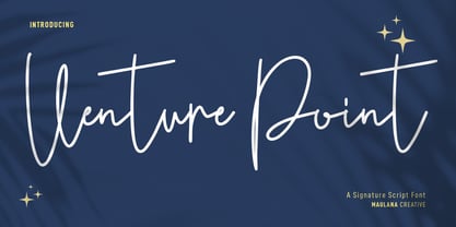 Venture Point is a modern signature script font. With upright consist mono-line stroke, fun character. To give you an extra creative work. Venture Point font support multilingual more than 100+ language. This font is good for logo design, Social media, Movie Titles, Books Titles, a short text even a long text letter and good for your secondary text font with sans or serif. Make a stunning work with Venture Point font. Cheers, Maulana Creative
 - Blofishing by Maulana Creative,
$12.00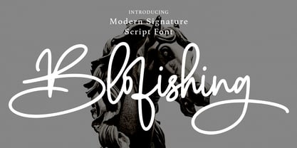 Blofishing is an expressive simply casual script font. With consist mono-line stroke, fun character. To give you an extra creative work. Blofishing font support multilingual more than 100+ language. This font is good for logo design, Social media, Movie Titles, Books Titles, a short text even a long text letter and good for your secondary text font with sans or serif. Make a stunning work with Blofishing font. Cheers, Maulana Creative
 - Whale Show by Olivetype,
$18.00 Whale Show is a fun display font with a youthful, whimsical, and bubbly feel, great if you need to create a friendly, playful mood in your design. This font is also quite versatile and easy to work with. You can use it for logos, posters, headlines, etc. So what’s included : Basic Latin Uppercase and Lowercase Numbers, symbols, and punctuations Multilingual Support. Fully accessible without additional design software Simple Installations Works on PC & Mac Thank You.
 - Sinyor Yebri by Maulana Creative,
$13.00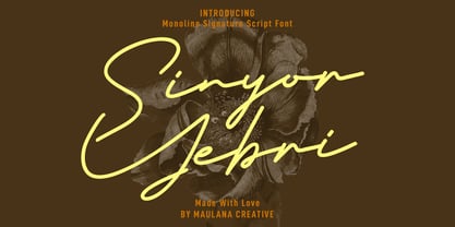 Sinyor Yebri is a modern signature script font. With consist regular mono-line stroke, fun character. To give you an extra creative work. Sinyor Yebri font support multilingual more than 100+ language. This font is good for logo design, Social media, Movie Titles, Books Titles, a short text even a long text letter and good for your secondary text font with sans or serif. Make a stunning work with Sinyor Yebri font. Cheers, Maulana Creative
 - Janek by Pawel Fonts,
$35.00 Janek is a semi-serif typeface inspired by old Polish signage. Rather then mimic specific style, it synthesises various inspirations. It is named after an Author of a classic Polish manual, that kickstarted this project, „Techniques of Lettering“ by Jan Wojeński. Large character set and style selection allows for richness of expression. Pointy upright and slightly decorative italic bring unique blend of aesthetics. It works well in rich text and as a striking display. Janek consists of seven italic and seven upright styles ranging from Light, to Black. With extensive language support and wide selection of features, it is suited for range of latin use cases. Janek is a contemporary throwback to the past.
 - Eclectic Web by Altered Ego,
$45.00STF Eclectic Web is the ultimate web design dingbat tool - with 80 icons designed for creating e-commerce, navigation, and interface designs. Use it as a starting point in your favorite vector program, or use the icons as is - they are optimized for sizes down to 20 point and anti-alias beautifully in all of the major applications (any smaller than that and you're on your own…) Shopping carts, directional arrows, buttons galore! It's like a pinata in font format, surprises for everyone! This font includes: a new button, order, buy, and close buttons, home, security, email, search, and a host of other icons and images to make designing your next website a breeze!. Most of the icons are shown Available in Mac and PC formats, in TrueType and Postscript formats. License it today! - Cul De Sac - Personal use only

- All Over Again - Personal use only

- Fashion Signature by Letterara,
$14.00 Fashion Signature is an enchanting handwritten font. This versatile Monoline font has a wide spectrum of applications ranging from greeting cards, fashion, weddings, posters, beauty cosmetics, and logos to headlines and is guaranteed to add a romantic or casual feel to your next project. Add it confidently to your projects, and you will love the results. This font is PUA encoded which means you can access all the beautiful glyphs and swashes with ease! Add to your collection for future Design and projects!
 - TessieMoreBirds by Ingrimayne Type,
$13.95 A tessellation is a shape that can be used to completely fill the plane. Simple examples are isosceles triangles, squares, and hexagons. Tessellation patterns are eye-catching and visually appealing, which is the reason that they have long been popular in a variety of decorative situations. These Tessie fonts have two family members, a solid style that must have different colors when used and an outline style. They can be used separately or they can be used in layers with the outline style on top of the solid style. For rows to align properly, leading must be the same as point size. To see how patterns can be constructed, see the “Samples” file here. Shapes that tessellate and also resemble real-world objects are often called Escher-like tessellations. This typeface contains Escher-like tessellations of birds. Quite a few of them resemble swimming birds, but there are also some that resemble flying birds or birds in other positions. Most or all of these shapes were discovered/created by the font designer during the past twenty years in the process of designing maze books, coloring books, and a book about tessellations. (Earlier tessellation fonts from IngrimayneType, the TessieDingies fonts, lack a black or filled version so cannot do colored patterns. The addition of a solid style that must be colored makes these new fonts a bit more difficult to use but offers far greater possibilities in getting visually interesting results.)
 - Thaun by Scholtz Fonts,
$19.00 I can best describe the Thaun family as a general purpose display family, inspired by Scholtz Fonts' " "Delikat". I wanted to produce a display font that was more robust than Delikat, without losing the delicacy of the original. In order to do this I thinned solid, curved strokes toward the baseline, and let them dwindle to gently rounded points. As a graphic designer I became aware that designs that used a number of styles from the same family seemed to work well. This was easily done using a standard sans serif font such as Arial or Helvetica. However, when a different look is needed, display fonts do not always have a the variety of different styles that are necessary to produce a coherent design. Thus with Thaun, the challenge was to create a coherent family based on a display font. The archetype of this family is Thaun Regular with six different widths forming closely related styles. There are also two variants of the archetype i.e. Thaun Black & Thaun Rough to add variety to the primary style. An additional sub-family, Thaun Accord, appears in two widths. Thaun Jazz is a wide three dimensional variation. Thaun has all the features usually included in a fully professional font. Language support includes all European character sets, Greek symbols and all punctuation. Opentype features include automatic replacement of some characters and discretionary replacement of stylistic alternatives.
 - Rubber B by TwelveTimesTwo,
$40.00 Rubber B is a heavy display typeface with very tight open counters & character spacing and non-existent closed counters. It is an amalgam of styles and influences that demands attention. It is comparable with the highly geometric experimental fonts of the '90s and early '00s, but also heavily inspired by decorative fonts of the '60s and the psychedelic poster art of the '70s. Bold and loud, yet delicate, almost calligraphic in some cases. It works with Latin & Extended Latin, Cyrillic & Extended Cyrillic and Greek. It comes with 1,500+ glyphs, with more than half of them being ligatures. It also contains several Stylistic Alternates as well as Localised forms (available through the Open Type Features and also as ligatures). All these features are available in order to not only make sure that it works with as many languages as possible, but also that depending on the specific glyph or ligature one chooses to use, they have the ability to alter the emotional character of the word(s) they’re setting. Ideal for titles and logos, as it works best in medium and large sizes.
 - Caliente by Imprimatvr,
$28.00 This font is shaped to exhibit a very compact and characterized design, clearly distinguishable from the mainstream condensed sans-serif fonts. That is why Caliente has a conspicuous modulation and a medium-to-high contrast. Both features are seldom observed among ordinary fonts of its kind. However, Caliente is designed to suit perfectly well in a number of applications—from advertising to business letters—while accurately preserving its strong personality even in very small sizes.
 - Mondapick by UICreative,
$23.00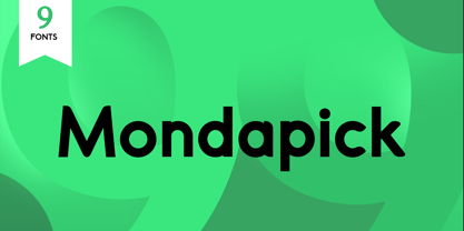 Introducing of our new product the name is Mondapick Sans Serif Font Family comes with 9 different weights. Modern Sans Serif font that feels beautiful classy, elegant, and modern .This font is perfect suited for a wide variety of projects, as to signature, stationery, logo, wedding, typography quotes, magazine or book cover, website header, clothing, branding, packaging design and more. Also for fashion related branding or editorial design and displays both masculine and feminine qualities.
 - ITC Cali by ITC,
$29.99 There are a few professions in which being left-handed confers an advantage-think of the great southpaw pitchers in major league baseball, like Sandy Koufax. Now, think of all the great left-handed calligraphers. Not so easy, right? Here's a hint: Luis Siquot. Far from being an advantage, Siquot's lefty orientation proved a hurdle to overcome. When I was young, I had serious problems writing," he recalls. "If there was a lot of text, I almost always soiled the paper with wet ink as my hand followed the pen." Then, a friend told Siquot about a special store in London that catered to left-handed people. It was there that he found an Osmiroid pen specially designed for left-handed calligraphers. ITC Cali is based on Siquot's use of this pen. "Electronic scans of my calligraphy were the foundation of the design," he says. "I was careful to leave in some imperfections to avoid an excessively mechanical look, and added the little notches in the strokes to imitate the texture of writing on a rough cotton paper." ITC Cali works equally well in text and display sizes, but it is a calligraphic script, Siquot warns, "and shouldn't be set in all capitals." That said, ITC Cali is a remarkably versatile design, well-suited to a variety of communication projects."
 - October Sweets by Chekart,
$17.00 October Sweets is a terribly playful and creepy font. It comes with all caps uppercase and lowercase characters, a set of punctuation marks, numbers, Cyrillic characters, an alternative set of characters and numbers, ligatures and multilingual support. Ideal for Halloween parties, horror film festivals, product packaging, T-shirts, book covers, quotes, posters, branding projects, etc.
 - Empty Inside by Chekart,
$17.00 Empty Inside is a kids playful font. It comes with uppercase and lowercase characters, a set of punctuation marks, numbers, Cyrillic characters, an alternative set of characters and numbers, ligatures and multilingual support. Ideal for logos, quotes, posters, branding projects, product packaging, t-shirt, book cover, greeting cards and applicable for any graphic design.
 - Turum Burum by Chekart,
$17.00 Turum Burum is a hand drawn funny playful font. It comes with uppercase and lowercase characters, set of punctuation marks, numbers, alternative set of latin characters and numbers, Cyrillic characters, ligatures and multilingual support. Ideal for logos, quotes, posters, branding projects, product packaging, t-shirt, book cover, greeting cards and applicable for any graphic design.
 - Gloriance by Mevstory Studio,
$25.00 Gloriance is a classic serif font adapted from the art deco style, a visual style that emerged in the 1920s and 1930s. This font is characterized by bold geometric shapes, a symmetrical design, and a sense of modernity and glamour. Gloriance is designed to have a distinctive classic impression with the presence of decorative elements such as extended lines, neat and tidy decorative shapes and types. These decorative elements can add a sense of sophistication and luxury to text. With a wide selection of alternates and ligatures, you can create a variety of styles and play with this unique fonts. This typeface is perfect for an elegant logo, jewelry stuff, packaging, magazine design, fashion brand, classic stuff, poster, flyer, wedding invitation, quotes, or simply as a stylish text overlay to any background image.
 - Neftali Pro by TipoType,
$25.00 2015 First Prize TipoType award. Neftali is a type family designed for continuous reading in long texts & editorial design, created as an interpretation of Pablo Neruda’s “Poema 20”. This work delivers a subtle experimentation of Baroque and Roman styles, rescuing features from some of the most successful chilean typefaces such as “Australis”, “Berenjena” and “Biblioteca”, along with its particular calligraphic details, medium weights, accentuated strokes, and wide curves that seek to project Pablo Neruda’s particular way of reciting. This typeface contains uppercase, lowercase, small caps, oldstyle, and tabular numbers; in addition to a true italic for every weight; and calligraphic details designed to compose his poems. A typography to talk about everything, except love… (Special thanks to: Francisco Gálvez & Patricio Truenos; without the help of the latter, this project wouldn’t have had an ending)
 - Botija by Tipo,
$69.00With a gentle, modulating effect and very neat from a formal point of view, Botija is ideal for medium sized texts: it is a font family with a unique style. Created initially as a reinterpretation of Bodoni, it maintains a sharp vertical axis and a medium level of contrast, suitable to function in smaller bodies and featuring subtle details which stand out in medium-sized bodies of text. - Flat10 Holly by Dharma Type,
$14.99 Very decorative pixel font which has organic and soft impressions. The best pixel font for Christmas. This 8-bit pixel font is designed with respect for 80s game designers and the pixel font pioneers in middle 90s. Use at size 10 pixels or multiples of 10 and anti-alias off is recommended. List of our Pixel Font Project. ·Flat10 Antique ·Flat10 Artdeco ·Flat10 Arts&Crafts ·Flat10 fraktur ·Flat10 Holy ·Flat10 Holly ·Flat10 Segments ·Flat10 Stencil ·Flat20 Gothic ·Flat20 Headline ·Flat20 Hippies ·Flat20 Streamer ·Behrensmeyer Vigesimals ·Civilite Vigesimals
 - Biennale by Latinotype,
$29.00 Biennale is a geometric typeface with a strong character and a large x-height which make it an excellent choice for a wide range of applications, such as headlines or branding. Although common in style, Biennale distinctive details and color on the page allow users to create really unique designs. The font comes in 11 weights, from Hair to Heavy, and includes matching italics. As you would expect from Latinotype, this typeface comes with a standard set of 417 characters that support over 200 Latin-based languages.
 - Pierce Jameson by Grezline Studio,
$20.00 Pierce Jameson is a display font family with vintage aesthetic. This font was created to give your headlines and logotype projects a stylish touch. Pierce Jameson font is also usable in a wide range of works such as logos, covers, posters, quotes, product packaging, merchandise, social media and much more! Combine them to make your creative projects become more authentic! Feature : - Multilingual Language - Works on PC & Mac - Simple installations - Accessible in the Adobe Illustrator, Adobe Photoshop, Adobe InDesign, even works on Microsoft Word.
 - Britonix by Owl king project,
$47.00 Inspired by monospaced letters, Britonix is designed with normal spacing but seems mono. Uppercase Britonix can be used for headlines or displays giving it a minimalist, professional yet modern look. Britonix also carries 20 weights including italic style, minimalistic lowercase letters can also work well for long sentences or paragraphs. happy exploring with Britonix.
 - Smart Bars12 by Postage Saver Software,
$15.00 This is a special font for use creating US Postal Service "Intelligent Mail" barcodes. Those are the barcodes you see on most cards and envelopes. Commercial mailers get the best pricing by printing barcodes when they address the mail, saving the Postal Service a step. The barcodes are also used on reply mail and Share mail, and for "Informed Visibility" tracking. Software to create these barcodes, including the USPS Intelligent Mail Small Business (IMsB) tool, typically provide an output of 65 characters, each character being an A, D, T or F, corresponding to each of the styles of bar. SmartBars 12 replaces those characters with the corresponding bar. When doing a mail merge to print addresses, the user would set the barcode field on their merge template to be printed using SmartBars 12, at 12 point, regular, and the barcode will print with the correct bars and at the required size to meet USPS requirements.
 - BLT Balfour by Black Lab Type,
$12.00 BLT Balfour : Art Deco Revival Font Balfour is a modern Art Deco typeface revival. Built from historic references in architecture during this time period, Balfour exudes class and elegance, yet still honors the style with unapologetic bold geometric forms. Pay close attention to the letterforms B and R, and how their extreme x-heights play off of the elongated strokes of C, D and G. Unique features throughout the character set make it less predictable and more unique than any Art Deco typeface before it. The geometry of this typeface plays from one letter to the next. Fill and Outline styles work well in headlines, logos and large type. The Line style is effective at all sizes and can be used in combination with other styles to achieve visual hierarchy.


