10,000 search results
(0.061 seconds)
- Schnitz by Linotype,
$29.99Linotype Schnitz is part of the Take Type Library, selected from the contestants of Linotype’s International Digital Type Design Contests of 1994 and 1997. Designed by the Finnish artist Osmo Niemi, the characters seem to contain no round forms at all. Linotype Schnitz looks as though it were chiseled and has an angular, almost brittle feel. The restless and lively appearance makes Linotype Schnitz particular well-suited to headlines and shorter texts with point sizes of 12 and larger. - Ceebo by Oliver Matelowski,
$55.00 Ceebo is a friendly sans-serif, which show some aspects of a humanist and grotesque typeface. It retained more details of writing and got some forms and characteristics of an italic. The font contains some alternative glyphs. It also contains some ligatures and discretionary ligatures. In addition, there are adjusted figures and additional character for uppercase letters, lowercase letters and small caps, which react by OpenType-Feature. The font was designed to stay legible also in small sizes: beside as possible open counters, a tall x-high, distinct vents and cuts, it especially are the details of the glyphs which make it discernable. The regular weight is slightly thinner than other sans-serif fonts, moreover the diacritics and small glyphs were designed for small sizes by taller and more open forms. The resulting “ruggedness” is mellowed by half-rounded stems and pointed stem ends.
 - Tenderly by Supfonts,
$15.00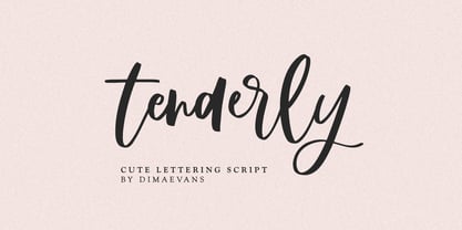 Tenderly it is a chic lettering font with exquisite accents. It is perfect for branding, wedding invitations and invitation cards and more. This font includes a full set of gorgeous uppercase and lowercase letters, numbers, a large selection of punctuation marks and ligatures. Includes: Regular Script Latin languages support Uppercase and lowercase Numbers and punctuation Ligatures Check out my blog: https://www.instagram.com/di.zigner/ pinterest.com/dmitriychirkov7 Enjoy
 - Rosegold by Supfonts,
$14.00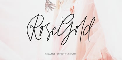 Rosegold it is a chic lettering font with exquisite accents. It is perfect for branding, wedding invitations and invitation cards and much more. This font includes a full set of gorgeous uppercase and lowercase letters, numbers, a large selection of punctuation marks & ligatures. Includes: Latin languages support Uppercase and lowercase Numbers and punctuation Ligatures Check out my blog: https://www.instagram.com/di.zigner pinterest.com/dmitriychirkov7 Enjoy
 - ReadMyHand by Linotype,
$29.99Linotype Read My Hand is part of the Take Type Library, selected from contestants in Linotype’s International Digital Type Design Contests of 1994 and 1997. It is the digitalized handwriting of its Dutch designer, Leon Hulst. As is common of handwriting fonts, the forms of the letters seem spontaneous and individual. Read My Hand is a dynamic font suitable for texts with point sizes larger than 12 and particularly good for documents which should have a personal touch. - Mastadoni by Eclectotype,
$40.00 Mastadoni is a bold headliner/masthead typeface, with high vertical contrast in a Didone style. That's the starting point at least. There's much more to this font than another modern clone. It is a specialized (only one weight) typeface that comes in five optical grades. Use G1 at very large sizes and G5 at smaller sizes. The grades can be combined so that the thins of type set at different point sizes appear the same thickness - a very useful feature for magazine layouts. Optical grades could also be used in circumstances where a logo needs to be size-specific; the text on your bistro sign can afford to be more delicate than that on your coffee cups. This is a typeface with a big x-height, small cap-height and stubby ascenders and descenders, which contribute to an overall appearance somewhat different from must Didones, and make for some interesting layout possibilities in tight spaces. Mastadoni features a number of useful OpenType features. All fonts include standard ligatures and automatic fractions. In the discretionary ligature feature, you'll find the esoteric "percent off" glyph. Just type '%ff' with dlig engaged and there it is! Case-sensitive forms are available in all the fonts. The contextual alternates feature performs a subtle trick that resolves an optical illusion whereby two ascenders next to each other appear to be different heights. The Roman and Italic styles have a different group of stylistic sets as follows: Roman: SS01 substitutes a less decorative 4; SS02 is a different eszett; SS03 substitues the # with an attractive numero glyph; and SS04 gives an alternate K. Italic: SS01 and SS03 are the same as in the Romans; SS02 gives you more bulbous variants of v, w, and y letters; SS04 is a single storey g; SS05 changes C, G and S to non-ball-terminal varieties; and SS06 changes the swash versions of E, L, N and Q (when the swash feature is engaged). Speaking of the swash feature, the italic fonts feature swash capitals from A to Z, and swash variations for lower case h k m n v w and z. Lastly, the discretionary ligature feature in the italic fonts has vi, wi, KA and RA ligatures. Mastadoni is a typeface that would find itself immediately at home in glossy magazines, while offering a different aesthetic palette from the more standard choices of Didones.
 - Melts Script Rough by Estudio Calderon,
$20.00 Melts Script Rough by Estudio Calderón is the textured version of Melts Script. It has a texture design in high definition that runs very good in any size and concepts. Good news! It includes a free version of “Melts Script Rough Sanscript One”. Specimen
 - Zalcony by HandletterYean,
$16.00 Introducing Zalcony, a captivating handmade font exuding a simple yet alluringly distorted brush aesthetic. Every letter and character carries its own unique size, beautifully showcasing the authentic, natural flow of handwritten script. With Zalcony, add a touch of genuine, personalized charm to your designs.
 - Sindelar by Willerstorfer,
$95.00 Please note: Sindelar webfonts are exclusively available at willerstorfer.com Sindelar is a capable, contemporary text face addressing today’s news design requirements. Its large x-height, low contrast and robust serifs grant a high legibility in small sizes. The balanced, well chosen proportions make the typeface economic (i.e. space saving) without giving it a too narrow appearance. These characteristics make it the ideal choice for extensive text setting in newspapers and magazines – on paper and on screen. Named after famous Austrian football (soccer) player Matthias Sindelar (1903–1939), one of the best players of his time, the typeface shares two major qualities with its namesake: their technical brilliance and their way of performing aesthetically to the last detail. The football player’s nickname »Der Papierene« (the Paper-man) elegantly refers to the media too. Although optimised for small sizes, Sindelar’s low contrast and robust serifs give the typeface a strong impact and an unmistakable personality in larger sizes. Sindelar’s calligraphic influences can be noticed in the Italics best. The italic letters are inclined by slightly different angles, respecting the letters’ shapes and proportions and resulting in a balanced, yet vivid appearance. Sindelar comes in 18 styles – nine weights in Roman and Italic each. Each font is equipped with a huge character set of about 980 glyphs and various OpenType features.
 - MFC Patisserie Monogram by Monogram Fonts Co.,
$19.95 The source of inspiration for MFC Patisserie Monogram is a letter set from the book, "Letters and Lettering" by Paul Carlyle & Guy Oring, published in 1938. This elegant decorative style was shown as Capitals & Numerals only, but we've expanded it out to include Capitals, Smallcaps, Numerals, an Ampersand, and ornamental parenthesis, brackets, and braces. MFC Patisserie Monogram can create one, two, or three letter monograms as well as basic headline and titling settings. It is a refined look that is as darling as it is delicate. The numeral set and bullet dividers allow for more detailed and personalized monograms. If you want an even more customized look, you can add any of a handful of brackets, braces, or parenthesis to surround your monograms in a complimenting style.
 - PT Root by ParaType,
$40.00 PT Root is a contemporary sans serif with strict, laconic forms. It’s a versatile typeface that provides a wide range of possibilities. Regular style works great in long texts (both on screen and in print), as well as in the interfaces. Medium and Demibold are good for signage, while the lightest and boldest styles look great in large sizes and are suitable for the brand identity. PT Root is a sans serif with 10 weights and a variable version. Its character set includes extended Latin and extended Cyrillic, three arrow variants, fractions, index numbers and letters. PT Root automatically lifts dashes and brackets with the case change. Its characters have stylistic variants, including the single-storey a, a strikethrough zero and some local alternates for Bulgarian and Serbian Cyrillic. PT Root can work in a project both independently and in pairs. Contemporary serif typefaces are the best text companions for it — try for example PT Serif, Yefimov Serif or Scientia. In case PT Root is the only text typeface in the project, then combine it with serious typefaces, such us technical (Din Condensed as an example) or pronouncedly contemporary typefaces, including postmodern ones, from Stapel or Spile to Helsa.
 - Ambitious by Create Big Supply,
$17.00 Ambitious is the perfect choice for adding a cute and energetic twist to your creative projects. With its combination of uppercase and lowercase letterforms, Ambitious offers versatility and allows you to create captivating typography that stands out. Whether you're designing posters, children's books, social media graphics, or any other lively project, this font will infuse your work with a sense of joy and excitement. The font includes a comprehensive range of characters, including numbers and punctuation marks, ensuring flexibility and compatibility across various design applications. It also supports multiple languages, enabling you to communicate your message effectively to a diverse audience. One of the standout features of Ambitious is its PUA Encoding, which grants easy access to all the special characters and glyphs. This means you can effortlessly incorporate unique flourishes and creative elements into your designs. Embrace the playful spirit of Ambitious and let your imagination soar. Whether you're working on personal projects, branding, or any other creative endeavor, this font will bring a cheerful vibe to your audience's experience.
 - Monotype Bodoni by Monotype,
$40.99 Bodoni expresses the beginning of the Industrial Revolution; its serifs are flat, think and unbracketed, while the stress is always on the mathematically vertical strokes. Bodoni believed in plenty of white space and therefore descenders are long. The M is rather narrow; in the Q the tail at first descends vertically and the R has a curled tail. The italic, like most continental modern faces, has roman serifs. Monotype Bodoni provides a clear-cut effect due to its simplicity. It reproduces well, particularly in sizes over 12pt. This font is slightly darker than Bauer Bodoni. The contrast makes Monotype Bodoni appear more condensed.
 - Nahid by Naghi Naghachian,
$128.00 Nahid is a sans-serif font family designed by Naghi Naghashian in 3 weights: Nahid Light, Nahid Medium and Nahid Bold. It is extremely legible even in very small size. This font family is a contribution to modernisation the Arabic typography, gives the font design of Arabic letters real typographic arrangement und provides more typographic flexibility. Nahid supports Arabic, Persian ( Farsi ) and Urdu. It also includes proportional and tabular numerals for the supported languages. Nahid fulfils the following needs: 1. Explicitly crafted for use in electronic media fulfils the demands of electronic communication. 2. Suitability for multiple applications. Gives the widest potential acceptability. 3. Extreme legibility not only in small sizes, but also when the type is filtered or skewed, e.g., in Photoshop or Illustrator. Bauhaus Arabic’s simplified forms may be artificial obliqued in InDesign or Illustrator, without any loss in quality for the effected text. 4. An attractive typographic image. Nahid was developed for multiple languages and writing conventions. Nahid supports Arabic, Persian and Urdu. It also includes proportional and tabular numerals for the supported languages. 5. The highest degree of calligraphic grace and the clarity of geometric typography.
 - Behtab by Naghi Naghachian,
$108.00 Behtab is a sans-serif font family designed by Naghi Naghashian in tree weights. Behtab Light, Behtab Regular and Behtab Bold. It is extremely legible even in very small size. This font family is a contribution to modernisation the Arabic typography, gives the font design of Arabic letters real typographic arrangement und provides more typographic flexibility. Behtab supports Arabic, Persian ( Farsi ) and Urdu. It also includes proportional and tabular numerals for the supported languages. Behtab design fulfills the following needs: A Explicitly crafted for use in electronic media fulfills the demands of electronic communication. B Suitability for multiple applications. Gives the widest potential acceptability. C Extreme legibility not only in small sizes, but also when the type is filtered or skewed, e.g., in Photoshop or Illustrator. Bauhaus Arabic’s simplified forms may be artificial obliqued in InDesign or Illustrator, without any loss in quality for the effected text. D An attractive typographic image. Behtab was developed for multiple languages and writing conventions. Behtab Arabic supports Arabic, Persian and Urdu. It also includes proportional and tabular numerals for the supported languages. E The highest degree of calligraphic grace and the clarity of geometric typography.
 - Gilan by Naghi Naghachian,
$105.00 Gilan is a sans-serif font family designed by Naghi Naghashian in tree weights, Gilan Light, Gilan Medium and Gilan Bold. It is extremely legible even in very small size. This font family is a contribution to modernisation the Arabic typography, gives the font design of Arabic letters real typographic arrangement und provides more typographic flexibility. Gilan supports Arabic, Persian ( Farsi ) and Urdu. It also includes proportional and tabular numerals for the supported languages. Gilan design fulfills the following needs: A Explicitly crafted for use in electronic media fulfills the demands of electronic communication. B Suitability for multiple applications. Gives the widest potential acceptability. C Extreme legibility not only in small sizes, but also when the type is filtered or skewed, e.g., in Photoshop or Illustrator. Gilan’s simplified forms may be artificial obliqued in InDesign or Illustrator, without any loss in quality for the effected text. D An attractive typographic image. Gilan was developed for multiple languages and writing conventions. Jaleh supports Arabic, Persian and Urdu. It also includes proportional and tabular numerals for the supported languages. E The highest degree of calligraphic grace and the clarity of geometric typography.
 - Painter by Mans Greback,
$59.00 Painter is a bold script font, with wide and wet brush strokes. It is articulate and clean, holds a high quality and comes with many features. Some of them are contextual and stylistic alternates, support for hundreds of languages, ligatures and a lot of special characters. The typeface is created by Måns Grebäck and works great for logotypes and other graphics that require a confident, handcrafted impression. Use > or < after a word to add a swash effect. Example: Painter>
 - Scruff by ITC,
$29.99Scruff was designed by Timothy Donaldson in 1995. This cheerful, laid-back font is made out of a variety of different fragments - stripes, dots, zigzags and more, giving each character its own identity. When brought together into words and sentences, the figures create a playful chaos like that of a patchwork quilt. To bring out its individual details, Scruff is best used in headlines in larger point sizes or as initials. - Zera JNL by Jeff Levine,
$29.00Zera JNL is one of those fonts that defy any simple description. While trying out effects on Transactive JNL, Jeff Levine came up with a set of letters comprised of intersecting rings that could illustrate chain, cellular structure, bubbles or probably anything your imagination can come up with to adapt the font to a particular project. Please keep in mind this design works best in larger point sizes. - Ottbelix by Stefani Letter,
$12.00 Ottbelix is signature monoline font. Clean and elegant, cursive, legible script font which can be used on a wide variety of designs such as: headlines, titles, headings, logos, branding, posters, invitations, books, and any other creative design. This font is PUA encoded which means you can access all of the cute glyphs and swashes with ease! It also features a wealth of special features including alternate glyphs and ligatures.
 - Fergitta by Letterara,
$12.00 Fergitta is a signature monoline font. Clean and elegant, cursive, legible script font which can be used on a wide variety of designs such as headlines, titles, headings, logos, branding, posters, invitations, books, and any other creative design. This font is PUA encoded which means you can access all of the cute glyphs and swashes with ease! It also features a wealth of special features including alternate glyphs and ligatures.
 - Brandford by ahweproject,
$14.00 BRANDFORD is a simple sans serif font with ligatures and alternates. It was purposely crafted to be used in large point sizes, although it doesn’t lose its magic in small point sizes. It is perfectly suited for designing unique logos & brands, bold packaging, powerful website headers, and so much more! With tons of ligatures, alternates, and other features to choose from, you can make your project stand out from the rest.
 - Flood by Adobe,
$35.00Flood was designed by Joachim M�ller-Lanc� and is not just another handwritten face. At smaller point sizes it exhibits the natural, dynamic, and spontaneous flow of felt tip marker writing. At larger sizes Flood is immediate, urgent, and provocative in its stylized detailing, without being overly dramatic. Flood�s energetic rhythm is well suited for informal menus, logos, and brief ad copy, as well as personal correspondence. - Gilway by Art Grootfontein,
$20.00 Gilway is a playful, rounded display with tons of personality. This versatile typeface is inspired by the earliest examples of rounded types from the 19th century, such as Caslon Rounded (1836) and Schmale Runde Grotesk (1885). Gilway has a distinctive hand-lettered feel because of its subtle variances, which make it powerful and impactful yet incredibly friendly. Layered options allow you to combine the various styles, and a unique Opentype feature makes your letters dance! To take full advantage of Gilway's features, please download this one-sheet pdf file. Please take a look at this video demo to see Gilway family in action ! Gilway’s design is suited for a wide range of uses, including headlines, displays, packaging and logotypes.
 - Colophon by Roy Cole,
$34.00 During development of Colophon 30, the base font of the typeface family, two requirements emerged; namely that it should demonstrate good legibility and robustness when used for text composition, and where individual characters become more apparent, as in much larger sizes, these should appear well formed. Colophon 60 and 90 progressively increase in x-height to allow the counters to retain openness. The italics lean towards informality, this being apparent in the descender tails. On account of its neutrality there are few instances where the use of Colophon would be inappropriate; a quality that can also be attributed to Roy Cole's other typeface families: Lina, Zeta and Coleface.
 - Gikit by bb-bureau,
$65.00 Gikit is a very raw and quirky typeface structured according to a strict grid. The design is massive, with very little curve (just the dots and a few punctuation marks). A really stand out characteristic is Gikit’s accents that crush the forms. The type is drawn with 2 styles, for 2 uses: Tittle or Text.
 - Leaf by Journey's End,
$12.00This "Leaf" font has been swirling in my head for years - I remember my sister and I making letter formations like these when I was young. It was exciting to see the lettering look even better on paper than it did in my mind! "Leaf" surprised me by having two distinct looks: in size 24 or smaller, the look is delicate, because your eye doesn't see any space in the letters. In size 28 or larger, the eye can discern spaces, which gives a different facet to its personality. As much as I like this font when viewed on a monitor screen, it really shines when printed. The "Leaf" font is a perfect blend of quaint hand-written style mixed with crisp letter formations. This font has a very "happy" quality to it. May using it bring a little more happiness to your day! - Macho Modular by CAST,
$45.00 Macho was designed in 2010 for MAN, Museo d'Arte Provincia di Nuoro, as a part of the corporate identity designed by Sabina Era. Macho is based on the idea of modular widths of the 20th-century typesetting systems, as the Olivetti Margherita and the hot-metal Linotype machine. The basic module is 7,5 percent of the body size (75 upm units) and every letter width is up to 20 modules. Every letter has the same width across different weights. Macho includes a large set of boxes and underlines that can be overlapped on the letters.
 - Britti Sans by Nois,
$24.00 Britti Sans is a modern grotesque typeface that has geometric details and deep roots in industrial design principles. Its opentype features (alternate characters, localised characters, multilingual characters) give it greater versatility allowing it to adapt to a wide range of contexts. Among its features are contextual alternates, uppercase and lowercase localized Sharp S, numerators and denominators, a wide range of currency symbols including the Bitcoin symbol, emojis and icons, proportional and tabular numbers, fractions and circled numbers. The family has 7 styles + italics and a two-axis variable cut. Any suggestion to continue improving Britti Sans will be welcome.
 - Civilite Vigesimals by Dharma Type,
$14.99 The Civilite is a historic script in the sixteenth century. This 8-bit pixel font is designed with respect for 80s game designers and the pixel font pioneers in middle 90s. Use at size 20 pixels or multiplies of 20 and anti-alias off is recommended. List of our Pixel Font Project. ·Flat10 Antique ·Flat10 Artdeco ·Flat10 Arts&Crafts ·Flat10 fraktur ·Flat10 Holy ·Flat10 Holly ·Flat10 Segments ·Flat10 Stencil ·Flat20 Gothic ·Flat20 Headline ·Flat20 Hippies ·Flat20 Streamer ·Behrensmeyer Vigesimals ·Civilite Vigesimals
 - Cavello by XdCreative,
$20.00 Cavéllo is a bold and clean slab serif font. This original look will appeal to a wide range of crafty ideas, from letterheads and titles, to stationery. Cavéllo the font family contains 3 basic forms: italics, obliques and uprights, Each of which has 4 different weights: light, regular, semi-bold and bold. Cavéllo slab serif font family ideal for the logos as well, t-shirts, the web as well as for print, for motion graphics, It is also great for headings,
 - Zanzabar by Sharkshock,
$125.00 Zanzabar is an exotic display font with a distinctive Middle Eastern flair. Its characters loosely mimic the Arabic script with lowercase letters being much smaller than uppercase. Special emphasis was given to the wispy, brush-like appearance of its characters for a suggestion of authenticity. This works best from far away or at small sizes. Although decorative by nature, the entire character set is relatively easy to read. Use Zanzabar for a restaurant logo, children’s book, or a movie poster.
 - Tacit by Fontar,
$25.00 Tacit is the first typeface to be the creative outcome of a PhD thesis in graphic design. The work's main study had the aim of documenting design processes in an effort to externalise the tacit (experiential) knowledge of graphic designers. Initially the task was only to design several glyphs but the work resulted in a full typeface. Tacit is an elegant sans serif with a distinctive character and is legible at small and large point sizes.
 - Bricked by Cristian Mielu,
$9.00 Bricked is a font family, containing 3 weights: Bolt, Regular and Light, plus their Italic versions, results in a total of 6 styles, 375 glyphs each one of them. The shapes of Bricked font, are borowed from the straight lines of the bricks, as the name says. Bricked is created to suit perfectly as a logo font for a construction company, ingineering company, auto garage, and many other activities with a relative profile, but not only, Bricked can be versatile and can be a perfect choice for other type of businesses to. Bricked supports a wide variety of Latin from Latin0 to Latin10, Windows Latin and Macintosh Latin.
 - Lamar Pen by Three Islands Press,
$39.00 Mirabeau Buonaparte Lamar had an exotic name for a historic Texan, but he left his mark beginning in 1836, the year of Texas independence and the first year that pioneers other than mountain men made their way West. Lamar went on to become the young republic’s first elected vice-president (to President Houston) and second president -- and to author a number of interesting letters in his elegant, stylish hand. (Mirabeau B. Lamar grew up a well-to-do southerner from Georgia, and his penmanship shows it.) One of the most interesting aspects of designing old handwriting fonts, to me, is pausing to reflect on the actual moment that the letter-writer is sitting at his or her desk or table, pen in hand, putting thoughts to words -- 150 to 200 years ago. Has a complete character set, and plenty more.
 - Atmosfera by Eurotypo,
$28.00 Atmosfera is a classic Didona typeface, recognizable by its extreme vertical tension, great contrast between thin and thick sticks and its straight and fine linear serifs that is angularly related to the staff of the letter, giving them an excellent legibility and a very clear and elegant appearance. In the design of this version, we chose to eliminate some serifs to give it a more avant-garde and modern look while maintaining an elegant style. With its 890 glyphs, it is enriched with a complete set of OpenType Type features: swashes, ligatures, alternates, stylistics sets and small caps, even so in the characters used in Western languages.. Atmosfera is an elegant text typeface that offers a wide range of possibilities.
 - Linotype Dummy by Linotype,
$29.00Linotype Dummy is a part of the Take Type Library, chosen from the contestants of Linotype’s International Digital Type Design Contests of 1994 and 1997. The Canadian artist Tad Biernot based the design of his font on optical illusions like those of M. C. Escher. The reader cannot always exactly decide if a character is twisting toward or away or both. Linotype Dummy is available in black and outline weights and is suited exclusively to short headlines in large point sizes. - Cornelius by Artcity,
$19.00 Cornelius is a playful hand-drawn font family designed by Daniel Bak (Artcity). It is available in three handy weights: regular, bold and screaming. It contains international language accent marks and diacriticals, including Greek and Cyrillic in both OTF and TTF formats. Font family name is inspired by the main male ape character from the 1968 science fiction film Planet of the Apes and Pierre Boulle novel of the same name. Boulle published his La Planète des singes in 1963, which was originally translated in 1964 as Monkey Planet by Xan Fielding, and later re-issued as Planet of the Apes . Dr. Cornelius is a chimpanzee archaeologist and historian who appears in the original novel, and also the first three installments of the classic movie series, from the 1960s and 1970s. He was portrayed mainly by actor Roddy McDowall, but also by David Watson.
 - ITC Orbon by ITC,
$29.99ITC Orbon font is the work of New York designer James Montalbano, inspired in part by a demo of black letter calligraphy in which letters were created out of only four or five basic strokes. I combined that idea with the notion of taking historical forms like German gothic blackletter and progressively paring them down to achieve a futuristic version, as if this old form naturally evolved over several hundred years to arrive at its post-modern incarnation." Text should be set in point sizes of 20 and higher for optimal legibility. ITC Orbon is a highly condensed font with unique, oblong shapes which are ideal for a number of display applications." - Dirty Stains by IKIIKOWRK,
$19.00 Introducing Dirty Stains - Ink Bleed Type, created by ikiiko Dirty Stains embracing the fusion of ink and structure. Each character exudes the wild energy of city streets, and the ink spill effect blurs the distinction between chaos and creativity while encapsulating the spirit of resistance and rebellion. Get also a good offer & FREEBIE at our site : www.ikiiko.com Enjoy our font and if you have any questions, you can contact us by email : ikiikowrk@gmail.com