6,273 search results
(0.086 seconds)
- Dinky Rink NF by Nick's Fonts,
$10.00Handlettering on a 1934 WPA poster promoting skating in Central Park provided the pattern for the uppercase letters of this typeface, while the lowercase letters take their inspiration from Paul Renner’s Steile Futura. The result is a warm, friendly face that is both quaint and modern. Available in Roman and Italic versions. Both versions of the font include 1252 Latin, 1250 CE (with localization for Romanian and Moldovan). - Megastina by Aqeela Studio,
$20.00 One of my favorite signature fonts is Megastina. It features a contemporary, natural, and fresh handwritten style that will give your ideal designs a special touch. This typeface is ideal for branding since it has a variety of choices that let you create a logo that is both feminine and masculine. It also includes a few markings that lend stiffness to the signature, emphasizing the organic feel of the handwriting.
 - VU Rock N Roll by VisualizeUnited Fonts,
$65.00 VU Rock nRoll is a block display typeface, that comes in English and Greek characters, numerals and a very basic set of marks. It was inspired by graffiti and custom made wooden type. Having a rough look, it feels appropriate for short messaging and titles since its design is dynamic. Posters, labels and tees would host beautiful designs, that can stand out! Choose your text and rock n roll!
 - Falansia by Crowntype Studio,
$14.00 Falansia is a modern Calligraphy font created in an elegant and professional style with alternate characters. perfect font for creating signature logos and watermarks for photography studios or personal photography logos, best for initial logos or brand signatures. Falansia includes a full set of beautiful handwritten upper and lower case letters, numbers, assorted punctuation marks. All lowercase letters include starting and ending strokes, providing a realistic handwriting style.
 - Majapahit by Portype Studio,
$29.00 The Majapahit was a Javanese Hindu empire in Southeast Asia that was based on the island of Java. It existed from 1293 to circa 1527 and reached its peak of glory during the era of Hayam Wuruk, whose reign from 1350 to 1389 was marked by conquests that extended throughout Southeast Asia. I was inspired to make fonts with our history, by creating font names from our history
 - Painting Stencil JNL by Jeff Levine,
$29.00 Painting Stencil JNL was modeled in part from a vintage set of 8 inch Gothic stencils. Alphabets of this size were generally referred to as painting stencils because each letter could be painted individually in marking signs, streets or buildings, where the classic 'lettering guide' type of stencils were used for smaller projects and had alignment holes for accurate letter spacing as well as multiples letters per page.
 - Pendleton JNL by Jeff Levine,
$29.00 Pendleton JNL was created from some scant images found on military machinery housed at the Marine Corps Mechanized Museum at Camp Pendleton, California. The photos were provided by Brian Platzer, a volunteer at the base who specializes in equipment restoration. Having used other stencil fonts by Jeff Levine, Brian thought the design of these hand-crafted markings might make another addition to Jeff's vast library of vintage stencil alphabets.
 - Kleist Fraktur by RMU,
$25.00 In the late 1920s Walter Tiemann cut this font for Klingspor Brothers in Offenbach am Main. It comes close to Luthersche Fraktur and, though quite slender, possesses a good gray value and readability. This blackletter font fits excellently into narrow columns. Kleist Fraktur contains a bunch of useful ligatures, and by typing 'N - o - period', marking this combination and activating OT feature Ordinals you get an oldstyle numbersign.
 - Party Lover by Sinfa,
$12.00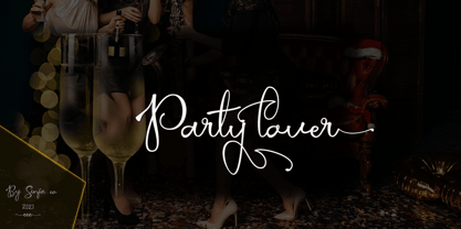 Party lover is a charming script font with a subtle and coarse signature font style, complemented by alternative fonts to make it look more charming, this font is perfect for completing your collection for logo, invitation, branding, label, trademark, and other needs. This font contains: Uppercase & Lowercase, and lowercase Alternative Symbols & Punctuation Marks OpenType Features attention ... that OpenType Features require software like Photoshop / Illustrator CC. Please try, thank you ...!
 - Arthur Serif by Gatype,
$16.00 Arthur is an edgy modern serif font. The long, classic serifs make for a unique high-contrast typeface that's all stylish. It appears regularly and boldly with lower and uppercase letters, numbers, punctuation marks plus multilingual letters. A must have for every modern graphic designer now! Features Include: Uppercase and lowercase Number Punctuation (OpenType Standard) Accents (Multilingual Characters) Alternative Style Ligatures and Style Sets Works on PC and Mac Simple installation
 - Wigwam NF by Nick's Fonts,
$10.00One in the series of fonts celebrating the Halcyon Days of Handlettering. Wigwam evokes, among other things, memories of summer camps and trailer parks of a bygone day. Based on a font presented in the 1933 book Lettering of Today by W. Ben and Ed C. Hunt. Both versions of this font contain the Unicode 1252 (Latin) and Unicode 1250 (Central European) character sets, with localization for Romanian and Moldovan. - Vladicek by 066.FONT,
$9.99 Vladicek is a display font in which each letter has been handwritten, giving it an authentic and original character. It exudes a varied and extravagant style, and with its daring and sophisticated letterforms, Vladicek attracts attention and gives projects a touch of nonchalance. It is ideal for creative projects such as posters, invitations or branding materials, where a striking and distinctive text finish is sought that stands out.
 - Frank Ruhl MF by Masterfont,
$59.00 The most popular Hebrew typeface, designed in 1908 by Raphael Frank and Otto Rühl. OpenType Pro Excellent support for Niqqud (Vowels). All marks are programmed to fit each glyph's shape and width. OpenType Pro includes new advanced features like Dagesh Hazak, ShevaNa, Qamatz Katan, Holam Haser and wide letters. Best used with Adobe InDesign CC that support complex Hebrew text. Please check these advanced features in this link: https://tinyurl.com/ybgdsxme
 - Kymmera Deco NF by Nick's Fonts,
$10.00The dreams that you dare to dream really can come true when you perk up your headlines with this re-imagining of Saul Bass's 1982 glitzy Deco classic, Rainbow Bass. For best results at large sizes, choose the TrueType version, rendered at a full 2,048 UPM. Both versions include the complete Latin 1252, Central European 1250 and Turkish 1254 character sets, as well as localization for Moldovan and Romanian. - Vocaloid - Personal use only

- Vocaloid Oblique - Personal use only

- ITC Needlescript by ITC,
$29.99It's been said that creativity requires ten parts to perspiration to one part inspiration. But not always. According to its creator, Mira Vucko, ITC Needlescript was designed in one breath." An accomplished lettering artist, Vucko was sketching letters one afternoon. "I was using a calligraphy nib and was drawing the alphabet without much thought," she recalls. "When I allowed the down strokes of a couple of letters to fall below the baseline, I realized that I had created the impression of movement. I kept drawing letters in this fashion and did the same with horizontal lines. I added a firm ending to the descenders. Instead of dots above the 'i' and 'j,' I placed strokes in the opposite direction." In this way, the first characters that were to become ITC Needlescript emerged. The finished design is a lively, distinctive alphabet that produces a striking texture on the page. Letters intertwine and overlap to create a sense of movement and graphic intensity, especially when reversed out of a dark background. Vucko lives, works and was educated in Zagreb, Croatia. She lived in France and Sweden while in her twenties, but then returned to Croatia to work as a graphic designer for the country's largest newspaper. It was here that her passion for type and typography was born. Vucko has since gone on to become one of Croatia's leading graphic designers, and has won many awards for her advertising and packaging design. Vucko recommends that ITC Needlescript be used for "titling, lively but 'thorny' content, and anywhere that a little typographic drama is called for."" - Kontext H by Elster Fonts,
$20.00 Imagine a font that is easier to read the smaller it is – or the further away the text is. There are already many line screen fonts, I wanted to take it to the extreme and use as few lines as possible, while keeping the grid of the fonts metrics. The result is a typeface that lives up to its name. Each individual line makes no sense on its own; individual letters are only recognisable in the context of all associated lines, individual letters are most likely to be recognised in the context of whole words. Attached to a building wall, text would be readable from a great distance and become increasingly difficult to decipher the closer you get to the building. Placed on the ground or on a large flat roof, text would only be readable from an aeroplane or - depending on the size - in Google Earth. Kontext has old style figures, superscript numerals, case-sensitive questiondown and exclamdown and an alternative ampersand, 390 glyphs at all. Use the same value for font size and line spacing to keep the lines in the grid, or change the line spacing in 10% steps. Change the spacing in 100-unit or 25-percent increments increments to keep the grid. The »H« in the font name stands for horizontal (lines). The numbers in the font name refer to the brightness of the background and letters themselves, with the first number describing the background and the second the letters. Starting with »00« (white) to »200« (dark) See also my Family Kontext Dot
 - Kontext V by Elster Fonts,
$20.00 Imagine a font that is easier to read the smaller it is – or the further away the text is. There are already many line screen fonts, I wanted to take it to the extreme and use as few lines as possible, while keeping the grid of the fonts metrics. The result is a typeface that lives up to its name. Each individual line makes no sense on its own; individual letters are only recognisable in the context of all associated lines, individual letters are most likely to be recognised in the context of whole words. Attached to a building wall, text would be readable from a great distance and become increasingly difficult to decipher the closer you get to the building. Placed on the ground or on a large flat roof, text would only be readable from an aeroplane or - depending on the size - in Google Earth. Kontext has old style figures, superscript numerals, case-sensitive questiondown and exclamdown and an alternative ampersand, 390 glyphs at all. Use the same value for font size and line spacing to keep the lines in the grid, or change the line spacing in 10% steps. Change the spacing in 50-unit or 25-percent increments to keep the grid. The »V« in the font name stands for vertical (lines). The numbers in the font name refer to the brightness of the background and letters themselves, with the first number describing the background and the second the letters. Starting with »00« (white) to »200« (dark) See also my family Kontext Dot
 - Golden Dust by Gleb Guralnyk,
$12.00 Introducing a "Golden dust" font. Fully handcrafted with vintage points effect. Hundreds of dots brings a lot of fun :) I hope you'll enjoy it!
 - Laughin by GroupType,
$19.00 Designed by Andrew Smith this bouncy and playful headline font does not take itself seriously. Perfect for headlines, children's books or on the web.
 - KG True Colors by Kimberly Geswein,
$5.00 This teacher-friendly polka-dotted font is perfect for kids and teachers. It is fun but still perfectly neat and legible for little readers.
 - PR Vanaheim by PR Fonts,
$10.00 This is a perfect font for historical or fantasy titles. It is influenced by ancient Nordic runes. the strokes flare slightly, to a concave terminal for a finely carved appearance. There are two sets of capitals in PR-Vanaheim-DC (Dual Capitals); one set of narrow letters, more closely related to Runic forms, and one set which includes wider and circular letters, which can be freely combined with the narrow letters for the variety associated with hand lettering. There is one version with dots placed in the centre of large counters and one version without the dots. The broad caps character set includes characters which allow for tight spacing; a dropped L, and a tall T. There are also two different lowercase sets, one modern, and one archaic, all of which can be freely mixed to fine tune the appearance of your text. Here is the brief description of the available faces: PR-Vanaheim-Med-DC-01 Duplex Caps PR-Vanaheim-Med-DC-02 Duplex Caps, Dotted counters and dot space PR-Vanaheim-Med-DC-03 Duplex Caps, Dotted counters PR-Vanaheim-Med-LC-04 Broad Caps, with modern style lower case. PR-Vanaheim-Med-LC-05 Narrow Caps, with modern style lower case. PR-Vanaheim-Med-LC-06 Broad Caps, with archaic lower case. PR-Vanaheim-Med-LC-07 Narrow Caps, with archaic lower case.
 - Led by Graviton,
$8.00 Led font family has been designed for Graviton Font Foundry by Pablo Balcells in 2012. It is dotted display typeface. Led consists of 2 styles.
 - Addressotype by Midwest Type,
$19.00 Addressotype is based on lettering from a vintage ad for the Addressograph-Multigraph Corporation, manufacturers of the Addressograph addressing machine. In days when the U.S. postal service delivered everything, mailing addresses were as important as email addresses are today. The Addressograph machines stamped out dog-tag-like plates that were used to print mailing labels at high volume. Embodying the company’s work ethic and durability, Addressotype recalls the gaspipe form of lettering popular in the 30s and 40s, updated to reflect the “streamlining” trend popular during the period.
 - Sleepy Time by Hanoded,
$15.00 Sleepy time… Ah, if only your kids would go to bed, close their eyes and drift off to sleep. This font was created when my son had some problems falling asleep: he'd cry, he wanted to sleep in a different bed, he wanted a different animal friend (he has Tij - a tiger, Meh - a sheep, Rafi - a giraffe, Moo - a cow, Woofy - a dog, Kikker - a frog). Sleepy Time font is an all caps typeface with uneven letters and a very different upper and lower case. It comes with all languages, including Cyrillic!
 - ALS Neuch by Art. Lebedev Studio,
$63.00 Neuch is a neat typeface for greeting cards, children's books, labels and signs, handmade goodies packaging, and other cheerful designs. Drawn with a sharp-tipped ink pen, the letters kick their legs up and down, stretch out their tails, and hop along gaily, as if not obeying any rules. The cute characters look like they are one big family—they get into arguments, mix noisily and good-humoredly, push each other, yet always stick together. Neuch can speak several languages and has ligatures, decorative elements, and even a cat and a dog.
 - Penitentiary Gothic by E-phemera,
$30.00Penitentiary Gothic is a digital recreation of the letters used on California state license plates, designed in order to make props for movies and television shows. The regular style is meant to be used on its own, but the other four styles are meant to be used one on top of another in different colors to create an embossed 3D effect. For best results, use the fill style in a dark color on top of a light colored background. Put the lolite style directly on top of the fill style in 10 - 30% of the background color. Put the hilite style directly on top of that in 10 - 30% of your fill color. Put the shadow style directly on top of that using your background color plus 50 - 80% black. - Acolyte by Altered Ego,
$45.00An elegantly refined typeface with a subtle wedge serif, the character shapes of Acolyte STF set a rhythm of light and dark like windows in a cathedral. Standing tall (as in condensed!) and respectful, Acolyte STF is aptly named as a companion to any design, packaging and advertising. Acolyte will illuminate your designs with a display typeface reminiscent of European 20th century letterforms. Its distinctive letterforms are slightly chiseled and angular with curves in just the right places. Wrapped in an aura of mystery, Acolyte's origins are from condensed typefaces, with an understated gothic feel. Available for Macintosh and Windows, Acolyte will set an edgy tone for all of your design needs. Complete with an Adobe-standard character set, this font also includes the Euro and is cross-platform compatible. - Das Riese by Intellecta Design,
$22.90 Das Riese, a type specimen by the most productive Brazilian type foundry, Intellecta Design, is a mix of victorian and art deco influences. A beautiful display type for tiling with uppercases only. It's shadows and volumes refer to pre-modern age whereas its surface to last century 20's. This heavy sans serif strokes characters have a particular appearance, a parallel line texture that reminds Bifur, typeface created in 1929 by A. M. Cassandre. The sideways absence of volume at some leaning letters right side in addition to the patchy darkness of shadows support its handmade design. A type full of historical references designed to small titles printed in big sizes. It's impossible not to think about posters when you look at Das Riese strong face. - (source Slanted Magazine #8)
 - Hollow House by Letterhend,
$19.00 Hollow House is a font which will looks great in dark / horror / spooky / scary theme. This type of font perfectly made to be applied especially in movies or storybook children which is need a standout font, and the other various formal forms such as invitations, labels, logos, magazines, books, greeting / wedding cards, packaging, fashion, make up, stationery, novels, labels or any type of advertising purpose. Features : numbers and punctuation multilingual alternates ligatures PUA encoded We highly recommend using a program that supports OpenType features and Glyphs panels like many of Adobe apps and Corel Draw, so you can see and access all Glyph variations. How to access opentype feature : letterhend.com/tutorials/using-opentype-feature-in-any-software/ Email us to letterhend@gmail.com if you need something! Happy Designing!
 - Geis by Galapagos,
$39.00In 1978 I went to work at Mergenthaler as a letter drawer. Being an inquisitive sort I decided that I should take a stab at this type design 'stuff'. I drew 25 or 30 glyphs before the work found its way to a high shelf in a dark corner of my apartment. Just 23 years later I found the drawings on a different shelf, in a different home, in a different city and decided to finish what I had started. I'm still trying to deal with my predisposition toward procrastination but I've finished the font. The name of the font is the last name of somebody I played softball with before I moved to Beantown. Ronnie Geis was one of the courageous firefighters we lost on September 11th when the WTC collapsed. - Bronzo by XO Type Co,
$39.00 This is a 2023 redesign of Bronzo, originally designed by Rick Valicenti and Mouli Marur in 1991. With this redesign, Bronzo now has 6 new weights, for a total of 9, and 587 more glyphs than it was able to in 1991. Bronzo appears to move forward, yet remain still, via a center stroke that only sticks out on the left, a tense curve that only happens on the right, and a width that sits uncomfortably between square and rectangle. Those three things, combined with a balanced light to dark ratio, are what makes Bronzo appear tense and ready. Bronzo accepts Modernist ideals of minimal, rational construction—but it also adopts luxuriant shapes over Modernism’s sandblasted neutrality. It’s almost an alternate reality, a “what if?” of Modernism. Modernism’s fun, interesting, cute reboot.
 - Technik by CarnokyType,
$25.00 Technik is a constructed typeface, which is almost strictly designed from basic geometrical elements consisting of mainly circles, also squares and diagonal shapes. Another characteristic is the connection of diagonals, verticals and diagonals, and also of some circle shapes touching each other at one point. It gives this type an original look, and prevents the problematic dark places in some letters. The technical feeling of the type (mainly in uppercase letters) is balanced by the design of lowercase which looks more friendly and fresh. Technik is not designed as a text typeface, it is recommended mainly for display typesetting. You can use it for example in fashion industry or in branding typography, or everywhere where you need the technical feeling of the constructed typefaces to look less cold and more friendly.
 - Augsburg Initials by Kaer,
$18.00 Hey! I'm happy to introduce to you my new initial's set. These drop caps I found in the "Introductorium in astronomiam" manuscript. It was printed in Augsburg in 1489 by Erhard Ratdolt. I've added some lost letters and assembled a full alphabet. Augsburg is a medieval gothic style font. Set of dim colored and monochrome grunge style emblems. Engraved initial drop caps. Perfect for vintage premium identity, Middle Ages posters, luxury packaging. If you want dark and strong medieval style concepts, please try it. --- *You can use color fonts in PS since CC 2017, AI since CC 2018, ID since CC 2019, macOS 10.14 Mojave* *Please note that the Canva & Corel doesn't support color fonts!* --- Please feel free to request any help you need: kaer.pro@gmail.com Best, Roman. Thank you!
 - Fleursdumal by Letterhead Studio-YG,
$40.00 How should an authentic baudelairean type look like? Aesthetically beautiful, that’s for sure. Intellectual, neurotic. Uptight — oh, the conventions of the time. Easily readable — still 20 years to go until the age of art nouveau with its outrage of typefaces. It may have a vibe of a Paris salon - salute to the Parnassiens. Such a modern-class (don’t mix it with the modern-styled) pharmaceutical Antiqua. Contrasts, thin serifs, the integrity of the operating theatre. But Baudelaire is not Heredia. «Une charogne» is not that much a vivid metaphor as a drawing from nature. The baudelairean typeface should have its cavern, flow, dark side. Not to demonstrate the fragile romantic profile of a cursed poet, as Baudelaire was seen 130 years ago, but to express the real pain. A true, unattractive, egoistic, suicidal passion.
 - Hells Kittchen Devil God by TypoGraphicDesign,
$19.00 CHARACTERISTICS The font name is a pun on the German word "Kittchen" (English prison/jail) and the English "Hell’s Kitchen". The character of the font looks as though the scum here — the guilty and innocent prisoners carved/scratched their signs and messages at the prison walls of their jail cell. The cold, creepy and scratchy character of the handwritten typeface is a very unique gloomy atmosphere. APPLICATION AREA The scary, dark, horror, trash, handwritten script font "Hells Kittchen Devil God" with many symbols/dingbats would look creepy good at rusty display size for headlines. Magazines or websites, movie posters, music covers or webbanner. TECHNICAL SPECIFICATIONS Headline Font / Display Font / Trash Script "Hells Kittchen Devil God" OpenType Font with 375 glyphs — many symbols/dingbats, alternative letters and ligatures (with accents &€) & 2 style (regular, bold)
 - Subversia by Arterfak Project,
$12.00 Subversia is inspired by sport and Victorian style. It is designed with elegant and solid shapes to give a modern touch, and is very suitable for your designs such as posters, flyers, t-shirts, logos, signage, branding, the even body text for magazines. Subversia has all-caps characters as Stylistic set in OpenType features that gives you greater variant of typographic possibilities, especially in headlines. This set also has ligatures, stylistic alternates and swashes to make your design look more natural and elegant. 400+ glyphs total with 23 languages. This font is designed with adaptive and flexible looks that possible to apply in other styles outside vintage. With the italic style you can use this font for a sporty theme, minimalism, pop contemporary, dark theme, feminine or editorial project.
 - Libertad by TipoType,
$24.00 Design can do without images, but not without typefaces. Libertad is a sans-serif typeface that mixes humanist and grotesk models. It’s most interesting feature is the combination of balanced regulars with dynamic italics, which makes it a very versatile font for different uses. This typeface follows the Luc(as) de Groot’s Interpolation Theory, that’s why it has seven specially-calculated weights plus their matching italics, from thin to extra-bold. This allows it to be useful in big headlines and also small texts. It has more than 800 characters per weight and support for more than 70 languages. WARNING: This does not work with most Office suites; you only have access to R/I/B/BI. Credits: Photos by Lu-Lee.com - Web template by EleganThemes.com
 - Linotype Party Time by Linotype,
$29.99Linotype Party Time is part of the Take Type Library, chosen from the entries of the Linotype-sponsored International Digital Type Design Contests of 1994 and 1997. The typeface is the work of Bulgarian designer Christo Velikov and is composed exclusively of capital letters. Different components make up this cheeful, frolicking font: stripes, dots, triangles, arrows, a trumpet, a ribbon, and others. The characters of Linotype Party Time stand straight on the base line while those of Linotype Party Time Drunk take on the stance typical of this state. Linotype Party Time is perfect for anything which has to do with fun and should be used exclusively in larger point sizes to emphasize the details which make the figures so unique.

