10,000 search results
(0.039 seconds)
- Rocketlers by LetterStock,
$23.00 **Rocketlers Font** This pair was inspired by the retro motorbike poster design that i saw on some coffee shop, It was crafted by hand specially to add natural handmade feeling in its brand identity than i make it clean with pentool. **Opentype features** Rocketler Font is very good looking in logo, labels, product packaging, invitations, advertising and others. This fonts works with following languages: Afrikaans, Albanian, Asu, Basque, Bemba, Bena, Chiga, Cornish, Danish, English, Estonian, Filipino, Finnish, French, Friulian, Galician, German, Gusii, Indonesian, Irish, Italian, Kabuverdianu, Kalenjin, Kinyarwanda, Low German, Luo, Luxembourgish, Luyia, Machame, Makhuwa-Meetto, Makonde, Malagasy, Malay, Manx, Morisyen, North Ndebele, Norwegian Bokmål, Norwegian Nynorsk, Nyankole, Oromo, Portuguese, Romansh, Rombo, Rundi, Rwa, Samburu, Sango, Sangu, Scottish Gaelic, Sena, Shambala, Shona, Soga, Somali, Spanish, Swahili, Swedish, Swiss German, Taita, Teso, Vunjo, Zulu Thank you for using this font. LS
 - Murga by Sudtipos,
$39.00 Angel Koziupa was drawing letters for labels since forty years ago, now he meets SudTipos and his beautiful works could be used around the world. Murga is a dance, it’s Latin, it’s carnival....
 - Ingeo by Blancoletters,
$40.00 Between the most rigid geometric letterforms and the most expressive calligraphy works there are, undoubtedly, countless combinatory possibilities. Ingeo is just one of them. Located very close to a geometric approach it shows, however, a clear willingness to accommodate in its structure the calligraphic traits of our alphabet. In Ingeo geometry grows from the inside, meaning that all its counters are based on geometric shapes. Around them, contours are later defined. The solid mass resulting from that interaction is modulated in specific areas in a way that evokes the way a writing hand finishes a letter and starts the following one. Ingeo seeks to accommodate calligraphic features in its geometric structure without any complexes, in the same way a computer engineer writes a song or a poet admires the orbits of planets and satellites. In this vast and unmapped realm between seemingly opposing concepts is where Ingeo finds its playground. There, that interaction is pushed to its limits and the resulting letterforms are later confronted with typographical conventions to assess whether they survive. Ingeo comes with 695 glyphs in its character set with support for more than 270 languages. Among these glyphs you can find 5 stylistic sets, 19 useful science-related icons as well as 7 different designs for ampersands.
 - TootSweetBistroNF - 100% free

- Sigmund Freud Typeface by Harald Geisler,
$29.00 “For those who regret what keyboards and touch screens have done to their penmanship, typographer Harald Geisler has an answer: Sigmund Freud.” — The Wall Street Journal Sigmund Freud was a neurologist who lived from 1856 to 1939. His research and studies led to the foundation of ‘Psychoanalysis’. When I first saw Freud’s century old letters, I was fascinated by the beauty of these historic manuscripts. It made me smile to imagine a person writing his or her shrink a letter set in Freud’s handwriting. I started to plan creating a font based on his manuscripts. I contacted the Sigmund Freud Museum Vienna and Freud Museum London. To start the creation I selected eight handwritten documents from the archive in Vienna – This selection of specimen was my orientation during the design process. The Samples were created between 1883 to 1938 and are of various character such as handwritten scientific papers, personal letters, notes and a telegram. A successful Kickstarter Campaign "The Sigmund Freud Typeface - A Letter to your Shrink" with over 1400 Backers enabled me to visit the archive in Vienna and study the original manuscripts of Sigmund Freud. After a year of preparation and design work, I finished four alphabets based on Freud’s handwriting. What are the different Versions PRO, Kurrent, #1, #2, #3 and #4 about? “This project gives people the convenience afforded by the computer while maintaining the romantic nostalgia, beauty, and character of letter writing with real handwriting.” — Daniel Vahab, The Huffington Post When you write with your hand, every letter looks a little different. When you write a text on your computer every letter looks exactly the same. In order to make type look like handwriting, I chose four different variations of each letter from Freud’s manuscripts, drew and stored them in the font. The font is then programmed to exchange letters while you are typing. This makes the rendered result on your screen or print look like unique handwriting. PRO While you are typing… the PRO Version actively combines all four alphabets and exchanges them automatically. Through this mechanism never the same two o’s will stand next to each other. With every touch a unique look is generated. This works in certain applications i.e. Word 2010(or newer), Pages, TextEdit, Editor(Pre-installed on Windows 7 or newer), InDesign, Illustrator… →Here you can see an animation of what this effect looks like in action. (Please Note: some applications like LibreOffice, OpenOffice do currently not support this feature. Date: December 2013) #1 #2 #3 and #4 The Sigmund Freud Typeface #1, #2, #3 and #4 each hold one individual lowercase alphabet based on Freud’s handwriting. Kurrent Most of Freud’s correspondence was written in German. Until the 1950′s a different handwriting was taught throughout German speaking countries (Switzerland, Austria, Germany). This style is called Kurrent. The name Kurrent and Cursive derive from the Latin word currere - to run, hurry - both styles were designed to write fast. As you can see in the samples above, Freud practiced both Kurrent and when writing english Cursive (Latin script or Joined-up). Kurrent has three significantly different letters (s,h,e). Use Kurrent to render the authentic look of an historic Sigmund Freud letter in German. Bundle On the Top of this page you can get all six fonts of the Sigmund Freud Typeface Family in a bundle. International Typeface All styles of the Sigmund Freud Typeface feature a wide range of accented letters so you can write to all your friends in Sweden (Bjørn) France (Chloé & Zoë), Ireland (Dáirine), Poland (Łucja), Germany (Jörg) and almost everywhere around the globe (Find a complete list in the tech specs). Usage recommendations I hope that this design will be valuable to you and most of all that you have fun with this typeface! 1. Point Size — To reproduce the size of Sigmund Freud’s handwriting adjust the type size between 18-24 point in your word processor. If you are using an imaging software like Photoshop set the resolution to 300dpi and adjust the point size between 18-24. 2. Line Spacing — Narrow the line hight until swashes of capital letters touch the baseline above. This also happens when you write a letter and gives the document a unique handwritten look. 3. Right Aligned — Freud had the habit to write towards the right edge of the page and start loosely on the left. Set your text alignment to ‘right’ to incorporate this dramatic expression also to your documents. What do other People say about the Sigmund Freud Typeface? “Wouldn’t you love to write a letter to your shrink using the Sigmund Freud typeface?” — Dorothy Tan, Design TAXI ''“JUST DON’T WRITE A LETTER TO YOUR MOTHER WITH IT… …until the reader looks a bit closer, and they see 70+ years of modern science weighing in on turn-of-the-century pop psychology."'' — Mark Willson, Fast Company “Doctor, what does it mean if you dream of creating a font of Freud’s handwriting?” — Ayun Halliday, Open Culture “…geekily romantic, at once artistic and scientific” — Edie Jarolim, Freud’s Butcher “…sympathisch” — Jürgen Siebert, Fontblog !WOW! Thank you for reading the complete font description! You are awesome! If you still have a question please contact me through MyFonts or my website haraldgeisler.com. Credits This project was made possible by the help of 1481 Backers on Kickstarter and the kind support of the Sigmund Freud Museum Vienna and the Freud Museum London. Thank you. All of Freud’s Manuscripts shown are © Sigmund Freud Museum Vienna. Poster Image: IN17 - Sigmund Freud, Germany 1932. © Freud Museum London. Flag Image: IN19 - Sigmund Freud 1930’s. © Freud Museum London.
 - Maestrale by Catharsis Fonts,
$25.00 Maestrale is a paradigm-breaking new take on calligraphy, built around a compact, serif-style core and outrageously long, flamboyant extenders. At large sizes, its confident, charismatic lettershapes are ideally suited for branding and decorative uses, whereas longer texts at smaller sizes naturally weave themselves into a flowing texture. The font comprises 1299 glyphs, including many stylistic alternates, ligatures, small capitals, and initial, terminal, and linking forms, and offers extensive OpenType programming to support them. The calligraphic form of Maestrale is complemented by a matching text font (Maestrale Text) with short extenders, available in three cuts (a serif-style Roman, an upright Cursive, and a tilted Italic). Maestrale is all about the lowercase; its capitals are deliberately understated so as not to steal the limelight. In fact, the font works very well when set exclusively in lowercase. Maestrale�s small capitals are fitted into the core space of the lowercase, allowing them to be freely interspersed with lowercase characters. Alternately, an OpenType feature is available to replace a and e in small-caps text with their lowercase equivalents for a fresh unicase look. Since alternates and ligatures play such an important role, Maestrale offers three different modes of use. The most straightforward approach is simply to start typing using Maestrale Pro � the extensive OpenType programming will ensure that collisions between extenders are avoided and attractive ligatures are substituted for common glyph combinations. A more interactive approach is provided by the font Maestrale Manual, which allows the user to manually select alternate forms and ligatures even in typographically unsavvy applications, such as PowerPoint (as long as standard ligatures are supported). Stylistic alternates are simply represented as ligatures of their base forms with one or more instances of the rarely-used by easily-accessed characters "~" (ASCII tilde) and "`" (spacing grave accent); linking forms are built with �_� (underscore), multi-character ligatures with "|" (pipe), and initial and terminal forms with the �less than� and �greater than� characters. For instance, the Maestrale wordmark in the posters above was simply typeset with the string (`ma`est|r_a```l```e)| in Maestrale Manual (The parentheses represent �less than� and �greater than� characters here.) Feel free to type this string into the test line below and see what happens! Make sure Standard Ligatures are enabled. An instruction sheet listing all alternate forms and their accessibility is available from the Gallery tab on this page. The third mode of usage is aimed at professional designers, who make use of sophisticated software with extensive OpenType support. These power users are advised to use the font Maestrale Pro again, where all glyphs are accessible as stylistic alternates. Maestrale Text is a less extravagant but more versatile variation on the design of Maestrale, replacing Maestrale�s swashes with efficiently compact extenders. It is intended to serve as a perfectly matching text companion to Maestrale calligraphy, but constitutes a full-fledged typeface in its own right. It is equally at home at display sizes as it is in pull quotes, titles, and high-impact blocks of text. Maestrale Text comes in three complementary faces: A serif-style Roman, an upright Cursive, and a tilted Italic. Maestrale is the Italian word for �masterful�. It is also the traditional Italian name for the northwesterly mediterranean wind, better known by its French name, Mistral. Acknowledgements: I am grateful to the helpful souls on the Typophile forums for extensive feedback and encouragement on Maestrale, and to the TypeDrawers forum for feedback on Maestrale Text. This font is dedicated to Simone.
 - Flicker Lettering by Hanzel Space,
$25.00 Flicker - Vintage Calligraphy Font We're Introducing the "Flicker" Font we created in 2022. To talk more about the character of this font, please see a preview of how each Glyph in the font will look when applied to a design. This font has a vintage touch and a modern look to each letter, slightly rounded and neat shapes in each curve, plus a Stylistic feature at the end of the letters. We design this font in such a way that it is suitable when used for design projects so that it looks very attractive. And you can also use this font for logos, branding, brochures, names on product packaging and so on. Uppercase & Lowercase, Numeral, Punctuation, Miltilingual, Swash
 - Brilliant Worth by Hanzel Space,
$25.00 Brilliant - Lettering Script Font We're Introducing the "Brilliant" Font we created in 2023. To talk more about the character of this font, please see a preview of how each Glyph in the font will look when applied to a design. This font has a vintage touch and a modern look to each letter, slightly rounded and neat shapes in each curve, plus a Stylistic feature at the end of the letters. We design this font in such a way that it is suitable when used for design projects so that it looks very attractive. And you can also use this font for logos, branding, brochures, names on product packaging and so on. Uppercase & Lowercase, Numeral, Punctuation, Miltilingual, Swash
 - AI Wood by Alphabets,
$17.95These six faces are interpreted from examples shown in Rob Roy Kelly's "American Wood Types" They are not merely scanned copies, but have been redrawn from scratch with various optical adjustments. Kelly points out that the true glory of the American Wood Types are the negative spaces, which are, in their dynamic active forms, the antithesis of the anemic flimsy letters produced by type foundries in the 19th century. The Alphabets Wood Types are designed with digital manipulation in mind. Stretch, curve and distort at will! These designs were released prior to similar revivals from Adobe. Each font has two full alphabets (one full height, one smaller) and numerals. However, certain points and accents will not be found. - Companion Old Style by Matteson Typographics,
$19.99 A unique design accurately revived by Steve Matteson in 2021. Frederic Goudy designed Companion Old Style for Women’s Home Companion in 1928. In his own words: “I believe the new letter I showed him, both in roman and italic, is one of the most distinctive types I have ever made. It incorporates features which deliberately violate tradition as to stress and curves, but which are so handled that attention is not specifically drawn to the innovations introduced.” Companion Old Style exudes the style of pre-World War 2 Americana. The unique characteristics are wonderful for greeting cards, wedding announcements and holiday invitations. Companion’s nostalgic letterforms are light hearted and quirky yet highly readable.
 - Airam by Linotype,
$29.99 Maria Martina Schmitt was born in Vienna, Austria in 1950. Since 1998, she has been working as a freelance designer, focusing on cultural collateral, economic publications, illustration, type design, and logo design. Airam blends contemporary legibility with historic blackletter forms, creating a contemporary text face that speaks to the old European past. Airam certainly appears darker than most other contemporary text faces. Airam’s letterforms are slightly broken, too. They display angled joints in lieu of smooth curves. This “broken” aspect actually aids legibility at smaller point sizes. While Airam may not be suitable for setting whole books or newspapers, this font will add a splendid touch to short tracts of small text. Additionally, Airam looks superb in large headlines.
 - Rodeo Clown by FontMesa,
$25.00 Rodeo Clown is a revival of an old classic font that you may have known under the name of Carnival. The Rodeo Clown family includes Fill fonts that you may layer behind the letters to add color or set to white so any background image doesn't show through the letters. The half fill should be layered on top to change the color of the top inlay design. The fill font for Rodeo Clown may also work as a stand alone black weight. In our sales images you'll see a sample of the fill font being used, we've intentionally offset the fill font to give it a misaligned printed look which was common to see with fill fonts in the 1800's
 - Mahavishnu by Typodermic,
$11.95 Step into the world of Mahavishnu—a typeface that takes inspiration from the psychedelic record covers of the legendary Mahavishnu Orchestra, and brings to life a unique, organic design that speaks volumes. Each letter has been meticulously crafted to have an intriguing interaction with the next, creating a flowing, organic feel that is sure to captivate your audience. With its soft, delicate curves, Mahavishnu exudes an aura of calm contemplation. Its sleek and stylish design gives your message an original, captivating voice, that will set you apart from the rest. It breathes life into your words, and delivers your message with a sense of depth and character that is hard to come by. The unusual curves of Mahavishnu make it perfect for those looking to create a design with a difference. It is a typeface that embodies the spirit of creativity and imagination, giving your message an organic feel that is both fresh and exciting. Whether you’re designing a poster, a logo, or even a book cover, Mahavishnu will add a touch of originality to your work, and ensure that your message is delivered in style. In short, Mahavishnu is a font that will elevate your design to new heights. Its distinctive curves and letter interaction make it the perfect choice for those who want to create an intriguing, original voice for their message. So why not give Mahavishnu a try and discover the creative possibilities it has to offer? Most Latin-based European writing systems are supported, including the following languages. Afaan Oromo, Afar, Afrikaans, Albanian, Alsatian, Aromanian, Aymara, Bashkir (Latin), Basque, Belarusian (Latin), Bemba, Bikol, Bosnian, Breton, Cape Verdean, Creole, Catalan, Cebuano, Chamorro, Chavacano, Chichewa, Crimean Tatar (Latin), Croatian, Czech, Danish, Dawan, Dholuo, Dutch, English, Estonian, Faroese, Fijian, Filipino, Finnish, French, Frisian, Friulian, Gagauz (Latin), Galician, Ganda, Genoese, German, Greenlandic, Guadeloupean Creole, Haitian Creole, Hawaiian, Hiligaynon, Hungarian, Icelandic, Ilocano, Indonesian, Irish, Italian, Jamaican, Kaqchikel, Karakalpak (Latin), Kashubian, Kikongo, Kinyarwanda, Kirundi, Kurdish (Latin), Latvian, Lithuanian, Lombard, Low Saxon, Luxembourgish, Maasai, Makhuwa, Malay, Maltese, Māori, Moldovan, Montenegrin, Ndebele, Neapolitan, Norwegian, Novial, Occitan, Ossetian (Latin), Papiamento, Piedmontese, Polish, Portuguese, Quechua, Rarotongan, Romanian, Romansh, Sami, Sango, Saramaccan, Sardinian, Scottish Gaelic, Serbian (Latin), Shona, Sicilian, Silesian, Slovak, Slovenian, Somali, Sorbian, Sotho, Spanish, Swahili, Swazi, Swedish, Tagalog, Tahitian, Tetum, Tongan, Tshiluba, Tsonga, Tswana, Tumbuka, Turkish, Turkmen (Latin), Tuvaluan, Uzbek (Latin), Venetian, Vepsian, Võro, Walloon, Waray-Waray, Wayuu, Welsh, Wolof, Xhosa, Yapese, Zapotec Zulu and Zuni.
 - Kristopher by Vintage Voyage Design Supply,
$22.00 An elegant serif with contrasting lines and balanced curves. A lot of stylish alternates will give you many useful variations for use. Try to play with the compositions of curves / alternate letters. This font may be conservative and classic, but also may be more playful and modern. It is good for theater or art posters and for modern music, web-pictures or vinyl covers. Of course it also will be good for coffee shops, cafe's, restaurants, magazine's headers, signs or gift/post cards and weddings. Try to use it in your beauty or travel blogs, you will see how many options you will have with stylish Kristopher.
 - ITC Nova Lineta by ITC,
$29.99The ITC Nova Lineta™ design is the first commercial typeface from Slobodan Jelesijevic. As with many typeface designs, it began as simple sketches. “I was working on a packaging design project,” recalls Jelesijevic, “and wanted an informal, slightly cursive design for the type. I could not find anything that matched my need, so I began sketching.” The preliminary design had an elegant yet fresh quality that, once developed, turned out to be perfect for Jelesijevic’s project. After its first use, however, Nova Lineta lay dormant for over a year. Other projects came and went, and new typeface ideas filled Jelesijevic’s notebook. Although Nova Lineta continued to tickle the creative crevices of his mind, no more work was done on the face. Then, in a period between projects, Jelesijevic began to polish the design – and, in the process, created extended and condensed versions to complement the normally-proportioned original. Born in Gornji Milanovac, Serbia in 1951, Jelesijevic graduated with a degree in graphic communication and lettering from the Faculty of Applied Arts in Belgrade. These days, Jelesijevic is sought out not only as a typeface designer, but also as a graphic designer and illustrator. When not working on design projects, he teaches graphic communication at the Faculty of Art in Niš, Serbia. Although it is a casual and inviting design, Nova Lineta has been carefully constructed and refined. As a result, it performs exceptionally well within a wide range of sizes and in a wealth of applications. An ample x-height, open counters and distinctive character shapes also ensure a high level of legibility. And, although at first glance Nova Lineta may appear to be a sans serif design, subtle serifs make their presence known at large sizes. Nova Lineta emanates warmth when used for extensive text, and it has a fresh quality at display sizes. The small family’s range of proportions also provides added flexibility. The result is a friendly yet powerful communication tool in a remarkably modestly-sized package. - Swollen - Unknown license

- Handtalk - Personal use only

- Joe DiMaggio - Unknown license

- Expreso by JVB Fonts,
$19.00 EXPRESO was inspired by the extinct art and craft of urban Lettering applied to buses and other kind of cars for public service of transportation. Since the mid of last century, main cities of Colombia - as Bogotá, Medellín and others - were growing in population and brought urban area expansion with it and serious traffic problems due to the lack of political will and urban planning. The problem of urban transport in Colombia's largest cities has not yet been resolved, despite adopting some examples of mass transit system in other cities in the region. Before these actions, public transport in cities such as Bogotá was quite varied, leaving space for popular culture that survived for a couple of decades, until the massive dieback of these old buses early this decade, either by practices associated with Lettering it was displaced by some technological, some expressions of art street and city that evolved or disappeared. EXPRESO can be used mainly in titles and display texts. You have a multitude of options using combination of layers from the basics of the font family to the various textures and shades. Supports East Europe languages.
 - Hornswoggled - 100% free

- TeamSpirit - 100% free

- HerzogVonGraf - 100% free

- Moonlight Shadow by Hanoded,
$10.00 Moonlight Shadow is a weird, but surprisingly versatile font. It is curly, messy - yet elegant and comes with all the accents.
 - Freekick by Girinesia,
$11.00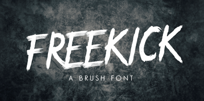 FREEKICK - Brush Font would perfect for sports, music festival, special events or anything What Included this font : PUA Encoded Characters Fully accessible without additional design software. Fonts include multilingual support for; Afrikaans, Albanian, Catalan, Danish, Dutch, English, Icelandic, Italian, Spanish, Portuguese, German, Swedish, Norweigen, Polish, Indonesian, Zulu and etc Simple installations
 - Spektakel by PizzaDude.dk,
$15.00 Spektakel is danish for something noisy - just like this font! Comes with 5 different versions of each letter, and these cycles as you type! A great way to make your text all wild and grungy - and still legible! Of course, without making too much noise, Spektakel has got multi language support!
 - Double Tracker by Hanzel Space,
$25.00 Double Tracker is an inspiration for a font with paint strokes so that it has a texture that seems natural, done with an original ink stroke process.. The strong and sturdy design makes it ideal for eye-catching headlines, branding, packaging, magazines, sports, logos, and more. Happy Creating! Hanzel Studio
 - PocketWrench by Deniart Systems,
$20.00 Make a bold statement with this modern, angular design - go wild and use it together with it's partner font, PolkaDot Wrench. This typeface features over 90 extended characters for setting European languages such as Czech, Danish, Dutch, Esperanto, Finnish, French, German, Italian, Hungarian, Polish, Portuguese, Romanian, Spanish, Swedish, Turkish & Welsh.
 - Spyced by Essqué Productions,
$35.00 This stylized font was inspired by the personal style of the designer’s sister. It has a mixture of Gothic, Arabian, & Persian styles, with elements inspired by thorns and smoke. It can be ideal for projects that require an air of mystery or intrigue, or have an exotic or dangerous flare.
 - Typek by Agnieszka Ewa Olszewska,
$25.00 Typek is a sans serif typeface for the lovers of minimal design and great curves. Typek outlines' professional shapes are perfect for large display usage.. Perfect for branding, posters, web and publications. The idea is to treat the letters' stroke create absorbing and interlaced shape. The design of small interfering in letters' construction makes Typek unique. Typek contains uppercase, diacritics and digits. The Typek Family is in two versions: Regular and Outline. Outline version can be an interesting addition and decoration for the Regular version.
 - Tondu by The Northern Block,
$37.95 Tondu is a straightforward display typeface inspired by film posters of the early 1900s. Strong upright forms combined with smooth curved details create a clear and bold font ideal for apparel, billboards, books and posters. Tondu is now available as version 2.0 (2021); the remastered version meets higher technical standards that modern-day users demand. Included in the font are over 490 characters, in one heavyweight style. Opentype features consist of digital numerals, lining figures, fractions and language support covering Western, South and Central Europe.
 - Luckylove by Scratch Design,
$9.00 Luckylove is a modern script font with natural brush effects in the bouncy curve and loops. This font will make your design text look stand out and also perfect for logos, posters, wedding invitations, websites, printed quotes, invitations, cards, product packaging, headers, and whatever with a feminine touch in your designs. Luckylove is an awesome script font that comes with some of the lowercase alternates, that allows you to create even more authentic modern script-feel text. Another feature of this font is complete with multi-languages.
 - Klartext Mono by Fonts With Love,
$20.00 Klartext [plain talking, clear words] A modern monospaced type family of 10 weights. Klartext Mono combines a classical monospaced font and modern monolined sans-serif with a humanistic touch. It is characterized by a large x-height, slightly condensed glyphs with well shaped curves and soft strokes. As a special feature, Klartext contains a bunch of uncommon glyphs like the German capital sharp S, a nice arrowset and a basic phonetic alphabet (20 letters in IPA Extensions, some more in Latin Basic thru Extended B).
 - Green Brooks by Asenbayu,
$14.00 Green Brooks is a semi serif decorative display font. A mix of abstract and curves inspired by flowing rivers in nature, this font has beautiful flowing shapes. This font also has a modern feel with a sans serif outline. You can use this font in both modern and vintage designs. This font is suitable for attractive packaging label designs, unique desired logos, poster designs, fashion and many more. Green Brooks font features: standard glyph, kerning, stylistic alternates, stylistic ligatures, symbol, punctuation and multi languages supported.
 - Safford by MysticalType,
$12.00 Safford is a family font with a sports style. I made it with a very mature calculation so as to produce the best visual view. This font is suitable for you to use for making flyers, advertisements, books, magazines, and others. Safford has 18 styles with different thickness sizes, each curve is dynamic and I will show you how serious I am in making it, you can see in the font presentation, how do I input designer values. Safford has 385 Glyphs with ligatures having 24.
 - Decennie Express JY Pro by JY&A,
$45.00 JY Décennie Express was developed as a sans serif workhorse complement to JY Décennie. The basic roman design shares characteristics, and in some cases, characters (e, o, and others) with the serif version, making JY Décennie Express work particularly well with its progenitor. The design is friendly and approachable, as opposed to stark (the effect one usually has with Helvetica and other over-used typefaces). On closer inspection, straight lines blend into curves on the outlines: the characters are in fact complex but appear simple.
 - Plantago by Schriftlabor,
$29.99 Viktor Solt-Bittner drew logo sketches for an insurance company. Luckily for Schriftlabor, they rejected the design, and he turned the sketches into a font family. Years later, Plantago was expanded, developed and completed by Schriftlabor’s type directors Franziska Hubmann and Lisa Schultz. Plantago shows delicate leaf-like stroke endings and subtle curvings and offers condensed and wide variants. Typeset in 6 weights from Light to Black, 3 widths from Condensed to Extended, both upright and italic, totaling in no less than 36 styles.
 - Radiograph by Up Up Creative,
$16.00 Radiograph is a stylish serif font with subtle curves and playful proportions. It’s equally at home in all-caps headlines as it is in full paragraphs. Radiograph is perfect for headlines, editorial design, monograms, branding, logos, poster design, and more. Radiograph includes approximately 480 glyphs and 16 standard and discretionary ligatures. OpenType features include a smattering of character variants, ligatures, and multilingual support (including multiple currency symbols). The OpenType features can be very easily accessed by using OpenType-savvy programs such as Adobe Illustrator and Adobe InDesign.
 - Buche by Factory738,
$15.00 Buche - a brief introduction Buche is a contemporary serif font designed for logo and brand design. It exudes an air of affluence and sophistication, despite its curvy appearance. The ligature fonts will come in handy for whatever your imagination can think up! 6 Weights & 2 Styles (Regular & Italic) Basic Latin A-Z and a-z Numerals & Punctuation Stylistic Ligatures Multilingual Support for ä ö ü Ä Ö Ü ... Free updates and feature additions Thanks for looking, and I hope you enjoy it.
 - Qia Display by SimpleType Studios,
$15.00 Qia Display is a modern high-contrast display font with bright positive character. Clean forms and a bit curly letter ends creates a friendly mood in any designs Qia Display will be perfect for many projects: logo, wedding designs, social media posts, advertisements, product packaging, product designs, label, photography, watermark, invitation, or whatever project you’re working on. This gorgeous font includes all lowercase and uppercase characters, numbers, punctuation, an array of standard ligatures and a selection of international characters as well.
 - Siegra by Arterfak Project,
$22.00 Siegra is a cool combination of powerful, sporty, automotive, elegant, and futuristic. One of kind techno font that versatile to apply in various design styles. Wide, sharp, and curvy of the letterforms that speed up your energy and get more confidently design. Siegra is suitable for posters, branding, campaign, logo, keychains, stickers, t-shirts, automotive, and many more! Completed with a lot of stylish ligatures to gives your design more power! Multilingual support and PUA encoded. Get yours! Thank you.


