10,000 search results
(0.725 seconds)
- Get A Grip - Unknown license

- Crushed Out Girl - Unknown license

- Got No Heart - Unknown license

- Crinkle Cut Glass - Personal use only

- VTC Krinkle-Kut - Unknown license

- VTC Krinkle-Kut - Unknown license

- VTC Krinkle-Kut - Unknown license

- VTC Krinkle-Kut - Unknown license

- Cacophony Out Loud - Unknown license

- Two Gun Johann - Unknown license

- Boldly Go Out - Unknown license

- Scissor Cuts 2 - Unknown license

- Out of sight - Unknown license

- VTC Krinkle-Kut - Unknown license

- Supervixen Honeyed Out - Personal use only

- Decked Out NF by Nick's Fonts,
$10.00 - Directors Cut Pro by Type Innovations,
$39.00
- Cut Sans Serif by Aksharasarovara,
$25.00 - Evening Out JNL by Jeff Levine,
$29.00
- Cut Nyak Dhin by Nandatype Studio,
$12.00
- Lets get crazy by Pedro Teixeira,
$14.00
- Spread Out NF by Nick's Fonts,
$10.00 - The Maggie Nut by Hydric Design,
$10.00
- Tough Guy JNL by Jeff Levine,
$29.00 - Dining Out JNL by Jeff Levine,
$29.00
- Gummed Alphabet JNL by Jeff Levine,
$29.00
- Plinc Bubble Gum by House Industries,
$33.00
- Maxed Out NF by Nick's Fonts,
$10.00
- AZ Cut Script by Artist of Design,
$25.00
- Random But Perfect by Aldedesign,
$18.00
- MC Robneys Hut by Maulana Creative,
$15.00
- Brazil Nut JNL by Jeff Levine,
$29.00
- Nut Kit 4F by 4th february,
$30.00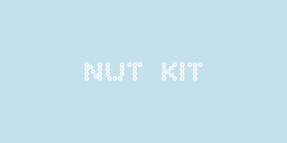
- Gummed Letters JNL by Jeff Levine,
$29.00 - FE Blacking Out by Egor Stremousov,
$50.00
- Tooned Out JNL by Jeff Levine,
$29.00 - Funky Tut NF by Nick's Fonts,
$10.00 - Pine Nuts United by Jonahfonts,
$35.00
- Rough Cut NF by Nick's Fonts,
$10.00 - Letterpress Cuts JNL by Jeff Levine,
$29.00


